What is Assyrian Palace Relief?
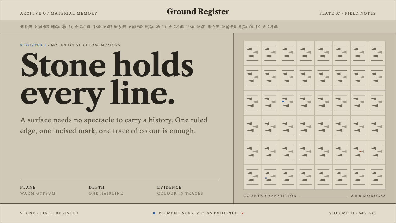
Assyrian Palace Relief takes the lion-hunt slabs of Nineveh as its model: pale gypsum carved barely proud of the stone, structure drawn in hairline shadow, and colour surviving only as scraps of ancient pigment.
Assyrian Palace Relief in brief
Assyrian Palace Relief is the visual language of the carved gypsum slabs that lined the walls of Ashurbanipal's North Palace at Nineveh in the seventh century BC, the lion hunt panels above all. Their surface is a chalky pale stone, now a warm grey, cut so shallowly that a mane, a bowstring or the grooves of a forearm read as a hairline of shadow rather than a mass in space. Horizontal registers divide the wall, and bands of cuneiform inscription run straight across the images.
The design system treats the page as that quarried stone. Structure comes from ruled horizontal registers and hairline edges, never from lift or glow. There are no floating layers and no stacked shadows. Egyptian blue and red ochre survive only as pigment traces, small and fragmentary and never a field of colour, so the palette is overwhelmingly stone, with colour present as evidence rather than as decoration. Type is serif, in the manner of an inscription.
Repetition is the ornament. A row of curls, a row of feathers, a row of tassels, counted off along a band, takes the place of illustration or flourish. The result feels weighty, archival and unhurried: a page that reads like a wall in a gallery, where history has been cut to a hairline.
Where does Assyrian Palace Relief come from?
The slabs belong to the Neo-Assyrian tradition of decorating palace walls with carved gypsum panels, a programme of orthostats: upright stone slabs set along a wall and carved with narrative. The ones at issue here come from the North Palace of Ashurbanipal at Nineveh, opposite modern Mosul in northern Iraq, and are dated to around 645–635 BC. The best known are the lion hunt slabs, in which the king hunts lions across a sequence of scenes, part of a wider cycle of royal hunt narratives.
The carving method defines the look. The slabs are cut barely proud of the gypsum, so depth is a matter of fine incision and of the light that falls across it. When quarried, the stone was close to white; it has since weathered to a warm grey. Everything that makes the images legible, from the hair of a mane to the muscles of an arm, is told by thin lines of shadow. The relief reads as drawing in stone, and that is why the system is built on hairlines rather than volumes.
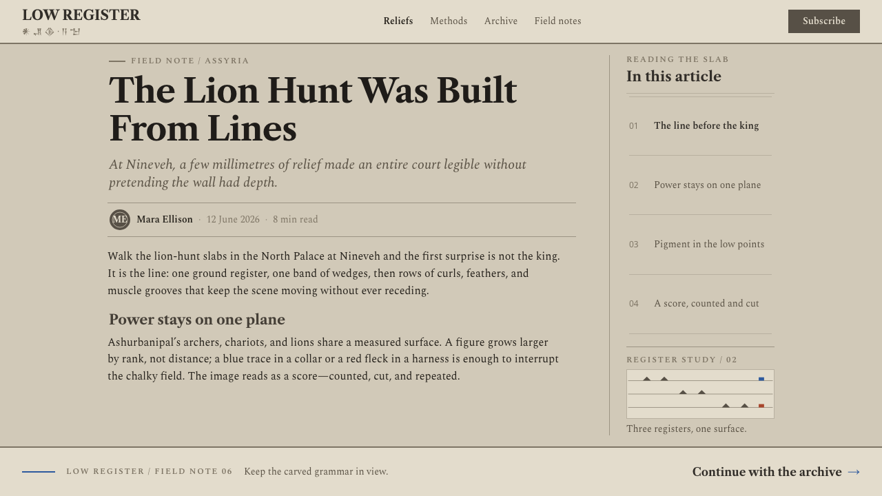
Text and image share the same wall. Cuneiform inscription bands run horizontally through the pictures and cut whatever they meet, without yielding to the composition. Colour appears only as trace: Egyptian blue and red ochre survive as small, fragmentary scraps of pigment, which the system treats as evidence, not as palette. Hence a warm, pale, almost monochrome stone ground with rare points of blue and ochre.
The slabs have a documented modern life as well. They were excavated in the 1840s and 1850s, work associated with the names of Austen Henry Layard and Hormuzd Rassam, and have been on display in their current setting since the 1850s. That history matters for the style, because the slabs reach us as displayed objects, read as evidence of a vanished palace rather than as decoration. The system keeps that archival calm and translates the wall into the registers of a page.
What defines the Assyrian Palace Relief look?
Shallow Carving
The relief rises barely at all, so form is described by fine lines of shadow, not by volume. A mane, a bowstring or the grooves of a forearm each read as a hairline cut into pale stone. For an interface this means depth is never built from thick shadows or raised layers: edges are thin, precise and quiet, and the surface stays flat while still feeling carved.
Gypsum Ground
The ground is a chalky, pale, warm-grey stone: close to white when it was quarried and softened by time to a gentle grey. It is dry and matte, with no shine. The page is the slab, and all other elements are cut into it or placed along it. Nothing in the ground competes for attention, which gives the style its calm, archival tone.
Ruled Registers
The wall is divided into horizontal bands, and the page follows. Structure comes from ruled lines and thin edges that separate one register from the next, rather than from boxes, cards or shadows. Content reads in stacked strips, one after another, like a narrative laid out along a wall. The ruling is the grid, and it stays visible.
Inscription Bands
Cuneiform text bands run straight across the images and cut through whatever they meet, with no concession to the composition. The style's typography follows that authority: a serif voice, set like an inscription, often in a band that crosses the layout. Text here is not squeezed around pictures. It is part of the wall, and it takes its own space.
Pigment Traces
Egyptian blue and red ochre are the only colours, and they survive only as traces: small, fragmentary and never a field. In design terms they are marks, such as a thin underline, a small marker or a single detail, rather than backgrounds or large shapes. Their scarcity is what makes them meaningful, because they read as evidence of colour that once covered the stone.
Repetition as Ornament
Where the reliefs are decorative, they repeat: a row of curls, a row of feathers, a row of tassels, counted off along a band. The style adopts this rule. Ornament is a measured sequence of identical units, never a flourish or an illustration. A repeated row can mark a section, finish a heading or frame a block, and the counting is the beauty.
No Lift, No Glow
Nothing in the system floats. There are no hovering layers, no stacked shadows and no luminous edges, because stone does not glow and a carving does not hover. Emphasis comes from the ruling, from type and from placement along the registers. It is a restraint that makes the page feel heavy and fixed, as if it could not be moved.
Who shaped Assyrian Palace Relief?
Ashurbanipal is the Assyrian king in whose North Palace at Nineveh the lion hunt slabs were set, around 645–635 BC. The slabs show the king as hunter, part of the royal hunt narrative cycles from which the style is built. He stands for the authority the images assert: a court art made to record and display royal power in stone, which is why the visual register is formal, measured and impersonal.
Austen Henry Layard is associated with the excavations of the 1840s and 1850s that brought the Nineveh slabs to modern attention. His name belongs to the story of how the style reached the present: not as a living workshop tradition but as an excavated and displayed object, whose reception shaped what Assyrian art looks like to us.
Hormuzd Rassam is the second name tied to the excavation era. Together with Layard he marks the moment when the palace reliefs moved from ruin to collection. For a designer, their importance is the record they left behind: because the slabs were excavated and displayed, we can study them as a stable body of images with consistent conventions.
How do you use Assyrian Palace Relief today?
Assyrian Palace Relief suits subjects that want weight, memory and formality: history, archives, law, culture and long-form reading. Its strengths are its structure of registers and its restraint, and applying it well means respecting both.
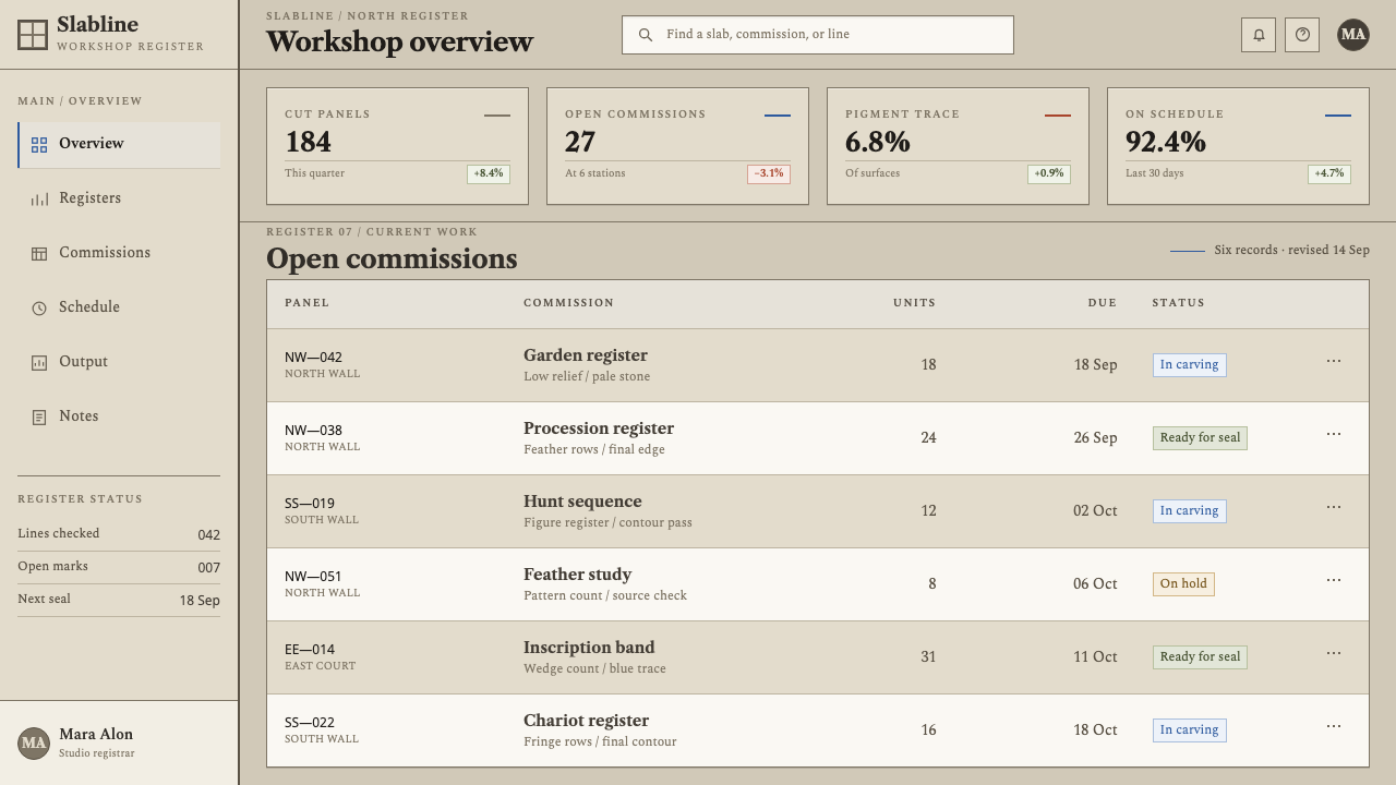
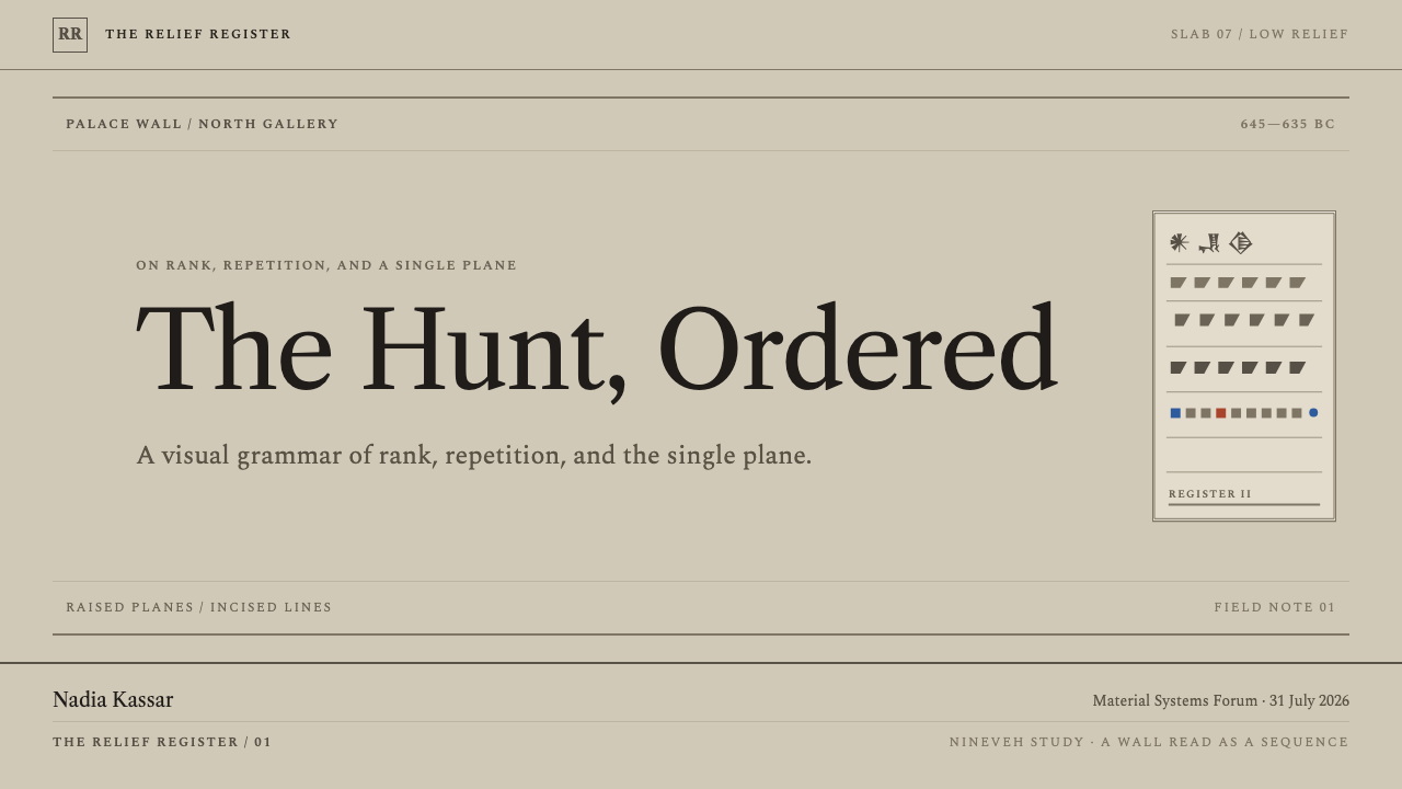
For presentation slides, build the cover on a pale, warm stone field, with the title in a serif face set inside a ruled register and, if needed, a thin inscription-style band running across the width. Add one trace of blue or ochre as a small mark. Content slides divide into registers, one idea per strip, separated by hairlines. Data slides suit the style well: tables become ruled rows, bar charts become flat bars between fine lines, and the traces of blue or ochre are reserved for the single figure that matters. Avoid shadows and fills; let thin lines carry the weight.
For web interfaces, the style fits documentation, research tools, archives and knowledge products, where reading is the task. Treat rows, panels and sections as registers separated by hairlines, with no card shadows and no elevated layers. Pricing plans become columns divided by thin rules. Buttons are outlined or quietly stone-tinted. Reserve the blue and ochre for small marks, such as a link underline, a status point or a marker beside a heading, so they remain traces rather than a theme colour.
For editorial and marketing work, the style supports heritage, publishing, cultural institutions and any brand that wants authority without ornament. A long article can read as a wall: running heads set like inscription bands, section breaks marked by a row of repeated small shapes, and generous space between registers. Marketing pages can alternate pale stone fields with ruled strips of text, using a repeated row of identical units as the single decorative element. Quiet, patient pacing is part of the voice.
The most common mistake is to turn the pigment traces into a palette. Large fields of Egyptian blue or ochre make the page look like a generic ancient-world theme and cancel the sense of surviving evidence. The second mistake is adding lift: drop shadows, glows and floating cards belong to another system and flatten the carved look. A third is heavy, bold type, which fights the hairline structure. Finally, do not fake cuneiform. The inscription band should be set in the serif voice, as a band, not as pseudo-script.
Assyrian Palace Relief — FAQ
Why does the style use so little colour?
Because the colour in the reliefs has almost entirely gone. Egyptian blue and red ochre survive only as small, fragmentary traces of pigment on pale stone. The system reproduces that condition: the ground is stone, structure is line, and colour appears as rare marks. This is also what gives the colours meaning. Used sparingly, they read as evidence; used widely, they read as a theme.
Why is the typography serif?
The style is modelled on an inscribed wall, and serif letterforms carry the feeling of cut and incised text: formal, measured and enduring. The inscription bands in the reliefs are part of the composition, and a serif voice lets text act like them, as part of the wall rather than something laid over it. A casual or rounded typeface would work against the archival tone.
How can a style built on hairlines avoid feeling weak?
Through structure and repetition. The registers give the page a firm, readable order, the repeated rows give it rhythm, and the serif voice gives it authority. The thinness of the line is balanced by the certainty of the layout: everything sits in a register and nothing wavers. The weight comes from the pale stone ground and the discipline of the ruling, not from heavy strokes.
Can the style work in a dark theme?
It is a light style by nature. The gypsum is chalky and pale, and hairline shadows read because they fall on a light surface. Inverting it to a dark ground would turn the carved lines into glowing lines, which is the opposite of the idea. If a dark context is unavoidable, treat it as a different design rather than a mode of this one.
What kinds of products suit it best?
Products where reading, record and authority matter: archives, research and documentation, legal and policy material, cultural and heritage organisations, publishing and long-form editorial. It struggles in contexts that want speed, play or bright energy, because its voice is slow, formal and monumental. A light touch of it, such as a ruled header or a repeated row, can still lend gravity to a quieter product.
Related design styles
 Kalmyk Todo Bichig Clear ScriptRestraint becomes script. Soot columns on grey rag paper, touched by cinnabar…
 Cherry Blossom HanamiTenderness arrives in dusk. Sakura pink, branch-shadow, and Mincho type leave…
 Étretat Chalk CliffsStone becomes light. Chalk-white forms dissolve through blue-gray mist and li…
 Micronesian Etak Star CompassNavigation as memory. White star points and sand ribs map a 32-point ocean-ni…
 Mongolian SoyomboReverent geometry. Gold Soyombo on Tengri blue, with vertical black-script rh…
 Shaker Broadside PrintAustere by conviction. Bone-black ground, brick rules, and wood-type hierarch…