What is Kalmyk Todo Bichig Clear Script?
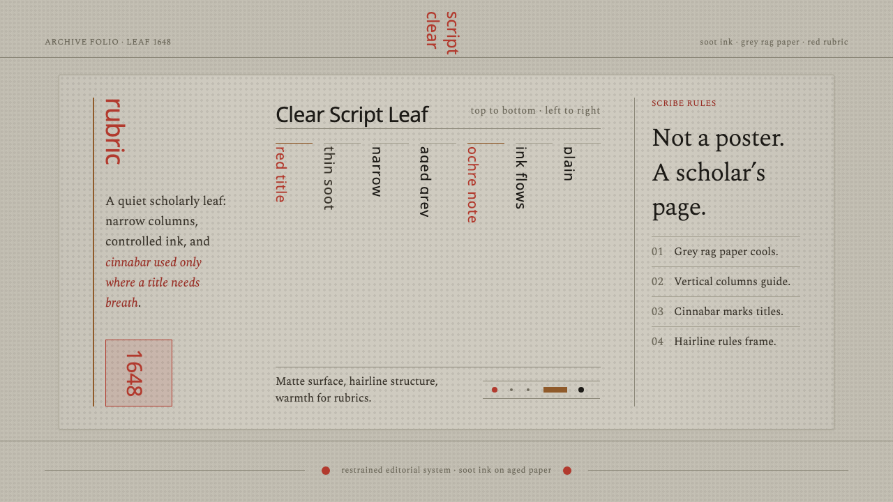
Restraint becomes script: soot-dark columns on cool grey rag paper, with cinnabar appearing only where the page needs to speak.
Kalmyk Todo Bichig Clear Script in brief
Kalmyk Todo Bichig Clear Script is a manuscript-derived visual language rooted in the Oirat clear script, a writing system devised by the monk-scholar Zaya Pandita in 1648 to resolve ambiguities in older Mongolian writing. Its character comes from disciplined writing rather than display: narrow vertical columns, controlled brush strokes, near-black ink, and a cool grey paper ground. The page feels made for study, copying, and careful reading.
The script moves from top to bottom within each column, then advances from left to right across the page. That directionality is not an ornamental gesture; it is the organizing structure of the entire style. Text, spacing, headings, and rules should all acknowledge the vertical rhythm. A contemporary interpretation therefore behaves less like a poster and more like a scholar's leaf: quiet, legible, measured, and materially present.
Color is deliberately scarce. Near-black ink carries the body of the page, while ochre or cinnabar may mark a title, rubric, or point of emphasis. The restraint is the visual argument. There is no need for theatrical contrast, decorative illustration, or a crowded palette when the page already has a strong internal order. Every stroke should feel placed by hand, even when the final surface is digital.

Where does Kalmyk Todo Bichig Clear Script come from?
Todo Bichig means clear script. The source tradition places its creation in 1648, when the Oirat monk-scholar Zaya Pandita devised it to fix ambiguities inherited from older Mongolian writing. That purpose matters to the style's visual interpretation. Clarity is not achieved through loud emphasis but through a writing system whose forms, direction, and spacing are held under control. The resulting aesthetic is exact without becoming mechanical.
Its historical setting is the seventeenth-century Oirat world of Kalmykia and Central Asia. The approved tradition is specifically an Oirat clear-script manuscript tradition, so the design language should remain close to the page rather than drifting toward generalized Central Asian ornament. Its strongest references are the scholar's copy, the vertical brush, the inked column, and the modest rubric that guides attention without overtaking the text.
The page is imagined as cool aged rag paper carrying soot ink. This material pairing establishes the style's emotional temperature: grey rather than bright white, near-black rather than glossy black, and tactile rather than polished. The paper is not a decorative background image. It is the quiet field that allows the script to be read as an artifact of study, with slight age and grain implied through tone rather than theatrical texture.
When the manuscript discipline moves onto a screen, the goal is not historical reconstruction or ornamental nostalgia. It is to preserve the relation between writing and attention. Vertical columns create a deliberate reading path; narrow measures protect concentration; subdued paper tones soften the digital surface; and cinnabar or ochre rubrics provide a restrained editorial hierarchy. The screen becomes a contemporary leaf while retaining the logic of the source.
What defines the Kalmyk Todo Bichig Clear Script look?
Vertical Direction
The defining structural gesture is vertical movement. Text descends through narrow columns, and the reading field progresses across the page from left to right. This creates a calm procession rather than a horizontal sweep. In digital layouts, even when ordinary interface constraints require horizontal text, the surrounding structure can retain this logic through upright dividers, stacked metadata, and columns that feel tall, narrow, and carefully spaced.
Soot Ink
The main color is a near-black ink tone, softer and more organic than absolute digital black. It should carry body text, rules, labels, and most structural marks. The effect is not low contrast; it is controlled contrast. Ink gathers the page into a single field of attention, allowing the paper ground and occasional rubric to remain visibly distinct without competing with the writing.
Grey Rag Paper
The ground is cool, greyish, and slightly aged in implication. It should feel like rag paper rather than a blank digital canvas, but the material suggestion must remain quiet. A restrained tonal variation is more convincing than a conspicuous texture. The paper gives the ink somewhere to land and keeps the composition from feeling sterile, glossy, or newly manufactured.
Controlled Brushwork
Strokes are thin, deliberate, and disciplined. They may suggest the movement of a brush, but they should never become loose calligraphic decoration detached from reading. Variation is useful when it reinforces the impression of handwork; excess variation becomes noise. The best interpretation lets every line feel purposeful, as though it belongs to a copied page whose maker valued accuracy above flourish.
Cinnabar Rubrics
Cinnabar or ochre is reserved for titles and editorial signals. It is not a secondary body color and should not spread across the page as a decorative field. Its power comes from scarcity. A small rubric can establish a hierarchy, mark a beginning, or give a key phrase the authority of a marginal note. The accent should feel applied by a separate attentive hand.
Manuscript Restraint
The whole system resists the poster impulse. It does not seek immediate spectacle through oversized display, crowded ornament, or aggressive contrast. Space is part of the writing discipline, giving each column room to remain legible and each rubric room to remain exceptional. The result should feel patient, scholarly, and close to the page, even when used for a contemporary interface.

Who shaped Kalmyk Todo Bichig Clear Script?
Zaya Pandita is the named origin figure of the style's script. In 1648, the monk-scholar devised Todo Bichig to resolve ambiguities in older Mongolian writing. His role gives the visual language its central ethic: clarity must be built through disciplined form. The page should therefore privilege readable structure, controlled marks, and purposeful emphasis over display or ornament.
The Oirat manuscript scholar is an interpretive figure within the style rather than a separate historical person. This figure represents the intended reader and maker: someone who values careful copying, sustained attention, and the quiet authority of a page made for study. The visual system inherits that posture through narrow columns, subdued materials, and an absence of theatrical effects.
The rubric hand is the second interpretive role in the system: the attentive hand that adds cinnabar or ochre to titles and signals. It does not compete with the black ink or redraw the whole page. Its function is selective and editorial, giving a heading the force of a considered annotation. This role explains why the accent color must remain rare and intentional.
How do you use Kalmyk Todo Bichig Clear Script today?
For presentation slides, use the style most strongly on the cover through a quiet paper field, a disciplined vertical structure, and a title treated like a rubric rather than a billboard. Content slides should preserve the same reading calm: narrow text measures, clear column relationships, and generous breathing room. Data slides should avoid glossy charts and decorative visual effects. Let ink-like marks, vertical rules, and restrained ochre or cinnabar signals organize the information so the slide reads as a scholarly leaf with a contemporary purpose.
For web interfaces, Todo Bichig Clear Script is best suited to dashboards, catalogs, research tools, and pricing pages that want authority without corporate gloss. Use the grey paper ground as the quiet surface, near-black ink for the main interface language, and cinnabar or ochre for selected states, headings, or important distinctions. Cards should feel like ordered entries rather than floating tiles. Navigation can rely on stacked labels and vertical separators, while tables and comparison areas should preserve the sense of columns advancing across a page.
For editorial and marketing work, the system supports a slow, attentive form of persuasion. Articles can use a calm paper field, narrow reading measures, and headings that behave like rubrics. Product stories can place a short cinnabar title beside a larger body of quiet text rather than filling the page with promotional color. Marketing pages should resist the impulse to turn the style into historical costume. The strongest result makes material restraint carry the brand voice, allowing the page to feel considered, literate, and durable.
The style can also guide identity systems for projects that value scholarship, cultural memory, archival care, or deliberate craft. A near-black wordmark, subdued paper surfaces, vertical rules, and a single rubric accent can establish recognition across a site, presentation, or printed artifact. The system works when its elements behave consistently: ink remains the main voice, paper remains the field, and the accent remains an event. Consistency matters more than adding more historical references.
The common mistake is turning the source into a decorative fantasy of old paper and calligraphy. Excessive texture, loose brush flourishes, frequent red accents, or oversized display lettering will push the work toward a poster and erase the manuscript discipline. Another mistake is treating verticality as a novelty while keeping every other decision loud and horizontal. Begin with reading order, material quiet, and controlled emphasis; only then introduce expressive detail where the page genuinely needs it.

Kalmyk Todo Bichig Clear Script — FAQ
What does Todo Bichig mean, and why was it created?
Todo Bichig means clear script. According to the approved source, the Oirat monk-scholar Zaya Pandita devised it in 1648 to resolve ambiguities in older Mongolian writing. That origin explains why the design language must be organized around clarity rather than display. Its vertical columns, controlled strokes, and restrained rubrics should help the reader understand where to begin, how to proceed, and what deserves emphasis.
Why is the background grey rag paper instead of clean white?
The grey rag-paper ground carries the manuscript atmosphere of the style. It makes the surface feel cool, aged, and tactile without turning texture into decoration. Clean white would make the page feel newly manufactured and overly digital; a quiet grey gives the soot ink a material place to settle. The effect should remain subtle. The paper is a supporting field for reading, not the main image.
How should cinnabar or ochre be used?
Use it as a rubric: for titles, headings, or carefully chosen editorial signals. It should not become a broad secondary palette or appear in every component. The accent works because it interrupts the near-black and grey field only occasionally. When overused, it loses its authority and turns the manuscript discipline into decoration. Its ideal role is a precise intervention made by an attentive hand.
Can this style work in a contemporary horizontal interface?
Yes, provided the interface preserves the underlying manuscript logic. The source direction is top-to-bottom within vertical columns, advancing left-to-right across the page. A modern interface does not have to force every sentence into a literal vertical script; it can retain the character through tall narrow modules, vertical dividers, stacked labels, calm paper surfaces, and deliberate movement across columns. The organizing rhythm matters more than literal imitation.
How can the style avoid becoming a poster?
Keep the page subordinate to reading. Let near-black ink carry most information, keep the paper ground quiet, and reserve cinnabar or ochre for selective rubrics. Avoid oversized display gestures, crowded ornament, excessive texture, and frequent color changes. The visual test is simple: the page should feel like a scholar's leaf first and an image second. If the material effects attract attention before the writing does, the restraint has been lost.
Related design styles
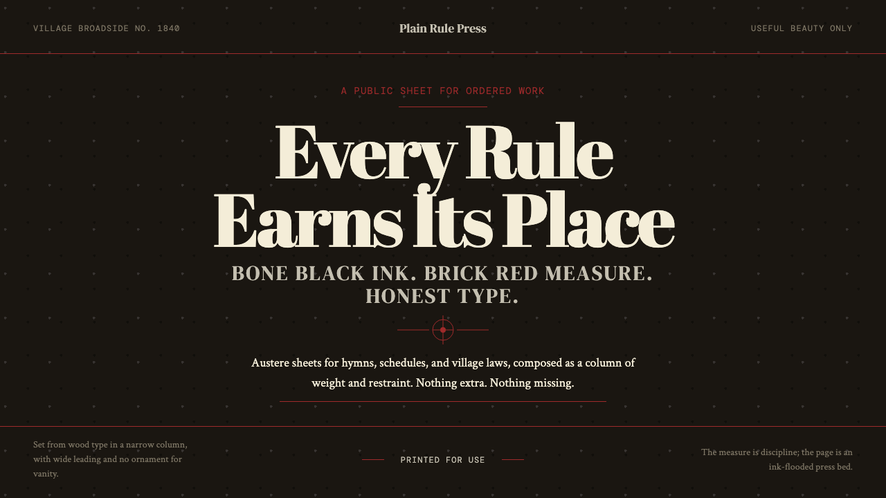 Shaker Broadside PrintAustere by conviction. Bone-black ground, brick rules, and wood-type hierarch…
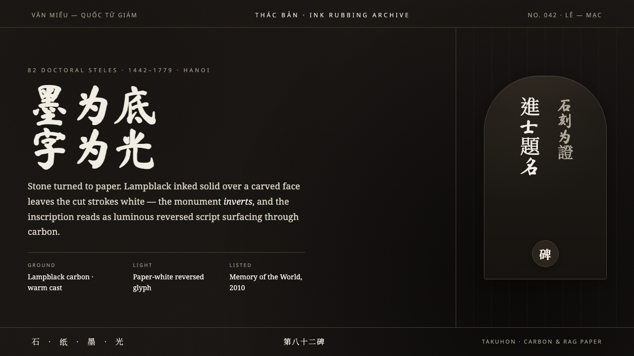 Vietnamese Stele RubbingStone turned to paper. Lampblack ground, ghost-white carved Han glyphs surfac…
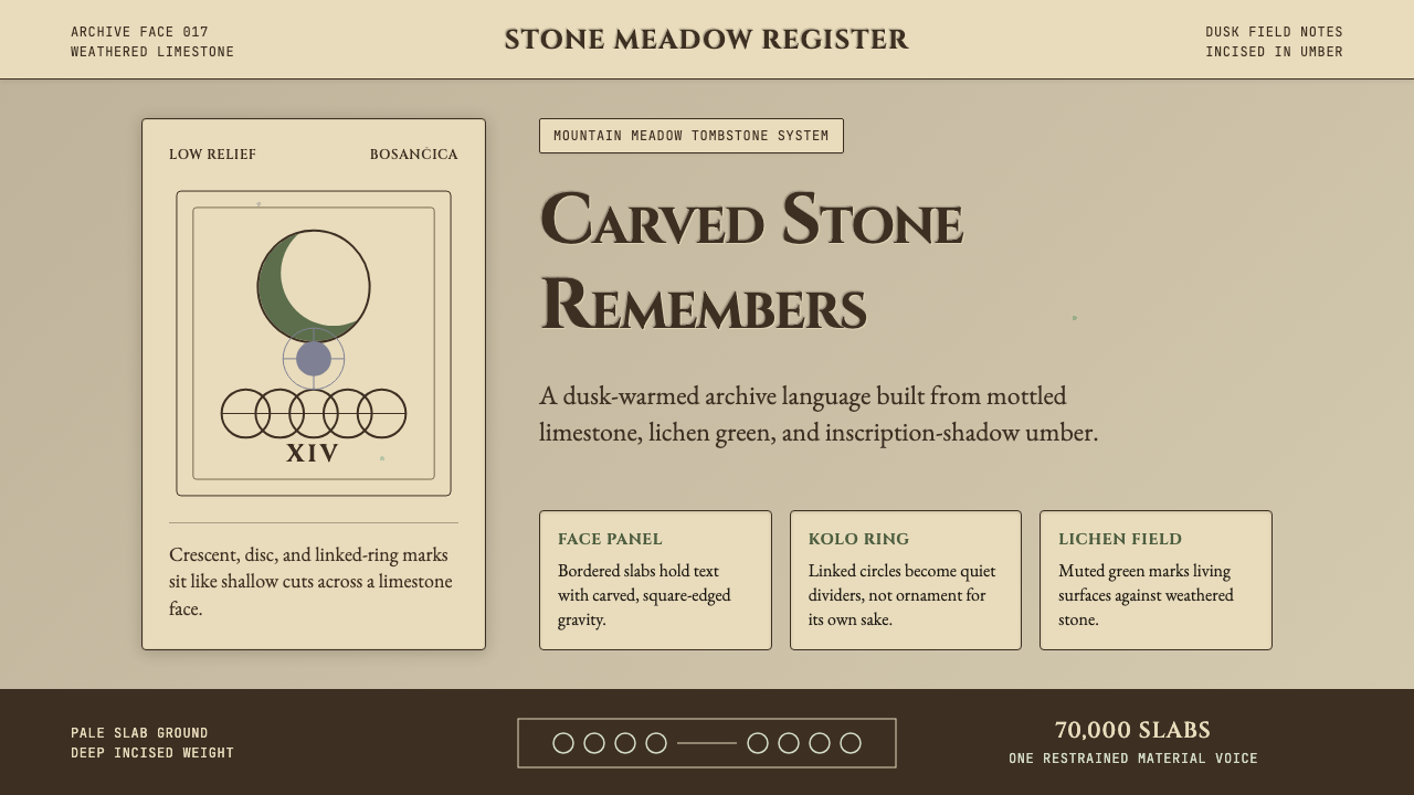 Bosnian Stećak Medieval TombstoneStone remembers quietly. Lichen green and Cinzel cuts sit on weathered limest…
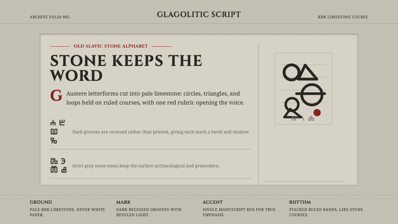 Glagolitic ScriptCarved faith in limestone. Cinzel capitals and red rubrics sit in shadowed gr…
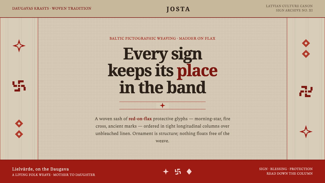 Latvian Lielvārde BeltOrnament is structure. Madder-red Baltic glyphs in tight longitudinal bands o…
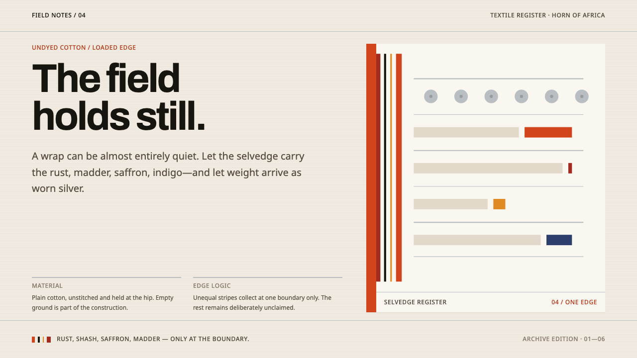 Afar Nomad TextileWeight lives at the edge. Rust and madder selvedges cut across a quiet cotton…