What is Vietnamese Stele Rubbing?
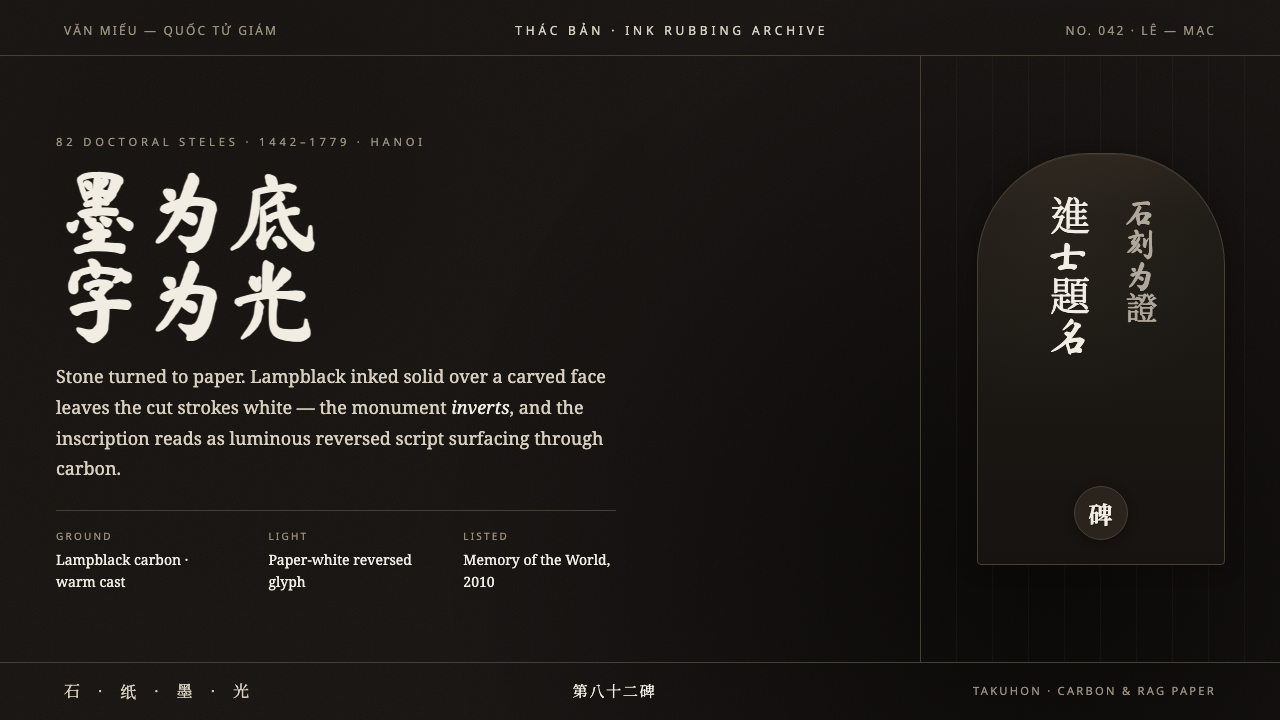
Stone turned to paper: lampblack becomes the field, and carved Hán characters return as ghost-white light.
Vietnamese Stele Rubbing in brief
Vietnamese Stele Rubbing is a visual language derived from thác bản, the ink-rubbing process used to transfer carved inscriptions from stone onto handmade paper. Paper is pressed across a stone surface and inked in dense lampblack; the raised surface takes the ink while the incised characters remain uninked. The resulting image reverses ordinary reading: stone becomes paper, darkness becomes ground, and writing emerges as pale absence. It is not black writing on a light page, but light script uncovered from blackness.
Its most important source is the collection of doctoral steles at Hanoi’s Temple of Literature, or Quốc Tử Giám. These tortoise-mounted monuments record examination laureates from the Lê and Mạc dynasties. Their inscriptions carry institutional memory, scholarship, rank, and ceremony, but a rubbing changes their material condition. The monument’s permanent, weighty surface becomes a portable sheet with softened grain, broken edges, and the evidence of a hand moving ink across paper.
As a contemporary design system, Vietnamese Stele Rubbing translates that reversal into an interface with a faintly warm carbon-dark field, dense vertical columns of Hán seal and regular script, and paper-white characters that appear to rise from the surface. It is restrained, solemn, and nearly monochrome. Texture is not a decorative layer added afterward; it is the condition that makes the text believable. The script is the only true source of visual illumination.
Where does Vietnamese Stele Rubbing come from?
The historical setting is Hanoi’s Temple of Literature and Quốc Tử Giám, where the doctoral steles preserve the names and inscriptions associated with examination laureates. The collection consists of tortoise-mounted stone monuments, an architectural and ceremonial form that gives writing physical permanence. Their carved Hán text was intended to be read on stone, in place, under changing daylight; the rubbing tradition made those inscriptions legible in another medium without separating them entirely from their original material presence.
The steles belong to the Lê and Mạc dynastic period identified with the collection, spanning 1442–1779 in the rubbing tradition. Their significance lies not only in the information they record, but also in the way they organize authority. A doctoral name is held within a formal inscription, an inscription is fixed in stone, and stone is raised on a tortoise base. The visual system therefore begins with gravity, verticality, repetition, and the disciplined rhythm of carved characters rather than with illustration or image-making.
Ink rubbing, known in this context as thác bản and related to takuhon, produces a faithful but never mechanically perfect transfer. Handmade paper receives pressure unevenly; lampblack catches the high points of the carved surface; moisture, fibers, pressure, and repeated passes create variation. The white character is not drawn onto a field. It is protected from the ink by the recess of the stone. That procedural fact is the core of the aesthetic: reversed script is evidence of contact between paper, ink, hand, and carving.
In 2010, the doctoral steles of the Temple of Literature were inscribed in UNESCO’s Memory of the World. That recognition frames them as documentary heritage, but their continuing visual power comes from a more immediate condition: legible language retained inside a field of carbon-black matter. A digital adaptation should preserve this tension. It may organize information with contemporary tools, but it should continue to feel as though text has been recovered from a rubbed surface rather than simply typed onto a dark screen.
What defines the Vietnamese Stele Rubbing look?
Reversed Light
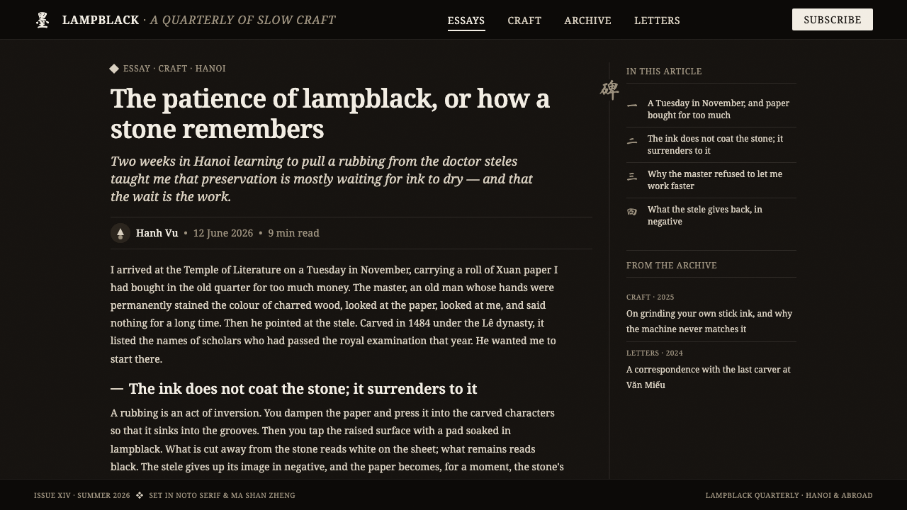
The governing relationship is inversion. Lampblack fills the field, while incised Hán characters appear pale because the stone recess keeps them from taking ink. In interface work, this means treating the light script as recovered matter rather than ordinary foreground text. The dark field should feel absorbent and substantial, and the pale letters should carry the visual authority normally assigned to an illuminated page.
Carbon Ground
The background is not neutral black. It carries the warm, mineral, and slightly uneven character of lampblack pressed into handmade paper. Its darkness should feel accumulated rather than digitally empty: dense in the broad areas, subtly mottled where pressure or paper grain interrupts the ink. A perfectly uniform field weakens the connection to rubbing and makes the composition feel synthetic.
Vertical Script Columns
Dense vertical columns of Hán seal and regular script establish rhythm before individual words are read. The column is both a textual structure and a visual measure: repeated narrow bands turn language into architecture. Columns should feel deliberate and contiguous, with variation arising from glyph shape, ink transfer, and breaks in the rubbed surface rather than from decorative rearrangement.
Hand-Rubbed Grain
Granularity is essential because a rubbing is made through contact, pressure, and imperfect material transfer. The texture should soften the border between ink and paper without making the script unreadable. Speckling, feathered interruptions, and faint shifts in density suggest handmade paper and repeated rubbing. The aim is not distressed nostalgia; it is material evidence that resists the sterile certainty of a crisp digital edge.
Monochrome Restraint
The system gains force by limiting its visual vocabulary. Carbon darkness, paper-white script, and only the faint warmth carried by the ground are enough to establish hierarchy. Additional color competes with the central inversion and distracts from the carved writing. Contrast should come from density, scale, column rhythm, and the changing visibility of the glyphs rather than from a broad decorative palette.
Solemn Materiality
The visual mood is ceremonial rather than theatrical. It should recall a record preserved in stone, not an ornamental East Asian motif applied for atmosphere. Broad empty dark areas provide silence around the script; dense passages feel archival and deliberate. Every texture, irregular edge, and vertical alignment should reinforce the sense that writing has survived through a physical process of preservation.
Who shaped Vietnamese Stele Rubbing?
The eighty-two doctoral steles are the central physical archive behind the style. Their tortoise bases, carved inscriptions, and repeated monument form give the visual language its sense of continuity and institutional gravity. A rubbing does not erase their monumentality; it translates it into columns, pressure marks, and reversed characters on paper.
Hanoi’s Temple of Literature and Quốc Tử Giám provide the cultural and spatial setting for the steles. The site joins learning, examination, inscription, and public memory in one place. For designers, it is a reminder that the script should be treated as record and ceremony, not as a loose ornamental texture detached from meaning.
The Lê dynasty examination laureates are represented through the inscriptions recorded on the steles. Their presence turns the writing into more than calligraphic form: each column belongs to a system of recognition, scholarship, and historical remembrance. This is why the style works best when text remains central, legible, and structurally important.
The Mạc dynasty stone carvers embody the craft dimension of the source material. Their carved surfaces make the later rubbing possible: the pale glyph is created by incision before it is revealed by ink. Their role underscores a key principle for digital adaptations—the image should suggest carved depth and transferred contact, not smooth calligraphy painted directly onto a dark background.
How do you use Vietnamese Stele Rubbing today?
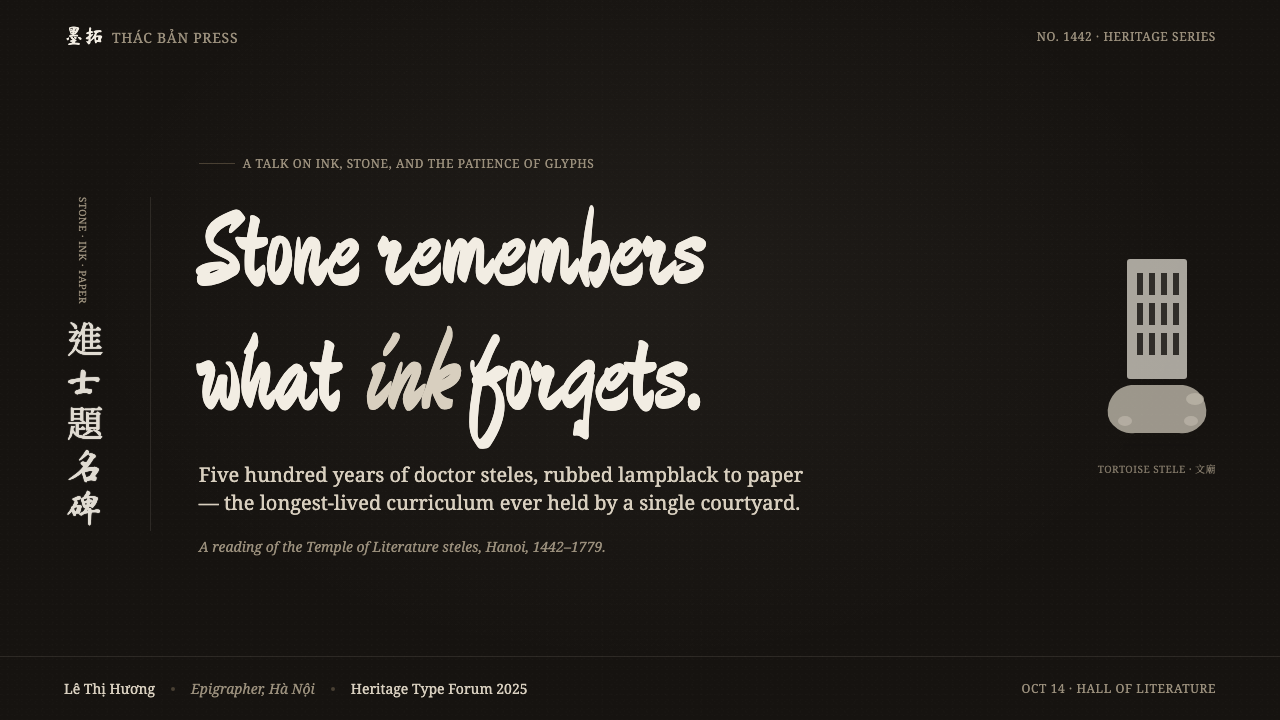
For presentation slides, use Vietnamese Stele Rubbing most strongly when the subject benefits from reflection, authority, cultural memory, or archival gravity. A cover can begin with a generous carbon-dark field, a restrained vertical script passage at one edge, and a pale title that feels surfaced rather than placed. Keep the title clear enough to read immediately, but let the surrounding darkness do part of the framing. Avoid turning the cover into a literal monument photograph; the style is more convincing when it works through inscription, texture, and silence.
Content slides should preserve the distinction between the rubbed script and contemporary explanatory text. Use the vertical Hán columns as a framing device, section marker, or quiet structural band, while keeping modern content in a stable reading direction and a clear hierarchy. Data slides can use pale marks against the dark ground, with grain kept subtle enough that values and labels remain trustworthy. Charts should feel like inscriptions or measured records, not glowing technical displays; dense information is appropriate when its order remains visible.
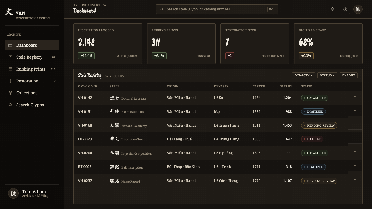
For web interfaces, the style is especially effective in cultural archives, research portals, reading environments, editorial tools, and premium information spaces where concentration matters. A dashboard can use dark panels as fields of paper-and-ink texture, with pale text as the primary navigational material and vertical script used sparingly to establish identity. Pricing or membership pages can borrow the same seriousness, but should make actions unmistakable. The atmosphere must never reduce legibility, accessibility, or the user’s confidence about where to continue.
For editorial and marketing work, Vietnamese Stele Rubbing supports essays, exhibitions, books, scholarly programs, and campaigns concerned with memory or craftsmanship. Long-form pages benefit from generous pauses of dark space, pale headline treatments, and occasional rubbed-script fragments that operate as marginal evidence rather than wallpaper. Marketing should lead with the transformation at the heart of the process—carving becoming absence, absence becoming visible writing—then support it with direct modern language. The strongest compositions make the reader feel close to the surface without pretending that every message is itself an ancient inscription.
The most common mistake is to treat the style as generic dark-mode calligraphy. A smooth black background, brilliant white lettering, and decorative Chinese characters do not create a rubbing. The essential features are reversal, material variation, vertical rhythm, and the sense that pale text has been withheld from ink. Another frequent error is making every line distressed until information becomes difficult to read. Preserve roughness at the edges and in the field, but allow the most important content to remain calm, deliberate, and legible.
Vietnamese Stele Rubbing — FAQ
Is Vietnamese Stele Rubbing simply a dark calligraphy style?
No. Calligraphy is only one visible component. The defining logic comes from rubbing: ink covers the raised stone surface, while carved characters remain pale. That material reversal gives the style its distinctive hierarchy. If the text looks merely painted or typeset in white on black, the central relationship between incision, ink, and paper has been lost.
Why are the characters presented as pale rather than black?
In a rubbing, the pale character is created by the carved recess in the stone. The ink reaches the surrounding raised surface, but not the recessed inscription in the same way. The character therefore appears as an uninked reserve inside a dark field. This is why the visual language can describe the script as light: it is visible because darkness has gathered around it.
Can the style support ordinary modern text as well as Hán script?
Yes, but the two should have different roles. Hán seal and regular script carry the historical and material reference, especially in vertical passages. Modern text should remain direct and easy to scan, providing titles, explanation, navigation, and practical information. The design becomes stronger when historical script establishes atmosphere and structure while contemporary text handles communication without imitation.
Where does Vietnamese Stele Rubbing work poorly?
It is less suitable where speed, cheerfulness, broad visual variety, or highly casual interaction are the main goals. The dark ground and ceremonial texture can make playful consumer experiences feel overly severe, and dense script columns can become distracting in fast transactional flows. Use it where reflection, provenance, scholarship, cultural memory, or quiet authority support the product’s purpose.
Related design styles
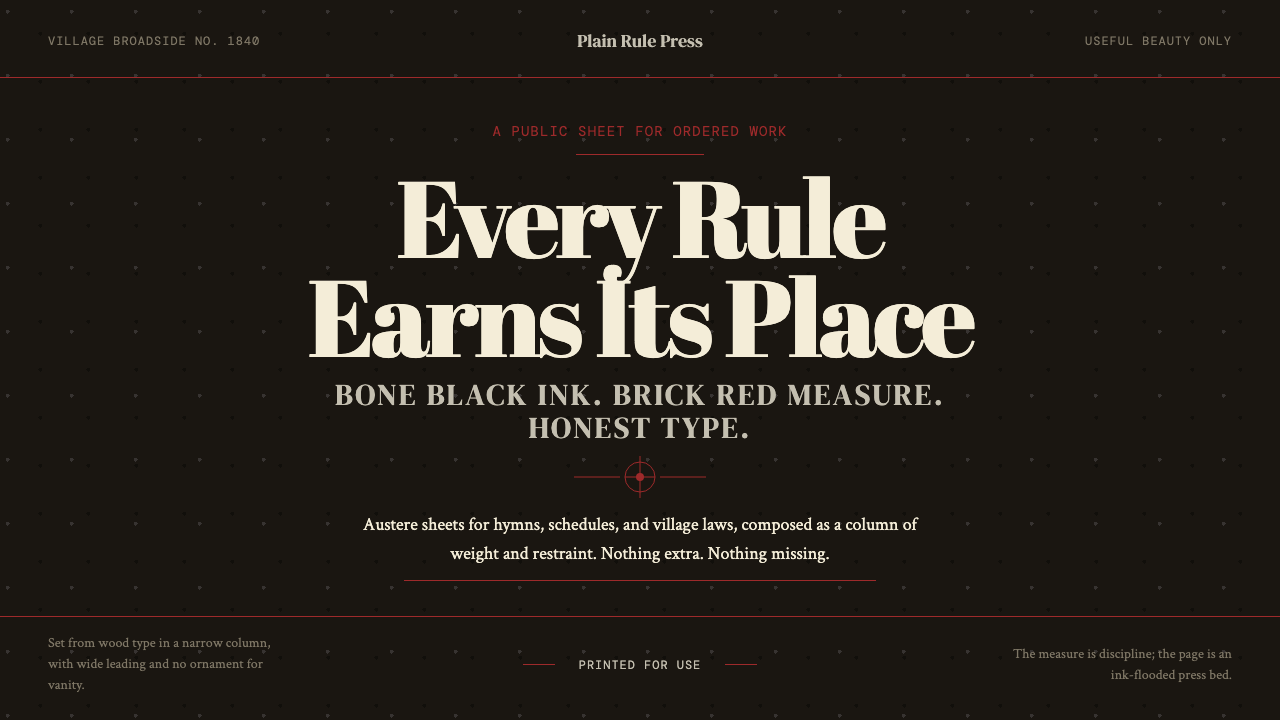 Shaker Broadside PrintAustere by conviction. Bone-black ground, brick rules, and wood-type hierarch…
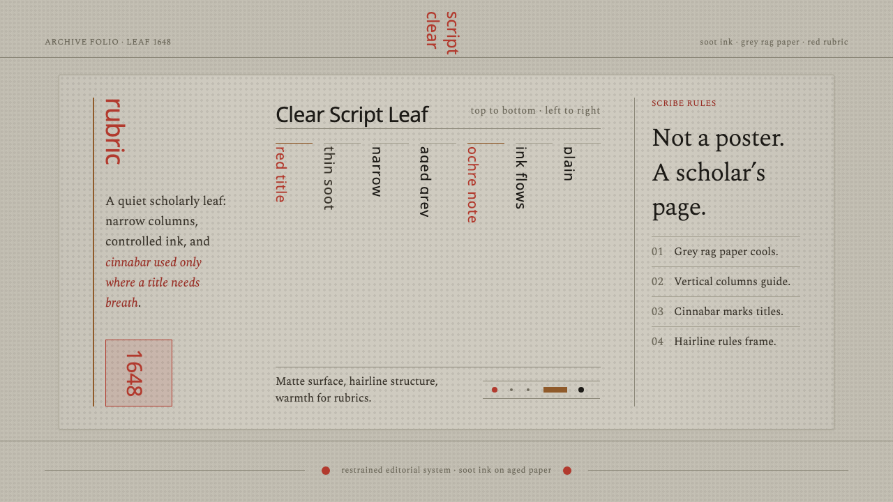 Kalmyk Todo Bichig Clear ScriptRestraint becomes script. Soot columns on grey rag paper, touched by cinnabar…
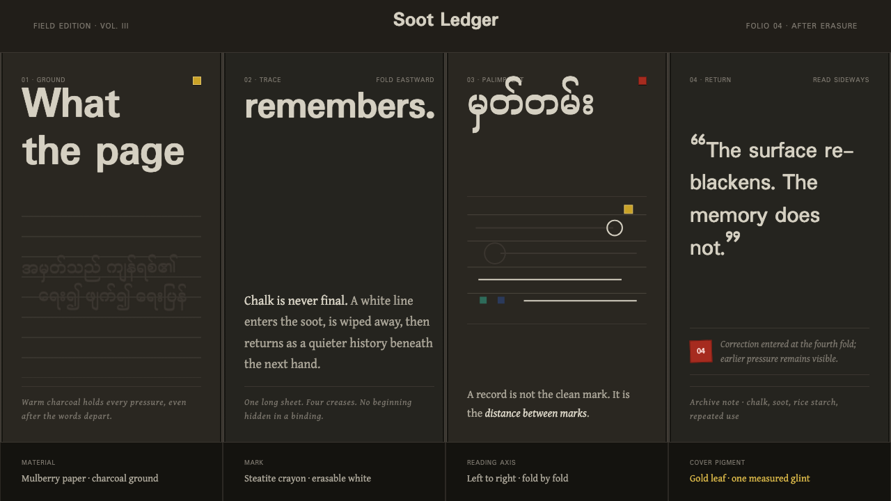 Shan Parabaik ManuscriptMemory survives erasure. Chalk-white lines and grey ghosts travel across warm…
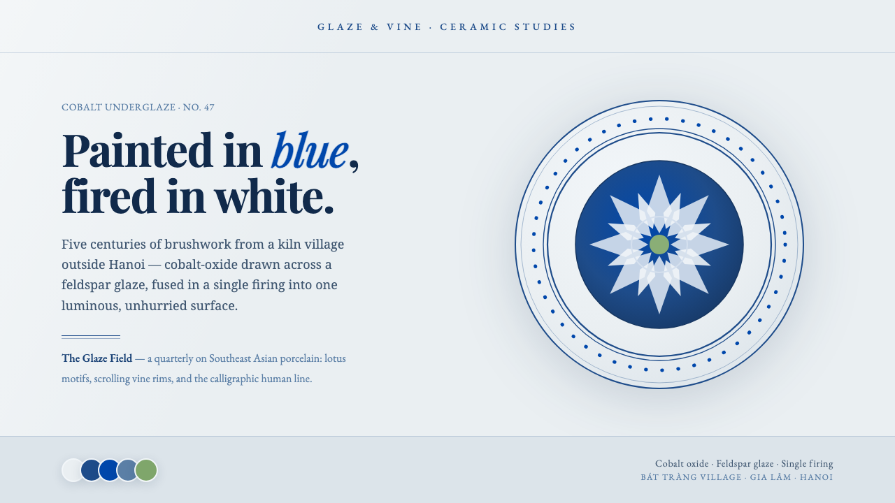 Bát Tràng Ceramic BlueCobalt brushed on glaze white. Muted underglaze blue, double-line plate rims,…
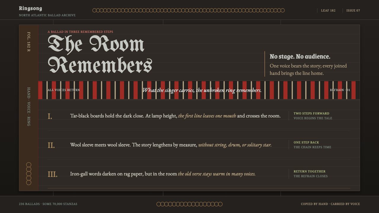 Faroese KvæðiThe room sings as one. Silver type and red refrain bands rule a tar-black man…
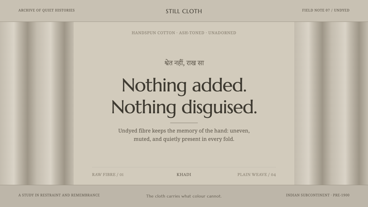 Hindu Widow White SariRestraint carries the weight. Ash-toned khadi, quiet serif type, and vertical…