What is Shan Parabaik Manuscript?
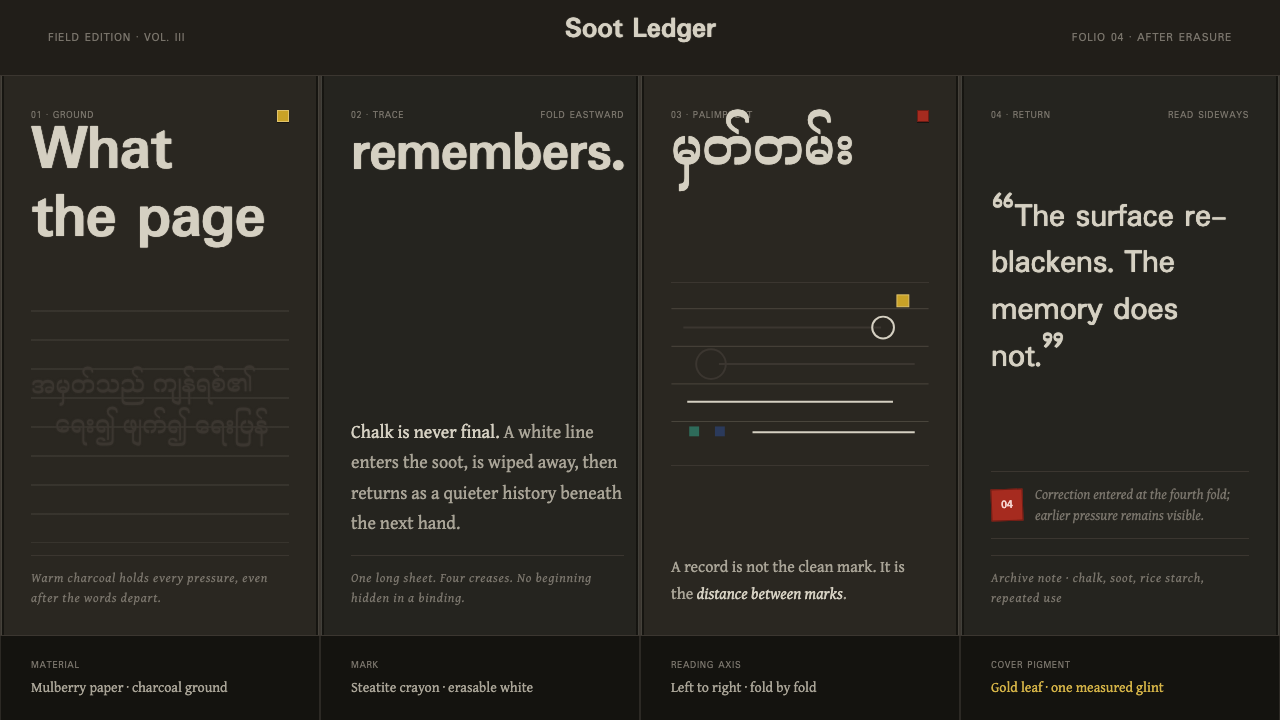
A parabaik remembers by being erased and rewritten — chalk-white lines and the grey ghosts of everything scraped before them, travelling sideways across warm charcoal folds.
Shan Parabaik Manuscript in brief
A parabaik folds rather than binds. Made from thick Shan mulberry-bark paper, the black variant is coated with ground charcoal mixed into rice starch, producing a matte, near-black working surface onto which text is written with a crayon of white steatite rather than ink. Uniquely, that written mark is not permanent: it can be wiped away, the surface recoated with fresh charcoal, and the same page written on again — a manuscript designed from the outset to be reused rather than filled once and kept.
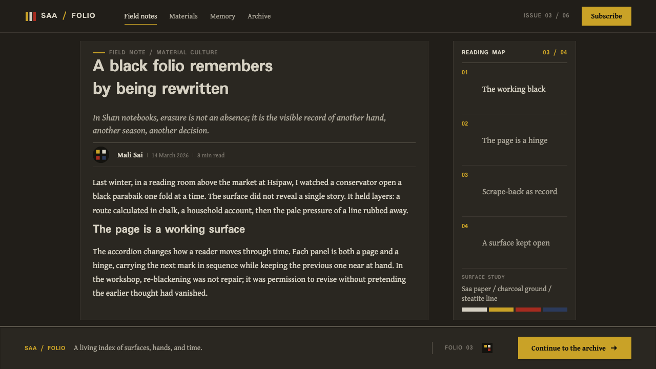
What survives on an actual black parabaik is therefore not a clean, single layer of writing but a palimpsest: a soot-dark ground, the current pass of chalky white text sitting on top of it, and the grey, incompletely erased ghosts of whatever was written and scraped away before. That layered residue is not a flaw in the object — it is the visible record of the object having been used exactly as it was meant to be used, again and again.
This design system reads that object literally rather than treating it as a generic 'ink on paper' template. The page itself is rendered as warm charcoal rather than pure black. Text takes the pale, slightly uneven quality of chalk rather than the crisp uniformity of printed ink. Content advances sideways, panel by panel along the accordion's fold creases, rather than stacking downward the way a scroll or a conventional page does. Gold, vermilion, and mirror-glass are treated as rare, covers-only accents — small, concentrated moments of color and shine against an otherwise monochrome working field, never spread across the page itself.
Where does Shan Parabaik Manuscript come from?
The parabaik belongs to Shan State and upper Burma, part of a wider tradition of folded-paper manuscripts found across mainland Southeast Asia. It was not the only writing format in use in the region — Myanmar's monastic and court culture also relied heavily on palm-leaf manuscripts — but the parabaik answered a different need: a folding-book format made from thick mulberry-bark paper, accordion-pleated into a single continuous strip rather than assembled from separate bound leaves, so that opening it reveals a long, unbroken horizontal frieze rather than a sequence of discrete pages.
The black variant of the parabaik, the type this design system draws on, was built specifically as an everyday working surface. Its paper was coated with ground charcoal mixed into a rice-starch binder, producing a rough, matte, near-black surface, and text was written onto it with a crayon of white steatite — a soft, chalky stone that leaves a clear pale mark against the dark ground. Crucially, that mark could be wiped away and the surface recoated with fresh charcoal, allowing the same physical page to be written on again and again rather than discarded once filled.
That reusability is the reason surviving black parabaik read as palimpsests rather than clean documents: a soot-dark ground, a layer of current chalky white text, and the grey, incompletely erased traces of whatever had been written and scraped away before it, all visible on the same surface at once. Surviving examples of this black-parabaik type date from the eighteenth through the early twentieth century, although the folded-book format itself is considerably older. The format served more than one register of use, produced and maintained by both Shan monastic scribes working within Buddhist monastic education and Shan court scribes handling administrative and courtly record-keeping — different institutional contexts drawing on the same reusable, foldable object.
Color beyond the working charcoal-and-chalk surface entered the object only through its covers, not its pages. Parabaik covers were lacquered and could carry gold-leaf decoration in the shwezawa tradition or inlaid mirror-glass work in the hmanzi shwecha tradition — small, concentrated pockets of gold, vermilion, and reflective glass framing a book whose interior remained a working field of soot and chalk. Surviving specimens of this fragile, much-reused paper format are preserved today largely through institutional holdings such as the SOAS Library's Special Collections and the British Library's Burmese Collections, whose care is a significant reason the format can still be studied and described in detail.
What defines the Shan Parabaik Manuscript look?
Ground and Base Color
The base is warm charcoal, never pure black and never a cool neutral gray. It reads as a soot-dark surface with a faint warmth to it, consistent with a working ground made from charcoal bound in rice starch rather than a printed or dyed black.
Text and Mark
Text takes the pale, slightly uneven quality of a soft crayon rather than the crisp uniformity of printed ink — chalky white-grey, with edges that are never perfectly sharp. Letterforms should look drawn by a hand pressing a soft stone against a rough surface, not set by a machine.
Palimpsest and Ghosting
Beneath the current layer of text sit faint grey traces of whatever was written and incompletely erased before — a soft, layered residue rather than a clean empty ground. This ghosting is treated as a deliberate visual quality, a record of reuse, not noise to be cleaned away.
Horizontal Panel Advance
Content moves sideways, one panel at a time along the fold creases of an accordion structure, rather than stacking downward the way a scroll or a conventional page does. Each fold functions as a discrete screen in a continuous horizontal sequence.
Sparse Accent Color
Gold, vermilion, and reflective mirror-glass appear only rarely and only in small, concentrated amounts, drawn from the lacquered covers rather than the working pages. A composition should use these as a single deliberate accent per screen at most, never as a spread-out decorative color scheme.
Matte, Worked Surface
The overall surface reads as matte and slightly rough rather than glossy or smooth — the texture of a hand-coated charcoal ground rather than a printed sheet. Any surface treatment should avoid the sheen of polished or glass-like materials in favor of a dry, worked quality.
Even Panel Rhythm
Because the underlying object is a continuous accordion fold, panels repeat at a steady, even rhythm rather than varying wildly in size or spacing. That regularity gives the system a quiet, processional pace even when a given panel carries very different content from its neighbor.
Who shaped Shan Parabaik Manuscript?
Shan monastic scribes used the black parabaik within Buddhist monastic education, producing and reusing folded charcoal-ground pages as a working surface for teaching, copying, and record-keeping. Their reliance on an erasable, reusable page — rather than a permanent one — reflects a working culture oriented around repeated use of a single physical object rather than the production of a fixed final document.
Shan court scribes maintained administrative and courtly records on the same folded-paper format, extending the black parabaik's working, reusable logic into a governmental rather than monastic setting. Their use of the format alongside monastic scribes shows that the object served more than one institutional register within Shan society.
The SOAS Library's Special Collections hold surviving examples of the parabaik format, contributing significantly to how the object's construction, materials, and use can be studied and described today. Institutional holdings like this one are a primary reason a fragile, reused paper format has survived in any documented form at all.
The British Library's Burmese Collections likewise preserve examples of the parabaik format, forming part of the small body of institutionally held material that documents this working manuscript tradition outside of Myanmar itself. Their holdings sit alongside those at SOAS as key reference points for the format's history.
How do you use Shan Parabaik Manuscript today?
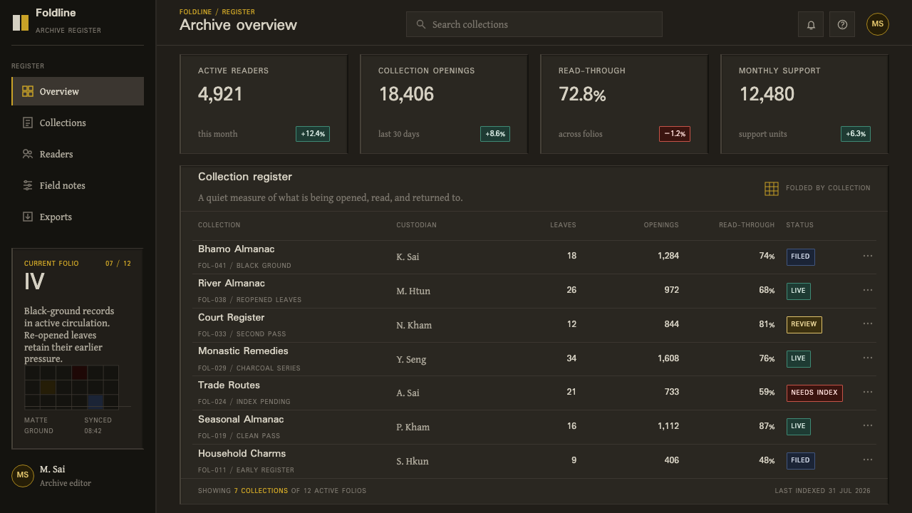
This system transfers well anywhere the content itself benefits from feeling handworked, revised, and carried forward across time rather than freshly printed and final — documentation of process, archives, timelines, or any narrative that wants to feel like it accumulated rather than arrived all at once.
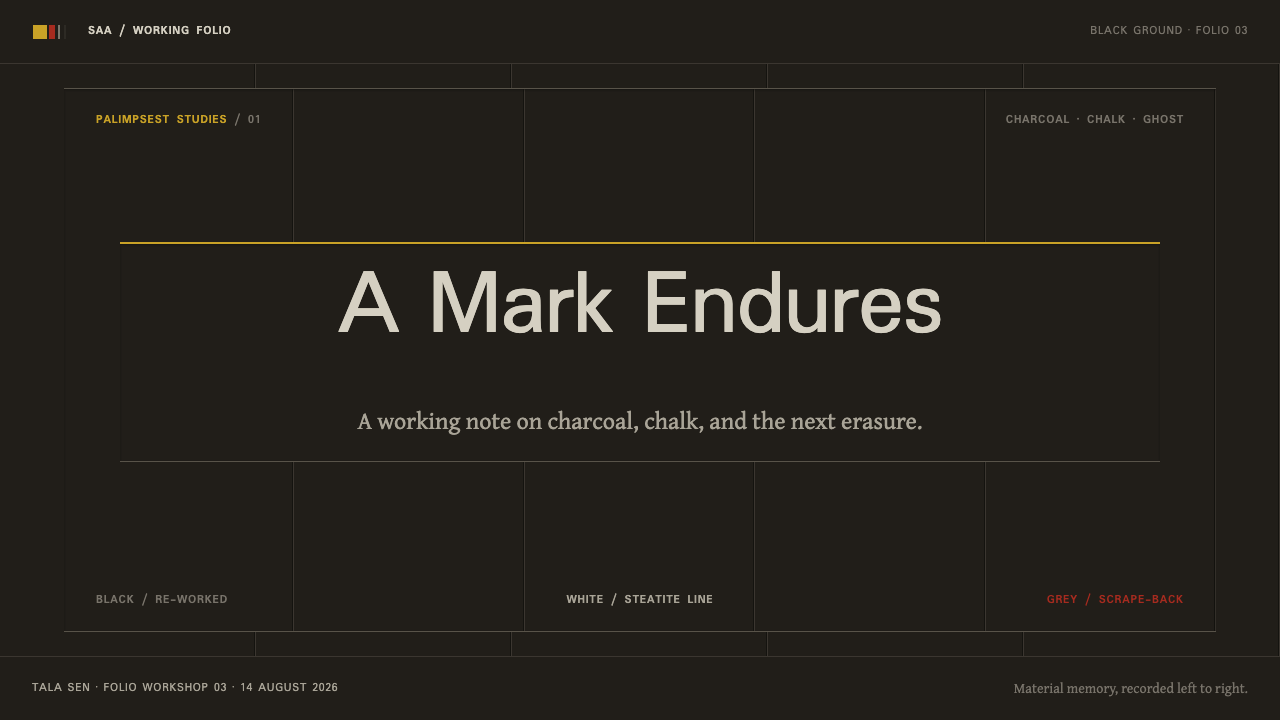
On presentation slides, the cover works well as a single panel treated the way a parabaik's lacquered cover would be: a warm charcoal field with one small, deliberate flash of gold or vermilion, and a title set in the pale, slightly uneven quality of chalk rather than crisp print type. Content slides should be organized as a horizontal sequence — a filmstrip of panels moving sideways rather than a vertical stack of bullet points — and data is best shown as a short sequence of step-panels rather than a dense chart, echoing the format's own panel-by-panel advance.
For web interfaces, the palette suits dark-mode documentation, narrative or archival sites, and any product that benefits from horizontal, panel-based navigation instead of continuous vertical scroll. Backgrounds should stay warm charcoal rather than a cool near-black, body text should keep the slightly soft, chalky quality described above for genuine legibility rather than harsh contrast, and gold or vermilion accents should be reserved for a single primary action or a rare highlight rather than spread across the interface.
In editorial and marketing work, the format supports heritage and craft storytelling especially well — brand histories, archive features, or 'how it was made' narratives that benefit from a visible sense of accumulated revision. A subtle ghosting effect behind a headline, echoing incompletely erased text, can signal depth and history without needing an explicit caption to explain it.
The most common mistake is treating gold, vermilion, and mirror-glass as a general decorative palette instead of a rare, covers-only accent — spreading shine and color across the page erases the exact restraint that makes the format distinctive. A second common mistake is rendering text with crisp, uniform printed type instead of the pale, slightly uneven chalk quality the system depends on, which strips away the handworked feeling that is the whole point of drawing on this tradition.
Shan Parabaik Manuscript — FAQ
What is the difference between a parabaik and a palm-leaf manuscript?
Both were used in Myanmar, but they are different physical formats serving different needs. A palm-leaf manuscript is made of separate stiff leaves, typically strung together, each one a fixed, non-reusable surface. A parabaik is a single continuous sheet of thick mulberry-bark paper folded accordion-style into a long strip; the black variant, in particular, is coated so that it can be written on, erased, and reused repeatedly, which makes it closer to a working notebook than to a permanent bound document.
Why does the design keep text looking uneven and chalky instead of clean and crisp?
Because that unevenness is exactly what a white steatite crayon produces when pressed by hand onto a rough, charcoal-coated surface — a soft stone leaves a slightly irregular, matte mark, never the sharp uniform edge of printed type. Smoothing the text into crisp, even letterforms would remove the single most identifying quality of the actual object: the visible evidence of a hand writing directly onto a reusable working surface.
Can this style be used for content that has nothing to do with Myanmar or Buddhism?
Yes — what transfers is the structural and material logic, not a specific religious or cultural subject matter. A warm charcoal ground, chalky text, sparing gold and vermilion accents, and horizontal panel-by-panel progression are all formal qualities that can carry any subject, provided the content itself benefits from a sense of accumulated history or handworked revision rather than sterile, freshly printed presentation.
Why is color restricted almost entirely to the covers?
Because that is where color actually appeared on the real object. The working pages of a black parabaik were a functional surface meant for repeated writing and erasing, not for decoration — gold leaf and mirror-glass inlay were reserved for the lacquered covers, which framed the book rather than carried its working content. Respecting that division keeps the system's restraint intact; spreading color across the pages themselves would misrepresent what the object actually was.
Where does this style struggle?
It struggles in contexts that need to feel bright, clean, and immediate — retail promotions, children's products, or anything wanting a crisp, high-energy first impression. The system's entire mood is quiet, dim, and historically weighted, built around dark grounds and restrained accents, which reads as rich and considered in the right context but can feel muted or somber where the goal is cheerful immediacy.
Related design styles
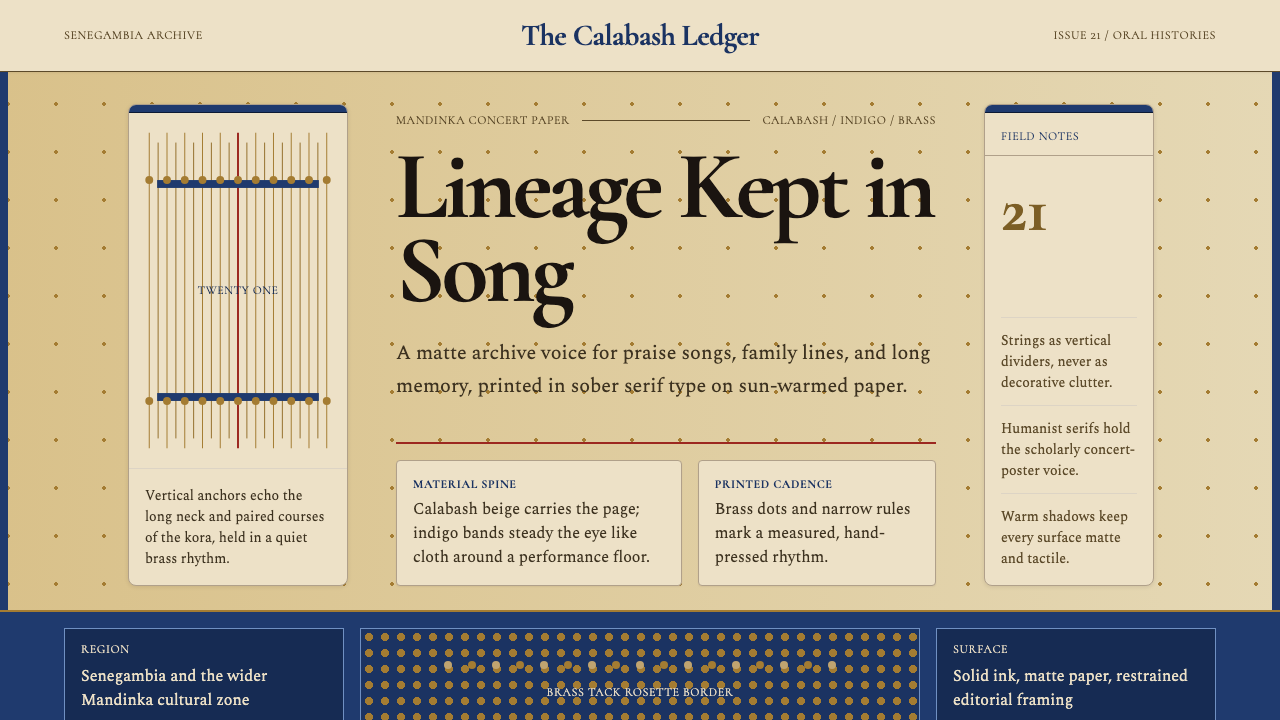 Gambian Griot Kora (21-string)Oral history feels tactile. Calabash beige, indigo bands, and 21 brass string…
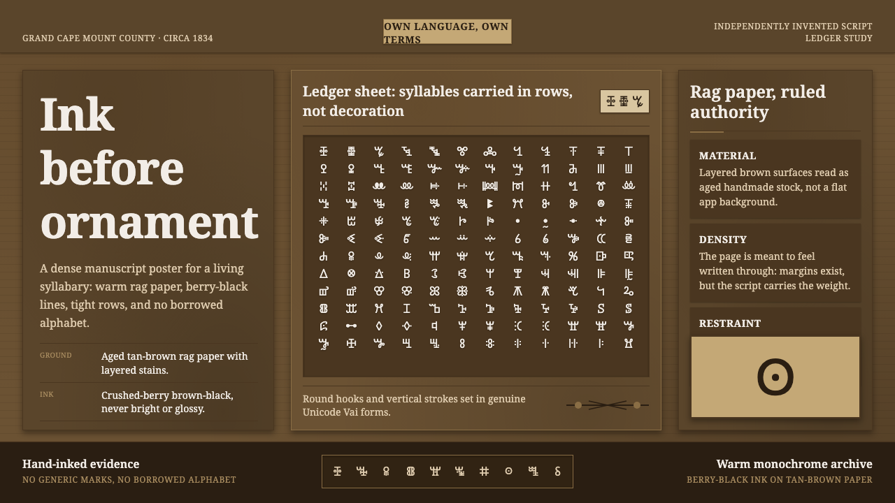 Vai Syllabary LiberiaInk has authority. Dense Vai glyphs pack berry-black rows across warm tan rag…
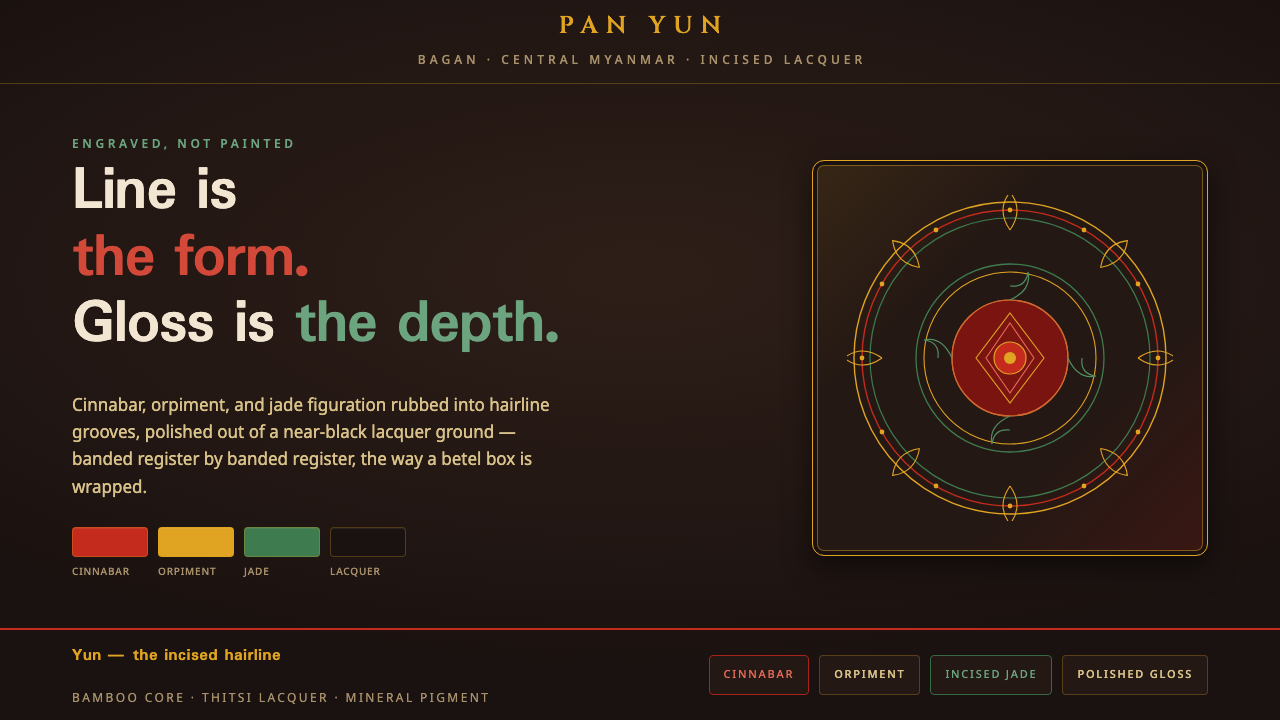 Bagan Yun LacquerwareEngraved, not painted. Cinnabar, orpiment and jade hairlines polished from ne…
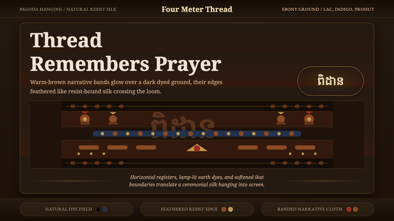 Cambodian Pidan IkatSacred cloth glows. Ebony-indigo bands carry warm-brown ikat figures with fea…
 Iban Pua KumbuSacred cloth logic. Indigo-rust bands, ecru reserves, and blurred ikat edges…
 Indonesian Pencak SilatHeld in stillness, drawn in gold. Songket thread glows on black silat garb un…