What is Vai Syllabary Liberia?
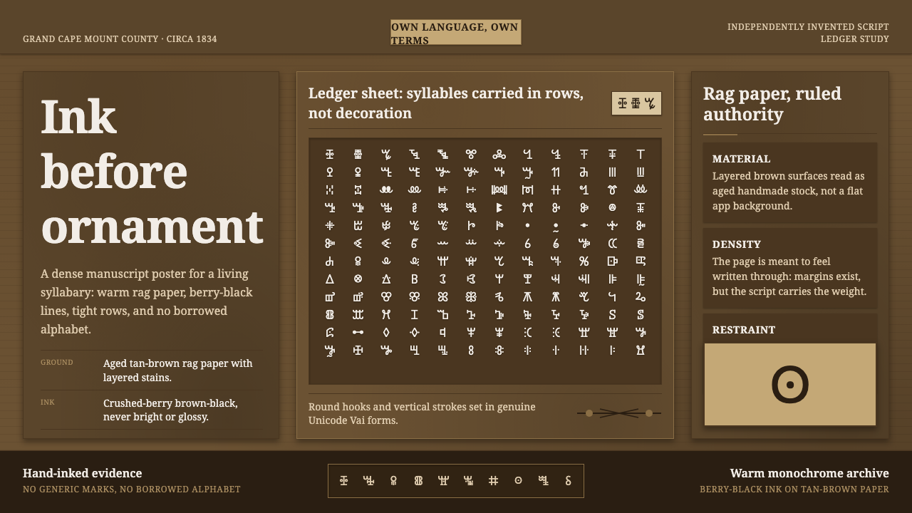
Ink has authority: the Vai syllabary turns a living Liberian writing system into dense, rhythmic fields of dark marks on warm, weathered paper.
Vai Syllabary Liberia in brief
Vai Syllabary Liberia is a design language rooted in the Vai writing system, created in 1834 by Momolu Duwalu Bukele of the Vai people in what is now Grand Cape Mount County, Liberia. It does not treat writing as a decorative pattern borrowed from elsewhere. Its central material is a real syllabary: a script made of distinct signs that represent spoken syllables in the Vai language. The visual character comes from the repeated presence of these compact glyphs, with their rounded hooks and vertical strokes creating rows that appear simultaneously orderly, handwritten, and alive.
The style channels the physical condition of a Vai manuscript rather than an abstract idea of African ornament. Imagine handmade rag paper that has darkened toward tan and brown through handling, storage, and time. Across that surface, crushed-berry ink settles into dense lines of brown-black writing. The page is not glossy, spacious, or digitally immaculate. It feels used, consequential, and closely held: a record that asks to be read rather than a surface arranged to be admired from a distance.
Its governing contrast is between warmth and severity. The paper carries softness, fiber, age, and human touch; the ink carries force, compression, and authority. Dense text dominates the composition, leaving only the necessary margins and pauses. There is little appetite for ornamental illustration, reflective effects, polished interfaces, or decorative motifs that compete with the script itself. A successful Vai-inspired composition makes the glyphs feel like knowledge in physical form: accumulated, insistent, and inseparable from the people who write and read them.
Where does Vai Syllabary Liberia come from?
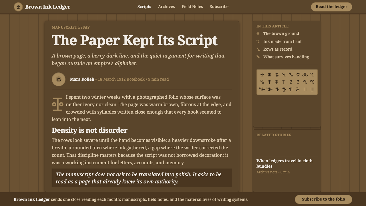
The Vai syllabary was invented around 1834 by Momolu Duwalu Bukele, a member of the Vai people in the region now known as Grand Cape Mount County, Liberia. The source tradition describes the script as having been born from a dream and from a practical collective need: the ability to write the Vai language on Vai terms. That dual origin matters to the visual language. The script is neither an imported alphabet nor a stylistic quotation from Arabic or Latin writing. It is a system formed for a particular language and community, and its visual identity begins with that independence.
Its importance lies in the unusual nature of its invention. The Vai syllabary is among the very few modern writing systems understood as having been independently created rather than adapted from an existing script. Its signs were built glyph by glyph from rounded hooks and upright strokes. This construction gives the script a compressed but varied texture. Individual characters can seem compact and sculptural, while repeated lines become broad fields of rhythm. The style therefore asks designers to preserve legibility, recurrence, and the internal energy of marks instead of extracting isolated symbols as exotic decoration.
The tradition runs through the early twentieth century and remains a living frame of reference rather than a sealed historical artifact. In manuscript form, the script is inseparable from material conditions: handmade rag paper, a warm aged ground, and dark ink made from crushed berries. These are not incidental props. They explain why the page feels dense and weighty, why contrast comes from ink against fiber rather than from bright graphic effects, and why writing should occupy the visual foreground. Contemporary use should keep this relationship intact: the design may adapt the manuscript atmosphere, but it should not pretend that the script is an anonymous pattern with no linguistic or cultural meaning.
What defines the Vai Syllabary Liberia look?
Aged Rag Ground
The ground should feel like handmade rag paper that has warmed with age: tan-brown, fibrous, matte, and slightly irregular rather than cleanly manufactured. It carries the quiet visual labor of the composition. Avoid pristine white surfaces, glassy panels, or synthetic paper effects. The background is not empty space; it is the physical field that makes dark writing believable.
Berry-Dark Ink
Writing is rendered in a deep brown-black that suggests crushed-berry ink absorbed into paper rather than machine-perfect black pigment. The marks should feel saturated, direct, and slightly organic in their edges. Their power comes from mass and repetition, not from shine, glow, or contrast tricks. Ink should look deposited, not illuminated.
Syllabic Density
Dense rows are the principal compositional device. Vai glyphs should gather into close writing fields that establish rhythm across the page. Generous empty space can weaken the manuscript logic when it is used merely to make a layout feel fashionable. Pause only where a reading structure, title, annotation, or physical edge calls for one; elsewhere, let the script carry sustained visual pressure.
Hooks and Uprights
The syllabary is built from rounded hooks and vertical strokes, a contrast that gives the glyphs their distinctive movement. Curves soften the field without making it ornamental; upright marks hold the rows together and introduce discipline. Do not smooth these forms into generic calligraphy or turn them into loose doodles. Their specificity lies in the tension between compact curves and decisive vertical direction.
Manuscript Authority
The tone is serious, tactile, and documentary. This is not a nostalgic fantasy of an old page, nor a luxury stationery aesthetic. Every sign should imply that something worth preserving has been written down. Titles, captions, and supporting text should remain subordinate to the written field, using restraint and clear hierarchy rather than dramatic branding gestures.
No Decorative Approximation
A living script must not be reduced to a generic ethnic texture. Decorative approximations, invented pseudo-glyphs, scattered symbols, and motifs detached from language undermine the premise of the style. Use authentic Vai writing only where it is appropriate and understood, and otherwise let the material palette, density, and manuscript structure carry the reference. Respect is visible in what the design declines to imitate.

Who shaped Vai Syllabary Liberia?
Bukele is credited with inventing the Vai syllabary around 1834 in the region now known as Grand Cape Mount County, Liberia. The script’s origin is associated with a dream and with the Vai people’s need to write their own language on their own terms. In this design language, his significance is not a decorative authorship credit: it is the reason the glyphs must be treated as the structure of a real writing system rather than as visual fragments.
The Vai people are the community at the center of the syllabary’s creation and continued meaning. Their role makes the style culturally specific: it concerns a language written by and for its own speakers, not a generalized visual category. Any contemporary adaptation should retain that specificity, foregrounding manuscript materiality and linguistic dignity instead of turning Vai signs into a mood board.
The unnamed makers of Vai manuscripts give the style its material lesson. Their pages unite handmade rag paper, warm age-darkened grounds, and brown-black berry ink with tightly organized syllabic rows. They demonstrate that the script’s visual authority does not depend on graphic excess. It comes from the physical act of writing, the persistence of the page, and the density of language held in ink.
How do you use Vai Syllabary Liberia today?
For presentation slides, use the style as a manuscript-inspired information system rather than a theatrical historical costume. A cover can begin with a warm rag-paper field, a concentrated block of authentic and contextually appropriate Vai writing, and a restrained title that does not overpower the script. Content slides should preserve the same hierarchy: dense textual zones may frame short explanations, while calm margins create room for orientation. On data slides, favor dark marks, clear groupings, and annotation that resembles a record written onto paper. Avoid glossy charts, decorative icons, or bright visual effects that sever the page from its manuscript logic.
For web interfaces, the strongest applications are knowledge archives, reading environments, cultural collections, language-learning materials, and editorial tools that benefit from a sense of document-based authority. A dashboard can use a warm dark-ground relationship to distinguish navigation, written records, and active material without making every panel appear like a floating product card. A pricing or membership page can borrow the seriousness of ink and paper, but it should remain plainly usable: language, hierarchy, and actions must be more legible than atmosphere. The script should never become a background texture behind controls or a substitute for accessible interface labels.
For editorial and marketing work, this style suits essays, exhibitions, cultural programs, book-like landing pages, and campaigns concerned with language, memory, preservation, or authorship. Let large written fields establish the visual identity, then introduce explanatory copy in quieter blocks that behave like marginal notes or catalog entries. Images, if present, should feel documentary and materially connected to paper, ink, handwriting, or reading. Marketing should speak with restraint. The goal is not to manufacture antiquity, but to make the viewer feel the gravity of a living written tradition and the physical persistence of a manuscript.
The common mistake is confusing density with clutter, or cultural specificity with generic ornament. Filling a surface with invented marks, scattering a few syllabary-like forms around a logo, or pairing manuscript texture with luxury gloss produces an aesthetic imitation without the system’s authority. Another mistake is treating aged paper as an excuse for low contrast and difficult reading. The style should be dense but organized, tactile but clear, historically attentive but contemporary in function. When actual Vai text is not available with reliable context, reference the manuscript’s material logic instead of fabricating language.
Vai Syllabary Liberia — FAQ
Is the Vai syllabary an alphabet?
No. It is a syllabary, meaning its distinct signs represent syllables in the Vai language rather than individual alphabetic letters. That difference matters visually and ethically. The glyphs belong to an organized writing system with linguistic purpose, so they should not be rearranged casually as if they were interchangeable decorative characters.
Why is density so important to this visual style?
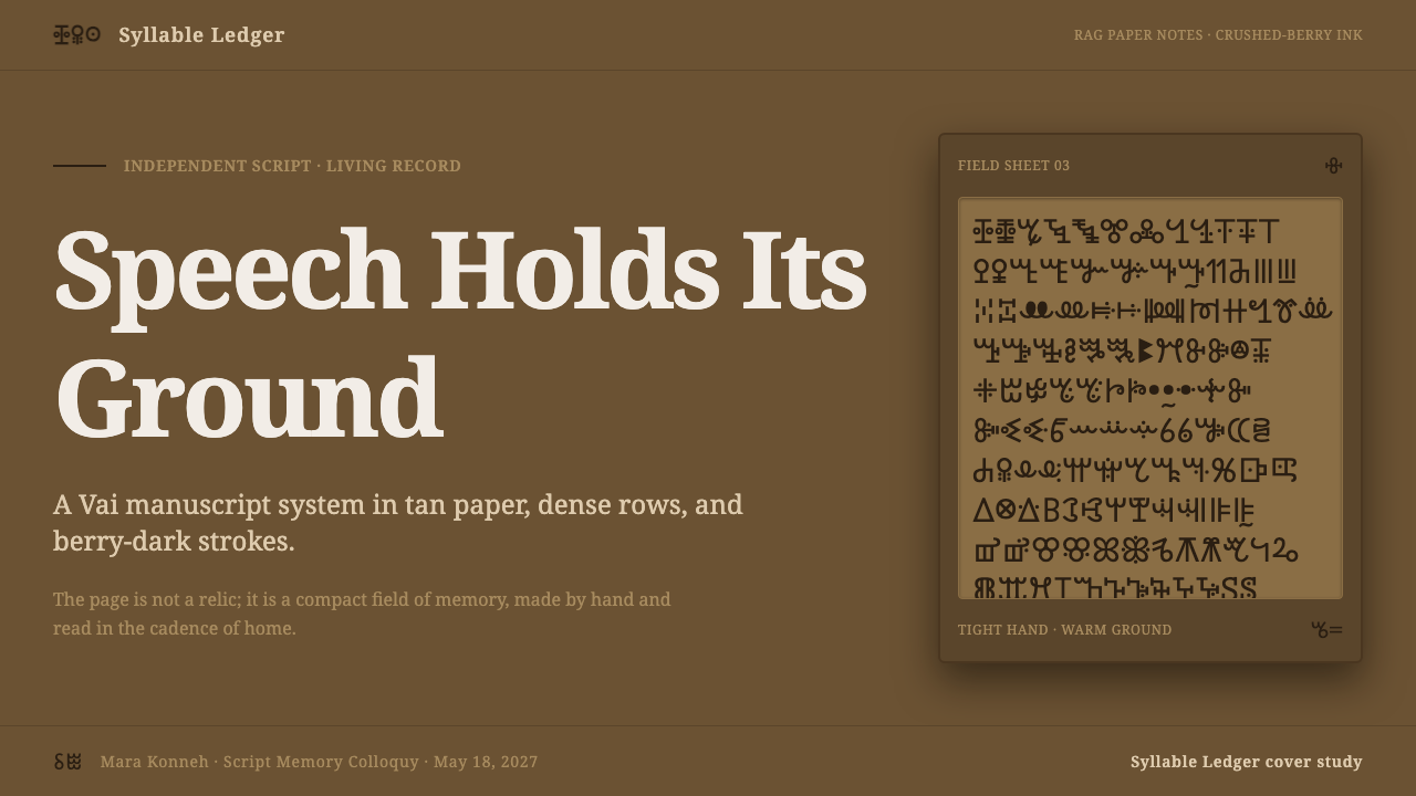
Density reflects the manuscript source: warm rag paper packed with tight rows of dark syllabic writing. It gives the page its authority and makes writing, rather than decoration, the dominant image. Density should still be structured. The goal is sustained rhythm and readable organization, not indiscriminate visual noise.
Can I use Vai glyphs as a decorative pattern?
That approach should be avoided. Vai is a living script, not an anonymous motif bank. If authentic writing is used, it should be accurate, relevant to the content, and treated with enough space and context to remain meaningful. If that cannot be assured, use the paper, ink, density, and manuscript organization as references instead of inventing or scattering glyphs.
Does this style require an old-looking interface or printed object?
No. Its reference to aged rag paper and ink is material, not a requirement to simulate decay. Contemporary pages and interfaces can use the same values: matte warmth, dark written authority, compact rhythm, and respect for real text. The result should feel grounded and tactile without becoming a costume version of the past.
Related design styles
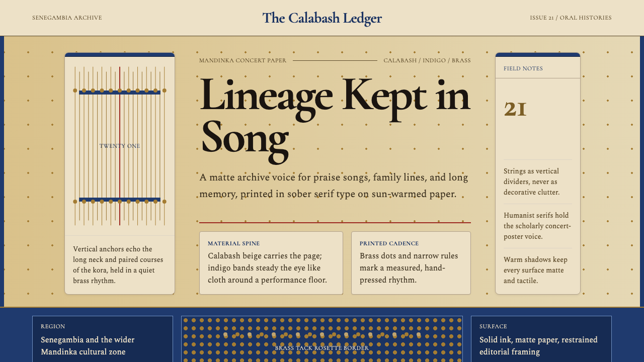 Gambian Griot Kora (21-string)Oral history feels tactile. Calabash beige, indigo bands, and 21 brass string…
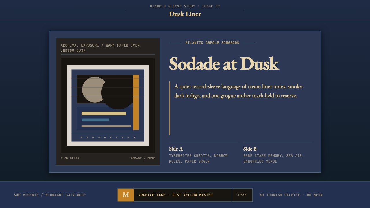 Cape Verdean Morna (Cesária Era)Longing in dusk. Indigo sleeve framing, Garamond liner notes, and one amber e…
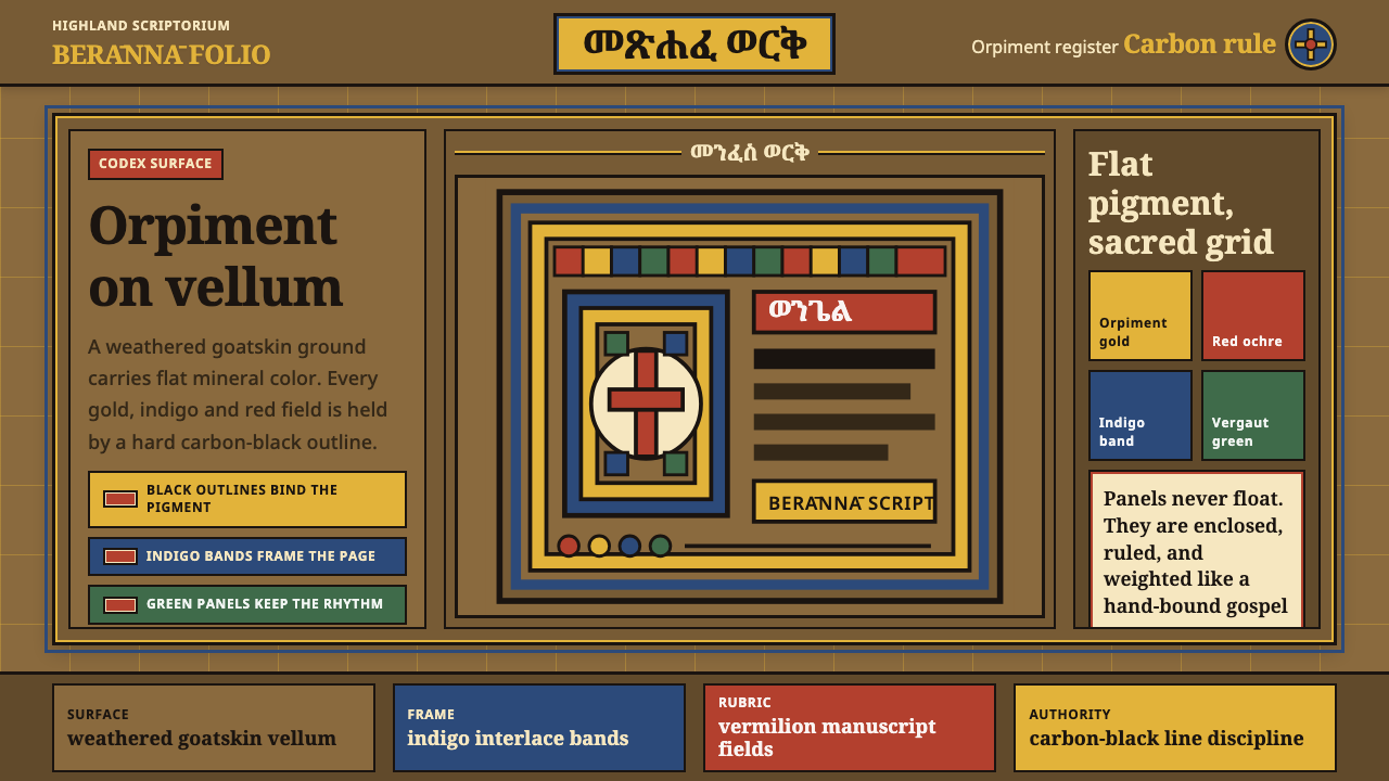 Ethiopian Geez GospelSacred color held in line. Orpiment gold and indigo panels sit on weathered v…
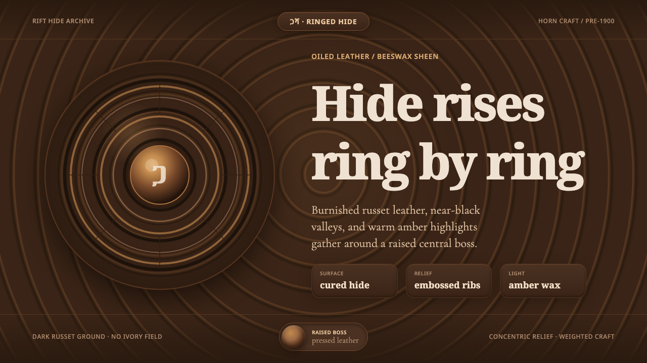 Ethiopian Hide ShieldDark hide speaks in relief. Russet rings and amber beeswax light rise from ne…
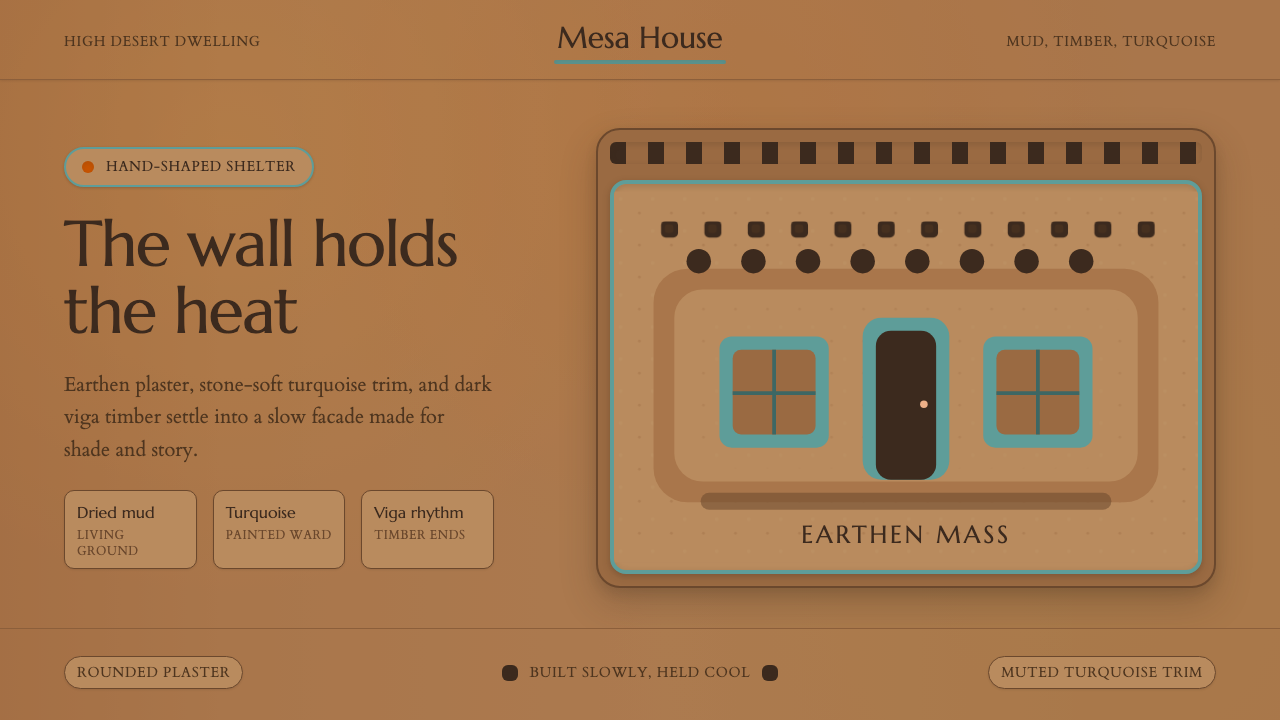 Adobe Pueblo SouthwestFeels made by hand. Earthen tan, turquoise trim, and viga rhythm shape the fr…
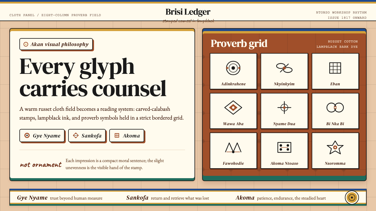 Akan Adinkra (Ghana)Proverbs become cloth. Russet grids, lampblack serif marks, and gold-edge ban…