What is Maronite Qadisha?
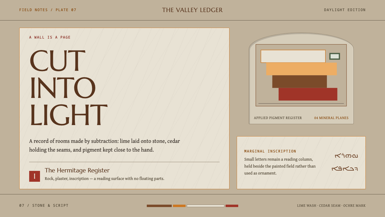
Maronite Qadisha takes its surfaces from the rock-cut hermitages of Lebanon's Holy Valley — stone, lime plaster and cedar brown, where nothing floats.
Maronite Qadisha in brief
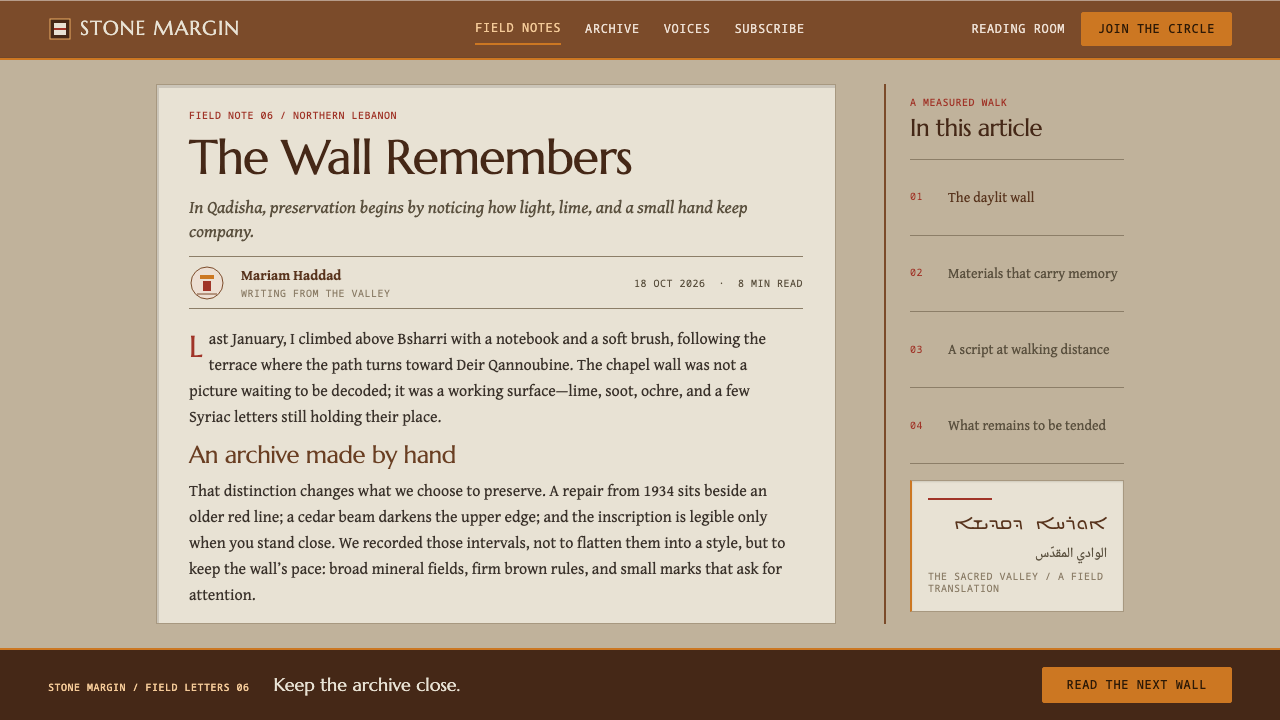
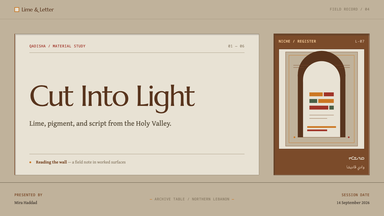
Maronite Qadisha is a design style taken from the surfaces of the hermitages in Ouadi Qadisha, the Holy Valley, a limestone gorge in North Lebanon. Cells and chapels were hollowed out of the rock, skimmed with lime plaster, painted with figures in ochre and hematite pigment, and annotated in small Syriac letters that run beside the images. The style is the look of that wall: a daylit, chisel-marked stone face with pale plastered panels laid onto it to carry pictures and writing.
The system works in mineral values only. Buff-grey cut stone is the ground, cedar heartwood brown carries structure, and lime wash marks the plastered panels that hold text. Ochre and a darker red supply the figures and letters, and a cedar-needle green appears only at the edges. There is no glow, no blur and no floating layer: every element is either cut into the wall, like a niche, or laid onto it, like a plaster panel.
What distinguishes it from other light, quiet styles is its sense of weight and permanence. Layouts step down the page like the dry-stone terraces of the valley, left edges are staggered, margins are deliberately uneven, and the plaster follows the stone rather than squaring it off. It reads less like a page and more like a wall that has been worked on over centuries — calm, text-forward, and built to be read slowly.
Where does Maronite Qadisha come from?
The valley's story begins with monastic occupation from the seventh century. Maronite hermits settled in the gorge, in the tradition the source calls Syriac Christian eremitic monasticism — a way of religious life centred on solitary or small-group retreat. Ouadi Qadisha lies in the Bsharri and Zgharta districts of North Lebanon, and its steep limestone walls offered what such a life needed: shelter, seclusion, and a ready-made building material in the rock itself.
The surviving record is later than the occupation. The rock-cut chapels and wall paintings that can still be seen date from the twelfth to the seventeenth century, which means the visible surface of the valley is the accumulated work of several centuries rather than a single moment. The paintings belong to the medieval Levantine fresco tradition: a lime-plaster ground applied over the cut rock, figures drawn in earth pigments such as ochre and hematite, and writing in Syriac set alongside the images instead of beneath them.
Rock-cut ecclesiastical architecture is architecture by subtraction. A chapel is made by removing stone, not by assembling it, and the plaster that follows is a skin laid over the cut. That two-step logic, cut first and then lay, is what the design style turns into its rule that nothing floats. The valley adds a second logic of its own: the dry-stone terraces of the gorge step down the slope, and the layout of the style steps down the page in the same way.
In 1998 the valley was inscribed by UNESCO, a recognition that fixes it in public memory as a place of heritage and not only of devotion. The source also names two people among the style's key figures, Estephan El Douaihy and Erica Cruikshank Dodd. This article does not lean on their biographies; their names are the places to start for readers who want the deeper history of the valley and its paintings. What the style itself takes from the place is more concrete: a palette of earth and lime, a wall that is cut and plastered, and a margin where small writing sits beside the image.
What defines the Maronite Qadisha look?
Mineral Palette
Every colour in the system could be dug, burned or cut from the valley. Buff-grey stone is the ground, cedar heartwood brown the structural colour, and lime wash the pale of the plastered panels. Ochre and a dark red — the hematite of the paintings — mark figures and letters, while the green of cedar needles appears only as a small touch at an edge. The palette is warm, low in saturation and entirely matte; nothing in it looks manufactured.
Cut or Laid
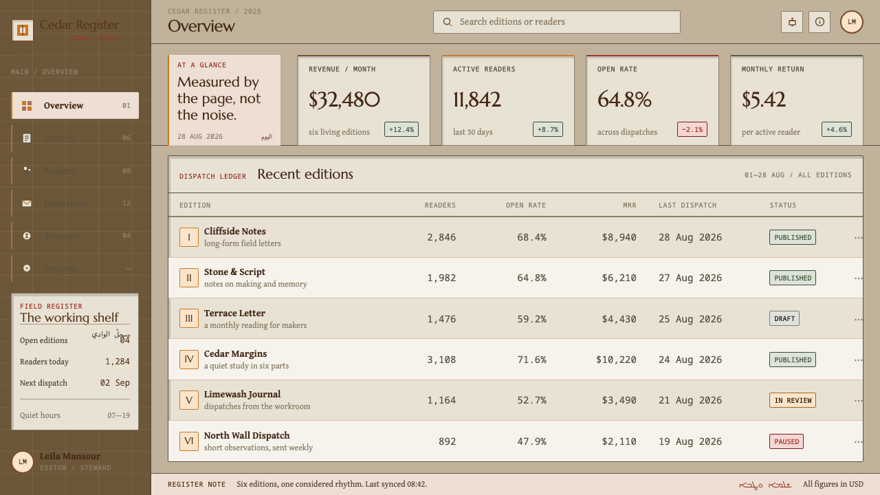
Nothing floats. Each element has to be one of two things: cut into the wall, like a niche or recess, or laid onto it, like a plaster panel. That rule excludes the usual vocabulary of floating interfaces — soft drop shadows, glows, translucent overlays — and replaces it with edges, insets and a few flat, firmly attached surfaces. Depth is carved depth: a recess is darker because it is deeper, not because light is simulated.
Plaster Panels for Text
Text does not sit on bare stone. It lives on pale lime-washed rectangles, the plastered panels that carry writing in the originals. This is a practical device as well as a historical one: the panel guarantees a calm, light reading surface against a textured, mid-tone ground, so legibility is built into the structure rather than patched on with contrast tricks.
Marginal Script
Beside the images in the valley, small Syriac letters run as annotation. The design style adopts the idea of a second, smaller voice: captions, labels and notes set small and quiet in the margin, next to a larger image or heading rather than beneath it. The result is a layered page in which the main content and its commentary are visibly separate but physically adjacent.
Terraced Layout
The layout steps down the page like the dry-stone terraces of the valley floor. Blocks start at slightly different left edges, margins are deliberately uneven, and each tier sits a little behind or ahead of the one above. The irregularity is intentional: stone is not level, and the plaster follows the stone. A grid exists, but it is a terraced grid, not a rigid one.
Daylit Quiet
The mood is of a stone face lit by daylight, not by a screen. Shadows are the shadows inside recesses, shallow and unmoving, and contrast comes from the difference between rough ground and smooth plaster rather than from saturation. The overall effect is quiet, unhurried and heavy in the good sense — the visual equivalent of a space where nothing is trying to attract attention.
Who shaped Maronite Qadisha?
Named in the source among the key figures of the style. The system does not depend on biographical detail, but the name marks a point of entry into the Maronite tradition as it speaks about its own valley, and designers who want depth behind the surface treatment should follow it up.
The second named reference. Because the style is built on painted plaster walls, her name is the one to follow on the art-historical side of the material: the pigments, the plaster grounds and the Syriac inscriptions behind the visual vocabulary.
The community around whom the surfaces exist. Monastic occupation of the valley runs from the seventh century, in the Syriac Christian eremitic tradition, and the cells and chapels were hollowed from the rock where these monks lived and prayed. When the style asks for restraint, quiet and weight, it is borrowing the temperament of a way of life as much as the look of a wall.
The modern anchor point for the valley. The 1998 inscription marks Ouadi Qadisha as protected heritage, which is a good reason for any project using the style to acknowledge its source and to treat the surfaces as something to be respected rather than skinned over any product.
How do you use Maronite Qadisha today?
Maronite Qadisha is a quiet, text-forward style that suits subjects where weight, memory and calm are values rather than decoration. It works best for documentation, archives, reading and research products, heritage or cultural institutions, and anything meant to be read slowly. It is less suited to energetic, high-velocity interfaces, where its refusal to float, glow or animate would feel like obstruction.
For slides, the cover is a stone ground with a single pale plaster panel set off-centre to carry the title, a smaller line of caption text beside it in the margin, and a brown structural band along one edge. Content slides step: each block sits on its own terrace, text always on a plaster panel, images set into the stone like recesses. Data slides suit the mineral palette well. Bars and lines in ochre, brown and dark red read as painted marks, labels sit small and quiet in the margin beside the figure, and tables are laid on a plaster panel with ruled lines in the structural brown.
For web interfaces, the style fits knowledge bases, documentation sites, library and archive catalogues and reading apps. Cards become inset panels or plaster tiles rather than floating layers. Modals give way to inline expansion or full-page steps, since nothing floats, and navigation can sit in the margin as small annotation-like labels. Dashboards work if they favour tables and structured lists on plaster panels over glossy widgets, and pricing pages benefit from a terraced arrangement of plans, each one a panel at a slightly different level.
In editorial and marketing work, the style supports long-form essays, travel and history features, institutional reports and anything with footnotes. Marginalia is the signature device: pull quotes, sources and asides set small and adjacent to the main column. Photography of stone, plaster, wood and landscape sits naturally in the system, and section changes are marked by a step in the layout rather than by a decorative rule.
The most common mistake is to read 'stone and plaster' as a texture instruction and paste a photographic rock background behind the layout, which makes the page look like skeuomorphic wallpaper and ruins legibility. The system is about values and logic, not photographs of rock. A second mistake is to add floating shadows and glass overlays, which contradicts the central rule. A third is to decorate with Syriac-looking lettering that means nothing; if the script appears at all, it should be real text, correctly set and used for a reason, and otherwise the idea of small marginal annotation can be kept in any language.
Maronite Qadisha — FAQ
Where does Maronite Qadisha come from?
It comes from the hermitages of Ouadi Qadisha, the Holy Valley, a limestone gorge in the Bsharri and Zgharta districts of North Lebanon. Monastic occupation began in the seventh century, the surviving rock-cut chapels and wall paintings date from the twelfth to the seventeenth century, and the valley was inscribed by UNESCO in 1998. The style borrows the look of those walls: cut stone, lime plaster, cedar brown, ochre and hematite figures, and small Syriac annotation beside the images.
What does 'nothing floats' mean in practice?
It means every element must be either cut into the surface or laid onto it. In interface terms that rules out soft drop shadows, glows, glass-like overlays and elements that appear to hover above the page. Panels are flat and firmly attached, recesses are shown as darker inset areas, and depth comes from carved difference rather than simulated light. Floating modals and tooltips can usually be replaced with inline expansion or a stepped panel.
Do I need to use Syriac script to use the style?
No. The source describes small Syriac letters running beside the images, and the design idea that comes from that is a second, smaller annotation voice in the margin, which works in any language. If you do use Syriac, it should be real text set by someone who can read it and used for a reason. Decorative lettering that only looks like the script would turn a living written tradition into a texture.
Can the style work for products that are not religious or cultural?
Yes, because its working grammar is structural rather than iconographic: a mineral palette, text carried on pale panels, layouts that step down the page, and small marginal annotation. Documentation tools, research products, archives and long-form reading apps all use that grammar naturally. What to avoid is borrowing religious imagery without a reason; take the surface logic, acknowledge the valley as the source, and leave the devotional content to contexts where it belongs.
Can Maronite Qadisha work in dark mode?
The style is defined by daylight on stone and by pale plaster panels, so the canonical form is light. A dark version is possible if the stone ground goes dark while the plaster panels stay light, because then text still sits on the pale lime surface and the cut-or-laid logic survives. Darkening the panels themselves would remove the device that gives the style its legibility and its identity.
Related design styles
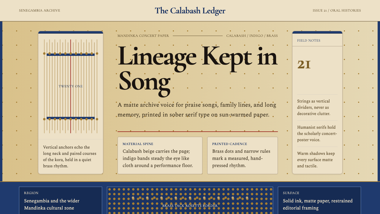 Gambian Griot Kora (21-string)Oral history feels tactile. Calabash beige, indigo bands, and 21 brass string…
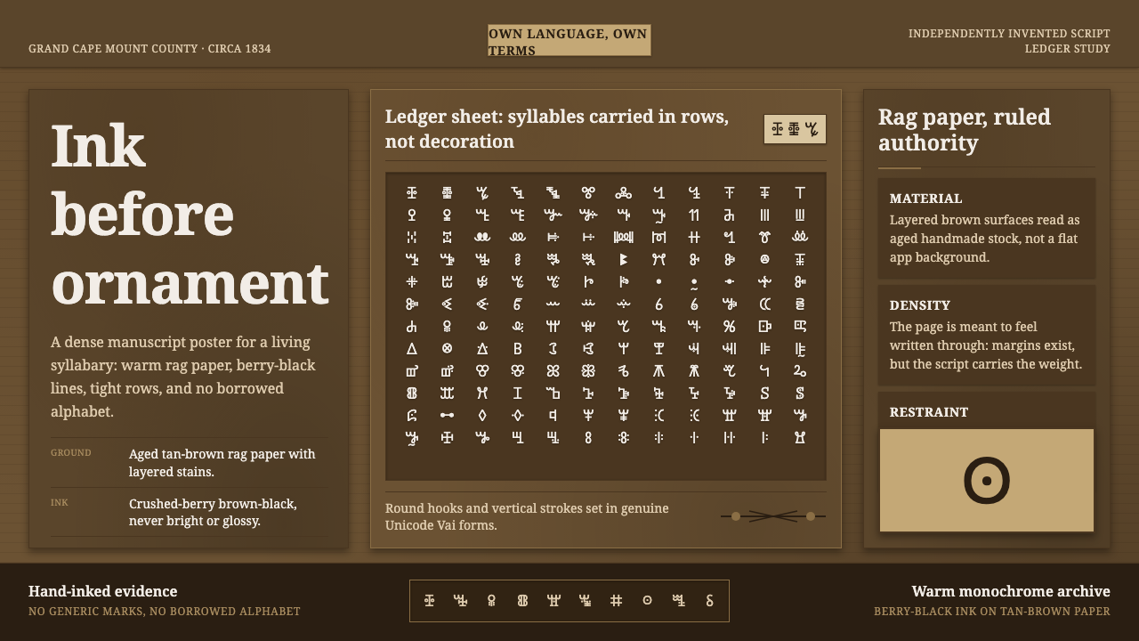 Vai Syllabary LiberiaInk has authority. Dense Vai glyphs pack berry-black rows across warm tan rag…
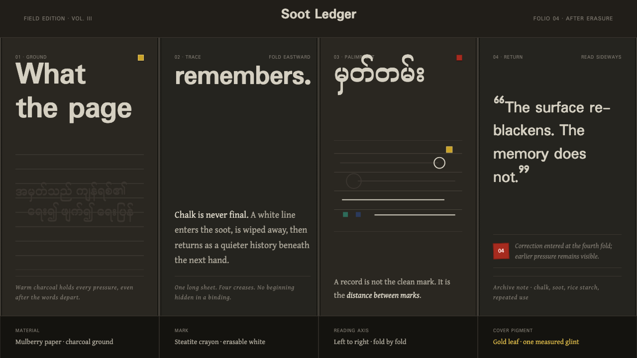 Shan Parabaik ManuscriptMemory survives erasure. Chalk-white lines and grey ghosts travel across warm…
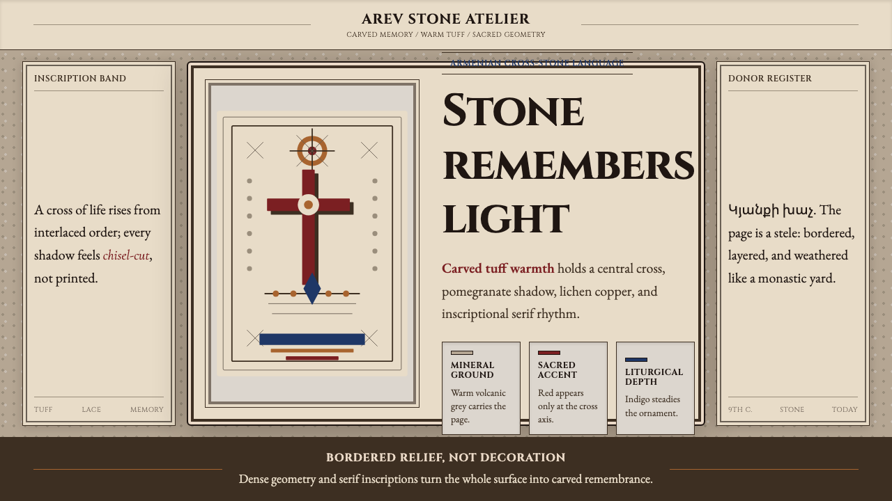 Armenian Khachkar Cross-StoneStone becomes memory. Tuff grey, pomegranate red, and carved borders hold the…
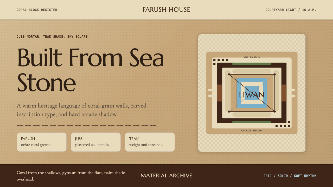 Emirati Bait Al Naboodah Coral HouseFeels built, not styled. Coral ochre, teak brown, and a sky-square courtyard…
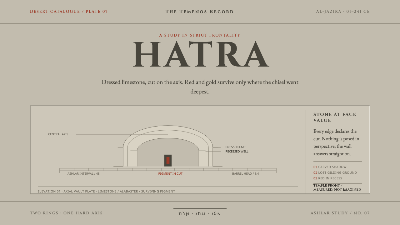 Hatra Parthian ReliefStone faces forward. Cinzel capitals and recessed red pigment hold a strict a…