What is Hatra Parthian Relief?
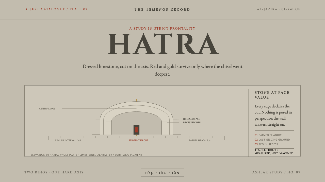
Hatra's relief walls set stone figures square to the viewer along a strict central axis, with the last traces of red and black surviving only in the deepest cuts.
Hatra Parthian Relief in brief
Hatra Parthian Relief takes its identity from Hatra, a caravan city in the desert of northern Iraq, in the region of Al-Jazira south-west of Mosul. The city was ringed by two circular walls and more than 160 towers. At its heart lay a sacred enclosure, the temenos, where barrel-vaulted halls called iwans rose to around thirty metres, built of dressed limestone and grey alabaster.
The walls of those halls were hung with relief slabs carved to a strict rule of frontality: figures stand square to the viewer and look straight out, feet turned outward, the body arranged around a vertical centre line. Greek arches and columns frame them, and the gods who appear beside those forms are Mesopotamian and Arab. The result is a visual language of confident symmetry in which architecture and image are built on the same axis.
As a design system it takes the stone at face value. The ground is warm, pale ashlar, meaning squared and dressed stone, and structural elements are drawn in the grey of carved shadow. Pigment is used the way it actually survives on the reliefs: red, black and the ground layer of a lost gilding appear only in very small amounts and only down in the cut, in the recesses the sun never reached. The effect is monumental, still and deliberately austere, with all its warmth held in reserve.
Where does Hatra Parthian Relief come from?
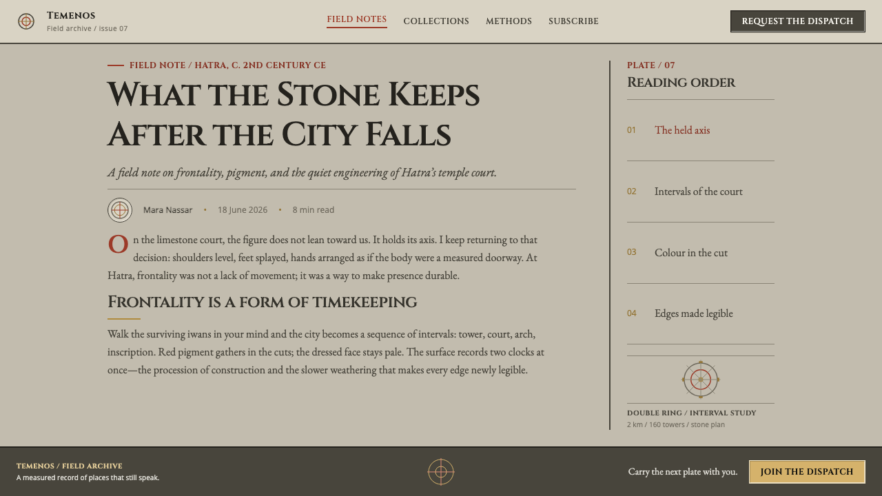
Hatra flourished from the first century BCE until 241 CE, the period the record calls Parthian Hatra. It sat in Al-Jazira, the region of northern Iraq south-west of Mosul, and as a caravan city it was a crossroads where traders and worshippers of many origins met. That position explains its character as a place that gathered forms from several traditions and fused them into one order.
Its architecture matched its ambitions. Two circular walls with more than 160 towers defined the city, and inside the sacred precinct the iwans, vaulted halls open at the front, rose in dressed limestone and grey alabaster. The scale is considerable, with vaults at about thirty metres, and it shows what a desert city could gather in resources and confidence. The inner walls were not left bare but hung with carved slabs, so the enclosure worked at once as architecture, gallery and shrine.
The sculpture follows what the record calls Parthian frontality: the figure faces the viewer directly and does not turn, look aside or enter a scene. It is a language of presence rather than narrative, and it makes a wall read as an assembly of figures held in rank. Beside it stand Greek forms, the arches and columns inherited from the Hellenistic world, so that Mesopotamian and Arab gods are housed in a Greek architectural grammar. The record names this Hellenistic-Mesopotamian syncretism, and it is the key to the city's look: nothing is pure, and everything is bound into a single order.
Writing was part of the surface. The record lists Hatran Aramaic monumental epigraphy among the movements behind the style: inscriptions in Aramaic, cut into stone in carefully formed letters as part of the architecture. The people and powers it names include two rulers called Sanatruq and gods such as Nergal and Atargatis. The city's end came in 241 CE, when the Sasanians destroyed it, and the reliefs that survive do so with their pigment largely gone, kept only in recesses. That pattern of survival, more than any restoration, is what this design system borrows.
What defines the Hatra Parthian Relief look?
Strict Frontality
Figures face straight out of the wall, square to the viewer, with feet turned outward and no turn of the head. They do not interact, gesture towards one another or enter a scene; they present themselves. In a layout, frontality means that each key element addresses the reader directly and holds still, with no dynamic diagonals pulling the eye away from the centre.
Central Axis
The composition is built on a strict vertical axis. Arches, figures and inscriptions line up along it, and what sits to either side tends to balance rather than compete. This is symmetry as authority rather than as decoration: the axis tells the viewer where to look first and implies that everything else is ranked in relation to it.
Ashlar Ground
The ground colour is that of dressed stone: warm, pale and slightly sandy, the tone of limestone in dry light. It is not white and not cream but something between, carrying a little warmth without any sweetness. Every other element sits on it as if carved into it, which gives the page a sense of mass rather than of a flat sheet.
Carved-Shadow Grey
Structure is drawn in the grey of shadow caught in a carved line. This grey is not a neutral chosen for convenience; it is the actual tone of the deepest part of a cut, cooler and darker than the stone around it. Rules, borders, outlines and secondary text take this grey, which keeps the whole page feeling like one material in different depths.
Pigment in the Cut
Red, black and the ground of a lost gilding survive only in the recesses of the carving, where the sun never reached. The design system copies that logic exactly: colour appears in very small amounts, and only in inset or recessed places, never as a surface fill. The effect is of colour discovered rather than applied, a quiet reward for looking closely.
Monumental Inscriptional Capitals
Lettering follows the tradition of Hatran Aramaic monumental epigraphy and of stone inscription generally: capital forms with clear, even strokes, set with generous spacing so that they read as cut rather than written. Titles and labels take this register. The letters should feel carved into the page, not typed onto it, and they should be few and deliberate.
Arch and Iwan Framing
The iwan, a vaulted hall open at the front, and the Greek arch are the architectural frames inside which the figures stand. They give the composition a built, enclosed quality: content is housed in niches and bays rather than floating on open ground. In interface terms this suggests panels with firm edges and clear thresholds, each holding one subject.
Who shaped Hatra Parthian Relief?
The record names two rulers called Sanatruq among the key figures of Hatra. Their names stand for the city's royal identity and for the dynastic confidence that the sacred precinct, the walls and the monumental inscriptions display. For a design system the point is not biography but register: the voice of a state speaking in stone, formal, ordered and addressed to a public that is expected to look up.
Nergal is a Mesopotamian god and one of the divine names the record lists for Hatra. His presence stands for the Mesopotamian half of the city's syncretism: a deity from the older cultures of the Tigris and Euphrates region housed in a space with Greek arches. In visual terms he reminds designers that the style is a fusion, and that its power comes from holding unlike things in one frame.
Atargatis is a goddess of the wider Near Eastern world, listed beside Nergal among the divine names of the style. Together the two show how the city's pantheon crossed older boundaries and still appeared in a unified frontal manner. The lesson is one of consistency: whatever the origin of the subject, the same strict grammar of address is applied, which is what makes the wall read as one coherent assembly.
How do you use Hatra Parthian Relief today?
Hatra Parthian Relief is suited to work that wants gravity, order and a sense of long duration. It is not a style for playful or fast-moving content. Its strength is that it makes a page feel built, centred and permanent, and it rewards designers who are willing to commit to symmetry and to hold back colour until it means something.
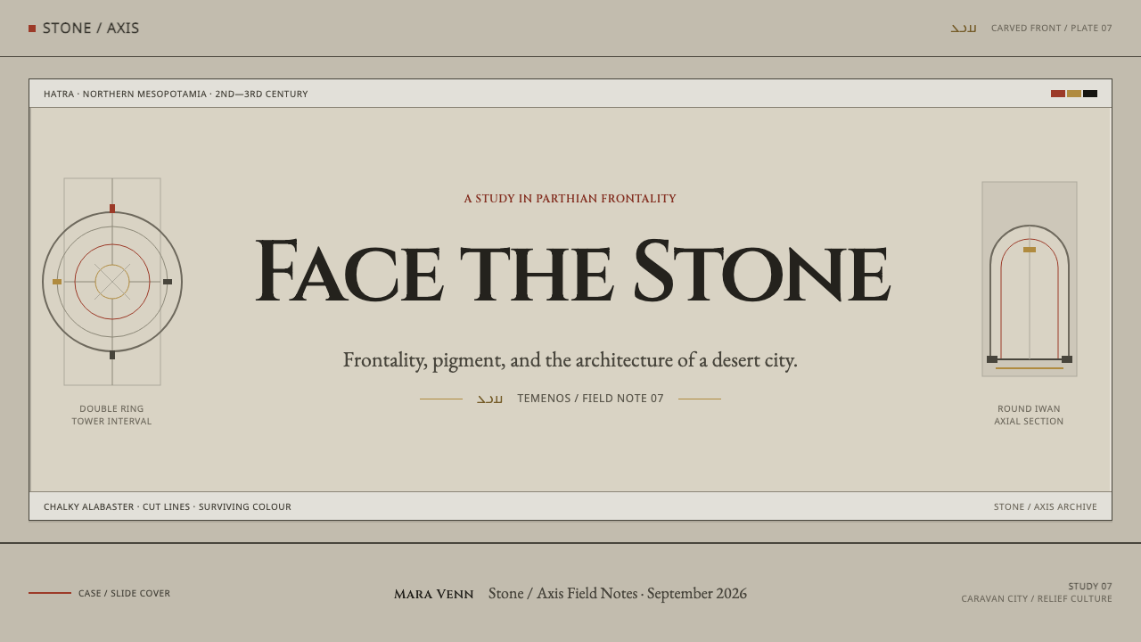
On presentation slides, a cover should be centred and axial: a title in inscriptional capitals on the central line, a restrained rule or arch-like frame around it, and a pale stone ground. Content slides work best as one subject per slide, in the middle of the frame, with secondary text in carved-shadow grey. Data slides can use symmetrical layouts, such as mirrored bars or centred rankings, and reserve a small red accent for the single value to be remembered.
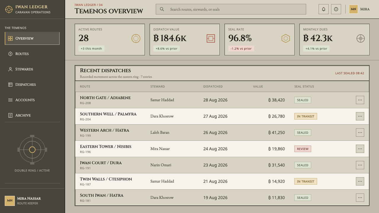
For web interfaces, the style fits institutions, archives, museums, cultural organisations, legal or historical products and any brand that wants authority without noise. Build pages from firm, centred panels with clear edges. On a pricing page, place tiers along the central axis, with the featured one slightly more framed, and let pigment colour appear only in recessed details such as an inset label or a small rule inside a card. Dashboards benefit from symmetrical grouping and plenty of stone-coloured space.
In editorial and marketing work, the style supports stories about history, heritage, archaeology, law and monumental subjects. A centred measure for headings, large inscriptional capitals for section openings, and pull quotes set into inset panels all carry the tone. Photography should be frontal and even, ideally of objects or architecture shot square to the camera. Avoid action shots and tilted compositions; they contradict the grammar of the wall.
The common mistake is treating the pigment colours as fills. In the reliefs, red and black survive only in the cut, and a layout that floods a hero area with red has lost the point. The second mistake is breaking the axis for the sake of visual variety, which turns a wall of figures into a collage. A third is adding shiny metallic gradients to suggest gold; the record speaks of the ground of a lost gilding, which is a quiet, matte trace, not a glow.
Hatra Parthian Relief — FAQ
What does 'frontality' mean in this style?
Frontality is the rule that figures face directly out of the wall, square to the viewer, with the body arranged around a vertical centre line and feet turned outward. The record calls it Parthian frontality. In design terms it means that key elements address the reader head-on and hold still, and that compositions are built on a central axis instead of on dynamic diagonals.
Why is the colour used so sparingly and only in recesses?
Because that is how the pigment actually survives on the reliefs. Red, black and the ground of a lost gilding remain only down in the cut, where the sun never reached, while exposed surfaces have returned to bare stone. The design system follows the real material evidence: colour is a small reserve held in inset places, which gives the page a sense of discovery instead of decoration.
What is an iwan?
An iwan is a barrel-vaulted hall that is open at the front. At Hatra the iwans stood inside the sacred enclosure, rose to around thirty metres and were built of dressed limestone and grey alabaster, with relief slabs on their walls. For designers the iwan is the model of a strongly framed space: a deep, arched bay that holds its subject and gives it presence.
Is this style Greek, Mesopotamian or Arab?
It is all three, which is the point. The record describes Parthian Hatra as a place of Hellenistic-Mesopotamian syncretism, where Greek arches stand beside Mesopotamian and Arab gods and inscriptions are in Aramaic. What unifies the elements is the strict grammar of frontality and the central axis. The practical lesson is that mixed sources can still read as one style when they obey one rule.
Does it work in a dark theme?
The source material is a light system: a warm pale stone ground with grey structure. A dark variant is possible, but it should be treated as a different mood, closer to stone in shadow than to stone in daylight. If you invert it, keep the same axial layout, keep colour to tiny recessed accents, and be careful that the inscriptional capitals remain clearly legible.
Related design styles
 Russian IzbaSky-blue craft, solemn and warm. White fretwork frames deep blue with pine-br…
 Church of the East LiturgyStructure is a second voice. Red rubrics cut brown-black Syriac across ruled…
 Coptic Tunic WeaveOrnament belongs to the cloth. Purple wool bands lock into a warm flax grid.
 Emirati Bait Al Naboodah Coral HouseFeels built, not styled. Coral ochre, teak brown, and a sky-square courtyard…
 Hebrew STaM ScrollExactness over ornament. Jet ink, ruled Hebrew columns, and amber-tan parchme…
 Isfahan Qalamkar PrintEvery impression keeps a hand. Indigo and madder repeats shift softly across…