What is Church of the East Liturgy?
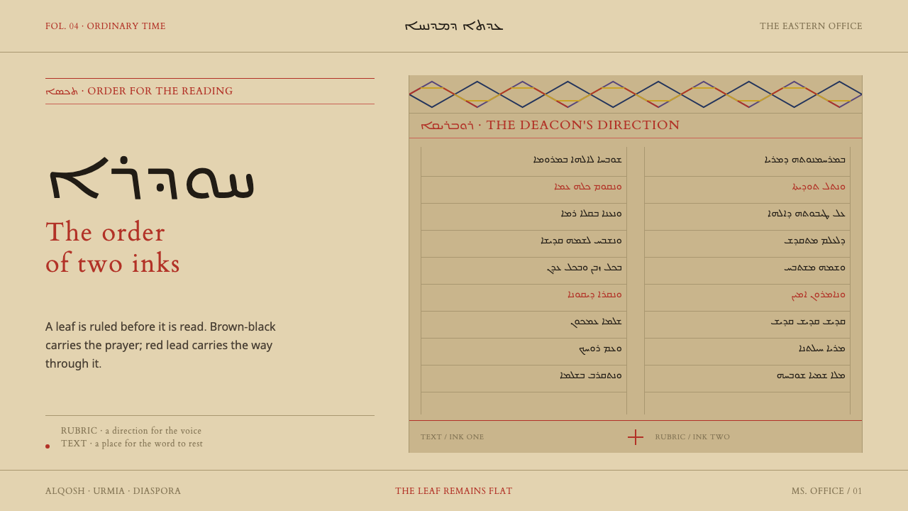
Church of the East Liturgy treats the page as a service book: brown-black Syriac in ruled columns, red rubrics that say what to do next, and a plain cross at the close.
Church of the East Liturgy in brief
Church of the East Liturgy is a design style drawn from the service books of the Church of the East, above all the Ḥudra and the Taksa. These books are written in Syriac, in ruled columns, on buff rag paper. The whole visual system rests on two inks: a dark brown-black for the text itself, and a lead red for headings, incipits and the directions that tell a deacon what to do next.
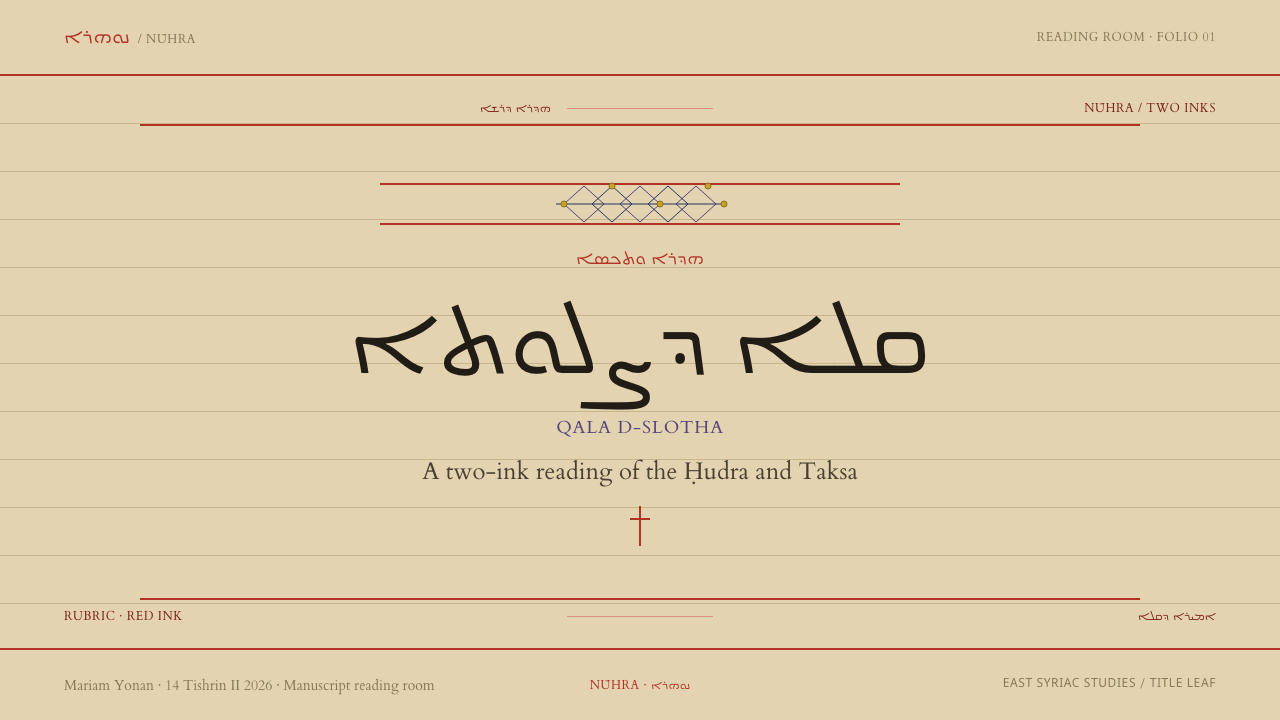
Nothing is boxed. Sections are cut apart by a red rule, not by a frame, and where a section opens, a headpiece of drawn interlace carries purple, navy, yellow and red as line, never as fill. Where a section closes, the plain cross of the Church of the East stands alone, with no corpus and no figures. The page is ink on a flat leaf, and the design keeps it that way.
This is a style about structure as a second voice. The text is the first voice, and the red layer is the second, speaking to the reader about how the text is to be used. For a designer it offers an unusual model: a long-reading page with a built-in instruction layer, strict, calm and almost entirely typographic.
Where does Church of the East Liturgy come from?
The books belong to the East Syriac Rite and to a late-antique Syriac manuscript tradition that reaches into the present: the Ḥudra, as the source notes, is still in daily use. The geographic range is Mesopotamia, Iraq, north-western Iran around Urmia, and the Syriac diaspora. The core of the style is therefore not an archaeological reconstruction but a living liturgical page, made to be read aloud and followed.
Copying was done in scriptoria, and the source names two in particular: Alqosh and Urmia, with copyists working in both between the seventeenth and twentieth centuries. Syriac palaeography, the study of the handwriting, recognises different hands, and the source lists Estrangela and Madnhaya. Each has its own proportions and rhythm, but the design takes the page, not any single hand, as its model: ruled columns, even ink and generous order.
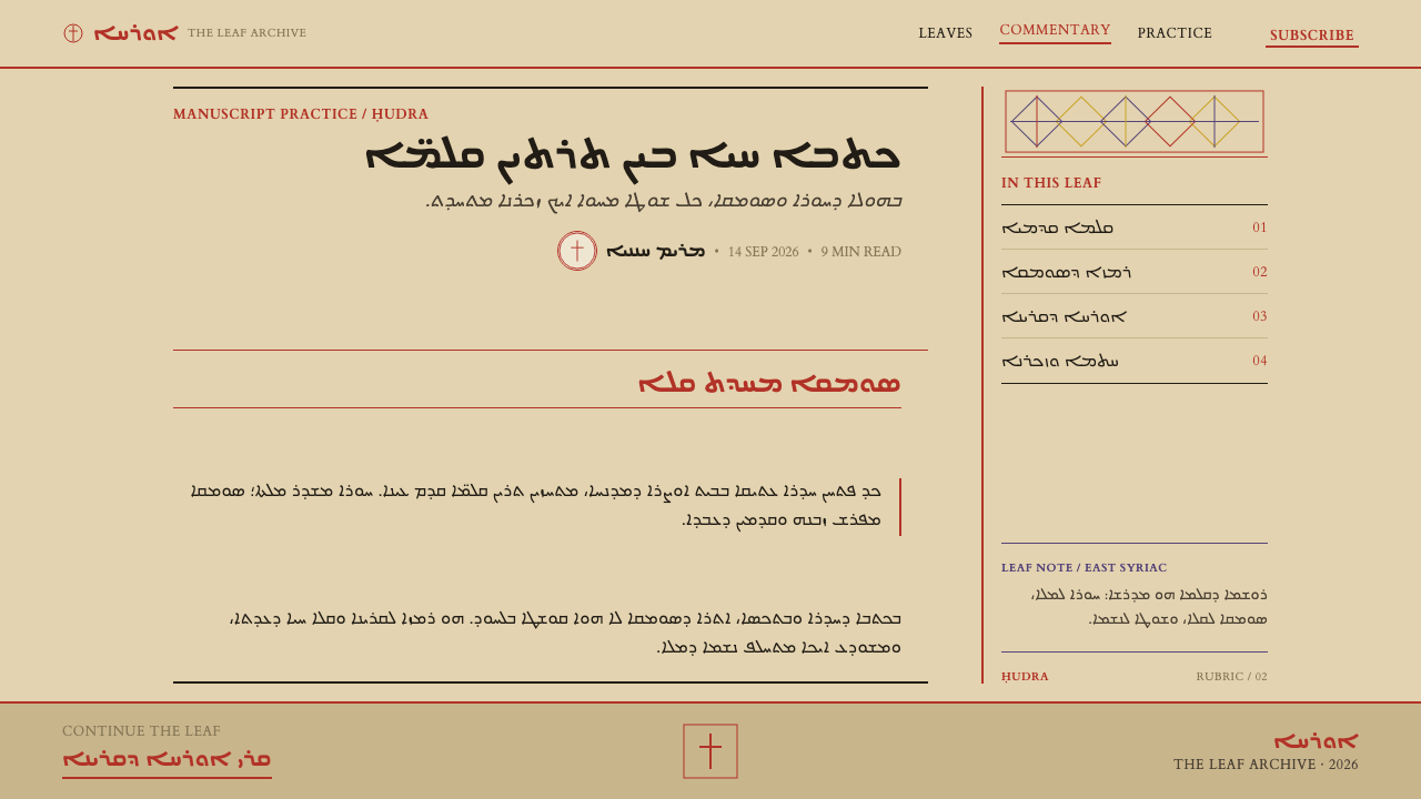
The restraint of the palette is structural. Two inks, a brown-black and a red, are enough to separate content from instruction, the text from the directions that govern it. The word rubric, from the Latin for red, names this convention in many liturgical traditions, and the practice of writing directions in red is precisely what this style preserves. Headpieces, which mark where a section begins, are the only place where purple, navy and yellow join the red, and they do so as drawn line.
Modern institutions preserve and document this tradition. The source names the Hill Museum & Manuscript Library (HMML) and the Beinecke Rare Book & Manuscript Library among them, and it is largely through such collections that these pages reach scholars and designers today. The style stays close to the manuscript original: a page is a written leaf, not a stack of cards or an app screen.
What defines the Church of the East Liturgy look?
Two-Ink Colour
A dark brown-black carries the text, and a lead red carries everything that is not the text itself: headings, incipits and directions. That is the entire colour logic. Other hues appear only in headpieces, as drawn line. Because red is never used for decoration, its appearance always signals that a line is a heading or an instruction.
Buff Leaf
The ground is a flat, warm buff, the colour of rag paper. It is a single sheet with nothing laid over it: no simulated fibre, no stains, no page curl, no shadow. The leaf is the container, so cards and panels would be redundant.
Ruled Columns
Text is set in columns laid out on ruling, the lines drawn on the sheet before any writing begins. The structure comes first and the words fill it. In a layout, this means a firm column structure with regular line spacing, and text that sits on its lines rather than floating in space.
Red Rubric Layer
Headings, incipits (the opening words of a section) and the directions to a deacon are written in red. This forms a second reading layer: you can skim the red to learn the structure and the next action, then read the brown-black for the content. Keep the two layers disciplined, and never use red for emphasis within the text.
Rule, Not Box
Sections are separated by a single red rule. There are no boxes, no cards, no panels, and no shadows. A section is cut from the next the way a scribe would, with a line across the column. This is the strongest instruction of the style: it is a page, not a stack of containers.
Interlace Headpiece
Where a section opens, a headpiece of drawn interlace carries purple, navy, yellow and red as line, never as fill. It is a banded strip of woven line work, not an illustration. Used only at openings, and sparingly, it marks the beginning of a major division and gives the page its one decorative moment.
Plain Cross
Where a section closes, the plain cross of the Church of the East stands alone: no corpus, no figures. It is a terminal mark, set on its own line, and it ends the section the way a full stop ends a sentence. Treat it as a sign of closure rather than an icon to scatter.
Who shaped Church of the East Liturgy?
The scribes of the Alqosh scriptorium, one of the two named centres of copying in the source, active between the seventeenth and twentieth centuries. Their books established the combination that this style takes as its core: ruled columns of Syriac in a dark brown-black ink, with red reserved for headings and directions.
The scribes of the Urmia scriptorium in north-western Iran, the second named centre, also working between the seventeenth and twentieth centuries. Alongside Alqosh they show that the system was a shared practice across a region, with the same two-ink discipline and the same page order, not the invention of a single workshop.
One of the institutions named in the source in connection with the preservation of Syriac manuscripts. Libraries of this kind are how most designers encounter these pages today. For the style they are a reminder that the references are real, documented objects, and that accuracy to the leaf is part of respecting the tradition.
The second institution named in the source in this connection. Collections like Beinecke's hold manuscript leaves whose layout, ruling and rubrication can be studied directly. They give a designer the means to check a layout against a real page: how wide the margins sit, how the red enters, how a section ends.
How do you use Church of the East Liturgy today?
Church of the East Liturgy is a style for projects built around reading and procedure. It suits documentation, handbooks, recipes and rituals, legal and policy texts, devotional and cultural publications, long-form essays, and any product where text is the main content and a second layer of instruction runs alongside it. It is a poor fit for glossy, card-based, image-led products.
In presentation slides, a cover can be a single buff leaf with a short title in the dark brown-black, a red rule beneath it and, if a flourish is wanted, one interlace headpiece across the top. Content slides work as ruled pages: a column of text, a red heading, a red rule between sections and nothing boxed. Data slides suit tables and lists best, set on rules instead of gridlines, with red marking the row or column heading and the instructions for reading it.
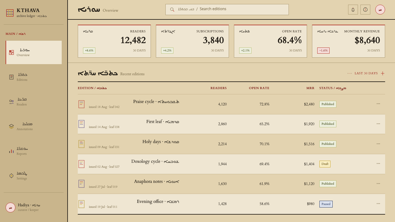
For web interfaces, the style fits documentation sites, knowledge bases, reading apps and onboarding guides. Use a buff ground, a dark brown-black for body text and a red for headings, step labels and warnings, so that red always means this is an instruction. Replace cards with sections divided by rules. Buttons can be simple text links in red or plain bordered lines. Pricing and settings pages work as ruled lists with red headings, which keeps them calm and scannable.
For editorial and marketing work, the style supports books, essays, catalogues, event programmes and cultural identities that want gravity without ornament. Place red rubrics for section titles, standfirsts and reading instructions, and leave a single headpiece for the start of a major part. If you set Syriac text, remember that it runs right to left, and give the columns the generous margins and even colour of a written page.
A common mistake is to treat the red as a decorative accent, using it for emphasis within running text, for buttons or for backgrounds, which erases its role as the instruction layer. A second mistake is to fill the headpiece with solid colour, or to put it in a box, which breaks the rule that colour appears only as line. A third is to add the cross as a decorative icon in contexts where it does not close a section, or to add figures to it, when the tradition's cross is plain.
Church of the East Liturgy — FAQ
What are the Ḥudra and the Taksa?
They are service books of the Church of the East, written in Syriac, in ruled columns, on buff rag paper. According to the source, the Ḥudra is still in daily use. The design style takes their page layout and their two-ink system, dark brown-black for text and lead red for headings, incipits and directions, as its model.
Do I need Syriac text to use the style?
No. The style is about page structure and two-ink discipline, so it works with Latin, Chinese or any other script. If you do set Syriac, remember that it runs right to left and that the columns, margins and ruling should stay generous. For other scripts, keep line lengths comfortable and the colour of the text even, as in a written page.
Why is red used only for headings and directions?
Because red is the instruction layer. In the manuscripts, red marks everything that tells the reader how the text is used, such as headings, incipits and the directions to the deacon, while the brown-black ink carries the text. If red also appears as decoration or emphasis, it can no longer be relied on to mean an instruction, and the second voice of the page is lost.
Is it appropriate to use the cross outside religious contexts?
Use it with care. In the tradition the plain cross is a sign of closure at the end of a section, and it carries real religious meaning for living communities. In a secular design the same function can often be served by a simple terminal mark or a short red rule. If you do use the cross, keep it plain, use it only where something closes, and be clear about the source.
Can the style work as a dark theme?
The system is built on buff paper with dark ink, so light is its natural state, and dark would reverse the relationship between the leaf and the ink. If you must make a dark version, keep the two-layer logic: a single warm light tone for text, a red for headings and directions only, and no boxes. Check the red for contrast, since it will behave differently against a dark ground.
Related design styles
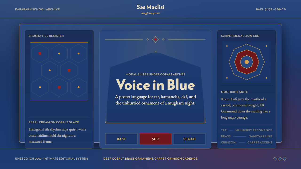 Azerbaijani Mugham Saz BlueMugham night, deeply tiled. Cobalt ground, brass hairlines, arched editorial…
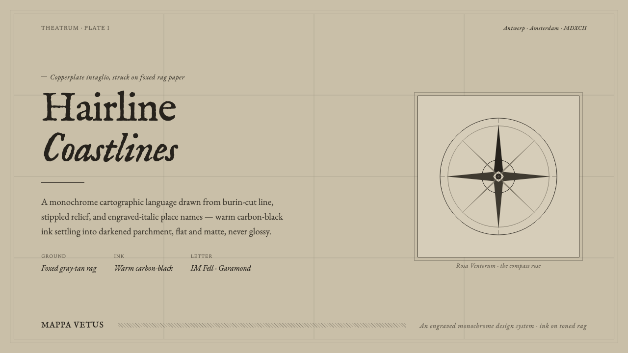 Engraved Monochrome MapThe gravity of an old printed sheet. Warm carbon-black ink on foxed rag paper…
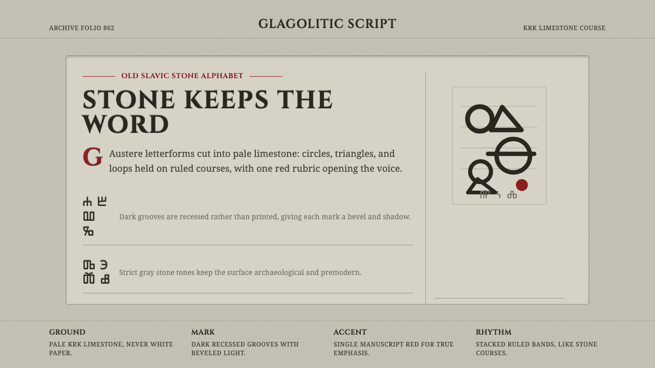 Glagolitic ScriptCarved faith in limestone. Cinzel capitals and red rubrics sit in shadowed gr…
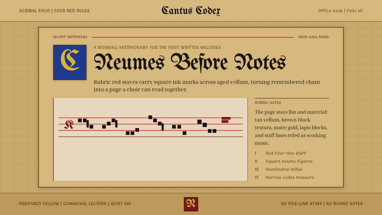 Gregorian Chant NeumesNotation becomes scripture. Rubric red staff lines and square neumes sit on t…
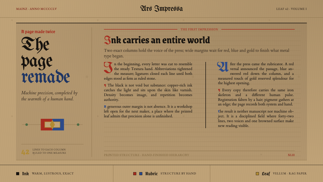 Gutenberg 42-Line BiblePrecision awaits the hand. Dense black columns open into red, blue and gold o…
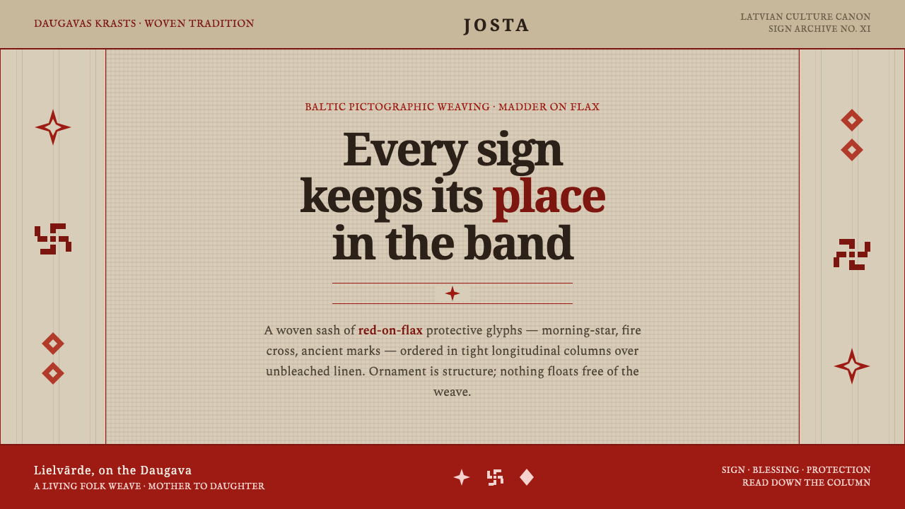 Latvian Lielvārde BeltOrnament is structure. Madder-red Baltic glyphs in tight longitudinal bands o…