What is Engraved Monochrome Map?
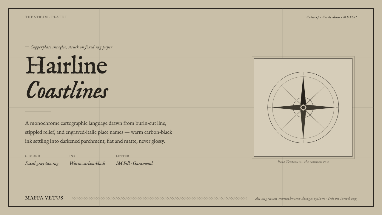
Engraved Monochrome Map brings the gravity of an old printed sheet to the screen: warm carbon-black ink, foxed rag paper, and coastlines cut as finely as a burin allows.
Engraved Monochrome Map in brief
Engraved monochrome cartography grows from copperplate intaglio map printing. A burin-cut plate carries coastlines, terrain, borders, lettering, and minute directional marks; ink is pressed from those incised marks onto rag paper. The resulting image is not simply black and beige. It is a record of pressure, restraint, and accumulated observation, where a line can describe both a shoreline and the hand discipline needed to make it.
Its visual referent is the authentic aged map sheet: paper toned toward warm gray-tan, subtly foxed by time, and bounded by the quiet evidence of a pressed plate mark. Hairline coastlines travel across the field, hills emerge through hachure, and relief is built from stipple rather than pictorial shading. Engraved italic place names sit within the land rather than floating above it, making typography part of the geography.
As a contemporary design system, Engraved Monochrome Map translates the intaglio tradition without pretending that a screen is paper. It uses an honest darkened-parchment ground, a restrained ink-on-paper monochrome relationship, fine rules, stipple texture, and engraved-letter typography. The effect should remain flat and matte, never glossy or theatrically antique. Its authority comes from the disciplined economy of the burin.
Where does Engraved Monochrome Map come from?
The tradition belongs to the long pre-1900 history of Western European mapmaking, spanning the sixteenth through nineteenth centuries. Its geographic centers include Antwerp, Amsterdam, Paris, London, and Nuremberg: cities named in the source tradition as part of the map trade and engraving world. Across this period, the printed map became an object whose geographic information and material finish were inseparable.
Copperplate intaglio engraving was dominant from the 1500s. Its method explains the style's defining marks: delicate engraved contour, compact lettering, and terrain rendered through repeated cuts, stipple, and hachure. The plate does not ask for broad painterly gesture. It rewards controlled incision, so visual density arises from many precise marks held in relation to one another.
Dutch golden-age cartography is one of the named currents within this history, alongside the English and French map trade. Gerardus Mercator, Abraham Ortelius, Willem Blaeu, and Jodocus Hondius are the key figures identified by the source material. Their presence anchors the system in a cartographic culture rather than in a generic idea of vintage decoration.
From the 1820s, steel-plate engraving joined the history named here. The material transition matters less to the screen translation than the continuity it preserves: engraved maps remain a language of line, pressure, paper, and monochrome ink. Engraved Monochrome Map draws from that continuity, selecting the tactile logic of the printed sheet rather than reproducing every historical artifact around it.
What defines the Engraved Monochrome Map look?
Ground and Paper
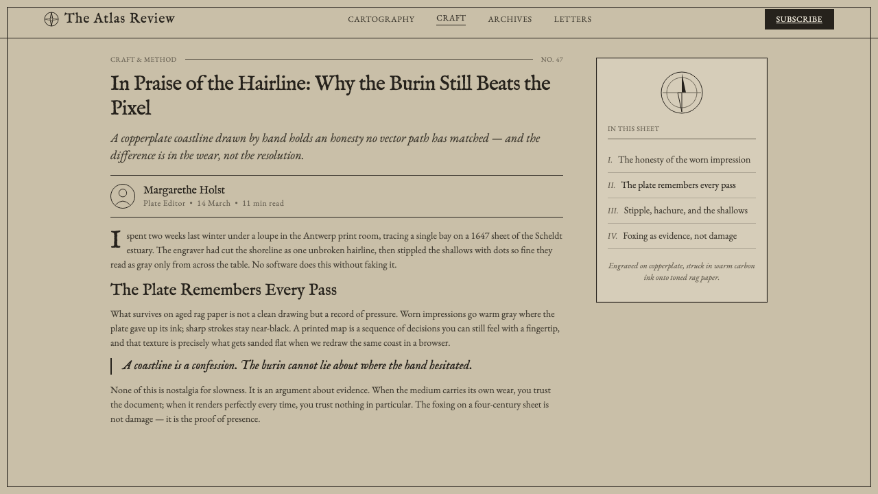
The background should feel like darkened parchment or aged rag paper: warm, quiet, and lightly weathered rather than cleanly neutral. Foxing is an atmospheric trace, not a pattern to be scattered for decoration. The ground supports the ink and lets the page feel handled by time.
Ink Monochrome
Warm carbon-black is the governing voice. Contrast comes from the amount, closeness, and interruption of ink marks, not from a decorative palette. The near-monochrome system gives every rule, label, and contour a shared material origin.
Linework
Coastlines and rules are hairline, deliberate, and unshowy. They should read as incised information rather than interface chrome. Fine lines gain force through continuity and placement; thickening them for emphasis breaks the engraved premise.
Relief and Terrain
Stippled relief and hachured hills create terrain through repetition. They imply elevation and contour without soft atmospheric modeling. Density can change, but the marks remain visible as marks, preserving the sense that geography has been patiently engraved.
Typography
Engraved italic place names belong inside the mapped field. The type should feel cut, printed, and geographically placed, never like a detached digital overlay. Italic movement gives names a navigational flow while the restraint of the system keeps them legible.
Matte Restraint
Everything remains flat and matte. No gloss, luminous sheen, or simulated metallic richness should interrupt the paper-and-ink relationship. The style earns depth through plate-mark suggestion, texture, and engraved accumulation, not through reflective effects.
Who shaped Engraved Monochrome Map?
Mercator is named among the key figures of the Western European cartographic tradition behind this system. His inclusion locates Engraved Monochrome Map within mapmaking history, not merely within antique surface styling.
Ortelius is identified as a key figure in the source tradition. Within this design language, that association reinforces the map sheet as an authored information object, where naming, linework, and printed material belong together.
Blaeu appears among the key figures connected to the tradition. His presence connects the visual system to the Dutch golden-age cartographic current named in the source material.
Hondius is likewise named as a key figure. He represents the same historical field in which engraving, map trade, and the printed sheet formed a unified visual culture.
How do you use Engraved Monochrome Map today?
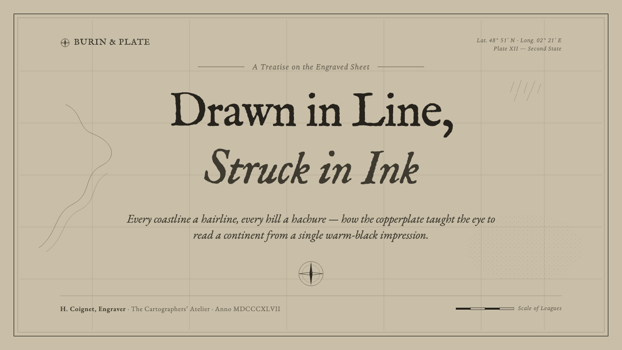
For presentation covers, treat the page as a sheet of territory rather than a billboard. Let a restrained field of parchment carry a title that feels engraved into the map, with a fine border or plate-mark suggestion establishing the perimeter. A small coastline fragment, hachured hill, or sparse directional rule can create orientation without turning the cover into an illustrated scene.
Content slides should privilege reading order and marginal evidence. Use hairline divisions to separate title, text, annotation, and source-like notes, allowing generous quiet ground around each block. A place-name treatment can frame sections or categories, but body copy should remain more functional than theatrical. The map language works when it organizes information as carefully as it evokes history.
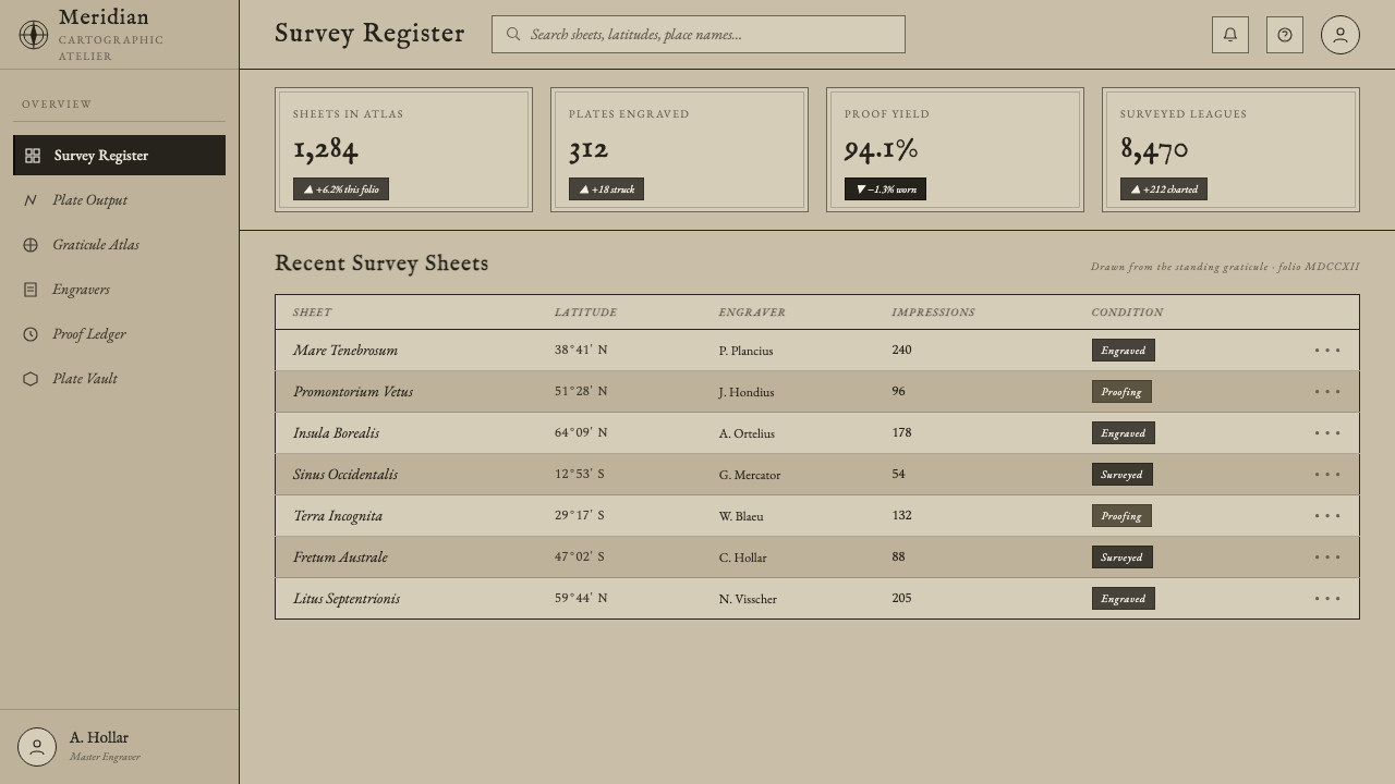
For data slides, translate chart structure into cartographic marks. Fine axes, stippled areas, restrained contour-like bands, and monochrome differentiation can make information feel measured rather than decorated. The goal is not to disguise data as a literal map. It is to borrow the engraved sheet's calm hierarchy, where density and placement communicate before embellishment does.
In web interfaces, this style is strongest in research dashboards, collections, archives, editorial tools, and pricing or comparison pages that benefit from seriousness and traceable structure. Use the parchment field as a stable ground, reserve the darkest ink for core reading and action, and let rules, labels, and grouped panels behave like mapped boundaries. Interactive elements should feel printed and bounded, never glassy or floating.
For editorial and marketing work, the system supports essays, catalogues, cultural programming, and products that need historical depth without nostalgia theater. A common mistake is adding every available antique cue at once: heavy stains, ornamental frames, faux tears, elaborate compasses, and aggressive texture. That turns a precise print tradition into costume. Keep the strongest signals to paper, ink, engraved line, and type; let absence preserve credibility.
Engraved Monochrome Map — FAQ
Is Engraved Monochrome Map simply a vintage map style?
No. Its source is specifically copperplate intaglio cartography and the aged printed sheet. Vintage atmosphere may result from foxed paper and engraved marks, but the system is defined by a material logic: incised line, pressed ink, rag-paper ground, stippled relief, hachure, and engraved lettering. Generic antique decoration does not carry that logic.
Why must the palette remain so restrained?
The style is built around an ink-on-paper relationship. Warm carbon-black ink is not merely a color choice; it is the shared medium that makes coastlines, rules, relief, and names belong to one printed sheet. Introducing a decorative palette weakens the sense of pressure and material continuity that defines engraved monochrome work.
Can this style use texture without becoming visually noisy?
Yes, when texture behaves like evidence of printing rather than a surface effect. Foxing should be quiet, stipple should describe relief, and a plate-mark suggestion should establish the sheet's edge. Texture becomes noisy when it is evenly applied everywhere or competes with text and linework for attention.
Where does the style struggle?
It struggles when a product needs gloss, speed, exuberant color, or overtly contemporary visual spectacle. The system asks viewers to attend to close marks, paper-like quiet, and measured hierarchy. It is better suited to archival, educational, research, editorial, and collection-oriented contexts than to experiences whose central promise is brightness, novelty, or visual excess.
Related design styles
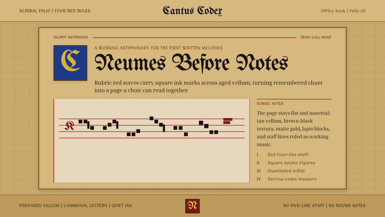 Gregorian Chant NeumesNotation becomes scripture. Rubric red staff lines and square neumes sit on t…
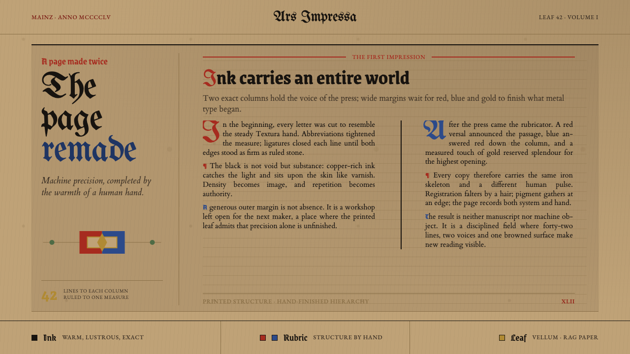 Gutenberg 42-Line BiblePrecision awaits the hand. Dense black columns open into red, blue and gold o…
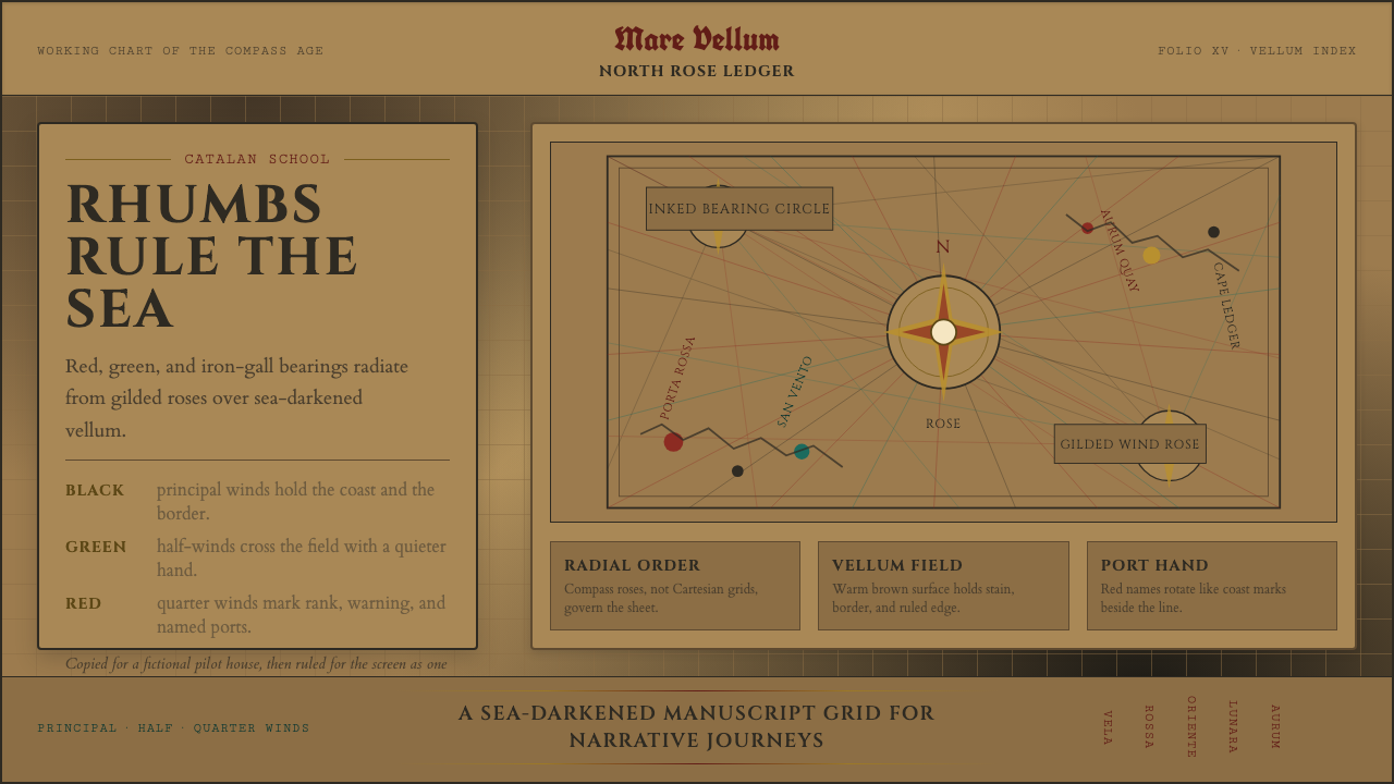 Portolan Rhumb ChartNavigation feels ceremonial. Rhumb lines cross dark vellum with red ink and g…
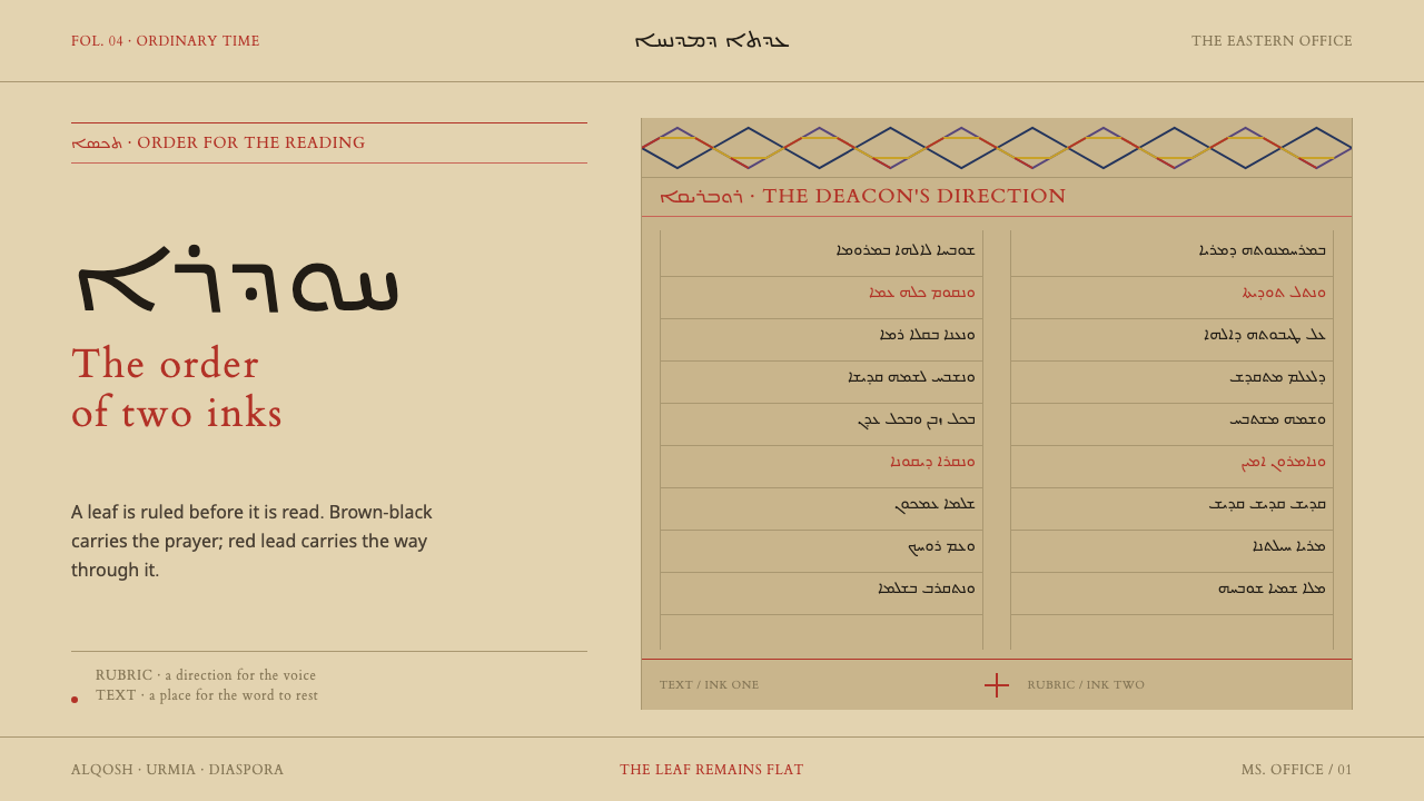 Church of the East LiturgyStructure is a second voice. Red rubrics cut brown-black Syriac across ruled…
 Delft BlauwBrushwork remembers. Lavender cobalt washes follow blue-black lines across mi…
 Fern CyanotypeStillness turns scientific. Prussian blue field, white photograms, Victorian…