What is Glagolitic Script?
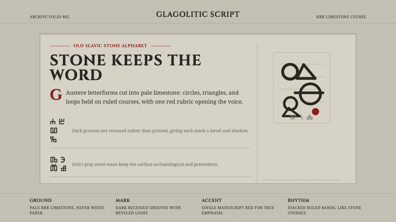
Glagolitic turns a webpage into carved stone — a faithful gray-white ground incised with dark grooves and a single rubric red, the oldest Slavic alphabet reborn as a design system.
Glagolitic Script in brief
Glagolitic is a design system built from the visual memory of stone inscription rather than printed ink. It takes its name and letterforms from glagoljica, the earliest Slavic alphabet, and its material logic from the carved Croatian monuments that preserved that alphabet for a thousand years. Where most historical styles reference a school or a decade, this one references a physical surface: pale limestone, cut by hand, lit from the side so every incision throws a small shadow.
The premise is that a letter carved into rock behaves differently from a letter printed on paper. Ink sits on top of a page and is fundamentally flat; a chisel removes material and leaves a groove with depth, a bevel, and a shadow that shifts with the light. A system built on this premise treats every letterform and divider as if it had been cut rather than drawn — recessed into the ground plane instead of floating on it.
Visually this produces something austere, quiet, and unmistakably pre-modern. The palette almost never leaves a narrow band of limestone gray and bone white. Where color appears, it is a single rubric red — the red a medieval scribe used to mark a chapter opening or a saint's name — spent carefully, the way a mason would not waste a rare pigment on a wall that faces the weather.
Where does Glagolitic Script come from?
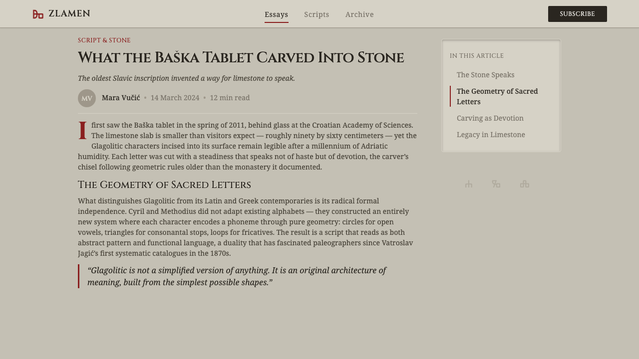
Glagolitic (glagoljica, from the Old Church Slavonic glagolŭ, meaning 'word' or 'utterance') is the oldest attested Slavic alphabet, traditionally credited to the Byzantine missionary brothers Saints Cyril and Methodius around 862–863. The two were dispatched from Constantinople to Great Moravia at the request of a Slavic prince who wanted liturgy conducted in a language his people could understand rather than in Latin or Greek. Cyril is thought to have devised the alphabet for this mission, building it from an idiosyncratic vocabulary of circles, triangles, and looping strokes that resembles no other script in circulation at the time — not Greek, not Latin, not Hebrew, though scholars have traced influences from several of these.
The alphabet's early history is one of retreat and displacement. After Methodius's death in 885, his disciples were expelled from Great Moravia and scattered into the Balkans, where Glagolitic took root most durably along the Adriatic coast — above all in Croatia. Over the following centuries a rival, structurally simpler alphabet based more directly on Greek majuscules — what became Cyrillic — displaced Glagolitic across most of the Slavic world. Croatia became the exception: a place where Glagolitic survived not as a curiosity but as a living liturgical and administrative script, used continuously by Croatian clergy for local, Roman-rite Catholic worship conducted in Old Church Slavonic, a privilege granted nowhere else in the Latin church.
The alphabet's defining physical monument is the Baška tablet (Bašćanska ploča), carved around the year 1100 and discovered in the small church of St. Lucy on the Croatian island of Krk. Cut into a slab of the island's pale local limestone, the inscription records a land donation by the Croatian king Zvonimir to a Benedictine abbey — making it not only a linguistic landmark but one of the earliest surviving documents naming a Croatian king on Croatian soil. Its rounded, angular letterforms are incised rather than painted, worn smooth at the edges by nine centuries of handling, and remain the reference point against which every later reconstruction of the alphabet's monumental form is measured.
Glagolitic script continued in active liturgical use in parts of Croatia — particularly on the Kvarner islands and in Istria — well into the twentieth century, making it one of the longest-lived writing systems in continuous, if narrowing, use anywhere in Europe. Today it survives mainly as a symbol of Croatian cultural and religious identity: reproduced on monuments, taught in local schools, and stamped onto tourist souvenirs, but no longer a script anyone reads fluently outside a small circle of scholars and clergy.
What defines the Glagolitic Script look?
Color
The palette lives almost entirely within a limestone grayscale — pale bone whites, warm mid grays, and darker shadow grays that read as the natural variation of quarried stone rather than a designed gradient. Against this neutral field sits one departure: a single rubric red, drawn from the practice of medieval scribes who used red ink sparingly to mark a chapter heading or a saint's name. That red is never decorative filler; it appears only where a scribe would have reached for red, and everywhere else the palette stays resolutely achromatic.
Incision and Depth
Every letterform and dividing rule reads as cut into the ground rather than printed on it. This is achieved through consistent bevel and shadow logic: an incised edge catches light on one side and falls into shadow on the other, exactly as a chisel stroke would under raking light. The effect is never a generic drop shadow — it follows a single, disciplined light direction across the entire composition, so headings, rules, and marks all appear carved by the same hand under the same sun. Flat, un-shadowed elements are reserved for passages that should read as background stone.
Letterform Geometry
Glagolitic letterforms are built from a small, idiosyncratic vocabulary of rounded loops, closed circles, and angular triangular strokes — a geometry unlike the straight-stemmed clarity of Latin capitals or the flowing curves of Cyrillic. A system built on this alphabet borrows that rounded-and-angular sensibility into its supporting display type and ornamental marks: circular bosses, looping flourishes at section breaks, and triangular pointer marks that echo the original script even where running text is set in a legible Latin face for a modern reader.
Ruled Composition
Nothing sits loose on the page. Every block of text, image, and divider is aligned to an implied set of inscription lines, the way a medieval stonecutter would score guide lines into a slab before committing to a single cut. This produces a composition that feels ruled and deliberate — closer to an epitaph or foundation stone than a modern brochure. Margins tend to be generous and consistent, echoing the worn border of a stone tablet rather than the tight margins of a printed page.
Surface and Texture
The ground plane behaves like real limestone rather than a flat digital background: subtle variation in tone across a large surface, a faint suggestion of grain, and edges that feel quarried rather than cut with a vector tool. This texture is always restrained — enough to read as stone under close inspection, never so aggressive that it competes with the incised content sitting on top of it.
Restraint and Devotion
The overall mood is austere and unhurried, closer to the atmosphere of a scriptorium or a chapel wall than to any commercial visual language. There is no ornament for ornament's sake — every loop, bevel, and mark either carries content or reinforces the stone-inscription premise. This restraint separates an authentic use of the system from a superficial one: a page that simply adds a gray background and a red accent has borrowed the palette without the discipline of treating every mark as a considered, permanent cut.
Who shaped Glagolitic Script?
Cyril (born Constantine, c. 826–869) is traditionally credited as the principal inventor of the Glagolitic alphabet, devised around 862–863 for the mission to Great Moravia. A Byzantine scholar and diplomat fluent in Slavic dialects, he is thought to have built the alphabet's unusual circle-and-triangle vocabulary specifically so it could render Slavic phonemes that neither Greek nor Latin script could express cleanly. His work made vernacular liturgy possible for Slavic-speaking Christians for the first time, a decision with lasting religious and political consequences across Eastern Europe.
Methodius (c. 815–885), Cyril's older brother and fellow missionary, continued and defended the Glagolitic liturgy after Cyril's death in 869, translating scripture into Old Church Slavonic and training a generation of disciples in Great Moravia. His death triggered the expulsion of those disciples from Moravia, which — paradoxically — is what pushed Glagolitic literacy south into the Balkans and secured its long survival in Croatia rather than its extinction alongside the mission that created it.
Dmitar Zvonimir, King of Croatia (reigned 1075–1089), is named in the inscription on the Baška tablet as the donor of land to a Benedictine abbey on the island of Krk. His appearance on the tablet makes it one of the earliest surviving records to name a Croatian king in a document produced on Croatian soil, tying the Glagolitic script directly to Croatian statehood rather than only to ecclesiastical use.
The glagoljaši — generations of anonymous Croatian priests and monks, especially along the Kvarner coast and in Istria — kept Glagolitic script and Old Church Slavonic liturgy alive for nearly a millennium after it had died out almost everywhere else in the Slavic world. Their continuous copying of missals and breviaries, and their special papal dispensation to celebrate the Roman rite in Old Church Slavonic rather than Latin, is the single reason Glagolitic survived as a living script into the modern era rather than becoming a purely archaeological curiosity.
How do you use Glagolitic Script today?
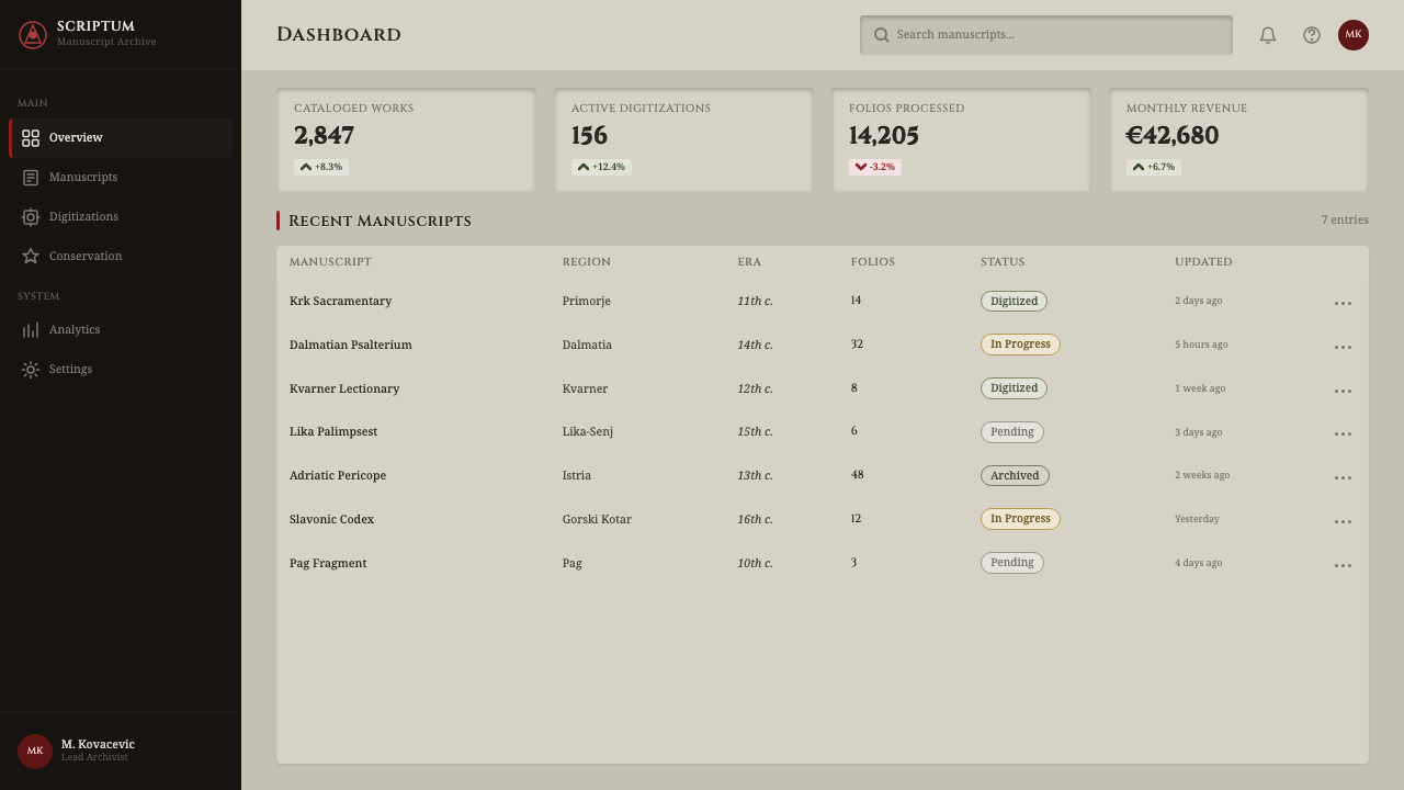
Glagolitic is a striking but demanding style to apply, because its entire credibility rests on the incision illusion — the sense that every mark was cut, not printed. Applying it well means committing to that premise everywhere at once: a single consistent light direction, a genuinely restrained rubric red, and a limestone surface that reads as material rather than a flat gray background color.
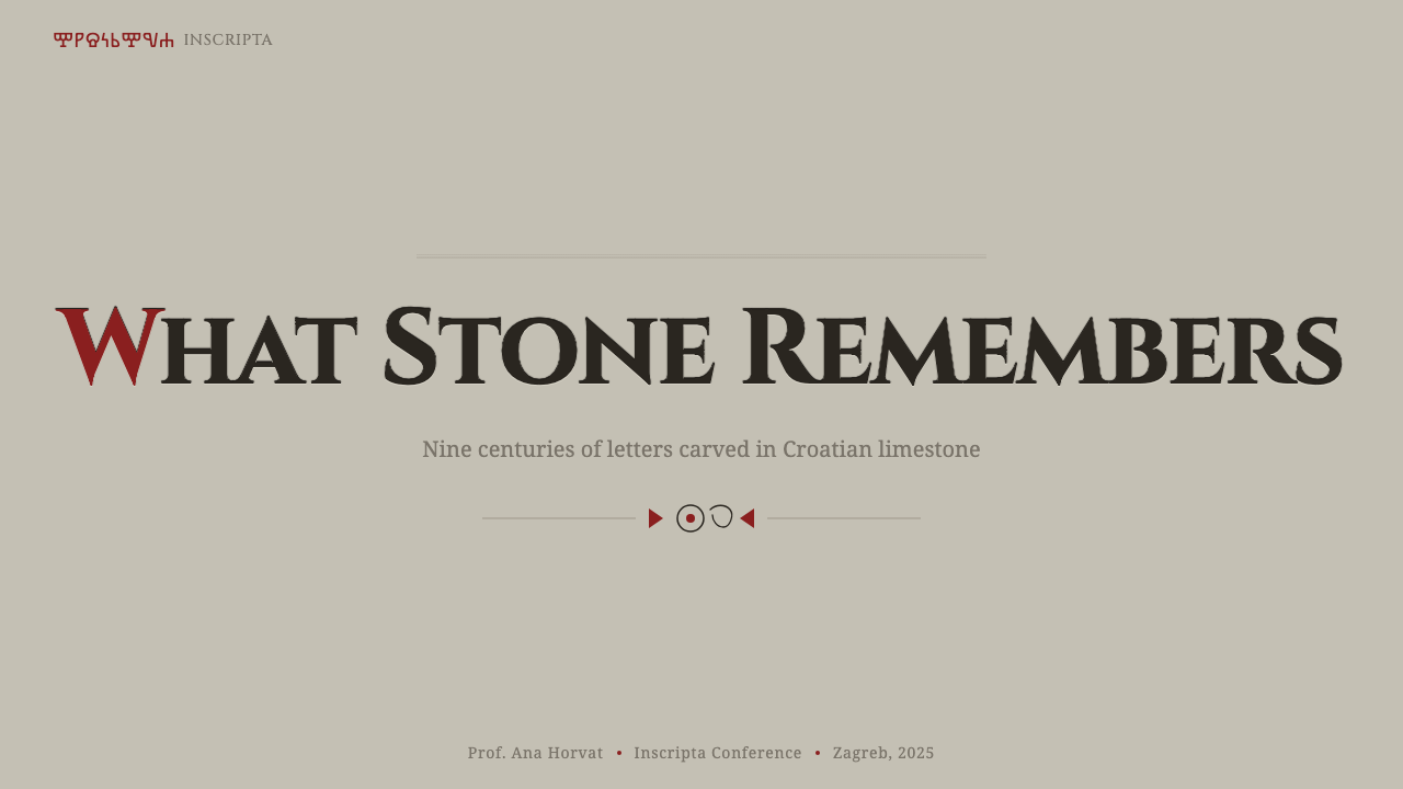
For presentation slides, the style works best on cover pages and section dividers rather than dense content slides. A cover benefits from a large incised title treatment — bold letterforms bevelled into a stone-toned field, with the rubric red reserved for a single word, a date, or a small mark of emphasis. Content and data slides need a lighter touch: keep body text plain and legible, use the incised treatment only for the single most important heading or number, and let charts sit on an unadorned pale ground rather than carving every bar and label — a whole slide of carved numerals quickly reads as noise rather than austere elegance.
For web interfaces such as dashboards and pricing pages, Glagolitic asks to be used sparingly and at the edges rather than throughout. A dashboard can carry the incised treatment in its masthead or section headers while keeping data tables and controls in plain, high-legibility type — inscriptions are not meant to be read quickly, and a pricing table set entirely in carved display type will frustrate a user comparing numbers. The rubric red suits a single call-to-action button or a 'recommended plan' marker, precisely because a scribe would have used red the same way: to mark the one thing that matters most on the page.
For editorial and marketing work, the style rewards long-form, contemplative content — heritage brands, cultural institutions, wine and craft goods, travel content set in the Adriatic or the Balkans, anything trading on permanence rather than speed. A marketing page can open with a full-bleed carved headline and settle into plain, generously spaced body text for the reading experience itself, using the rubric red only at section openings the way a manuscript would mark a new chapter.
The most common mistake is over-applying the incision effect until every piece of text looks carved. That defeats the premise: on an actual tablet, only the most important content — a name, a date, a dedication — was worth the labor of cutting, while everything else was left plain or omitted. A page that carves its footer copyright notice with the same weight as its headline has lost the hierarchy of effort that makes the style legible as inscription, and a rubric red used for more than one or two elements per screen stops reading as sacred emphasis and starts reading as a color scheme.
Glagolitic Script — FAQ
Is Glagolitic the same script as Cyrillic?
No, they are two distinct alphabets. Glagolitic came first, devised around 862–863 for the Cyril and Methodius mission, and is built from an unusual vocabulary of circles, triangles, and loops unlike any other script in use at the time. Cyrillic emerged somewhat later, developed by disciples of Cyril and Methodius using Greek majuscule letters as its base, and its structurally simpler, more Greek-derived forms eventually displaced Glagolitic across most of the Slavic world. Croatia is the notable exception where Glagolitic persisted in continuous liturgical use for centuries after Cyrillic had won out elsewhere.
Why does this style use so little color?
Because its reference object — carved stone with occasional manuscript rubrication — simply did not have much color to begin with. A limestone tablet is gray and white by nature; adding pigment to a monumental inscription was rare and expensive, so when color was used at all, it was reserved for something that mattered, following the same logic manuscript scribes used when they reached for red ink only to mark a heading or a saint's name. A design system that added a broad, saturated palette on top of this premise would break the illusion immediately — real inscriptions simply don't look like that, and the restraint is what makes the occasional red feel significant rather than arbitrary.
Can Glagolitic work for a dark-mode interface?
It is possible but changes the underlying metaphor. The canonical version is light-ground, because limestone read in daylight is pale. A dark variant shifts the reference from 'a tablet in daylight' to something closer to 'an inscription read by torchlight or lamplight in a crypt or chapel interior' — still plausible, and arguably atmospheric, but it needs the incision logic to work even harder, since shadows are less visually distinct against a dark ground than against a pale one. The rubric red tends to read as more vivid and more precious against a dark ground, which can work in the style's favor if used with the same restraint as the light version.
What kinds of products or brands does Glagolitic suit?
It suits contexts where permanence, heritage, and cultural specificity are genuine assets: cultural institutions, museums, heritage tourism (especially anything tied to Croatia or the Adriatic), wine and artisanal goods with a story of tradition, religious or academic publishing, and any brand whose value proposition rests on being old and enduring rather than fast and disposable. It struggles where things need to feel immediate or technologically forward — a checkout flow or social app will find the style's deliberate slowness works against the experience rather than for it.
Related design styles
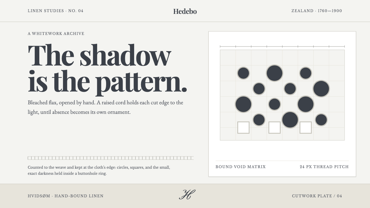 Danish Hedebo CutworkOrnament is cut, not applied. Bleached linen and bound shadow turn voids into…
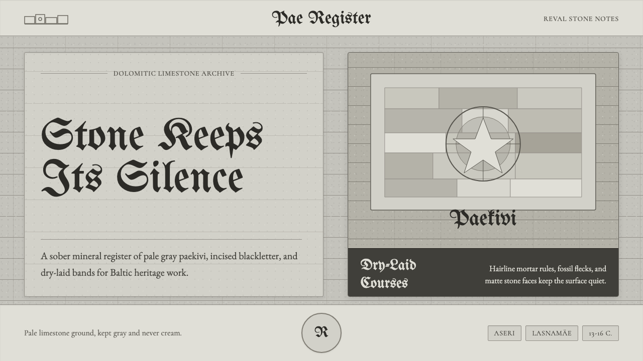 Estonian Limestone GrayStone keeps its silence. Limestone grays, blackletter, and dry-laid bands car…
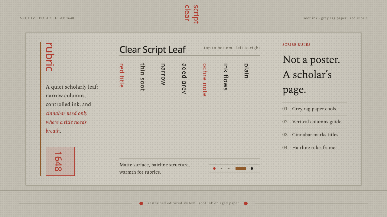 Kalmyk Todo Bichig Clear ScriptRestraint becomes script. Soot columns on grey rag paper, touched by cinnabar…
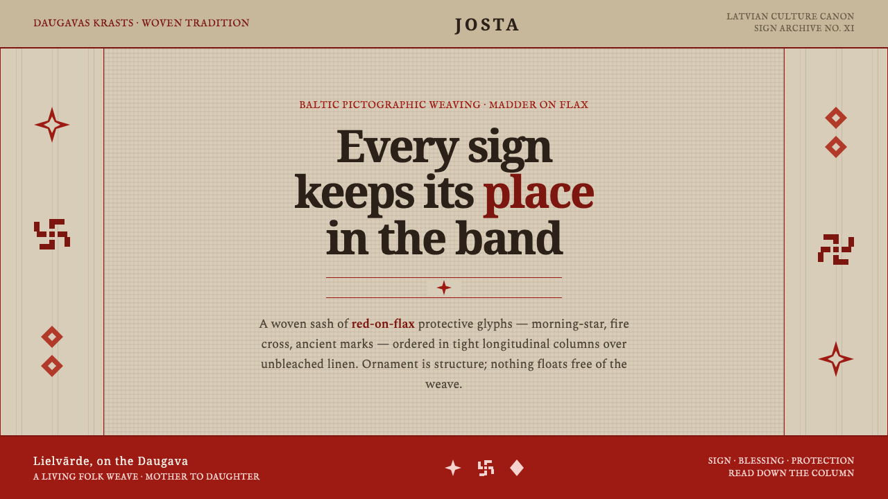 Latvian Lielvārde BeltOrnament is structure. Madder-red Baltic glyphs in tight longitudinal bands o…
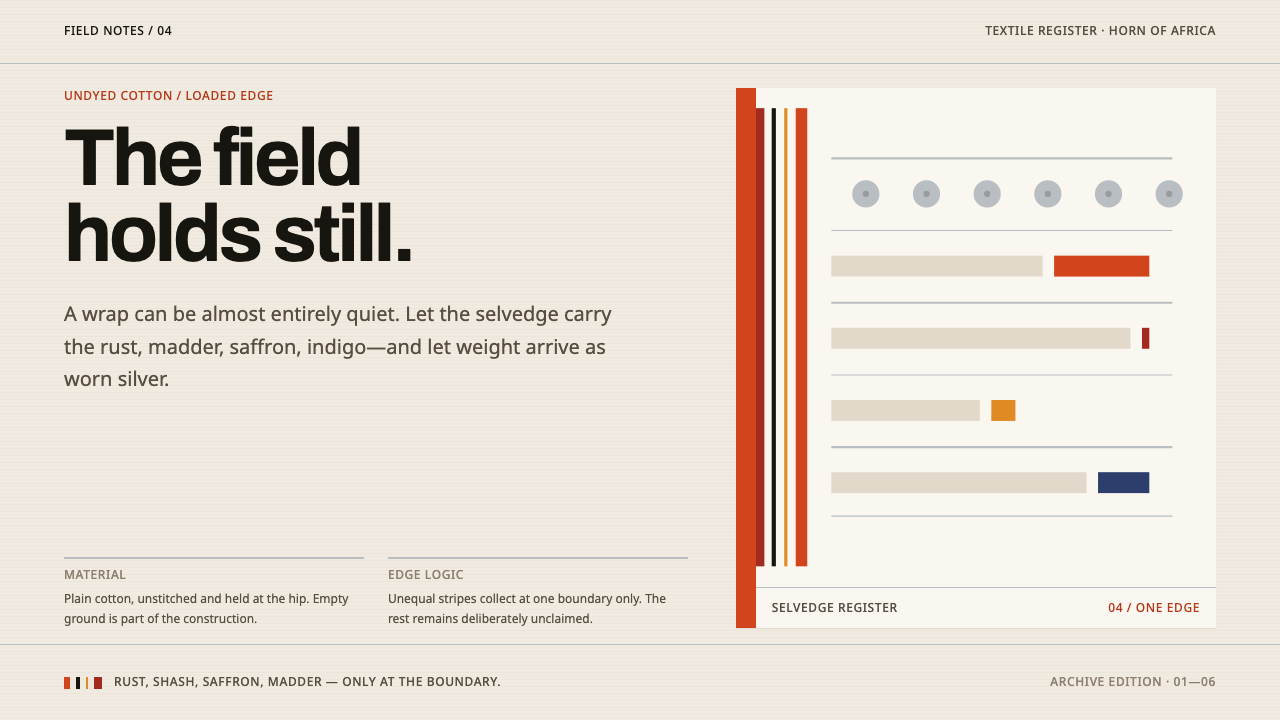 Afar Nomad TextileWeight lives at the edge. Rust and madder selvedges cut across a quiet cotton…
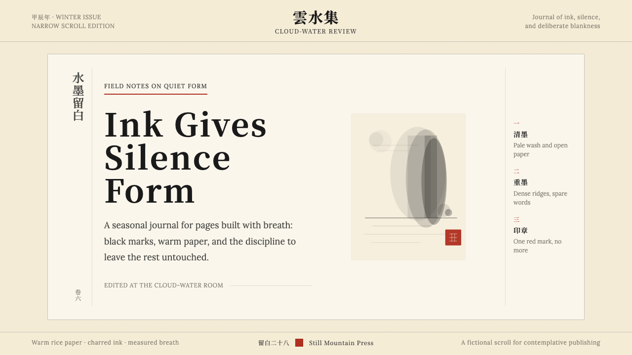 Chinese Ink Wash 水墨A thousand years of restraint. Six tones of ink on rice-paper warmth, a singl…