What is Russian Izba?
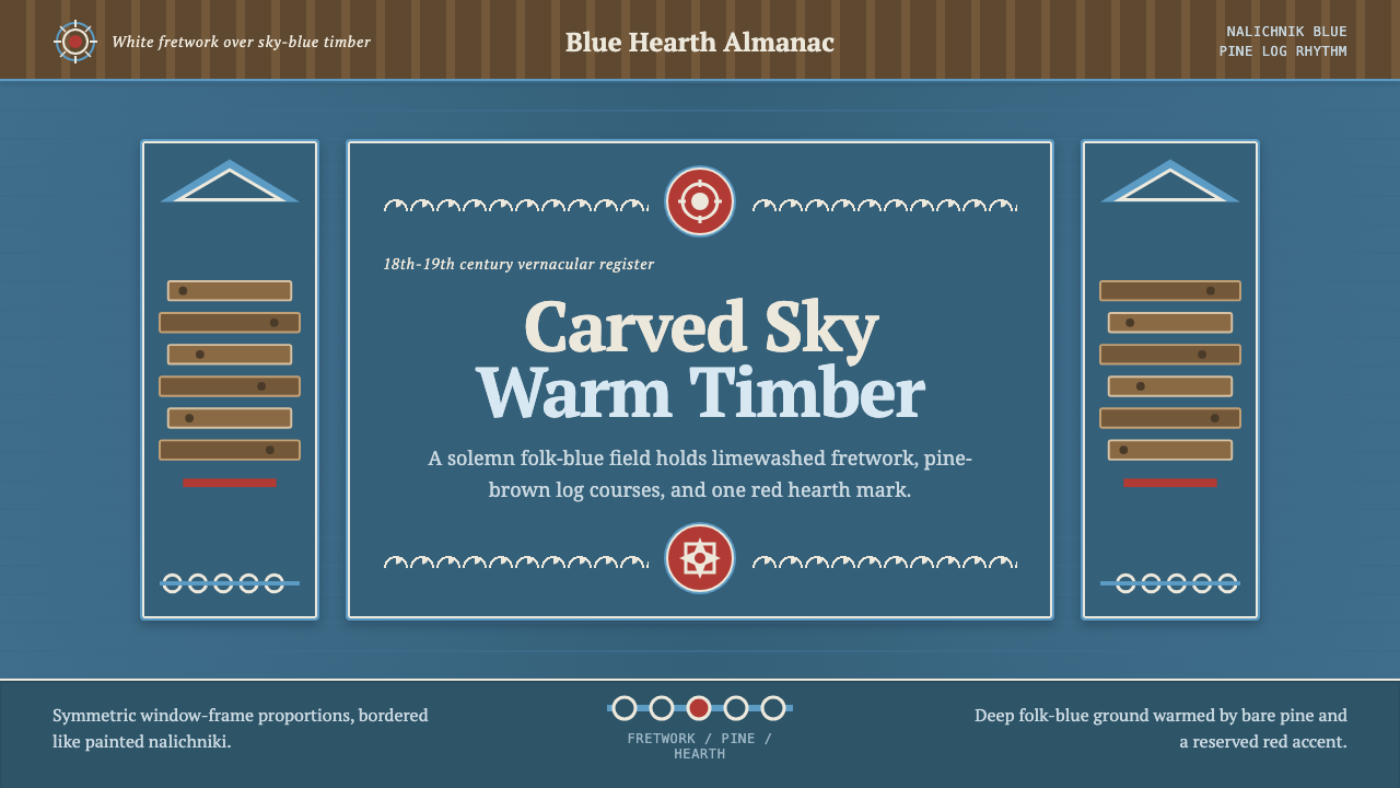
Russian Izba carries the warmth of a log house — white lace-cut fretwork framing deep folk-blue, with the quiet rhythm of bare pine underneath.
Russian Izba in brief
The Russian izba is the traditional log house of the Russian countryside — walls built from stacked, notched timber courses, a great masonry stove occupying much of the interior, and window surrounds called nalichniki carved into white fretwork over painted folk-blue boards. This design system draws directly from that architecture, rendered as a dark, warm, handcrafted visual language rather than a bright decorative one.
Blue held a particular meaning in Slavic folk tradition, standing for sky and heaven, so the platband around a window — the nalichnik — became a field for carved ornament: suns, birds, and scrolling lace patterns cut by jigsaw into thin boards. That carved white ornament, set against deep painted blue, is the system's defining visual relationship, echoed throughout in framing devices, borders, and structural accents rather than confined only to a literal window shape.
The palette layers a bright nalichnik-blue used for framing against a deeper, more saturated folk-blue ground, finished with white limewash-toned fretwork detail, an occasional folk-red accent, and the warm, honeyed tone of bare, unpainted pine. The overall effect is dark rather than airy, solemn rather than playful, and unmistakably handmade — every line reads as something a carpenter cut with a saw, not something printed by a machine.
Where does Russian Izba come from?
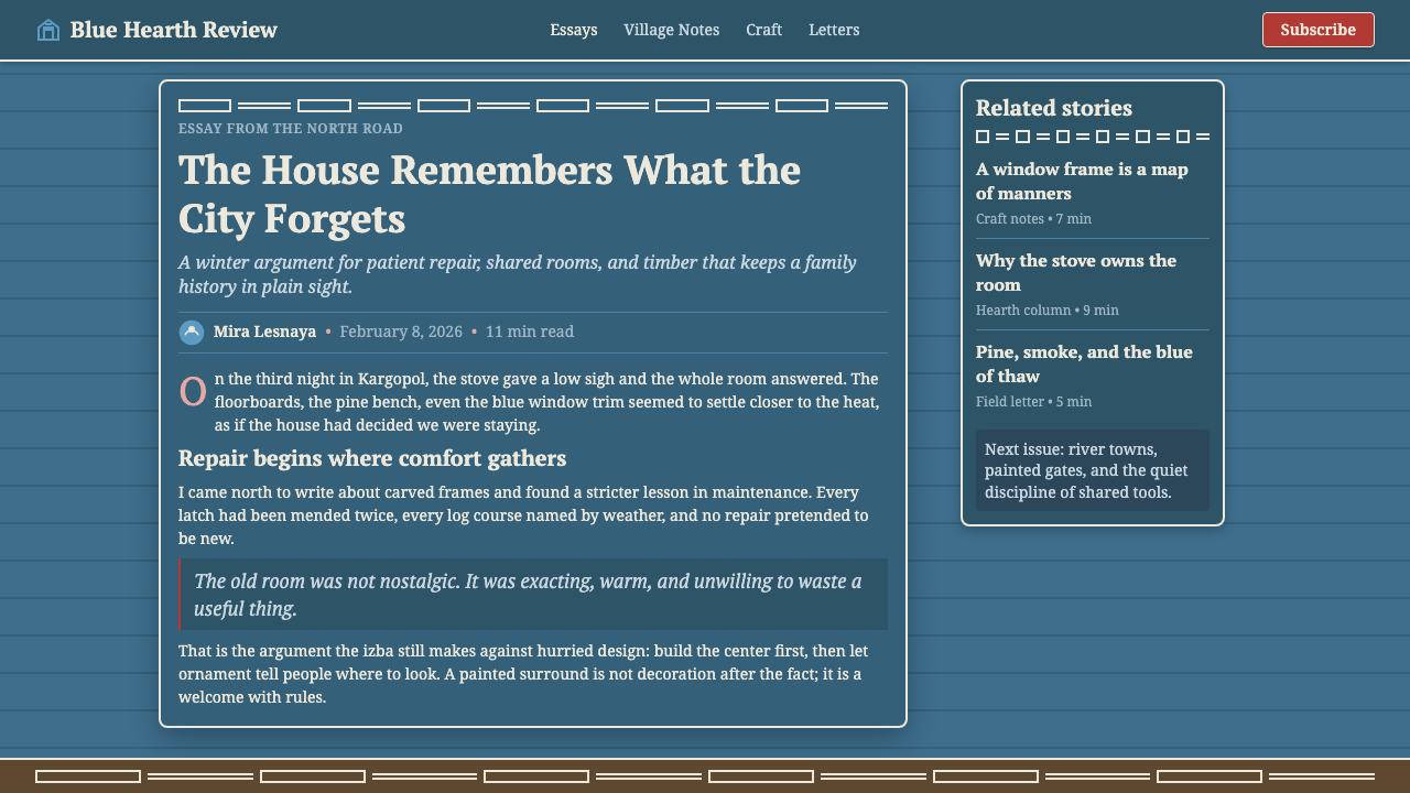
Log construction has been the dominant building method across rural Russia for well over a thousand years, driven by the simple abundance of forest timber across the Volga region, northern Russia, and Siberia. An izba's walls were raised from horizontal log courses, notched at the corners so they interlocked without nails, and the whole structure was typically built around a single massive masonry stove that served for cooking, heating, and often as a sleeping platform through the long winter — the physical and social center of the household.
The carved window surrounds that give this style its most distinctive feature, known as nalichniki, developed as a folk art tradition applied to the practical necessity of a window frame and shutter. Carpenters used jigsaws and hand tools to cut elaborate fretwork patterns — suns, birds, rosettes, looping vines — into thin boards, a technique known as propilnaya rezba, or fretwork carving, that reached particular sophistication in the eighteenth and nineteenth centuries. Villages developed recognizably local styles of nalichnik carving, distinctive enough that a trained eye could often identify which region, or even which village, a house belonged to just from its window frames.
The color blue carried deep symbolic weight in Slavic folk belief, associated with the sky, protection, and the divine, which is part of why so many izba window frames and shutters were painted in shades of blue rather than left as bare wood or painted in other colors. This was not simply decorative preference — in folk cosmology, painted ornament around a window or doorway often carried a protective function, warding off misfortune from the threshold where the household met the outside world.
Some of the finest surviving examples of Russian wooden architecture stand at Kizhi Pogost, an open-air museum on an island in Lake Onega renowned for its all-wood churches built without a single nail, and in the historic town of Suzdal, whose wooden buildings and carved detail preserve the craft tradition this system draws from. These sites, maintained and studied by generations of carpenters and preservationists, remain the primary reference for understanding how the izba's carved, painted vocabulary actually looked and functioned in daily rural life.
What defines the Russian Izba look?
Color
A layered blue scheme dominates: a bright nalichnik-blue used for window and border framing against a deeper, more saturated folk-blue ground, finished with white fretwork detail, an occasional folk-red accent, and the warm honey tone of bare pine. The overall balance leans dark and solemn rather than light and airy.
Fretwork Ornament
White carved fretwork — suns, birds, rosettes, scrolling lace patterns cut by jigsaw — frames the deep blue ground the way a nalichnik frames a window. The ornament is linear and cut-through rather than painted flat, giving it a lace-like, almost see-through quality against the solid color behind it.
Symmetry and Framing
Compositions are built around a strong, symmetrical frame — mirrored ornament to either side of a central element, echoing the way a nalichnik surrounds a window on all four sides. This gives the system a settled, formal quality even though every line is handmade rather than mechanically ruled.
Timber Texture
Bare pine surfaces — warm, honey-brown, and grained — appear as a structural material rather than a decorative surface, standing in for the log walls of the actual izba. The wood grain provides rhythm and warmth beneath the more formal blue-and-white ornament above it.
Protective Motif
Recurring symbols — suns, birds, and other carved shapes drawn from Slavic folk belief — carry a protective, almost talismanic meaning rather than purely decorative intent. Their placement around a border or frame echoes their traditional role guarding a household's threshold from misfortune.
Handcrafted Line
Every line in this system should read as cut by a saw or carved by hand rather than drawn with mechanical precision — slightly irregular curves, a fretwork pattern that varies subtly rather than repeating identically. This handmade quality is essential to the style's warmth and authenticity.
Dark, Warm Ground
Rather than a bright, cheerful backdrop, the system favors a dark, saturated ground — deep folk-blue paired with the warm brown of timber — that gives even a decorative pattern a solemn, sheltering quality, closer to the interior of a winter log house than an open, sunlit exterior.

Who shaped Russian Izba?
The anonymous village carpenters, or plotniki, who built izbas and carved their nalichniki by hand across rural Russia are the true authors of this visual tradition. Working without nails, using notched log joints and jigsaw fretwork passed down through apprenticeship, they developed regionally distinct decorative vocabularies now studied as folk art in their own right.
The builders and carvers responsible for the wooden churches of Kizhi Pogost, an island complex on Lake Onega renowned for structures built entirely without nails, represent the pinnacle of Russian wooden craft technique. Their work, preserved as an open-air museum, remains a primary reference for the joinery and ornament this style draws from.
The builders of the historic town of Suzdal preserved and developed a wooden building tradition whose surviving structures and carved detail document the regional variations of nalichnik carving and log construction technique that this design system generalizes into a coherent visual language.
How do you use Russian Izba today?
Russian Izba is a style for products that want to feel warm, handcrafted, and rooted in folk tradition rather than sleek or industrial — heritage food and craft brands, cultural and tourism products, storytelling platforms, or anything that wants to evoke a sense of home, shelter, and generational craft.
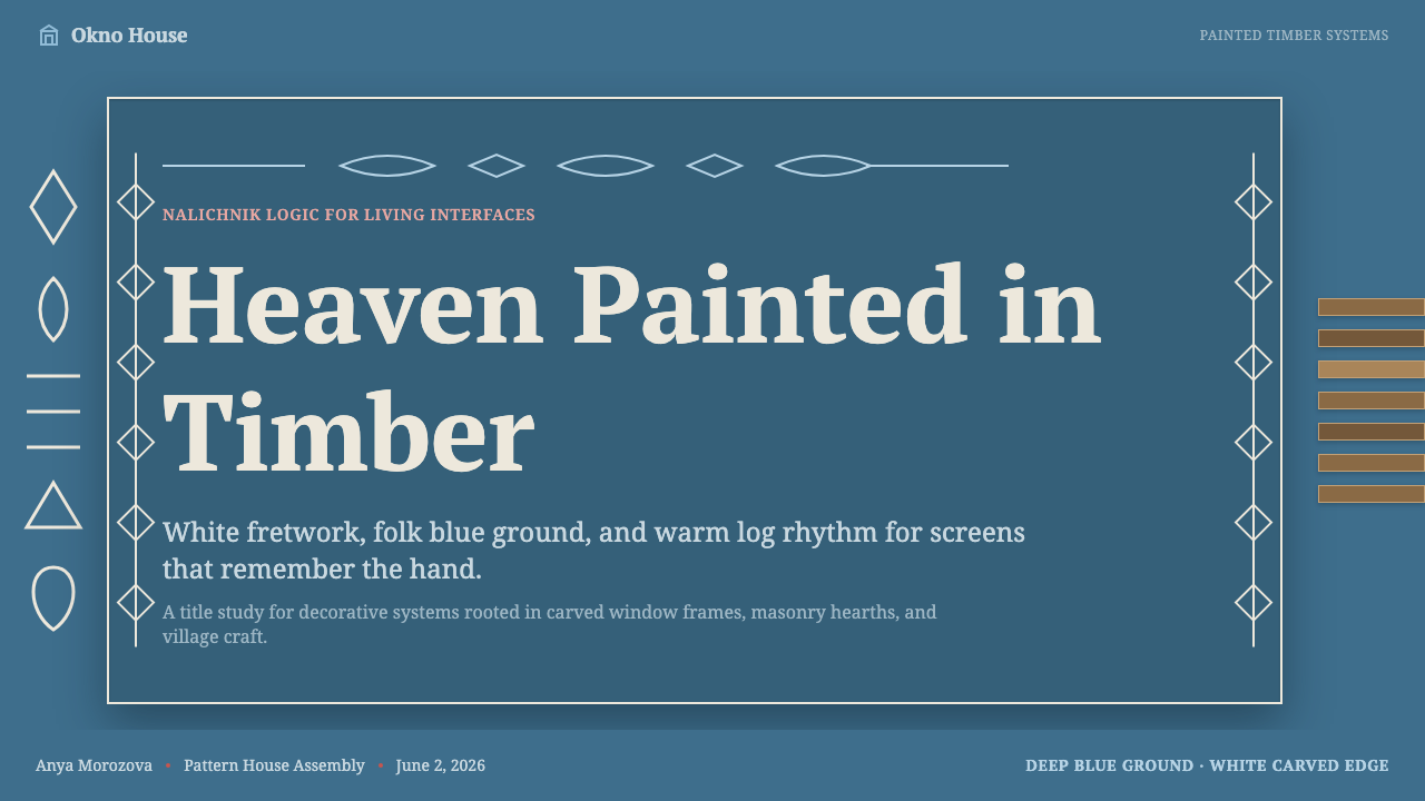
For presentation slides, a cover works well with a deep folk-blue ground framed by white fretwork ornament along the edges, echoing the way a nalichnik surrounds a window, with a title set centrally within that frame. Content slides can use a simplified fretwork motif as a recurring border or divider rather than a plain rule, while data slides benefit from a warm pine-toned background with the blue and white ornament reserved for chart accents and callouts rather than the whole visualization.
For web interfaces, the style suits cultural, heritage, or artisan-marketplace products where warmth and craft authenticity matter more than clinical efficiency. Card borders can adopt a simplified fretwork pattern rather than a plain line, buttons can use the deep folk-blue as a primary color with white ornamental detailing, and background sections can alternate between the dark blue ground and the warm pine tone to create rhythm across a page.
For editorial and marketing work, the style supports storytelling around heritage, craft, and place — travel content about rural Russia, articles on folk art and vernacular architecture, or marketing for artisanal and handmade goods. A carved-fretwork motif makes an effective section divider or pull-quote frame, giving text the same sheltered, framed quality a nalichnik gives a window.
A common mistake is to treat the fretwork ornament as a generic 'ornate border' applied indiscriminately, without regard to its symmetrical, window-like logic — the pattern should read as framing something, not simply decorating a rectangle's edge. Equally, lightening the palette toward pastel blues undoes the style's solemn, sheltering warmth; the folk-blue ground should stay deep and saturated, with white ornament providing contrast rather than the whole composition turning pale and airy.
Russian Izba — FAQ
Is this style the same as generic 'Russian folk art' patterns?
It draws from Russian folk tradition but is more specific than a generic folk-pattern label — it is built around the particular architectural relationship of a nalichnik framing a window: white carved fretwork against a deep painted blue ground, with bare pine as a structural material beneath. Applying random Russian folk motifs without that framing logic, or without the specific blue-and-white-and-pine palette, produces something more generic than this style intends.
Can this style work with a light, pastel background instead of the deep blue?
It can, but it changes the mood significantly. The historic nalichnik palette leans deep and saturated — a solemn, sheltering blue rather than a light, cheerful pastel — and that depth is part of what gives the white fretwork its lace-like contrast. A pastel version would need to preserve strong value contrast between the ornament and the ground some other way, or the design risks losing the framing clarity that makes the style legible.
What is the difference between this style and Russian Onion Domes or Russian Lubok?
All three draw from Russian folk and vernacular tradition but from different physical sources. Russian Izba comes from rural log-house architecture and carved window fretwork — a domestic, handcrafted, structural vocabulary. Russian Onion Domes comes from Orthodox ecclesiastical architecture — sacred, gilded, and civic in scale. Russian Lubok comes from popular woodcut printmaking — a flat, narrative, mass-produced folk print tradition. They share a cultural root but read very differently: one is a house, one is a church, one is a broadsheet.
Does this style suit modern digital products, or only heritage or cultural content?
It works best for products with a genuine connection to warmth, craft, home, or cultural heritage — travel, artisanal goods, storytelling platforms, or cultural institutions. It is a poor fit for products that need to feel fast, technical, or impersonal, since the style's entire visual logic depends on evoking handmade care and sheltering warmth, values that sit uneasily against a clinical or high-speed product experience.
Why does blue carry so much weight in this style, compared to the folk-red accent?
Because in Slavic folk tradition blue specifically signified sky and heaven, which is why it became the dominant color for window frames and shutters across so many regions — it was the color chosen to frame the threshold between the household and the world beyond. Red appears as a secondary folk accent, carrying its own separate associations, but the structural, framing role in this system belongs to blue, with white fretwork and red accent both playing supporting parts around it.
Related design styles
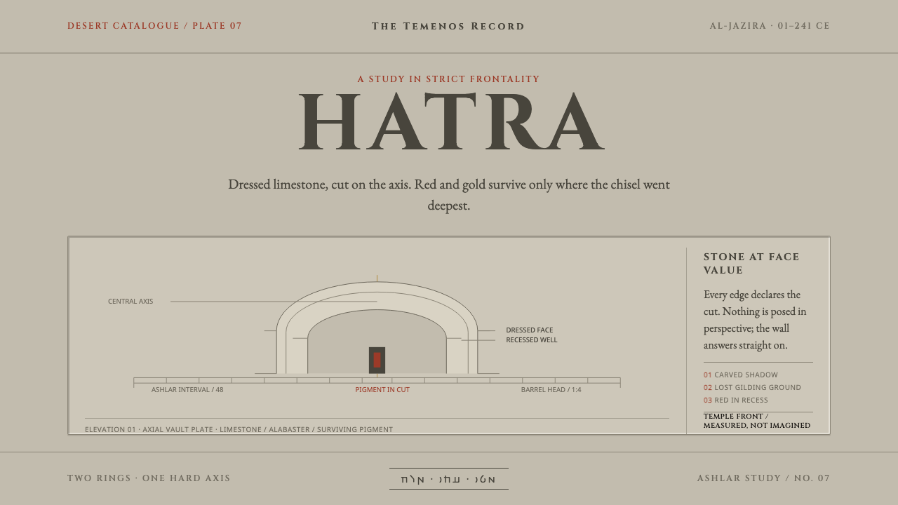 Hatra Parthian ReliefStone faces forward. Cinzel capitals and recessed red pigment hold a strict a…
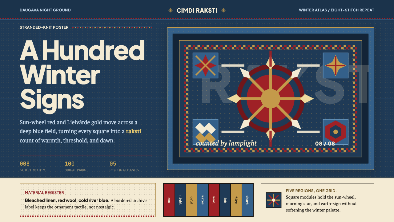 Latvian Knitted MittensWinter craft glows. Sun-wheel red and Lielvarde gold lock into an 8-stitch bl…
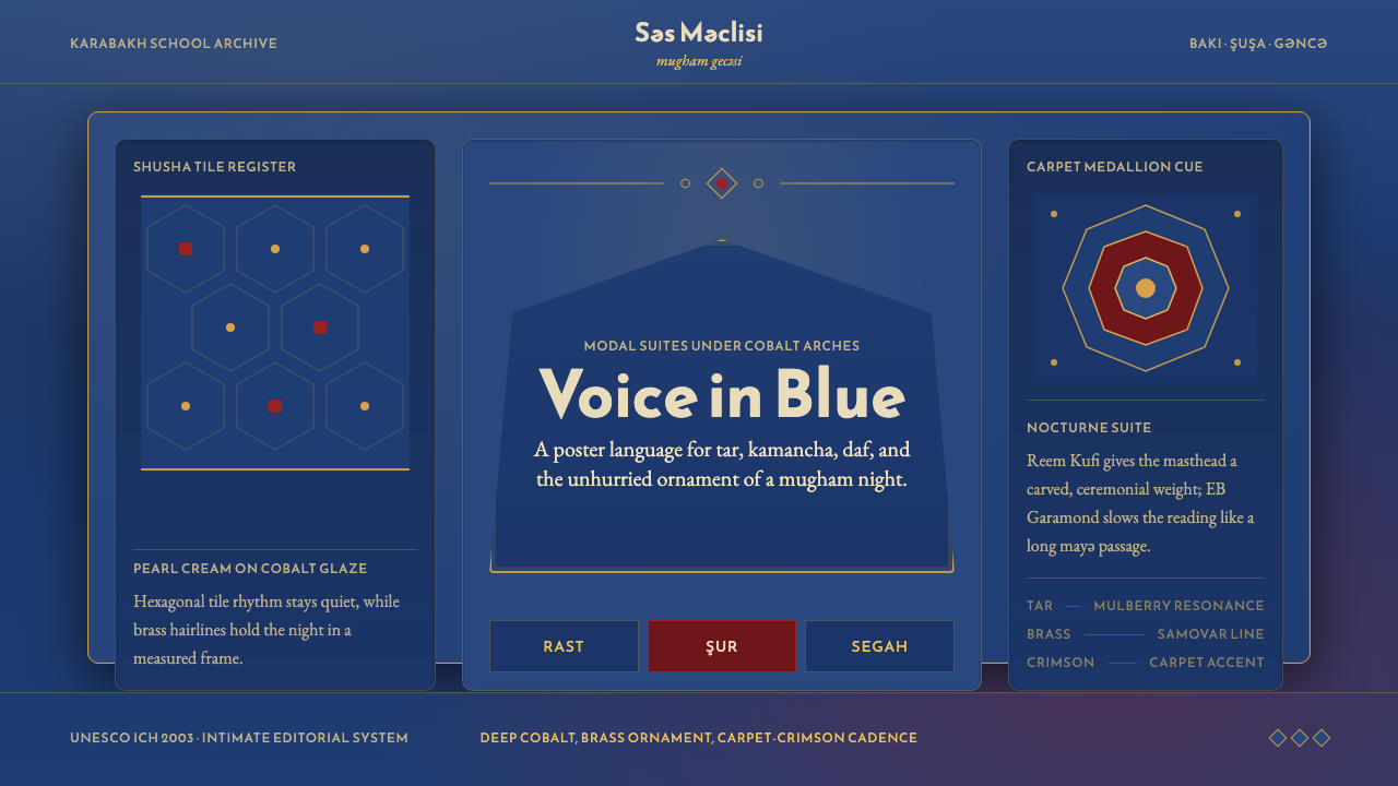 Azerbaijani Mugham Saz BlueMugham night, deeply tiled. Cobalt ground, brass hairlines, arched editorial…
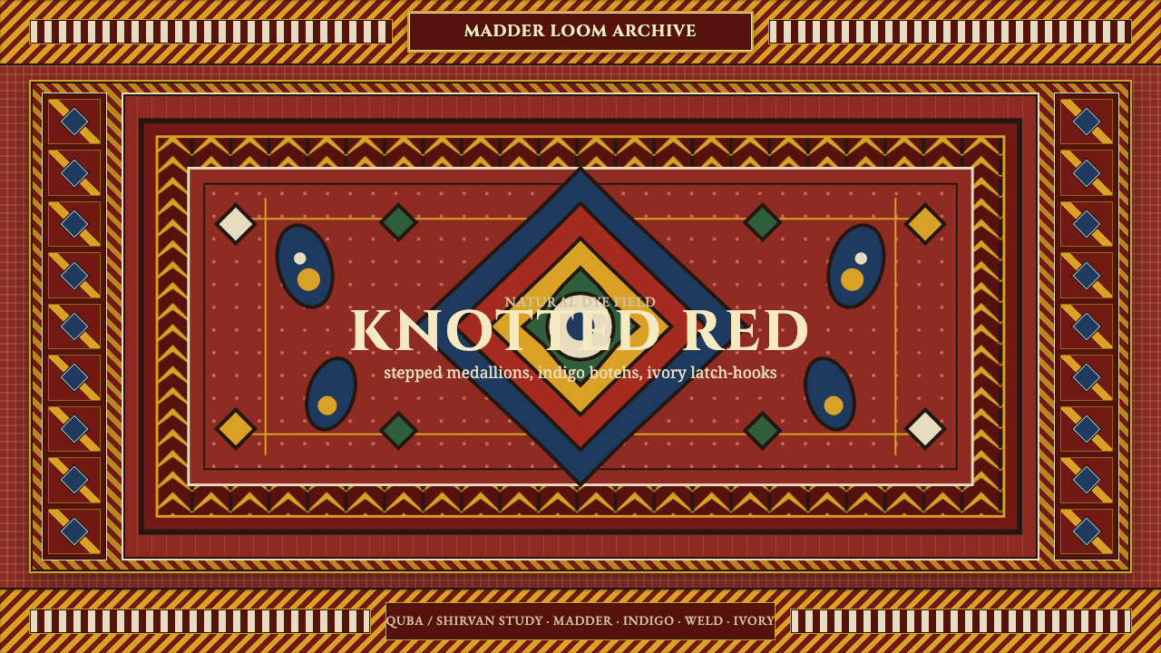 Azerbaijani Quba CarpetRed is the field. Indigo botehs and ivory latch-hooks orbit a stepped medalli…
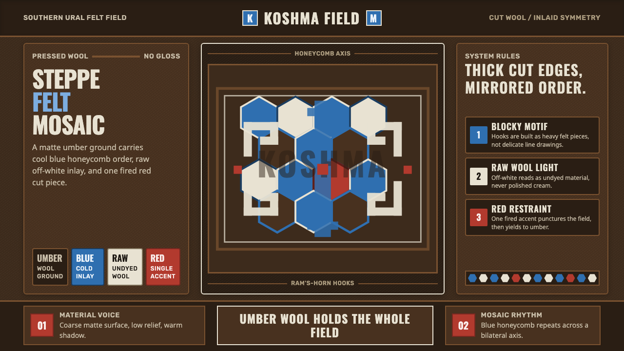 Bashkir Honeycomb Felt OrnamentSteppe craft feels weighty. Umber felt holds blue honeycomb and raw-wool hook…
 Belarusian RushnykRed carries meaning. Madder rhombs crowd aged flax edges while the woven cent…