What is Coptic Tunic Weave?
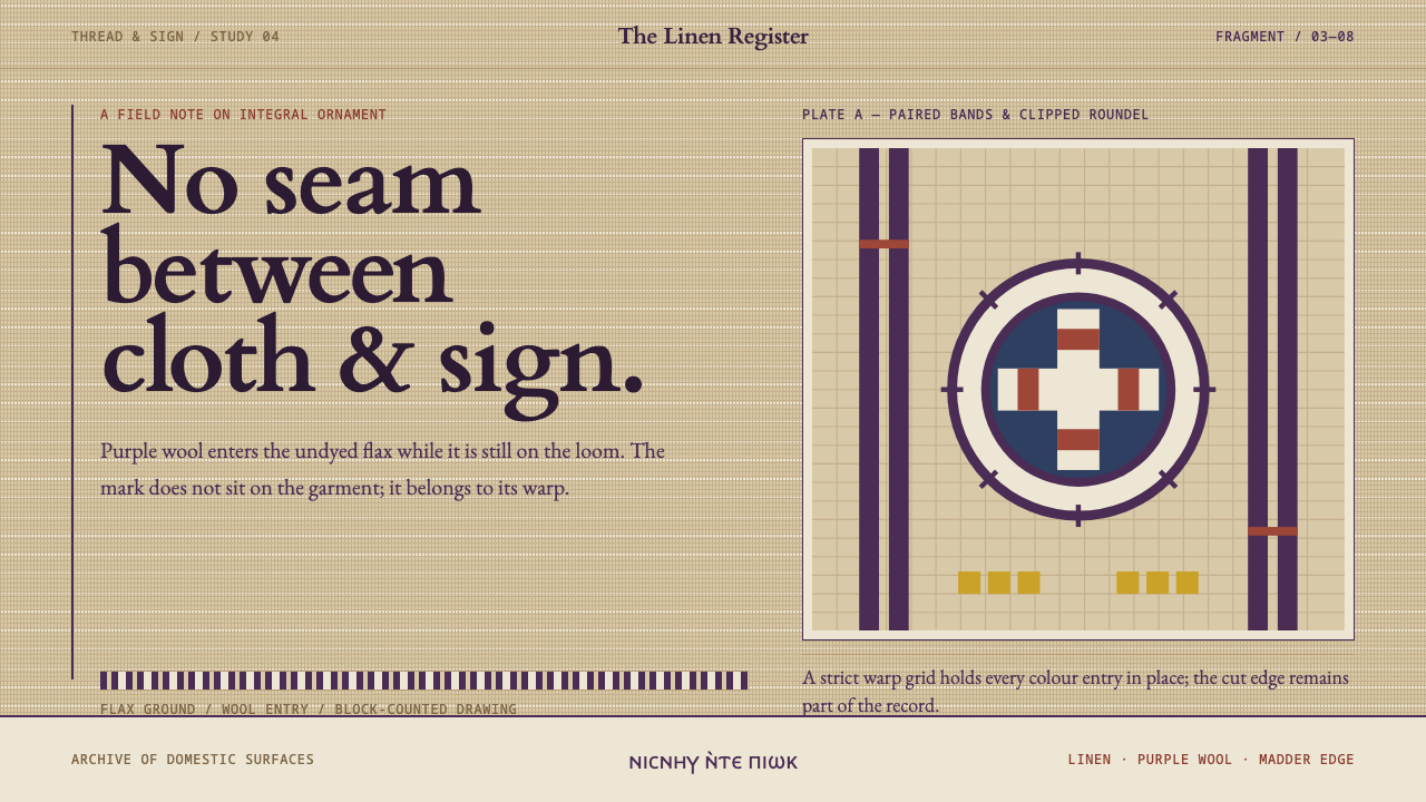
Coptic Tunic Weave starts from a garment in which ornament is not applied but woven: dark purple wool bands locked into the warm grid of undyed flax.
Coptic Tunic Weave in brief
Coptic Tunic Weave is a design style based on the woven tunics of late-antique Egypt, made roughly between the third and eighth centuries AD. Its signature is a warm, flax-coloured ground, built like a visible grid of warp and weft, carrying dark blue-purple bands, roundels and borders. Everything on the surface looks as though it belongs to the cloth rather than sitting on top of it.
The central principle is that ornament and structure are the same thing. A Coptic tunic was woven in one piece and its decoration was woven with it, so there is no seam between garment and ornament, because there was no joining step at all. The style turns this into a rule for the interface: bands, rails and roundels are part of the layout's construction, not a coat of decoration applied afterwards.
The look is blocky and frontal. Figures face the viewer, with stout limbs and oversized eyes, and animals and plants are simplified into stepped, geometric shapes. This is not clumsiness. The shapes are the ones that warp and weft allow, and the style keeps that logic, preferring drawing that obeys a grid over drawing that pretends to be free.
Where does Coptic Tunic Weave come from?
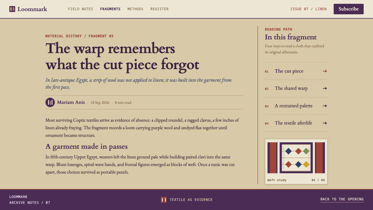
The tradition belongs to Egypt in late antiquity, roughly the third to the eighth century AD, in a country shaped by Greek and Roman visual culture while Christianity spread through it. Much of what we know comes from burial grounds and settlements along the Nile and in the oases, including Akhmim, Antinoöpolis, the Fayum and al-Bagawat in the Kharga Oasis. The dry climate preserved linen and wool that would have rotted elsewhere, which is why this cloth survives at all. The purple clavi, the vertical bands, were at their height between the third and fifth centuries.
The textile was technically specific. The ornament was tapestry-woven in wool on the same warp as the linen ground: coloured wool threads are worked into the cloth only where each patch of pattern needs them, which is why edges step and curves turn into blocks. The linen ground was left undyed, keeping the warm yellowish tone of flax. The clavi ran from shoulder to hem, roundels sat on the shoulders, and bands finished the neck and sleeves.
Colour followed what a household could dye. The dark blue-purple was murex purple where it could be afforded. Where it could not, madder over woad stood in, and lichen purple was another substitute. Madder also gave red, woad gave indigo, weld gave yellow, and green came from laying yellow over blue. The palette was small because the dyes were few, and each colour had an economic story behind it, which is part of why a purple band reads as a sign of care.
Most of what survives today is not whole garments but bands and roundels cut from old clothes. Scholars such as Marie-Hélène Rutschowscaya have studied this material as a body of evidence, and the Metropolitan Museum of Art's Egyptian Expedition of 1930–31 is cited among the reference points for it. The style inherits that fragmentary condition on purpose: it accepts that its units are pieces and does not retouch them into a seamless whole. Hellenistic iconography appears throughout, put to Christian use, which explains the mix of classical subjects and a rigid, woven simplification.
What defines the Coptic Tunic Weave look?
Undyed Flax Ground
The ground is the colour of the linen itself, a warm yellowish flax that is neither white nor cream by design but simply undyed. It gives every page a lived-in, natural warmth. Nothing is bleached, and the slight unevenness of a woven surface is more welcome than a perfectly clean field.
Dark Blue-Purple Wool
The leading colour is a dark blue-purple, the stand-in for murex purple that households reached with madder over woad. It is deep and slightly cool, and it is used in bands and shapes rather than washes. Against the warm flax it reads as weighty and ceremonial without being loud.
Accent Dyes in Small Quantities
Madder red, woad indigo, weld yellow and an overdyed green appear in small amounts, as dots, thin stripes and details inside a purple field. They never compete with the purple. Treat them as a restricted dye box: each accent should feel like a precious thread, not a second theme colour.
Clavi, Roundels and Bands
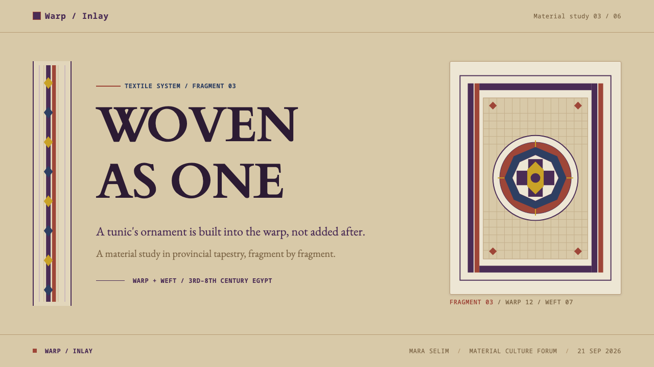
The layout vocabulary comes straight from the tunic. Vertical clavi run from top to bottom like rails, roundels mark corners and focal points, and horizontal bands close edges. These are structure, not trim: content sits between and inside them, and the page is organised by them the way the garment was.
Grid-Obeying, Blocky Drawing
Because warp and weft decide the drawing, diagonals become steps and circles become stacked blocks. Edges are visibly stepped, and patterns are built from repeated small units. The style accepts the stair-step look as its own beauty and avoids smoothing it into clean vector curves.
Frontal Figures
Human figures face the viewer squarely, with stout limbs, large eyes and no attempt at foreshortening or perspective. They are signs more than portraits. Figures work best small and repeated inside a band or a roundel, where their stiffness becomes rhythm.
Honest Fragments
Surviving pieces are cut bands and roundels from older clothes, and the system admits that condition instead of repairing it. Cropped edges, partial roundels and uneven margins are allowed. The style values a piece that is clearly a piece over a restoration that hides its own history. On a slide or a web page, this can mean letting a band run off the edge of the frame or a roundel be cropped, so the layout feels like a piece cut from a larger cloth.
Who shaped Coptic Tunic Weave?
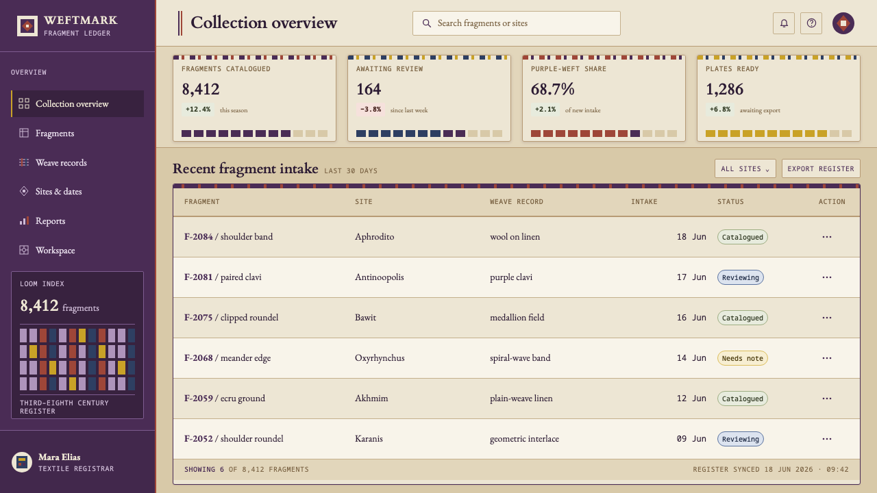
A scholar of Coptic art whose studies of Coptic textiles are widely consulted. Her kind of research treats bands and roundels as evidence of how cloth was made, dyed and used, which is the same attitude this style takes to its own interface: the ornament is information about the construction.
An institutional fieldwork effort of 1930–31 cited among the reference points for this material. It stands for the archaeological side of the style: pieces recovered from the ground and later studied as fragments rather than as finished garments.
The anonymous households and workshops behind this cloth, whose finds cluster at Akhmim, Antinoöpolis, the Fayum and al-Bagawat. Their names are unknown, but their decisions are the real authorship of the style: blocky forms dictated by the loom, and dyes chosen by what a household could afford.
How do you use Coptic Tunic Weave today?
Coptic Tunic Weave is most at home in products and stories where craft, heritage and warmth are the point. Its logic is structural, so it needs to be applied as construction, with bands and roundels that do real organising work, and not as a purple tint over an ordinary layout. Craft shops, museum stores, cultural education and heritage brands benefit most, because the style's own history is about patient making.
On slides, a cover can use a single purple band running edge to edge like a clavus, with a roundel as the title mark on a warm flax field. Content slides work well in two or three columns separated by narrow bands, with plain text and no cards. Data slides should keep the woven logic: bars as blocks with stepped ends, line charts drawn as stair-steps rather than smooth curves, and colours limited to the small dye set, with purple as the lead series. Let one purple band be the slide's single strong gesture, and keep the other dye colours as thin stripes inside it.
In web interfaces the style suits museum collections, craft and textile shops, cultural platforms, education and calm editorial products. Vertical purple rails can mark navigation or a selected state, roundels can serve as avatars and badges, and horizontal bands can close headers and footers. A pricing page can present tiers as vertical bands, with one purple band for the recommended plan. Avoid glossy buttons, translucent panels and soft shadows, since cloth has none of these.
For editorial and marketing work, the style supports catalogue entries, exhibition pages and heritage brand stories. Show objects as framed pieces with plain captions and generous margins, and let a cropped band or roundel behave as a section marker. Photographs of cloth are welcome when they show the weave. Keep the copy plain and descriptive, in the manner of a museum label.
The most common mistake is smoothing: turning stepped edges into smooth curves, adding gradients to the purple, or placing drop shadows under roundels. A second is using every dye colour at full strength, which turns a restrained tapestry into a rainbow. A third is repairing the fragment: forcing perfect symmetry, closing every margin and filling every gap removes the honesty that gives the style its character.
Coptic Tunic Weave — FAQ
Is this the same as Coptic art in general?
Not quite. Coptic art is a broad field that includes sculpture, icons, manuscripts and architecture as well as cloth. This style takes only the logic of the woven tunic: ornament woven in with the structure, a restricted dye palette on a flax ground, and blocky shapes dictated by the loom. It borrows the weave, not the whole artistic tradition.
Why is purple the lead colour?
Because the garments themselves were led by it. The tunic's bands and roundels were worked in a dark blue-purple, murex purple where a household could afford it and madder over woad where it could not. That history gives the colour weight. In the style it signals structure and care, and it is used in bands and blocks rather than as a general tint.
Why are the shapes so blocky?
Because warp and weft decide the drawing. In tapestry weaving a curve has to be built from stepped units, so circles turn into stacked blocks and diagonals turn into stairs. The figures with stout limbs and large eyes are not poorly drawn. They are drawn the only way the loom allows, and the style treats that constraint as its own aesthetic.
Can it be used on a dark background?
It is a light-ground style, and its identity rests on the warm flax field with purple set against it. A dark version would lose that relationship and read as something else, such as a jewel-toned or ecclesiastical look. If a dark surface is unavoidable, keep it small, as a band or a roundel, and let the flax tone stay as the main ground.
How do I use clavi and roundels in a modern interface?
Treat clavi as vertical rails that organise a page: a navigation edge, a timeline, a selected-item marker. Treat roundels as contained focal points such as avatars, badges, step numbers or featured items. Horizontal bands close headers, footers and section edges. Keep them few and structural, so the page feels woven together rather than decorated.
Related design styles
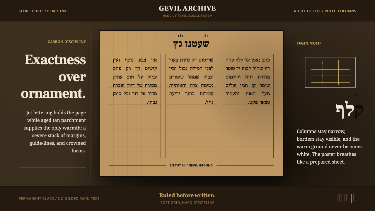 Hebrew STaM ScrollExactness over ornament. Jet ink, ruled Hebrew columns, and amber-tan parchme…
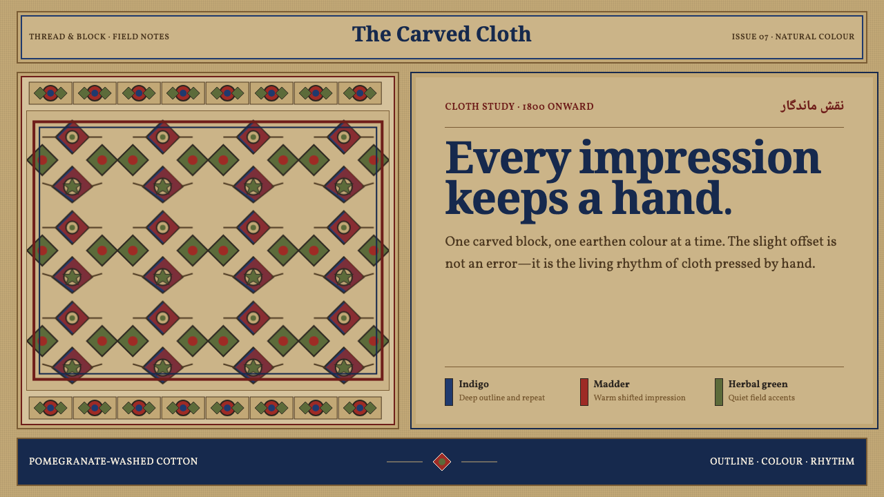 Isfahan Qalamkar PrintEvery impression keeps a hand. Indigo and madder repeats shift softly across…
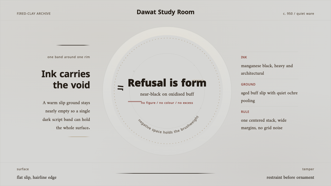 Nishapur Epigraphic WareRestraint carries the surface. Black Kufic arcs across warm buff clay and ope…
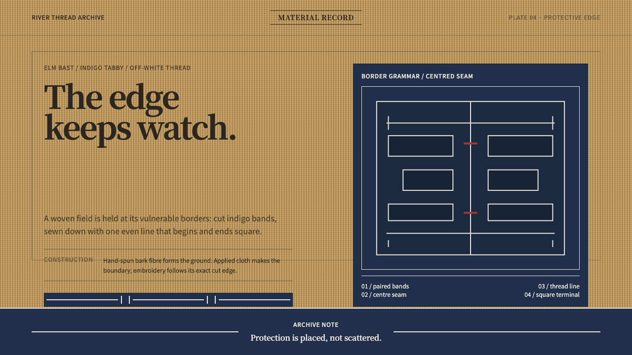 Ainu Attus RobeProtection is cut, not painted. Indigo bands and square-ended thread hold elm…
 Armenian Marash Interlace EmbroideryDense memory in raised thread. Green-gold interlace locks over deep brown clo…
 Belarusian RushnykRed carries meaning. Madder rhombs crowd aged flax edges while the woven cent…