What is Basra Shanasheel?
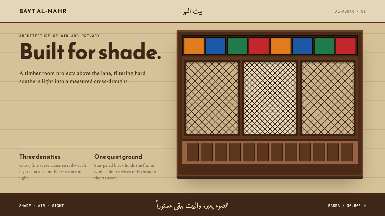
Shanasheel turns climate engineering into ornament: a dark timber lattice projects over pale brick, and color arrives only as light through glass.
Basra Shanasheel in brief
Basra Shanasheel is a design language drawn from the shanasheel, the Iraqi form of the mashrabiya: a carved wooden oriel that overhangs the lane from the first floor of an Ottoman-era merchant house. In Basra's Al-Ashar canal quarter the arrangement is almost fixed. Below is plain, pale-yellow brick. Above it projects a box of mulberry and sidr lattice, set with orange, green, red and blue glass. The design system turns that composition into a rule: a quiet brick ground, a dark timber structure that projects and casts shadow, and color that arrives only as light through glass.
What makes the style distinctive is that its ornament is a by-product of function. The lattice shades the alley, pulls a cross-draught through the room and lets the household watch the canal without being watched. Beauty is what remains when a climate solution is built by skilled hands. For a designer this sets a clear discipline: every pattern must be doing a job, and every panel should have thickness, overlap and shadow, rather than a pattern pasted flat onto a surface.
The overall impression is warm, shaded and layered. The lower register is calm and almost blank, giving the eye a place to rest; the upper register is dense, dark and intricate, and glows in small jewel-like points. Light is treated as the true color of the system. Where most interfaces paint hues onto surfaces, Basra Shanasheel lets hue exist only where something translucent catches the sun.
Where does Basra Shanasheel come from?
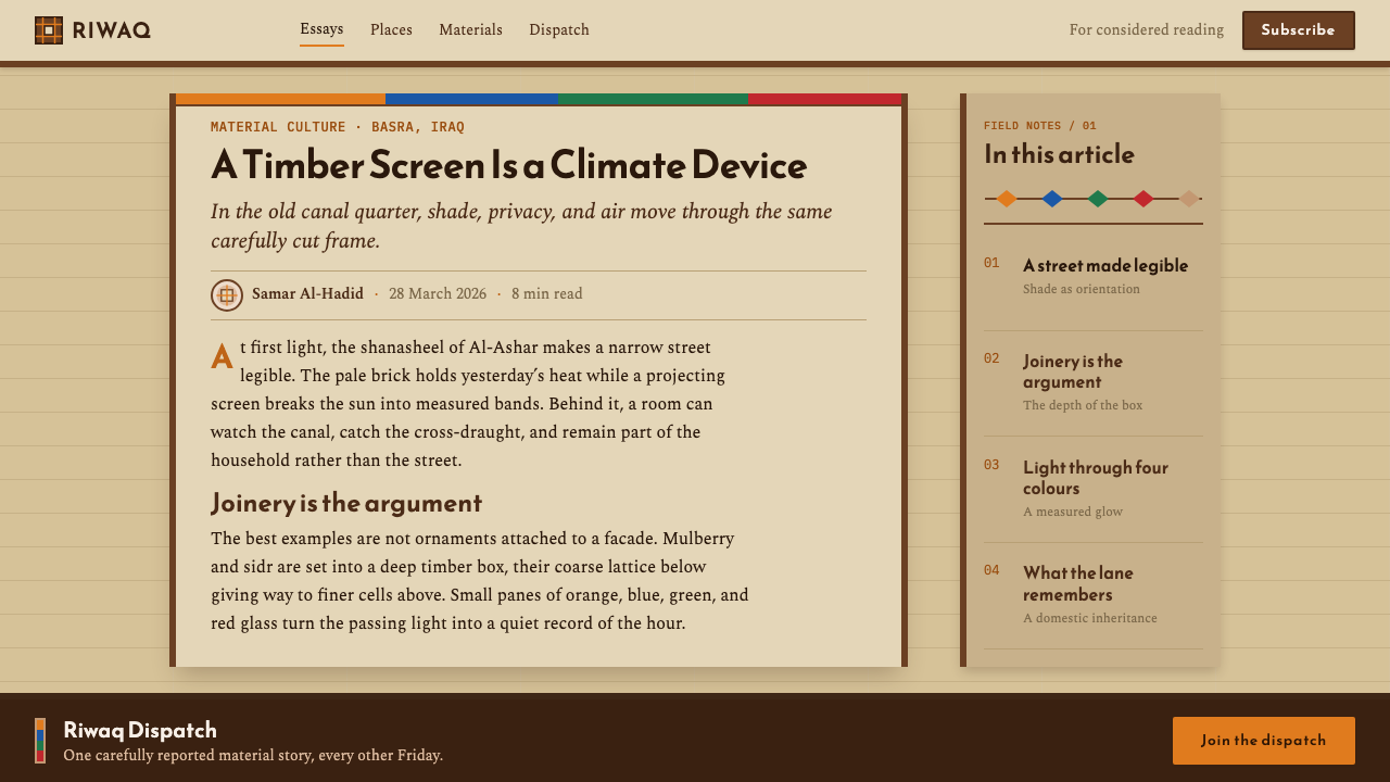
The shanasheel belongs to Ottoman Iraq and to the wider mashrabiya tradition. In Basra, the period associated with the form runs from the sixteenth century into the early twentieth, and the setting is the Al-Ashar quarter, a district of canals, lanes and merchant houses in southern Iraq. The term names the projecting wooden window-box itself: a structure that leaves the plane of the wall, hangs over the street and creates a shaded interior balcony above it. In an alley, it is the part of the house that meets the public.
The house type behind it is the merchant house of southern Iraq and the Gulf, a building organized around climate and privacy. The first floor projects over the lane so that the house gains room without taking more ground, and the oriel is the face the house shows the street: mulberry and sidr timber latticework, built up from small members into a screen, with colored glass set into the openings. Below it the wall stays plain. This contrast between a calm lower register and an ornate upper one is the signature of Ottoman Iraqi vernacular architecture in the Gulf merchant-house tradition.
Making such screens was the work of carpenters. The najjar guild carpenters of Al-Ashar are the named craftspeople in the record, and the lattice they built is a lesson in joinery: many small pieces assembled into one surface that can breathe, filter and hold glass at once. The skill lay in turning a large number of small decisions into one calm, ordered whole that happened to be beautiful. Nothing about it is arbitrary decoration; each opening is sized and placed for light and air.
In the 2020s the quarter has been the subject of restoration of the Al-Ashar houses, with UNESCO Iraq and the EU Delegation to Iraq among the named institutions involved. That revival matters to the design system because it presents the form as living heritage with a future, not as a nostalgic image. The style is a way to bring the logic of the shanasheel into interfaces: a quiet ground, dark timber, projection and shadow, and color that arrives only as light.
What defines the Basra Shanasheel look?
Color as Light
Orange, green, red and blue appear only as transmitted light, the way glass colors the room behind a lattice. They are not painted onto surfaces as flat fills. In an interface this means saturated hues are reserved for small translucent-looking accents, highlights and indicators, and large areas remain in quiet brick and timber tones. Color feels like something that happens to the surface when the sun passes through.
Brick Ground
The base is a plain, pale-yellow brick tone, sun-bleached and quiet. It is deliberately modest: the wall is the calm that lets the timber above it speak. Large surfaces stay close to this ground, so that hierarchy comes from structure and projection rather than from contrasting backgrounds. The effect is a warm, matte, unfussy canvas.
Dark Timber Structure
Mulberry and sidr give the style its dark, structural lines. Frames, borders, dividers and headings take the tone of aged timber, so they read as load-bearing parts of the layout rather than as outlines. The dark is brown rather than black, warm rather than cold, and it stays close to the brick ground so that the pairing feels architectural instead of graphic.
Projection and Shadow
The oriel leaves the wall and hangs over the lane, and the style repeats that gesture. Panels step forward from the ground, cards overhang the section beneath them, and shadow falls from the projecting element onto what is below. Shadow here is architectural: cast by a real overhang, directional and consistent. It tells the viewer which parts are structure and which are recessed.
Lattice Rhythm
The lattice is built from many small members assembled into one screen, so rhythm is repeated and fine-grained rather than monumental. Patterns in this style feel joined, not drawn: lines cross, overlap and meet at fitted corners. Used as dividers, backgrounds for key panels or frame details, the rhythm gives density to the upper register without making it noisy.
Two Registers
The composition has a calm lower register and a dense upper one: plain brick below, ornate timber above. Pages inherit that split. A quiet, generous area holds the main content and breathing room; a richer band at the top or edge holds navigation, headings and the glowing accents. Resisting the urge to decorate the whole page is what keeps the ornament meaningful.
Seeing Without Being Seen
The lattice lets the household watch the canal without being watched, and the principle translates into filtering rather than hiding. Layers can be partly see-through, panels can reveal what lies behind them in fragments, and glimpses of color can show through openings in the structure. Nothing is walled off completely; everything is screened, which gives the style its privacy and its depth.
Who shaped Basra Shanasheel?
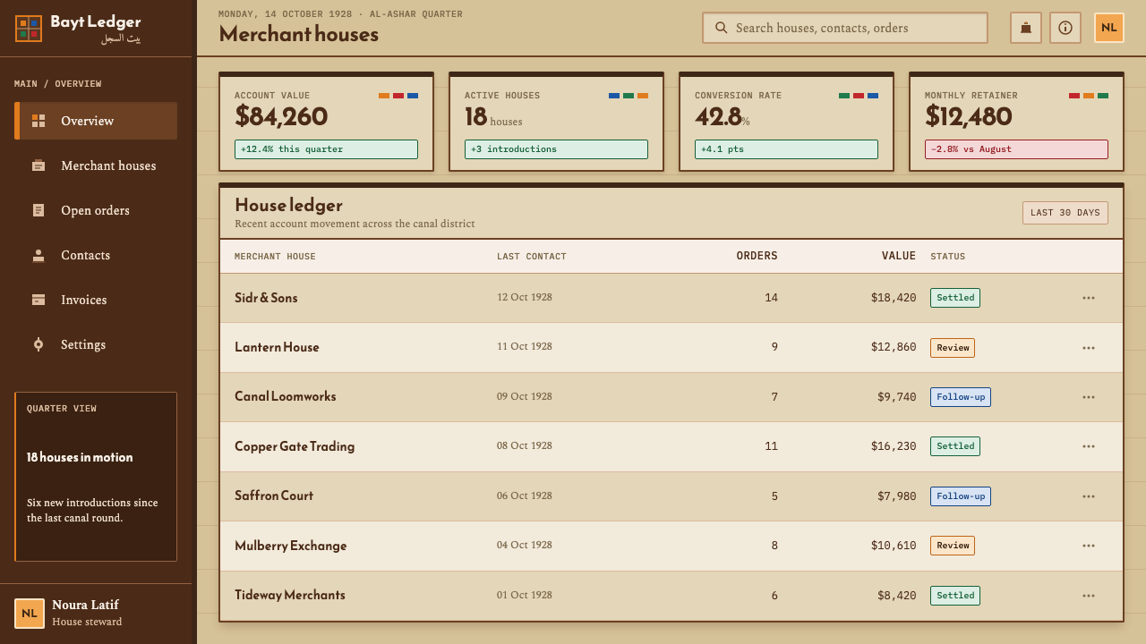
The najjar, the carpenters of Al-Ashar, are the craftspeople behind the form. Their work was joinery on a small scale: lattice assembled from many pieces, shaped for light and air, with glass set into the openings. They are the reason the style insists that ornament should be built, not applied, and that a pattern should have thickness and structure behind it.
UNESCO Iraq is named among the institutions involved in the restoration of the Al-Ashar houses from the 2020s. Its role in the record is that of a steward: the organization that treats the quarter's timber balconies as heritage worth saving. For the design system, that stewardship frames the style as the continuation of a living craft rather than a pastiche of old windows.
The EU Delegation to Iraq is the second named institution in the Al-Ashar restoration. Its presence in the record shows that the revival is a joint effort, which gives the style its sense of contemporary relevance: this is not a lost tradition recovered in a museum, but a built environment being repaired, house by house, in the present.
How do you use Basra Shanasheel today?
Basra Shanasheel is a style of depth and shade, best used where a project benefits from warmth, layering and a sense of craft. It asks for thought rather than speed. The core principles are simple to state: keep the ground quiet, build the structure in dark timber tones, let panels project and cast shadow, and bring color in only as light.
On presentation slides the style works well for covers and section openers. A cover can be a calm brick-toned slide with a dark timber band across the top carrying the title, and a small cluster of translucent colored accents glowing in one corner like panes of glass. Content slides can be built as two registers, with the main point in the open lower area and headings and dividers held in the darker upper band. Data slides can use the four glass hues as series colors, applied as luminous, slightly translucent fills instead of flat blocks.
For web interfaces the style suits cultural institutions, architecture and heritage sites, travel and hospitality, craft marketplaces, and any product that wants a warm and tactile personality. Navigation can sit in a dark timber band; cards should step forward with a visible overhang and a directional shadow; buttons can read as small framed panes. Because shadow and projection are part of the grammar, flat interfaces will need more care here than in minimalist systems, and the shadow direction should be consistent across the whole page.
In editorial and marketing work the style carries stories about place, craft and climate with real conviction. Long-form pieces can open with a dark timber masthead, set body text on the quiet brick tone, and mark pull quotes with a glimpse of colored light. Campaign and exhibition pages benefit from the same restraint, where a single luminous accent is more powerful than many. Copy should be calm and precise, in keeping with the style's craftsmanship.
The most common mistake is to paint the colors on rather than let them arrive as light. Designers fill large panels with orange, green, red and blue and the result looks like a bright carnival, losing the shade and subtlety of the original. The second mistake is pasting a lattice pattern flat onto a surface as wallpaper; without thickness, overlap and shadow, it stops being a shanasheel and becomes a generic Arabesque texture. Keep the ground quiet, build the structure, and let color be a visitor.
Basra Shanasheel — FAQ
What is a shanasheel?
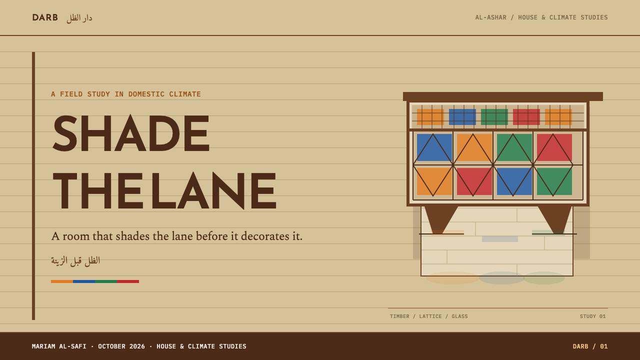
A shanasheel is the Iraqi form of the mashrabiya: a carved wooden oriel that overhangs the lane from the first floor of an Ottoman-era merchant house. In Basra's Al-Ashar quarter it typically sits on pale-yellow brick walls and is made of mulberry and sidr lattice set with colored glass. It shades the alley, draws a cross-draught through the room and lets the people inside look out without being seen.
What is the difference between a shanasheel and a mashrabiya?
The two belong to the same family of carved wooden screens and oriels. Mashrabiya is the broader term for the tradition; the shanasheel is the Iraqi version, with its own typical features such as the combination of pale brick below and a mulberry and sidr lattice above, with colored glass in the openings. This design system draws specifically on the Basra shanasheel, not on a generic mashrabiya motif.
Why does color appear only through glass?
Because that is how color works in the original building. The brick and timber are muted, and the orange, green, red and blue arrive only where glass sits in the lattice and the sun passes through it. The design system keeps that logic: large surfaces stay quiet, while color is used for small, luminous accents. It gives the page a restrained look and makes every bright moment feel earned.
Can I use this style on a flat, minimal interface?
Yes, but the shadow and thickness have to come back. The style is built on projection: panels should step forward, overlap and cast a directional shadow, because a lattice pattern with no depth stops being a shanasheel. In a flat interface, you can introduce depth with a few well-placed overhanging cards and a consistent shadow direction, keeping the rest of the page calm and matte.
Is the style only suitable for Middle Eastern subjects?
No. The logic of the style, a quiet ground, a structural frame, projection and shadow, and color that arrives as light, applies well beyond Iraq. It suits any subject about craft, shelter, climate, privacy or heritage. When the subject is Basra or the Gulf, name the source and avoid using the lattice as generic exotic decoration; when it is something else, carry over the principles rather than the specific motifs.
Related design styles
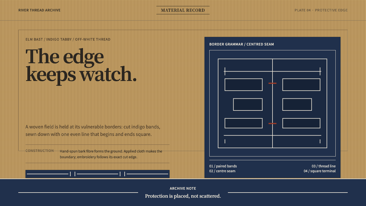 Ainu Attus RobeProtection is cut, not painted. Indigo bands and square-ended thread hold elm…
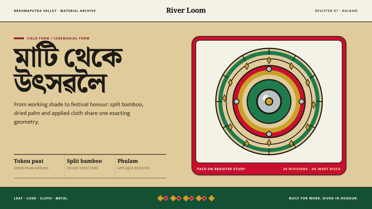 Assamese JapiWork becomes ceremony. Straw-gold rings carry green appliqué, festival red an…
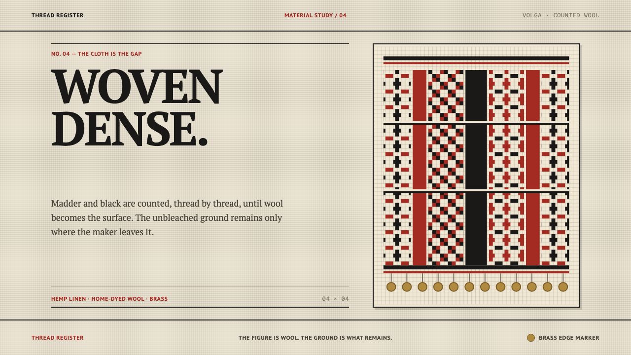 Erzya PangaDensity is the ornament. Madder and black stepped stitches crowd unbleached l…
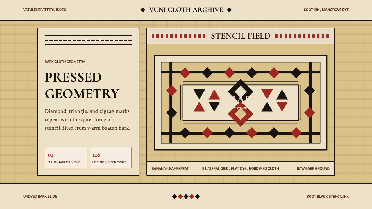 Fijian Masi Tapa StencilGeometry keeps ceremony. Soot-black diamonds repeat on bark beige with rust-r…
 Finnish RyijyWool holds its ground. Lamb's-grey centres meet stepped madder and indigo ban…
 Harakeke Raranga WeavingStructure carries care. Honey-straw grids expose each green, bark and fibre s…