What is Fujara Flute?
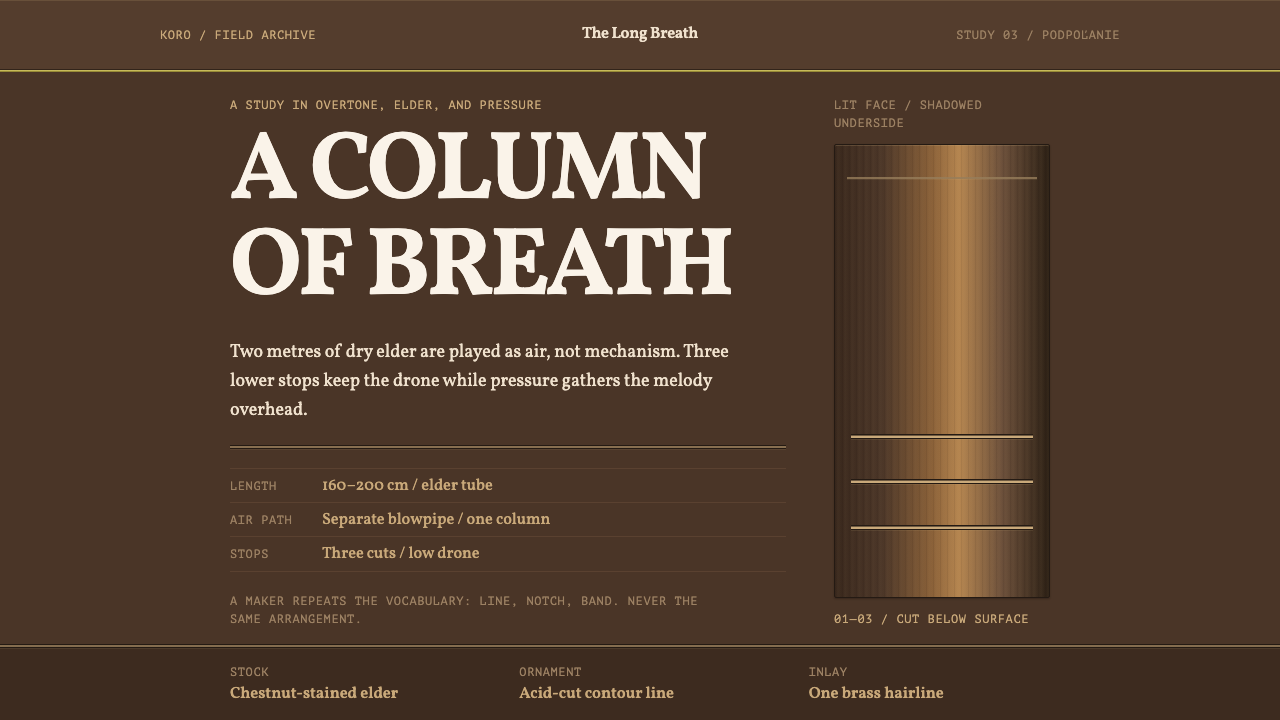
The fujara turns a shepherd's breath into architecture: a column of dry elder nearly two metres long, three finger holes, and ornament that is cut into the wood rather than laid on top of it.
Fujara Flute in brief
The fujara is a shepherd's overtone flute from the foothills under Poľana mountain in central Slovakia. It is a tube of dry elder up to two metres long, played with a separate blowpipe and only three finger holes. It is too long to finger like a recorder, so it is not played as a melodic instrument in the ordinary sense. The repertoire is built almost entirely from overblown harmonics, and the player shapes a column of air rather than picking out individual notes. UNESCO inscribed the tradition in 2005 as intangible cultural heritage.
As a visual style, the fujara means extreme verticality and very few elements. A tall, narrow axis organises the page; a chestnut-brown field moves from a lit face to a turned-away face like the barrel of a turned wooden tube; and dividers are drawn as incised double rules that sit below the surface, with a pale highlight between them like the raised edge of a knife cut. The result is a dark, warm and quiet system in which the number of elements can nearly be counted on one hand.
The central design idea is that ornament is carved, not printed. On a real fujara the decoration is contour lines cut with a blade and browned with acid, deep-notch carving, and sometimes a strip of thin brass let into the wood. Nothing is applied to the surface; everything is taken out of it. This system takes that literally, treating every line as a groove with depth and a burnt edge, and treating the surface as a material that has been worked rather than a canvas that has been painted.

Where does Fujara Flute come from?
The fujara belongs to the shepherd culture of Podpoľanie, the region around Poľana in central Slovakia, with Detva and the wider Banská Bystrica area at its centre. The tradition predates 1900 and was carried on by men who spent long seasons with flocks in the hills. The instrument's size and range suit that life: it can be played in open country, its low voice carries across a valley, and it is made from a material, elder, that grows at the edge of the same pastures. It is an instrument shaped by landscape and by the habits of herding.
Nothing about the fujara is mass-produced. The reference material for this style points to a tradition in which instrument makers and players overlap, and in which every maker ornaments his own instrument in his own way, so that no two are alike. The tradition names a few kinds of people rather than a school or a manifesto: the shepherd-makers of Podpoľanie, the instrument carvers of Detva, and individual players such as Palo Čepček. Authorship here is local, personal and repeated, and the ornament is the signature of whoever held the knife.
Three overlapping movements shape the look. Carpathian shepherd instrument-making supplies the material logic: dry elder, simple tools, carving and burning as the only decoration. Slovak overtone-flute playing supplies the proportions, since the instrument is defined by its enormous length and its vertical stance, with the player standing and the tube rising upright in front of him. The recognition of the tradition as UNESCO intangible cultural heritage supplies a modern frame, in which a regional shepherd practice is treated as living knowledge worth documenting and preserving.
Seen from design, this lineage is useful because it offers a very strict example of ornament that has a reason. Every decorative decision on a fujara follows from how it is made and played: it is long, so the decoration climbs; it is cut, so the lines have depth; it is browned, so the contrast between the cut and the surface is a matter of burning rather than paint; it is an individual's work, so the pattern is never perfectly regular. A system that learns from the fujara learns discipline, not a folk costume.
What defines the Fujara Flute look?
Extreme Verticality
The organising idea is a tall, narrow column. Layouts are built on a single strong vertical axis, with content stacked along it rather than spread across a wide grid. Proportions favour the narrow and the long: tall panels, slim bands, text set in a deliberately narrow measure. On a wide screen this produces generous empty margins on either side, and the emptiness is part of the design, like the air around the instrument.
Chestnut Body, Lit Face and Turned Face
The colour logic is a small family of chestnut and deep brown tones, organised as a lit side, a body tone and a turned-away side. Colour moves in gentle gradients along the surface in the way light moves along a turned wooden barrel, so the gradient here models form rather than decorating a background. Brightness is reserved for the lit face, and the darkest tones sit in the shadow. There are no cool accent colours; the warmth is the point.
Incised Double Rules
Dividers are drawn as pairs of lines that read as grooves cut into the surface, with a thin pale highlight running between them like the lifted edge of wood at a knife cut. They sit below the surface rather than on it, and their edges are slightly burnt rather than crisp. This is the most distinctive element in the system. Where other styles use a thin rule to separate two areas, the fujara uses a cut, and the cut has depth, a highlight and a dark edge.
Very Few Elements
The number of components on any given screen is small enough to count. A title, a column of text, one or two cuts, perhaps a single accent: that is a complete composition. The system treats each added element as a cost, and the instrument offers the model, since three finger holes are sufficient for an entire repertoire. Hierarchy comes from placement along the vertical axis and from the weight of the cuts, not from a crowd of different component types.
Ornament Cut, Not Printed
Decoration appears only in the forms a carver could produce: contour lines, deep notches and, occasionally, a thin metal inlay in brass tones set into the dark body as the single bright accent. There are no drawn patterns, no pictorial illustration and no applied textures. Where a pattern appears, it is made of repeated cuts and slightly irregular spacing, because a hand-cut pattern is never perfectly regular, and the small deviations keep the surface from looking synthetic.
Breath as Space
Because the instrument is defined by a column of air, empty space is treated as an active element rather than as leftover room. Margins are generous, line spacing is open, and sections are separated by long pauses along the vertical axis. The pace of reading is slow and sustained, like a held tone. The system works against clutter and urgency, and pages built in it feel quiet even when they contain a lot of text.

Who shaped Fujara Flute?
Palo Čepček is the one individual named in the reference material for this style, and his name stands for the idea that the fujara is a personal instrument. In a tradition where each maker ornaments his own flute, a named player is a reminder that the patterns are signatures rather than a catalogue of motifs. For designers, the lesson is that a system based on the fujara should allow for individual variation in its ornament rather than treat it as a fixed template.
The shepherd-makers of Podpoľanie are the origin of the tradition: herders who built and played the instrument themselves during long seasons with their flocks. They stand for a design ethic in which the maker and the user are the same person, tools are few, and ornament is a by-product of care. Their work explains why the visual system is so sparing: it was shaped by people who made what they needed with the materials at hand.
The carvers of Detva represent the more specialised side of the practice: craftspeople associated with the town at the centre of the region who cut contour lines, deep notches and inlays into instruments. They provide the vocabulary the design system borrows, with incised lines, burnt edges and occasional metal inlay. Their craft is the reason the system speaks in grooves and cuts rather than in lines and fills.
How do you use Fujara Flute today?
The fujara style is a good fit for work that is meant to be slow, quiet and tactile. Its rules are demanding: stay vertical, keep elements few, and treat every line as a cut. When these rules are followed, even simple content looks crafted. When they are ignored, the dark brown palette alone reads as a generic rustic theme.
On presentation slides, a cover works well as a tall central column: the title set in a narrow measure on a deep chestnut field, with a pair of incised rules above and below and a great deal of empty space on either side. Content slides should carry one idea each, a short column of text beside or beneath a single cut. Data slides are best served by vertical bars and long, narrow tables, with the rules doing the work of dividing categories, and a single brass-toned accent highlighting the figure that matters.
For web interfaces, the style suits reading apps, music and audio products, heritage and museum sites, craft and maker shops, and any product where the experience should feel unhurried. A dark ground with a narrow central column keeps the page calm; navigation stays minimal, and a page seldom needs more than a handful of components. On a pricing page, tiers can be tall, narrow columns separated by incised rules, with the recommended one marked by a single metal-toned inlay rather than a badge. Avoid dense dashboards; the style is a poor fit for screens that need many controls visible at once.
For editorial and marketing work, the style gives long-form stories a distinctive rhythm. A feature article can run as one continuous column with section breaks drawn as double cuts, pull quotes set in the same narrow measure, and a single image allowed to break the column once. Campaign pages for crafted goods, folk music, regional food or cultural events can rely on the warmth of the palette and the authority of the cut line, so that the product is presented as made rather than manufactured.
The most common mistake is to treat the ornament as pattern. Spreading decorative motifs across the page, adding illustrated folk-art borders or filling the empty space defeats the whole idea; the fujara is a system of removal, not addition. A second mistake is to turn the incised rule into a drop shadow or a glow, which loses the sense of depth. A third is to abandon the vertical for a wide, multi-column layout, since the verticality is the instrument's identity. When in doubt, take something out.

Fujara Flute — FAQ
Is this a folk-art pastiche?
It does not need to be. A pastiche borrows motifs, such as stylised flowers, borders and costume patterns, and spreads them across a layout. The fujara system borrows a method: ornament is cut into the surface, the surface is a worked material, and the fewer elements, the better. It uses almost none of the surface motifs associated with folk design, and relies on structure, proportion and the depth of a groove. That makes it easier to apply to contemporary products without looking like a costume.
Why does the style use gradients when others avoid them?
Because the gradient here models form. It describes a turned wooden barrel catching light on one side and turning away on the other, which is a physical fact about the instrument. It is not a decorative glow, and it should stay gentle, move along the vertical surface and never include bright highlights or colourful transitions. If the gradient starts to look like a glossy button or a sunset, it has drifted away from the source.
Does the layout have to stay narrow on a wide screen?
The vertical axis is the identity of the style, so the main content should stay in a narrow column even on a wide display. The extra width becomes margin, which in this system is a feature rather than wasted space. If a project needs side-by-side content, such as a comparison, it is better to keep two narrow columns separated by a double rule than to spread one wide block. A genuinely wide layout is a sign that another style would serve better.
Can I use a light background?
The system is conceived as a dark one: the lit face and the turned face of a chestnut barrel, with incised lines that catch a pale highlight, only make sense against depth. A light version is possible, but it needs a rethink rather than a colour swap. The cuts would read as dark lines on a pale surface and lose the highlight between them, and the warm gradient would risk looking like parchment. If a light version is necessary, keep the narrowness and the minimal element count, which carry the identity regardless of colour.
What kinds of products should avoid it?
Anything that needs speed, density or a lot of visible controls: analytics tools, trading screens, busy admin panels and dashboards with many filters. Playful, high-energy brands and children's products also sit uneasily with its stillness. The style is strongest where the audience is meant to slow down, as with long reading, listening, collecting or considering a handmade object.
Related design styles
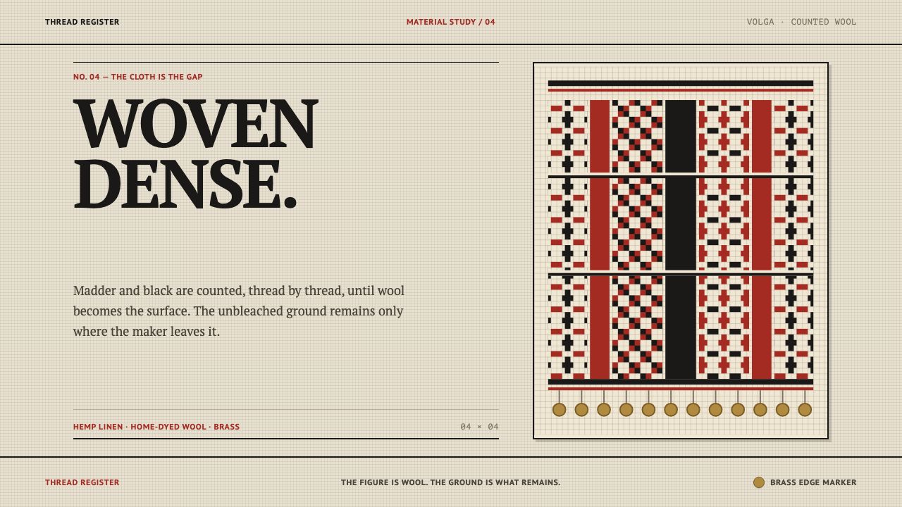 Erzya PangaDensity is the ornament. Madder and black stepped stitches crowd unbleached l…
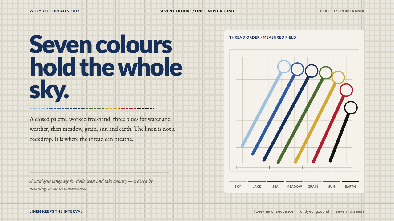 Kashubian Seven ColoursMeaning is stitched into the palette. Seven threads cross undyed linen in a m…
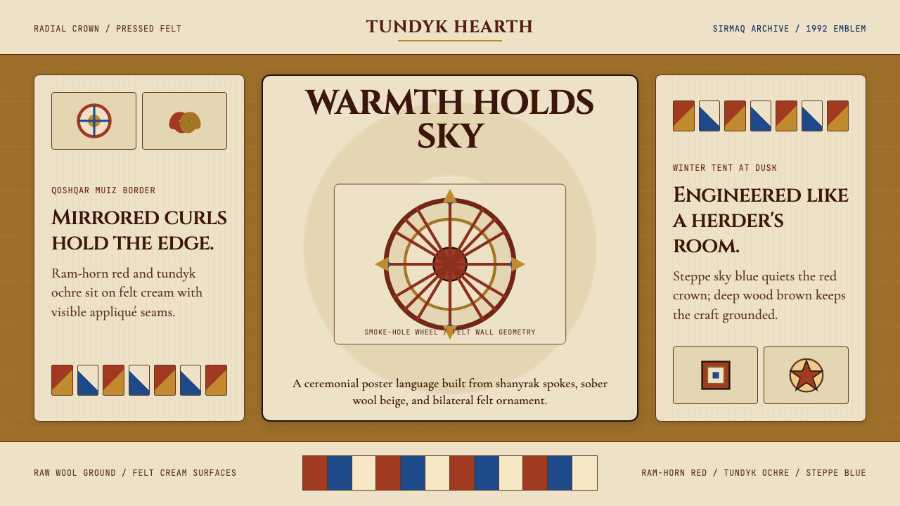 Kazakh Shanyrak Yurt FeltDomestic warmth, engineered. Ram-horn red felt curls around a radial shanyrak…
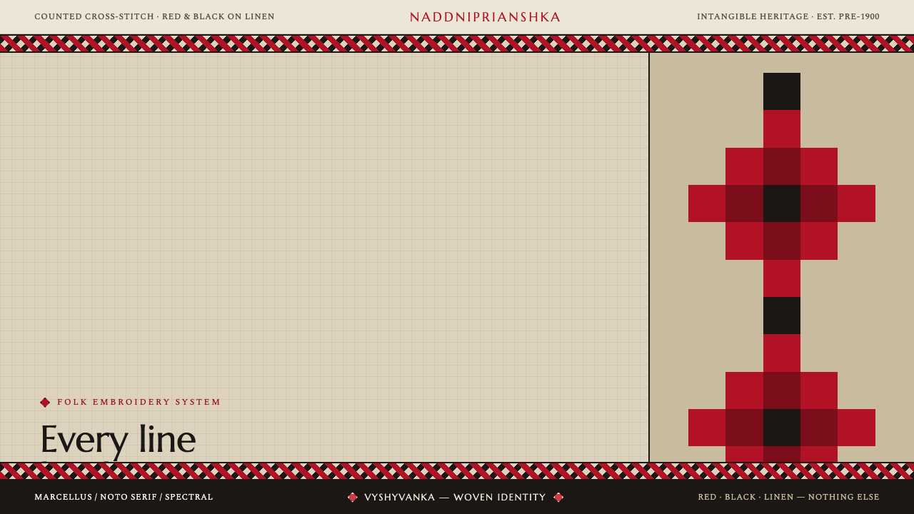 Ukrainian Vyshyvanka EmbroideryRed is life, black is protection. Stepped rhombus motifs counted thread by th…
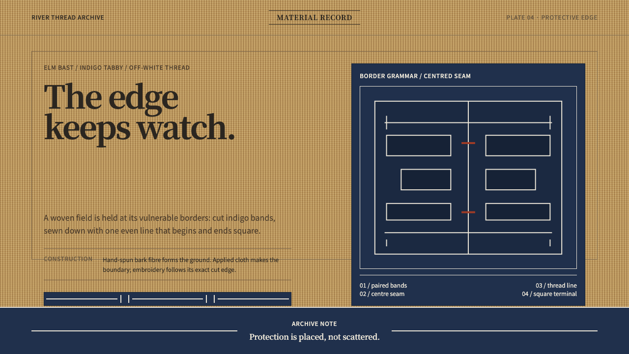 Ainu Attus RobeProtection is cut, not painted. Indigo bands and square-ended thread hold elm…
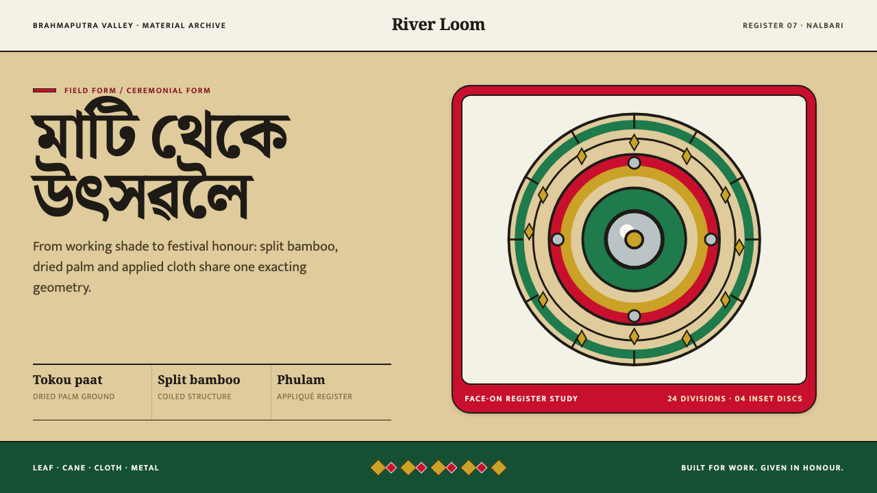 Assamese JapiWork becomes ceremony. Straw-gold rings carry green appliqué, festival red an…