What is Kashubian Seven Colours?
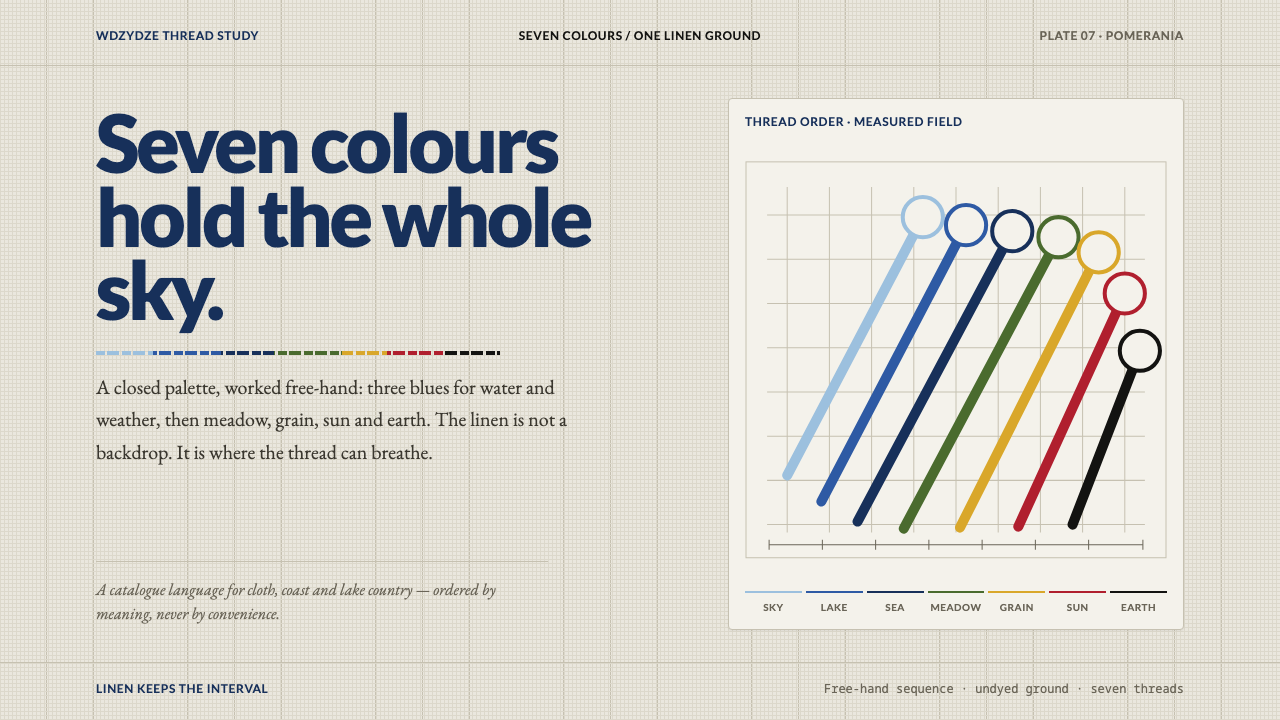
Kashubian embroidery is a colour code stitched into linen: seven threads, each tied to something in the landscape, with flowers that grow from a trailing vine instead of sitting in a grid.
Kashubian Seven Colours in brief
Kashubian embroidery is the needlework of Kashubia, the Pomeranian region of northern Poland, worked in exactly seven thread colours on loosely woven, undyed linen. Three blues stand for sky, lakes and sea. Green stands for forest and meadow, yellow for sand and ripening grain, red for blood and the setting sun, and black for Kashubian earth. The count is fixed. The palette is not a matter of preference but a small code in which every colour already means something.
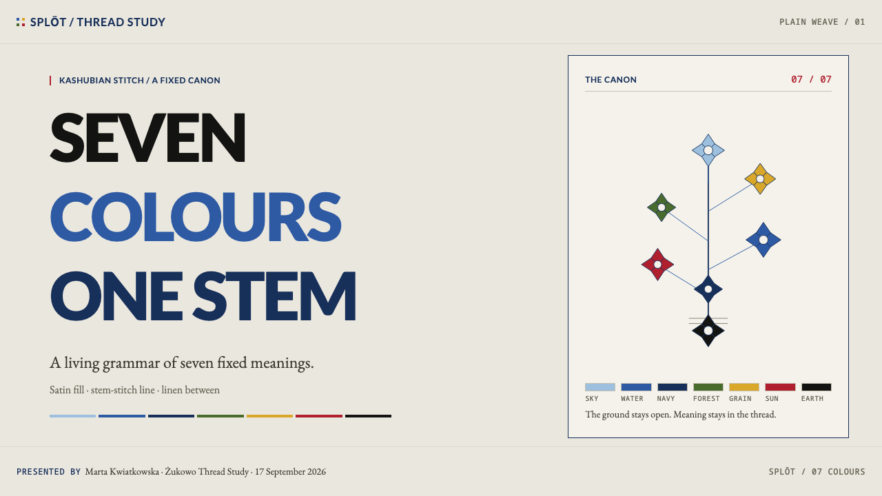
The motifs do not sit in a grid; they grow from a stem. Tulip, cornflower, lily, pomegranate, carnation, palmette and acanthus branch off a trailing vine and lean out of true, with bees and beetles tucked into the gaps between them. The unbleached linen shows through everywhere, and the outline swells and thins as the thread and the stitcher's hand pressure vary along its length.
As a design reference, the style offers something rare: a palette with a rationale and ornament with a growth logic. It produces layouts that feel ordered but not tidy, where a fixed vocabulary of colours and a vine-like structure organise the surface and hand-made irregularity keeps it alive. The result is warm and bright against a natural ground, and unmistakably regional without turning into a costume.
Where does Kashubian Seven Colours come from?
Kashubia lies in Pomerania in northern Poland, in the country between a lake district and the Baltic coast, and the colour list reads like a map of that landscape: sky, lakes, sea, forest, meadow, sand, grain, earth. The embroidery is landscape turned into thread. The reference record dates the tradition to before 1900, with a lineage traced to the Żukowo convent, and a revival from the early 1900s centred on Wdzydze.
Two named schools sit behind the style, the Żukowo and the Wdzydze embroidery schools, and both treat colour as a matter of rule rather than taste. Old workshops in Żukowo are said to have specified which petal takes which colour. That detail is the key to the whole system: the palette is a vocabulary with grammar, and a flower is not coloured to look pleasing but coloured correctly. A fixed meaning for every thread is what lets a stitcher read a motif almost like a sentence.
The early-twentieth-century revival is catalogued as the Kashubian folk revival, and three names are attached to it: Teodora Gulgowska, Izydor Gulgowski and Franciszka Majkowska. A folk revival turns a household craft into a named, collected and taught tradition, and in this case the emblem it produced is easy to describe: seven colours, a trailing vine, flowers that lean. That recognisability is exactly what makes the style useful as a design reference today.
The technique is as characterful as the palette. Satin stitch fills the colour and stem stitch draws the outline, and whether a line is thick or thin depends on the hand that pulls the thread. Because of this, the same pattern stitched twice is never identical. Even the creatures in the gaps carry history: the bees and beetles are said to predate the arrival of Christianity in the region. The embroidery therefore holds together things that look decorative but are in fact old, local and deliberate.
What defines the Kashubian Seven Colours look?
Seven Fixed Colours
The palette has seven threads and no more: three blues, a green, a yellow, a red and a black. The limit is part of the identity. A closed palette forces every decision to be made inside a known vocabulary, and the result is a surface that feels coherent even when the motifs vary widely. In interface terms it is a ready-made, fully-bounded colour system with a built-in sense of restraint.
Colours That Mean Something
Each thread is tied to something real: blue to sky, lakes and sea, green to forest and meadow, yellow to sand and ripening grain, red to blood and the setting sun, black to the earth. This gives the palette a semantic spine. It is natural to map the same meanings onto interface roles, so that the three blues become a graded neutral family, green signals growth, yellow warms and highlights, red marks urgency, and black grounds text and rules.
Undyed Linen Ground
The ground is loosely woven linen left undyed, and it is a participant rather than a backdrop. Its weave shows between stitches, which means the background has texture, warmth and a slightly irregular tone. A faithful interpretation uses a natural, warm off-white ground, lets it show through between elements, and resists the temptation to cover every area with colour.
Stem-Grown Motifs
Tulip, cornflower, lily, pomegranate, carnation, palmette and acanthus all branch from a trailing vine rather than sitting in a grid. They lean, they are unevenly spaced, and they do not mirror one another left to right. The structure is organic: a main line of growth with side branches. It suits layouts where ornament should flow along an edge, a heading or a divider, rather than tile across a surface.
Satin Fill, Stem Outline
Two stitches divide the labour. Satin stitch fills a shape with smooth, directional colour, and stem stitch draws its outline. Because the stitcher controls how thick the thread lies, outlines swell and thin along their length rather than keeping a mechanical width. For designers this suggests solid fills with a slightly hand-drawn outline of variable weight, instead of a uniform stroke.
Bees and Beetles in the Gaps
Small creatures are tucked between the flowers, and they are said to be older than the arrival of Christianity in the region. They are the style's quiet surprise: a tiny, specific detail placed in open space where a lesser pattern would leave nothing or add filler. Used sparingly, such details reward a closer look and keep large decorative areas from feeling generic.
Order Without Neatness
The system is strict about colour and loose about line. The same motif stitched twice is never identical, because tension, thread thickness and the angle of a stem all vary with the hand. The overall impression is of something governed by firm rules and carried out by a person. That balance, ordered but not tidy, is the defining feel of the style and the quality most easily lost when it is rendered too cleanly.
Who shaped Kashubian Seven Colours?
Gulgowska is one of the three names the reference record attaches to the Kashubian folk revival of the early 1900s. The revival matters to designers because it is the moment a fixed seven-colour palette and a vine-grown flower vocabulary were treated as a tradition worth naming and teaching, which is also why the style can be described in clear rules today.
Gulgowski is the second name in the revival's cast. The reference material ties no single motif to him; what his name signals is that the revival was an organised, documented effort, with palettes recorded, motifs named and work taught, rather than a spontaneous return to old habits. That documentation is what lets a designer rebuild the system from description.
Majkowska completes the trio of key figures. Listing a third, separate name underlines that the revival was carried by several people at once, which fits the character of the style itself: a shared vocabulary stitched by many hands, each result a little different from the last.
How do you use Kashubian Seven Colours today?
Kashubian Seven Colours is a style about discipline and warmth together: a fixed, meaningful palette applied to an organic structure. Apply it by respecting both halves. Keep the colour vocabulary closed and its meanings consistent, and let the layout grow like a vine instead of sitting on a rigid grid of identical boxes.
On slides, a cover works well on a warm, natural linen-toned ground, with a trailing line of flowers entering from one corner on leaning stems and the title set in black. Content slides can treat colour semantically: the blues for neutral information, green for growth or progress, yellow for highlights, red for the one thing that needs attention. Data slides have a natural limit of seven series, which is generous enough for most charts; render them as solid fills with a slightly darker, hand-weighted outline, and let the linen ground show between bars or segments.
For web interfaces, the style suits products with a human, craft or regional character. A dashboard can assign each of the seven colours a fixed role and use the three blues as a graded scale. Cards sit on the natural ground with outlines that feel drawn rather than ruled, and a thin vine of small flowers can mark section dividers or empty states. Pricing pages can give each tier one thread colour and keep everything else quiet, so the colour does the sorting.
In editorial and marketing work, ornament should travel along edges: a stem running down a margin, a small flower leaning beside a heading, a bee tucked beside a caption. Long-form pages can use colour to tag sections by theme, and photographs of landscape pair naturally with the palette because the palette came from landscape. Asymmetry is a feature here, so avoid centring everything and let the weight of a page lean the way a stem leans.
The most common mistake is to add an eighth colour, a gradient or a glossy effect, which breaks the closed vocabulary that gives the style its coherence. A second is to tile identical flowers in a mirrored grid; that produces counted-pattern wallpaper, not stem-grown embroidery. A third is to use the colours without their meanings, for example red for success or black as a decorative tint. Finally, avoid covering the whole page with flowers: when the linen disappears, so does the breathing room that makes the stitching legible.
Kashubian Seven Colours — FAQ
What are the seven colours of Kashubian embroidery, and what do they stand for?
Three blues stand for sky, lakes and sea. Green stands for forest and meadow, yellow for sand and ripening grain, red for blood and the setting sun, and black for Kashubian earth. The count is fixed at seven, and the assignment is treated as a code rather than a taste. Old Żukowo workshops are said to have specified which petal takes which colour.
How is it different from grid-based patterns such as cross-stitch?
Kashubian motifs grow from a trailing stem instead of sitting in a counted grid. Flowers lean out of true, are unevenly spaced and do not mirror each other, and the work is done with satin stitch for fill and stem stitch for outline, so lines swell and thin with the stitcher's hand. The same pattern stitched twice is never identical, which is the opposite of grid-based regularity.
Where does the tradition come from?
It comes from Kashubia, in Pomerania in northern Poland, between a lake district and the coast. The reference record places it before 1900, with a lineage traced to the Żukowo convent and a revival from the early 1900s associated with Wdzydze. Those two places are catalogued as embroidery schools, and a Kashubian folk revival carried the tradition into the twentieth century.
Can I use more than seven colours?
You can, but you will leave the style. The closed palette of seven threads is what makes the system coherent and what gives each colour its meaning. If you need more differentiation, work within the three blues, use the natural linen ground as a neutral, and rely on stitch weight and motif rather than inventing new hues. An eighth colour usually weakens the code rather than extending it.
Does the style work on a dark background?
The reference is a light-ground system built on undyed linen, so a dark inversion is a substantial departure. Black thread would vanish and the deep blue would sink, and the sense of a natural ground showing between stitches would be lost. If you must go dark, keep the colour meanings, lighten the black role into a deep neutral, and keep generous empty space so the motifs still read as stems leaning in open ground.
Related design styles
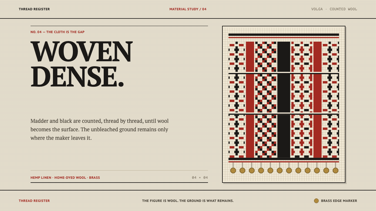 Erzya PangaDensity is the ornament. Madder and black stepped stitches crowd unbleached l…
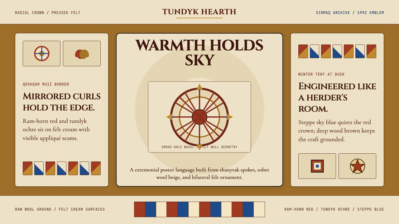 Kazakh Shanyrak Yurt FeltDomestic warmth, engineered. Ram-horn red felt curls around a radial shanyrak…
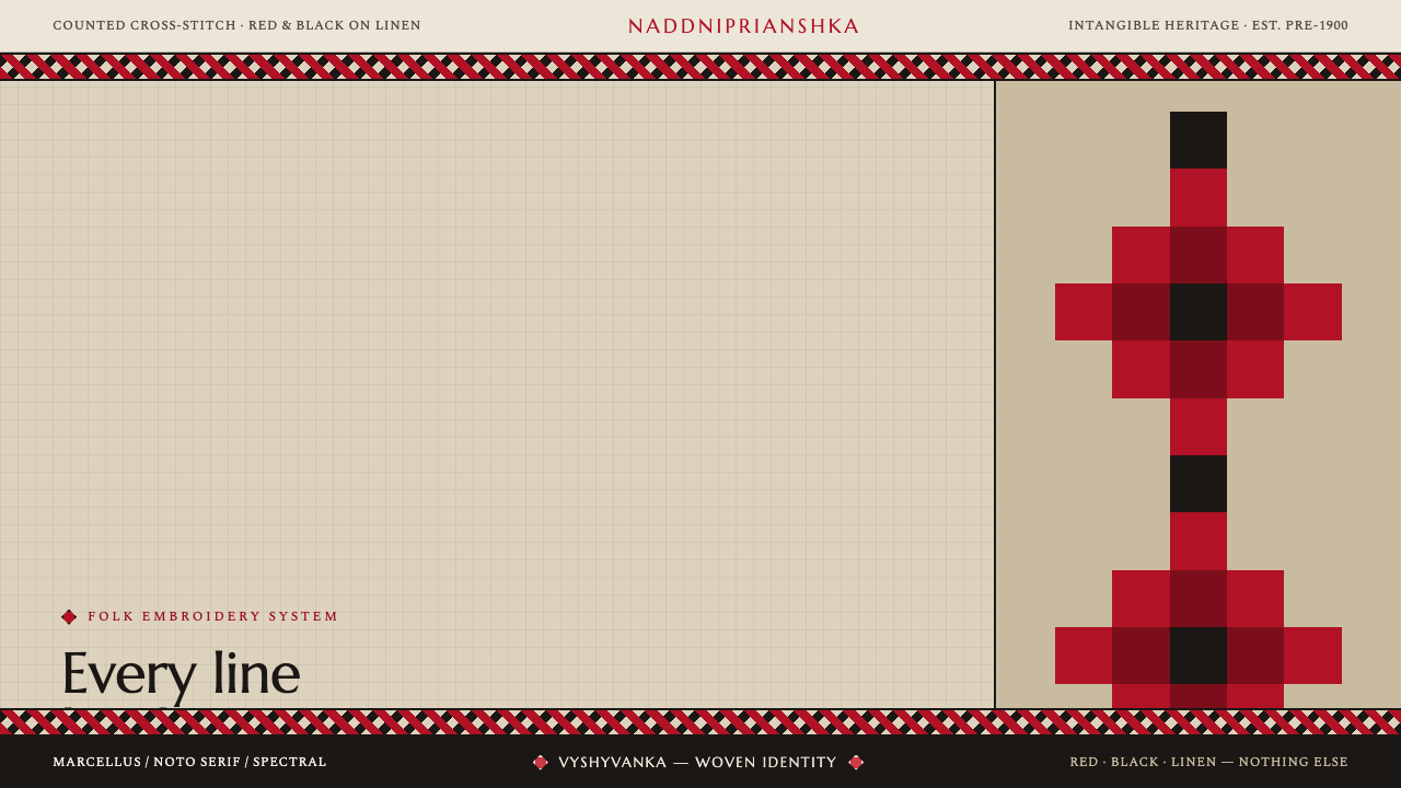 Ukrainian Vyshyvanka EmbroideryRed is life, black is protection. Stepped rhombus motifs counted thread by th…
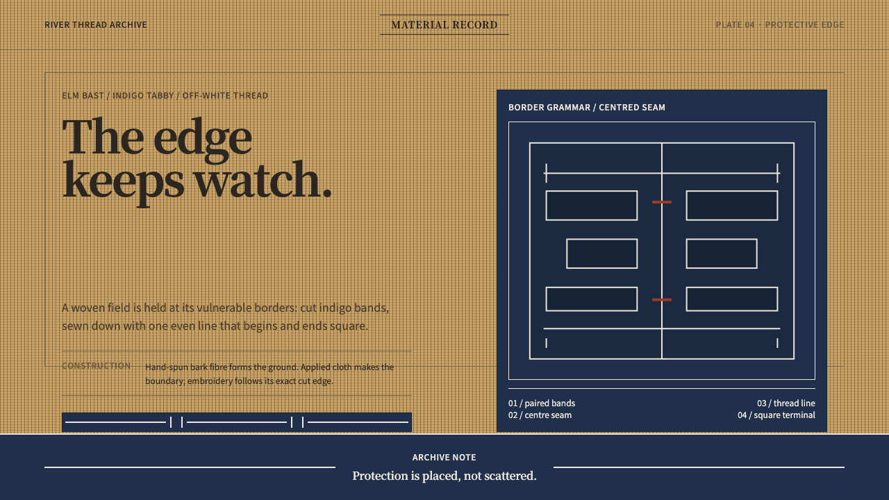 Ainu Attus RobeProtection is cut, not painted. Indigo bands and square-ended thread hold elm…
 Bashkir Honeycomb Felt OrnamentSteppe craft feels weighty. Umber felt holds blue honeycomb and raw-wool hook…
 Fijian Masi Tapa StencilGeometry keeps ceremony. Soot-black diamonds repeat on bark beige with rust-r…