What is Finnish Ryijy?
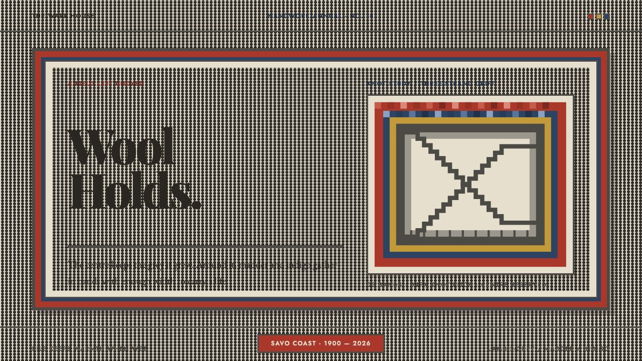
The Finnish ryijy is a long-pile wool rug that leaves its centre the colour of the sheep and puts all its effort into the stepped bands around it — a design where wool holds its ground and borders do the work that whitespace usually does.
Finnish Ryijy in brief
A ryijy is a long, knotted wool pile tied over a linen warp, a Finnish textile that began as a practical covering and became a national symbol. As a design reference it has a very particular layout: a plain centre in the natural colour of the sheep, framed by concentric bands in madder red and indigo blue. The field is left alone. The effort goes into the border.
The principle behind it is that structure is made of material. The grey of the centre is not a chosen background colour but the colour the wool already had; it is called lampaanharmaa, lamb's-grey. The bands are not lines drawn around the field but physical rows of dyed knots with real width. Because each knot is tied from several strands of different shades, colour areas drift slightly from one knot to the next instead of lying perfectly flat.
Visually, the style is warm, matte and quietly rhythmic. Figures are stepped because a knot grid turns every diagonal into a staircase; there are no true arcs or circles. Whitespace in the usual sense does not exist. Instead, a wide, calm centre and a set of generous bands share the work of creating pause, hierarchy and focus.
Where does Finnish Ryijy come from?
The ryijy is a pre-1900 folk textile tradition from Finland, with the source material pointing to Savo and the coastal seafaring communities. Its first life was functional: a knotted pile covering for sailors. The logic was practical, since wool keeps its warmth when it gets wet and hide does not. Everything the later design system borrows, such as the plain wool ground, the thick pile and the heavy bands, started out as properties of a thing meant to be used in hard weather.
Over time the ryijy moved indoors and acquired a social role. In the eighteenth century it became a wedding rug, the dowry piece on which the newly married couple stood. A rug that carries that kind of ceremonial weight tends to have a clear, formal layout, and the ryijy's did: a calm centre in the natural colour of the sheep and a set of concentric bands around it. The structure that the design system now treats as its core grammar is the one the ryijy carries out of this domestic, ceremonial life.
The next shift was from floor to wall. At the Paris Exposition of 1900, the Finnish pavilion's Iris Room hung a ryijy called Flame, designed by Akseli Gallen-Kallela and woven by the Friends of Finnish Handicraft, known in Finnish as Suomen Käsityön Ystävät. This moment places the ryijy inside the current of National Romanticism that the source lists among its movements: a folk textile was lifted into a national art form, shown to an international audience and read as an expression of Finnish identity.
The source also names a mid-century revival and a wider Nordic craft revival among the traditions this style draws on, so the ryijy has been repeatedly rediscovered rather than frozen. The design system takes from all these layers at once. From the seafaring rug it takes honesty of material. From the wedding rug it takes the formal frame. From the Paris wall hanging it takes the idea that a textile can be a composition in its own right. From the knot grid it takes the stepped geometry.
What defines the Finnish Ryijy look?
Lamb's-Grey Ground
The base colour is lampaanharmaa, the grey of undyed lamb's wool. It is warm, soft and slightly uneven, never a clinical neutral. Everything else is read against it. Because the ground is a material colour rather than a chosen one, the design never needs a white or a black to feel complete. The whole interface sits in the middle of the tonal range, with the dyed bands as its only strong accents.
Plain Centres
The centre of the rug carries nothing. No ornament, no pattern, no secondary decoration: just the wool as it came. In a layout this is the reading area, a calm field where content is placed without competing texture. The restraint in the middle is what gives the border its weight. If the centre were busy, the bands would turn into one more layer of noise.
Borders With Real Width
Frames are bands, not hairlines. Each is a wide strip of knotted colour with an actual physical presence, and several of them nest concentrically around the centre. This is the opposite of a thin-rule interface. A band separates, frames and gives hierarchy by sheer size, and the viewer feels the change from field to border as a step into a different material, rather than as a line crossing a page.
Madder and Indigo
Two dyed colours do the framing: a warm madder red and a deep indigo blue. They are earthy dye colours, not screen-bright primaries, and they sit comfortably against the grey ground. Used together in alternating bands they create rhythm without needing a third hue. The restriction is the point; adding more colours would weaken the connection to a rug dyed in a restricted palette.
Shade-by-Shade Drift
Each Ghiordes knot takes three strands, and the strands are not identical in shade, so a colour area changes slightly from knot to knot. The drift is small and stepwise, never a smooth blend. In a design this means a coloured band is built from a few adjacent shades arranged in small blocks, which gives it a woven, living quality, instead of one perfectly flat fill.
Stepped Figures
Because the knot grid quantises every diagonal, figures are built from steps. There are no arcs and no true circles; a round shape becomes a stepped approximation, a diamond is a pair of staircases. This keeps the geometry honest to the technique. In a layout it means corners are square or stepped, icons are blocky, and charts use steps in place of smooth curves.
Bands Replace Whitespace
Where many modern layouts use empty space to create pause and emphasis, the ryijy uses bands. A thick stripe between sections does the job that a large margin would do elsewhere; a nest of stripes around a content block signals importance. The empty centre is still present, but it is not a gap between things; it is the thing itself. The visual rhythm comes from alternating field and band, quiet and colour.
Who shaped Finnish Ryijy?
Akseli Gallen-Kallela designed Flame, the ryijy hung in the Iris Room of the Finnish pavilion at the Paris Exposition of 1900. His involvement shows how the ryijy crossed from household textile to art object, and why the source places the style within National Romanticism. The design system inherits the idea that a craft form can carry a composition with the authority of a painting.
The Friends of Finnish Handicraft wove Flame to Gallen-Kallela's design. As an organisation devoted to Finnish handwork, it stands for the revival strand in the story: the effort to keep traditional textile skills alive and to present them as part of a national culture. The source lists it among the key figures of the style, together with Gallen-Kallela.
The source places the ryijy tradition in Savo and in coastal seafaring communities. These are the people who tied the first practical knotted coverings, valuing wool because it kept its warmth when wet. They are not individually named, but the properties they relied on, such as plain wool, heavy pile and honest material, are the foundation of the design system.
Flame is the ryijy that carried the form onto the international stage. Hung in the Iris Room of the Finnish pavilion, it showed that a knotted wool rug could be shown on a wall as a serious composition. For designers, it is a useful reference point: a work where the rug's structure of calm field and strong bands was deliberately put forward as a national image.
How do you use Finnish Ryijy today?
The Finnish Ryijy style suits work that wants to feel warm, grounded and handmade without being rustic or decorative. It is a good fit for craft, textile, home, food, wellness and cultural brands, and for any product that values calm over excitement. Its structure, a quiet centre framed by generous bands, is easy to apply in a layout, and it gives pages an unmistakable identity with very few colours.
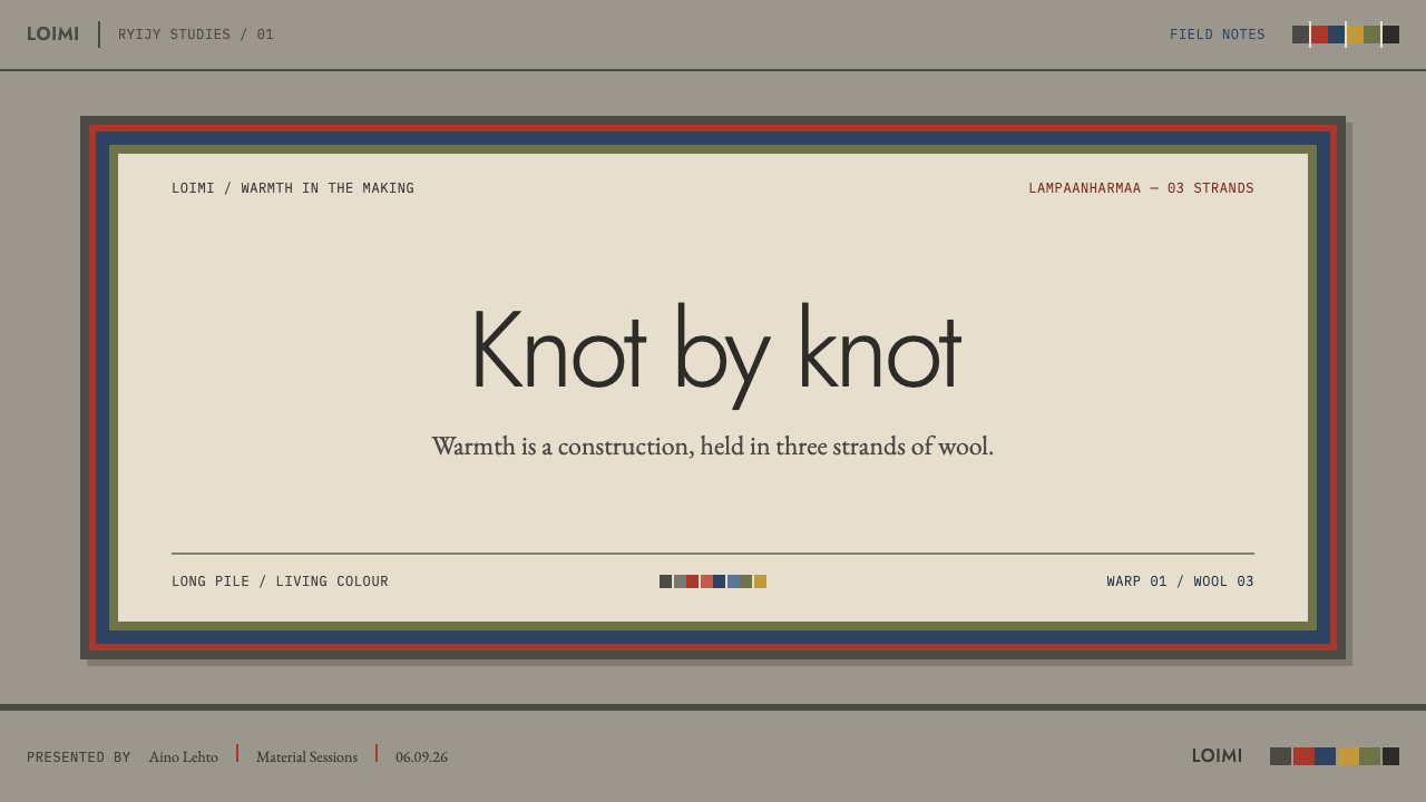
For presentation slides, a cover can show the grey wool field with a broad madder and indigo border running around its edges and the title set plainly in the middle. Content slides keep the border thin enough to stay out of the way while the centre carries text. Data slides use stepped bar charts and step lines rather than smooth curves, and avoid pie charts in favour of banded or stacked bars, since a true circle does not exist in this vocabulary.
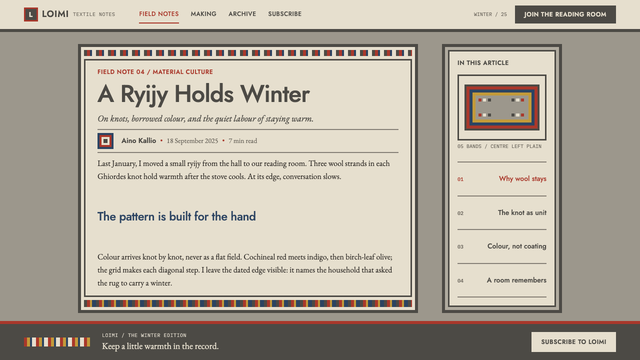
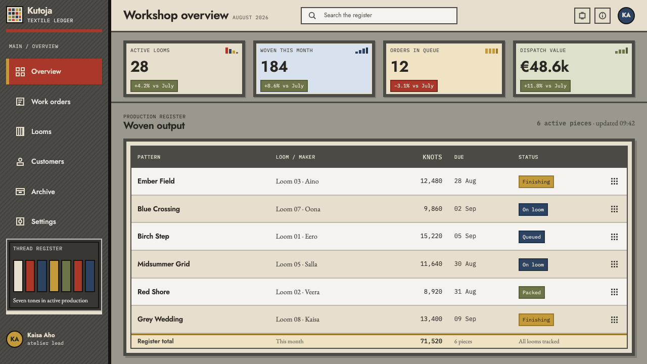
For web interfaces, treat each major section as a small rug. A wide band marks the start of the section, a calm grey field holds the content, and a closing band marks the end. Dashboards work well if panels are framed with bands instead of hairline borders and if buttons and badges are square or stepped. Pricing tiers can be set as nested bands, with the featured tier given one additional band.
For editorial and marketing work, the style supports long, calm reading. A wide, quiet text column with a banded divider between chapters gives an article the feel of a woven object. Marketing pages can alternate the plain grey field with colour-banded sections, using the bands to pace the reader. Photography fits when its tones are warm and its frame is a thick band, which echoes the structure of the rug.
A common mistake is to use thin hairline borders, which defeat the idea that frames have real width. Another is to fill the centre with ornament, patterns or textures, which removes the contrast that gives the bands meaning. Rounded corners, circles and smooth gradients also break the stepped logic. Finally, avoid flat single-shade fills in the coloured bands; letting a few adjacent shades drift block by block keeps the sense of wool.
Finnish Ryijy — FAQ
What does lampaanharmaa mean, and why is it the ground colour?
Lampaanharmaa is Finnish for lamb's-grey, the colour of the undyed wool as it came from the sheep. It is the ground because in a ryijy the centre is deliberately left in the natural colour of the material, and the dyed bands are the only added colour. Using it as the interface ground keeps the design anchored in a material, and it avoids the sterile feel of a pure white or pure black background.
Why are there no circles or curves in this style?
Because the ryijy is made from knots tied on a grid. The grid quantises every diagonal, so any line that is not horizontal or vertical becomes a series of steps, and a round shape can only be approximated. The design system respects that: figures are stepped, corners are square or stepped, and charts use steps. It keeps the look honest to how the object is actually made.
How can I get shade-by-shade drift without gradients?
Build each coloured area from a few adjacent shades of the same colour arranged in small blocks, so that the tone shifts in steps from one block to the next. The change should be subtle and irregular enough to feel hand-made, but never smooth. This mirrors the knot, which takes three strands of different shade. A band made this way reads as woven and alive, while a gradient would read as lit and digital.
Is the ryijy a folk tradition or a fine-art style?
Both. It began as a pre-1900 folk textile from Savo and the coastal seafaring communities, served as an eighteenth-century wedding rug, and was lifted onto a wall at the Paris Exposition of 1900 through Gallen-Kallela's Flame, woven by the Friends of Finnish Handicraft. The source places it within Finnish folk textile, National Romanticism and the Nordic craft revival, so the style carries both vernacular honesty and a conscious national image.
Related design styles
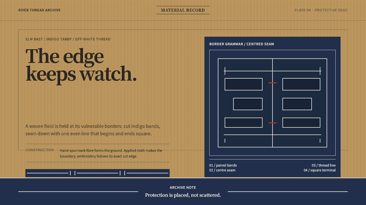 Ainu Attus RobeProtection is cut, not painted. Indigo bands and square-ended thread hold elm…
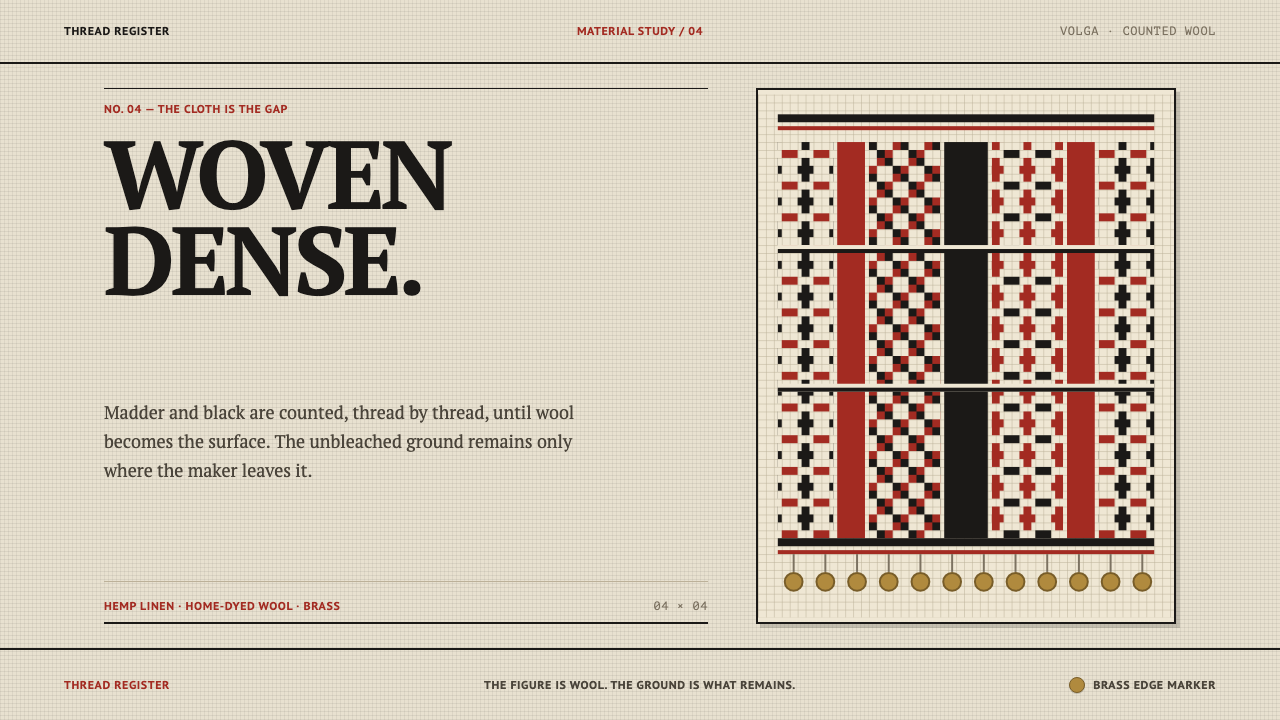 Erzya PangaDensity is the ornament. Madder and black stepped stitches crowd unbleached l…
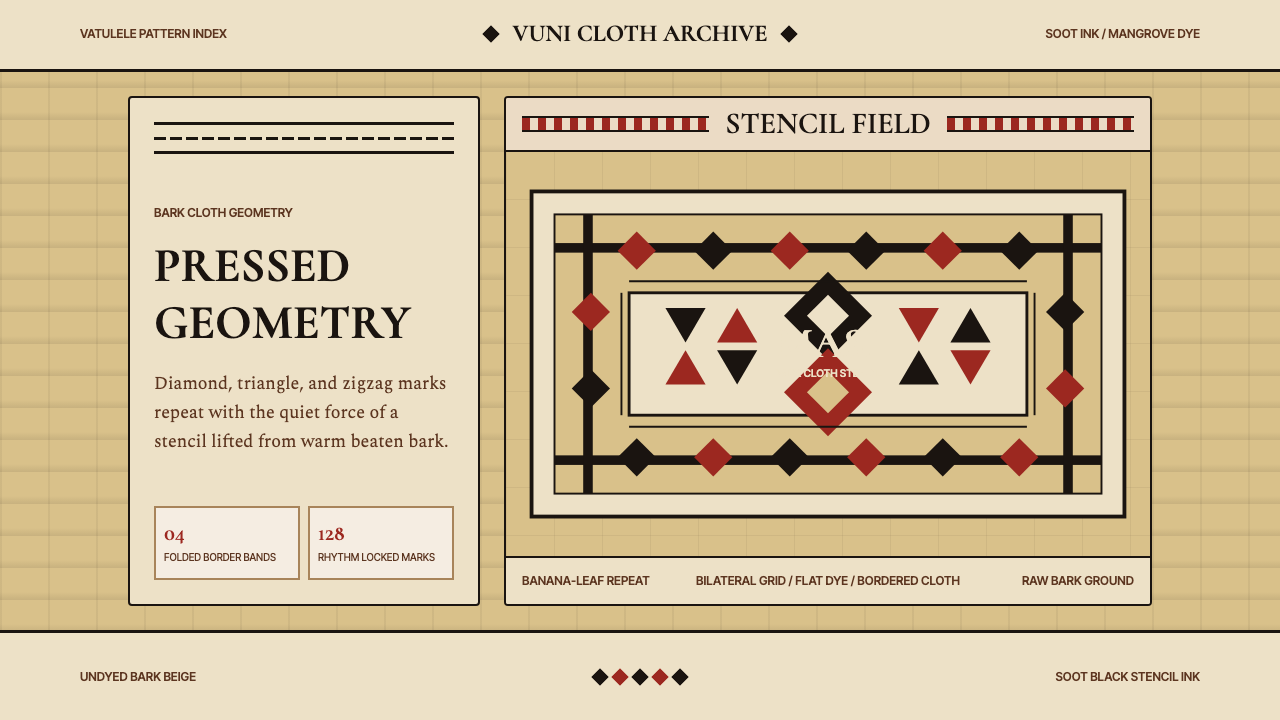 Fijian Masi Tapa StencilGeometry keeps ceremony. Soot-black diamonds repeat on bark beige with rust-r…
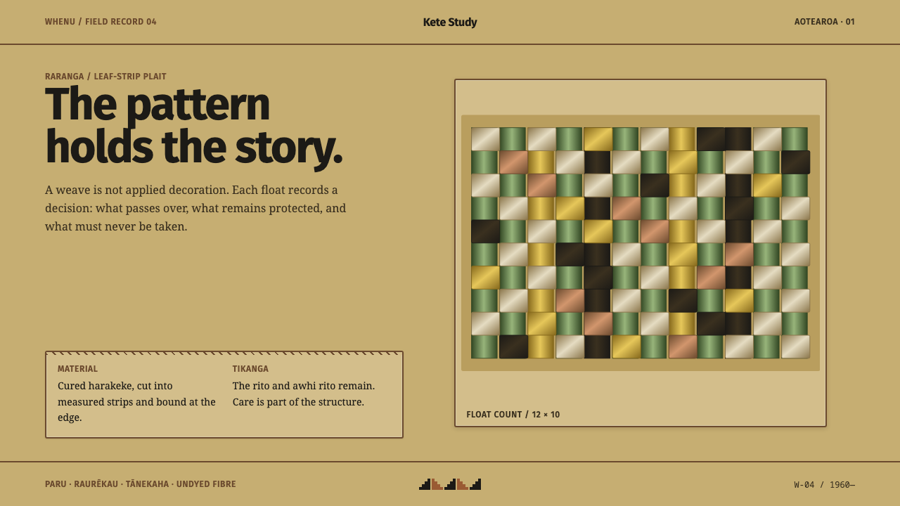 Harakeke Raranga WeavingStructure carries care. Honey-straw grids expose each green, bark and fibre s…
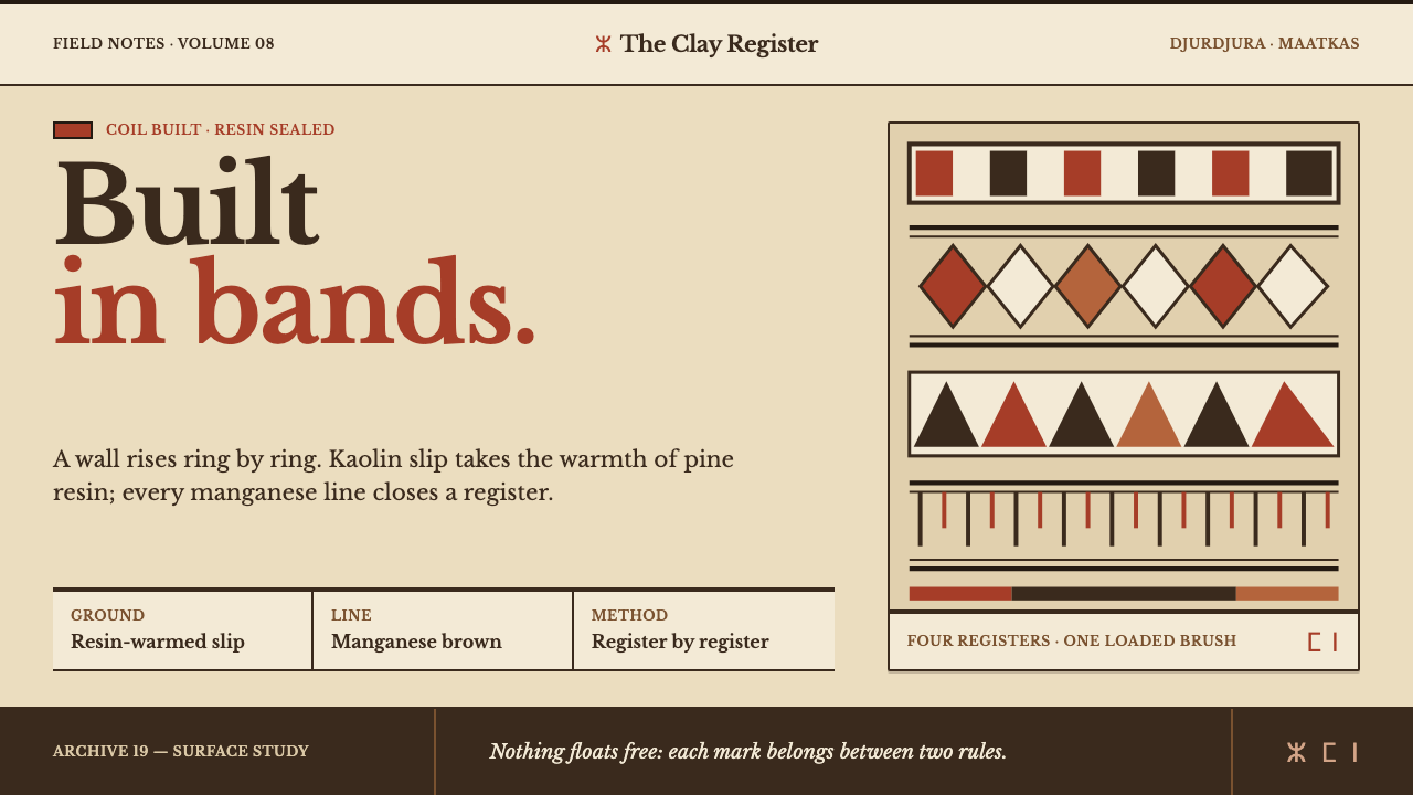 Kabyle PotteryBuilt band by band. Resin-warm kaolin carries manganese rules and iron-red ge…
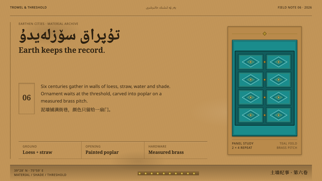 Kashgar Old TownEarth holds the field; ornament waits at one teal door, cut in a strict brass…