What is Kabyle Pottery?
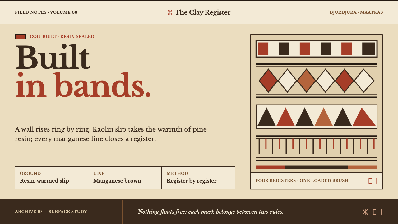
Kabyle pottery is coiled by hand, slipped in white kaolin, sealed with pine resin and painted in stacked bands of dark geometry — a style where every element sits inside a register with a top and a bottom.
Kabyle Pottery in brief
Kabyle pottery comes from Grande Kabylie, in the Djurdjura mountains of Algeria, where women build jars by hand from coils of clay rather than throwing them on a wheel. The finished pot is coated in a white kaolin slip and painted in stacked horizontal registers — checkerboards, chevrons, combs, lozenge chains and the eye motif — each band closed off above and below by a pair of dark rules. Hot pine resin then seals the surface and warms the white to a beige with a satin, faintly sticky sheen.
As a design language, Kabyle Pottery is a system of bands. Everything sits inside a register, every register has a top and a bottom, and every line carries the weight of a loaded brush. Colour is minimal and earthy: a resin-warm kaolin ground, manganese-brown rules, and iron-red geometry held between them. There are no gradients and no reflective effects, because a pot has none; the surface is satin and quiet.
Its character is deliberately imperfect and human. A coiled wall leans a little, a brushed line varies in thickness, and the same motifs return from generation to generation while each hand trembles in its own way. The system keeps this on purpose. Irregular line weight is not an error to be corrected but the proof that the lines were painted, and the discipline of the bands is what stops that irregularity from turning into mess.
Where does Kabyle Pottery come from?
Kabyle pots are coiled, never thrown. The potter builds the wall upward in rings, so the form is shaped by hand, pressure and patience, and the wall tends to sit slightly askew. The practice belongs to the Djurdjura massif in Grande Kabylie, and it is carried by women. Two communities stand out in the tradition: the women potters of Maatkas and of Ath Kheir. They are the tradition's makers in the full sense, building, slipping and painting each vessel themselves.
After building, the pot is coated in kaolin slip, a fine white clay wash that gives a pale, even ground for painting. The decoration is applied in manganese-brown lines and iron-red geometry. Once the pot is fired, hot pine resin seals it and tints the white slip a warm beige-yellow, leaving a satin, matte finish that neither reflects nor lets light through. This surface is the reason the style's ground is a warm beige rather than white: white is the slip, and beige is what the resin does to it.
The patterns are passed from mother to daughter and stay recognisably the same across generations. The tradition belongs to Amazigh (Berber) domestic ceramics, and it sits in the same visual world as the pre-Islamic geometric ornament of the Maghreb and sign systems close to Tifinagh, the Amazigh script. The checkerboard, chevron, comb and lozenge are therefore not casual decoration. They belong to a shared vocabulary older than any single pot, and the eye motif is there to ward off harm.
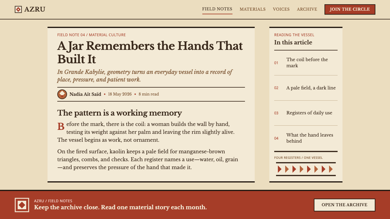
The tradition is old and continuous. It is dated to the nineteenth century and earlier and ran on into the twentieth, and a Kabyle jar acquired by the V&A in 1868 is one marker of how long such pots have been valued as objects. Curio's system turns the pot into a page. The resin colour becomes the base, the manganese line becomes all of the structure, the card is a stretch of bare slip between two horizontal lines, the button is a filled block of colour and the divider is a row of comb teeth.
What defines the Kabyle Pottery look?
Coiled Form
A coiled pot is built in rings by hand, so its walls are never perfectly true. The style keeps that quality: shapes are simple, slightly irregular and clearly made rather than generated. Blocks are not mathematically crisp, and edges are allowed to wander a little, because this slight lean is the evidence of the hand and the reason the style feels warm.
Stacked Registers
Decoration is never scattered freely across the surface. It is stacked in horizontal registers, one band above another, like belts on a jar. Each register holds one pattern and has a clear top and bottom. The same rule governs layouts: content is divided into bands, and nothing floats outside one.
Paired Dark Rules
Each band is closed by a pair of dark manganese-brown rules, drawn with a loaded brush. These lines are the structure of the whole system: they separate registers, frame content and give the surface its rhythm. They are heavy rather than hairline, and their weight is allowed to vary slightly, because a brushed line is never a machine line.
Resin-Warm Ground
The ground is a warm beige, the white kaolin slip yellowed by hot pine resin. Its surface is satin and matte, with a very faint sticky sheen that never turns into a reflection. It reads as a surface that has been handled and sealed, not as a clean white page. All other colours rest on it, and they are chosen to sit well on that warmth.
Geometric Vocabulary
The motifs are abstract and finite: checkerboards, chevrons, combs, lozenge chains and the eye. They are built from straight strokes and simple repeating units, so a register can be drawn by repetition alone. There is no illustration, no pictorial scene and no free ornament. The vocabulary is small on purpose, and the repetition is the decoration.
Iron-Red Geometry
Where colour appears inside a band, it is iron-red, an earthy, brick-like red used for the geometric fields themselves. It is always held between dark rules and never allowed to spread across the ground. Manganese brown draws the structure, and iron-red fills the pattern, so each colour has one job and nothing is accidental.
Components as Bands
Interface pieces are translated into the language of the pot. A card is a stretch of bare slip between two horizontal lines, a button is a filled block of colour, and a divider is a row of comb teeth. None of them needs a shadow or a gradient, because the lines supply all the structure. The result is flat, graphic and sturdy, closer to a painted vessel than to a typical interface.
Who shaped Kabyle Pottery?
The women potters of Maatkas are one of the two communities named in the Kabyle tradition. They build jars by coiling, coat them in kaolin slip and paint them in manganese and iron-red bands, so that the whole process, from clay to finished pattern, stays in a single pair of hands. They stand for the continuity of a domestic craft handed from mother to daughter.
The potters of Ath Kheir are the second community the tradition is associated with. Their presence alongside Maatkas shows that the style is a shared regional practice rather than the signature of one workshop, held in common across the Djurdjura. What they share is a method: coiled walls, white slip, banded paintwork and a pine-resin finish.
The Victoria and Albert Museum is the institution tied to a dated marker of the tradition: a Kabyle jar acquired in 1868. An object of this kind shows how early such pots were collected and why the banded, resin-warm surface is so well documented as an image. The museum's role is that of a witness rather than a maker.
How do you use Kabyle Pottery today?
Kabyle Pottery suits work that wants warmth, handcraft and strong structure without softness. Its power lies in the discipline of the bands and the roughness of the line, and applying it well means keeping both, rather than only borrowing a beige background.
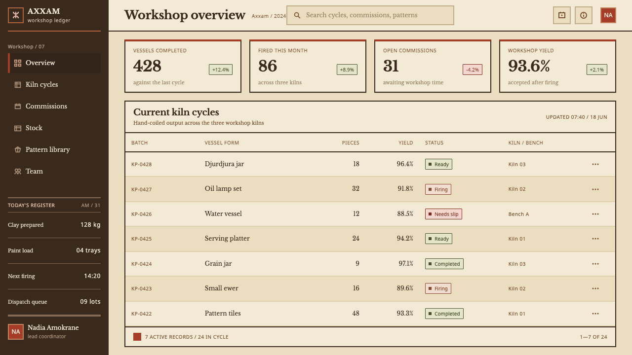
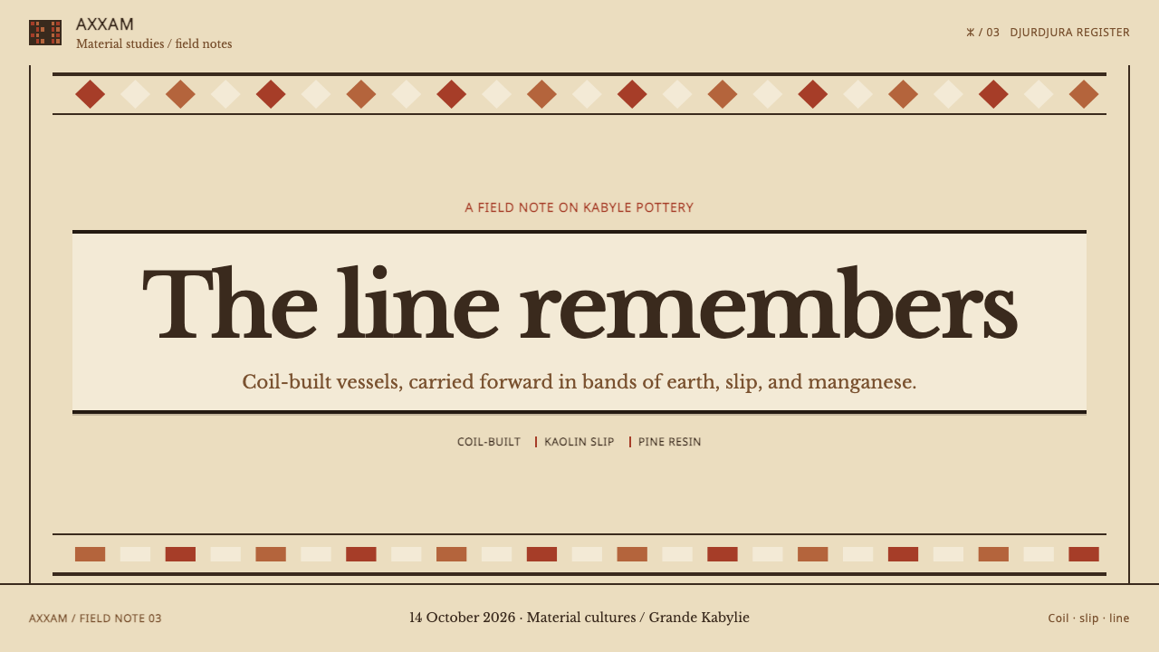
For presentation slides, build the cover as a warm beige field with the title set between two heavy dark rules, and add one band of iron-red checkerboard or chevron above or below it. Content slides divide into registers, one idea per band, with a rule at the top and bottom. Data slides are natural here: bars become filled blocks of colour sitting between rules, tables become stacked rows, and a patterned band can serve as a chapter divider. Keep each chart to the three working colours of the pot, and let line weight, not shading, carry the emphasis.
For web interfaces, the style suits dashboards, tables and settings screens, because rows and bands are its native structure. Cards are stretches of bare ground between two lines, buttons are solid colour blocks, and inputs are ruled boxes with a dark border. Dividers become rows of comb teeth. Pricing tiers read well as stacked bands, each with its own pair of rules. Avoid drop shadows and gradients; if a state needs emphasis, make the rule heavier or fill a block with colour rather than glow.
For editorial and marketing work, the style fits food, craft, heritage, travel and education, and any brand that wants to feel handmade without looking rustic. Articles can be organised as bands, with pull quotes set between two rules and a patterned register to mark a change of section. Marketing pages can alternate bare slip with filled iron-red blocks, using one geometric motif per section. If the work refers to Kabylie or to Amazigh culture, name that source plainly.
The most common mistake is to scatter the motifs freely, as a texture or a wallpaper. In this system every pattern lives in a band that has a top and a bottom; a checkerboard floating loose across a page is no longer Kabyle. The second mistake is over-correction: perfectly thin, mechanically even lines, glossy buttons or soft shadows remove the hand and the satin surface. The third is white. Pure white page backgrounds and a crowd of extra colours break the resin-warm ground that holds the whole palette together.
Kabyle Pottery — FAQ
Why is everything arranged in horizontal bands?
Because the pot is. Kabyle jars are built in rings and painted in stacked horizontal registers, each closed by a pair of dark rules. The band is the unit of both the object and the decoration, so the style treats it as the unit of layout too. Content that does not sit in a band tends to look unfinished, and the bands are what give a page its steady, belt-like rhythm.
Why are the lines uneven? Isn't that a flaw?
In this style uneven line weight is intentional. The lines are painted with a loaded brush by a human hand, and a brushed line has a slightly different weight along its length. Removing that variation by making every rule a perfect, uniform hairline would erase the evidence of the hand. The discipline of the bands keeps the irregularity from reading as sloppiness, so the two qualities depend on each other.
Why is the ground beige rather than white?
The pot starts white, with a kaolin slip, but hot pine resin yellows it to a warm beige and leaves a satin finish. That resin-warm colour is what the finished object actually looks like, so it is the ground of the system. A white background would lose that warmth and make the manganese and iron-red geometry look harder and colder than it should.
How many colours should I use?
Very few. The working palette comes from the pot itself: a resin-warm ground, manganese brown for rules and structure, and iron-red for geometry. Each colour has a clear job, so the system stays legible without extra hues. If an interface needs status colours, keep them small and functional, and let the three pot colours carry the identity.
Is it too crafty for digital products?
Not if you keep the structure and drop the costume. The system's grammar of bands, rules and blocks is very close to how tables, lists, cards and settings screens already work, so it translates well. It becomes too crafty only when the motifs are overused or applied as decoration. Used with restraint, with a patterned band here and there and the rest left plain, it gives a digital product a warm, sturdy, human character.
Related design styles
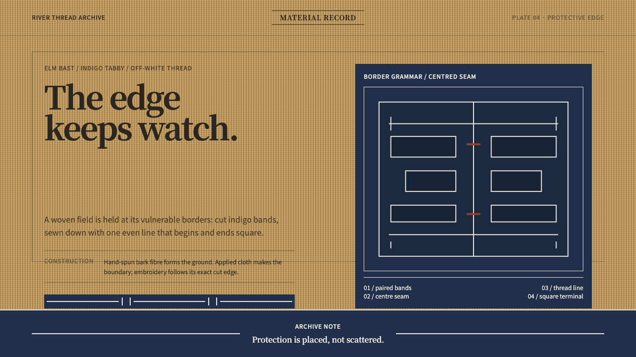 Ainu Attus RobeProtection is cut, not painted. Indigo bands and square-ended thread hold elm…
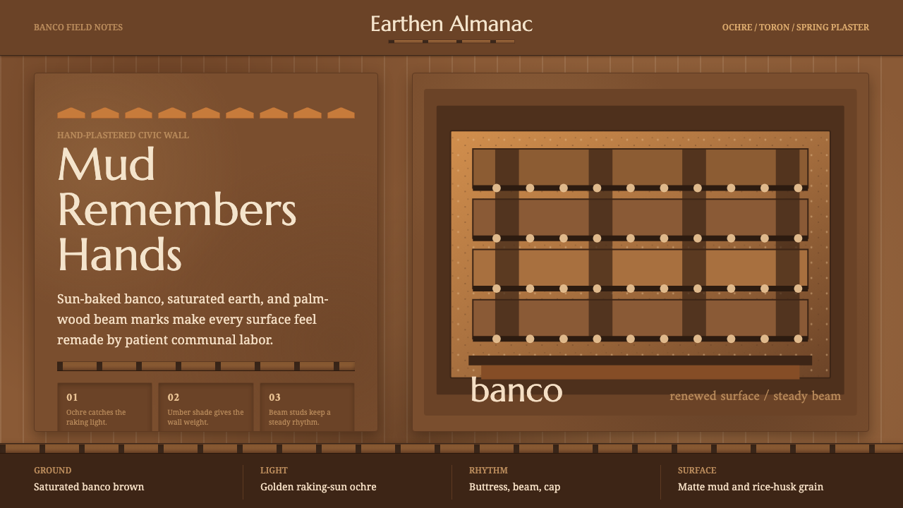 Djenné Mud MosqueBuilt from renewal. Banco brown, ochre caps, and toron grids feel hand-plaste…
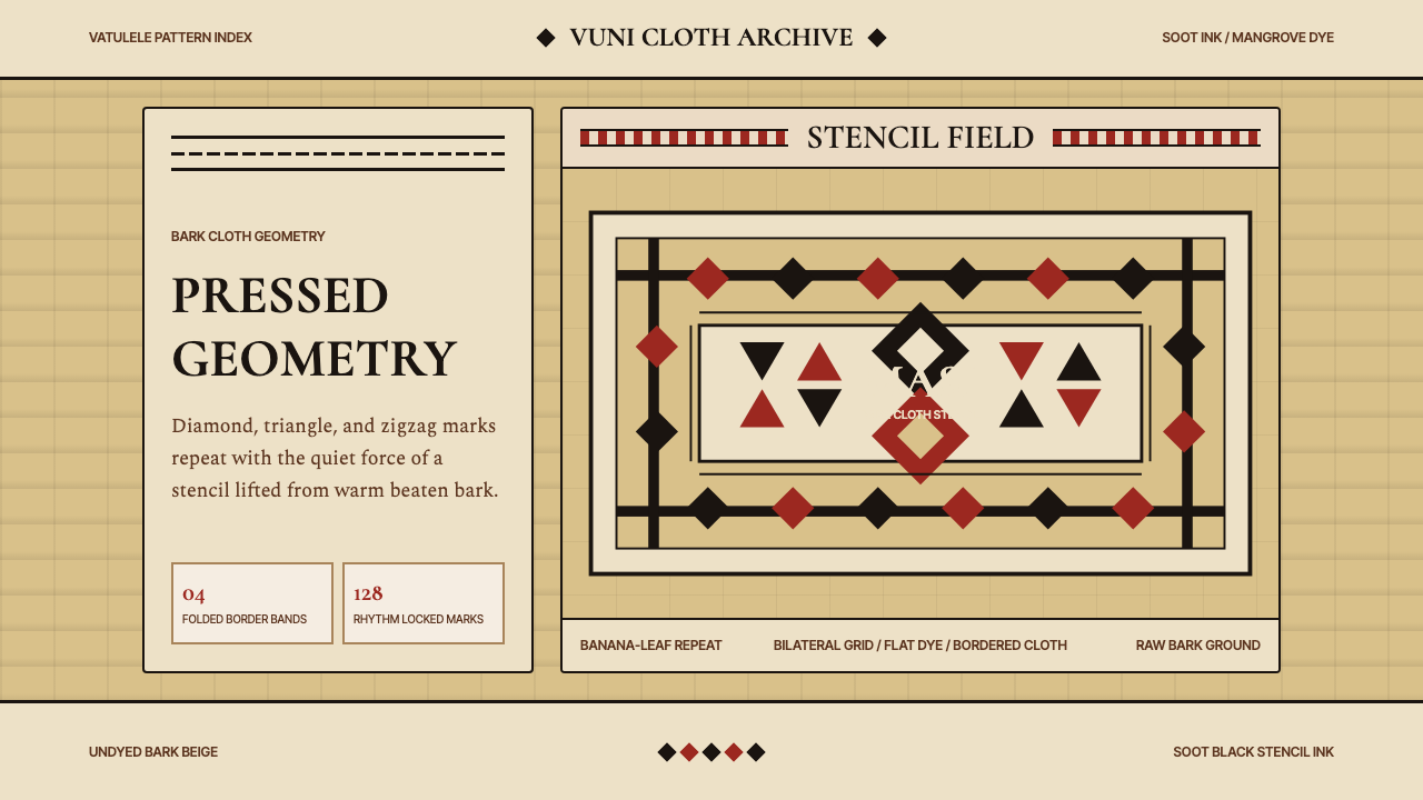 Fijian Masi Tapa StencilGeometry keeps ceremony. Soot-black diamonds repeat on bark beige with rust-r…
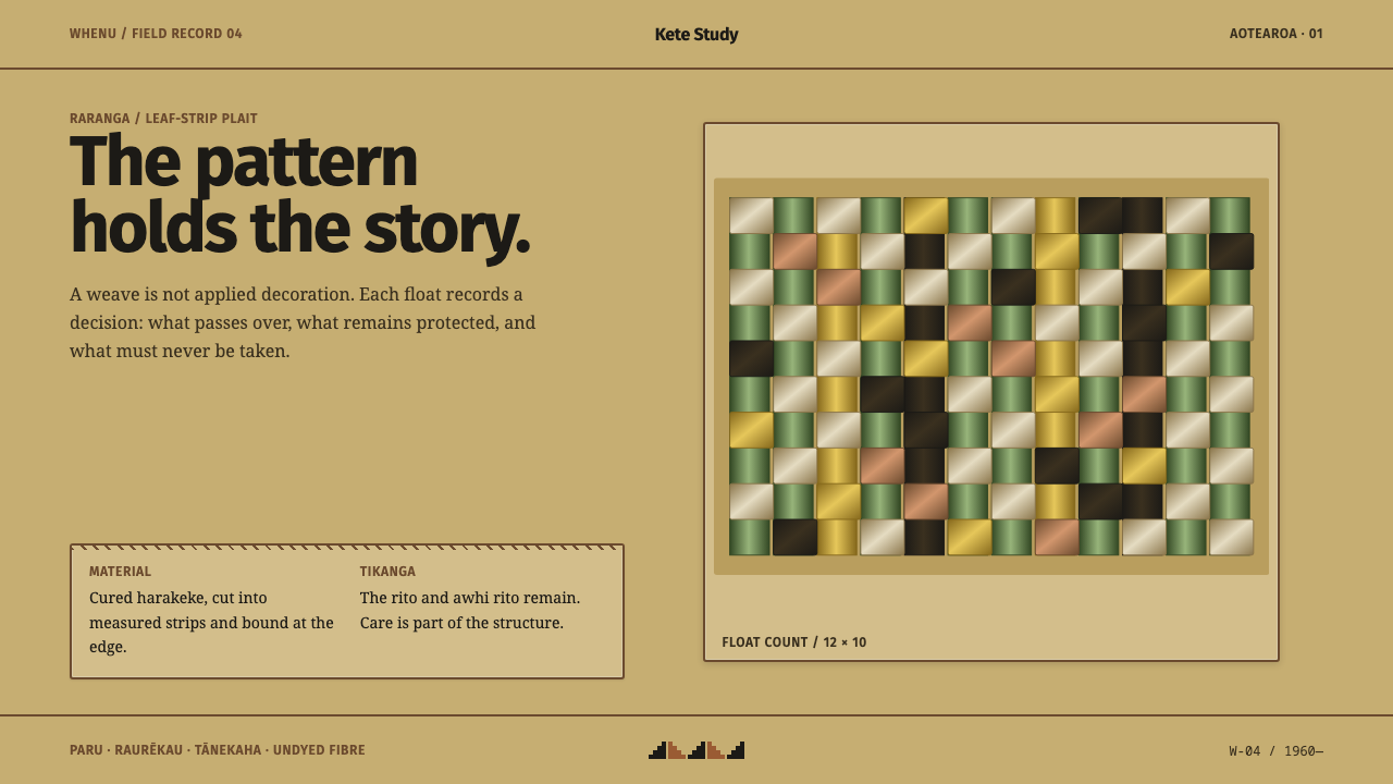 Harakeke Raranga WeavingStructure carries care. Honey-straw grids expose each green, bark and fibre s…
 Kashgar Old TownEarth holds the field; ornament waits at one teal door, cut in a strict brass…
 Kazakh Shanyrak Yurt FeltDomestic warmth, engineered. Ram-horn red felt curls around a radial shanyrak…