What is Kashgar Old Town?
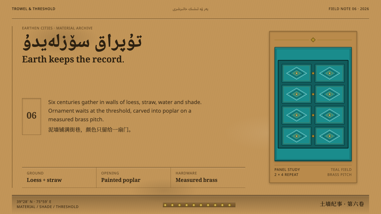
In Kashgar's old town, the whole street is the same earth — and the entire design lives in one carved, brass-studded door.
Kashgar Old Town in brief
Kashgar's old city is a fabric of two- and three-storey buildings made from sun-dried adobe brick and finished in loess plaster, rising directly out of narrow, shaded alleys. Upper floors typically overhang the lane below, deepening the shadow at street level and giving the passage a compressed, intimate scale. Walk down any of these lanes and the overwhelming visual fact is sameness: wall after wall of the same earthen material, the same warm, dusty tone, uninterrupted for long stretches.
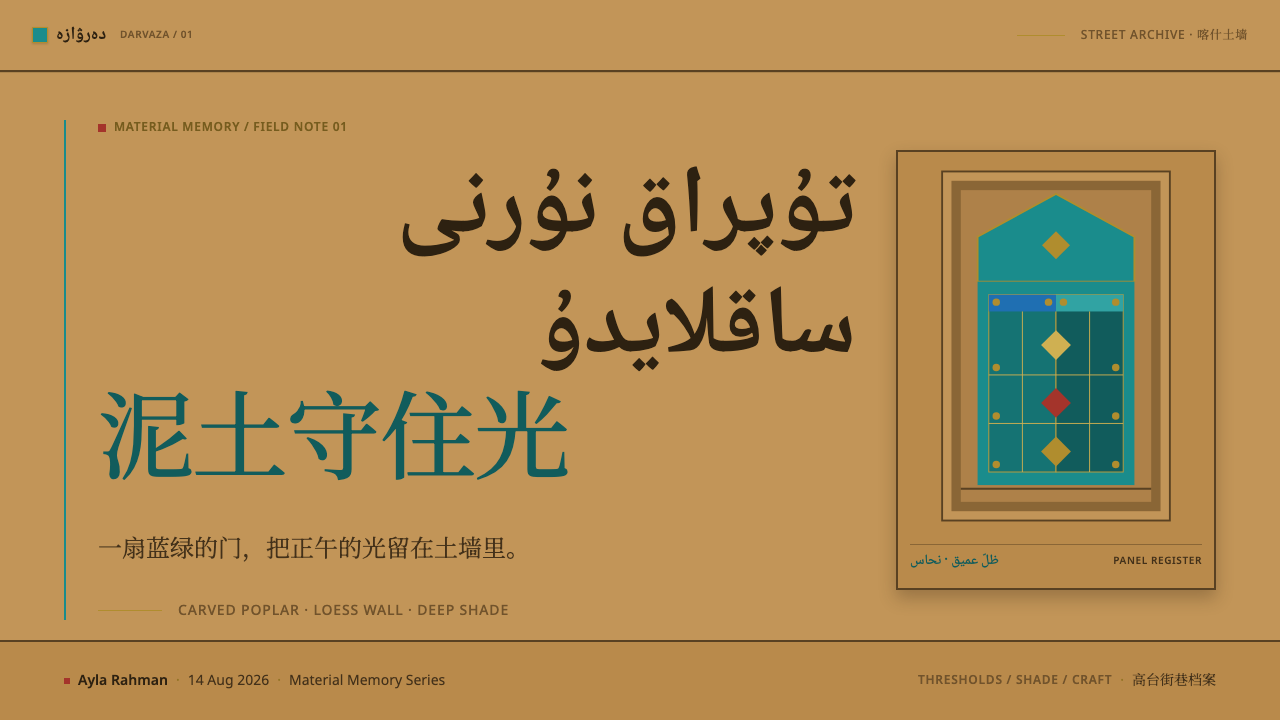
Against that field of near-total uniformity, the design event is concentrated into a single element: the door. A typical entrance is carved from poplar wood and painted a distinct blue-green, its panels cut so deeply that they read like frozen, rolling waves rather than flat carved decoration. Brass petals are studded across the surface, and the lintel above is carved with pomegranate motifs. Everything the street withholds elsewhere, it spends here.
This design system reproduces that exact ratio rather than spreading ornament evenly across a page. Earthen tones hold the ground and occupy the overwhelming majority of any surface; teal is reserved specifically for where a door would sit, appearing rarely and always as a marked, deliberate event rather than a recurring accent. Ornament, in turn, is treated as something carved and repeated — a motif cut into a surface and echoed — rather than something drawn as a flat decorative icon. The discipline that makes this legible is subtraction rather than addition: the street withholds almost everything so that the single door can afford to spend everything, and a design built on the same logic has to be equally willing to leave most of its surface plain. That withholding is not the same as emptiness — the earthen field in Kashgar's alleys is textured and weathered, plaster laid by hand over brick, not a flat digital neutral, even though it carries no ornament of its own. A faithful version of this system treats its dominant ground the same way: quiet, but with a worked, tactile quality, so that the contrast with the carved door reads as a shift in intensity rather than a shift from nothing to something.
Where does Kashgar Old Town come from?
The fabric of Kashgar's old town predates 1900 as a vernacular urban form, built up through continuous, incremental construction rather than a single planned campaign. Its architecture belongs to a broader tradition of Central Asian earthen building, in which adobe brick and loess plaster were the standard materials for an oasis city along historic Silk Road trade routes, chosen because they were locally abundant and well suited to the region's climate.
Within that earthen fabric, ornament was concentrated in the hands of specialist trades rather than distributed evenly across every building element. Uyghur master carpenters carved the doors and structural woodwork, producing the deep, wave-like relief patterns and pomegranate lintels that mark an entrance as significant. Ganch plasterers — specialists in a traditional carved and molded plaster technique — shaped surface ornament elsewhere in the urban fabric, while old-city coppersmith families supplied the worked brasswork, including the studded petals set into carved doors.
This division of labor reflects a wider regional current: Islamic geometric and vegetal ornament, applied through specialist woodcarving and brasswork rather than through painted decoration alone, in an urban context where Uyghur craft traditions gave the earthen city its specific character. The Gaotai quarter, part of the same old-town fabric, preserves this vernacular architecture in a particularly continuous form.
That continuity was interrupted decisively after 2009, when demolition and reconstruction of large sections of Kashgar's old town began and has continued since. The pre-1900 vernacular fabric this design system draws on therefore represents a specific historical condition — a continuously rebuilt but materially and stylistically consistent urban fabric — that the ongoing reconstruction era has since altered.
What defines the Kashgar Old Town look?
Earthen Ground
The dominant surface across the entire system is a warm, dusty earthen tone, standing in for sun-dried adobe brick finished with loess plaster. This tone occupies the overwhelming majority of any composition — walls, backgrounds, and structural surfaces are earth, not accent color.
Teal Reserved for the Door
Blue-green appears only where a door — or a door-equivalent focal element — would sit. It is never used as a general accent color scattered across a layout; its rarity and its fixed association with a single significant element are what give it visual weight.
Carved, Repeated Ornament
Pattern is treated as something carved into a surface and echoed through repetition — like the wave-like relief cut into a door panel — rather than as a flat decorative icon dropped onto a background. Depth and repetition define the ornament, not a single drawn motif.
Near-Square Corners
Corners and edges lean toward square rather than rounded, reflecting the physical reality that plaster over adobe does not curve cleanly. Softly rounded corners would contradict the material logic of the system; sharp, plain edges are the honest default.
Brass Accent Details
Small brass or gold-toned studs and petal shapes appear as isolated accents on the door element, echoing the coppersmith work of studded petals and carved lintel pomegranates. These details are concentrated, never spread thinly as a repeated background texture.
Script Hierarchy
Arabic script leads the type hierarchy, reflecting what is actually painted and carved on the walls and doors of the old town, with other scripts following in support rather than taking the lead position.
Who shaped Kashgar Old Town?
These craftsmen carved the poplar doors and structural woodwork of the old town, producing the deep wave-like relief patterns and pomegranate-carved lintels that concentrate the design event of an otherwise uniform earthen street into a single entrance.
Specialists in a traditional carved and molded plaster technique, ganch plasterers shaped surface ornament across the earthen urban fabric, working within the same Central Asian earthen-architecture tradition that produced Kashgar's adobe and loess-plaster buildings.
These family workshops supplied the worked brasswork found across the old town, including the studded brass petals set into carved doors — the concentrated metalwork accent that punctuates an otherwise plain earthen facade.
How do you use Kashgar Old Town today?
The power of this system lies entirely in ratio: an overwhelming field of plain, warm earth tone against one small, concentrated event of color and ornament. Applying it well means resisting the temptation to spread teal or brass detail evenly across a layout; the style depends on scarcity, with color and pattern doing maximum work in a minimum of space.
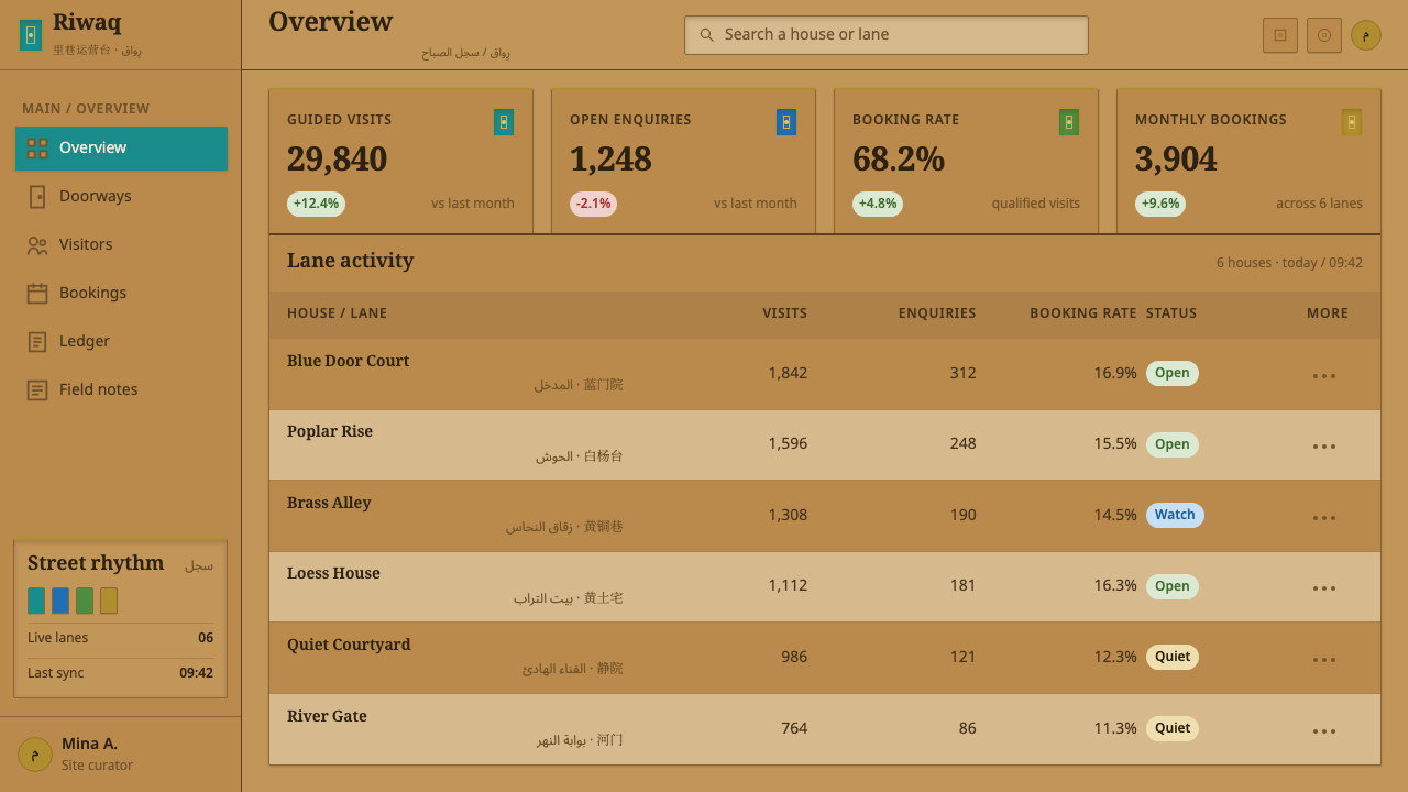
For presentation slides, this approach suits a cover slide extremely well: a wide, plain earthen field with a single carved-ornament graphic or teal accent shape positioned like a door within the frame, title type set nearby in a restrained, script-led hierarchy. Content and data slides should keep almost the entire surface in earth tones, reserving teal exclusively for one key highlighted figure or call-out per slide, never for general chart coloring.
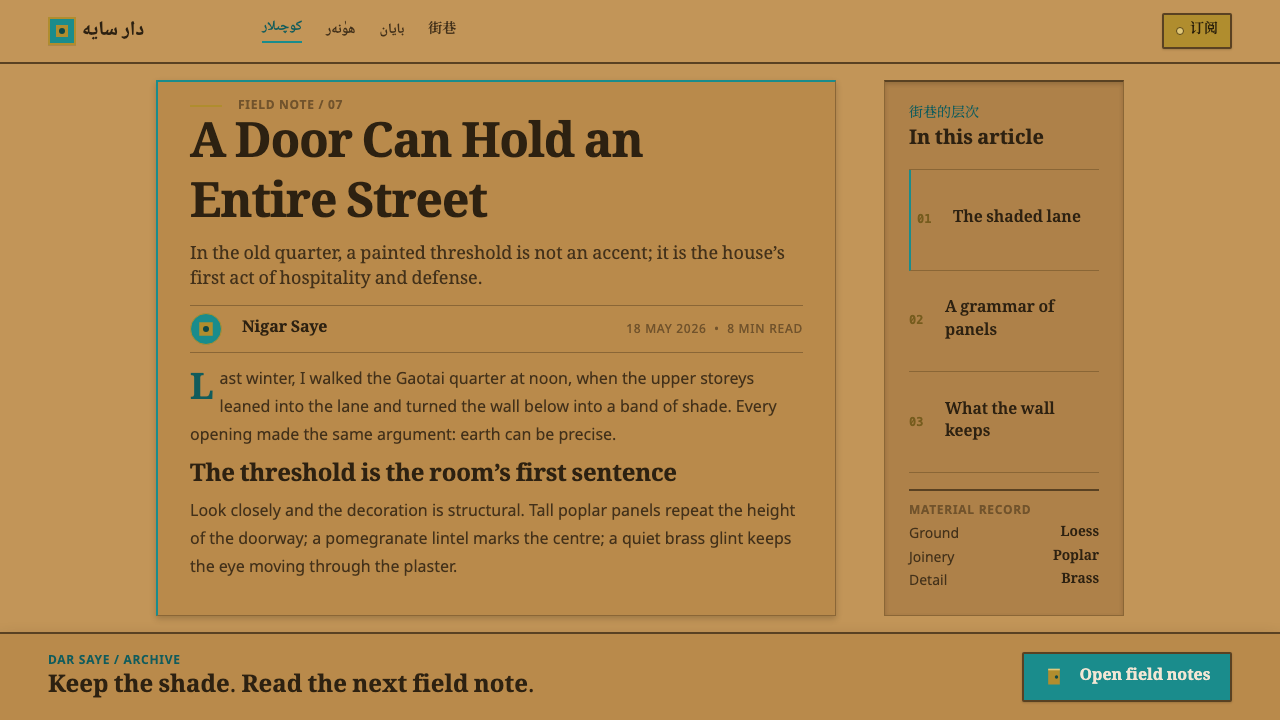
For web interfaces, this system fits a landing page or a cultural storytelling site better than a data-dense dashboard, because its logic depends on a single focal moment rather than many equally weighted elements. A hero section can use an earthen-toned background with one teal call-to-action button or graphic positioned as the 'door' of the page — the one place a visitor's eye is meant to land — while navigation and secondary elements stay strictly within the earthen palette. Card grids and list views should keep their borders and dividers near-square rather than rounded, and any carved-motif texture applied to a container should repeat quietly along an edge rather than filling the whole surface, echoing how ornament in the source material clings to frames and lintels rather than spreading across open wall.
In editorial and marketing layouts, the style rewards a single strong pull-quote or highlighted figure treated with carved-repeat ornament and teal accent, surrounded by long stretches of plain earthen-toned text blocks and near-square-cornered containers. Section breaks should read as repeated carved motifs rather than plain rules, echoing the carpenters' and plasterers' logic of pattern through repetition.
The most common mistake is treating teal as simply 'the brand color' and applying it broadly — to buttons, links, headers, and backgrounds alike. That approach destroys the ratio the system depends on. In the source material, teal exists in exactly one place: the door. A layout that uses it everywhere has an earthen street with no door left to distinguish it.
Kashgar Old Town — FAQ
Why does teal appear in only one place instead of throughout the design?
Because in the source material, the entire old town is built from the same earthen adobe and plaster, and the design event is deliberately concentrated into a single carved, blue-green door per building. Spreading that color evenly across a layout would contradict the very contrast — one marked exception against a uniform field — that makes the style recognizable.
Why does the style avoid rounded corners?
Because the buildings it draws from are finished in loess plaster over adobe brick, a material combination that does not curve cleanly. Near-square corners and edges are a direct reflection of that material honesty, and softening them into rounded shapes would misrepresent the physical surface the system is modeled on.
What role does script and typography play in this style?
Arabic script leads the type hierarchy, because that is what is actually painted and carved on the walls and doors of Kashgar's old town. Any typographic system built on this style should preserve that lead position rather than defaulting to a Latin-first hierarchy, since the script choice reflects the real visual record rather than an arbitrary stylistic preference.
Is this style well suited to a data-dense product dashboard?
Not especially. Its logic depends on a single concentrated focal event standing out against a vast, plain field, which works well for a landing page, a cover slide, or a storytelling section but sits awkwardly with a dashboard's need for many equally weighted data points. A dashboard using this style would need to pick one genuinely important element per view to carry the teal-and-carved-ornament treatment, rather than distributing it across every widget.
Why did the design draw specifically on the pre-1900 old town rather than the current rebuilt city?
Because the pre-1900 fabric represents a continuously built-up but materially consistent urban condition — the same adobe, the same loess plaster, the same craft division between carpenters, plasterers, and coppersmiths — sustained over a long span before the demolition and reconstruction that began in 2009 altered large sections of the old town. That earlier condition is what gives the earth-and-single-door ratio its integrity as a design source.
Related design styles
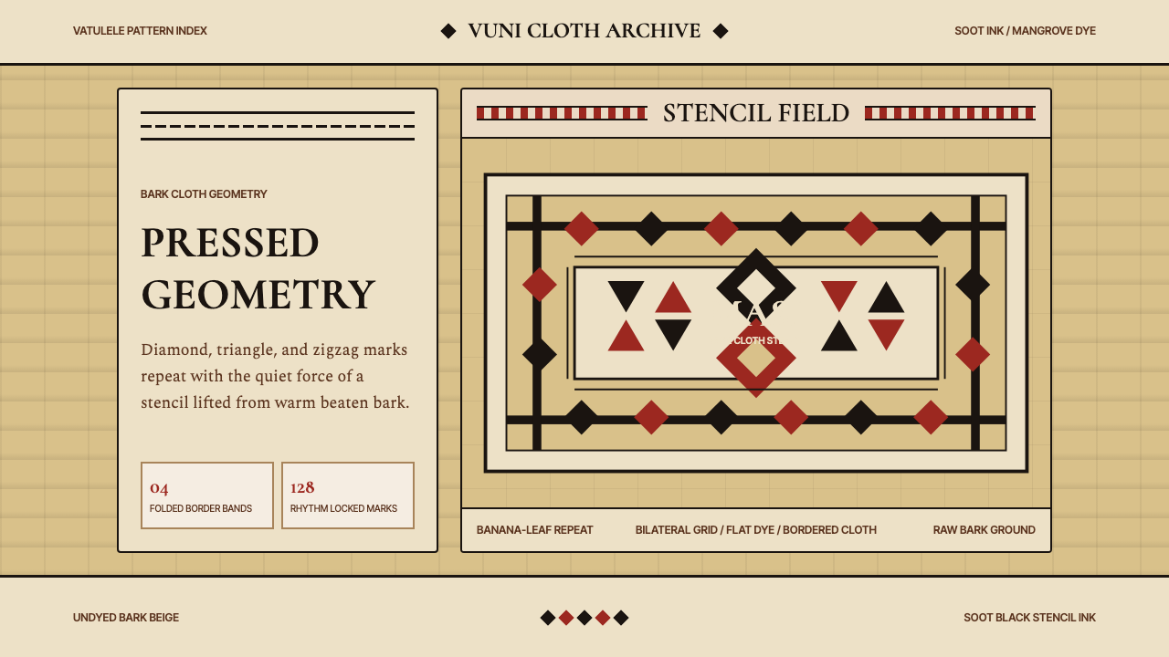 Fijian Masi Tapa StencilGeometry keeps ceremony. Soot-black diamonds repeat on bark beige with rust-r…
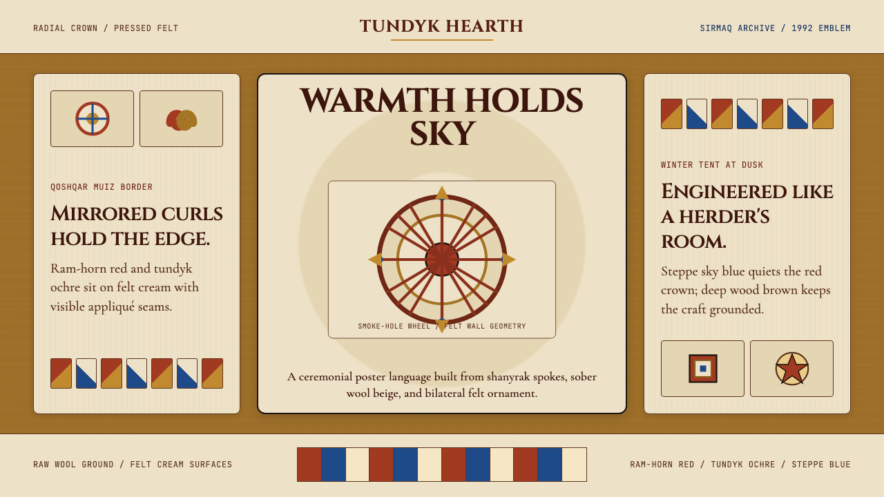 Kazakh Shanyrak Yurt FeltDomestic warmth, engineered. Ram-horn red felt curls around a radial shanyrak…
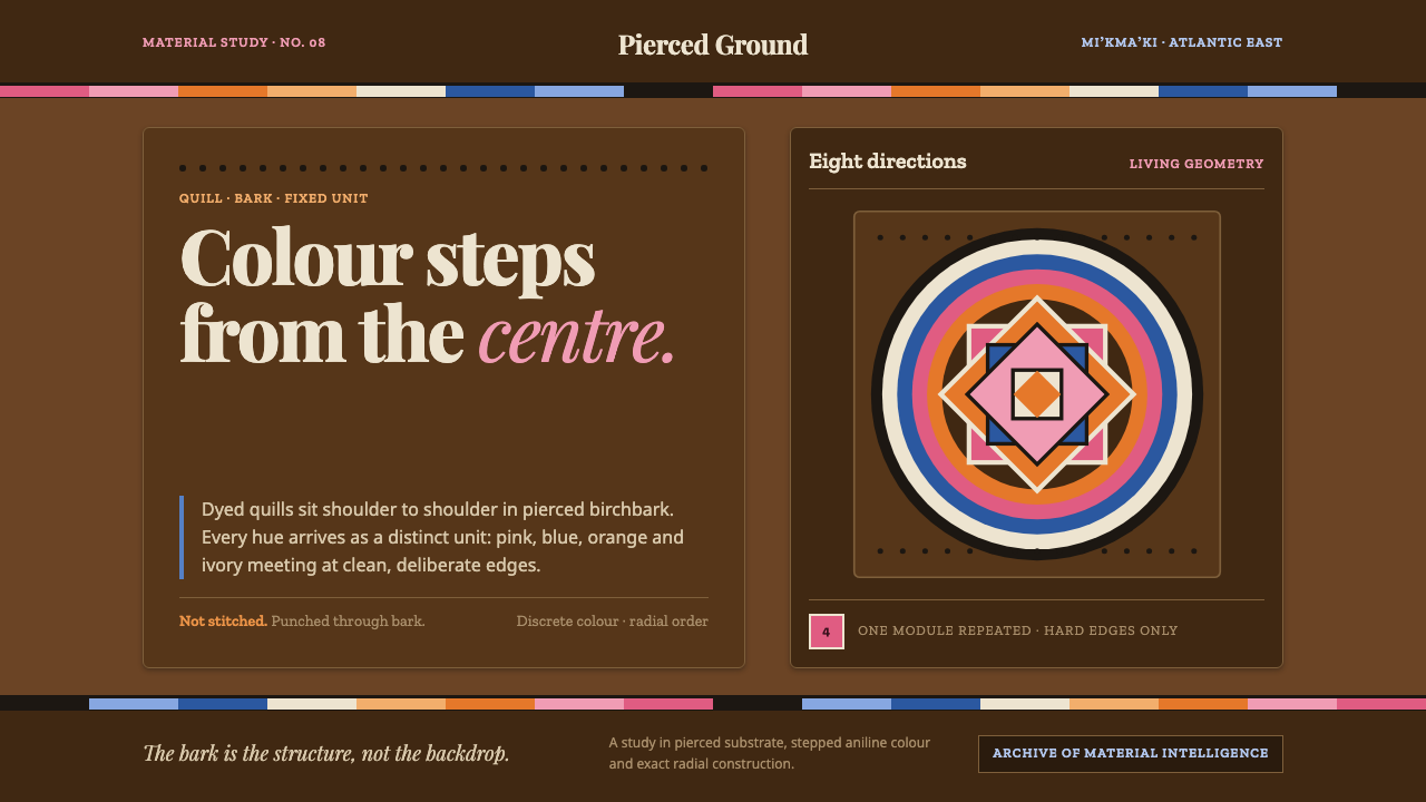 Miʼkmaq QuillworkColour never blends. Bright quill bands step across dark birchbark toward an…
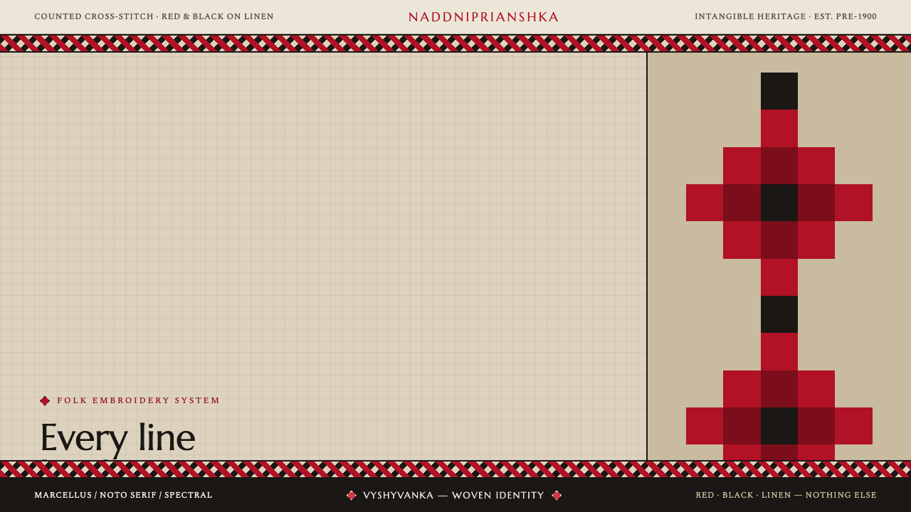 Ukrainian Vyshyvanka EmbroideryRed is life, black is protection. Stepped rhombus motifs counted thread by th…
 Uyghur Kashgar DoppaVelvet carries the blaze. Emerald borders, gold thread, and badam symmetry gl…
 Bashkir Honeycomb Felt OrnamentSteppe craft feels weighty. Umber felt holds blue honeycomb and raw-wool hook…