What is Nishapur Epigraphic Ware?
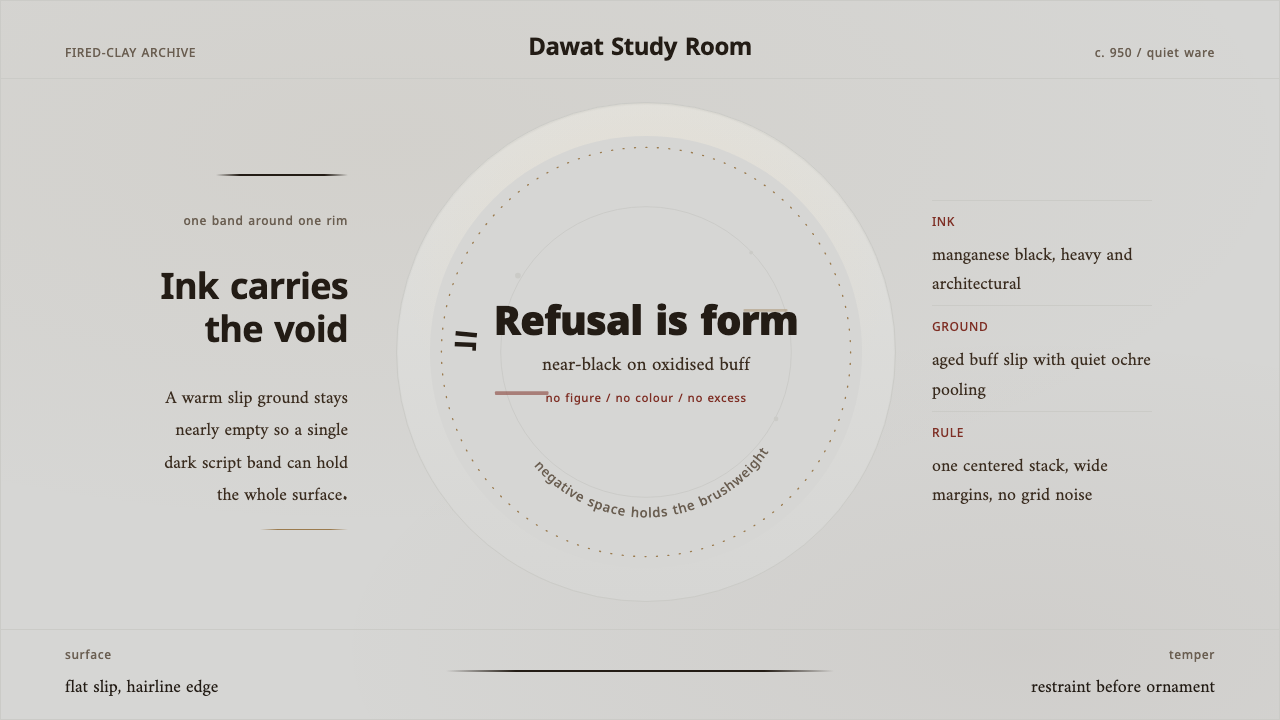
Nishapur Epigraphic Ware turns restraint into presence: near-black Kufic script circles warm clay, while silence occupies the center.
Nishapur Epigraphic Ware in brief
Nishapur Epigraphic Ware is a tradition of tenth-century slip-painted pottery associated with Samanid Khorasan. Its visual language begins with an earthenware body in reddish clay, covered with a pale slip and marked by a broad band of black manganese Kufic lettering. The inscription follows the rim or curves around the vessel, making writing the primary image rather than a caption added after decoration.
The style is powerful precisely because it declines almost everything usually expected of ceramic ornament. There is no figurative scene, no crowded floral field, and no competition among bright colors. Dark calligraphic arcs sit against an aged, warm surface; the unpainted field remains spacious. The vessel feels composed through contrast between ink-like marks, oxidized clay, and open air.
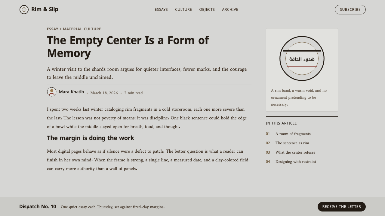
Translated into contemporary design, Nishapur Epigraphic Ware is not a pattern to be copied indiscriminately. It is a system of hierarchy. A single dark visual voice carries authority, warm clay-toned grounds prevent the result from becoming sterile, and margins are treated as active structure. Its apparent simplicity asks for discipline: every mark must earn its place.
Where does Nishapur Epigraphic Ware come from?
The tradition belongs to the Samanid world of the ninth and tenth centuries, centered in the wider cultural geography of Greater Khorasan and Transoxiana. Nishapur and Samarkand are the places named with this epigraphic slipware, linking the objects to a regional network in which pottery, writing, and material craft could meet on a domestic vessel.
Around the middle of the tenth century, potters working in Nishapur developed an exceptionally spare surface language. A reddish earthenware body was dipped or covered in white clay slip, creating a pale field that still retained the warmth of fired clay. Onto that prepared surface came a dark manganese inscription. Rather than filling every available area, the lettering deliberately left broad margins intact.
The source of the form was calligraphic as much as ceramic. Kufic scribes associated with the Afrasiab kilns brought a script defined here by its sweeping, weighty movement around the bowl. Samanid epigraphic slipware therefore makes an ordinary object carry the visual force of writing. Its legacy is not an illustrated narrative but the demonstration that language, material, and emptiness can create a complete decorative order.
What defines the Nishapur Epigraphic Ware look?
Clay Ground
The ground should feel fired rather than digitally neutral: warm, aged, slightly buff, and visibly related to earthenware. It is not a blank white canvas in the modern sense. Its quiet warmth gives the dark lettering a physical setting and keeps the composition connected to material rather than abstract monochrome.
Near-Black Ink
The lettering reads as a single dark ink, close to black but materially related to manganese on clay. Its role is structural, not decorative. This dark mark establishes the strongest contrast in the composition, carrying the eye around an edge while allowing every supporting element to remain restrained.
Calligraphic Arc
Kufic script is treated as the central visual event. Its movement is broad, rhythmic, and circumferential rather than stacked into a dense text block. In a contemporary adaptation, type or custom lettering should suggest an inscription traveling along a boundary, with deliberate pacing and a clear sense of direction.
Open Margin
Vast empty fields are not leftover space; they are the compositional counterweight to the inscription. The center stays quiet so the rim can carry force. Interfaces in this language should resist filling every panel, card, or hero area, allowing the principal statement to remain isolated and legible.
Restrained Palette
The palette derives from one dark ink and the family of clay reds, ochres, pale slips, and oxidized buff implied by the vessel. Color should not become a menu of accents. Warm variations can separate surfaces or signal hierarchy, but the composition remains governed by the contrast between dark inscription and quiet ground.
No Figurative Ornament
The system avoids figures, illustrative scenes, and ornamental accumulation. Meaning emerges from inscription, proportion, and material contrast instead of depicted subject matter. Contemporary work should preserve that refusal by avoiding decorative icon scatter, ornamental flourishes, and imagery that competes with the written line for attention.

Who shaped Nishapur Epigraphic Ware?
The Nishapur potters are the makers identified with this tenth-century ceramic language. Their contribution was not excess technique for its own sake, but a precise balance of reddish earthenware, pale slip, dark manganese, and preserved empty field. Through that balance, a domestic bowl became a disciplined surface for calligraphic presence.
The Kufic scribes associated with the Afrasiab kilns represent the writing tradition embedded in the ware. Their role matters because the script is not secondary labeling: it determines movement, weight, edge, and rhythm. The ceramic surface becomes a field in which a written line organizes the entire visual experience.
The Samanid dynasty provides the historical frame for this epigraphic slipware of ninth- and tenth-century Khorasan. Within that frame, Nishapur and Samarkand connect the style to Greater Khorasan and Transoxiana. The dynasty is not a decorative reference point; it names the cultural setting in which calligraphy and pottery formed a shared visual language.
How do you use Nishapur Epigraphic Ware today?
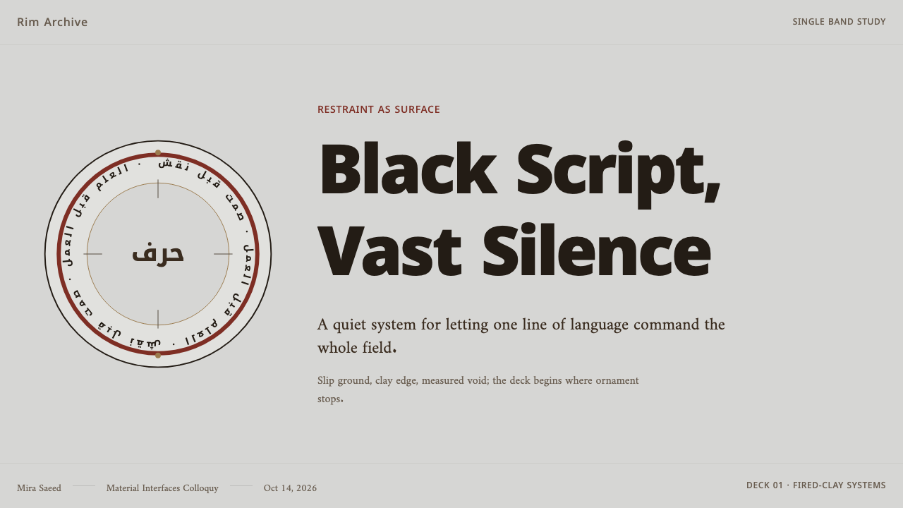
For presentation covers, use the logic of a bowl rather than a conventional poster. Place a dominant written title or calligraphic gesture along an upper, lower, or side boundary, then leave the main field calm. The ground should feel like fired clay or pale slip; supporting information should be sparse and subordinate. A cover succeeds when the edge feels charged and the center feels intentionally unoccupied.
For content and data slides, preserve the same hierarchy without forcing every chart into a historical imitation. Let a dark heading establish the primary line of reading, organize supporting copy in quiet blocks, and use warm clay-related tones only to distinguish important groups. Charts should remain plain and legible. The inscription-like movement belongs to titles and section dividers, while data itself benefits from restraint and generous separation.
For web interfaces, the style is particularly useful for dashboards, pricing pages, and focused editorial products where hierarchy must remain calm under dense information. A pale, clay-like foundation can support dark navigation, strong section names, and carefully limited warm accents. Panels should not be decorated merely to announce themselves; boundaries, spacing, and typography should establish order before color or imagery are introduced.
For editorial and marketing work, treat the margin as a place of meaning. A campaign page can place a short proposition along a curved or edge-led path, then allow the main message to stand in a broad quiet field. Product descriptions, captions, and calls to action should feel like measured annotations rather than sales noise. The effect is most convincing when material warmth and verbal clarity do more work than illustration.
A common mistake is to confuse Nishapur restraint with generic rustic styling. Adding rough textures, many earthy accents, ornamental borders, pseudo-Arabic lettering, or unrelated historical motifs destroys the system's precision. Another mistake is crowding the page after choosing a quiet palette. The style depends on real absence: use one decisive dark voice, preserve open margins, and never turn calligraphic reference into decorative clutter.
Nishapur Epigraphic Ware — FAQ
Is Nishapur Epigraphic Ware simply an Arabic-calligraphy style?
No. Kufic script is central, but the style is equally defined by the ceramic ground, the pale slip, dark manganese, rim-led composition, and extensive empty margins. Reducing it to a type treatment misses the relationship between writing and vessel. In contemporary work, the goal is not to paste script onto a surface but to make text, boundary, material warmth, and silence function as one system.
Can the style use imagery?
The source language is defined by its refusal of figuration and ornamental scene-making, so imagery should be exceptional rather than routine. If an image is necessary, it should remain subordinate to the written line and the open field. A quiet material detail or restrained object view can work more naturally than expressive illustration, but the composition should still be carried by text and margin.
Why is empty space so important here?
Because the inscription gains force from what it does not occupy. The broad quiet field makes the dark Kufic arc feel measured, legible, and physically present. When the surface is crowded, the writing becomes merely another ornament. In an interface, empty space preserves the same relationship: it gives the principal statement room to hold attention without needing louder color, more components, or visual effects.
What should designers avoid when adapting the style?
Avoid treating historical reference as costume. Do not add decorative marks merely because they appear old, and do not imitate a script without understanding its compositional role. Avoid making every surface clay-colored, every label curved, or every margin visibly distressed. The most faithful adaptation is selective: dark writing carries structure, warm material tones support it, and everything else yields to clarity.
Related design styles
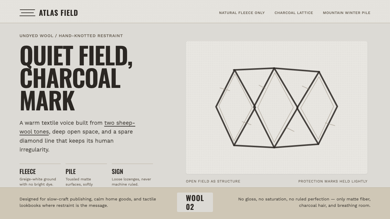 Beni Ourain Berber CarpetRestraint feels tactile. Greige wool field, Oswald type, and a loose charcoal…
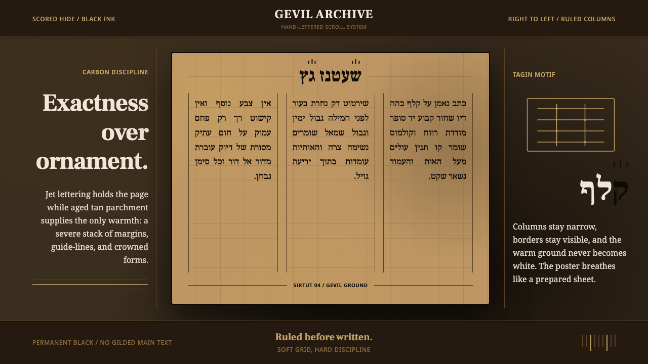 Hebrew STaM ScrollExactness over ornament. Jet ink, ruled Hebrew columns, and amber-tan parchme…
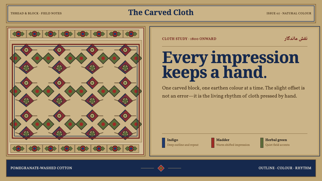 Isfahan Qalamkar PrintEvery impression keeps a hand. Indigo and madder repeats shift softly across…
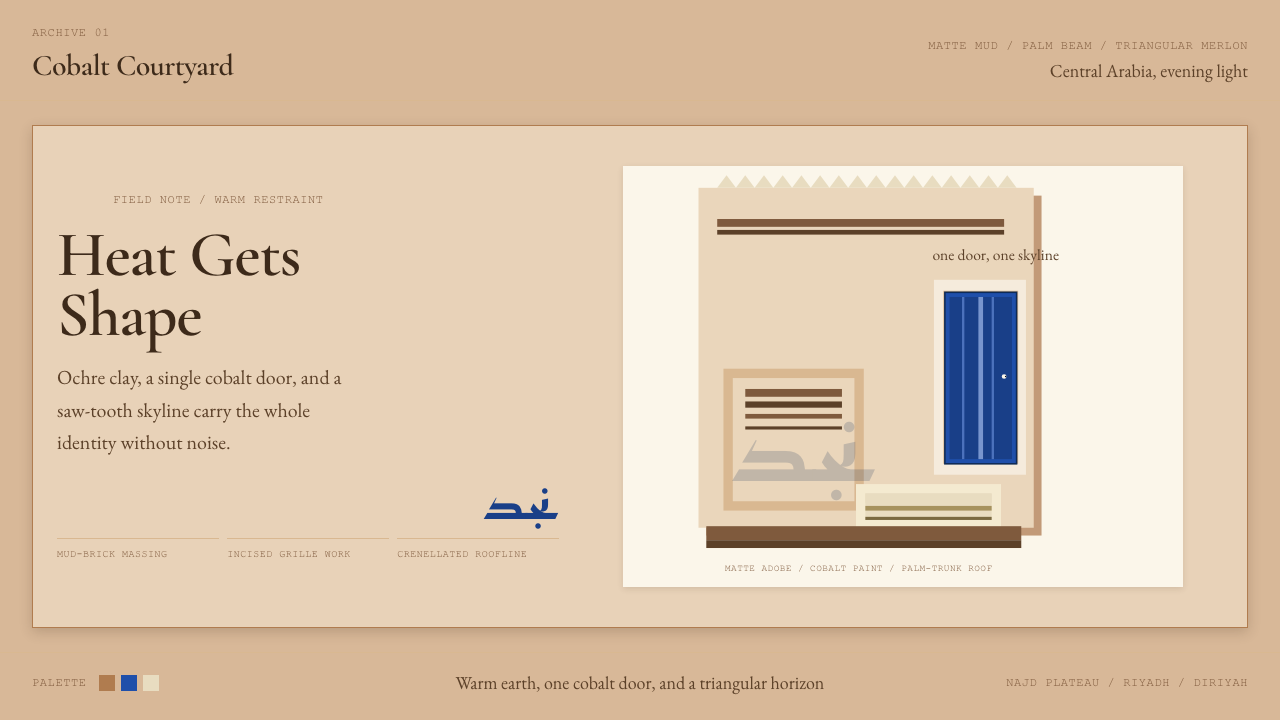 Saudi Najdi Vernacular ArchitectureHeat gets shape. Ochre clay, a single cobalt door, and a saw-tooth skyline.
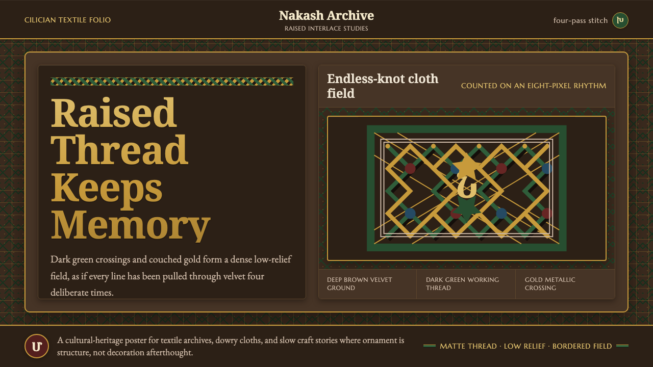 Armenian Marash Interlace EmbroideryDense memory in raised thread. Green-gold interlace locks over deep brown clo…
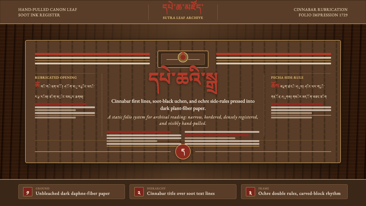 Derge Woodblock Sutra PrintHand-pulled scripture gravity. Cinnabar uchen and ochre rules press into dark…