What is Kano Indigo Dye Pits?
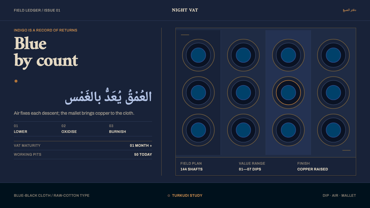
Kano's dye pits make depth by repetition: dip, air, dip again, until the cloth turns blue-black and the mallet raises a copper sheen.
Kano Indigo Dye Pits in brief
The Kano Indigo Dye Pits style takes its identity from one working place: the pit field of Kofar Mata in Kano, northern Nigeria, where cloth has been dyed by hand since 1498. The vats are shafts dug into the ground and filled with natural indigo prepared with ash and potash, then left to ferment for at least a month before they are ready to use. The craft is a family inheritance. The knowledge passes down through the dyeing families, not through a manual.
What makes the place a design source is its logic of depth. In these pits the blue is not a pattern or a gradient applied to cloth; it is a count. Cloth goes into the vat, comes out, oxidises in the air and goes in again, and the number of repetitions decides the colour. The heaviest cloth ends up blue-black with an aubergine cast beneath the blue. The final step is beating: wooden mallets pound the weave until the surface throws a coppery, uneven sheen.
As an interface language this becomes a dark, textile-grounded system. The ground is the cloth itself, deep and faintly purple at its darkest. Hierarchy is how many times a thing has been dipped, expressed as bands that step from lighter to darker blue. The accent is the copper the mallets raise, appearing as thin seams and glints rather than as paint. Nothing is decorative; every tone is the record of a process.

Where does Kano Indigo Dye Pits come from?
Kofar Mata lies in Kano, in the Hausa-speaking north of Nigeria, where the dye-pit area is also known locally as Marina. The library dates dyeing at the site to 1498 and describes a tradition that runs unbroken to the present. At its peak the field held 144 hand-dug shafts, each about six feet deep. Roughly fifty are still in daily use, which means the tradition has contracted but has not ended.
Dyeing here is Hausa textile craft, but the cloth also belongs to a wider story: trans-Saharan trade. Tuareg merchants bought the beaten indigo cloth and, according to the library's notes, deliberately asked that it not be washed, so that the indigo would rub off onto face and hands. Cloth that colours the body it covers is cloth that has been dyed to real depth, and the design system keeps that sense of saturation as a quality of its dark surfaces.
The craft sits within the broader West African tradition of natural indigo dyeing, where a fermented vat is tended rather than manufactured, and where the result depends on the vat's condition as much as on the dyer's hands. The library names one individual, Muhammad Dabosa, as a key figure, but the real author of this style is the working collective of the pits: the dyeing families whose knowledge is handed down through generations. That is reflected in the system itself, where nothing claims individual flourish or showmanship.
Seen from outside, the pits are a working field of vats and people working by hand. Seen from the design table, they are a system for producing hierarchy without ornament: one material, one process, a visible count. The Curio style turns that into a language of cloth, counts and copper, and it asks what an interface looks like when its depth is earned by repetition rather than painted on by effects.
What defines the Kano Indigo Dye Pits look?
Cloth as ground
The page is the cloth: a deep blue-black with a hint of aubergine in its darkest places, matte and woven-looking rather than glossy. It is a dark system, but not a neutral black. The blue beneath keeps it organic, and the faint purple gives depth a direction.
Dips as hierarchy
Level is how many times something has been dipped. Primary elements sit in the deepest tone; secondary elements sit one or two dips lighter; background areas step lighter again. The differences are steps, not smooth gradients, because a dip is a discrete event and the cloth records each one.
Blue-black bands
Bands of blue-black run across surfaces like strips of woven cloth, each marking a change of depth. They give pages a horizontal, loom-like rhythm and make sections feel like lengths of fabric laid side by side, each one carrying its own count of dips.
Copper seams
Thin copper seams mark joins, rules and emphasis. The copper is uneven, brighter in one place and duller in another, as a surface beaten by mallets would be. It is the only warm, reflective note in the system, and it should stay thin and rare so that it reads as a sheen rather than a colour.
Beaten texture
Surfaces carry the feel of cloth that has been beaten: compacted, slightly uneven, faintly metallic at the edges of things, never glossy. Think of fibres pressed together. Soft drop shadows have no place here, because the cloth has no light source of its own; depth comes from stepping the tone instead.
The visible count
Repetition is meant to be seen: evenly spaced bands, stepped tones, countable rows. A viewer should be able to read the number of dips in a layout the way one counts rounds in a coil. Text stays clean and clear against the deep ground, set in pale cloth tones rather than stark white.

Who shaped Kano Indigo Dye Pits?
Muhammad Dabosa is the individual dyer the library names in connection with the Kofar Mata pits. The record is not biographical, and it is better to say so than to embroider it. What his place in the reference establishes is a principle: this craft's authority lives in people who work the vats with their hands, not in a studio brand or a designer's signature. Treat his name as a pointer to that working knowledge.
Dyeing at Kofar Mata is a family inheritance, with the pits and the knowledge of keeping a vat passing down through generations. These families are the real custodians of the tradition. Their method, at least a month of fermentation before a vat is ready and patient repetition afterward, is what the design system converts into a visual logic of time made visible.
Tuareg merchants appear in the library's notes as buyers of the beaten indigo cloth, taking it across the Sahara in the trans-Saharan trade. They asked for it unwashed so the indigo would rub onto face and hands. That detail is the best argument for deep saturation in this style: the colour is meant to be so present that it passes from cloth to body.
How do you use Kano Indigo Dye Pits today?
On slides, the style is built for covers that want weight. Fill the slide with the deep cloth tone, set the title in pale type and let a single thin copper seam divide title from subtitle. Content slides can use bands as structure: each band is a section, the deepest band is the main point, and the lighter ones hold supporting detail. Data slides suit stepped, banded charts where bar colour darkens with value, so that the graph literally becomes a count of dips. Reserve copper for the one series, annotation or number you want the audience to remember.
On the web, the system suits dashboards, finance and analytics products, and anything that benefits from a calm dark mode with a strong sense of hierarchy. Layer panels by tonal step rather than shadow, mark active elements with a copper seam, and give long tables banded rows so the eye can follow them like the rounds of a coil. A pricing page can express tiers as depth, with the most substantial plan in the deepest band. Keep interactive states restrained: a copper edge or a subtle change of dip is enough.
For editorial and marketing work, the dye pits offer a grounded, craft-led voice that suits textile, fashion, heritage and sustainability stories, as well as any brand that wants to say that quality takes repetition. Photographs of cloth, hands and vats work as the only full-colour material, and long-form layouts can use bands as chapter dividers. Headlines work best when they are plain and confident; the style does its talking through tone and rhythm.
Because the system belongs to a real working place, its story should travel with it when it is used for a project about West African craft. Name Kofar Mata, Kano and the Hausa tradition rather than treating the look as a generic 'African textile' pattern. The visual principles of banding, stepped depth and a rare copper accent can be applied far beyond that setting, but the reference should remain visible.
The most common mistake is to turn the blue into a bright, saturated 'indigo' with a glossy gradient, which loses the very thing that defines the style: depth made by counting, not by effect. The second is to scatter copper everywhere. Copper is a sheen raised by beating, and it only works because it is scarce; if every border and button is copper, the accent stops meaning anything. Finally, avoid smoothing the bands into a seamless gradient, since the steps are the point.

Kano Indigo Dye Pits — FAQ
What is Kofar Mata and why does it matter for design?
Kofar Mata is a field of hand-dug dye pits in Kano, northern Nigeria, where natural indigo dyeing has been practised since 1498. It matters for design because its method is a complete visual logic in itself: depth comes from counted repetition, texture comes from beating, and the accent comes from the sheen that the mallets raise. Curio turns that logic into a dark interface system.
What does the sheen on Kano indigo cloth come from?
It comes from beating. After repeated dipping, wooden mallets pound the weave until the fibres compact and the surface throws a coppery, uneven metallic sheen. The library calls this the mark of genuine Kano turkudi. In the design system, that sheen is what the copper accent represents, which is why it appears as thin, irregular seams rather than as a flat fill.
Why is the style dark, and can it work on a light background?
The darkness is the result of the process: the heaviest cloth has been dipped until it is blue-black with an aubergine cast. A light version is therefore a different idea, closer to cloth that has had only a few dips. You can borrow the stepped banding on a lighter ground, but the full character of the style, with its depth and its copper sheen, belongs to the dark end of the scale.
How do I show depth without gradients or shadows?
Use discrete tonal steps. Each step is a dip: a card one step lighter than the page, a panel two steps lighter than the card, and so on. Because the steps are visible, they communicate hierarchy as a count instead of an illusion of light. A thin copper seam on the edge of the active element does the work a shadow would otherwise do.
Which kinds of project suit this style best?
It suits products and stories that value patience and depth: analytics and finance dashboards, craft and textile brands, heritage and sustainability journalism, and anything where a calm dark mode with strong hierarchy helps. It is less suited to playful, high-energy consumer products, where its seriousness and low-key palette would work against the mood.
Related design styles
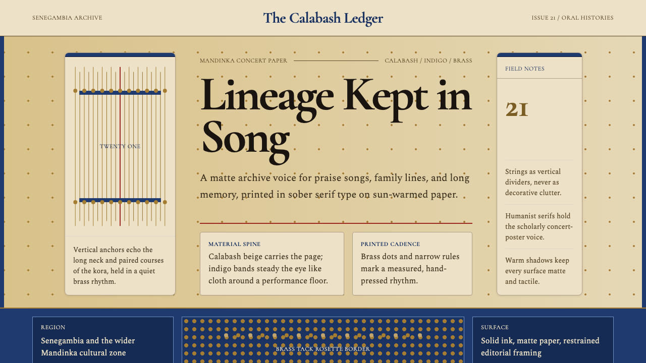 Gambian Griot Kora (21-string)Oral history feels tactile. Calabash beige, indigo bands, and 21 brass string…
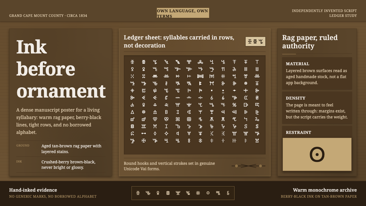 Vai Syllabary LiberiaInk has authority. Dense Vai glyphs pack berry-black rows across warm tan rag…
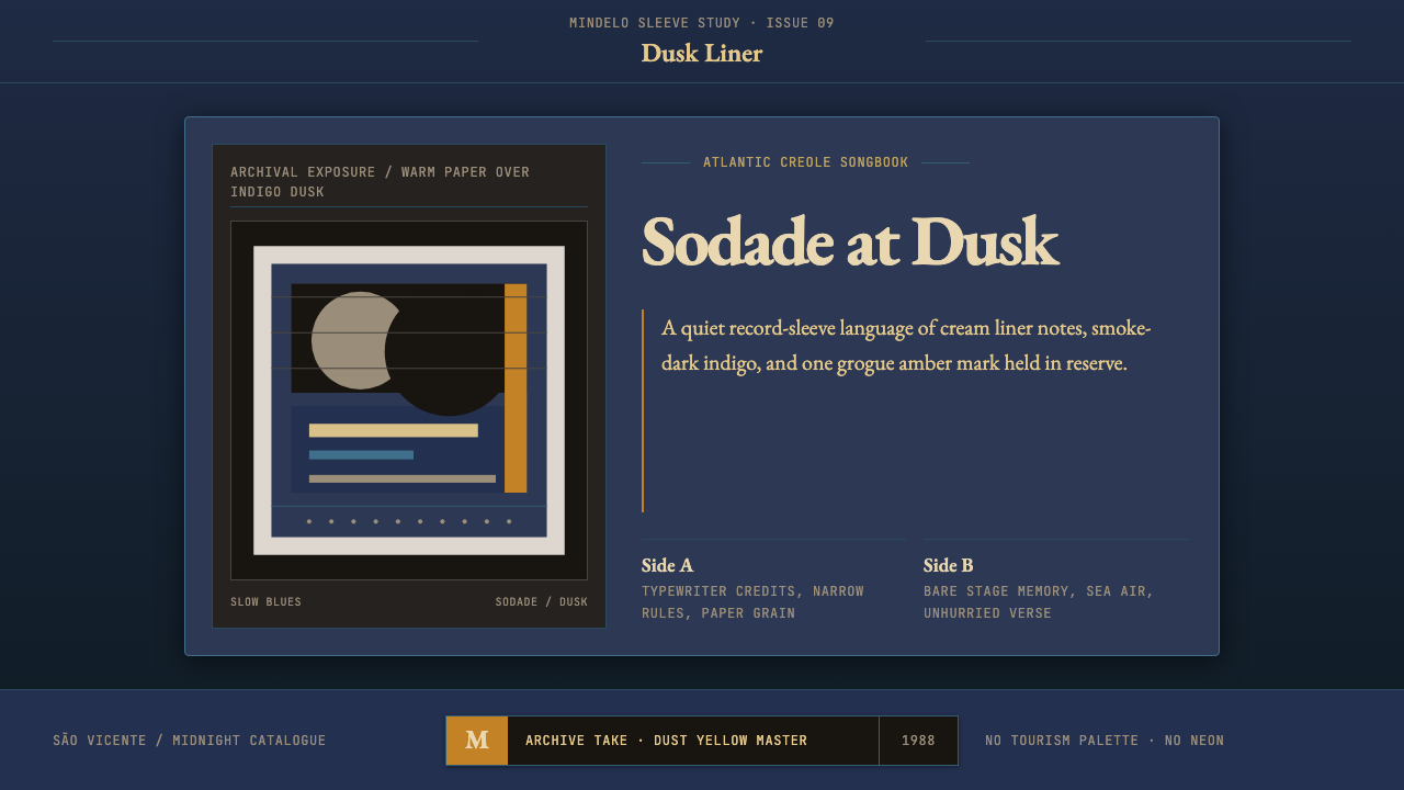 Cape Verdean Morna (Cesária Era)Longing in dusk. Indigo sleeve framing, Garamond liner notes, and one amber e…
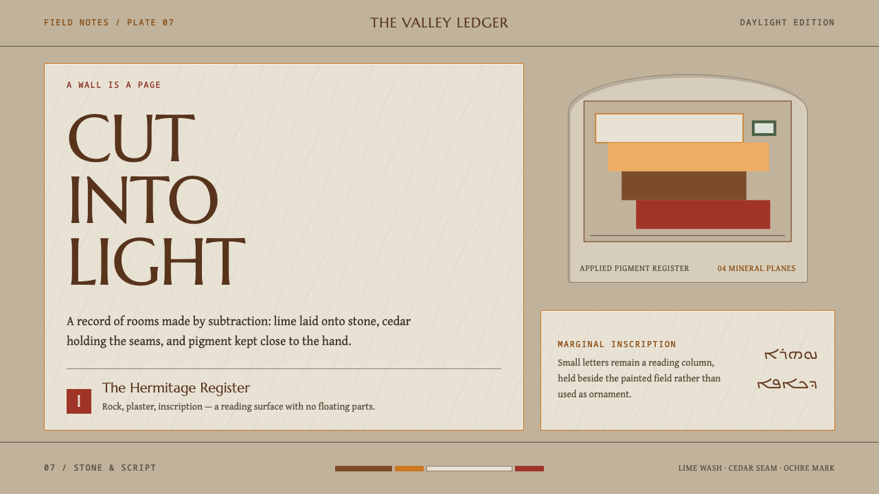 Maronite QadishaNothing floats. Lime-plaster terraces, cedar seams, and small Syriac margins…
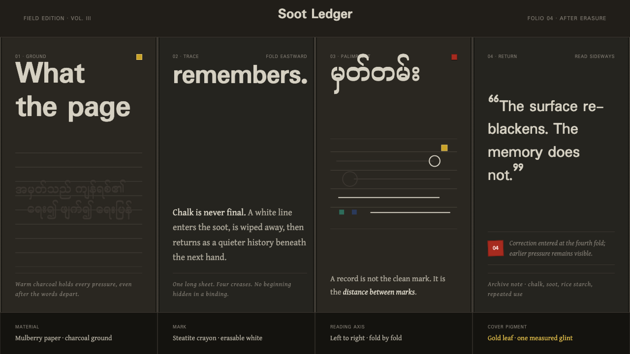 Shan Parabaik ManuscriptMemory survives erasure. Chalk-white lines and grey ghosts travel across warm…
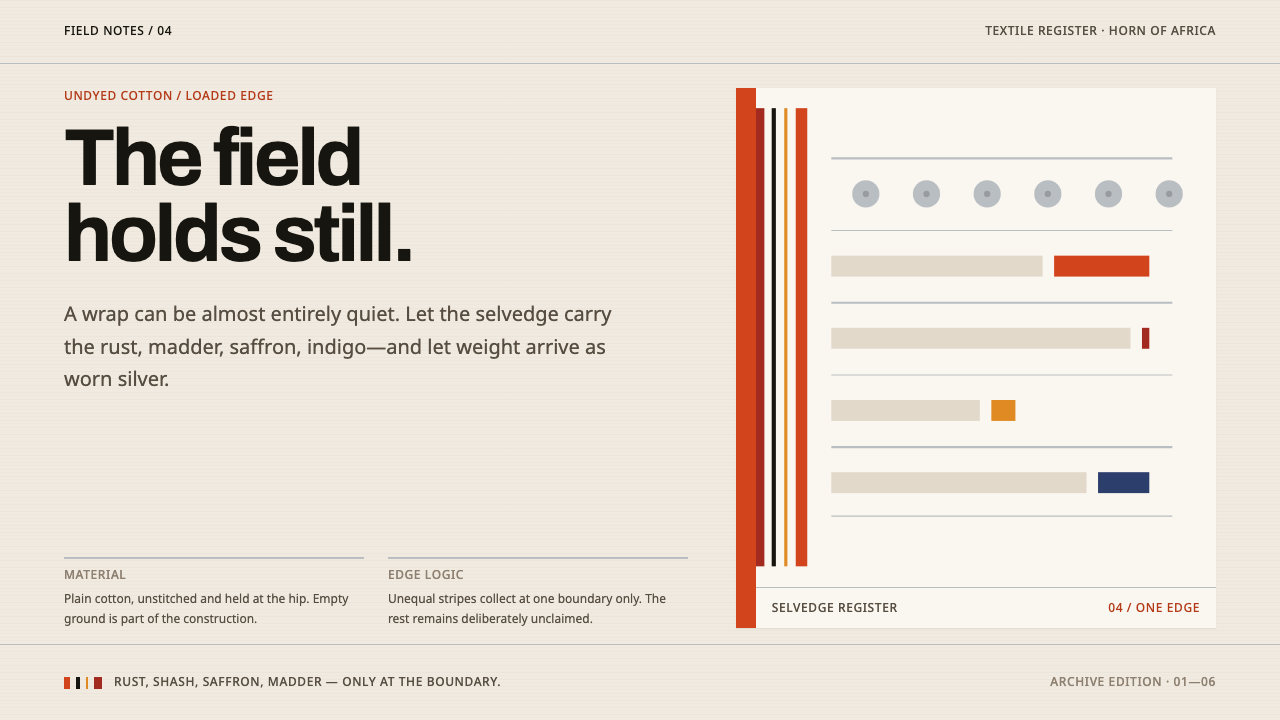 Afar Nomad TextileWeight lives at the edge. Rust and madder selvedges cut across a quiet cotton…