Design style guide设计风格指南
What is Cape Verdean Morna (Cesária Era)?什么是 Cape Verdean Morna (Cesária Era)?
Morna is Cape Verde's soul music — a slow, barefoot lament born in Atlantic harbour bars and carried to the world by Cesária Évora, whose voice and record sleeves together became one of the twentieth century's most quietly devastating visual identities.莫尔纳是佛得角的灵魂乐——一种诞生于大西洋港口酒吧的赤脚悲歌,由塞萨莉亚·埃沃拉带向世界,她的嗓音与唱片封套共同构成了二十世纪最动人心魄的视觉身份之一。
Cape Verdean Morna (Cesária Era) in briefCape Verdean Morna (Cesária Era) 速览
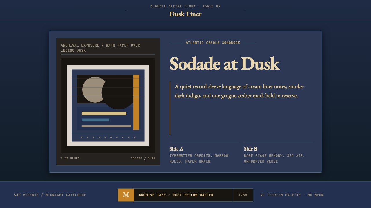
Cape Verdean Morna (Cesária Era) is a design aesthetic rooted in the visual world of the Lusafrica record label and the analogue archive culture of the Atlantic Creole world. It is built on a layered tension between warm, aged materials and cool night-blue depth — the feeling of a candlelit bar opening onto an ocean horizon. Black-and-white archival photography sits over warm dust-yellow paper stocks, typewriter letterforms meet hairline rules, and a single saturated accent of grogue amber or Atlantic indigo cuts through an otherwise muted, smoky palette.佛得角莫尔纳(塞萨莉亚时代)是一种植根于Lusafrica唱片公司视觉世界与大西洋克里奥尔文化模拟档案传统的设计美学。它建立在温热陈年材质与深邃夜蓝之间的层叠张力之上——如同一间烛光酒吧向着海洋地平线敞开的感觉。黑白档案摄影覆于温暖的尘黄纸面,打字机字形与发丝细线相遇,一抹浓烈的甘蔗酒琥珀或大西洋靛蓝从烟雾弥漫、低饱和的整体色调中划出。
The style is fundamentally about sodade — the Cape Verdean Creole word that merges Portuguese saudade with something rawer and more oceanic, a longing for a home that is always both near and impossibly far. Every visual choice in this aesthetic carries that emotional temperature: photographs that feel found rather than staged, type that feels transcribed rather than designed, and negative space that feels like the quiet between notes rather than deliberate composition.这种风格从根本上关乎“sodade”——佛得角克里奥尔语中那个融合了葡萄牙语saudade与某种更原始、更具海洋性的词汇,一种对家园的渴望,那家园永远既近在咫尺又遥不可及。这套美学中的每一个视觉选择都携带着这种情感温度:照片看起来像是被发现的而非被摆拍的,字体看起来像是被誊录的而非被设计的,负空间感觉像音符之间的寂静而非刻意的构图。
What distinguishes this aesthetic from generic 'vintage' or 'lo-fi' styles is its specific cultural and material rootedness. The warm paper tones are not retro-nostalgic decoration; they reference actual physical artifacts — album sleeves printed on budget stock, hand-typed liner notes, airmail paper. The indigo and amber are not decorative accents; they are the chromatic memory of the archipelago's dusk light and its famous grogue spirit. Authenticity in this style requires understanding its geography and emotional register, not merely its surface textures.使这种美学区别于一般“复古”或“低保真”风格的,是其特定的文化与材质根植性。温暖的纸张色调并非怀旧装饰;它们指涉真实的物质遗产——印在廉价纸上的唱片封套、手工打字的内页说明、航空邮件信纸。靛蓝与琥珀并非装饰性点缀;它们是这片群岛暮光与著名甘蔗酒的色彩记忆。这种风格的真实性要求理解其地理背景与情感调性,而不仅仅是表面质感。
See the Cape Verdean Morna (Cesária Era) design system →查看 Cape Verdean Morna (Cesária Era) 完整设计系统 →
Where does Cape Verdean Morna (Cesária Era) come from?Cape Verdean Morna (Cesária Era) 从何而来?
Morna as a musical form dates to at least the mid-nineteenth century in the Cape Verde archipelago, a group of volcanic islands some five hundred kilometres off the West African coast that had been a Portuguese colonial territory since the fifteenth century. The islands' position as a mid-Atlantic waystation — a crossroads of Portuguese colonial administration, African migration routes, and the transatlantic trade networks — made Cape Verdean culture a creole synthesis from its earliest recorded history. Morna absorbed Portuguese fado's spirit of longing, African rhythmic sensibility, and Brazilian modinha's lyric romanticism into a form that was entirely its own.莫尔纳作为一种音乐形式,至少可以追溯到十九世纪中叶的佛得角群岛——这片距西非海岸约五百公里的火山岛链,自十五世纪起便是葡萄牙的殖民地。群岛作为大西洋中途停靠站的地理位置——葡萄牙殖民管理、非洲迁徙路线与跨大西洋贸易网络的交汇处——使佛得角文化从有文字记载的最初时期便是一种克里奥尔综合体。莫尔纳将葡萄牙法多的乡愁精神、非洲的律动感性与巴西修迪尼亚的抒情浪漫主义融为一体,形成了完全属于自己的样式。
The genre crystallised most powerfully in Mindelo, the cosmopolitan port city on the island of São Vicente, which by the early twentieth century had become Cape Verde's cultural capital. Poets and composers like Eugénio Tavares and B. Léza — both considered foundational figures — set the emotional and lyrical template for the genre: verses in Crioulo that traced themes of departure, return, exile, and the sea. The music was performed in small bars and domestic gatherings, accompanied by acoustic guitar and cavaquinho, a small Portuguese-derived stringed instrument. This intimate performance context shaped the aesthetic of the music's later visual representation: small-room warmth, close-mic intimacy, handwritten notes.这一音乐类型在明德卢——圣维森特岛的国际性港口城市——得到了最强烈的结晶,二十世纪初,明德卢已成为佛得角的文化首都。欧热尼奥·塔瓦雷斯与B.莱扎——两人均被视为奠基人物——用克里奥尔语写下以离别、归来、流亡与大海为主题的诗句,为这一类型奠定了情感与抒情的基调。音乐在小酒吧与家庭聚会中演奏,伴以原声吉他与卡瓦基纽琴——一种源自葡萄牙的小型弦乐器。这种亲密的演出语境塑造了音乐后来视觉呈现的美学:小空间的温暖,近距离拾音的亲密感,手写的文字。
The visual identity of morna as a global design phenomenon is inseparable from the career of Cesária Évora, the singer born in Mindelo in 1941 who rose to international recognition after a series of recordings released by the Paris-based Lusafrica label beginning in 1988. The Lusafrica releases — particularly the albums that followed her breakthrough 'Miss Perfumado' in 1992 — established a coherent visual grammar for the genre that spread worldwide through record shops, festival posters, and music press. The label's art direction favoured warm-toned archival photography, careful typographic restraint, and a consistent deployment of the indigo and amber tones that would become the palette most closely associated with the style.莫尔纳作为一种全球设计现象的视觉身份,与塞萨莉亚·埃沃拉的职业生涯密不可分。这位1941年出生于明德卢的歌手,在巴黎Lusafrica唱片公司自1988年起发行的一系列录音之后获得了国际认可。Lusafrica出版的唱片——尤其是1992年突破性专辑《Miss Perfumado》之后的作品——为这一类型建立了一套连贯的视觉语法,通过唱片店、音乐节海报与音乐媒体传遍世界。该厂牌的艺术指导倾向于温暖色调的档案摄影、谨慎的字体克制,以及靛蓝与琥珀色调的一致运用——这两种颜色后来成为与这种风格关系最为密切的色盘。
Évora performed barefoot by choice — a gesture she initially made in solidarity with the poor of Cape Verde and that became one of the most recognisable personal brands in world music. This biographical detail mattered visually: it embedded a politics of understatement and authenticity into the aesthetic of the whole genre. The barefoot singer in the smoky club, the crackle of a cassette tape playing through a taxi radio in Praia, the weight of a record sleeve in the hand — these tactile and acoustic memories are the emotional raw material that the design system attempts to make visible. In 2019, UNESCO recognized morna as an Intangible Cultural Heritage of Humanity, cementing its status not merely as a regional music tradition but as a culturally significant form deserving preservation and study.埃沃拉选择赤脚演出——这一姿态最初是她与佛得角穷人的团结表达,后来成为世界音乐中最具辨识度的个人品牌之一。这一传记细节在视觉上意义重大:它将低调与真实的政治性嵌入了整个类型的美学之中。烟雾弥漫酒吧里的赤脚歌手、一盘卡带在普拉亚出租车收音机里播放时的沙沙声、手握唱片封套时的重量——这些触觉与听觉记忆,是这套设计语言试图使其可见的情感原材料。2019年,联合国教科文组织将莫尔纳列为人类非物质文化遗产,确立了它不仅仅是一种地区音乐传统的地位,而是值得保护与研究的具有重大文化意义的形式。
What defines the Cape Verdean Morna (Cesária Era) look?Cape Verdean Morna (Cesária Era) 的视觉特征是什么?
Palette色盘
The palette is anchored in tension: warm dust-yellow and aged-paper tones form the base, while deep Atlantic indigo provides the night-sky counterweight. A single high-saturation accent — grogue amber, the colour of the Cape Verdean sugarcane spirit — punctuates the composition like an ember in darkness. Black-and-white photograph tones integrate naturally into this warm-cool contrast. The effect is neither monochrome nor richly coloured, but something in between: the palette of smoke, lamplight, and open ocean.色盘建立在张力之上:温暖的尘黄与陈旧纸张的色调构成基底,深沉的大西洋靛蓝提供夜空般的重量平衡。一抹高饱和度的点缀——甘蔗酒琥珀,佛得角甘蔗烈酒的颜色——像黑暗中的余烬一样点亮构图。黑白照片的影调自然地融入这种冷暖对比之中。效果既非单色也非浓彩,而是介于两者之间:烟雾、灯光与开阔海洋的色盘。
Typography字体排印
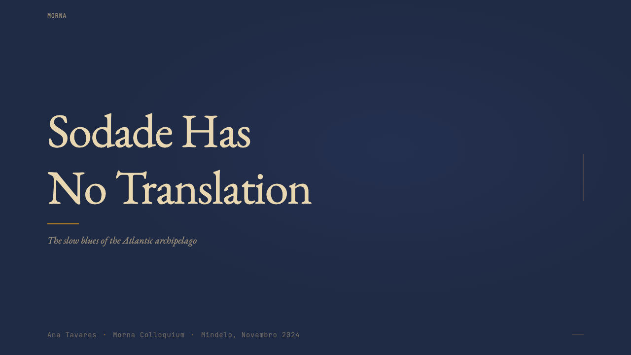
Type in this style carries the memory of physical production. Serif letterforms — particularly those with a classic editorial or book-printing lineage — are favoured over geometric sans-serifs, because they carry the connotation of liner notes, letters, and literary culture rather than corporate modernity. Typewriter-weight monospaced fonts appear as a secondary voice: for catalogue numbers, dates, track listings, and labels. Hierarchy is created through the quiet contrast of these two type voices rather than through bold display weights or aggressive scale shifts.这种风格中的字体携带着物质生产的记忆。具有经典编辑或书籍印刷渊源的衬线字形,比几何无衬线字体更受青睐,因为它们带有内页说明、书信与文学文化的联想,而非企业现代感。打字机风格的等宽字体以次要声部出现:用于目录编号、日期、曲目清单与标签。层级通过这两种字体声部之间安静的对比来创建,而非通过粗重的展示字重或激进的尺度转换。
Texture and Surface质感与表面
This aesthetic embraces visible material texture in a way that most contemporary design systems explicitly forbid. Aged paper grain, slight photographic halftone, and the soft degradation of offset printing are not imperfections to be smoothed out but carriers of authenticity. The surface of the design should feel like it could be touched — like the sleeve of a record worn smooth at the edges, or a photograph slightly faded by light. This is not simulated grime for retro effect but a specific kind of material honesty applied to printed ephemera.这种美学以大多数当代设计系统明确禁止的方式接纳可见的材质质感。陈旧的纸张颗粒、微弱的照片网点、胶印的轻微降解,这些都不是需要抹平的缺陷,而是真实性的载体。设计的表面应当感觉可以触摸——像一张边缘磨得光滑的唱片封套,或一张被光线略微褪色的照片。这不是为复古效果模拟的做旧,而是一种应用于印刷短暂物的特定材质诚实。
Photography摄影处理
Archival black-and-white photography is the compositional heart of the aesthetic. Images feel documentary rather than art-directed — candid, slightly underexposed, with the grain structure visible. Subjects are often shown in the act of something: singing, smoking, looking away from the camera, caught in a moment rather than posed for one. When colour photography appears, it is typically treated with warmth applied to the shadows and a desaturated, slightly aged quality overall. Photographs are laid over toned paper or allowed to bleed to the edge, rather than floated in white space.黑白档案摄影是这套美学的构图核心。图像感觉是纪录片式的而非经过指导的——随意、略微曝光不足,颗粒结构清晰可见。被摄对象通常处于某种行为之中:歌唱、吸烟、目光移开镜头,被捕捉在某个瞬间而非被摆拍于某个瞬间。彩色摄影出现时,通常在暗部施以暖调,整体呈现低饱和、略微陈旧的质感。照片铺设在有色纸面上,或允许出血至边缘,而非悬浮在白色空间中。
Composition构图
Layouts in this style are quiet and unhurried. There is a characteristic generosity of space — not the mathematical negative space of Swiss rationalism, but something more like the pause before the next verse of a song. Information is organised in horizontal bands that echo the layered structure of a record sleeve: a main image zone, a title zone, a credit or label zone. Hairline rules — single-weight, delicate lines — divide these bands without imposing authority. The overall effect is of something assembled by hand over time rather than designed all at once.这种风格的版面安静而不急迫。有一种特征性的空间慷慨——不是瑞士理性主义的数学式负空间,而是更像歌曲下一段开始前的停顿。信息以水平带状组织,呼应唱片封套的层叠结构:主图像区、标题区、制作信息或标签区。发丝细线——单一粗细、纤细的线条——划分这些区域,却不施加权威感。整体效果是某种随时间手工拼组而成的东西,而非一次性设计完成的。
Accent and Restraint点缀与克制
The amber accent — when it appears — is used with extreme economy. In a sleeve dominated by dusk tones and aged paper warmth, a single element in this colour carries enormous weight: a label sticker, a small decorative mark, a highlighted word. Its rarity is its power. Similarly, indigo appears as a depth element — a background band suggesting night or water — rather than as a decorative flourish. The style is built on a principle of one thing at a time: one photograph, one voice, one ember of colour.琥珀色点缀——当它出现时——以极度节制的方式使用。在一张以暮光色调与陈旧纸张温暖为主导的封套上,这种颜色的单个元素承载着巨大的分量:一枚标签贴纸、一个小装饰标记、一个被强调的词语。它的稀有性就是它的力量。同样,靛蓝作为深度元素出现——一条暗示夜晚或海水的背景带——而非作为装饰性点缀。这种风格建立在一次一件的原则上:一张照片,一个声音,一点色彩的余烬。
Emotional Register情感调性
Unlike design systems whose primary goal is clarity or efficiency, this aesthetic is organised around a specific emotional experience: sodade, the ache of beautiful absence. Visual elements are chosen not for their communicative efficiency but for their capacity to produce a feeling of quiet longing. This means deliberate imperfection, deliberate age, deliberate quietness. A perfectly clean version of this style is a contradiction in terms. The texture, the restraint, the small flicker of amber in darkness — together they perform an emotion rather than communicate information.与以清晰或高效为首要目标的设计语言不同,这套美学围绕着一种特定的情感体验组织:sodade,美丽缺席的痛苦。视觉元素的选择不是为了传达效率,而是为了产生安静渴望的感觉。这意味着刻意的不完美、刻意的陈旧、刻意的安静。这种风格的完全干净版本自相矛盾。质感、克制、黑暗中那一点琥珀的微光——它们共同演绎一种情感,而非传达一条信息。

See the Cape Verdean Morna (Cesária Era) design system →查看 Cape Verdean Morna (Cesária Era) 完整设计系统 →
Who shaped Cape Verdean Morna (Cesária Era)?谁塑造了 Cape Verdean Morna (Cesária Era)?
Born in Mindelo in 1941, Évora worked as a club singer in São Vicente for decades before achieving international recognition. Her Lusafrica recordings beginning in 1988 — particularly 'Miss Perfumado' (1992) and 'Café Atlantico' (1999) — reached audiences in Europe, the Americas, and beyond, making her the most globally recognised Cape Verdean artist of any era. Her performance practice — always barefoot, always unaffected — defined the aesthetic politics of the whole genre: authenticity over spectacle, emotion over technique. She died in 2011; in 2019 morna was inscribed on the UNESCO Intangible Cultural Heritage list, partly in recognition of her role in internationalising the form.埃沃拉1941年生于明德卢,在圣维森特岛的夜总会演唱数十年后才获得国际认可。她从1988年起在Lusafrica录制的唱片——尤其是《Miss Perfumado》(1992年)与《Café Atlantico》(1999年)——在欧洲、美洲及更广泛地区赢得了听众,使她成为任何时代最具全球知名度的佛得角艺术家。她的演出风格——始终赤脚,始终不做作——界定了整个类型的美学政治:真实性重于奇观,情感重于技巧。她于2011年辞世;2019年莫尔纳被列入联合国教科文组织人类非物质文化遗产名录,部分是对她使这一形式国际化所起作用的认可。
Tavares (1867–1930) was a poet, journalist, and composer from the island of Brava who is considered one of the foundational figures of morna as a literary and musical form. He wrote in Crioulo at a time when Portuguese was the language of official culture, elevating the vernacular language to literary status and establishing the emotional vocabulary — exile, longing, the sea, unrequited love — that would define morna for the next century. His work represents the genre's deepest roots in the literary culture of the Atlantic Creole world.塔瓦雷斯(1867—1930年)是布拉瓦岛的诗人、记者与作曲家,被认为是莫尔纳作为文学与音乐形式的奠基人之一。他在葡萄牙语是官方文化语言的时代用克里奥尔语写作,将方言语言提升至文学地位,并建立了情感词汇——流亡、渴望、大海、单恋——这些词汇将在此后一个世纪定义莫尔纳。他的作品代表了这一类型在大西洋克里奥尔文学文化中最深的根系。
Francisco Xavier da Cruz, known as B. Léza (1905–1958), was a Mindelo-born musician and composer whose songs became the canonical repertoire for the generation of morna performers who followed him. His compositions — including pieces that Évora would later record and bring to world audiences — established the melodic and harmonic language of mid-century morna: slow, minor-inflected, built for intimate spaces. His life, cut short by illness, became part of morna's mythology of beautiful, unrealised potential.弗朗西斯科·沙维尔·达·克鲁兹,人称B.莱扎(1905—1958年),是出生于明德卢的音乐家与作曲家,他的歌曲成为后继一代莫尔纳演奏者的标准曲目。他的作品——包括埃沃拉后来录制并带给世界听众的篇章——确立了二十世纪中叶莫尔纳的旋律与和声语言:缓慢、带有小调色彩、为亲密空间而建。他因病英年早逝的人生,成为莫尔纳关于美丽而未竟潜力神话的一部分。
Da Silva was the founder of Lusafrica, the Paris-based record label that released Cesária Évora's international catalogue and, in doing so, co-created the global visual identity of morna. His decisions around sleeve design, photography, and presentation were as responsible for the aesthetic dissemination of the genre as the music itself. The Lusafrica look — warm tones, archival photography, careful typographic restraint — set the template that the world came to associate with Cape Verdean music, and that template is the direct ancestor of the design system described here.达·席尔瓦是Lusafrica的创始人——这家总部位于巴黎的唱片公司发行了塞萨莉亚·埃沃拉的国际目录,并由此共同创造了莫尔纳的全球视觉身份。他在封套设计、摄影与呈现方面的决策,与音乐本身一样对这一类型的美学传播负有责任。Lusafrica的视觉风格——温暖色调、档案摄影、谨慎的字体克制——奠定了世界与佛得角音乐相关联的模板,而这一模板正是本文所描述设计语言的直接祖先。
How do you use Cape Verdean Morna (Cesária Era) today?今天怎么用 Cape Verdean Morna (Cesária Era)?
The Cape Verdean Morna aesthetic is one of the richer and more demanding historical styles to apply, because it depends on emotional authenticity as much as visual technique. Simply overlaying warm paper textures and indigo tones on a layout produces decoration, not feeling. The key discipline is restraint and specificity: every element should feel chosen because it carries emotional weight, not because it fills space.佛得角莫尔纳美学是应用起来最丰富也最有要求的历史风格之一,因为它同样依赖情感真实性与视觉技巧。仅仅将温暖的纸张质感与靛蓝色调叠加在版面上,产生的是装饰而非感受。关键的规律是克制与具体性:每个元素的选择应当感觉是因为它承载情感重量,而不是因为它填充了空间。
For presentation slides, this aesthetic works best in contexts where atmosphere and narrative are the primary goals — a cultural organisation's annual report, a music or arts institution's communications, a personal project presented with intimate tone. Cover slides benefit from a single archival or documentary photograph treated with warm shadows, with the title set in a classic serif at quiet size rather than dominant scale. Content slides should use horizontal banding with hairline rules as dividers, allowing generous space between text blocks. Data presented in this style should be restrained in quantity — two or three figures given room to breathe are more consistent with the aesthetic than dense tables or animated charts.对于演示文稿,这种美学在氛围与叙事是首要目标的场景中效果最佳——一个文化机构的年度报告、一个音乐或艺术机构的传播材料、以亲密语调呈现的个人项目。封面页得益于一张以温暖暗部处理的单幅档案或纪录片式照片,标题以经典衬线字体设置,尺度安静而非主导。内容页应使用发丝细线分隔的水平带状结构,文字块之间留以充裕空间。在这种风格中呈现的数据应当在数量上保持克制——两三个数字给以呼吸空间,比密集的表格或动态图表更符合美学气质。
For web interfaces, the style suits landing pages for cultural projects, music streaming pages, or editorial publications where an immersive, slow-reading experience is the goal. Navigation should be typographic and self-effacing. A full-width aged-paper or dusk-indigo background image can anchor the hero section; from there, content descends in ordered, unhurried bands. Interactive elements — buttons, links — should use the amber accent sparingly, reserving its warmth for the single most important call to action on any given page. The style struggles with content-dense interfaces: it does not suit dashboards, data-heavy tools, or any context where multiple simultaneous hierarchies compete for attention.对于网页界面,这种风格适合文化项目的落地页、音乐流媒体页面,或以沉浸式、缓慢阅读体验为目标的编辑出版物。导航应当是字体性的、自我消隐的。一张全宽的陈旧纸张或暮光靛蓝背景图可以锚定主视觉区;从这里开始,内容以有序、不急迫的带状向下展开。交互元素——按钮、链接——应当节制地使用琥珀色点缀,将其温度保留给任何页面上最重要的单一行动号召。这种风格在内容密集的界面中表现欠佳:它不适合仪表板、数据密集型工具,或任何多个同时竞争注意力的层级场景。
For editorial and marketing work, the aesthetic excels in contexts that benefit from cultural specificity and emotional depth. A music festival poster, a cultural magazine spread, a book or album cover, a tourism campaign for the Atlantic islands — all of these are natural territory. The compositional approach should treat the page like a record sleeve: one dominant image zone, one text zone, the amber accent used once. Marketing copy in this style should be short, imagistic, and written to be felt rather than processed. Headlines work best when they reference the sensory world of the aesthetic — night, warmth, distance, return — rather than making direct promotional claims.对于编辑与营销内容,这种美学在受益于文化特殊性与情感深度的场景中表现出色。音乐节海报、文化杂志版面、书籍或唱片封面、大西洋岛屿旅游推广——这些都是自然的领域。构图方法应当像对待唱片封套一样对待页面:一个主导图像区,一个文字区,琥珀色点缀只用一次。这种风格的营销文案应当简短、富有意象性,写出来是为了被感受而非被处理。当标题指涉这套美学的感官世界——夜晚、温暖、距离、归来——而非直接作出促销声明时,效果最佳。
A common mistake when applying this aesthetic is over-saturating the amber accent or using indigo and amber simultaneously at high saturation, which destroys the quiet tension that makes the style work. Another error is applying visible texture indiscriminately — paper grain on every layer, every photograph processed with the same filter — which reads as costume rather than character. Authentic use of this style means the texture appears where it belongs (on base layers, in photograph grain) and disappears where clarity is needed (in type, in fine rules). The most frequent failure is treating sodade as a mood board rather than a structural principle: filling the composition with warm tones and archival imagery without understanding that the style's power comes from what it withholds as much as what it shows.应用这种美学时,一个常见错误是过度饱和琥珀色,或同时以高饱和度使用靛蓝与琥珀,这会破坏使这种风格奏效的安静张力。另一个错误是不加区分地应用可见质感——每一层都有纸张颗粒,每一张照片都用相同的滤镜处理——这读起来像服装而非性格。真实使用这种风格意味着质感在它属于的地方出现(在基础层上,在照片颗粒中),并在需要清晰的地方消失(在字体中,在细线中)。最常见的失败是将sodade当作情绪板而非结构原则:用温暖色调和档案图像填满构图,却不理解这种风格的力量同样来自它所保留不显的东西。
See the Cape Verdean Morna (Cesária Era) design system →查看 Cape Verdean Morna (Cesária Era) 完整设计系统 →
Cape Verdean Morna (Cesária Era) — FAQCape Verdean Morna (Cesária Era) · 常见问题
How is this aesthetic different from other 'vintage' or 'lo-fi' design styles?这种美学与其他“复古”或“低保真”设计风格有何不同?
The key difference is specificity of origin. Most vintage or lo-fi design styles are generic evocations of 'the past' — warm tones, grain, and soft focus as mood indicators without cultural anchoring. The Cape Verdean Morna aesthetic is rooted in a specific place (the Mindelo bar scene, the Lusafrica sleeve archive), a specific emotional concept (sodade), and a specific set of cultural artefacts (album covers, liner notes, handwritten labels). Applying it correctly requires engagement with that specificity. A design that simply applies warm grain and indigo tones without that cultural grounding is decorative pastiche; a design that understands why those tones carry the emotional weight they do produces something more resonant.关键区别在于来源的具体性。大多数复古或低保真设计风格是对“过去”的泛化唤起——温暖色调、颗粒感与柔焦作为情绪指标,而无文化锚点。佛得角莫尔纳美学植根于一个具体的地方(明德卢的酒吧场景、Lusafrica封套档案)、一个具体的情感概念(sodade)、以及一套具体的文化遗物(唱片封面、内页说明、手写标签)。正确应用它需要与这种具体性的接触。一个仅仅应用温暖颗粒感与靛蓝色调却没有这种文化根基的设计是装饰性的仿制;一个理解这些色调为何承载如此情感重量的设计则产生更具共鸣的东西。
Can this style work for commercial or corporate clients?这种风格适合商业或企业客户吗?
It is a poor fit for most corporate contexts. The style depends on emotional registers — longing, intimacy, imperfection, time — that are antithetical to the authority, efficiency, and scalability that corporate communication typically requires. Where it can work commercially is in sectors where cultural authenticity and emotional resonance are valued brand assets: independent music, cultural tourism, artisan food and drink brands, publishing, and arts institutions. In these contexts, the style's specificity becomes a strength rather than a limitation. Outside them, forcing the aesthetic onto a context that requires rational clarity or professional authority will produce cognitive dissonance for the audience.它与大多数企业场景不太匹配。这种风格依赖于情感调性——渴望、亲密、不完美、时间——这些与企业传播通常要求的权威性、高效性与可扩展性相悖。它在商业上可以奏效的地方,是文化真实性与情感共鸣被视为品牌资产的行业:独立音乐、文化旅游、手工食品与饮料品牌、出版业以及艺术机构。在这些场景中,这种风格的具体性成为优势而非局限。在这些场景之外,将这种美学强行应用于要求理性清晰或专业权威的场景,会为受众产生认知失调。
How should the amber accent be handled when the design needs multiple accent colours?当设计需要多种强调色时,应如何处理琥珀色点缀?
The style's fundamental principle is one accent, used once per composition. The moment you introduce a second saturated accent colour alongside amber, you dissolve the tension that gives the amber its emotional weight — the sense of a single ember in darkness. If a design genuinely requires multiple accent colours for functional reasons (distinguishing categories, for example), the pragmatic approach is to treat amber as the primary accent and derive the secondary from within the same warm-analogue range: a more muted terracotta, a cooled amber, or a desaturated ochre. Introducing a cool secondary accent — green, blue-green, or anything chromatic — breaks the palette logic entirely.这种风格的基本原则是一种点缀色,在每个构图中使用一次。一旦在琥珀旁边引入第二种饱和强调色,你就消解了赋予琥珀情感重量的张力——那种黑暗中单一余烬的感觉。如果设计出于功能原因(例如区分类别)确实需要多种强调色,实用的方法是将琥珀视为主要强调色,并从同一暖色类比色域内派生次要色:更低调的赭土、冷却的琥珀,或去饱和的赭黄。引入冷色系次要强调色——绿色、蓝绿色或任何色彩性冷调——会完全打破色盘逻辑。
Is there a dark-mode version of this style?这种风格有深色模式版本吗?
The style is naturally dark-ground: the canonical Lusafrica sleeves lean heavily on deep backgrounds — near-black, deep indigo, rich midnight — against which the warm paper tones and amber accents glow. A dark version of this aesthetic does not require inversion; it is already embedded in the original visual language. The challenge in dark implementations is maintaining the warmth of the palette: cool, grey-tinted dark backgrounds undermine the emotional register entirely. The background depth should read as Atlantic night sky or deep ocean rather than neutral digital dark mode. Warm, slightly tinted darks — the colour of a room filled with cigarette smoke — preserve the emotional temperature.这种风格天然就是深色底面:经典的Lusafrica封套大量倚重深色背景——近黑色、深靛蓝、浓重的午夜色——温暖的纸张色调与琥珀色点缀在其上发光。这种美学的深色版本不需要反转;它已经嵌入在原始视觉语言之中。深色实现的挑战在于维持色盘的温暖感:冷色调、带有灰色调的深色背景会完全破坏情感调性。背景的深度应当读起来像大西洋的夜空或深邃的海洋,而非中性的数字深色模式。温暖的、略带色调的暗色——一个充满烟雾的房间的颜色——保留了情感温度。
What is sodade and why does it matter for understanding this design style?什么是sodade,为什么理解这种设计风格需要理解它?
Sodade is a word in Cape Verdean Creole that has no direct English equivalent. It is related to the Portuguese saudade — a longing for something absent or lost — but with a specifically Atlantic and Creole inflection: the longing of islanders for a mainland they may never have seen, the feeling of diaspora, the ache of beautiful distance. In the context of this design system, sodade is not merely a mood or aesthetic reference — it is the structural principle that determines what goes in and what stays out. Elements that would make the design feel resolved, complete, or self-satisfied are excluded, because sodade is precisely the feeling of something not yet arrived, something irretrievably elsewhere. The amber accent is never abundant; the photographs are never posed; the type is never triumphant. Every absence in the composition is an expression of sodade.Sodade是佛得角克里奥尔语中一个没有直接英语对应词的词汇。它与葡萄牙语saudade相关——对缺席或逝去之物的渴望——但带有特定的大西洋与克里奥尔色彩:岛民对一块也许从未见过的大陆的渴望,流散的感觉,美丽距离的痛苦。在这套设计语言的语境中,sodade不仅仅是一种情绪或美学参照——它是决定什么纳入、什么排除的结构性原则。那些会使设计感觉被解决、完整或自我满足的元素被排除在外,因为sodade恰恰是某种尚未抵达、某种无可挽回地在别处的感觉。琥珀色从不丰沛;照片从不摆拍;字体从不凯旋。构图中的每一处缺席,都是sodade的表达。
Related design styles相关设计风格
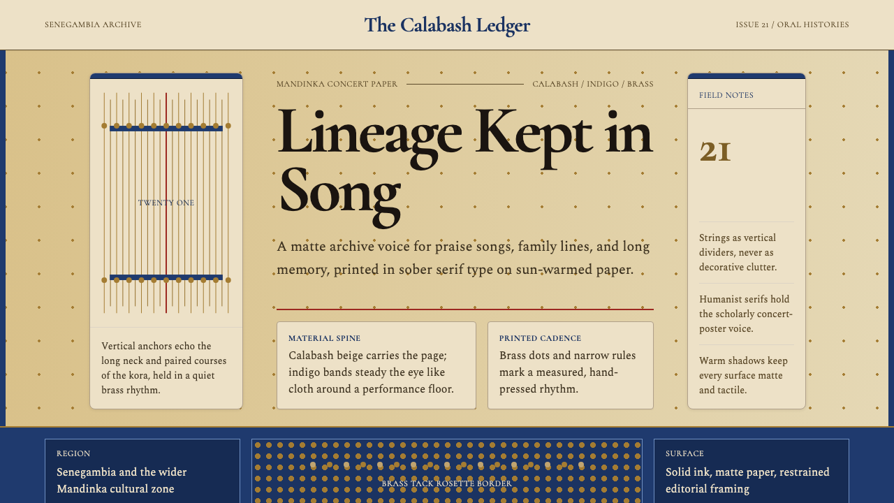 Gambian Griot Kora (21-string)Oral history feels tactile. Calabash beige, indigo bands, and 21 brass string…口述史有触感。葫芦米色、靛蓝带与21道黄铜弦线。
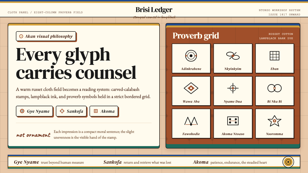 Akan Adinkra (Ghana)Proverbs become cloth. Russet grids, lampblack serif marks, and gold-edge ban…箴言化为布面:赭红网格、灯烟黑印纹与金边带盖出意义。
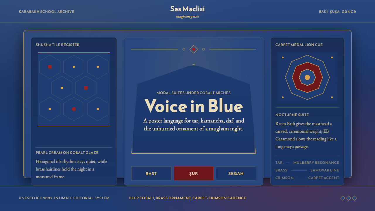 Azerbaijani Mugham Saz BlueMugham night, deeply tiled. Cobalt ground, brass hairlines, arched editorial…穆卡姆之夜深而温暖:钴蓝底、黄铜细线与拱形排版。
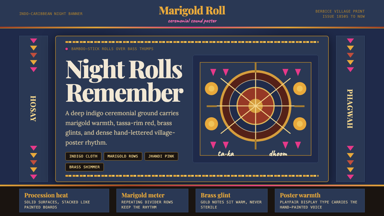 Guyanese Tassa DrumCeremony carries the beat. Indigo banners, Playfair type, and marigold rows g…仪式感击出鼓点:靛蓝旗面、Playfair 标题与万寿菊分隔线发光。
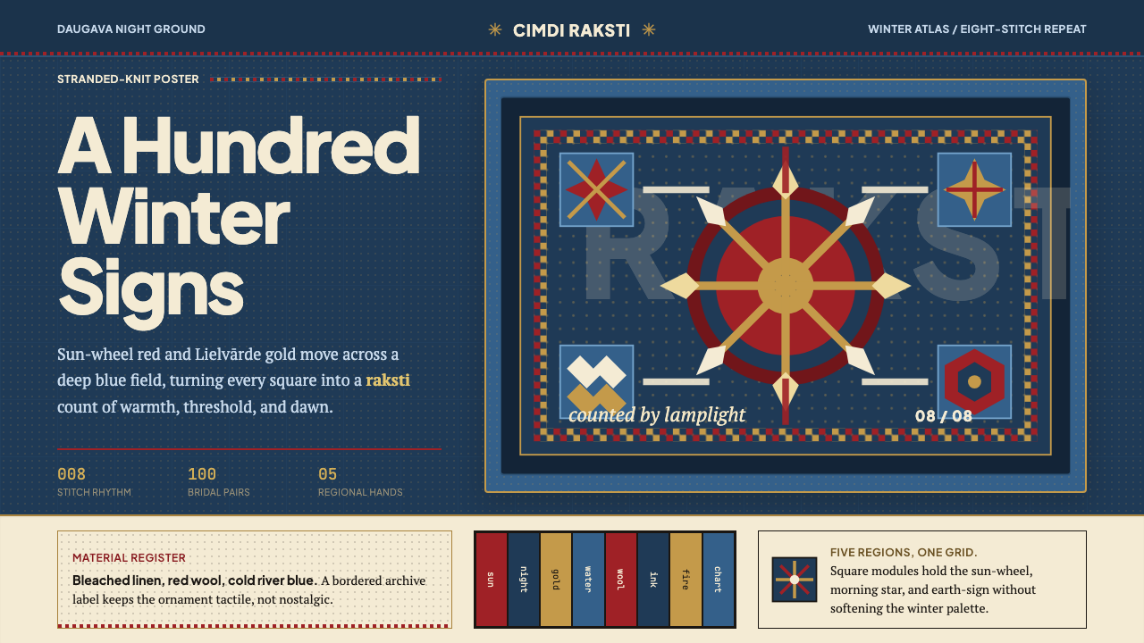 Latvian Knitted MittensWinter craft glows. Sun-wheel red and Lielvarde gold lock into an 8-stitch bl…冬夜手作发光。太阳红与利耶尔瓦尔德金锁进八针蓝格。
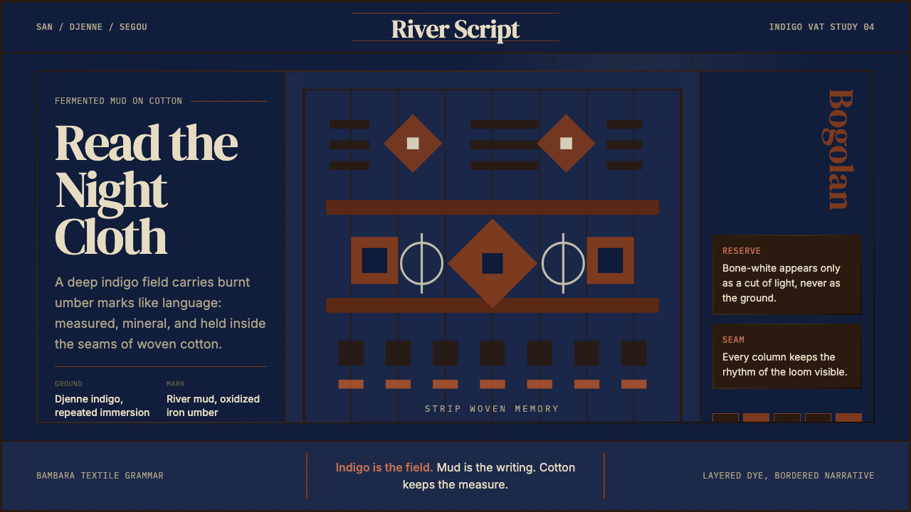 Malian Bogolan over Djenné IndigoCloth reads at night. Djenne indigo, burnt-umber mud marks, and strip seams.夜读之布。杰内靛蓝底、焦赭泥痕与条织缝线。