What is Latvian Lielvārde Belt?
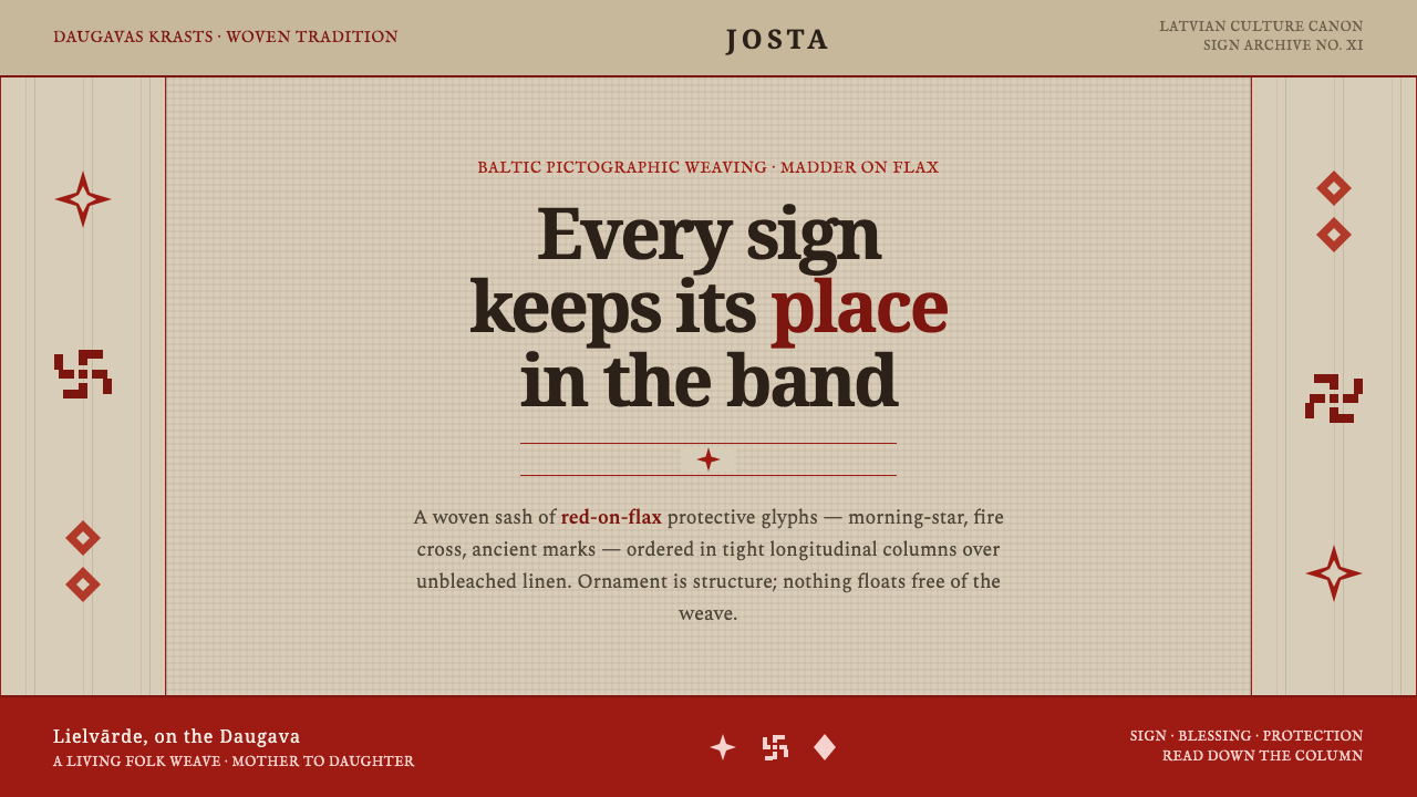
The Lielvārde belt turns ornament into order: madder-red Baltic signs hold their place in disciplined bands across unbleached flax.
Latvian Lielvārde Belt in brief
The Lielvārde belt, or josta, is a narrow woven sash from Lielvārde, Latvia, dense with red-on-flax pictographic Baltic signs. The Auseklis morning-star, the fire cross, and ancient protective glyphs run through tight longitudinal bands, creating a visual language that feels less applied than built. Its identity comes from continuity, repetition, and the exact relationship between sign, stripe, and ground.
The defining white is not cream and never pure white. It is the warm greige of unbleached natural flax: softly oatmeal, slightly irregular, and materially present. Against it, madder-red marks read as dyed wool rather than digital pigment. The contrast is strong but earthy, giving the system a protective and ceremonial character without becoming theatrical.
Translated into screen language, the belt becomes a disciplined graphic system of narrow vertical columns, mirrored rows, red glyphs, and half-basket-weave texture. The pattern is not scattered across a surface as decoration. Every sign belongs to a band, every band participates in a larger rhythm, and the empty flax ground is part of the structure.
Where does Latvian Lielvārde Belt come from?
The Lielvārde belt belongs to a pre-1900 folk tradition rooted in Lielvārde, Latvia, within the Eastern European and Baltic region. Its visual vocabulary is carried through weaving rather than isolated illustration: signs are embedded in a narrow textile form, repeated along its length, and held together by a consistent red-and-flax relationship.
The signs themselves trace to Neolithic and Bronze-Age Baltic artifacts. That deep reference gives the belt its unusual density. The marks do not behave like casual motifs added for surface interest; they carry the visual authority of an inherited sign tradition. Auseklis, the fire cross, and protective glyphs therefore function as structural units as much as symbolic ones.
The tradition belongs to Baltic pagan-symbol weaving and to the broader protective red-and-white folk colour tradition. In this context, colour is not simply a matter of taste. Red marks the active sign layer, while the natural flax ground supplies continuity, restraint, and material balance. The limited palette makes repetition legible and gives every interruption visual importance.
Contemporary knowledge of the belt is also shaped by Latvian Culture Canon archivists, whose work places this folk form within Latvia’s recorded cultural heritage. The resulting design system keeps the essential discipline intact: narrow bands, ordered glyphs, mirror symmetry, and a tactile flax-like ground. It adapts the language to screens without turning it into generic historical ornament.
What defines the Latvian Lielvārde Belt look?
Flax Ground
The ground is warm unbleached flax, closer to greige or oatmeal than to cream. It should feel fibrous, quiet, and slightly irregular, carrying the presence of a woven material even when rendered on screen. Pure white weakens the reference, while a polished cream shifts it toward luxury stationery. The ground is not an empty backdrop; it is the stable field that lets the red signs remain legible.
Madder Red
Red is the active and identifying colour of the system. It should resemble madder-dyed wool: earthy, warm, and saturated without looking fluorescent. Use it for glyphs, structural bands, and selected emphasis rather than for broad decorative flooding. Its strength comes from repetition against flax, not from competing with a large supporting palette. Red should feel woven into the surface, never pasted on top.
Longitudinal Bands
The belt’s primary organizing device is the longitudinal band. Glyphs sit within narrow, closely spaced channels that run in a consistent direction. On screen, these channels can organize navigation, metadata, borders, or repeated content modules. Their role is structural: they control movement across the page and prevent symbols from dissolving into an undifferentiated pattern.
Pictographic Glyphs
The Auseklis morning-star, the fire cross, and protective glyphs form a compact vocabulary. They should be treated as signs with visual weight, not as arbitrary folk-inspired icons. Simplification is possible, but the marks should retain their compact geometry, repeated rhythm, and sense of encoded meaning. Avoid replacing them with unrelated decorative symbols; the system depends on a coherent inherited vocabulary.
Mirror Symmetry
Rows are organized through mirroring and recurrence. Symmetry here is not ornamental balance added after composition; it is the mechanism that makes the band feel woven and held together. Mirrored glyphs can frame a title, bracket a panel, or create a continuous border. Breaks should be deliberate and rare, because an isolated mark reads as an error when the surrounding system promises order.
Woven Texture
Half-basket-weave texture gives the system its tactile layer. It should remain quiet enough for text and glyphs to stay clear, appearing as a restrained rhythm of interlaced material rather than a noisy fabric photograph. Texture works best when it supports the flax ground and helps flat surfaces feel made. It should never become a distressed filter or overpower the sign structure.
Ornament as Structure
The governing principle is that ornament belongs to the architecture of the layout. A border is not filler; it establishes a band. A glyph is not an accent sticker; it marks a position in a sequence. A repeated red row is not wallpaper; it creates rhythm and hierarchy. Authentic application therefore feels ordered, dense, and purposeful, with no symbol drifting outside the system that gives it meaning.
Who shaped Latvian Lielvārde Belt?
The anonymous master weavers are the living intelligence behind the belt’s discipline. Their authorship is collective rather than branded, expressed through repeated signs, controlled bands, and material consistency. In a contemporary translation, their lesson is to design the system before decorating the surface: establish the band logic, assign each glyph a place, and let repetition create authority.
Latvian Culture Canon archivists give the Lielvārde belt a place within recorded Latvian cultural heritage. Their role matters because the style is not merely a visual mood detached from origin. It is a documented folk form whose material, regional, and symbolic identity should remain visible when the language is adapted for contemporary communication.
Auseklis is one of the belt’s named Baltic signs and serves as a concentrated example of the system’s pictographic character. Its value in design is not simply that it looks distinctive, but that it behaves like an ordered unit within a band. It can anchor a title or mark a threshold while preserving the sense of an inherited sign language.
The fire cross and ancient protective glyphs extend the vocabulary beyond a single emblem. Together they create a family of marks with different densities and directional behaviours, allowing a band to feel composed rather than mechanically repeated. Their presence should be handled with care: they belong to a symbolic tradition, so their use is strongest when tied to structure and context.
How do you use Latvian Lielvārde Belt today?
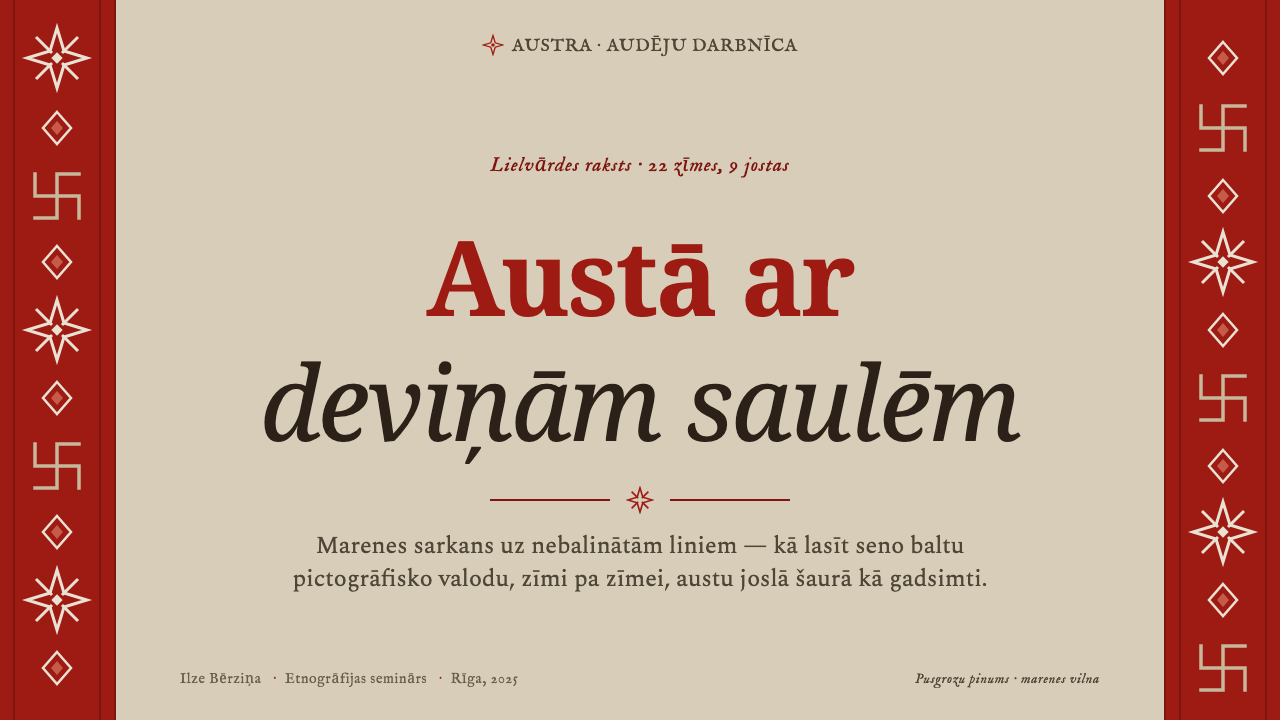
For presentation slides, use the belt logic as a framing device. A cover can place the title on an unbleached flax ground, with a dense red band acting as a visual threshold or edge. Content slides should keep that band logic visible through aligned columns, restrained glyph borders, and mirrored separators. Data slides benefit from repeated red marks and woven texture, but the signs should support hierarchy rather than compete with the information.
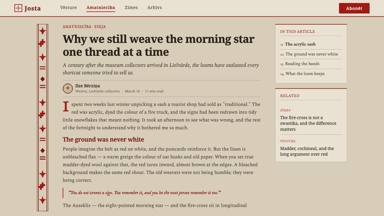
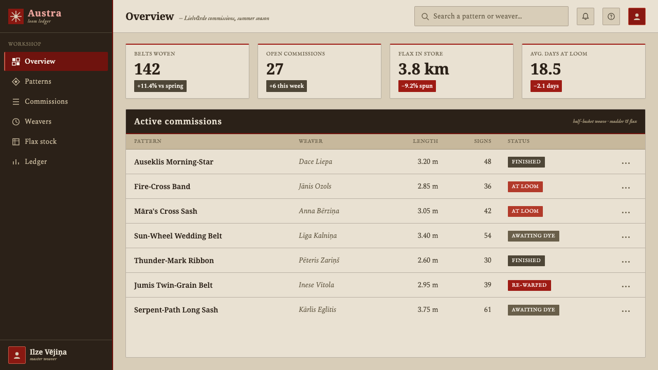
For web interfaces, the system suits dashboards, archives, cultural platforms, and pricing pages that need a strong sense of order and provenance. Use flax for the primary field, madder red for active states and key divisions, and glyph bands to distinguish sections or plan tiers. Cards should feel woven into a shared structure instead of floating independently. Navigation can use compact signs as directional markers, provided labels remain clear.
For editorial and marketing work, Lielvārde belt language creates a distinctive frame for stories about craft, heritage, regional identity, and material practice. A narrow red border can carry section rhythm, while larger mirrored bands can introduce chapters or campaign messages. Marketing layouts should let the unbleached ground remain visible and use texture selectively, so the work feels tactile and rooted rather than like a generic ethnic pattern.
For data communication, treat the signs as a grammar of recurrence. Repeated marks can indicate categories, stages, or related entries, while bands can establish reading direction across a dense page. The red layer should remain selective enough that the underlying flax field continues to organize the composition. This makes the result feel like an information textile: dense, legible, and held together by repeated structure.
The common mistake is to scatter Baltic-looking symbols across a polished background as decorative stickers. That breaks the style’s central principle. Another failure is replacing the warm flax ground with clean white, or using bright synthetic red that loses the character of dyed wool. Keep symbols inside bands, preserve mirror relationships, and allow the material ground to remain visible. The style succeeds through discipline, not through the quantity of motifs.
Latvian Lielvārde Belt — FAQ
Is the Lielvārde belt mainly a decorative pattern?
No. Its visual force comes from treating ornament as structure. The glyphs, bands, mirrored rows, red marks, and flax ground work together as an ordered system. When adapted for contemporary design, the goal is not to spread motifs across a surface but to preserve their assigned positions and relationships.
What should the background look like?
It should resemble unbleached natural flax: warm greige, oatmeal-like, fibrous, and quietly irregular. It should not become cream, pure white, or a glossy luxury-paper tone. A restrained half-basket-weave texture can reinforce the material reference, but the surface must remain calm enough for signs and text to stay readable.
Can I use the glyphs as standalone icons?
They can mark a title, threshold, section, or category, but they are strongest when their relationship to a band remains visible. The Auseklis morning-star, fire cross, and protective glyphs belong to a coherent vocabulary. Isolating them without context can make them feel like arbitrary decoration and can weaken the belt’s structural character.
Does this style work on a dark background?
The supplied system is explicitly light-ground: its identity depends on red marks over natural flax. A dark adaptation is possible as an experiment, but it moves away from the material and regional reference. If the ground becomes dark, preserve the narrow-band discipline and the restrained symbolic vocabulary rather than compensating with brighter colours or more motifs.
How can I keep the result from feeling like generic folk styling?
Keep the origin visible in the formal decisions. Use the warm flax ground, madder-red sign layer, longitudinal bands, mirror symmetry, and half-basket-weave texture as a connected system. Avoid random motifs, broad decorative fields, and unrelated cultural symbols. The design should feel woven, inherited, and purposeful because every mark participates in an ordered band.
Related design styles
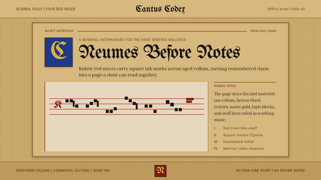 Gregorian Chant NeumesNotation becomes scripture. Rubric red staff lines and square neumes sit on t…
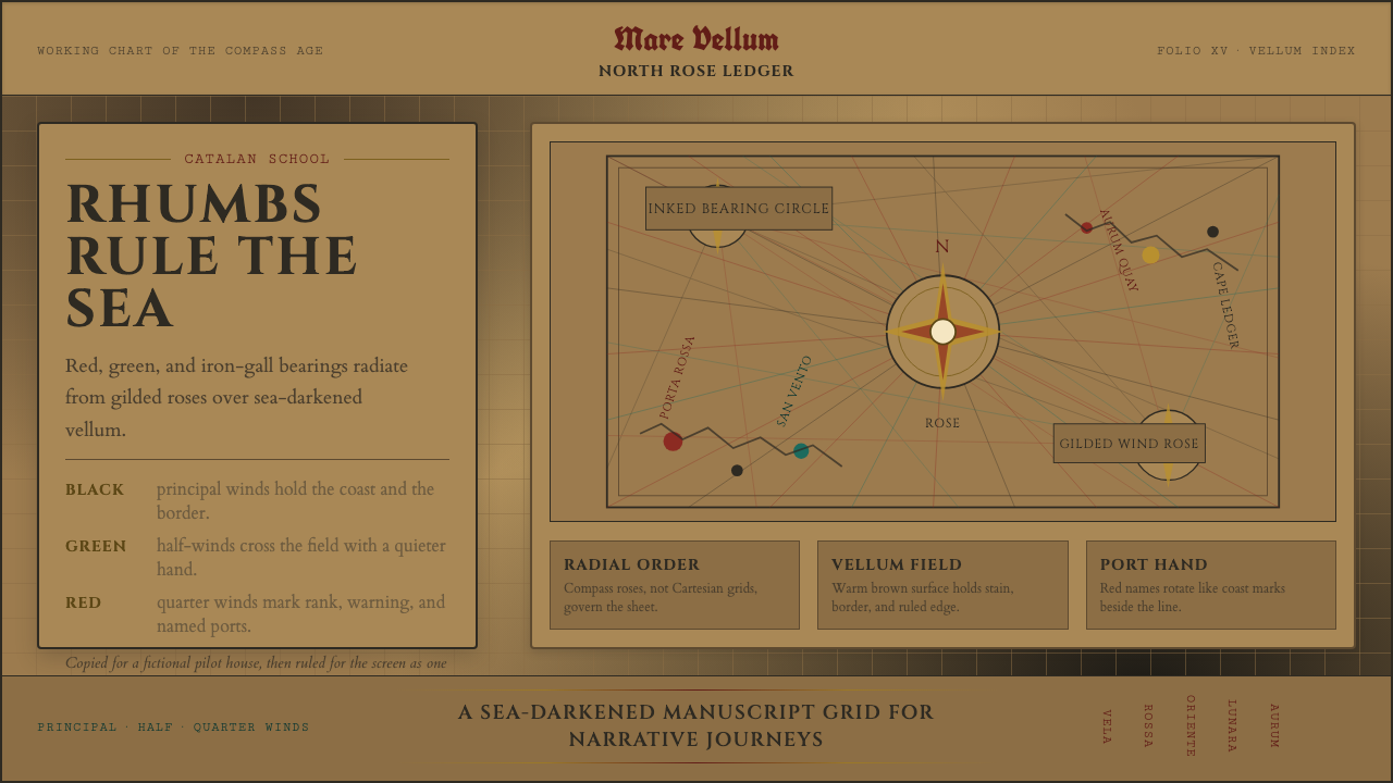 Portolan Rhumb ChartNavigation feels ceremonial. Rhumb lines cross dark vellum with red ink and g…
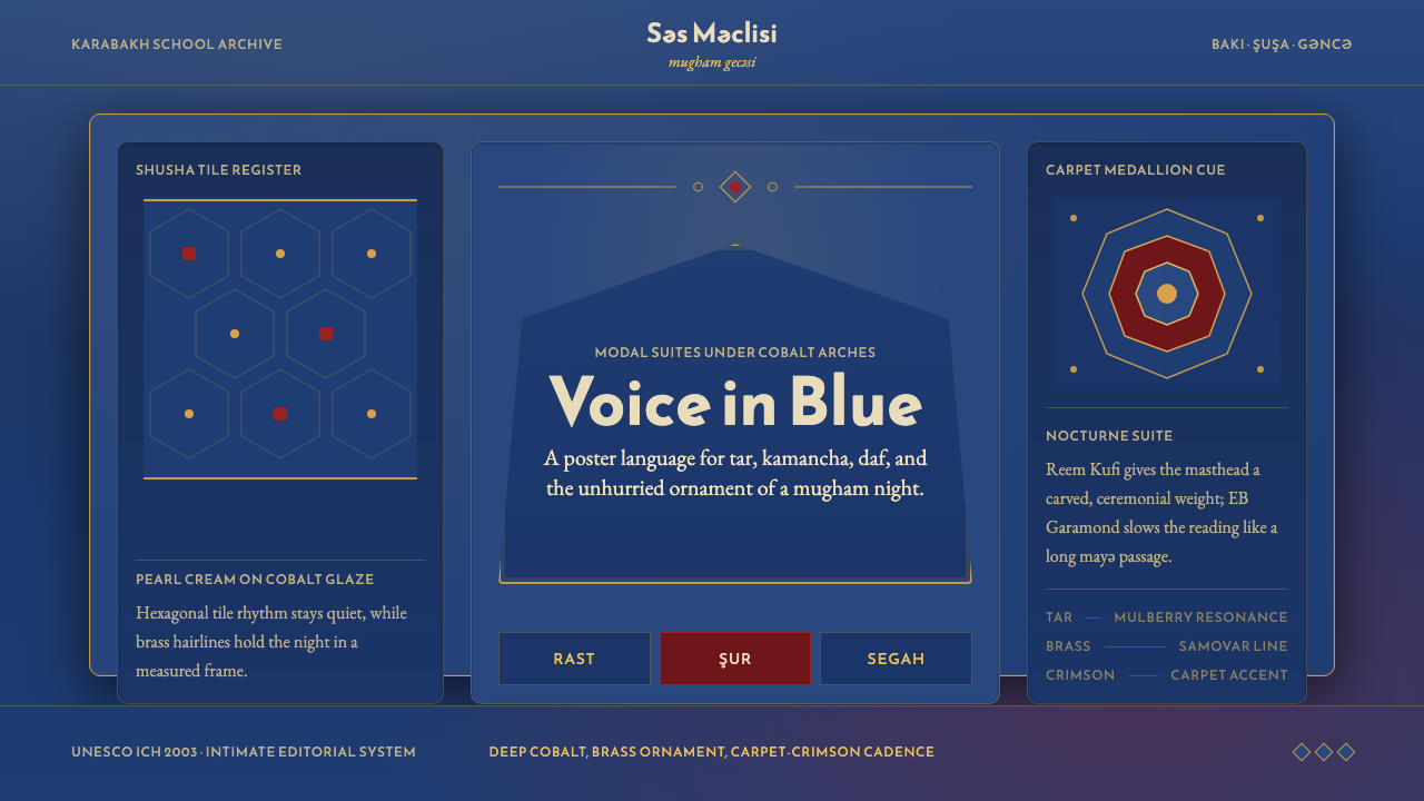 Azerbaijani Mugham Saz BlueMugham night, deeply tiled. Cobalt ground, brass hairlines, arched editorial…
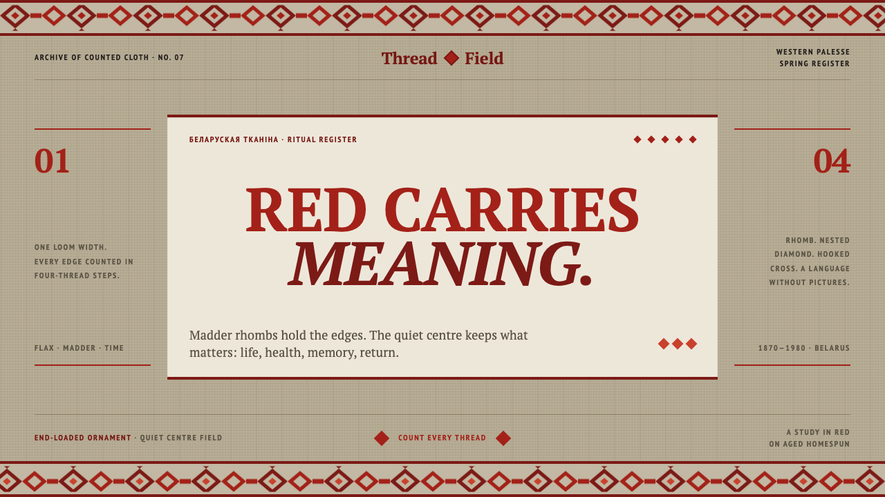 Belarusian RushnykRed carries meaning. Madder rhombs crowd aged flax edges while the woven cent…
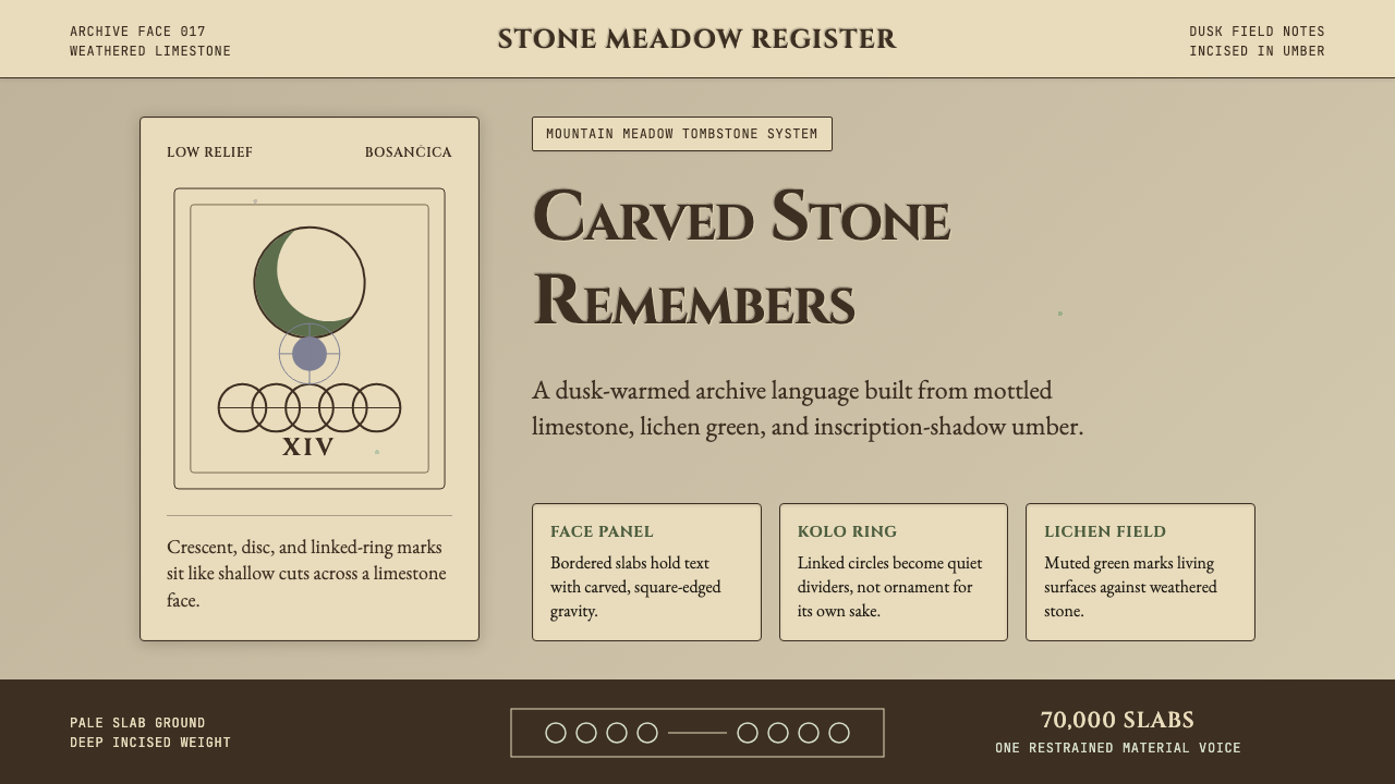 Bosnian Stećak Medieval TombstoneStone remembers quietly. Lichen green and Cinzel cuts sit on weathered limest…
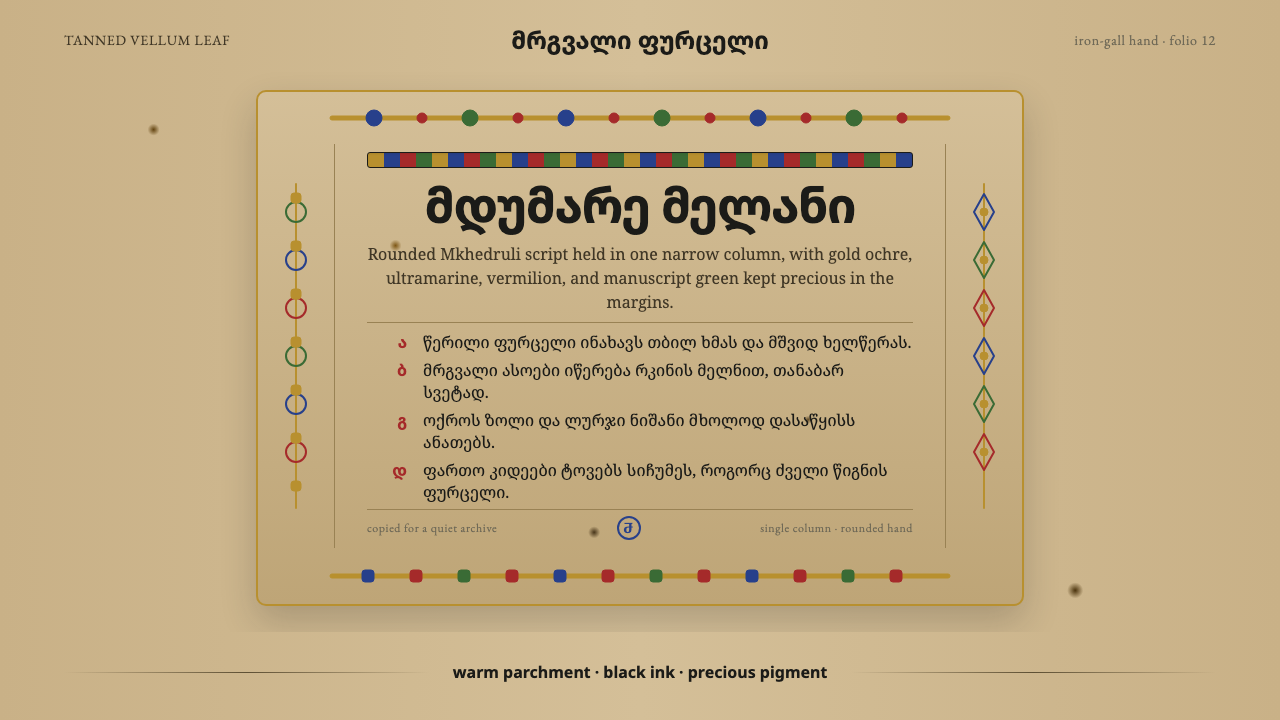 Georgian MkhedruliA manuscript breathes slowly. Tanned vellum, round Mkhedruli ink, ochre and u…