What is Palmyrene Funerary Bust?
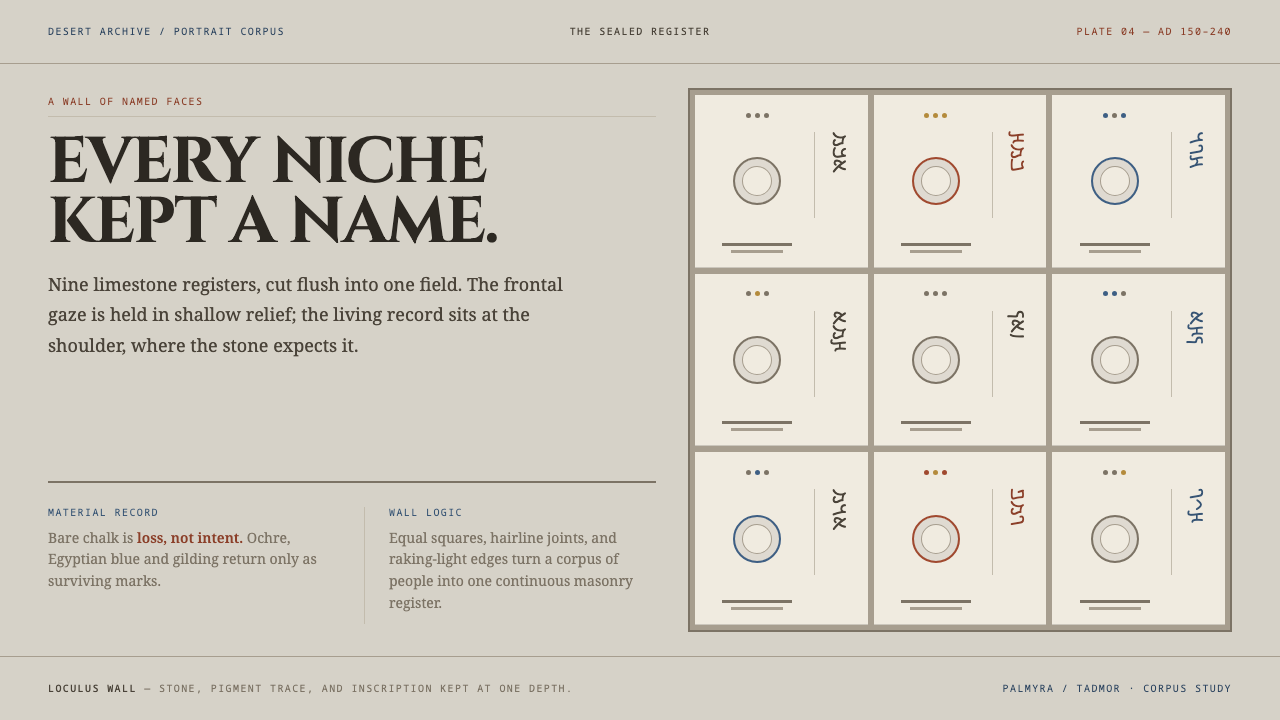
Palmyrene Funerary Bust builds a wall of named faces: pale limestone squares stacked edge to edge, a name cut beside every shoulder, and colour returning only where the paint once sat.
Palmyrene Funerary Bust in brief
Palmyrene Funerary Bust is a design language drawn from the limestone burial slabs of Palmyra, a caravan city in the Syrian desert. Each slab closed one burial niche in a tower tomb and carries one person in shallow relief: frontal, shoulders flat to the plane, eyes level with the viewer's. The name and lineage are cut beside the shoulder in Palmyrene Aramaic, not set underneath as a caption.
Visually, the style is a wall. The ground is the pale, weathered grey of limestone, matte and chalky. Square slabs sit edge to edge and are stacked upward, and the boundaries between them are the edges of cut stone rather than printed lines. Colour is scarce. The chalky white that these sculptures show today is a loss, not an intention: red ochre, Egyptian blue and gilding were once painted across dress and jewellery. The system keeps the stone bare and lets colour return only where it once sat.
The result is a wall of faces, each with a name, each the same size as its neighbour. It is a system about people as units: directories, memorials, archives, rosters and cohorts. It is dignified, frontal and quietly democratic, a grid in which nobody is reduced to a thumbnail and nobody is given more room than the person next to them.
Where does Palmyrene Funerary Bust come from?
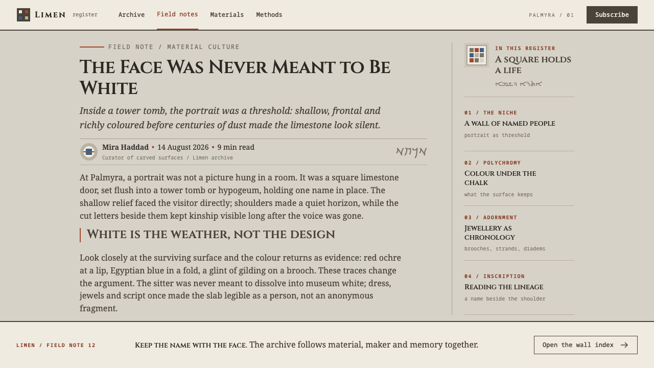
Palmyra, called Tadmor in the record, stood in the Syrian desert on the caravan route between Rome and Parthia. The record dates the portrait tradition from the middle of the first century BC to AD 273, and ends it with the fall of Zenobia's Palmyra. In between, the families of the city buried their dead in tower tombs, and each burial niche, a loculus, was sealed with a limestone slab bearing the portrait of the person inside. The slab was both a door and a likeness.
The record files the tradition under Romano-Parthian portrait sculpture, a label that reflects the city's position between two powers, and under the loculus-relief tradition, which names the format itself. The format is distinctive. The figure is frontal, the shoulders lie flat against the stone, the relief is shallow, and the eyes meet the viewer directly. There is no narrative scene and no setting. What the portrait gives is presence: one face, one name, one place in a wall of faces.
Roughly four thousand of these portraits survive, the largest portrait corpus in the Roman world outside Rome. Their inscriptions are a field of study in their own right, listed as Palmyrene Aramaic epigraphy. The name and lineage sit beside the shoulder, so the slab functions as both an image and a short genealogy. For a designer, the scale of the corpus is important: it is not a single masterpiece but a system of thousands of near-identical modules, each differentiated only by a face, a name and a few details of dress and jewellery.
The colour history completes the picture. Red ochre, Egyptian blue and gilding were painted across dress and jewellery, and what we see now, a chalky white, is the result of loss. The Palmyra Portrait Project, named in the record, is the kind of research effort that documents and studies the corpus, and the record also lists Aqmat among its key figures, a person known through a portrait and an inscription. The design system takes that evidence seriously: it keeps the stone bare and restores colour only where traces suggest it once was.
What defines the Palmyrene Funerary Bust look?
Weathered Stone Ground
The ground is a pale, warm-grey limestone tone, matte and slightly chalky, the colour of stone after centuries of exposure. It is not white and not a gradient. The surface should feel like a quarried wall, calm and even, with no paper-like shine and no decorative texture beyond the faint grain of stone itself.
Square Slabs
The module is the square, because a slab closed a square niche. Squares are stacked edge to edge into a wall and are all the same size. A feature square is not allowed to become a hero card; if one portrait needs emphasis, it is given emphasis through its colour traces, not through extra area.
Frontal, Eye-Level Portrait
The figure faces the viewer directly, shoulders flat to the plane, eyes at the viewer's own height. There are no three-quarter angles, no looking away, no dynamic tilts. This frontality is what makes the wall readable as a group of equals, and it gives each face a quiet insistence on being seen.
Shoulder Inscriptions
The name and lineage sit beside the shoulder, not underneath, and are incised in plain letters in the stone's own tone. In layout this means placing labels next to the subject, on the side, as part of the slab. A caption below the image would make the name an afterthought, which is the opposite of this tradition.
Cut Edges, Not Drawn Lines
Boundaries are the edges of cut stone and the narrow joints between slabs. Rules, outlines and decorative borders are not used. Separation comes from the meeting of two squares, so the wall feels built rather than drawn, and the grid is visible only because the stones are.
Shallow Relief
Depth is low and held close to the surface. Light picks out the edge of a figure and the grooves of its inscription, but there are no deep shadows, no floating cards and no heavy elevation. Slabs sit in the wall, flush with their neighbours, and nothing lifts away from the plane.
Returning Pigment
Red ochre, Egyptian blue and gilding return in small amounts, on jewellery, on names and at points of emphasis, where paint once sat. They appear as traces, not floods: a mark, a line, a small field. The restraint is the argument. If colour is everywhere, the stone, and the idea of loss, disappears.
Who shaped Palmyrene Funerary Bust?
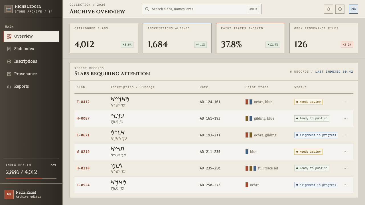
A name listed among the key figures of the record, carried by a portrait and its inscription. Aqmat stands for the thousands of individuals known to us primarily through a face and a name cut in stone rather than through a biography. For the design system, that is the model: a person is presented as a face, a name and a place, in a grid where each is given the same space.
The ruler whose Palmyra fell in AD 273, the date the record gives as the end of the tradition. Her name marks the close of the period rather than its content: the portrait slabs belong to the people on them more than to any ruler. In design terms, she is a reminder that a system can have a historical boundary, and that part of its meaning comes from knowing where it stops.
A research project named in the record, dedicated to the Palmyrene portraits. Efforts of this kind are how a corpus of four thousand slabs becomes something that can be searched, compared and understood, and how the faded colour of the stone can be reasoned about. The design system's treatment of colour, bare stone with traces returning, is only possible because such scholarship exists.
The thousands of individuals whose faces and names fill the corpus. They are not famous people but members of the city's families, and the tradition gives each of them the same square, the same frontal pose and the same inscribed name. The whole system is a tribute to that plainness. When using this style, give every person on the wall the same dignity and the same room.
How do you use Palmyrene Funerary Bust today?
Palmyrene Funerary Bust is a system for presenting many people with equal respect. It is strongest when the content is a collection of individuals, and weakest when it is a single hero message. Decide early what the wall is a wall of, and let every other decision serve that answer.
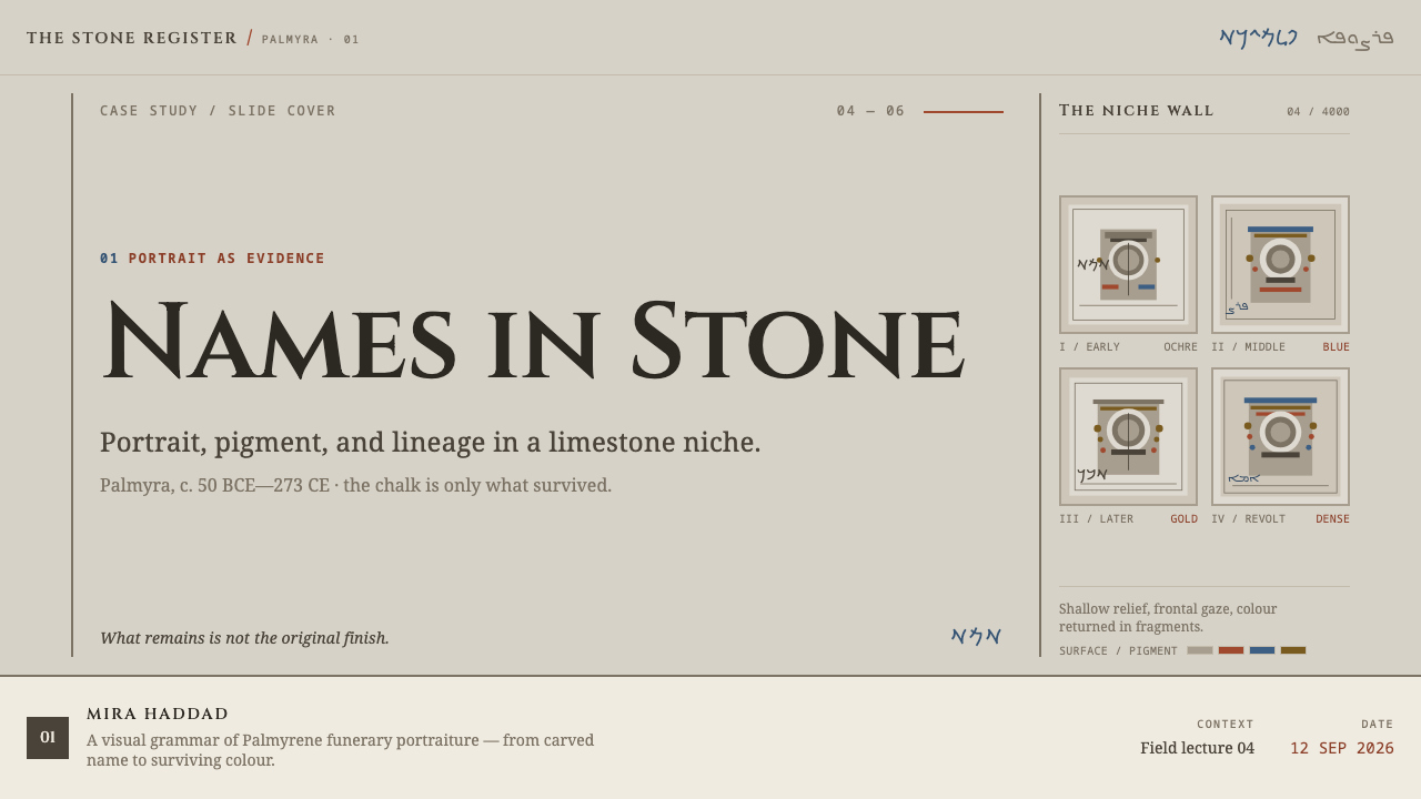
On cover slides, use a single large square slab holding a frontal portrait or a plain title block, with the name set at the side and not underneath. Content slides can be a wall of equal squares, each holding a face, an image or a number, with its label placed beside it. Data slides work well when each square is a single person, case or unit, so that a total becomes a visible wall of individuals rather than an abstract bar; a number can sit frontally in a square with its label at the shoulder.
In product interfaces, the style fits people-centred screens: team pages, member directories, customer records, alumni networks, memorial and legacy products, genealogy tools and archive viewers. Cards become equal squares with no elevation, set flush against each other, and separation comes from narrow joints. Pricing pages can present plans as three equal slabs, with the recommended plan marked by a single trace of ochre at one point and not by a larger card. Buttons and inputs are flat, rectangular and in stone tones.
In editorial and marketing work, the style suits biography, oral history, obituaries, archival features, museum collections and any story where individuals should be named. Set portraits frontally, crop them to squares, and put names beside the shoulder in plain letters. Use returning colour in one or two places per page, such as a name in ochre or a thread of blue near the jewellery. The tone is serious and unhurried, so keep copy restrained.
The most common mistake is to put the caption underneath the image, which turns the name into a footnote and breaks the tradition's central gesture. A second mistake is to flood the page with ochre and blue; the colour is a trace, and spending it freely repaints the stone and erases the story of loss. A third is to make some squares larger than others, which creates a hierarchy the wall was designed to avoid. Finally, avoid faux-stone textures, soft floating shadows and cheerful retail contexts: this is a funerary format and it deserves a respectful setting.
Palmyrene Funerary Bust — FAQ
What are Palmyrene funerary busts?
They are limestone burial slabs from Palmyra, in the Syrian desert, dating from the middle of the first century BC to AD 273. Each slab closed one burial niche in a tower tomb and carries a single person in shallow relief, shown frontally with shoulders flat to the plane. The name and lineage are cut beside the shoulder in Palmyrene Aramaic. Roughly four thousand survive, making them the largest portrait corpus in the Roman world outside Rome.
Why is the stone left bare and colour kept so sparse?
Because the white we see today is loss, not intention. The sculptures were once painted with red ochre, Egyptian blue and gilding across dress and jewellery. The design system respects both facts: it keeps the stone bare as the base and lets colour return only where it once sat, on jewellery, names and emphasis. Spreading colour everywhere would claim more than the evidence supports and would erase the sense of weathering that gives the style its character.
Why is the name beside the shoulder and not underneath?
Because that is how the tradition did it. The inscription was cut next to the figure, in Palmyrene Aramaic, so the name and lineage were part of the slab rather than a caption to it. In design, this treats the name as an integral part of the person: a label next to the face on the side, in plain letters, instead of a line of small text beneath an image. It makes a gallery of people feel like a gathering and not a catalogue.
Why must all the squares be the same size?
Because each slab closed a niche of the same kind, and the wall of thousands of near-identical modules is what makes the tradition distinctive. Equal squares say that each person is given the same space and the same dignity. If one tile grows into a hero card, the wall turns into a hierarchy of featured and non-featured, which the format was not built to carry. Emphasis should come from colour traces or position, not from size.
Where does this style work best, and where does it struggle?
It works best for people-centred collections: directories, teams, archives, memorials, biographies and museum or heritage content, along with any product that wants a calm, equal, serious grid. It struggles with high-energy promotional pages, playful consumer brands, and designs that depend on one dominant hero image. Because its source is funerary, it also asks for sensitivity: use it to honour individuals, not as a casual decorative skin.
Related design styles
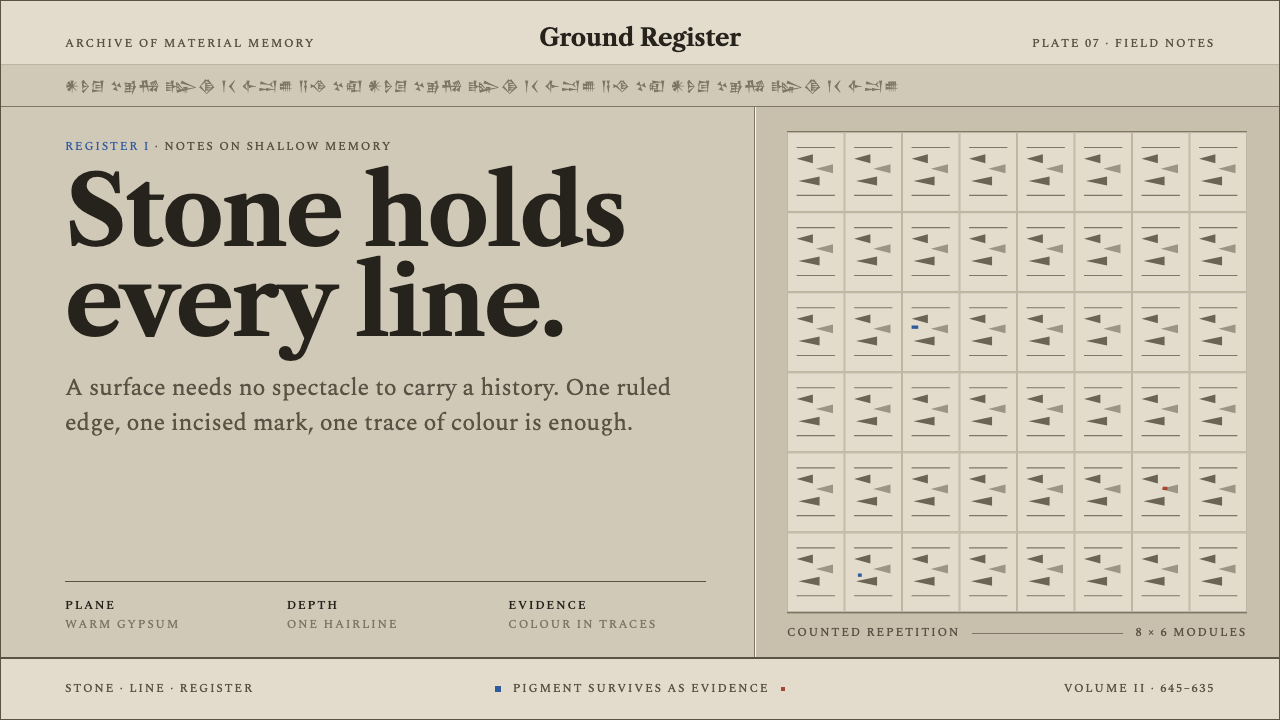 Assyrian Palace ReliefHistory cut to a hairline. Warm gypsum registers hold serif type and rare pig…
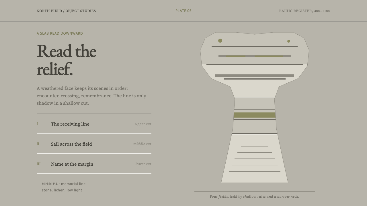 Gotland Picture StoneMeaning emerges slowly. Weathered limestone greys divide a story into shallow…
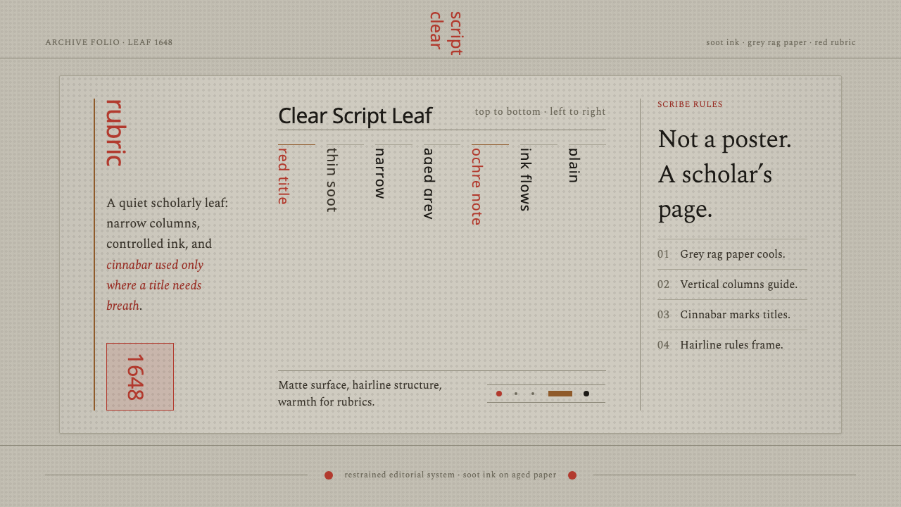 Kalmyk Todo Bichig Clear ScriptRestraint becomes script. Soot columns on grey rag paper, touched by cinnabar…
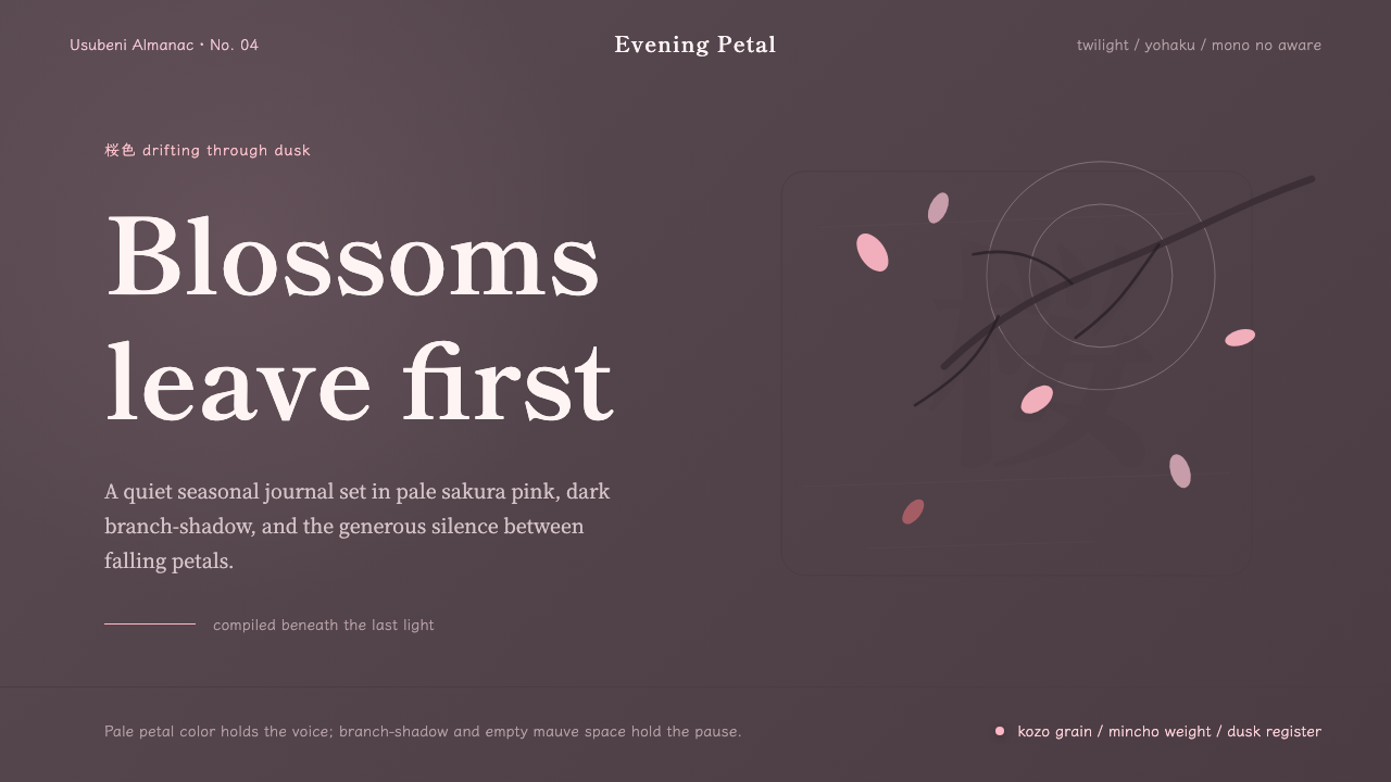 Cherry Blossom HanamiTenderness arrives in dusk. Sakura pink, branch-shadow, and Mincho type leave…
 Étretat Chalk CliffsStone becomes light. Chalk-white forms dissolve through blue-gray mist and li…
 Micronesian Etak Star CompassNavigation as memory. White star points and sand ribs map a 32-point ocean-ni…