
About The New Yorker Classic
The New Yorker has defined what "literary American magazine" looks like for a century. From the Rea Irvin masthead to the pen-and-ink cartoons punctuating every issue, its visual identity is a masterclass in editorial restraint — cream paper, deep ink, a single accent red, and classical serif typography that lets the writing command the page.
Everything in the system defers to readability and intellectual confidence. Generous columns, hairline rules, elegant drop-caps, and a palette that never strays beyond ink, cream, and the occasional flash of masthead red create an atmosphere of quiet authority without academic stuffiness.
- Origin
- New York City, United States (Condé Nast publishing)
- Era
- 1925 founded; visual identity remarkably consistent for 100 years
- Key figures
- Harold Ross · Rea Irvin · William Shawn · David Remnick
- Movements
- American literary magazine tradition · classical printing · single-panel cartoon tradition
The New Yorker Classic design spec
Colors
Typography
The other 11 sections — buttons, cards, spacing, motion, techniques and more — open once you unlock. Download the DESIGN.md or send it to your AI in one click. Unlock once, yours forever.
Sign up nowStyles similar to The New Yorker Classic
Also inspired by brands & products, with a close feel.
 Norwegian Fjord TourismMonumental, not loud. Fjord blue, glacier-white panels, and one stave-red accent.
 Saudi Vision 2030Measured ambition, made luminous. Ivory, green, and gold tracery on a civic grid.
 Dieter Rams / BraunQuiet by design. Warm gray, white panels, hairline grids, and one earned green dot.
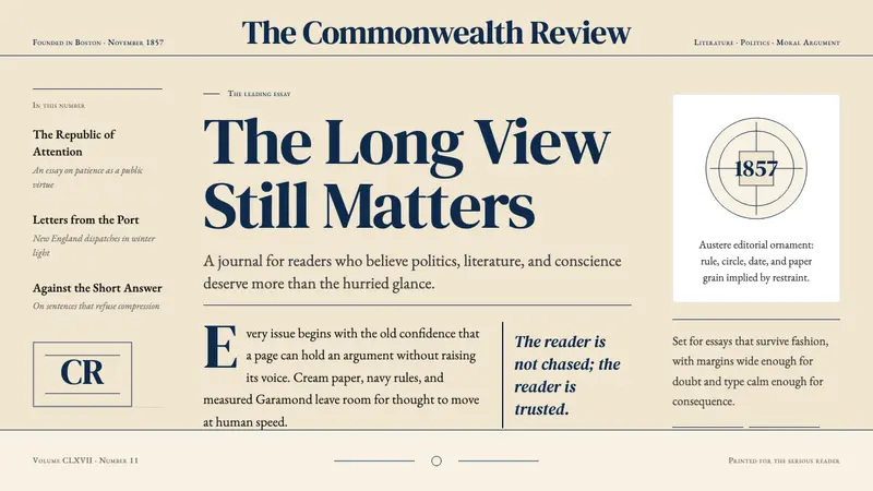 The Atlantic MonthlyAuthority slows down. Navy Garamond on warm cream, ruled like an essay page.