What is Aesop Apothecary Amber?
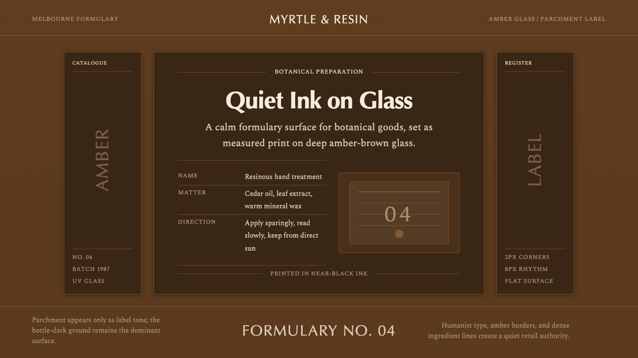
Aesop turned a UV-blocking amber bottle into an entire brand system, trading beauty-industry gloss for the quiet authority of a chemist's dispensary.
Aesop Apothecary Amber in brief
Aesop Apothecary Amber is a design system built around a single object rather than a mood board: the deep amber-brown glass bottle that has carried every Aesop product since the brand's earliest years in Melbourne. Where most personal-care brands treat packaging as a canvas for illustration or lifestyle photography, this system treats the bottle itself as the entire visual surface — the glass color is the brand color, and almost nothing is added on top of it.
Printed directly onto that amber ground is a plain rectangular label carrying the product name, an ingredient listing, and usage directions, set in a restrained, humanist letterform and printed in near-black ink on a parchment or cream stock. The composition deliberately echoes a dispensing chemist's label rather than a cosmetics counter — dense, factual, evenly set, with no illustration, no model photography, and no decorative border competing with the text.
The overall effect is closer to a formulary than a display shelf. Because the system refuses gradients, bright accent colors, and glossy finishes, a bottle sitting on a bathroom shelf reads less like a manufactured commodity and more like something measured out and compounded — a deliberate visual argument that the product's value lives in its formulation, not in its packaging theatrics.
Where does Aesop Apothecary Amber come from?
Aesop was founded in Melbourne in 1987 by Dennis Paphitis, who began the business making hair-care products before expanding into the broader skincare, body, and home-fragrance range the brand is known for today. From close to the start, the products shared the same packaging language: deep amber-brown glass, a plain printed label, and an almost complete absence of the visual conventions the beauty industry relied on at the time.
The amber glass was originally a functional choice rather than an aesthetic one. Amber and brown glass have long been used to store light-sensitive formulations — the tinted glass filters out ultraviolet light that would otherwise degrade certain botanical extracts and active ingredients over time, a practice with roots in centuries of pharmacy and chemist dispensing. Aesop's decision was to leave that functional glass fully exposed rather than concealing it inside an outer carton, turning a preservation technique into the brand's most recognizable visual signature.
That restraint became a competitive advantage as the brand expanded internationally through the 1990s and 2000s. At a time when most personal-care competitors leaned into soft-focus photography, pastel packaging, and aspirational lifestyle imagery, Aesop's consistently plain, text-forward bottles stood out precisely by refusing to compete on those terms. The same discipline carried into the brand's retail spaces: rather than rolling out one fixed store template worldwide, Aesop commissioned different architects and designers for individual locations, producing stores that varied enormously in material and layout while the amber bottle on the counter stayed constant as the one fixed anchor of brand recognition.
By the 2010s, the amber bottle and apothecary label had become one of the most recognized packaging silhouettes in global retail, instantly identifiable even with the brand name obscured. That recognition underpinned Aesop's position as a premium, design-literate brand within a much larger beauty conglomerate landscape, culminating in L'Oréal's acquisition of the company in 2023 — a transaction widely read in the industry as confirmation that visual restraint, sustained for decades, had become a genuine commercial asset rather than a stylistic quirk.
What defines the Aesop Apothecary Amber look?
Color
The palette is anchored entirely by deep amber-brown glass, paired with a parchment or warm cream label ground and near-black ink for text. There is no secondary brand color and no accent hue — variation across the product range comes from subtle shifts in label copy and category naming rather than from color coding, which keeps every item legible as unmistakably part of the same family.
Typography
Letterforms are humanist and unadorned, closer to a chemist's dispensing label than to a display or luxury script. Text is set dense and functional — full ingredient names, directions, and cautionary copy all appear on the label rather than being hidden away — and hierarchy is built through modest size and spacing changes rather than through bold color or ornament.
Composition
Labels follow a plain rectangular panel, centered or left-aligned, with no illustrated border, no photography, and no decorative flourish. The composition is symmetrical and calm in the way a prescription label is calm — everything necessary is present, nothing extraneous is added, and the panel edges are treated as functional boundaries rather than as a decorative frame.
Material Honesty
The amber glass is left fully visible rather than boxed away, and its function — filtering ultraviolet light to protect the formulation inside — is allowed to remain the reason for its color. Nothing about the surface pretends to be something it is not: no simulated texture, no faux-vintage distressing, no printed pattern imitating a material the bottle is not actually made of.
Texture
Two textures sit in deliberate contrast: the smooth, faintly reflective surface of the glass itself, and the matte, slightly toothy surface of the printed paper label. The interplay between a glossy container and a non-glossy label is what gives the object its apothecary read — a glass vessel with a workmanlike paper instruction sheet, rather than a fully lacquered retail object.
Restraint and Whitespace
Even with a dense ingredient list on every label, the overall composition never feels cluttered, because margins around the text block are generous and consistent across the entire product range. Restraint here is not the absence of information — it is the discipline of presenting a great deal of factual content without ever resorting to visual noise to organize it.
Who shaped Aesop Apothecary Amber?
Founded Aesop in Melbourne in 1987, beginning with hair-care products before expanding the range. Paphitis is credited with the founding instinct to let the functional amber glass carry the brand's entire visual identity rather than adding decoration on top of it, a decision that shaped every product the company has released since.
A Melbourne creative and branding studio co-founded by Paphitis, closely associated over many years with refining Aesop's label typography, signage, and printed collateral. Its involvement helped keep the apothecary label system consistent as the product range and retail footprint grew from a single Australian brand into a global one.
Rather than a single fixed storefront template, Aesop has commissioned a rotating roster of architects and designers to create individually designed stores around the world, each responding to its local material culture while keeping the amber bottle as the one constant, unifying object across every location.
Acquired Aesop in 2023 in a deal widely covered in the beauty industry press, a transaction commentators read as confirmation that the brand's decades of visual restraint had translated into serious commercial value within a much larger, more conventionally marketed portfolio of beauty companies.
How do you use Aesop Apothecary Amber today?
Because the system's power comes from restraint rather than decoration, applying it correctly means resisting the urge to add anything. The core discipline is treating brown or amber as a functional, near-neutral ground rather than as a warm accent color, and letting dense, factual text carry the visual weight that illustration or photography would carry in most other systems.
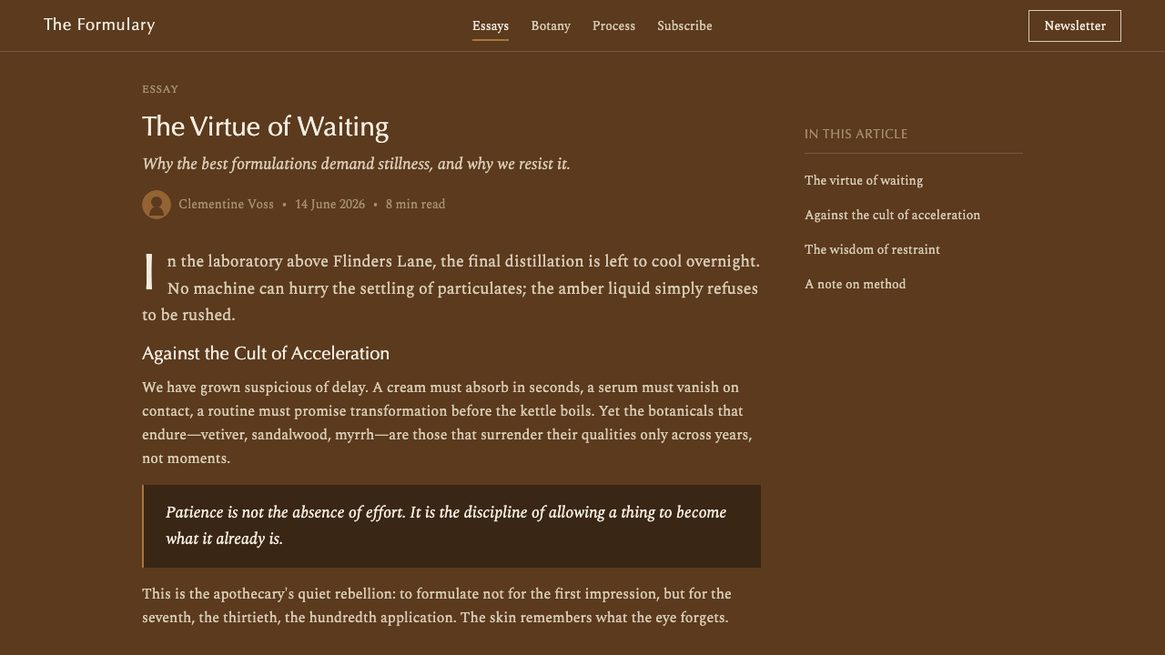
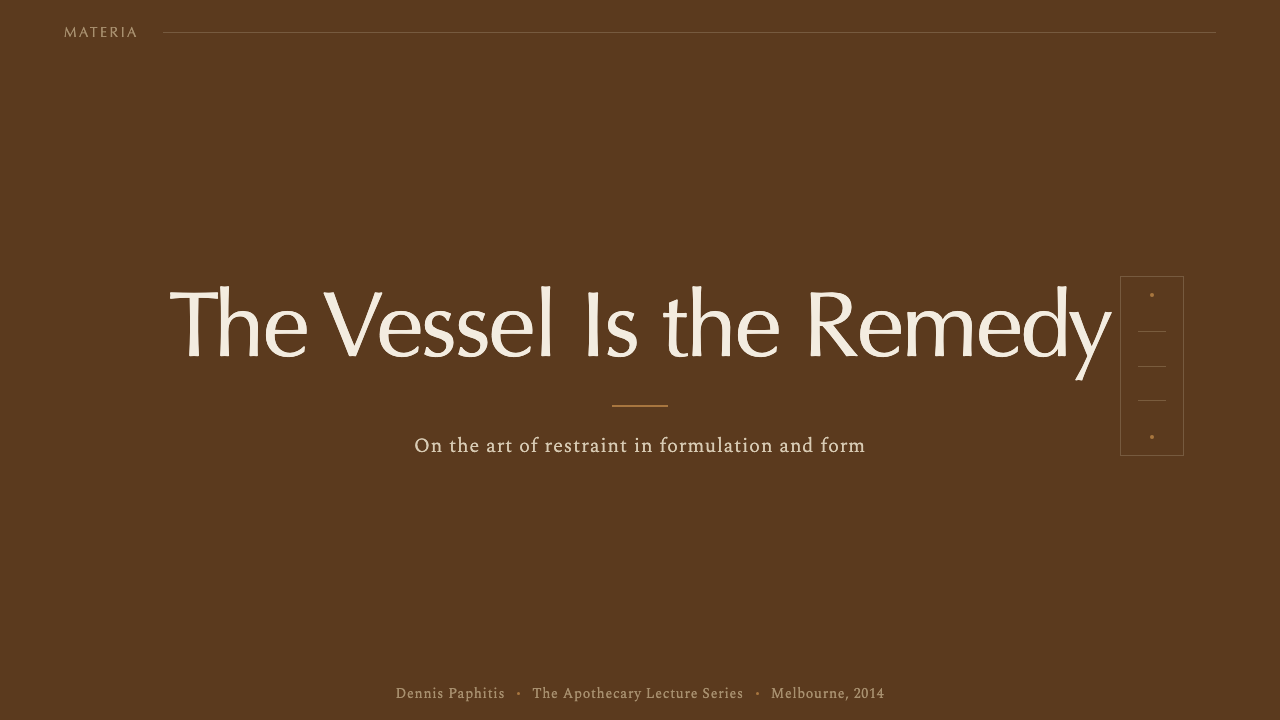
On presentation slides, a cover works well as a plain amber or parchment field with a single centered wordmark or product name, set exactly as it would appear on a bottle label — no gradient background, no supporting graphic. Content slides should adopt the label's density: full sentences rather than fragmented bullet points, set in even, unadorned type, with section headers behaving like a product name rather than like a decorative banner. Data should be presented as a plain, well-labeled list or table rather than as a colorful chart, echoing an ingredient listing.
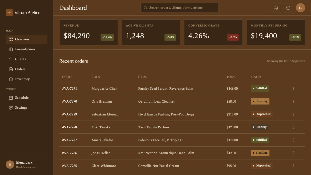
For web interfaces, the palette suits premium e-commerce, formulary or ingredient-transparency products, and any brand wanting to signal expertise over trendiness. Backgrounds lean toward parchment or warm off-white rather than pure white; body copy stays near-black; and amber-brown is reserved for structural elements — dividers, borders, a product image's own packaging — rather than for buttons or links, which should remain plain and text-led. Pricing and account pages benefit from being set like a formulary sheet: clear, complete information laid out in an even grid, with no colorful upsell banners.
In editorial and marketing work, the system supports a voice that reads as informed rather than persuasive. Long-form content benefits from a narrow, dense text column reminiscent of an ingredient list, with pull quotes set plainly rather than in decorative script. Marketing pages should avoid lifestyle photography of models in favor of close, functional product imagery — the object itself, unstyled, doing the persuading.
The most common mistake is treating amber-brown as simply a warm, cozy accent color and pairing it with soft photography, rounded decorative type, or gradient backgrounds — conventions this system exists specifically to reject. A second frequent error is thinning out the label copy to look more 'modern': the density of factual text is not a limitation to be minimized but the entire source of the system's credibility, and stripping it away removes the apothecary logic along with it.
Aesop Apothecary Amber — FAQ
Is this just a 'brown theme'?
No. Treating amber-brown as an interchangeable warm accent color misses the point entirely — the color exists because it is functional, filtering light the way real apothecary glass does, and the system depends on that logic being legible even when the literal function no longer applies. A brown theme paired with rounded type and soft photography reads as cozy; this system, paired with dense label typography and plain composition, reads as clinical and expert.
Does this style work outside beauty and skincare products?
Yes. The underlying logic — dense factual text, a functional rather than decorative color, and a refusal of illustration or lifestyle imagery — transfers well to any product where expertise and formulation matter more than trend, such as supplement brands, specialty food and beverage labeling, laboratory or research-adjacent tools, and premium B2B products that want to signal rigor over polish.
How is this different from a generic 'vintage pharmacy' aesthetic?
Generic vintage-pharmacy styling usually leans on aged paper textures, ornate borders, and antique-looking scripts to signal history. This system does the opposite: it is contemporary and functional rather than nostalgic, uses a clean humanist letterform rather than an antique script, and avoids any deliberate aging or distressing effect. The apothecary reference here is about density and honesty of information, not about decorative old-timeyness.
Why does the system avoid photography and illustration almost entirely?
Because photography and illustration are, in this system's logic, forms of persuasion, and the entire point of the apothecary label is to persuade through information rather than through imagery. A model's face or a botanical illustration asks the viewer to feel something; a complete ingredient list and plain directions ask the viewer to evaluate something. Keeping imagery out preserves that evaluative, expert tone.
Can this system work on a light or white background instead of amber?
It can, and many applications of the label typography alone — without the literal glass color — work well on parchment or off-white grounds, since the label itself was always printed on light paper. What should not change is the density and plainness of the text and the absence of decoration; the amber is the most recognizable single element, but the disciplined, factual composition underneath it is what actually makes the system work.
Related design styles
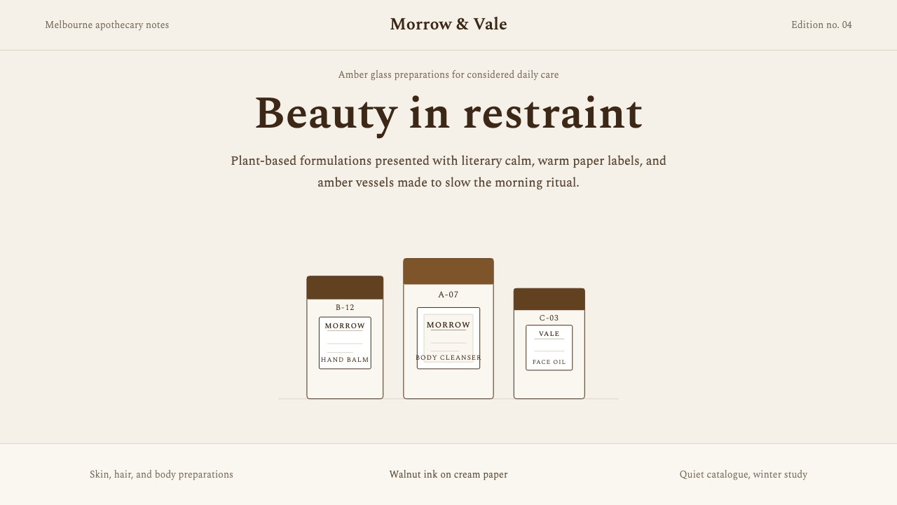 AesopRefuses urgency. Walnut serif on cream paper — every surface paced like a 19t…
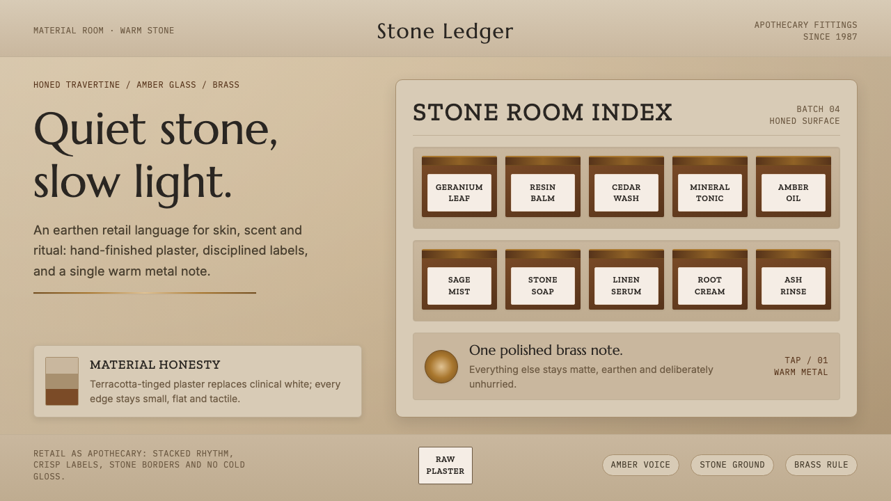 Aesop Store TravertineQuiet material honesty. Warm plaster, amber glass and a single brass line pac…
 Japanese Whisky BarLuxury whispers. Amber glow and mincho type hold one object in dark wood quie…
 Acne Studios Pink-PaperQuiet luxury in one pink plane. Inter type floats on white with a bag-like re…
 Claude / Anthropic Warm 2024Warm intelligence at night. Ochre rules and Source Serif glow on deep charcoa…
 COS Gallery MinimalSilence has structure. Cool gallery white, Archivo uppercase, and concrete-gr…