What is COS Gallery Minimal?
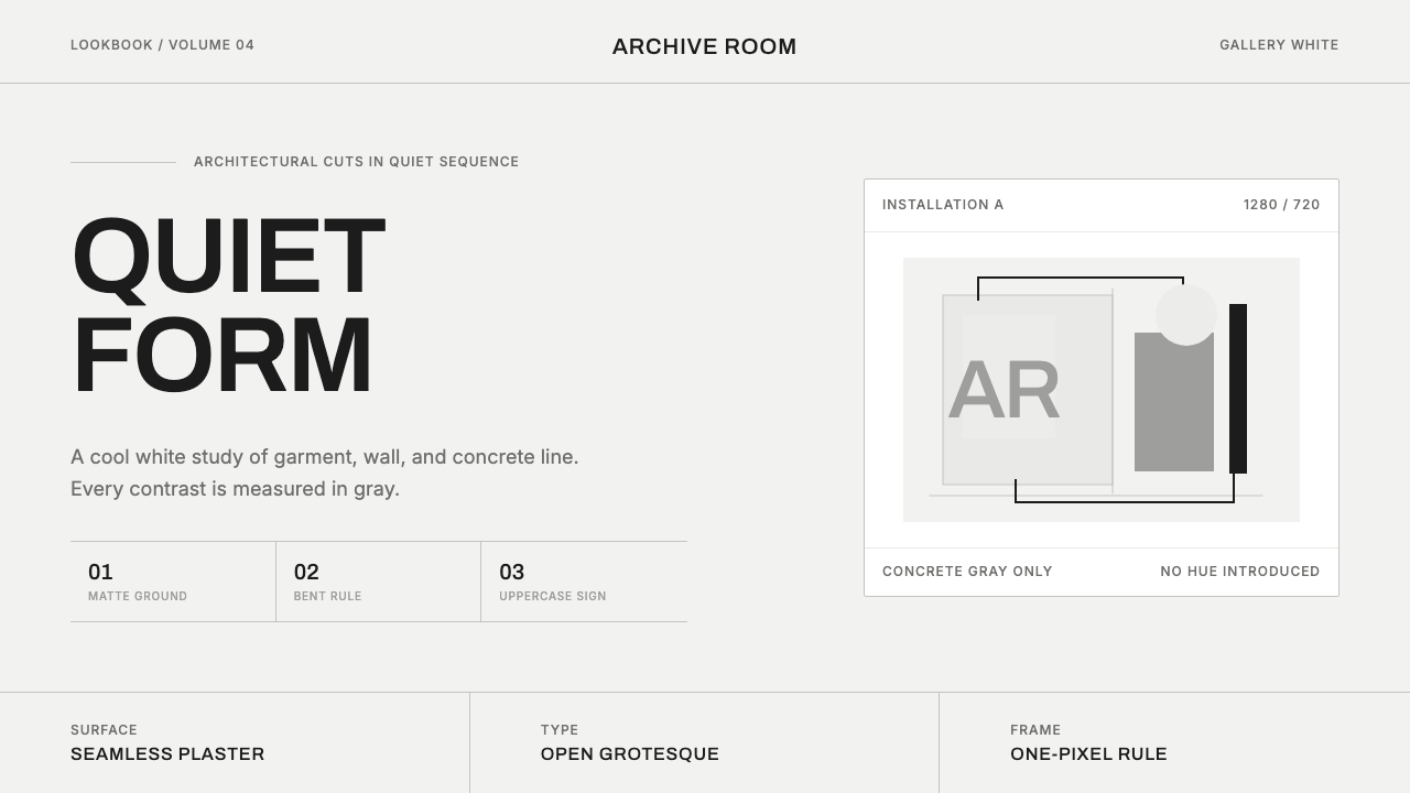
COS turned the hush of a contemporary art gallery into a clothing brand, trading cream and clutter for cool white walls and concrete-gray restraint.
COS Gallery Minimal in brief
COS — short for Collection of Style — translates the hush of a contemporary art gallery into clothing and retail space. Since its founding in 2007, the Swedish-British label, part of the H&M group, has built its identity on crisp, cool gallery-white grounds, concrete-gray contrast, and architectural cuts, all rendered in a clean grotesque sans, frequently set in uppercase.
Its art-fair collaborations and all-white installations with the design studio Snarkitecture established the visual logic that still governs the brand: matte concrete and seamless white surfaces, generous negative space, and contrast sourced only from gray. Nothing in the system is warm, and nothing is cream — the white is deliberately, insistently cool, closer to the walls of a museum than to the walls of a home.
The result is a visual identity built almost entirely on restraint and precision rather than pattern, color, or ornament. Where many retail brands compete for attention through visual noise, COS's system argues the opposite case: that quiet, exact, architectural presentation is itself the luxury signal, and that a gray hairline rule can carry as much authority as a bold graphic.
Where does COS Gallery Minimal come from?
COS was founded in 2007 as a more design-forward, considered sibling brand within the H&M group, positioned deliberately apart from H&M's fast-fashion identity and aimed at a customer interested in modern, minimal, longer-lasting design rather than trend-driven, disposable clothing. The name — Collection of Style — signaled from the outset that the brand's ambition was curatorial rather than purely commercial: less a store, more a considered collection.
That curatorial ambition was expressed architecturally as much as through the clothing itself. COS built its identity by consistently aligning its retail spaces and presentations with the visual conventions of the contemporary art world rather than conventional fashion retail — the brand became a regular presence at international art fairs and design weeks, staging installations that behaved more like gallery exhibitions than product displays.
The clearest expression of this alignment came through repeated collaborations with Snarkitecture, the Brooklyn-based art and design studio known for large-scale, immersive white installations — among them a widely covered ball-pit installation, "The Beach," in the mid-2010s. Working with a studio whose own practice was built on stark white minimalism, oversized architectural gesture, and matte, seamless surfaces gave COS a visual vocabulary directly borrowed from gallery and installation art rather than adapted from other clothing brands.
That vocabulary draws, more distantly, on a much older lineage: the twentieth-century "white cube" convention of exhibiting art in a neutral, windowless, brightly lit white room, intended to remove all context and let the object speak for itself, and the mid-century Swiss and international typographic tradition of grid-based, sans-serif, restraint-driven graphic design. COS did not originate either idea, but it is one of the few fashion brands to apply both consistently — to a shopfront, a garment, and a printed catalog alike — rather than treating minimalism as a seasonal trend.
What defines the COS Gallery Minimal look?
Cool Gallery White
The ground color is a deliberately cool white, closer to a museum wall or a fresh coat of gallery paint than to warm cream, ivory, or off-white. This coolness is a considered choice rather than a default: warmth reads as domestic and comfortable, while this particular cool white reads as clinical, exact, and curated — the color of a space built to display something rather than to live in.
Concrete-Gray Contrast
The only contrast color permitted against the white ground is gray, sourced visually from raw or matte-finished concrete rather than from any warmer neutral. Gray appears in hairline dividers, structural framing, and secondary text, always in service of hierarchy rather than decoration — it never behaves as an accent color in the way a brand might use a signature hue.
Architectural Cut and Space
Both garment silhouettes and layout compositions favor clean, geometric structure over soft draping or dense arrangement — straight lines, precise proportion, and a sense that every edge was measured rather than styled. Negative space is treated as an active structural element, not empty leftover area; a composition is often mostly white space with a single precisely placed element.
Grotesque Uppercase Type
Typography relies on a clean grotesque sans-serif, frequently set entirely in uppercase with even, unhurried letterspacing. The effect is signage-like and architectural rather than editorial or expressive — type behaves as a label or a wayfinding element within the space, not as a voice with personality.
Matte Material Feel
Surfaces across the system — from photographic backdrops to structural elements — read as matte rather than glossy, echoing the finish of raw concrete rather than polished stone or reflective material. This flat, non-reflective quality keeps attention on form and proportion rather than on surface shine.
Hairline Precision
Dividing lines, borders, and structural marks are kept extremely fine and exact — a single crisp hairline rather than a heavier rule — reinforcing the sense of architectural drafting and precision rather than a bold, graphic hand. Every line looks drawn with a straightedge rather than sketched.
Hushed, Curated Mood
The overall mood is deliberately quiet and unhurried, closer to the atmosphere of walking through a gallery than browsing a store — nothing competes for attention, and the restraint itself is what communicates confidence and considered taste rather than any single striking visual gesture.

Who shaped COS Gallery Minimal?
The in-house design team responsible for building and maintaining the brand's identity since its 2007 founding, consistently applying the gallery-white, concrete-gray, architectural system across garments, shopfronts, catalogs, and campaign imagery rather than letting the look shift with seasonal trend cycles.
The Brooklyn-based art and design studio whose repeated collaborations with COS, including large-scale all-white installations, gave the brand a visual vocabulary borrowed directly from gallery and installation art. Snarkitecture's own practice — stark white, matte, oversized architectural gesture — is close to a direct source for COS's spatial and material language.
The parent company that founded COS in 2007 as a deliberately distinct, design-forward sibling brand, giving it the commercial scale to build a global retail and gallery-collaboration presence while positioning it apart from H&M's own fast-fashion identity.
The twentieth-century museum and gallery exhibition tradition of displaying art in a neutral, windowless, evenly lit white room, intended to strip away context so the object itself commands attention. COS's retail spaces borrow this convention's core logic directly, treating the shopfront as an exhibition space rather than a sales floor.
The mid-century grid-based, sans-serif graphic design tradition that underlies COS's typographic restraint — even letterspacing, structural hierarchy through scale rather than decoration, and a grotesque sans treated as a neutral, architectural tool rather than an expressive voice.
How do you use COS Gallery Minimal today?
COS's system rewards contexts where restraint itself needs to communicate confidence, precision, or premium positioning — it is a style built to make the absence of decoration read as a deliberate choice rather than an oversight, which means it only works when every remaining element is placed with real precision.
On slides, the style suits cover and section-break pages built almost entirely from white space, a single precisely cropped image, and a small amount of uppercase grotesque type set with generous letterspacing — the composition should feel like a single museum wall label rather than a busy title slide. Content slides should carry information through gray hairline rules and careful alignment rather than color-coded boxes or icons; a data slide in this system should present numbers as large, quiet typographic statements against white, with gray used only for axis lines and secondary labels, never for the data itself.
For web interfaces, the aesthetic is well suited to dashboards and pricing pages that want to project precision and premium restraint rather than energy or urgency — a pricing table rendered in thin gray hairlines on white, with uppercase labels and no color-coded tiers, communicates confidence through quietness. It is a poor match for any interface that needs to convey warmth, urgency, or playfulness; a cool white ground with only gray for contrast can read as cold or even unwelcoming in consumer contexts where reassurance matters more than restraint.
In editorial and marketing work, the style suits long-form brand storytelling, lookbooks, and campaign pages where the goal is to let a single image or a short line of uppercase type carry the entire page — the measure should stay narrow, margins generous, and any pull quote treated as its own isolated composition rather than woven into a busy layout. Marketing pages benefit from full-bleed white space punctuated by rare, precisely placed images rather than dense grids of product photography.
The most common mistake is confusing this style with generic minimalism and filling supposedly empty space with soft shadows, rounded corners, or a warm off-white in place of the cool gallery white — any of those choices immediately pulls the system toward comfortable domestic minimalism rather than the deliberately clinical, gallery-grade restraint that defines it. A second common mistake is treating uppercase type as decorative rather than structural, using it inconsistently rather than as a fixed rule applied everywhere text appears.

COS Gallery Minimal — FAQ
What does the name "COS" actually stand for?
COS stands for Collection of Style. The name signals a curatorial intent from the brand's 2007 founding — the ambition to present a considered, edited collection rather than a broad, trend-chasing assortment, which is also why the retail and visual identity behave more like a gallery than a conventional clothing store.
How is COS's gallery-white different from a typical minimalist white?
The key distinction is temperature and intent. Many minimalist brands use a warm off-white or cream because it reads as comfortable and inviting. COS's white is deliberately cool — closer to a museum wall than a living room — and it is paired exclusively with gray rather than any warm neutral, which keeps the whole system reading as curated and exact rather than cozy. The coolness is not a byproduct of minimalism; it is a specific, considered choice.
Why does the Snarkitecture collaboration matter so much to understanding this style?
Because it shows the visual system's real source is installation and gallery art rather than fashion retail convention. Snarkitecture's own practice — large-scale, immersive, all-white, matte, architectural — gave COS a working model for how a completely uncolored, texture-driven space could still feel considered and even playful at scale. The collaboration is the clearest evidence that COS's minimalism is borrowed from contemporary art practice, not developed independently within fashion retail.
Does this style work for brands that need to feel warm or emotionally approachable?
Generally not without significant adaptation. The system's entire authority comes from its coolness and restraint — it argues that precision is the luxury, not comfort. A brand whose core promise depends on feeling warm, nurturing, or emotionally reassuring will find the cool white and gray-only contrast working against its message rather than supporting it. The style is far better suited to brands whose value proposition is precision, quality, or considered taste than to those built on emotional warmth.
Can this style be applied outside of fashion retail?
Yes — its underlying logic is architectural and typographic rather than specific to clothing, which is exactly what makes it transferable. Any context that wants to project precision, editorial confidence, and premium restraint — a design studio's portfolio site, an architecture firm's presentation, a product priced at the high end of its category — can borrow the cool-white-and-concrete-gray, hairline-precise, uppercase-grotesque system directly, as long as the rest of the content is genuinely considered enough to withstand that much exposed white space.
Related design styles
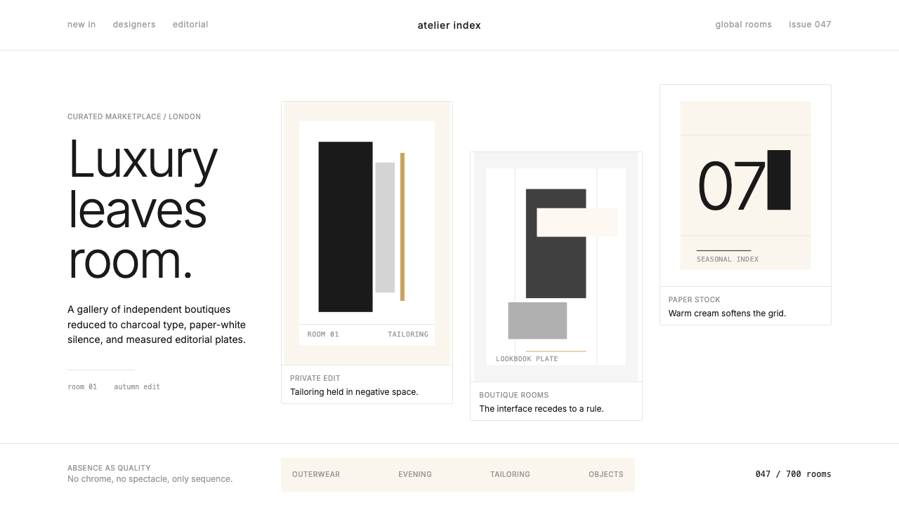 FarfetchLuxury as absence. Charcoal type, white canvas, and hairline editorial plates.
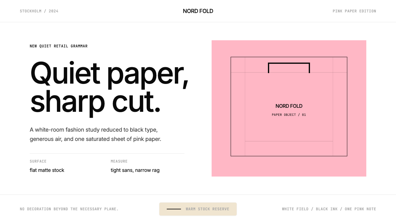 Acne Studios Pink-PaperQuiet luxury in one pink plane. Inter type floats on white with a bag-like re…
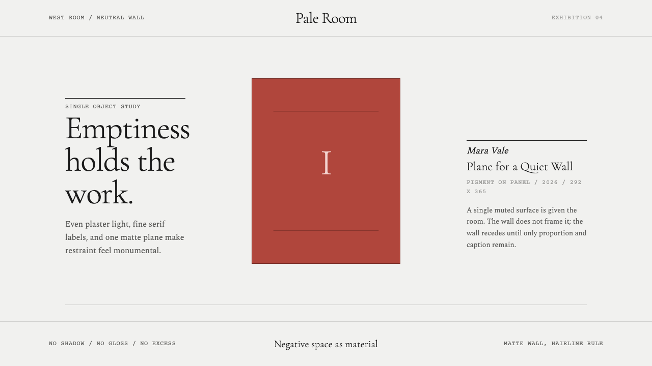 White Cube GalleryEmptiness is the medium. Cormorant labels and one terracotta plane hold the w…
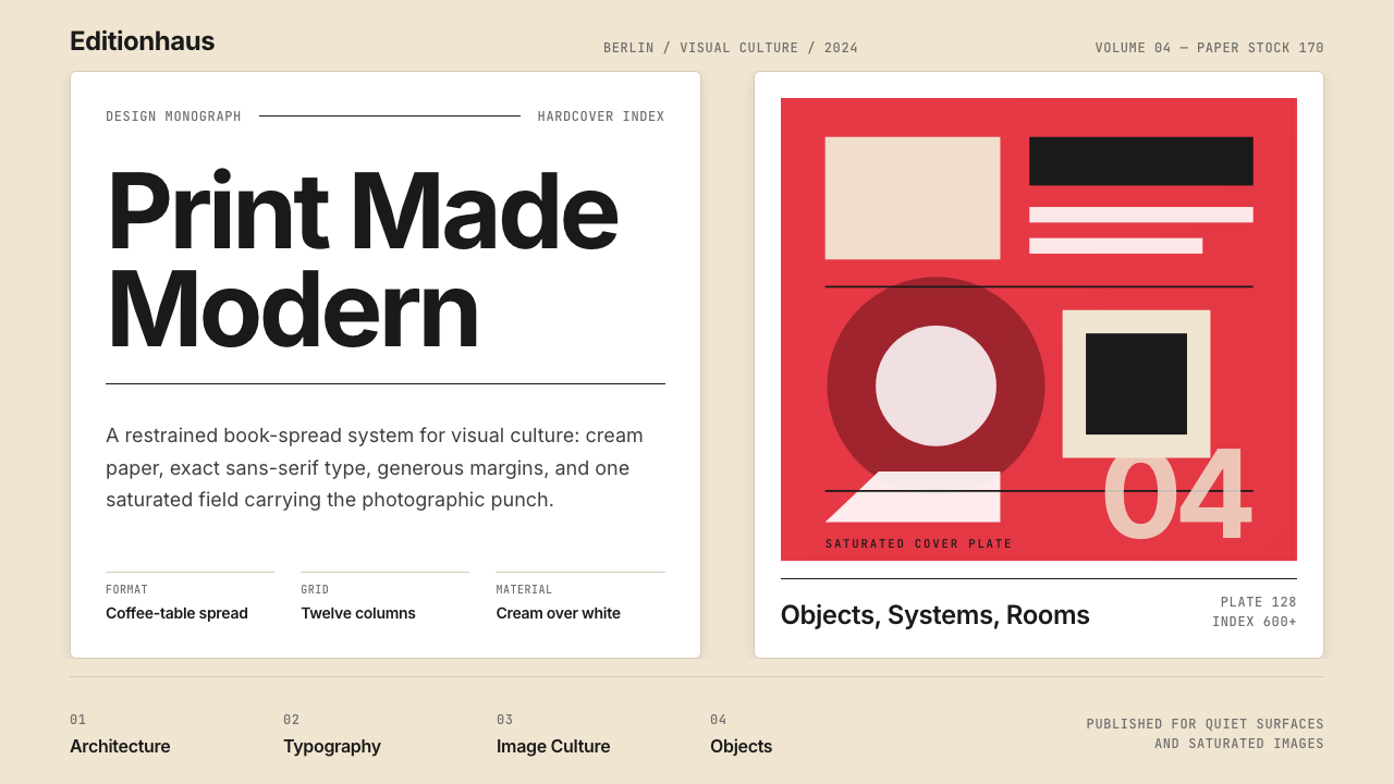 Gestalten Design BookCoffee-table calm. Cream paper, tight sans, one saturated block, and a strict…
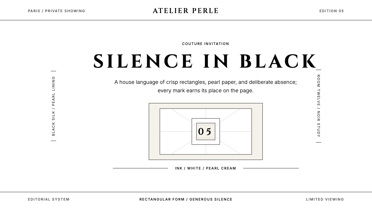 ChanelLuxury needs no color. Black on white, pearl-cream warmth, geometric capitals…
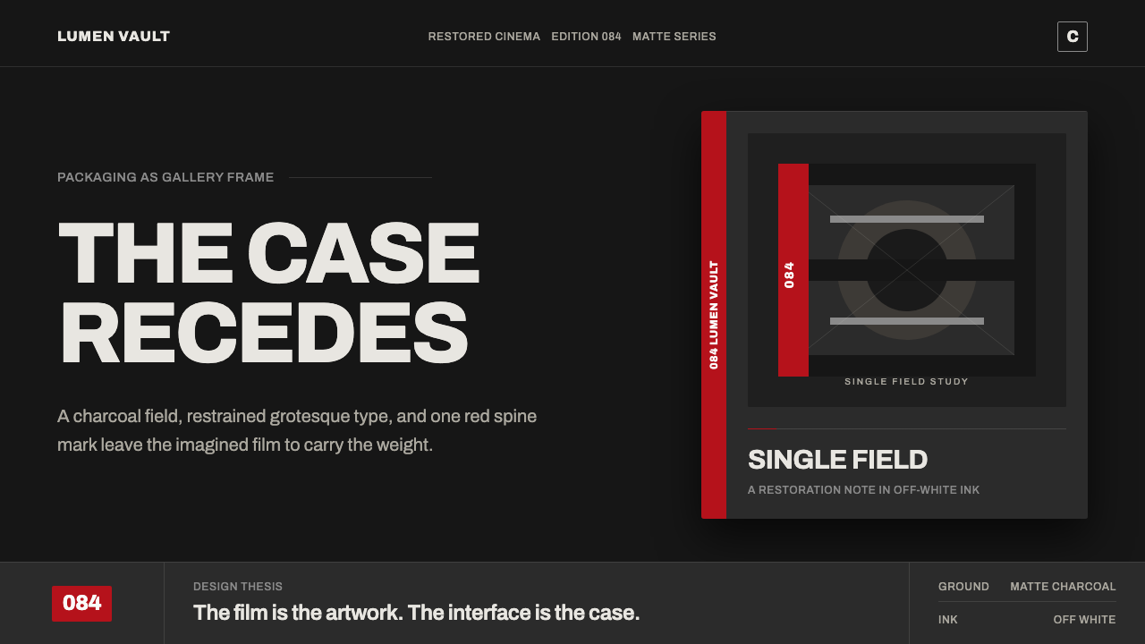 Criterion ArthouseThe case disappears. Charcoal field, off-white Archivo, hairline rules, one r…