What is Criterion Arthouse?
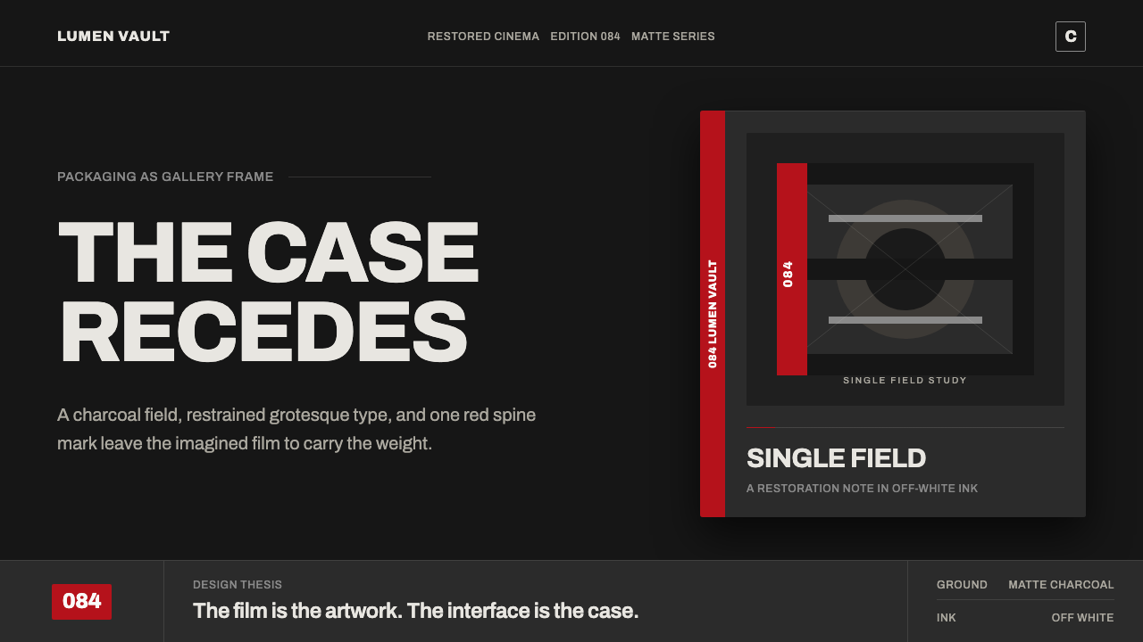
Criterion Arthouse takes the most recognizable object in cinephile culture — the black Criterion Collection case on a shelf — and turns its hush into a design system: one commissioned image, one red mark, and a lot of quiet charcoal.
Criterion Arthouse in brief
Criterion Arthouse is the packaging language of The Criterion Collection translated into an interface. Since 1984 the American label has released classic and contemporary art films on video, and its cases share one unmistakable shape: a deep, near-black card-stock field carries a single piece of commissioned cover art, a bold pale spine number runs down one edge, and a small monogram logo sits quietly in a corner. Nothing else competes for attention. On a shelf of shrink-wrapped studio releases, a Criterion spine reads instantly — not because it shouts, but because everything around it does, and it doesn't.
The underlying idea is that the case exists to frame the film, not to compete with it. A studio poster tries to sell the movie in one glance — stacked taglines, an actor's face, a starburst of credits. Criterion's cases do the opposite: one image, room to breathe, and a structure so consistent across thousands of titles that the packaging itself becomes a kind of trusted imprint, the way a university press or a serious literary publisher builds trust through restraint rather than noise. This system takes that same restraint and gives it token form — a charcoal ground rather than true black, an off-white body sans instead of a decorative display face, hairline rules instead of boxes, and one red mark used as punctuation rather than as color.
The overall register is closer to an exhibition catalog or a small press art book than to an entertainment product. It reads as considered rather than loud, curated rather than mass-market, and — because the palette is so tightly held — instantly legible even at a glance. A single red numeral or underline does more work here than a full secondary palette would anywhere else, precisely because it is the only color allowed to speak.
Where does Criterion Arthouse come from?
The Criterion Collection was founded in 1984 as a joint venture between Janus Films, the New York distributor that had been importing and re-releasing classic international and art cinema since 1956, and the Voyager Company, an early home-video and multimedia publisher. Its founders are usually credited as Robert Stein, Aleen Stein, and Joe Medjuck, with Roger Smith joining soon after. The label's first two releases, in 1984, were Citizen Kane and King Kong — chosen deliberately as canonical films rather than new releases, and pressed on LaserDisc rather than the VHS format that dominated ordinary home video at the time.
Those first discs were also a statement about how film should be preserved and studied at home. Criterion is widely credited with introducing supplemental special features and audio commentary tracks and — crucially for the widescreen films in its catalog — letterboxing, the practice of preserving a film's original theatrical aspect ratio on a home screen rather than cropping it to fit a square television. At a moment when most studios treated home video as a disposable afterthought, Criterion treated it as a form of publishing: each release came with liner notes and restoration credits, and the implicit claim that this particular version of this particular film mattered.
The spine-number system that now defines the collection's visual identity — the bold numeral running down each case — began later, when Criterion relaunched on DVD in 1998. Spine #1 was assigned to Jean Renoir's 1937 anti-war drama Grand Illusion, even though, by most accounts, restoration delays on that title meant it wasn't literally the first disc to ship under the new numbering. The number matters less as a literal release order than as a cataloging device — the same logic a library uses for a call number, letting a shelf of otherwise-identical black spines read as an ordered, browsable set rather than a pile.
Unlike a studio with one signature illustrator, Criterion commissions a different artist or designer for nearly every cover, matched to whatever the film seems to call for. Eric Skillman worked inside the company as a designer and art director across many releases and is widely credited in design coverage of the label with shaping its cover language; outside collaborators such as illustrator and designer Neil Kellerhouse have contributed some of the collection's most frequently cited covers, including its packaging for Mishima: A Life in Four Chapters and sex, lies, and videotape. What holds thousands of different artistic hands together into one recognizable identity isn't a shared illustration style — it's the constant scaffolding around it: the charcoal field, the spine number, the small monogram, and the restraint of everything else. As the label matured through the Blu-ray era from roughly 2008 onward, that scaffolding hardened into a house style precise enough that even a blurred thumbnail of a Criterion case is recognizable before the title is legible.
What defines the Criterion Arthouse look?
Color
The field is a deep charcoal rather than a true black — closer to the tone of dense, matte card stock than to a screen's darkest pixel. Against it sits off-white for text and a single restrained red used as a mark, not a palette: one numeral, one underline, one small point of emphasis per composition. No secondary or tertiary hues are permitted; the entire identity survives on the tension between three values held in careful proportion.
Typography
Body and label text is set in a quiet, workmanlike sans — legible and slightly condensed, built for long captions and credits rather than for shouting a headline. Hierarchy comes from scale and weight rather than color or ornament: a title sits noticeably larger than a credit line, which sits larger than a footnote, and nothing is bolded simply for emphasis. The type behaves like museum wall text — present, readable, and careful never to outshine the object it is labeling.
The Spine Mark
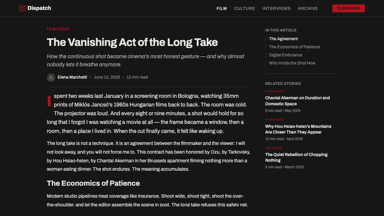
A bold, pale numeral running down one edge of the composition is the system's signature structural device — a cataloging mark borrowed directly from the physical spine number that orders the source collection. In an interface it functions like a call number or an issue number: a small piece of information that turns a single object into part of a numbered, ongoing series, implying an archive behind whatever is currently on screen.
Commissioned Illustration
A single piece of purpose-made artwork carries the visual weight of the whole composition, standing in for the grids of publicity photography and film-still collages that dominate most entertainment packaging. The image is treated as authored work — worth full-bleed space and quiet framing — rather than as a marketing collage stitched together from stock photography and overlapping logos.
Hairline Rules
Thin, single-weight rule lines divide information — a title from a credit block, one section from the next — in place of boxes, shadows, or background-color panels. The rule is a quiet, almost typographic gesture: it separates without decorating, and its restraint keeps a dense catalog page or a data-heavy screen from ever feeling boxed in or cluttered.
Restraint as Authority
Nothing in the system competes for attention with anything else, and that absence of competition is the entire point. Generous quiet space surrounds every element; no gradients, decorative textures, or attention-seeking motion are layered on top. The confidence to leave things alone — rather than the addition of any single visual flourish — is what reads as curated, considered, and premium.
Who shaped Criterion Arthouse?
Founded in 1984 as a joint venture between the classic-film distributor Janus Films and the early home-video publisher the Voyager Company, credited to Robert Stein, Aleen Stein, and Joe Medjuck, with Roger Smith joining shortly after. Its first releases, Citizen Kane and King Kong, established the label's founding claim: that a home-video edition could be treated as a serious, annotated publication rather than disposable merchandise.
The New York distributor founded in 1956 that spent decades importing and re-releasing the international art-house canon — Bergman, Kurosawa, Renoir, Fellini, and dozens more — in American theaters. Its catalog seeded much of Criterion's early library and remains the reason the collection reads as arthouse rather than mainstream studio product: the packaging exists to serve films that were never designed to be sold like blockbusters in the first place.
A designer and art director who worked within Criterion across a long run of releases and is widely credited in design-press coverage of the label with helping define its cover language — the restraint, the typographic discipline, and the way a single commissioned image is asked to carry an entire release.
An illustrator and graphic designer frequently commissioned by Criterion as an outside collaborator, credited with some of the collection's most cited covers — including the packaging for Mishima: A Life in Four Chapters and sex, lies, and videotape — and a clear example of how the label's identity survives the handoff between many different artistic hands.
Criterion's library is built around filmmakers already recognized as canonical by film history — figures such as Ingmar Bergman, Akira Kurosawa, Jean-Luc Godard, Federico Fellini, and Andrei Tarkovsky recur across the catalog. The packaging system exists to serve this canon: restrained enough to let a director's reputation, rather than the cover art, do the selling.
How do you use Criterion Arthouse today?
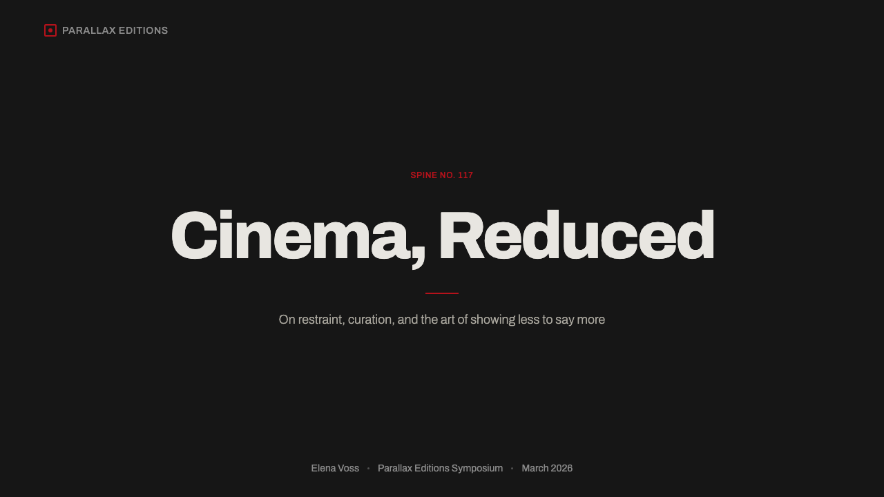
On a presentation cover slide, this style reads as a statement of seriousness before a single word is spoken. A charcoal field holds one strong image or a single large geometric mark, the deck title sits in restrained off-white type against a hairline rule, and a small monogram or wordmark occupies a quiet corner the way Criterion's own logo does. A bold, pale numeral in one corner — standing in for the spine number — can double as a deck or chapter marker, quietly implying that this presentation is one entry in a considered, numbered series rather than a one-off.
Content slides replace boxes and drop shadows with hairline rules: a rule under a section header, a rule separating a quote from its attribution, nothing boxed or carded unless it genuinely needs a container. Data slides benefit from the same discipline — grid lines rendered as hairlines rather than heavy strokes, most series held in muted grayscale, and the single red accent reserved for exactly the one number, bar, or trend line that the slide exists to make the audience notice.
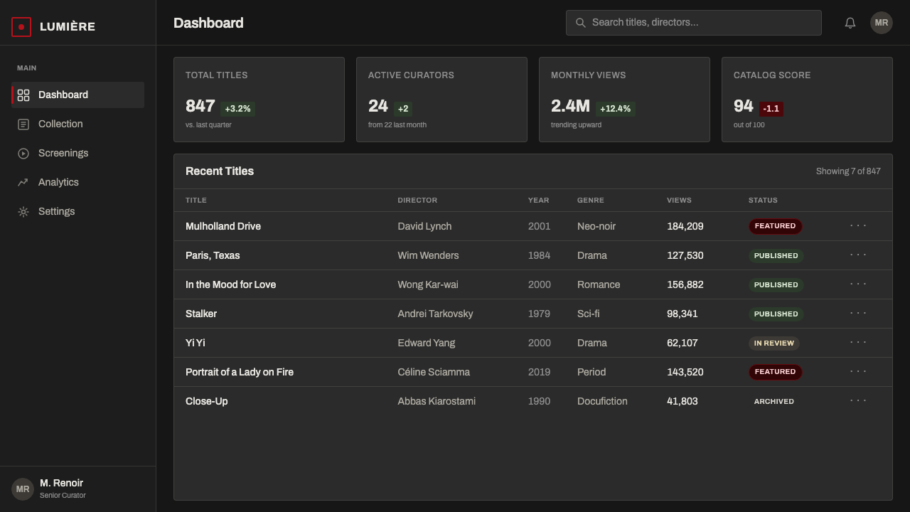
In web interfaces, the palette suits dashboards and pricing pages that want to read as curated and premium rather than busy. Charcoal surfaces carry off-white content; hairline dividers replace card borders and shadows; a small quiet logo mark sits where a heavier wordmark would normally shout. On a pricing table, the single red accent is best spent on exactly one thing — the recommended plan's badge, or the current plan indicator — never scattered across multiple buttons or highlights, which would turn a mark into a color scheme and undo the entire effect.
Editorial layouts suit the style particularly well: a long-read article can open with one commissioned-feeling hero image, use a running folio number the way Criterion uses a spine number, and set pull quotes off with a hairline rule rather than a colored box. Marketing pages built around a single strong image plus a wordmark — closer to a poster than a busy landing page — read as premium, curated, and made for people who already know what they're looking for rather than needing to be sold.
The most common mistake is treating the accent red as a color scheme rather than a mark — applying it to several buttons, icons, or highlights until it stops reading as punctuation and starts reading as decoration. A close second is reaching for true black instead of the softer charcoal ground, which reads as a generic screen dark mode rather than the specific, slightly warm tone of matte printed card stock; and a third is replacing the single commissioned-feeling image with a grid of smaller photos or stills, which immediately breaks the one object, one frame logic the entire system depends on.
Criterion Arthouse — FAQ
Is this just a dark mode UI?
Not quite. Dark mode is a technical, accessibility-driven state — any interface can be flipped into it. This is a specific curatorial aesthetic underneath a dark surface: a charcoal rather than true-black ground, one restrained accent color used as a mark rather than a scheme, hairline rules instead of card chrome, and a single commissioned-feeling image standing in for busier photography. A generic dark-mode toggle applied to an ordinary interface will not produce this read on its own.
Why charcoal instead of true black?
True black on a screen reads as a technical value — the darkest a pixel can go. Charcoal reads as a material — the tone of dense, matte, slightly absorbent card stock under gallery light. It keeps a commissioned illustration's darker tones from disappearing into the background, avoids the slightly clinical association some viewers have with pure-black interfaces, and is closer to how the physical object this style is drawn from actually looks and feels on a shelf.
Does the style require illustration, or can photography work?
Illustration is closer to the authentic source, but photography can work if it is treated the same way — as one deliberate, full-bleed image rather than a collage. The test is whether the image reads as a single authored piece worth framing on its own, or as a grid of stills and marketing photography stitched together. The latter breaks the logic no matter which medium produced it.
How much of the accent red is correct?
As little as possible while still doing its job. Authentic uses treat it as a single mark per composition — one numeral, one underline, one badge — never as a second base color spread across multiple elements. If a layout needs the red to appear in more than one or two places to feel finished, that is usually a sign the hierarchy underneath it isn't doing enough work on its own.
What kinds of products suit this style, and which don't?
It suits products that want to signal curation, authority, and a slower kind of confidence — boutique software, portfolio and studio sites, editorial platforms, cultural and archival projects, premium subscription tiers. It struggles for products that need many simultaneous calls to action, high-energy retail or entertainment contexts, or younger and more playful audiences, where a single restrained accent color and a near-silent palette can read as withholding rather than premium.
Related design styles
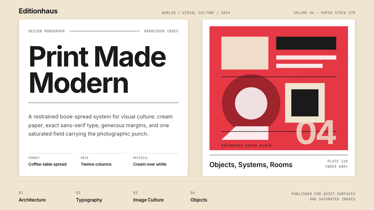 Gestalten Design BookCoffee-table calm. Cream paper, tight sans, one saturated block, and a strict…
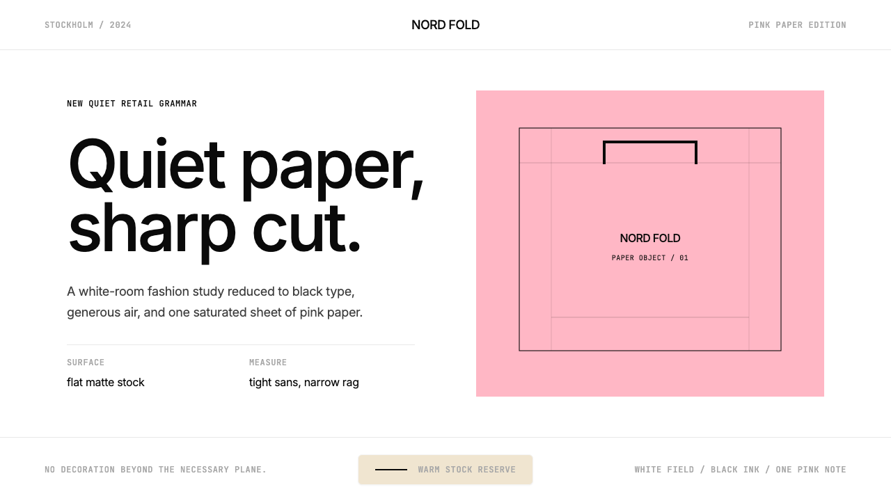 Acne Studios Pink-PaperQuiet luxury in one pink plane. Inter type floats on white with a bag-like re…
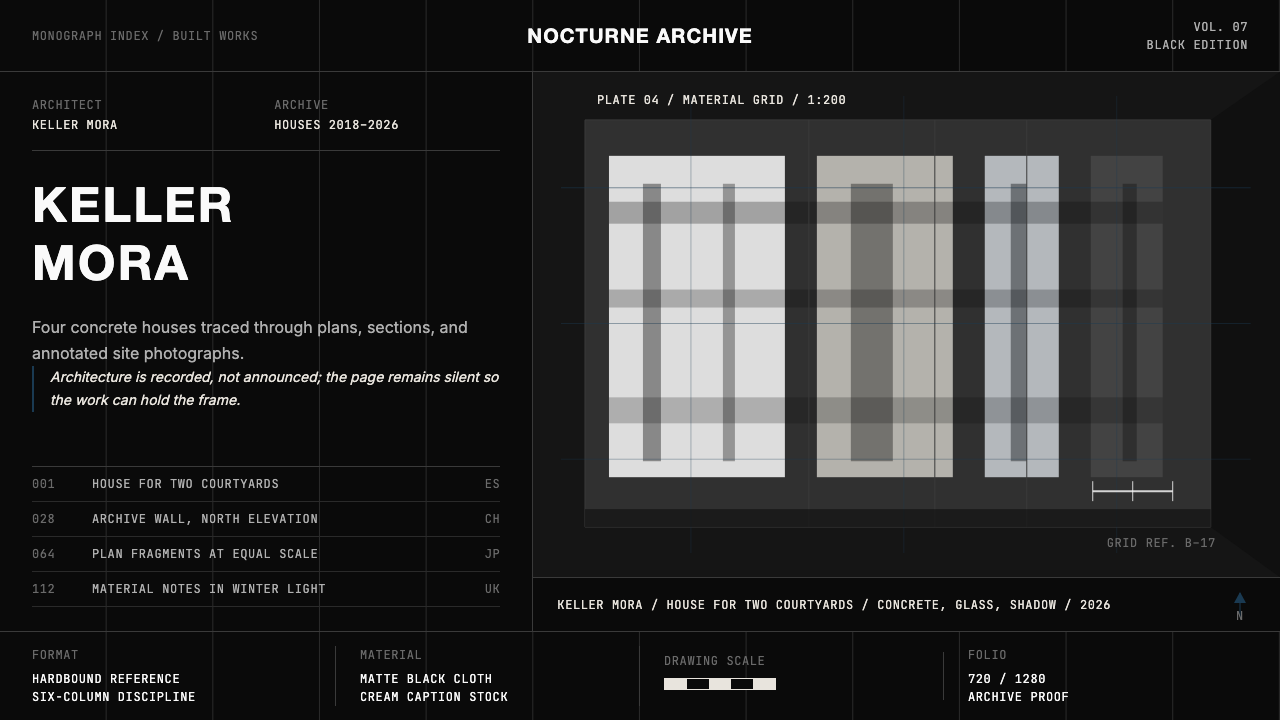 Architect Monograph (Black Edition)Architecture stays sovereign. Matte black, Helvetica caps, hairline grids, bl…
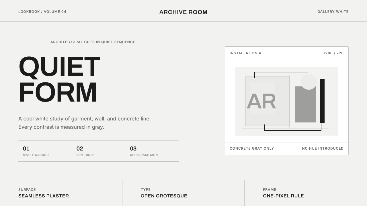 COS Gallery MinimalSilence has structure. Cool gallery white, Archivo uppercase, and concrete-gr…
 FarfetchLuxury as absence. Charcoal type, white canvas, and hairline editorial plates.
 White Cube GalleryEmptiness is the medium. Cormorant labels and one terracotta plane hold the w…