About Criterion Arthouse
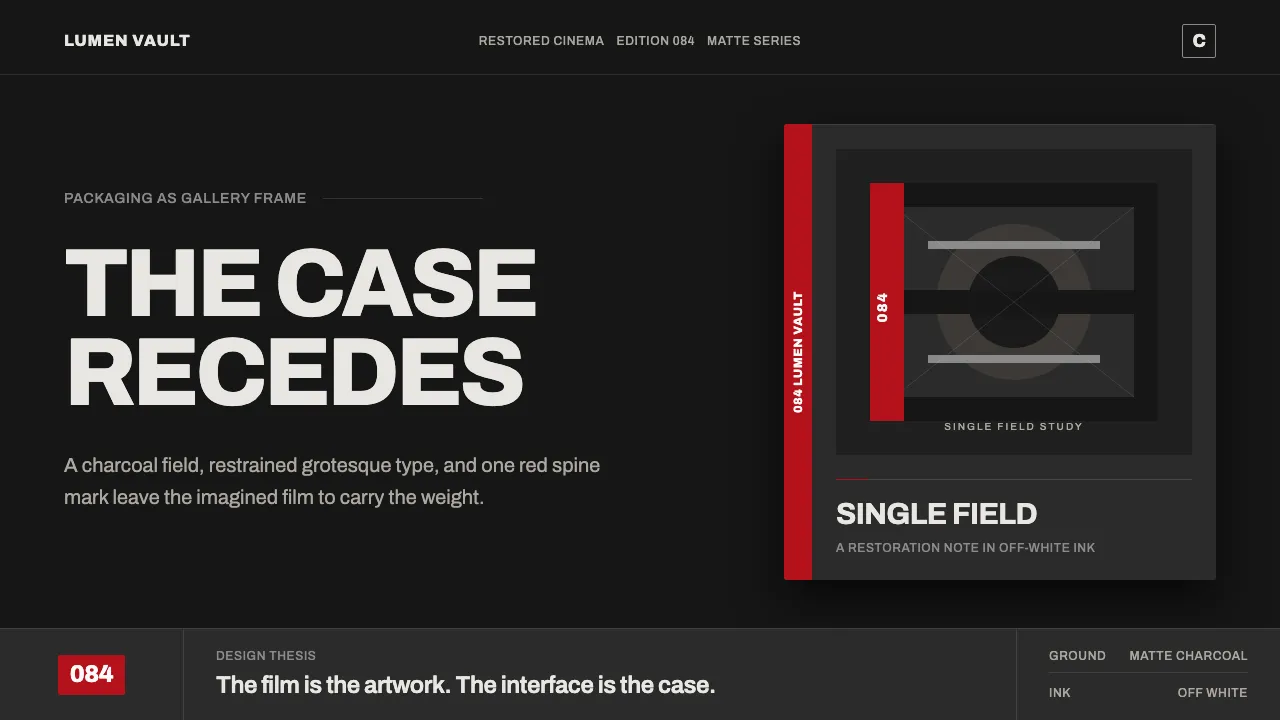
Criterion Collection arthouse packaging is the matte Blu-ray case on a shelf: a single commissioned cover illustration on a deep, near-black cardstock field, the bold white spine number, and the small "C" logo tucked in a corner. The house aesthetic is dark, gallery-like, and restrained.
This system distills that frame-not-the-painting philosophy into a digital language — a premium charcoal ground rather than pure black, restrained off-white grotesque type, thin rule dividers, and a single signature red accent. The film is the artwork; the interface is the case.
- Origin
- North America (New York)
- Era
- Contemporary, c. 2010–now (Criterion brand founded 1984; mature Blu-ray-era house style)
- Key figures
- Criterion Collection cover artists · Commissioned illustrators & designers · Reissued auteur directors
- Movements
- Arthouse / repertory film curation · Minimal editorial packaging design
Criterion Arthouse design spec
Colors
Typography
The other 11 sections — buttons, cards, spacing, motion, techniques and more — open once you unlock. Download the DESIGN.md or send it to your AI in one click. Unlock once, yours forever.
Sign up nowStyles similar to Criterion Arthouse
Also inspired by brands & products, with a close feel.
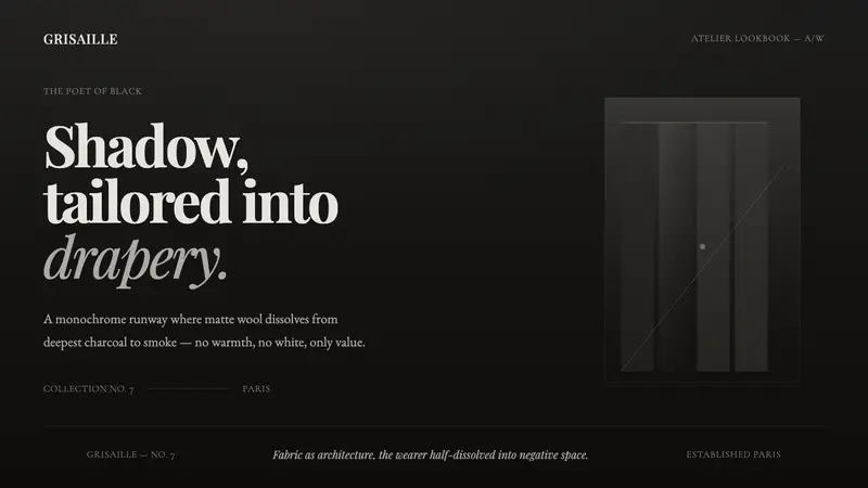 Yohji GrisailleThe poet of black, as a screen. Charcoal-to-smoke grisaille on near-black serif — no warmth, no white.
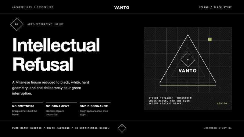 Prada Milan MinimalistLuxury refuses ornament. Pure black, austere sans, and one sour green hairline.
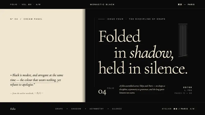 Yohji Yamamoto Monastic BlackBlack as philosophy. Monastic ink ground, warm cream reprieve, low-weight Garamond at near-whisper.
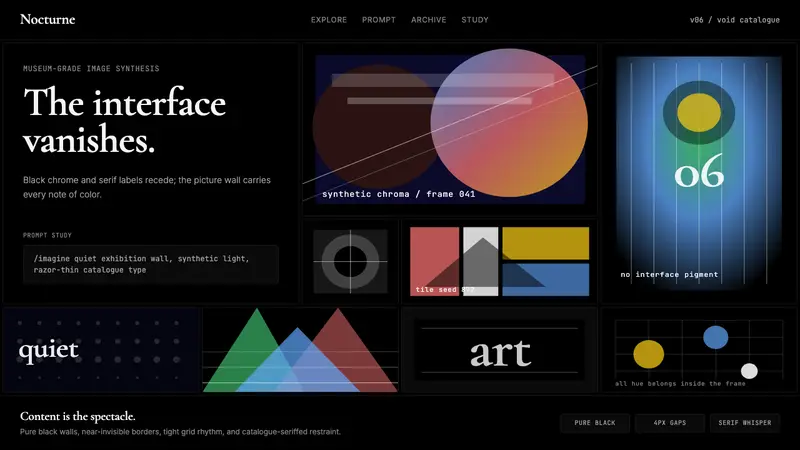 MidjourneyInvisible chrome, visible art. Pure black grid and Cormorant serif give color to images.