What is Japanese Whisky Bar?
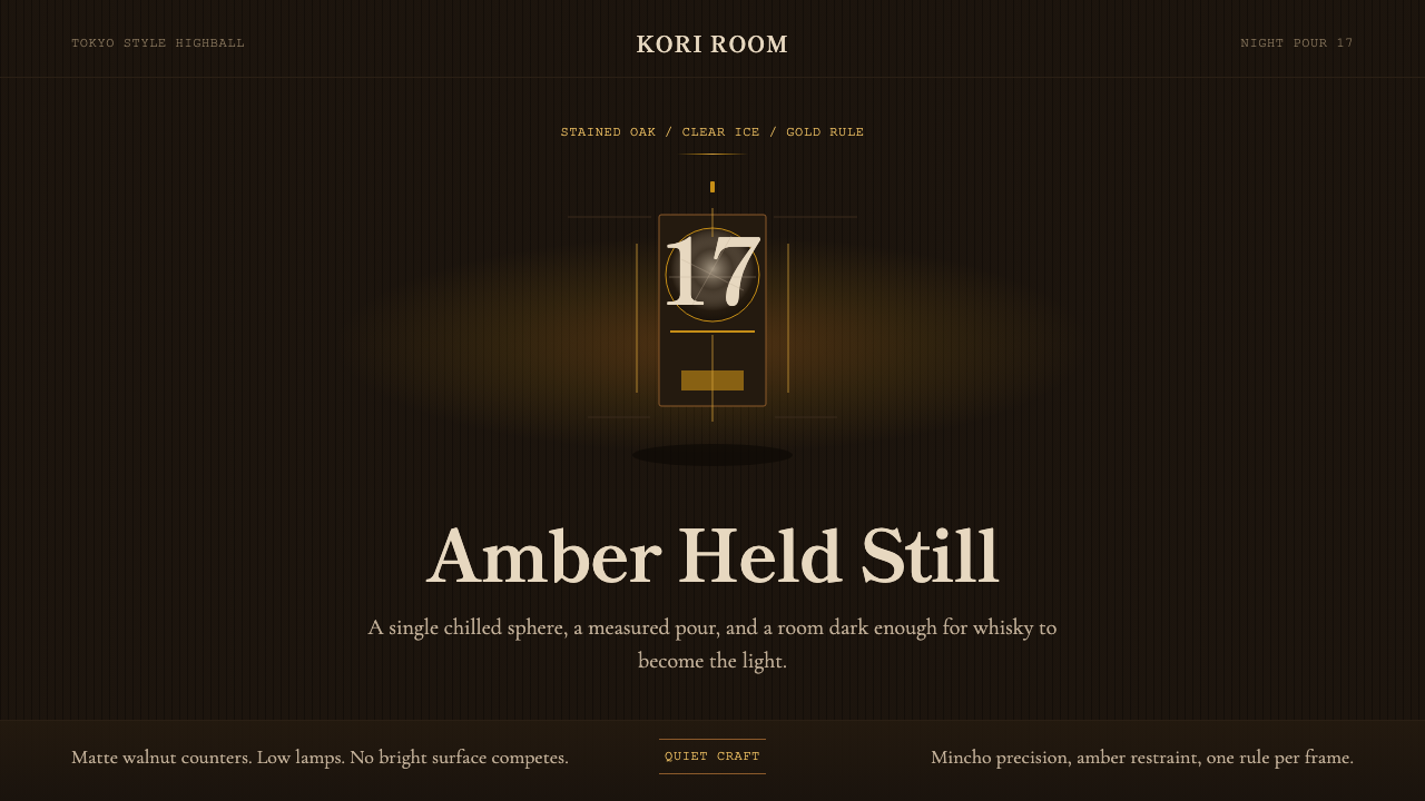
The Japanese whisky bar aesthetic distills a whole ritual — stained oak, low amber light, one hand-carved ice ball — into a design language where restraint itself is the luxury.
Japanese Whisky Bar in brief
The Japanese whisky bar style renders the hushed, craftsman-run drinking room as a visual system: near-black wood tones as the dominant ground, warm amber as the single accent that is allowed to glow, and a mincho (Japanese serif) typographic voice that reads as precise and unhurried rather than decorative. Where many bar-and-spirits aesthetics reach for noise — neon signage, crowded shelves, loud branding — this one reaches for quiet. The design assumes that if the room is dark enough and calm enough, a single glass of amber liquid will be the most interesting thing in it.
This is a dark-first system by construction, not by trend. The near-black ground is not a background color choice made after the fact; it is the entire premise. Every other decision — the warmth of the amber, the thinness of the gold rule lines, the generosity of the empty space — exists to protect that one point of light. Nothing competes with the glass.
Visually, the style is instantly legible against louder alternatives: no gradients trying to simulate glass or ice, no crowded iconography, no shouting typographic hierarchy. Contrast is used sparingly and deliberately — a thin gold line here, a single amber highlight there — so that the eye has exactly one place to land. The craft is in what has been left out.
Where does Japanese Whisky Bar come from?
Japanese whisky's modern lineage begins in 1923, when Shinjiro Torii — the founder of what would become Suntory — opened the Yamazaki distillery near Kyoto, choosing the site for the quality of its water and the mist that settled over the valley. Torii hired Masataka Taketsuru, a young chemist who had traveled to Scotland to study distilling firsthand and returned with both technical knowledge and a personal devotion to the craft. Taketsuru later left to found his own distillery, Nikka, at Yoichi on the northern island of Hokkaido, seeking a climate closer to the Scottish Highlands. The rivalry and shared origin of these two houses — Suntory's Yamazaki and Nikka's Yoichi — forms the founding mythology that Japanese whisky culture still draws on today.
For most of the twentieth century, Japanese whisky was a domestic pursuit, admired at home but largely unknown abroad. That changed after 2010, when a wave of international blind-tasting awards — Japanese single malts placing above long-established Scotch labels — triggered a global reassessment. Demand outpaced two generations' worth of aging stock almost overnight, and bottles that had once sat quietly on shelves became difficult to find anywhere in the world. This scarcity itself became part of the mystique: a Japanese whisky bar was no longer just serving a drink, it was granting access to something increasingly rare.
The bars that grew up around this culture, concentrated in Tokyo and Osaka, borrowed their operating philosophy from a much older Japanese idea: shokunin, the ethic of the dedicated craftsperson who treats even a small, repeatable task — carving one ball of ice, pouring one highball at a fixed angle — as worthy of a lifetime's refinement. The bartender in this tradition is not a performer working a crowd; he is closer to a tea master, and the bar counter is his tearoom.
Kanban branding — the tradition of the carved wooden shop sign, quiet and durable, meant to be read once and trusted for decades — informed how these bars presented themselves to the street and to their own interiors. No illuminated sign competing for attention, no seasonal rebrand. The same restraint that governs the drink governs the room, the menu, and the signage above the door.
What defines the Japanese Whisky Bar look?
Color
The palette begins from near-black wood tones — the deep, almost light-absorbing browns of stained oak and darkened timber — and allows exactly one warm color through: amber, the color of the whisky itself. That amber is never spread evenly across a composition; it is concentrated, appearing as a glow, a highlight, a single warm accent against the dark, the way a lit glass looks against a dim room. Gold appears only as a thin structural accent — a rule line, a border, a small mark of quality — never as a fill color competing with the amber glow.
Typography
Type carries a mincho — Japanese serif — sensibility: precise, upright strokes with a quiet formality that reads as craft rather than flourish. The voice is unhurried. Headlines do not shout through extreme scale contrast; instead, hierarchy is communicated through spacing and placement, the way a menu at a quiet counter bar lists its offerings without competing for the eye. Letterforms and rule lines alike favor thinness over weight — a hairline rather than a bold stroke — which is itself a signal of confidence: nothing here needs to be loud to be taken seriously.
Spacing and Composition
Generous quiet is the organizing principle. Compositions favor a single focal point — one bottle, one glass, one carved ice ball — surrounded by dark, deliberately empty space rather than filled with supporting detail. This is composition by subtraction: every element that does not serve the one focus is removed, leaving a wide field of dark calm around a small area of warmth. The effect mirrors the physical room itself, where a handful of seats face a single counter and nothing else demands attention.
Materials and Texture
The visual vocabulary draws on stained oak, darkened timber, and polished stone or metal counter surfaces — materials chosen for how they absorb and hold low light rather than reflect it brightly. Surfaces read as tactile and aged rather than glossy or synthetic. Where texture appears, it suggests wood grain or the cool weight of a stone counter, never a slick or overtly digital sheen. This groundedness in real, weathered materials is part of what keeps the style feeling crafted rather than merely dark-themed.
Restraint as Structure
The single governing discipline behind every other characteristic is restraint treated as an active design decision rather than an absence of ideas. Every surface stays dark, every rule is a thin line, every composition holds to one focus — these are not default states but chosen constraints, repeated so consistently that they become the system's signature. Luxury here is communicated by what has been withheld: no extra ornament, no competing color, no crowded information. The confidence to leave space empty is the design's central argument.
Iconography and Ornament
Decorative elements are almost entirely absent. Where a mark or icon appears, it tends toward the emblematic — a single carved seal, a minimal line-drawn glass or bottle silhouette — rather than illustrative detail. This sparseness echoes kanban shop-sign tradition: a mark meant to be seen once and trusted for years, not refreshed seasonally or layered with decorative flourish. The style trusts a single well-placed mark over a field of supporting graphics.
Who shaped Japanese Whisky Bar?
Torii founded what would become Suntory and, in 1923, opened the Yamazaki distillery outside Kyoto — the founding site of Japanese whisky as a serious craft rather than an imported novelty. His choice of location, prized for its water and valley mist, established the idea that Japanese whisky making was inseparable from a specific, cultivated sense of place, an idea the bar aesthetic later inherited in its emphasis on atmosphere over spectacle.
Taketsuru traveled to Scotland to study distilling before returning to work with Torii at Yamazaki, then left to found Nikka at Yoichi in Hokkaido, seeking a climate closer to the Scottish Highlands. His dual devotion — rigorous technical training paired with lifelong personal craft — is often cited as the clearest embodiment of the shokunin spirit that Japanese whisky bars still model their service on.
Founded in 1923 near Kyoto, Yamazaki is the origin point of the Suntory whisky lineage and remains the reference name most associated with Japanese whisky's international reputation, particularly after the wave of blind-tasting awards after 2010 that first drew global attention to the category.
Founded by Taketsuru on Hokkaido, Yoichi represents the counterpoint house to Yamazaki within Japanese whisky mythology — chosen deliberately for a climate closer to Scotland's. The rivalry and complementary origin stories of Yamazaki and Yoichi form the founding narrative that Japanese whisky bar culture continues to reference.
How do you use Japanese Whisky Bar today?
Applying this style well means understanding that it is a system of subtraction, not a color palette. It transfers cleanly wherever a single point of focus deserves to be protected by darkness and quiet — but it will always demand more restraint than the average brief calls for.
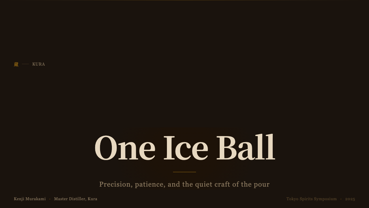
For presentation cover slides, the style works by isolating one element — a product, a headline, a single striking word — against a near-black field, with a thin gold rule or hairline border doing all the structural work a border normally needs heavier treatment to do. Content and data slides should resist the temptation to fill space: a single amber-accented chart or figure surrounded by dark quiet reads as more premium than a slide packed with supporting graphics. Data itself can be rendered as one warm highlight against dark rows, echoing the glow-in-the-dark logic of the glass itself.
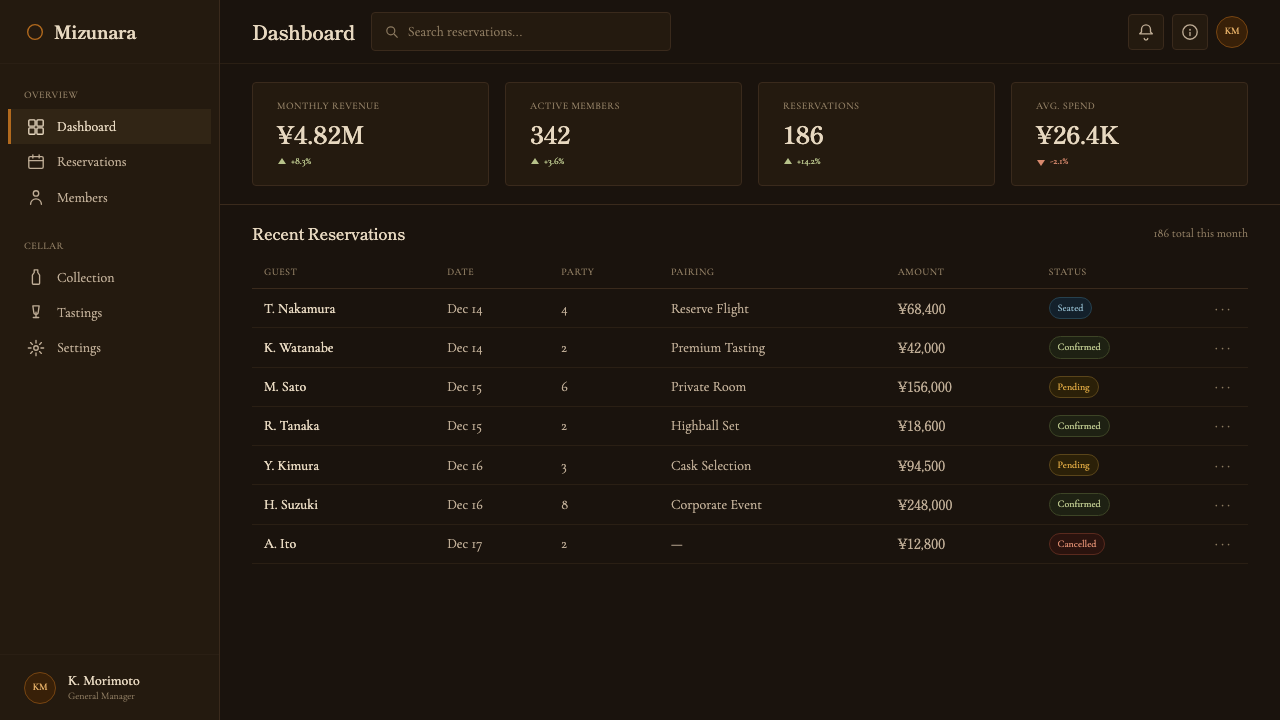
For web UI, dashboards benefit from the same discipline: a dark near-black canvas, sparing use of the amber accent reserved for the one metric or call-to-action that matters most on a given screen, and thin gold-toned rules used only where a genuine division is needed. Pricing pages suit this style particularly well — a dark, quiet background lets a single recommended tier glow with the amber accent while the others recede, mirroring exactly the way one glass draws the eye in a dim room. Navigation and secondary text should stay muted, almost recessive, so the accent color never has to compete for attention.
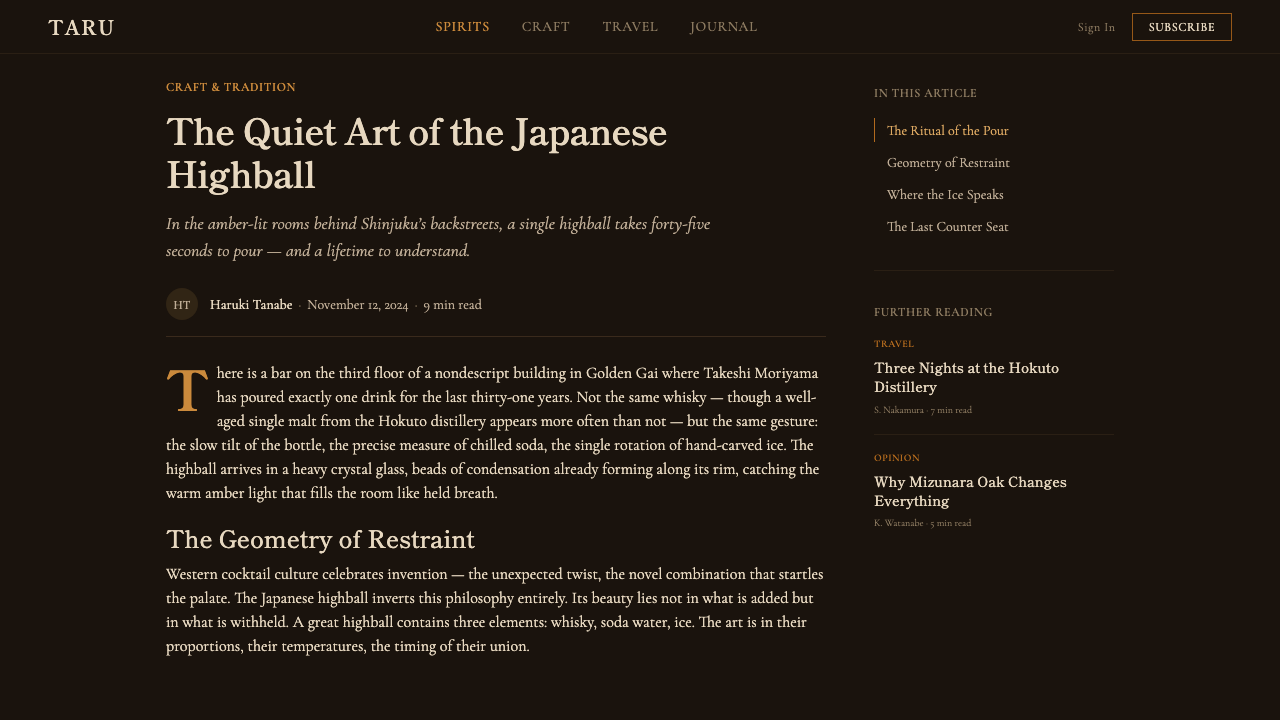
For editorial and marketing work, the style rewards long-form, unhurried pacing: wide margins, mincho-inflected headlines, and pull quotes set apart with a single thin gold rule rather than a decorative box. Marketing pages built in this style should resist the instinct to showcase — a single strong image of the product against dark space communicates more confidence than a gallery of angles. The style is well suited to spirits, hospitality, and any premium product where the story is craft and patience rather than novelty or speed.
The most common mistake is treating this as simply 'dark mode with a gold accent.' Authentic execution requires that darkness do real compositional work — creating the emptiness that makes the one warm focal point meaningful — rather than serving as a trendy background swap. A second common error is letting the amber accent spread: using it for multiple competing elements on the same screen dilutes the exact effect the style depends on, which is that amber earns attention because it is rare, not because it is loud.
Japanese Whisky Bar — FAQ
Is this style the same as generic 'dark mode' design?
No. Generic dark mode simply inverts a light interface to a dark one for comfort or battery reasons, without changing the underlying logic of the design. The Japanese whisky bar style uses darkness as an active compositional tool — the near-black ground exists specifically to make a single amber point of focus meaningful. Strip out the restraint and the single accent color, and what remains is just a dark-themed layout, not this style.
Can this style work with more than one accent color?
It is possible but risky. The style's entire effect depends on scarcity — amber earns attention precisely because nothing else competes with it. Introducing a second accent color, even a complementary one, tends to split focus and undercut the sense of a single, precious point of light. If a second color is genuinely necessary, it should be reserved for a clearly subordinate role, such as a rare cautionary state, never given equal visual weight to the amber.
Does this style require literal wood textures or photography?
No — the wood and stone references describe a tonal and tactile sensibility, not a mandate for photographic texture. The same effect can be achieved with flat near-black surfaces, careful color temperature, and restrained typography; what matters is that the darkness reads as considered and warm rather than flat and generic. Literal wood-grain imagery can support the mood but is a stylistic choice, not a requirement.
What kinds of products or brands does this style suit, and where does it struggle?
It suits products built on craft, patience, and scarcity — premium spirits, hospitality, high-end services, anything where the story is about mastery earned over time rather than speed or novelty. It struggles in contexts that need to feel energetic, youthful, or immediately scannable at a glance: high-volume e-commerce, casual consumer apps, or any product where dense information needs to be visible all at once rather than revealed through a single focal point. The style also assumes a slower, more deliberate reading pace, which can frustrate users who expect instant clarity.
How does the mincho typographic feel translate when the actual system font isn't a Japanese serif?
The point is the sensibility, not a specific typeface mandate: upright, precise strokes, quiet formality, and hierarchy built through spacing and placement rather than aggressive size jumps. In Latin-script contexts, a refined serif with restrained contrast and generous letter spacing can carry the same unhurried, crafted feeling. What should transfer regardless of typeface is the pacing — headlines that state rather than shout, and body text given room to breathe.
Related design styles
 Aesop Apothecary AmberQuiet authority in glass. Amber-brown ground, parchment labels, and humanist…
 Kyoto Machiya StayQuiet dusk, held in shadow. Charred black, washi cream, and indigo seams crea…
 Acne Studios Pink-PaperQuiet luxury in one pink plane. Inter type floats on white with a bag-like re…
 AesopRefuses urgency. Walnut serif on cream paper — every surface paced like a 19t…
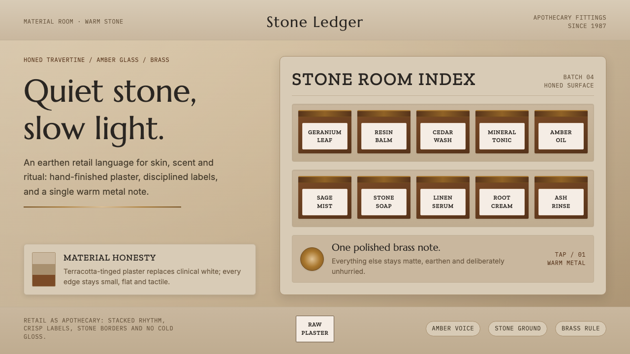 Aesop Store TravertineQuiet material honesty. Warm plaster, amber glass and a single brass line pac…
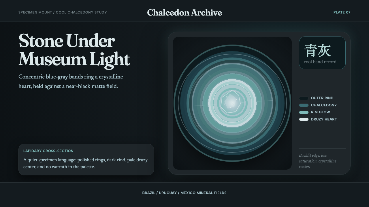 Agate Cross-SectionQuiet mineral glow. Fraunces type and cyan-gray rings shine on matte black.