What is Agate Cross-Section?
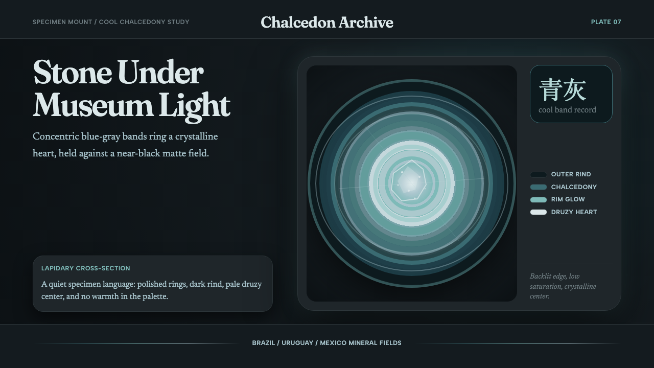
Agate Cross-Section takes one of nature's most disciplined compositions — concentric mineral banding around a crystalline core — and translates it into a visual language of quiet luminosity, cool restraint, and editorial precision on a near-black ground.
Agate Cross-Section in brief
Agate Cross-Section is a design style modeled on the lapidary photograph — the image of a sliced and polished agate stone laid on a dark specimen mount so its internal structure becomes the sole subject. The visual system borrows the stone's own compositional logic: a dark outer ground, concentric bands of blue-gray that grade inward from deep and opaque to pale and luminous, and a faceted crystal center that seems to glow from within. Everything in the style exists to honor that geological drama without embellishing it.
The defining characteristic is controlled gradation within strict cool hues. Unlike styles that rely on flat fills or high-saturation contrast, Agate Cross-Section works through subtle tonal shifts — the difference between the outermost band and the innermost crystal is a journey, not a jump. This gives the style an unusual quality: it reads as decorative at a glance but rewards close attention the way a specimen under a magnifying glass does. The palette never drifts into warm territory; earth tones, amber, and sepia are structurally excluded.
As a design system, it is editorial and quiet rather than bold and assertive. It is suited to contexts that want to signal depth, rarity, and careful craftsmanship — museum-quality product presentation, collector-oriented platforms, high-end editorial spreads — rather than contexts demanding speed-reading or high-energy persuasion. The darkness of the ground means it functions as a genuinely dark-mode aesthetic, not a light-mode design with the colors inverted.
Where does Agate Cross-Section come from?
Agate has been cut, polished, and used decoratively for more than five thousand years. The oldest worked agate beads are traced to the Indus Valley Civilization around 3000 BCE; the stone was traded across ancient Mesopotamia and Egypt, prized for the same quality that drives the contemporary design style — its interior banding, invisible until the stone is sliced open, reveals a hidden order that seems almost impossibly regular for a natural object. The word 'agate' itself derives from the Achates River in Sicily, where Greek colonists sourced the stone in antiquity.
The modern visual vernacular of the agate cross-section emerged with the rise of mineral-slice photography as a distinct genre, roughly from the 1980s onward, and accelerated dramatically with the spread of digital macro photography and backlit light-table techniques in the 2000s. Brazil, Uruguay, and Mexico supply the majority of the world's commercially cut geode and agate specimens; the Rio Grande do Sul state in southern Brazil is the single largest source, producing the blue-gray banded agates most associated with the style's cool palette. Lapidary craftsmen in these regions developed the specialized slab-cutting and polishing methods — using diamond-tipped saws and progressively finer abrasive grits — that produce the mirror-smooth cross-sections essential to the photographic aesthetic.
The contemporary design movement drawing on this visual material is not tied to a single school or manifesto. It belongs to a broader late 2010s and 2020s tendency to look to geology, botany, and microscopy as sources of non-human compositional logic — patterns that are rigorous and beautiful without being the product of conscious design intention. In design and illustration, the agate cross-section became a recognizable aesthetic shorthand for scientific wonder, natural luxury, and patient craftsmanship. It entered branding for fragrance, wellness, and premium home goods, and was adopted by digital editorial designers looking for a dark-mode palette that felt earned rather than arbitrary.
Unlike most design movements, Agate Cross-Section does not have a founding text, a school, or a named theorist. Its grammar was assembled through the accumulation of lapidary photography, museum specimen display conventions, the backlit-slide tradition in natural history illustration, and the growing appetite in commercial design for what might be called 'geological aesthetics' — visual systems borrowed from the deep time and deep structure of the earth rather than from human cultural production.
What defines the Agate Cross-Section look?
Color Palette
The palette is anchored in a near-black matte ground — not a pure black but the particular deep charcoal that reads like a specimen tray under controlled museum lighting. From that ground, banding moves through a range of blue-grays: the outermost bands are deep and low-saturation, the middle rings increase slightly in luminosity, and the innermost zones approach an almost-white pale cyan. The entire palette stays within the cool quadrant; no warm tones enter. Occasional translucent zones within the banding suggest the chalcedony's semi-translucency — these lighter passages create the impression of backlit depth rather than surface color.
Concentric Gradation
The signature compositional move is concentric banding that grades in both tone and perceived translucency from outer to inner. This is not a simple two-stop gradient; it is a sequence of discrete band layers, each with its own tonal identity, that together read as a continuous transition. The bands are not perfectly uniform — slight variations in width and edge softness are preserved because they are what distinguish agate from a mechanical diagram of itself. Too regular, and the result looks computed; the right amount of organic irregularity preserves the lapidary quality.
The Crystal Core
Natural agates are often geodes — their interiors can contain a druzy cluster of small crystals rather than solid chalcedony throughout. The design system treats this crystal center as a focal light source: the innermost zone radiates slightly more intensity than the surrounding bands, as though it has its own internal illumination. Visually this is achieved through a concentration of the palest tones at the center, sometimes with a slight textural suggestion of faceting. This inner glow is the most compositionally complex element of the style; it is what gives the design its sense of depth rather than flatness.
Typography
The typographic register is editorial and calm. A serif typeface with pronounced optical contrast — the kind used in quality scientific publications and natural history museum catalogues — suits the style because it shares the agate's quality of appearing highly refined at close inspection. Type is set in off-white or pale cyan against the dark ground, never in pure white (which would be too stark) and never in warm cream (which would conflict with the cool palette). Size contrast is used to establish hierarchy: a generous headline, a restrained body weight, and light-weight captions or labels for specimen data.
Glow and Luminosity
Agate Cross-Section achieves a sense of light without using explicit lighting effects. The glow comes from the strategic placement of the palest values in the interior bands and core, so the composition seems to emit light rather than reflect it. Subtle halation — a barely-perceptible softening of the boundary between the darkest outer ground and the first banding ring — reinforces the impression that the specimen is being backlit. This is executed with enormous restraint; the moment glow becomes obvious, it cheapens the effect.
Texture and Surface
The surfaces in this style are paradoxically both matte and luminous. The ground is matte — absorptive, specimen-tray quality. The banding itself reads as polished stone: smooth, with the subtle sheen of a lapidary finish rather than either a rough mineral surface or a glassy digital render. This is achieved through restraint in contrast rather than by adding visible texture; the eye reads the tonal gradation as surface quality. No noise, grain, or simulated stone texture should appear — those would undermine the sense of a real cut specimen and replace it with a decoration.
Compositional Centering
Unlike styles that use asymmetric tension as their primary compositional energy, Agate Cross-Section is radially centered by nature. The cross-section is read outward from its core; symmetry is not a convention borrowed from classical design but a property of the geological object itself. This makes the style unusual in contemporary design practice: centering is the default, and it works because the concentric structure earns it. Type and interface elements can be placed off-axis relative to the circular motif without undermining the overall centripetal reading.

Who shaped Agate Cross-Section?
The anonymous craftsmen of southern Brazil's agate district, centered around towns such as Soledade and Lajeado in Rio Grande do Sul, are the material authors of the visual language this style draws on. Over generations they developed the slab-cutting, grinding, and polishing sequences that produce the mirror-smooth cross-sections essential to the aesthetic. Their primary market is the international mineral collector and museum specimen trade, but their craft output became, inadvertently, a major source of contemporary design imagery.
As a genre distinct from gem photography — which typically shows a stone from its best faceted angle — mineral cross-section photography treats the saw-cut face as the subject. The backlit light-table method, in which a thin slice of translucent material is placed over a diffuse light source to reveal internal structure, was in wide use in geological research and natural history illustration long before it became an aesthetic practice. When macro photography and digital post-processing made the technique accessible to non-scientists, the images moved from scientific journals into design and art contexts.
Museum specimen display — the practice of presenting geological, zoological, and botanical objects on neutral dark or cream matte grounds, lit to reveal surface detail while eliminating environmental context — is the direct design ancestor of the agate cross-section aesthetic. The specimen tray or specimen mount, in which an object is isolated against a non-competing background, is essentially the compositional template the style follows. European natural history museums, particularly those established in the nineteenth century in the tradition of the Wunderkammer, codified these display conventions.
Within digital implementations of the agate cross-section aesthetic, the Fraunces typeface — a free, open-source optical serif with pronounced stroke contrast and a slightly archaic warmth — has emerged as a characteristic typographic pairing. Its optical contrast (the significant difference between thick and thin strokes within each letterform) echoes the tonal banding of the stone; its editorial associations with scientific and cultural journals match the style's implied context. The choice is not mandatory but has become recognizable enough to be part of the style's contemporary signature.
The international mineral and gem show circuit — the Tucson Gem and Mineral Show being the largest — established the visual standards for how cut agates and geodes are presented, marketed, and photographed. This collector culture, spanning hobbyists, museum buyers, and commercial lapidary dealers, produced the conventions of backlit display, dark velvet or matte-black mounting, and specimen labeling that feed directly into the design style's compositional and typographic choices. The aesthetic did not emerge from graphic design studios but from a community of natural object enthusiasts.
How do you use Agate Cross-Section today?
Agate Cross-Section is a style that rewards application in contexts where the content itself can sustain a contemplative pace. It does not suit fast-consumption interfaces — social feeds, news aggregators, high-frequency dashboards — but excels at product detail pages, long-form editorial layouts, and premium brand presentations where the user is expected to dwell rather than scan. The style signals to the viewer: this is worth careful attention.
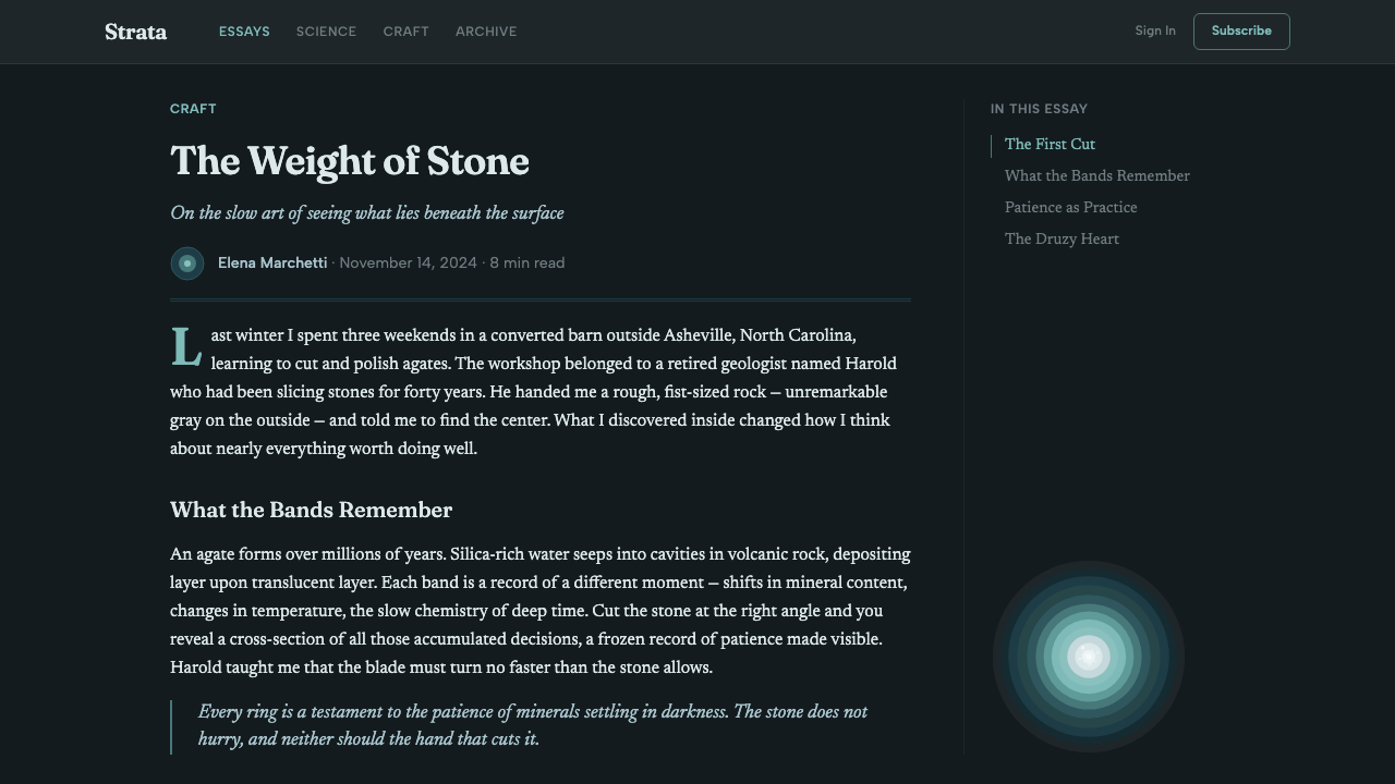
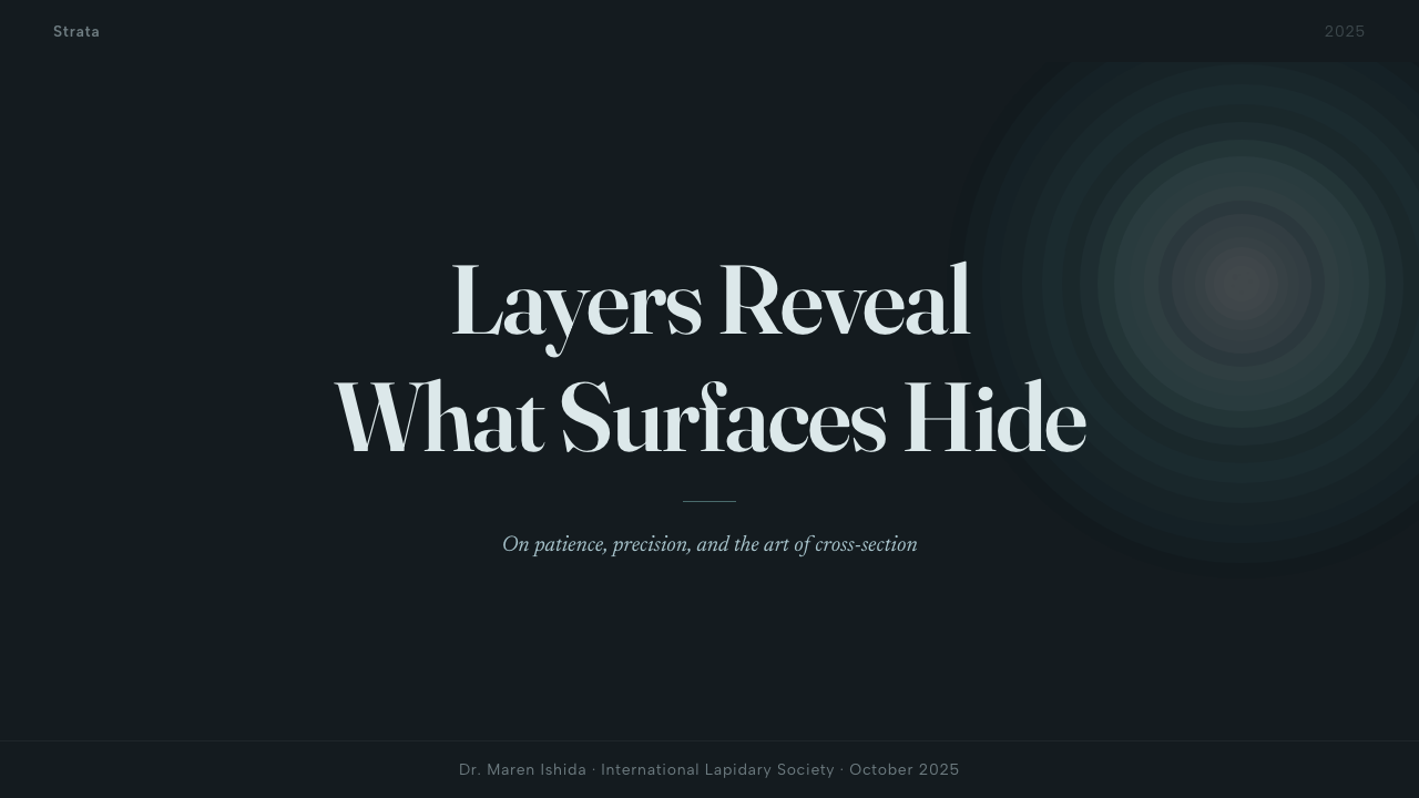
For presentation slides, the style works best as a framework for single-subject focus rather than information density. A cover slide built on the agate motif — concentric bands radiating from a slightly off-center core, title in a high-contrast serif — establishes a tone of authority and rarity immediately. Content slides should resist the temptation to fill the dark ground with text: generous negative space and a small number of precisely placed typographic elements reads far better than crowded bullets. Data visualizations in this style should use the band-to-core gradient logic to encode meaning — outer rings for less significant context, inner rings for the primary finding — rather than conventional bar or line charts.
For web interfaces, Agate Cross-Section functions well as a hero section or feature-highlight aesthetic rather than an all-page system. Applied to a full dashboard or dense navigation structure, the decorative intensity of the banding can overwhelm the functional hierarchy. The recommended approach is to reserve the full agate motif for high-emphasis moments — landing page heroes, feature-announcement pages, collector or premium-tier profile pages — and use a simplified extract of the palette (cool dark ground, pale cyan accent, editorial serif) for the surrounding interface.
For editorial and marketing work, the style is naturally suited to natural science, geology, luxury goods, fragrance, wellness brands with a mineral or crystalline positioning, and any editorial context wanting to invoke slow, careful looking. A magazine spread using the agate cross-section as a structural element — banding as a background field, a specimen-quality photograph of the product, serif caption in pale cyan — can achieve a museum-grade editorial authority. Avoid pairing it with san-serif-heavy, high-energy branding or photography with warm color casts.
The most common mistake with Agate Cross-Section is overbrightening: adding too much luminosity or increasing saturation to make the palette feel more vivid. The style's power is in restraint and subtlety — the glow at the center should feel discovered, not advertised. A related error is replacing the cool palette with warm or neutral equivalents; 'amber geode' or 'warm agate' interpretations exist but are a different aesthetic. The cold, scientific-cabinet quality of the blue-gray palette is not incidental — it is what separates the style from generic 'gemstone' decoration.
Agate Cross-Section — FAQ
Is Agate Cross-Section suitable as a primary design system for a whole product, or only for accent use?
It depends on the product type. A collector platform, a geological data product, a museum e-commerce site, or a premium fragrance brand could sustain the full aesthetic system throughout because the style's values — rarity, patience, scientific precision — align with what the product is selling. For most products, particularly those requiring dense functional interfaces or fast interaction patterns, the style is better used as a premium layer: hero sections, feature spotlights, marketing pages, and special states. The dark ground and banding are decoratively intense enough that sustained exposure across a whole functional interface tends to fatigue the eye rather than reward it.
How does Agate Cross-Section differ from other dark-palette design styles like obsidian or dark marble?
The crucial distinction is the light source. Obsidian and dark marble aesthetics typically work by placing objects on a dark ground that absorbs and reflects — the darkness is a backdrop. Agate Cross-Section inverts this: the light comes from inside the composition, from the core outward. This produces a fundamentally different spatial relationship — the viewer feels like they are looking at something that emits rather than reflects, which is psychologically closer to the experience of looking at a backlit slide or a glowing screen than to the experience of looking at a dark stone. Additionally, the palette is strictly cool and specifically geological; other dark styles often incorporate warm metallic tones, warm grays, or veining patterns associated with different minerals.
Can this style work in light mode?
Technically yes, but with significant trade-offs. A light-mode inversion — pale ground, dark blue-gray banding, deep core — produces a different aesthetic that resembles technical illustration or scientific diagram more than lapidary photography. The luminosity effect that defines the style depends on the contrast between a dark ground and lighter interior zones; in a light inversion, the center can no longer appear to glow, because the whole composition is already light. The style's dark-mode incarnation is the canonical one; designers wanting a cool geological aesthetic in light mode should look at other mineral-inspired palettes that are native to light grounds rather than trying to invert the agate logic.
What makes the style feel scientific rather than merely decorative?
The key is restraint and specificity. A decorative use of agate imagery tends to increase saturation, add warm tones for visual warmth, multiply patterns for richness, and apply sparkle or glitter effects at the crystal center. A scientific-feeling execution does the opposite: it restrains saturation, maintains the cool palette without exception, preserves the specific geological banding proportions rather than abstracting them into a generic pattern, and treats the inner glow as a quality to be revealed rather than amplified. Typography choices matter too — editorial serif fonts with scientific associations position the composition as studied and documented, whereas display typefaces with decorative flair push it toward the decorative.
Does the style translate well to motion and animation?
Yes, and in a specific way. The most natural motion language for Agate Cross-Section is slow reveal — the bands appearing progressively from outside to inside, as though the stone is being sliced open in real time. This works well for page transitions, loading sequences, and feature introductions. Quick motion is tonally wrong; anything fast or bouncy conflicts with the contemplative register of the style. The inner glow can animate with a very slow, low-amplitude pulse — reminiscent of bioluminescence or long-exposure mineral photography — which adds depth without becoming distracting. Particle effects at the crystal core can work if executed with extreme restraint, but tend to tip quickly into screen-saver territory.
Related design styles
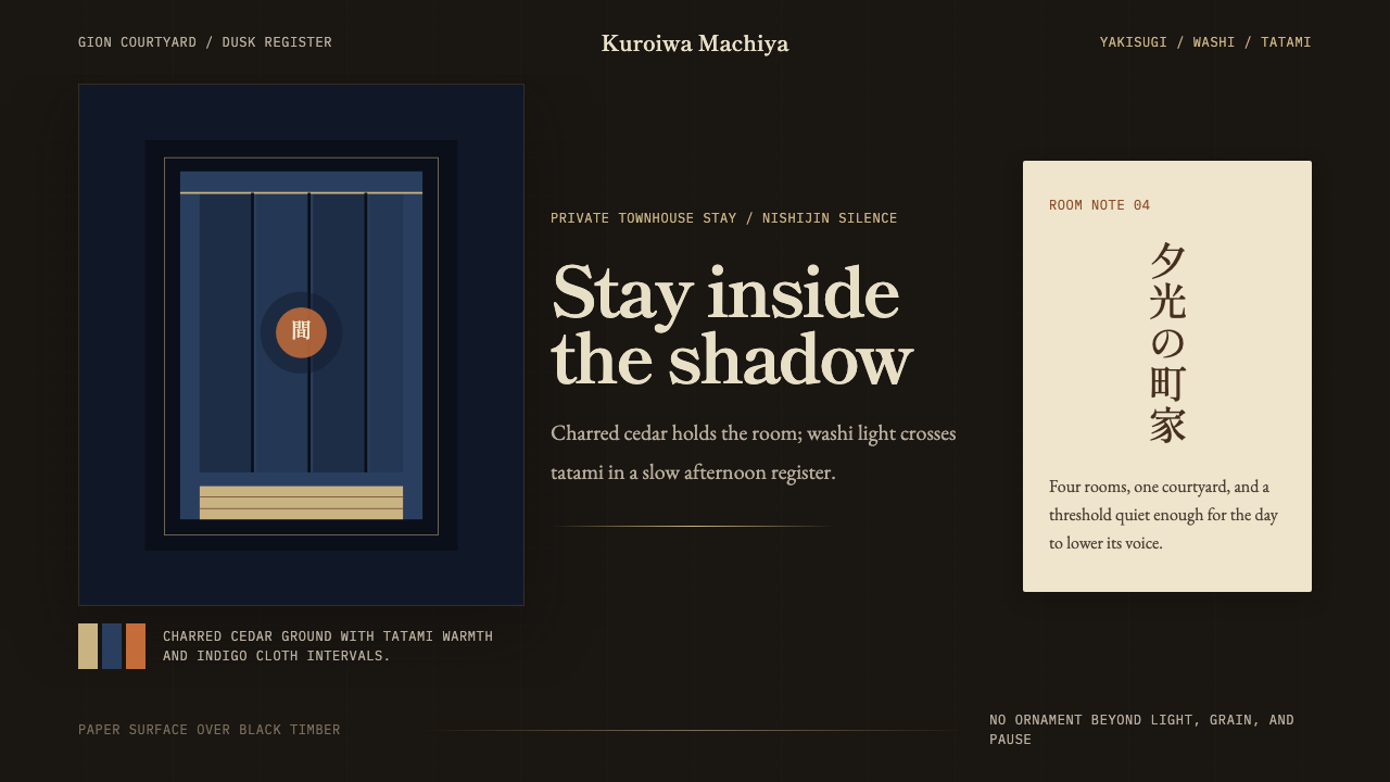 Kyoto Machiya StayQuiet dusk, held in shadow. Charred black, washi cream, and indigo seams crea…
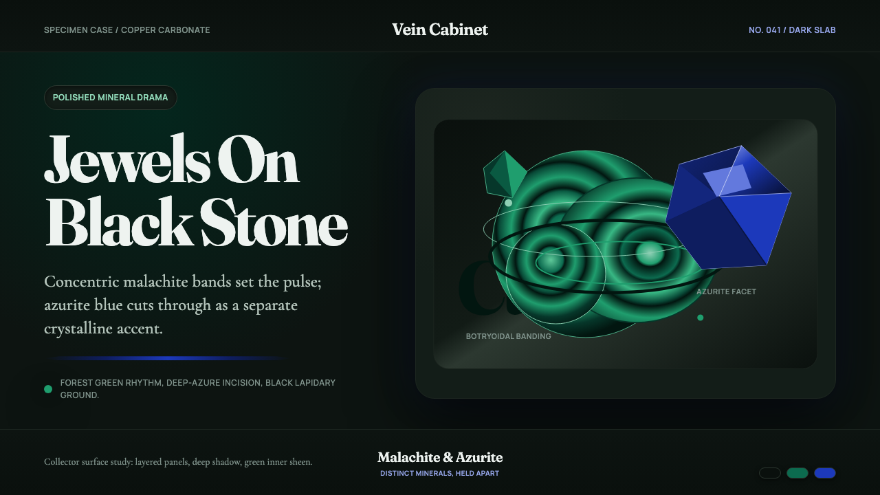 Malachite & AzuriteLiving jewels on black stone. Fraunces type meets green rings and sharp azuri…
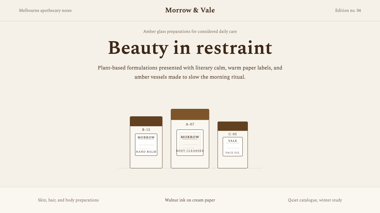 AesopRefuses urgency. Walnut serif on cream paper — every surface paced like a 19t…
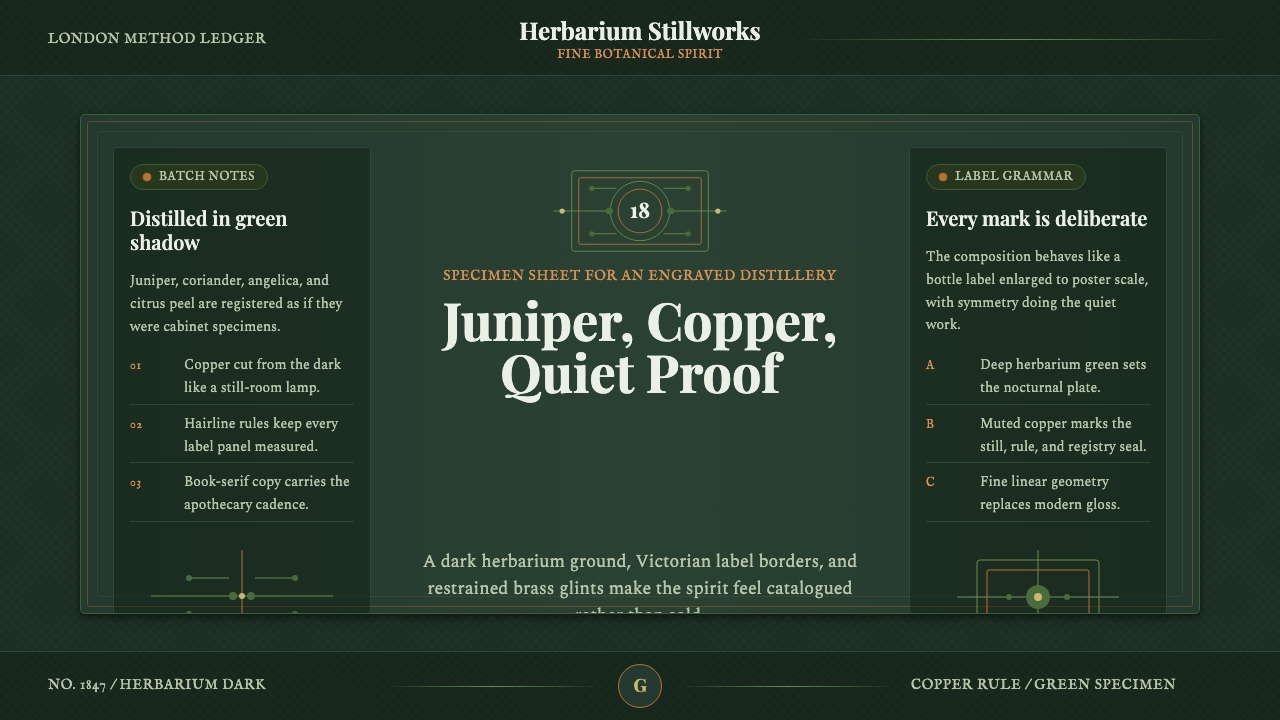 Gin BotanicalHerbarium precision. Dark green frames, Playfair serif, and copper rules hold…
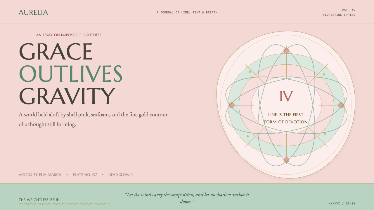 Botticelli Birth of Venus (1486)Grace defeats gravity. Shell pink, seafoam, and fine gilt contours keep every…
 Chinese Ink Wash 水墨A thousand years of restraint. Six tones of ink on rice-paper warmth, a singl…