What is Kyoto Machiya Stay?什么是 Kyoto Machiya Stay?
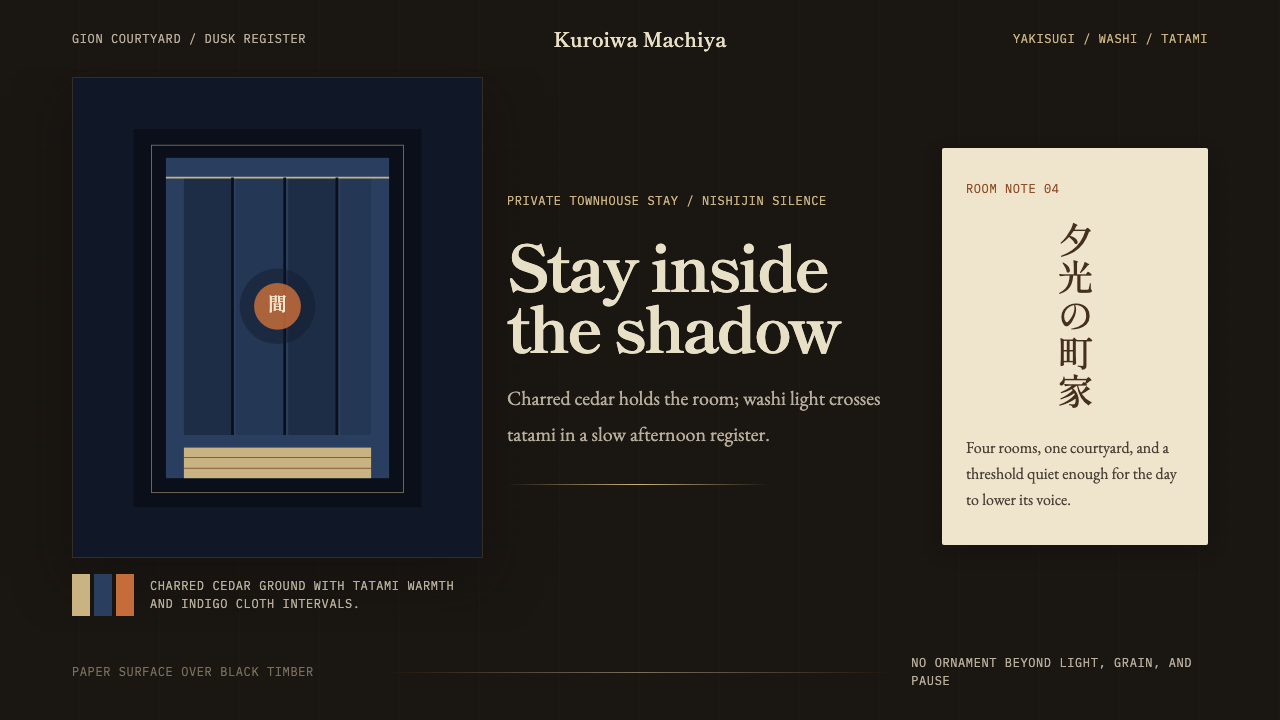
Charred cedar, washi cream, and a silence that belongs to 4 PM — Kyoto Machiya Stay distills the atmosphere of a Gion townhouse into a design language built on restraint, shadow, and the art of leaving space empty.焦黑杉木、和纸暖白,以及只属于午後四點的靜默——京都町家旅宿將祇園町家的氣韻提煉為一套以克制、陰影與留白為核心的設計語言。
Kyoto Machiya Stay in briefKyoto Machiya Stay 速览
Kyoto Machiya Stay is a design style born from the boutique-hospitality renaissance that transformed Kyoto's aging wooden townhouses — machiya — into design-led short-stay accommodations from roughly 2014 onward. Its visual language is not a romanticized pastiche of traditional Japanese motifs but a precise, disciplined translation of a specific lived atmosphere: the particular quality of light inside a narrow townhouse at dusk, the weight of a charred cedar facade, the restraint imposed by a room whose beauty depends entirely on what is withheld.京都町家旅宿是一種設計風格,誕生於2014年前後席捲京都的精品旅宿復興浪潮——設計師們將城中老舊的木造連棟町家改建為以設計為核心賣點的短租空間。它的視覺語言並非對傳統日本符號的浪漫拼貼,而是對一種具體生活氛圍的精準轉譯:黃昏時分,光線在狹長町家內部投下的特定質地;焦黑杉板外牆的重量感;一個房間因為屏棄一切多餘而獲得的美。
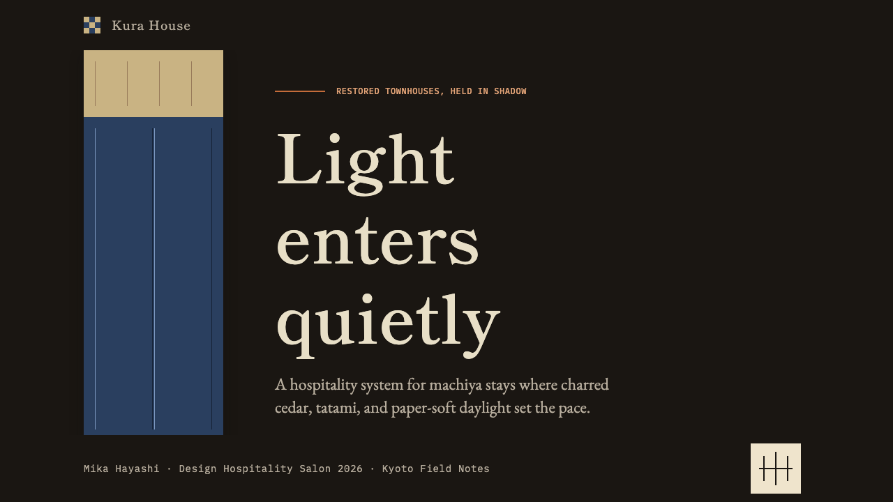
The palette is anchored by shou sugi ban black — the deep, matte, almost mineral darkness of timber treated by controlled burning — held against washi-paper cream, a warm near-white with the slight irregularity of handmade paper. Against this two-tone ground, accents arrive rarely and specifically: indigo the color of a dyed noren curtain, persimmon the warmth of lacquerware in low light. No more than two accent tones appear in any composition, and they serve punctuation, not decoration.色彩以燒杉炭黑為錨——那是木材經控制性燃燒處理後的深沉、啞光、近乎礦物質的黑暗——與和紙暖白並置。和紙暖白是一種帶有手工紙微妙不均勻感的暖調近白色。在這個雙色底面之上,點綴色稀少而精準地出現:靛藍如染色暖簾的顏色,柿色如漆器在低光中散發的溫暖。任何構圖中出現的點綴色不超過兩種,它們的作用是標點,而非裝飾。
At its core, this style is about ma — the Japanese concept of negative space, the interval between things, the silence that gives sound its meaning. Applied to design, ma means that emptiness is compositional material, not failure of content. A layout in this style breathes. A slide has one idea per surface. A web page resists the impulse to fill. The result is an aesthetic that feels genuinely quiet rather than merely sparse.這種風格的核心是「間」——日語中負空間的概念,事物之間的間隔,賦予聲音意義的靜默。應用於設計,「間」意味著空白是構圖材料,而非內容匱乏的證明。這種風格的版面需要呼吸。一張幻燈片只承載一個想法。一個網頁抵制填充的衝動。結果是一種真正靜謐的美學,而不僅僅是稀疏。
See the Kyoto Machiya Stay design system查看 Kyoto Machiya Stay 完整设计系统
Where does Kyoto Machiya Stay come from?Kyoto Machiya Stay 从何而来?
The machiya — literally 'town house' — is a form of vernacular urban architecture that evolved in Kyoto across the Edo and Meiji periods, roughly from the 1600s through the early 1900s. Built incrementally by merchant families whose commerce occupied the street-facing ground floor while living quarters retreated through a long, narrow plot toward an interior garden, the machiya solved a specific urban problem: maximizing usable floor space on a narrow street frontage while maintaining airflow, natural light, and a graduated sequence from public to private. The result was a building type whose proportions — long, low, and layered — became inseparable from Kyoto's urban identity.「町家」——字面意為「城鎮住宅」——是一種在江戶、明治時期(大致1600年代至1900年代初期)在京都逐步演化的鄉土城市建築形式。這種建築由商人家族分階段建造,商業活動佔據面街的底層,起居空間則沿著狹長地塊向內院退進。町家解決了一個具體的城市問題:如何在狹窄的臨街面最大化使用面積,同時維持通風、自然採光,以及從公共到私密的漸進空間序列。由此產生的建築類型——狹長、低平、層疊遞進——與京都的城市肌理難以分割。
The exterior language of the machiya was shaped by craft traditions and practical necessity in equal measure. Cedar facades were treated with oil and weathered to dark silver-grey, or in some traditions subjected to shou sugi ban — controlled burning that carbonizes the surface, creating a durable, water-resistant, and distinctively matte-black cladding. Sliding lattice screens (koshi) filtered street light while maintaining privacy. Noren — fabric curtains in indigo, persimmon, or natural undyed hemp — hung at thresholds, marking the transition between outside and inside with color and texture rather than a hard door. Every exterior element was a functional decision that happened also to be beautiful.町家的外部語言由工藝傳統與實際需求共同塑造。杉木外牆以油脂處理,風化後呈深銀灰色;某些傳統中則採用燒杉手法——控制性燃燒使表面炭化,形成耐久、防水且具有鮮明啞光黑質感的覆層。格子滑門(格子)在過濾街道光線的同時保護隱私。暖簾——以靛藍、柿色或天然未染麻布製成的門簾——懸掛於門檻,以色彩和質感而非一扇硬門標示出內外之間的轉換。每一個外部元素都是功能性的決定,而恰好也是美的。
Inside, the machiya interior was organized by the logic of the tokonoma — an alcove dedicated to a single seasonal object: a hanging scroll, a flower arrangement, a piece of ceramics. This practice of displaying one thing with intention, surrounded by deliberate emptiness, embedded the ma principle into the architecture itself. Tatami floors, shoji screens, and washi-paper surfaces created an interior that was warm in color temperature but almost entirely without pattern, ornament, or visual noise. Afternoon light entering through a rear garden transformed these surfaces into a composition of shifting shadow and warm cream that required nothing added.町家室內由床之間的邏輯組織——那是一個專門陳列單件季節性物品的壁龕:一幅掛軸、一束花、一件陶器。這種以意圖展示一件事物、四周環以刻意的空曠的做法,將「間」的原則嵌入了建築本身。榻榻米地板、障子紙門和和紙表面創造了一個色溫溫暖、但幾乎完全沒有圖案、裝飾或視覺噪音的室內。午後光線穿過後院射入,將這些表面轉化為一幅由流動陰影與暖白構成的構圖,無需添加任何東西。
The contemporary boutique-stay revival that gave rise to this design style began in earnest around 2014, as Kyoto's expanding international tourism drew architects and interior designers to the city's stock of rapidly deteriorating machiya. Preservation advocates, including the writer and restorer Alex Kerr — whose own work documenting the loss of traditional Japanese architecture gave the movement moral weight — had been sounding alarms for decades about the pace of demolition. The boutique-stay model offered an economic rationale for preservation: a sensitively restored machiya could function as a small inn or private rental, generating revenue that covered maintenance costs no ordinary resident could sustain. Designers including Atsushi Yokoyama and firms associated with Kengo Kuma's broader influence on Japanese vernacular modernism began translating the machiya interior vocabulary into a coherent visual system — one that could be applied not only to physical spaces but to the graphic communication surrounding them: brand identity, digital presence, printed materials, and eventually the wider design language that this style encodes.催生這種設計風格的當代精品旅宿復興浪潮大約在2014年前後正式展開。隨著京都國際旅遊業的擴張,建築師和室內設計師被城中大量迅速老化的町家所吸引。作家兼修復者Alex Kerr等保護倡導者——其記錄日本傳統建築消失的著作為這場運動賦予了道義分量——已就拆除速度發出數十年警報。精品旅宿模式為保育提供了經濟理由:一座經過細心修復的町家可以作為小型旅館或私人租屋運營,所產生的收入足以支付普通居民無力承擔的維護成本。橫山篤志等設計師,以及與隈研吾對日本鄉土現代主義廣泛影響相關的設計事務所,開始將町家室內詞彙轉譯為一套連貫的視覺系統。
Hana Tsukamoto and a generation of Kyoto-based designers played a key role in codifying what had previously been an atmospheric sensibility into a transferable visual grammar. The key insight was that the machiya's appeal was not its historical details — the joinery, the lattice patterns, the specific proportions — but its phenomenological character: the quality of shadow, the temperature of the palette, the discipline of restraint. Isolated from the building itself, these qualities could travel into any two-dimensional or digital medium, provided the discipline was maintained. The result is a design language that feels authentically rooted without being historicist, contemporary without being generic.塚本花及一批京都設計師在將此前僅為氛圍感受的東西編碼為可移植的視覺語法方面扮演了關鍵角色。核心洞察是:町家的吸引力不在於其歷史細節——榫卯、格子圖案、特定比例——而在於其現象學特質:陰影的品質、色板的溫度、克制的紀律。從建築物本身分離出來後,這些品質可以進入任何二維或數字媒介,只要維持同樣的紀律。結果是一種感覺真實紮根於傳統、同時又不流於歷史主義、當代而不流於通俗的設計語言。
What defines the Kyoto Machiya Stay look?Kyoto Machiya Stay 的视觉特征是什么?
Shou Sugi Ban Black Ground燒杉炭黑底色
The dominant tone is the deep, matte black of timber treated by controlled burning — shou sugi ban. Unlike ink black or graphic black, this darkness carries material memory: it is uneven at the microscopic level, slightly warm rather than cool, and absorbs light rather than reflecting it. In design application, this quality should be preserved: the black ground is matte and heavy, not glossy or digital. It functions as the surrounding darkness of a dim interior, not as a graphic device.主色調是燒杉工藝處理的木材所呈現的深沉啞光黑——燒杉黑。不同於墨汁黑或圖形意義上的黑色,這種黑暗承載著材料記憶:在微觀層面它是不均勻的,略帶暖調而非冷調,吸收光線而非反射。在設計應用中,這種品質應當被保留:黑色底面是啞光的、有重量感的,而非光澤或數字感的。它的功能是昏暗室內的環繞暗度,而非圖形符號。
Washi Cream Surface和紙暖白面層
The secondary ground — used for text fields, content areas, and reading surfaces — is a warm cream that references the color of handmade washi paper: slightly yellowed, neither purely white nor noticeably beige, with a quality that suggests texture even when rendered flat. This tone is the visual equivalent of afternoon light on a shoji screen. It is never clinical white, never grey-shifted. When type or content sits on it, the combination reads as warm and considered rather than stark.次要底面——用於文字欄位、內容區域和閱讀面——是一種暖奶油色,對應手工和紙的色調:略帶黃調,既非純白也非明顯的米黃,即使以平面方式呈現,也帶有一種暗示質感的品質。這個色調是障子紙門上午後光線的視覺等價物。它絕不是臨床感的白色,也絕不向灰色偏移。當文字或內容置於其上,整體閱讀為溫暖、考究,而非生硬。
Indigo and Persimmon Accents靛藍與柿色點綴
Accent color is used with the restraint of a dye applied to cloth — you use exactly as much as the cloth needs, and no more. Indigo references the noren curtain hung at the threshold: a color that is simultaneously natural, saturated, and quiet, never aggressive. Persimmon — the warm reddish-orange of lacquerware and autumn foliage — appears more sparingly still, used for singular moments of warmth or emphasis. The two accents are never deployed simultaneously at full strength; typically only one appears per composition, and only at points of genuine importance.點綴色的使用克制如布料染色——你只用布料所需的量,不多一分。靛藍對應懸掛於門檻的暖簾:這是一種同時具有自然感、飽和感和安靜感的顏色,從不攻擊性地存在。柿色——漆器與秋葉的暖調橙紅——出現得更為稀少,用於單一的溫暖或強調時刻。兩種點綴色從不同時以全強度出現;通常每個構圖中只出現一種,且只在真正重要的節點處使用。
Ma — Compositional Emptiness間——構圖性空白
Negative space in this style is not simply the absence of content — it is an active compositional element, deliberately sized and placed. A margin is as considered as the text it frames. A pause between sections has visual weight. This discipline requires resisting every impulse to fill: to add a decorative rule, to pull a caption closer, to crowd a header with sub-information. The emptiness is the design. When executed correctly, a layout in this style feels as if it is breathing — as if silence between elements is itself a form of content.在這種風格中,負空間不僅僅是內容的缺席——它是一個主動的構圖元素,被刻意地尺寸化和定位。邊距與它所框住的文字同樣經過考量。段落之間的停頓有視覺重量。這種紀律要求抵制一切填充的衝動:添加裝飾性線條、將說明文字拉近、在標題周圍堆砌子信息。空白即設計。執行正確時,這種風格的版面感覺如同在呼吸——元素之間的靜默本身就是一種內容形式。
Texture Over Flatness質感優先於平滑
Where contemporary flat design tends toward perfectly smooth, identical surfaces, this style preserves and celebrates material irregularity. Washi paper has grain. Charred cedar has fissures. Tatami has weave. In two-dimensional and digital application, this principle means preferring surfaces that carry the suggestion of material — a ground that is almost-but-not-quite uniform, a stroke that carries slight variation in weight, a photographic element that retains its textural information. The goal is warmth and specificity, not simulation of aging or distressing.當代扁平設計傾向於完美光滑的均質表面,而這種風格則保留並珍視材料的不均勻性。和紙有紋理,燒杉有裂縫,榻榻米有編織感。在二維和數字應用中,這一原則意味著偏好帶有材料暗示的表面——一個幾乎但不完全均勻的底面,一條筆觸略有粗細變化的線條,一個保留質感信息的攝影元素。目標是溫暖感和特異性,而非模擬老化或做舊效果。
Horizontal Restraint and Vertical Rhythm橫向克制與縱向節律
The machiya's proportions — a narrow street frontage extended into a long, low, retreating depth — inform the compositional logic of this style. Layouts favor horizontal stillness: wide, quiet fields interrupted by deliberate vertical elements (a column of text, a single image aligned to a grid edge, a noren-like band of color across the top third of a surface). Reading direction is unhurried. Section breaks are generously spaced. The overall effect is of moving through a space, not scanning a surface.町家的比例——狹窄的臨街面延伸進一條長而低的縱深——為這種風格的構圖邏輯提供依據。版面偏好橫向靜止:寬闊、安靜的區域被刻意的縱向元素打斷(一列文字、一幅對齊網格邊緣的單張圖像、橫貫畫面上三分之一的暖簾式色帶)。閱讀節奏從容不迫。段落分隔留有充裕的空間。整體效果如同穿越一個空間,而非掃視一個平面。
Craft Legibility in Typography字體排印中的手工可讀性
Type in this style occupies a middle ground between the impersonal precision of modernist sans-serif and the decorative richness of calligraphic brush script. For Latin text, the preferred register is a typeface with organic, slightly variable stroke qualities — something that carries the warmth of a drawn letter without being self-consciously handmade. For Japanese text, a high-quality mincho with classical proportions is preferred over mechanical gothic, honoring the brushwork origins of the characters. Both languages are set with generous line spacing and restrained hierarchy: two levels of type scale are sufficient; three is the maximum.這種風格的字體排印占據一個中間地帶——介於現代主義無衬線字的非個人精確與書法筆觸的裝飾豐富性之間。對於拉丁文字,偏好筆畫品質有機、略帶變化的字體——帶有手繪字母溫暖感,但不刻意強調手工質感。對於日文,偏好具有古典比例的高品質明朝體,而非機械感的黑體,以尊重漢字的筆墨起源。兩種語言均以充裕的行距和克制的層級排版:兩級字號層次即已足夠,三級為上限。
See the Kyoto Machiya Stay design system查看 Kyoto Machiya Stay 完整设计系统
Who shaped Kyoto Machiya Stay?谁塑造了 Kyoto Machiya Stay?
The American writer and restorer Alex Kerr spent decades documenting the disappearance of traditional Japanese architecture and landscape, most notably in his books on the deterioration of rural Japan and the loss of Kyoto's historic built fabric. His own restoration of a traditional Japanese farmhouse gave his advocacy a lived authenticity. Kerr's work provided the cultural and moral framework within which the machiya preservation movement operated — articulating not just what was being lost but why the loss mattered aesthetically, spiritually, and culturally. His influence can be felt in the seriousness with which the boutique-stay generation approached the question of authenticity: not as a stylistic exercise but as a genuine act of cultural stewardship.美國作家兼修復者Alex Kerr數十年來記錄日本傳統建築與景觀的消失,尤以記錄日本農村衰落和京都歷史建成環境流失的著作最為人知。他親自修復一棟傳統日本農屋的經歷賦予他的倡導以親歷者的真實性。Kerr的著作為町家保育運動提供了文化與道義框架——不僅闡明了正在失去什麼,也闡明了這種失去在美學、精神與文化層面為何重要。他的影響體現在精品旅宿一代對本真性問題的嚴肅態度上:不視之為風格練習,而視之為真正的文化守護行動。
Yokoyama represents the generation of Japanese architects and designers who translated machiya preservation from a conservationist project into a design practice. Working within the constraints of narrow Kyoto plots and the preservation requirements of registered townhouses, Yokoyama developed an approach that honored the structural logic and material character of the machiya while making it habitable and functional for contemporary guests. His work demonstrates the central discipline of this style: that intervention must be legible but not loud, that new elements must earn their presence through usefulness rather than announce themselves through novelty.橫山篤志代表了將町家保育從保護主義項目轉化為設計實踐的一代日本建築師和設計師。在京都狹長地塊的限制條件和登錄町家的保護要求之下,橫山發展出一種尊重町家結構邏輯和材料特質、同時使其對當代旅客保持宜居和功能性的設計方法。他的作品體現了這種風格的核心紀律:介入必須清晰可辨但不張揚,新元素必須以實用性贏得存在的正當性,而非以新奇感宣告自身的存在。
The architect Kengo Kuma's broader influence on contemporary Japanese architecture — and particularly his sustained engagement with the question of how traditional Japanese material and spatial concepts can be translated into contemporary building and product design — created an intellectual environment in which the machiya revival could be understood as part of a serious architectural discourse rather than mere nostalgia tourism. Kuma's principle of 'erasing architecture' — making a building recede into its materials and site rather than asserting itself — echoes the ma principle central to this design style, and his prominence gave the broader movement cultural legitimacy.建築師隈研吾對當代日本建築的廣泛影響——尤其是他對如何將傳統日本材料和空間概念轉譯為當代建築和產品設計這一問題的持續探索——創造了一種智識環境,使町家復興得以被理解為嚴肅建築論述的一部分,而非單純的懷舊旅遊。隈研吾「消滅建築」的原則——讓建築融入其材料和場地,而非彰顯自身——與這種設計風格核心的「間」原則形成呼應,他的聲望也為這場更廣泛的運動賦予了文化合法性。
Tsukamoto is among the Kyoto-based designers who worked to codify the visual language of the machiya boutique-stay movement into a transferable graphic and branding system. Her contribution lay in recognizing that the atmospheric qualities of a restored machiya — its palette, its proportions, its relationship to shadow and emptiness — could be abstracted from the physical space and applied consistently to printed materials, digital interfaces, and brand communications without losing their essential character. This translation is the foundation of the design style as it exists today in two-dimensional and screen-based form.塚本花是推動將町家精品旅宿運動的視覺語言編碼為可移植的圖形和品牌系統的京都設計師之一。她的貢獻在於認識到,一座修復後的町家的氛圍特質——其色板、比例、與陰影和空白的關係——可以從物理空間中抽象出來,一致地應用於印刷品、數字界面和品牌傳播,而不失去其本質特性。這種轉譯是今天這種設計風格以二維和屏幕形式存在的基礎。
The broader institutional movement to preserve Kyoto's machiya stock — involving municipal government, academic researchers, civic organizations, and individual property owners — created the conditions within which the boutique-stay design language emerged. Kyoto's registered machiya numbered in the tens of thousands at the movement's peak engagement, but demolition rates remained high throughout the 1990s and 2000s. The preservation framework that eventually developed — combining tax incentives, design guidelines, and tourism infrastructure — gave designers both material to work with and a set of constraints that proved generative: you cannot fundamentally alter a registered structure, so every design decision must work within what already exists.更廣泛的機構性保育運動——涉及市政府、學術研究者、公民組織和個人業主——為精品旅宿設計語言的誕生創造了條件。在運動最活躍的時期,京都登錄在冊的町家數量達數萬棟,但整個1990年代和2000年代的拆除率仍居高不下。最終形成的保護框架——結合稅收優惠、設計導則和旅遊基礎設施——賦予設計師既可以使用的材料,也賦予了他們一套被證明具有生產力的約束條件:你不能從根本上改變一棟登錄建築,因此每個設計決策都必須在已有的東西之內運作。
How do you use Kyoto Machiya Stay today?今天怎么用 Kyoto Machiya Stay?
Kyoto Machiya Stay is a style that transfers most successfully when the underlying principle of ma is understood and respected. The temptation when working with a rich atmospheric reference is to over-specify — to add too many texture layers, to use both accent colors simultaneously, to fill every available surface with content. This style demands the opposite discipline: start with emptiness and add only what the composition requires. Every element earns its place through necessity, not decoration.京都町家旅宿的移植成功,最根本地取決於「間」這一原則是否被理解和尊重。在使用豐富的氛圍參照時,誘惑在於過度具體化——堆疊過多質感層次、同時使用兩種點綴色、用內容填滿每一個可用的表面。這種風格要求恰恰相反的紀律:從空白開始,只添加構圖所需的元素。每個元素都以必要性而非裝飾性贏得自己的位置。
For presentation slides, the style works best with a strict one-idea-per-slide discipline. A cover slide should establish the tonal ground immediately: shou sugi ban black as the full-bleed background, a single line of title text in washi cream set with generous tracking, and nothing else. An optional band of indigo or persimmon — the width of a noren curtain — can anchor the composition at the upper or lower third. Content slides should use the washi cream field as the primary reading surface, with black text at two hierarchical scales only. Data slides take on an almost meditative quality: a single chart or metric, placed with deliberate off-center asymmetry, surrounded by the kind of empty space that makes the number feel important rather than lonely.對於演示幻燈片,這種風格在嚴格的每張幻燈片一個想法的紀律下效果最佳。封面幻燈片應立即建立色調基礎:燒杉炭黑作為全出血背景,一行以和紙暖白呈現、字距寬鬆的標題文字,此外什麼都沒有。可選的靛藍或柿色色帶——寬度如一幅暖簾——可以在畫面的上三分之一或下三分之一處錨定構圖。內容幻燈片應以和紙暖白區域作為主要閱讀面,黑色文字僅使用兩個層級。數據幻燈片呈現出近乎冥想的品質:單個圖表或指標,以刻意的偏心非對稱方式置放,四周環以大量留白,使那個數字感覺重要而非孤單。
For web interfaces and dashboards, the style suits products where the experience of calm and considered quality is part of the value proposition — hospitality brands, premium lifestyle services, artisanal product retail, and any context where the user should feel they have entered a curated space rather than a transactional one. The approach: a dark header in shou sugi ban black with cream navigation text, a washi cream body field for content, and persistent horizontal breathing room in all margins. Card components should have no rounded corners — the machiya's joinery is angular — and drop shadows, when used, are very slight and warm-toned rather than cool and diffuse. Interactive states use the indigo accent; calls to action use the persimmon.對於網頁界面和儀表板,這種風格適合那些平靜與考究質感本身即是價值主張一部分的產品——旅宿品牌、高端生活方式服務、匠人產品零售,以及任何用戶應感覺進入了一個精選空間而非交易場所的語境。方法如下:以燒杉炭黑為深色頁頭、暖白色導航文字;以和紙暖白為正文內容區;所有邊距保持持續的橫向呼吸空間。卡片組件不應有圓角——町家的木工是直角的——投影效果若要使用,應非常輕微且帶有暖調,而非冷調漫射。交互狀態使用靛藍點綴,行動號召使用柿色。
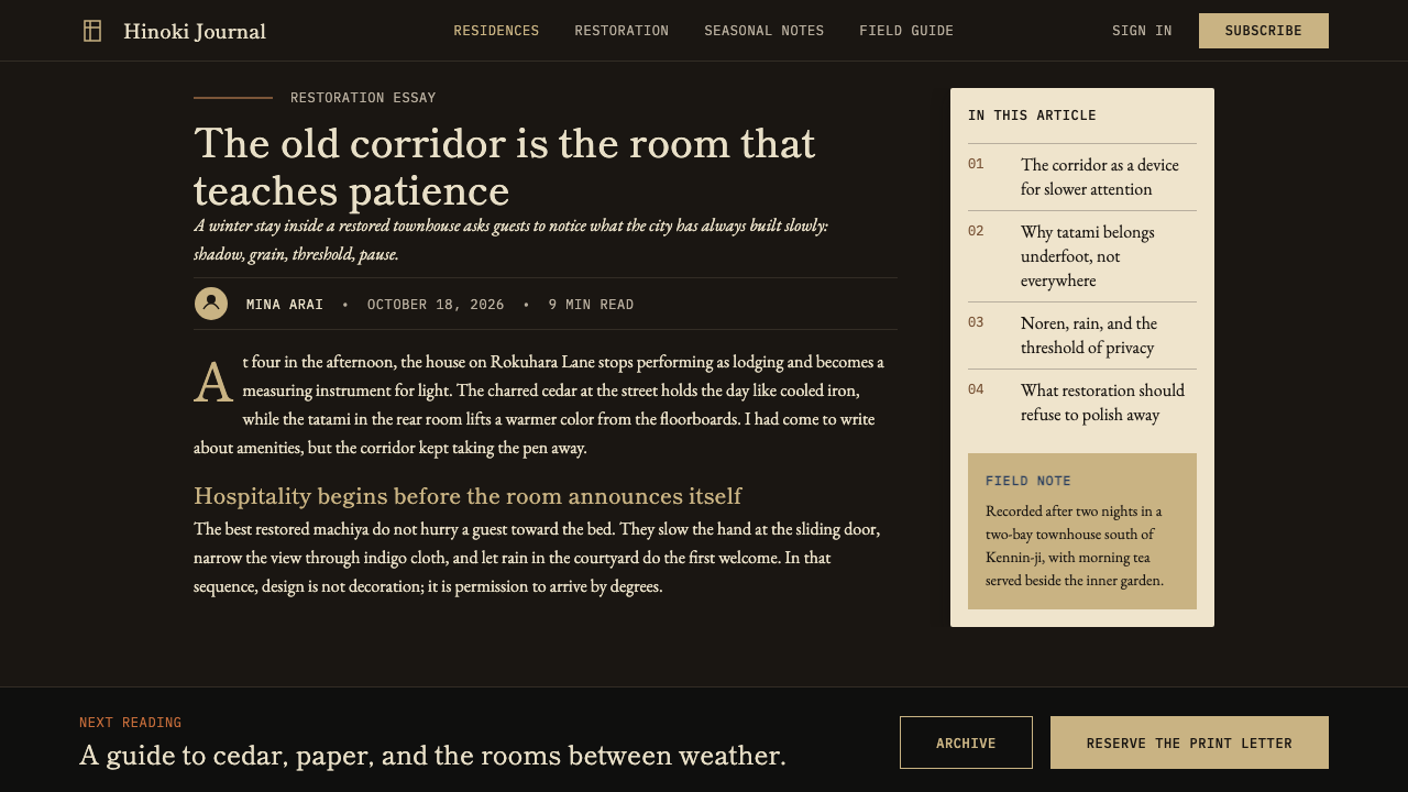
For editorial and marketing work, the style supports a poster-like compositional confidence that serves well in high-end travel writing, interior design publications, cultural institution materials, and luxury brand communications. An editorial spread in this style might use the full-bleed dark ground for an image, bleed-printed to the edge with no border, followed by a cream spread of text set at a deliberately narrow measure with a generous right margin reserved for a single caption or pull-quote in a smaller scale. Marketing pages translate this into a vertical rhythm of alternating dark and cream full-width sections, with each section carrying no more than two typographic elements and one image or graphic. The overall impression should be of a building you walk through, not a document you read.對於編輯與行銷內容,這種風格支持一種海報式的構圖自信,在高端旅行寫作、室內設計出版物、文化機構材料和奢侈品牌傳播中表現出色。這種風格的編輯對頁可能使用全出血深色底面承載一張圖片——印至頁邊無邊框——隨後是一個暖白對頁,正文以刻意的窄行寬排版,右側留有寬裕的留白,專門放置一行說明文字或以較小字號呈現的引語。行銷頁面將此轉化為深色與暖白全寬區塊交替出現的縱向節律,每個區塊承載不超過兩個字體元素和一張圖片或圖形。整體印象應如同穿越一棟建築,而非閱讀一份文件。
The most common mistake when applying this style is importing the palette without the discipline. The charcoal-black, cream, and indigo combination is visually striking, and it is tempting to deploy it with high contrast and full saturation everywhere — creating something that reads as bold and dramatic rather than quiet and refined. Authentic application requires that the black ground feel heavy and matte, not graphic; that the cream feel warm and slightly irregular, not clinical; that the indigo appear rarely and with restraint. A second common error is adding contemporary sans-serif type at aggressive tracking and scale, which produces a Nordic-minimalism aesthetic entirely at odds with the machiya's handcraft warmth. The typographic register must carry some quality of the made — variable weight, classical proportion, a suggestion of the brush — or the style's cultural rootedness is entirely lost.應用這種風格時最常見的錯誤是移植了色板卻丟掉了紀律。炭黑、暖白與靛藍的組合在視覺上很有吸引力,誘人的做法是在各處都部署高對比度和全飽和度——製造出一種讀起來大膽戲劇而非安靜精緻的效果。真實的應用要求炭黑底面感覺厚重啞光而非圖形化;暖白感覺溫暖略有不均而非臨床感;靛藍只在必要時以克制方式出現。第二個常見錯誤是加入字距激進、尺度誇張的當代無衬線字體,這會製造出一種完全與町家手工藝溫暖相悖的北歐極簡主義美學。字體排印的語域必須帶有一些「製作過」的品質——粗細變化、古典比例、筆墨的暗示——否則這種風格的文化根植性將蕩然無存。
See the Kyoto Machiya Stay design system查看 Kyoto Machiya Stay 完整设计系统
Kyoto Machiya Stay — FAQKyoto Machiya Stay · 常见问题
Is this the same as wabi-sabi?這和侘寂是同一回事嗎?
Wabi-sabi and Kyoto Machiya Stay share an origin culture and some overlapping values — both honor impermanence, imperfection, and the beauty of the incomplete. But wabi-sabi is a philosophical and aesthetic sensibility, not a design system, and its visual application tends toward extreme rusticity, visible deterioration, and earthy irregularity. Machiya Stay is a more precise, contemporary design language that draws on wabi-sabi as one of several influences — alongside the spatial philosophy of ma, the material discipline of traditional Japanese craft, and the contemporary hospitality design movement — but applies them within a system that can function in digital and commercial contexts. The palette is more controlled, the compositions are more considered, and the visual discipline is more consistent than wabi-sabi's open-ended embrace of accident.侘寂與京都町家旅宿共享一種起源文化和若干重疊的價值觀——兩者都尊重無常、不完整之物的美。但侘寂是一種哲學和美學感性,而非設計系統;其視覺應用傾向於極度粗樸感、可見的歲月痕跡和土質不均勻感。町家旅宿是一種更精確、更當代的設計語言,它以侘寂作為多種影響之一——連同「間」的空間哲學、傳統日本工藝的材料紀律,以及當代旅宿設計運動——但將它們應用在一個可以在數字和商業語境中運作的系統內。其色板更受控,構圖更考究,視覺紀律比侘寂對偶然性的開放性擁抱更為一貫。
Can this style work on a light or white background rather than the dark shou sugi ban ground?這種風格能用在淺色或白色背景上,而不是深色燒杉底面嗎?
Yes, and it is actually the more versatile application. The washi cream ground — used alone without the dark shou sugi ban — functions as the primary field for documents, web interfaces, editorial layouts, and any context where extended reading is required. In this light-ground variant, the black becomes the type and structural element, indigo and persimmon remain accents, and the shou sugi ban dark is reserved for feature sections, pull-quotes, or header bands. The critical discipline is to maintain the same restraint and ma in the light-ground version: washi cream with generous margins and unhurried hierarchy reads as Kyoto; washi cream crowded with content and decorative elements reads as nothing in particular.可以,而且這實際上是更具通用性的應用。和紙暖白底面——單獨使用,不搭配深色燒杉底面——作為文件、網頁界面、編輯版面以及任何需要延伸閱讀的語境的主要底面。在這個淺色底面的變體中,黑色成為文字和結構性元素,靛藍和柿色仍為點綴色,燒杉深色保留給特色區段、引語或頁頭色帶。關鍵紀律在於在淺色底面版本中維持同樣的克制和「間」:留有充裕邊距、閱讀節奏從容的和紙暖白讀起來是京都;被內容和裝飾元素塞滿的和紙暖白則毫無特點可言。
How does Japanese text behave in this style — does it require different typographic treatment than Latin text?日文在這種風格中的表現如何——它是否需要與拉丁文字不同的排版處理?
Japanese text in this style benefits from a mincho (serif) rather than gothic (sans-serif) typeface — the former carries the brushwork origins of the characters and aligns with the style's preference for craft warmth over mechanical precision. Vertical typesetting (tategumi) is appropriate for display contexts and headings where a strong traditional register is desired; horizontal setting (yokogumi) is more practical for body text and interface labels. Line spacing for Japanese should be even more generous than for Latin text, given the visual complexity of the characters. A common error in mixed Japanese-Latin layouts is treating the two scripts as interchangeable — Japanese needs more breathing room, and the relative scale of Latin characters alongside full-width Japanese characters requires careful optical adjustment.這種風格中的日文受益於明朝體(有衬線)而非黑體(無衬線)——前者承載漢字的筆墨起源,與這種風格對手工藝溫暖感優先於機械精確度的偏好相符。直排(縦組み)適合展示性語境和需要強烈傳統語域的標題;橫排(横組み)在正文和界面標籤上更為實用。日文的行距應比拉丁文字更為充裕,考慮到漢字的視覺複雜性。在日英混排版面中,一個常見錯誤是將兩種文字當作可互換的對等物——日文需要更多呼吸空間,全角日文字符旁的拉丁字符相對尺寸需要仔細的視覺調整。
What kinds of imagery work best — photography, illustration, or graphic elements?哪種類型的圖像效果最好——攝影、插畫還是圖形元素?
Photography is strongly preferred over illustration, and specifically photography that captures the material and atmospheric qualities the style encodes: the texture of charred wood, the diffusion of light through washi paper, the shadow of a koshi lattice on a tatami floor, the quietness of an interior in late afternoon. Images should be shot in ambient light rather than studio-lit, and the overall tone should be warm and slightly underexposed rather than bright and fully rendered. Graphic elements should be used sparingly and structurally — a horizontal rule as a section divider, a band of color marking a header zone — never as decorative fill. Abstract illustration is generally at odds with the style's commitment to material honesty; if imagery is needed beyond photography, it should be photographic in character.攝影比插畫更受偏好,且特別是那種捕捉這種風格所編碼的材料和氛圍特質的攝影:焦黑木材的質感,光線穿透和紙時的漫射,格子影落在榻榻米上的陰影,午後光線中室內的靜謐。圖像應在自然光而非攝影棚燈光下拍攝,整體色調應溫暖且略微曝光不足,而非明亮且充分渲染。圖形元素應節制而結構性地使用——橫線作為段落分隔,色帶標記頁頭區域——絕不作為裝飾性填充。抽象插畫通常與這種風格對材料誠實性的承諾相悖;如果攝影之外需要圖像,它在性質上應盡量接近攝影。
Does this style suit products that are not related to Japan, hospitality, or interiors?這種風格是否適合與日本、旅宿或室內設計無關的產品?
The style is transferable beyond its origin context, but the transfer requires judgment about values alignment. It works naturally for any product or service where quiet authority, handcraft quality, and a premium sense of restraint are desirable — certain financial or legal services, high-end consumer goods, artisanal food and beverage brands, cultural institutions, and architecture or design practices. It is poorly suited to contexts requiring high energy, broad accessibility, or visual assertiveness — sports brands, fast consumer products, entertainment platforms, or any context where the audience expects dynamism and volume. The test is not whether the product is Japanese or hospitality-related, but whether the user experience you want to create is one of entering a considered, curated space — because that is what this visual language, at its core, describes.這種風格在其起源語境之外是可移植的,但移植需要對價值觀對齊度作出判斷。對於任何以安靜的權威感、手工藝品質和高端克制感為理想特質的產品或服務,它自然地運作——某些金融或法律服務、高端消費品、匠人食品和飲料品牌、文化機構、建築或設計事務所。它不適合需要高能量、廣泛可及性或視覺主張性的語境——運動品牌、快速消費品、娛樂平台,或任何受眾期待動感和力量感的語境。判斷標準不是產品是否與日本或旅宿相關,而是你想創造的用戶體驗是否是進入一個考究、精選空間的體驗——因為這正是這套視覺語言在其核心所描述的。
Related design styles相关设计风格
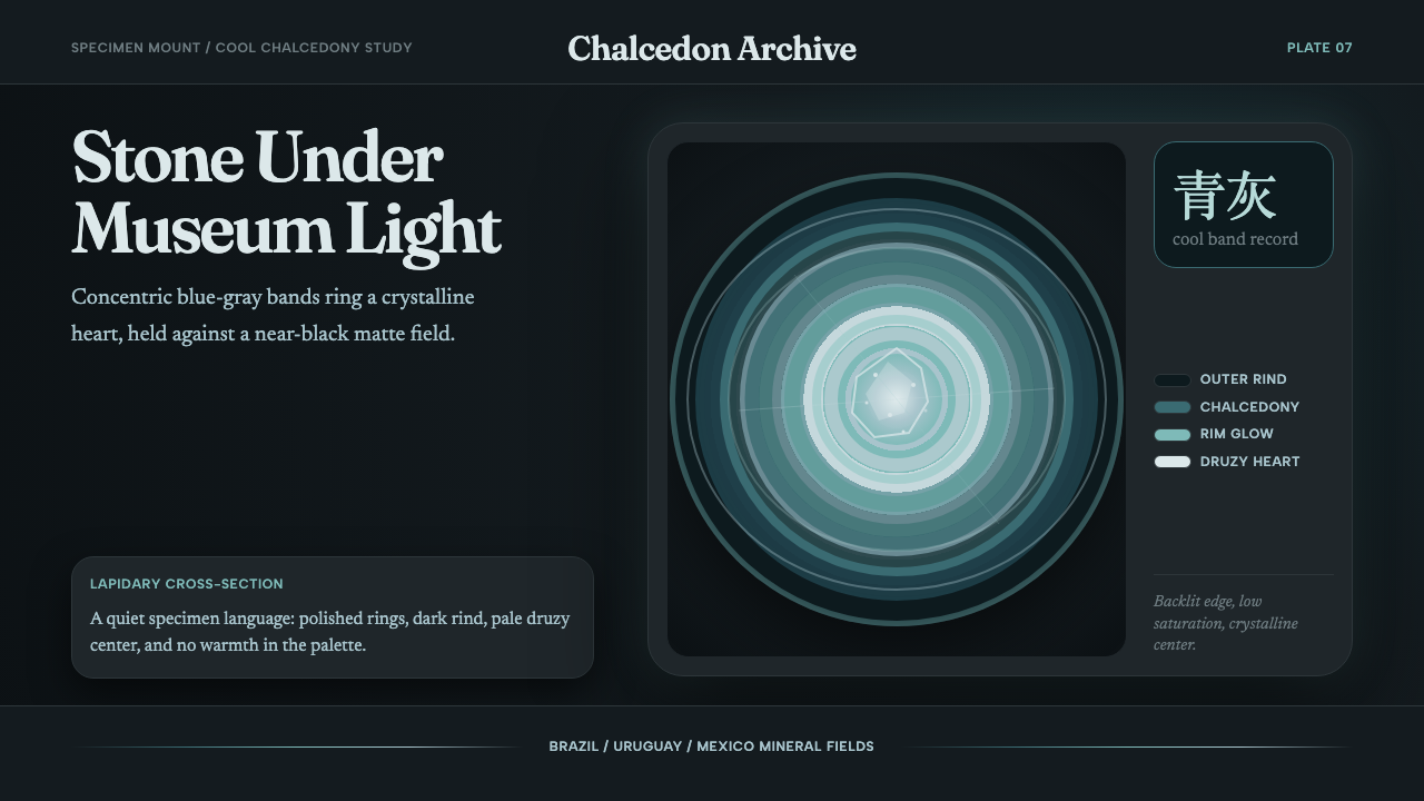 Agate Cross-SectionQuiet mineral glow. Fraunces type and cyan-gray rings shine on matte black.安静的矿物微光:Fraunces 字体与青灰同心环在哑黑底上发亮。
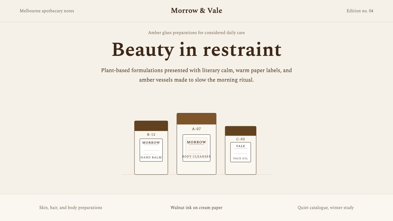 AesopRefuses urgency. Walnut serif on cream paper — every surface paced like a 19t…拒绝急迫的视觉语言:胡桃棕衬线落于奶油纸底,每个界面如 19 世纪药剂房般缓慢…
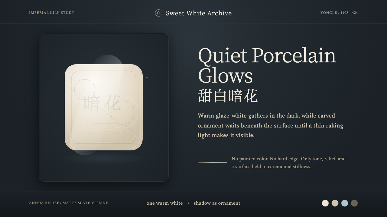 Jingdezhen BlancQuiet porcelain glows. Warm glaze-white on slate reveals hidden anhua incisio…静默瓷光:深板岩底上的温润甜白,暗花随斜光浮现。
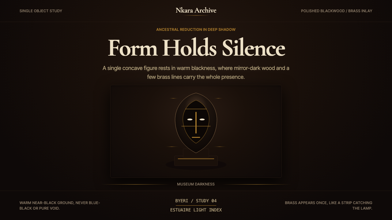 Gabonese Fang Mask & ByeriStillness has weight. Mirror-black forms, brass hairlines, and museum shadow…静默有重量。镜黑形体、黄铜细线与博物馆阴影托起气场。
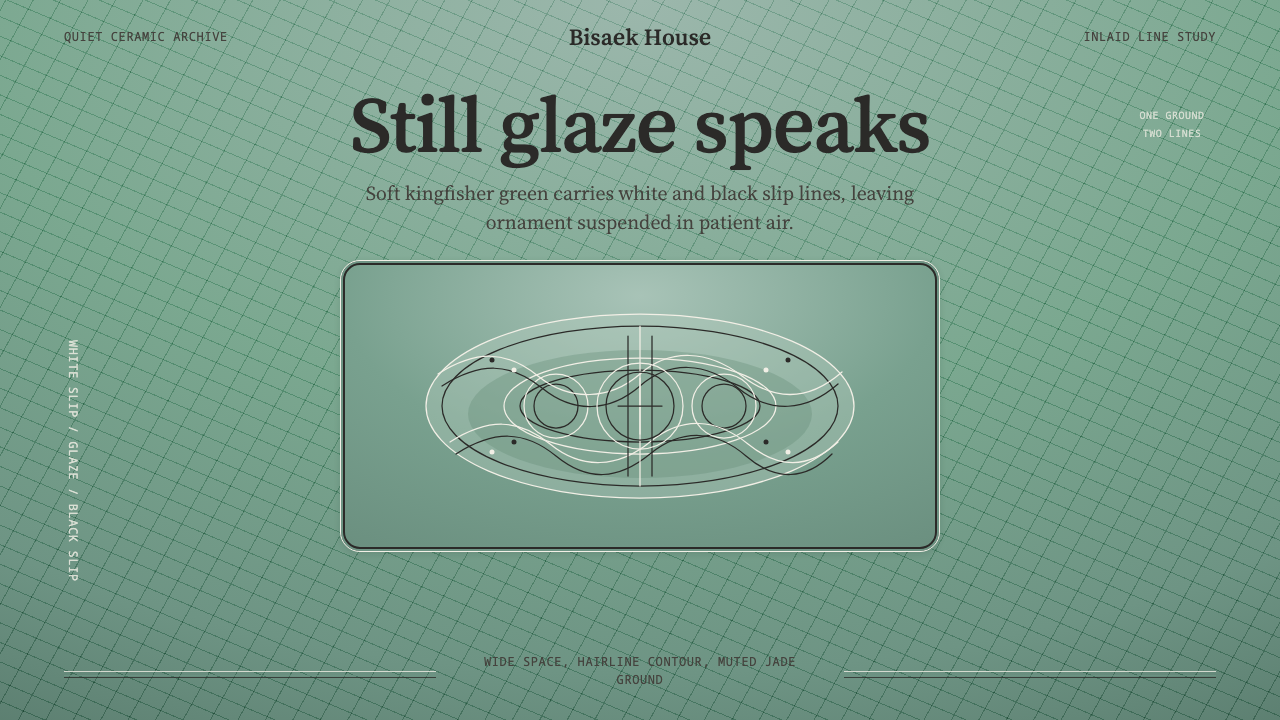 Goryeo Celadon 高麗青瓷Stillness carries ornament. Bisaek jade ground holds white and black hairline…静中见纹:翡色釉底承托黑白发丝镶嵌线。
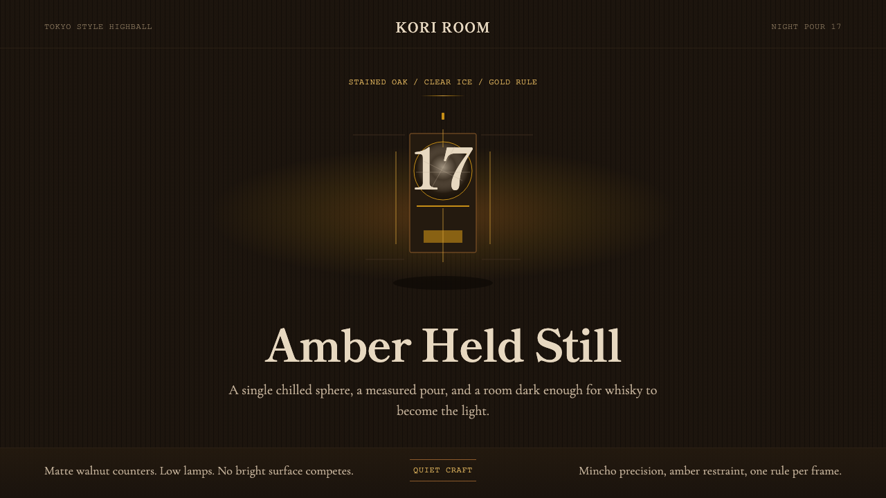 Japanese Whisky BarLuxury whispers. Amber glow and mincho type hold one object in dark wood quie…奢华低声:琥珀微光与明朝体,在深木黑中凝住单一焦点。