What is Malachite & Azurite?
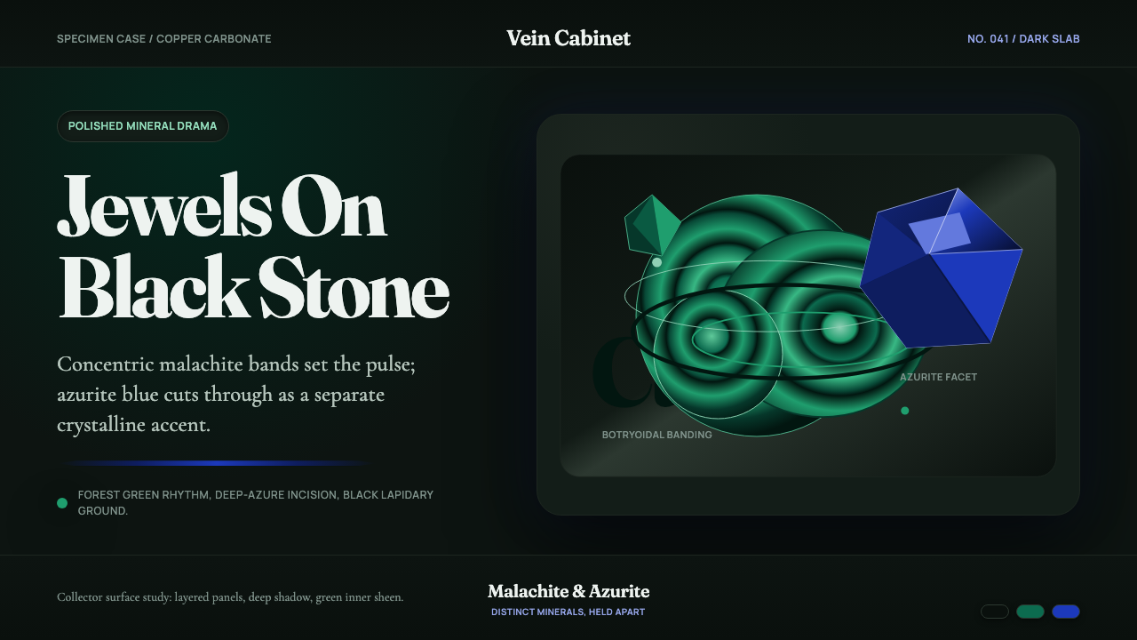
Malachite and azurite are two faces of the same copper deposit — one a deep banded green, the other a sharp saturated blue — and together they turn a mineral specimen case into a design system.
Malachite & Azurite in brief
Malachite & Azurite is a design system built from a real object: the polished specimen slab that mineral collectors and museum cases display side by side. Malachite is the deep, forest-green stone banded in concentric botryoidal rings, like a cut section of tree growth. Azurite is its intensely blue neighbor, growing in sharp, faceted crystal clusters rather than smooth bands. Photographed together on black lapidary stone, the two minerals read less like rock and more like jewelry — luminous, saturated, and lit for display.
What makes this system credible rather than merely decorative is that the two minerals are genuinely related. Both are copper carbonates that form in the same geological environment, and over long spans of time azurite is chemically unstable and gradually converts into malachite. Specimens showing sharp blue crystal cores wrapped in green banding are not a designer's invention — they are a documented, collectible mineral phenomenon called azurmalachite. The interface honors that relationship: green banding carries the primary visual rhythm across a layout, while azurite blue is held back as a distinct, unblended accent, appearing only where a genuine crystal facet would appear in the real stone.
Visually, everything sits on an authentic dark mineral ground rather than a neutral gray or cream backdrop, because that is how the specimen is actually staged in a collector's cabinet or museum vitrine — dark stone or black velvet beneath the glass to make the color glow. Surfaces are treated as polished and lustrous, like a cut and buffed cabochon, and a warm, high-contrast display serif carries headlines the way a hand-lettered museum label might, giving the whole system a sense of something cut, polished, and placed under glass rather than printed on a page.

Where does Malachite & Azurite come from?
Malachite and azurite are both secondary copper minerals — they do not crystallize directly from molten rock, but form later, when water percolating through a copper ore deposit reacts with oxygen and carbon dioxide near the surface. Malachite (copper carbonate hydroxide) typically precipitates as rounded, layered masses because its growth responds to slow, fluctuating changes in the surrounding fluid, which is why cut specimens show tree-ring-like bands rather than sharp crystal faces. Azurite, a closely related copper carbonate, crystallizes instead in the same environment but favors distinct, blocky, vitreous crystals. Because azurite is the less chemically stable of the two over geological time, it slowly hydrates and converts toward malachite, which is why the two minerals are so often found together in a single nodule, one growing out of the other.
Both minerals have been mined and used by humans for thousands of years, long before either was understood in chemical terms. Malachite was ground into a fine green powder in ancient Egypt and used as eye paint, associated with the goddess Hathor and worn as both cosmetic and protective symbol; the same green pigment, sometimes called mountain green, appears in wall paintings and later in medieval and East Asian pigment traditions. Azurite served a parallel role as a blue pigment — ground and used in panel painting across medieval and early Renaissance Europe and in East Asian painting long before the much more expensive ultramarine, made from lapis lazuli, became widely available. Painters valued azurite precisely because it delivered a convincing blue at a fraction of the cost of imported lapis.
The most famous decorative use of malachite by far comes from Russia. Large malachite deposits discovered in the Ural Mountains in the eighteenth and nineteenth centuries fed a distinctive craft tradition: because natural malachite rarely occurs in blocks thick enough to carve solid, Russian artisans developed a veneering technique — sometimes called the Russian mosaic — that sliced thin sheets of the banded stone and matched their patterns edge to edge across columns, vases, and tabletops so the banding appeared to flow continuously across a large surface. The technique reached its height in the Malachite Room of the Winter Palace in St. Petersburg, a state room clad floor to ceiling in malachite veneer, and in monumental malachite vases and columns exhibited at nineteenth-century world's fairs.
Today the trade has shifted geography. The copper belt of the Democratic Republic of Congo now supplies most of the finest malachite and azurite specimens reaching museums, lapidaries, and mineral shows such as the annual gem and mineral show in Tucson, Arizona, where cut and polished slabs are traded and displayed much like the ones this design system draws from. The specimen-case aesthetic — dark stone plinth, focused lighting, a handwritten label identifying locality and species — remains the dominant way both minerals are still presented to the public.
What defines the Malachite & Azurite look?
Color
The palette is built on a deep forest green and a saturated, intense azure blue, set against a very dark, near-black ground rather than a light one. Green carries most of the surface area, acting the way malachite banding does in the real stone; blue is used sparingly and deliberately, the way a sharp azurite crystal punctuates a mostly green specimen. The two hues are kept visually distinct — never blended into a gradient or a muddy teal — because in the mineral itself they remain two separate crystalline structures, not a mixed compound.
Banding and Pattern
Malachite's signature is its concentric, ring-like banding, formed by slow fluctuations in mineral-rich fluid over time — visually similar to tree rings or a topographic contour map, but organic and slightly irregular rather than mechanically repeating. This banding is used as a background rhythm — a texture that suggests depth and growth without becoming a busy, competing pattern. Azurite crystals, by contrast, contribute faceted, angular shapes rather than curved bands, giving the system a second, sharper visual vocabulary that reads as crystalline rather than sedimentary.
Surface and Luster
Both minerals are shown at their most refined state: cut, polished, and buffed to a lapidary sheen rather than left in their rough, matte mined form. Surfaces are treated as glossy and reflective, catching light the way a museum specimen does under a focused display lamp. This luster is what distinguishes the system from a rustic or raw-stone aesthetic — it is closer to jewelry and gemology than to geology in the field.
Grounding and Contrast
Everything is staged on a dark, near-black ground because that is how the actual specimen is displayed — black lapidary slabs and dark velvet linings are the standard museum and collector convention for showcasing malachite and azurite, since a light ground would wash out both the green banding and the blue accent. The system inherits this convention directly: a dark base is not a stylistic choice layered on top, but the correct staging condition borrowed from how the real object is exhibited.
Typography
Headlines lean on a warm, high-contrast display serif in the vein of a typeface like Fraunces — generous curves and soft, jewel-like character shapes that echo the rounded botryoidal forms of malachite rather than the hard geometry of a technical sans-serif. This choice keeps the system feeling closer to a hand-lettered museum label or an antique specimen catalogue than to a sterile scientific data sheet.
Composition and Focal Points
Content is arranged the way a specimen is lit in a display case: a clear focal point sits against generous dark negative space, rather than competing elements spread evenly across the frame. Cards and panels behave like individually cut and lit stones — each given room to be seen on its own — rather than a dense, tiled grid of equal-weight tiles.

Who shaped Malachite & Azurite?
Ancient Egyptians ground malachite into a fine green cosmetic powder used as eye paint, associated with the goddess Hathor and worn as both adornment and protective symbol. This is among the earliest documented uses of the mineral as a deliberately applied color rather than a raw material, and it establishes malachite green as a cosmetic and ceremonial hue long before it became a decorative stone.
Large malachite deposits discovered in Russia's Ural Mountains in the eighteenth and nineteenth centuries gave rise to a distinctive veneering technique that sliced thin, pattern-matched sheets of the stone across columns, vases, and furniture, since solid malachite blocks thick enough to carve are exceptionally rare in nature. The craft produced some of the most extravagant decorative stonework of the Russian imperial court.
The state room known as the Malachite Room in St. Petersburg's Winter Palace is clad floor to ceiling in malachite veneer, standing as the single most famous architectural showcase of the stone. It represents the culmination of the Ural veneering tradition and remains a touchstone reference whenever malachite is discussed as a material of luxury and state power rather than everyday ornament.
Azurite served European and East Asian painters as a working blue pigment for centuries before the far more expensive ultramarine, made from lapis lazuli, became widely accessible. Ground and mixed as paint, it appears throughout medieval and early Renaissance panel painting and in East Asian pigment traditions, prized as a convincing, affordable blue.
The copper belt of the Democratic Republic of Congo is today the source of most of the finest malachite and azurite specimens reaching collectors, museums, and gem and mineral shows such as the long-running annual show in Tucson, Arizona, where cut and polished slabs continue to be traded and displayed on dark stone plinths — the direct real-world source of the specimen-case staging this design system borrows.
How do you use Malachite & Azurite today?
Malachite & Azurite reads best where a dark, jewel-like presentation reinforces a message of rarity or craftsmanship, because the whole system is built around the logic of a lit display case rather than a printed page. Applying it well means preserving that logic — a dark ground, a single clear focal point, and color used the way it appears in the actual stone, banding as rhythm and blue as accent — rather than simply swapping a light theme's colors for green and blue.
On presentation slides, the system is strongest on cover and section-divider slides, where a single large focal element — a title treated like a specimen label, or an image cropped like a polished slab — sits against generous dark space. Content slides should keep the banding motif in the background rather than the foreground, letting body text and data breathe against dark, uncluttered panels; data visualizations read well as clusters of individually lit values rather than dense, evenly tiled grids.
For web interfaces, the system suits dashboards, portfolio pieces, and premium product pages where a sense of considered rarity matters more than raw density of information. Dark-ground panels work as cards, with green carrying structural weight and blue reserved for the one or two elements that most need attention — a primary action, a highlighted price tier, a status indicator. Navigation and secondary text should stay quiet and desaturated, so the green-and-blue accent pairing keeps its impact.
In editorial and marketing contexts, the system supports a tone of considered luxury — jewelry, collectibles, craft goods, or any story about something rare and cut by hand. Long-form layouts benefit from generous dark margins and a warm serif for pull quotes, echoing the feel of a museum label rather than a glossy advertisement. Marketing pages work well when a hero section treats the product itself like a specimen under glass, with copy playing the role of the identifying label beside it.
A common mistake is treating green and blue as interchangeable decorative accents and blending them into a single teal, which erases the entire point of the system — the two colors are meant to stay visibly distinct, just as the two minerals remain chemically distinct crystalline structures even when they grow in the same nodule. A second mistake is placing the system on a light or cream background; without the dark ground, the banding pattern loses the contrast that makes it read as polished stone rather than a flat green fill.
Malachite & Azurite — FAQ
Are malachite and azurite actually the same mineral?
No, they are two distinct copper carbonate minerals that form under very similar geological conditions and are frequently found together, but they are chemically and structurally different — malachite is copper carbonate hydroxide with a different formula and crystal habit than azurite. Over long geological time, azurite is the less stable of the two and gradually hydrates into malachite, which is why specimens showing both together, sometimes called azurmalachite, are common and collectible.
Why does malachite show ring-like bands?
The banding forms because malachite grows slowly, layer by layer, as mineral-rich fluid passes through rock over time, and the composition or flow rate of that fluid fluctuates as it grows. Each fluctuation leaves a slightly different band, in the same way that a tree's growth rings record yearly changes in conditions. This is why cut and polished malachite looks similar to a sliced section of tree trunk rather than a uniform block of color.
Does this style only work on dark backgrounds?
The system is built around a dark, near-black ground because that is how the real specimens are actually staged and photographed — a light ground washes out the contrast between the green banding and the blue accent that gives the system its identity. A very light or cream variation is possible in principle, but it requires deliberately re-engineering the contrast logic, and most authentic applications of this style stay dark for that reason.
Where does the greenish-blue color pairing come from historically?
The pairing is not an invented color scheme but a direct observation of geology: malachite and azurite form in the same copper-rich environments and are frequently discovered growing together in a single specimen. Both minerals also have independent histories as pigments — malachite as a green cosmetic and paint color in ancient Egypt, azurite as an affordable blue substitute for ultramarine in medieval and Renaissance painting — which gave each color cultural weight long before they were paired as a design palette.
What is the most common mistake when applying this style?
The most common mistake is losing the distinction between the two colors — blending green and blue into a single muddy teal, which erases the specimen logic the whole system is built on. A close second is over-decorating the banding pattern until it becomes a busy texture competing with content; in the real stone, the banding is a quiet background rhythm, not a foreground pattern, and the design should treat it the same way.
Related design styles
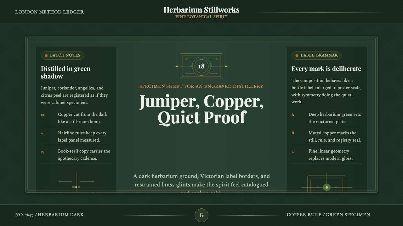 Gin BotanicalHerbarium precision. Dark green frames, Playfair serif, and copper rules hold…
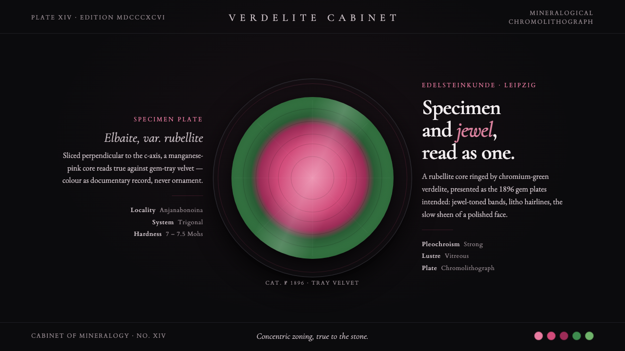 Tourmaline Crystal SliceSpecimen and jewel as one. A watermelon-tourmaline slice — pink core, green r…
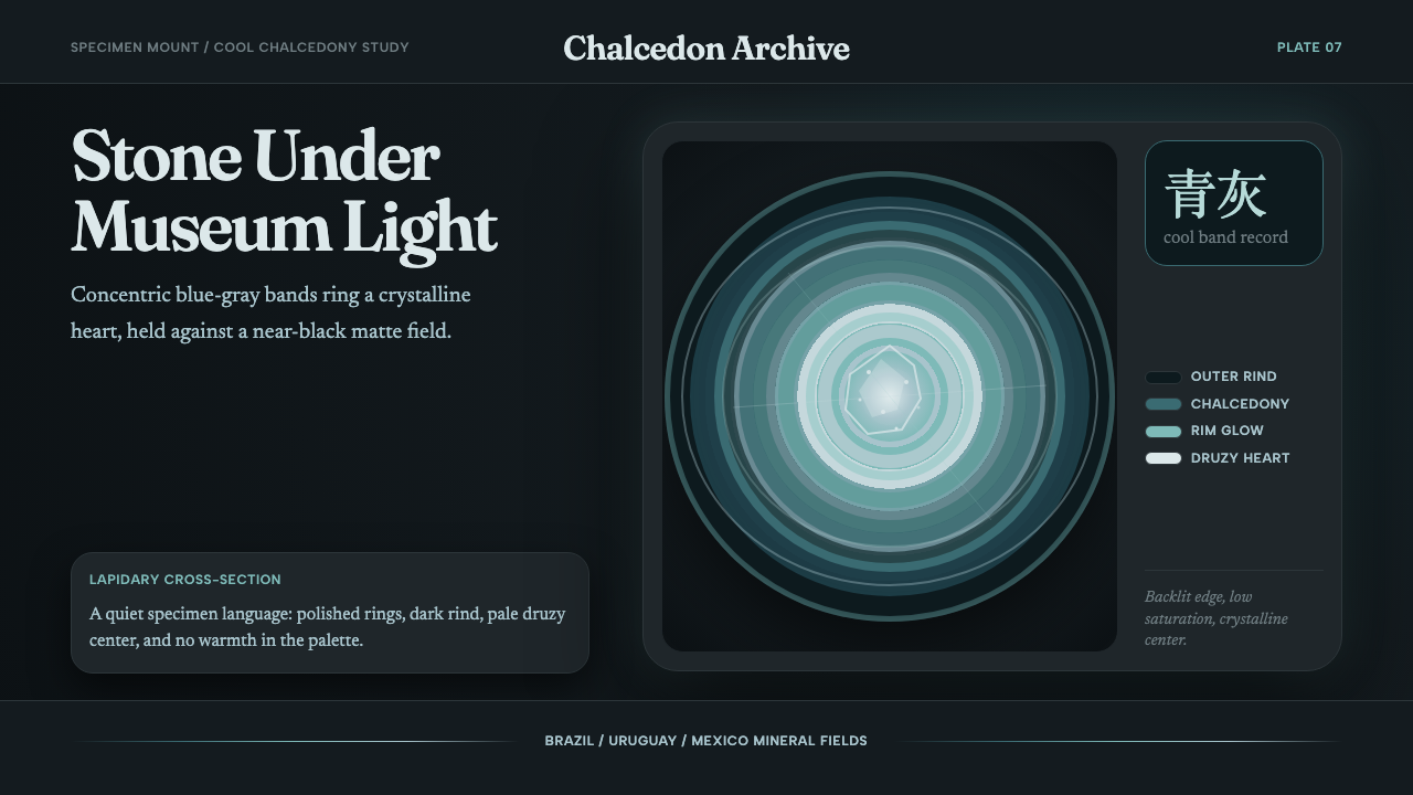 Agate Cross-SectionQuiet mineral glow. Fraunces type and cyan-gray rings shine on matte black.
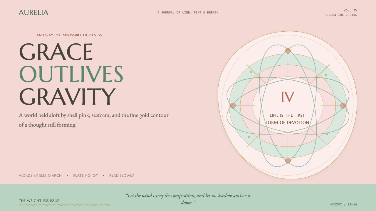 Botticelli Birth of Venus (1486)Grace defeats gravity. Shell pink, seafoam, and fine gilt contours keep every…
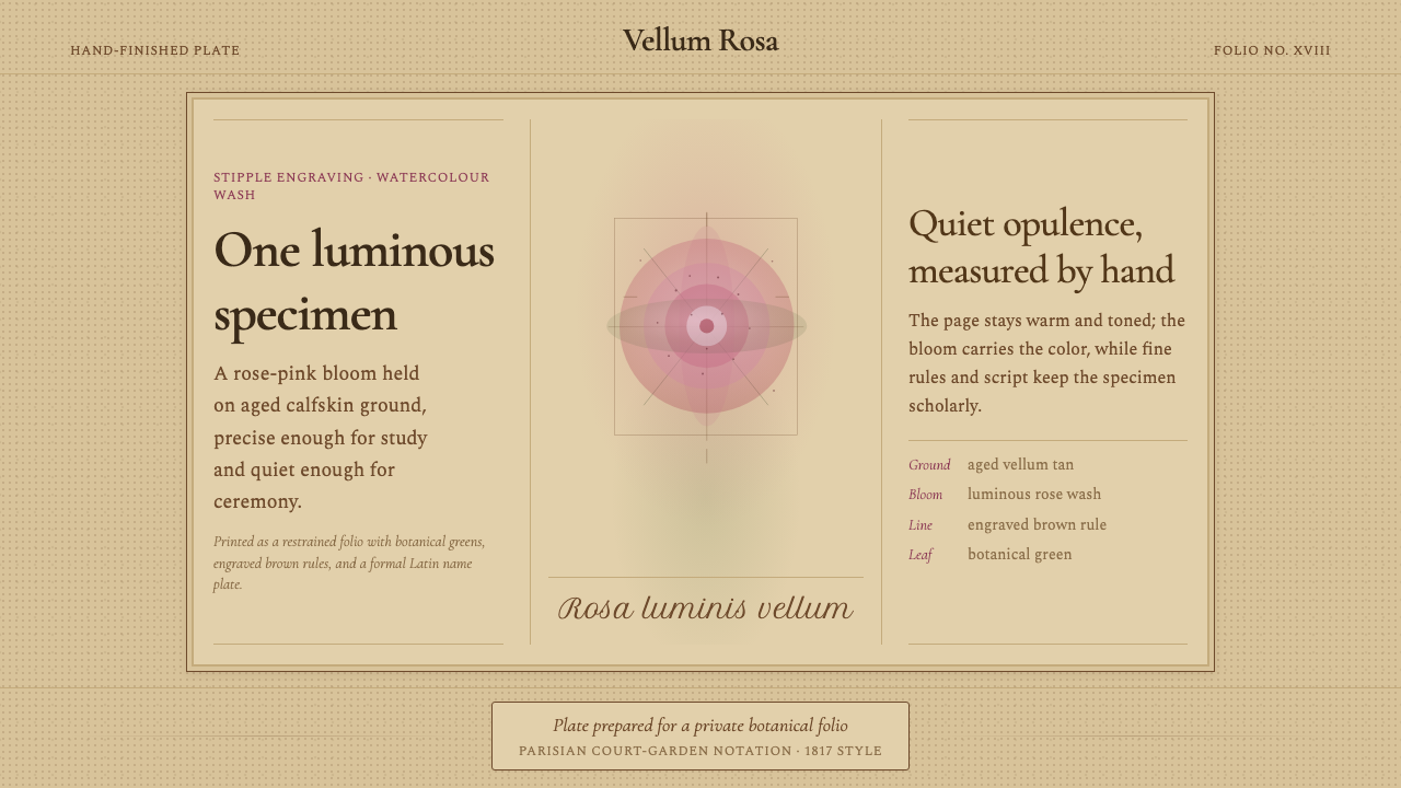 Redouté BotanicalScholarly opulence. Rose wash on aged vellum, framed by engraved brown rules.
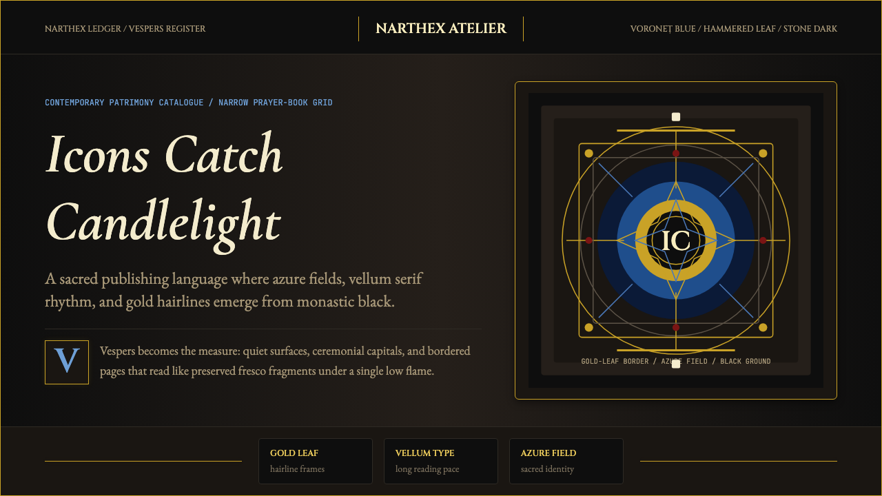 Romanian Orthodox Modern RevivalSacred dark refuses sparkle. Voroneț blue halos and gold hairlines rise from…