Design style guide设计风格指南
What is Romanian Orthodox Modern Revival?什么是 Romanian Orthodox Modern Revival?
Romanian Orthodox Modern Revival summons five centuries of candlelit Bukovina monastery walls into contemporary dark-ground design, where sacred azure halos and hammered gold hairlines emerge from a monastic depth of black.罗马尼亚东正教现代复兴将布科维纳修道院五百年烛光壁画召唤入当代暗底设计,让神圣蓝光环与锤制金箔细线从修道院深黑中浮现。
Romanian Orthodox Modern Revival in briefRomanian Orthodox Modern Revival 速览
Romanian Orthodox Modern Revival is a contemporary design aesthetic rooted in the iconographic and architectural traditions of Romanian Eastern Christianity. It draws directly from the painted monasteries of Bukovina — most famously Voroneț, Sucevița, and Moldovița — whose exterior frescoes have survived outdoors since the fifteenth and sixteenth centuries, and from the stone-carved ornament of the Brâncoveanu style developed in Wallachia during the late seventeenth and early eighteenth centuries. The result is a visual language that is simultaneously ancient and deliberately contemporary: dark grounds, restrained sacred chroma, gold as a structural rather than decorative element, and a compositional order borrowed from iconostasis arrangement.罗马尼亚东正教现代复兴是一种当代设计美学,根植于罗马尼亚东方基督教的圣像与建筑传统。它直接汲取布科维纳彩绘修道院——最著名的有沃罗内茨、苏切维察和摩尔多维察——的外部壁画(这些壁画自十五至十六世纪以来一直保存于室外),以及十七世纪末至十八世纪初在瓦拉几亚发展起来的布伦科韦亚努风格石雕纹饰。其成果是一套同时兼具古老感与当代自觉的视觉语言:暗色底面、克制的神圣色彩、作为结构而非装饰的金色,以及借鉴圣像壁格局的构图秩序。
Unlike many historical revival movements that merely borrow surface motifs, this aesthetic is grounded in a theology of image. Eastern Orthodox visual tradition holds that an icon is not a picture of a holy figure but a window into a spiritual reality — the image participates in what it depicts. This gives Romanian Orthodox-derived design its characteristic intensity: nothing in the composition is casual or purely decorative. Gold halos are theological statements about divine light; the deep-blue grounds of Voroneț reference the heavenly realm rather than a earthly sky; the hierarchical arrangement of figures from center outward follows liturgical logic, not compositional preference.与许多仅借用表面母题的历史复兴运动不同,这种美学植根于一种图像神学。东方正教视觉传统认为,圣像并非圣者的画像,而是通往灵性实在的窗口——图像参与它所描绘的对象。这赋予了罗马尼亚东正教衍生设计其独特的强度:构图中没有任何元素是随意的或纯粹装饰性的。金色光环是关于神圣之光的神学陈述;沃罗内茨的深蓝底面指向天国领域而非地上的天空;人物从中心向外的层级排列遵循礼仪逻辑,而非构图偏好。
The modern revival emerged after 1989, when Romania's transition away from communism enabled a broad recovery of Orthodox patrimony. Churches were restored, iconographic workshops reopened, and a generation of artists trained in traditional egg-tempera techniques while also working in digital media. Designers and visual artists began drawing on this recovered tradition not as nostalgia but as a living aesthetic resource — one with sufficient visual richness, symbolic depth, and cultural specificity to stand against the homogeneity of global digital design.现代复兴出现在1989年之后,当时罗马尼亚摆脱共产主义政权,使东正教遗产的广泛恢复成为可能。教堂得到修缮,圣像工坊重新开放,一代艺术家在学习传统蛋彩技艺的同时也在数字媒介中工作。设计师与视觉艺术家开始将这一复苏的传统作为活跃的美学资源加以援引——不是出于怀旧,而是因为它具有足够的视觉丰富性、象征深度与文化特殊性,能够在全球数字设计的同质化浪潮中屹立。
See the Romanian Orthodox Modern Revival design system →查看 Romanian Orthodox Modern Revival 完整设计系统 →
Where does Romanian Orthodox Modern Revival come from?Romanian Orthodox Modern Revival 从何而来?
The deepest root of this aesthetic lies in the painted monastery tradition of Bukovina, a region in northeastern Romania. Between 1488 and 1547, Moldavian princes — most notably Stephen the Great and his successors — commissioned the painting of entire exterior walls of monastery churches. At Voroneț, founded in 1488, a vivid azure was applied across the south-facing exterior wall to depict the Last Judgment on a scale impossible to execute inside the nave. This blue, produced from lapis lazuli and azurite minerals ground into Byzantine-recipe binders, achieved a depth and luminosity that no later restoration has fully replicated. It became known simply as Voroneț blue — a specific chromatic identity so singular that it functions as a cultural landmark the way Yves Klein blue does in Western modern art, but with five centuries more institutional weight.这种美学最深层的根源在于布科维纳的彩绘修道院传统,布科维纳是罗马尼亚东北部的一个地区。1488至1547年间,摩尔多瓦诸侯——最著名的是斯蒂芬大帝及其继任者——委托将修道院教堂的整个外墙绘满壁画。沃罗内茨修道院建于1488年,其朝南外墙整面涂绘着鲜明的蓝色,以在室内中殿无法实现的规模描绘了《最后的审判》。这种蓝色由青金石和蓝铜矿矿物研磨后按拜占庭配方调制而成,达到了任何后来修复都无法完全复制的深度与发光性。它被称为「沃罗内茨蓝」——一种如此独特的色彩身份,以文化地标的方式发挥着作用,就像伊夫·克莱因蓝在西方现代艺术中的地位,但背后有五百年更深厚的机构分量。
The second major historical current is the Brâncoveanu style, named after Constantin Brâncoveanu, Prince of Wallachia from 1688 to 1714. Brâncoveanu patronized a hybrid architectural and ornamental language that fused Byzantine iconographic tradition with Italian Renaissance stone-carving techniques, Ottoman decorative motifs, and local Romanian folk patterns. The result was an extraordinarily rich vocabulary of interlaced vine scrolls, trefoil arches, acanthus capitals, and foliated column shafts — all rendered in limestone with a precision that gives even the most elaborate carvings a quality of controlled clarity. Brâncoveanu himself was eventually executed by the Ottomans in 1714, making him a martyr-figure in Romanian Orthodox memory, and his stylistic legacy was formally preserved by the Romanian Orthodox Church as an emblem of both spiritual and national continuity.第二条重要的历史脉络是布伦科韦亚努风格,以1688至1714年在位的瓦拉几亚大公康斯坦丁·布伦科韦亚努命名。布伦科韦亚努资助了一种融合拜占庭圣像传统、意大利文艺复兴石雕技法、奥斯曼装饰母题与罗马尼亚本土民间图案的混合建筑与装饰语言。其成果是一套极为丰富的词汇:交织的藤蔓卷轴、三叶拱、莨苕柱头和叶饰柱身——全部以石灰岩精刻,即使是最繁复的雕刻也具有一种受控的清晰感。布伦科韦亚努本人于1714年被奥斯曼人处死,成为罗马尼亚东正教记忆中的殉道者,他的风格遗产被罗马尼亚东正教会正式保存为精神与民族延续的象征。
The monastic context for this aesthetic deepened through the influence of the Stavropoleos Monastery in Bucharest, founded in 1724 and surviving as one of the most complete examples of Brâncoveanu-influenced urban religious architecture. Its courtyard, carved portico, and interior fresco program established an experiential template for what Romanian sacred space looks like: enclosed and intimate in scale, richly carved at eye level, dark and candlelit within, with gold and deep color emerging from shadow rather than being illuminated by ambient light. Contemporary designers working in this tradition consistently reference the Stavropoleos atmosphere — the sensation of visual richness revealing itself slowly from darkness — as the intended experiential register.这种美学的修道院语境因布加勒斯特斯塔夫罗波莱奥斯修道院的影响而更为深厚。该修道院建于1724年,是布伦科韦亚努影响下的城市宗教建筑中保存最为完整的范例之一。其庭院、雕刻门廊与室内壁画程序确立了罗马尼亚神圣空间的体验模板:封闭而亲密的尺度,视线高度有丰富的雕刻,内部幽暗烛照,金色与深邃色彩从阴影中浮现而非被环境光照亮。在这一传统中工作的当代设计师始终将斯塔夫罗波莱奥斯的氛围——视觉丰富性从黑暗中缓缓揭示的感受——作为预期的体验基调加以援引。
After 1989, the post-communist recovery of Romanian Orthodox identity accelerated the development of a self-conscious modern revival. The Prodromu workshop on Mount Athos — the monastic community on the Greek peninsula where Romanian monks have maintained a continuous presence since the medieval period — became a center for rigorous training in traditional Byzantine iconography, producing painters who returned to Romania and opened workshops in Bucharest and other cities. Artists such as Sorin Dumitrescu and Father Iustin Marchiș contributed to theoretical frameworks for understanding how iconographic principles could be applied beyond the church context. By the 2010s, a distinct aesthetic had emerged in Romanian graphic design, typography, and digital product design that drew on this vocabulary while operating entirely outside ecclesiastical commissions — dark grounds, gold hairlines, the specific azure of Bukovina, and a compositional gravity borrowed from the iconostasis.1989年之后,罗马尼亚后共产主义时代东正教身份认同的复苏加速了自觉现代复兴的发展。阿索斯山上的普罗德罗姆工坊——罗马尼亚修士自中世纪以来一直保持连续存在的希腊半岛修道院社区——成为严格传授传统拜占庭圣像绘制技艺的中心,培养了一批返回罗马尼亚、在布加勒斯特等城市开设工坊的画家。索林·杜米特雷斯库和尤斯丁·马尔基什神父等艺术家为理解圣像原则如何应用于教会委托之外的语境作出了理论贡献。到2010年代,罗马尼亚平面设计、字体排印与数字产品设计中已形成一种独特的美学——暗色底面、金箔细线、布科维纳特有的蓝色,以及借鉴圣像壁的构图庄严感——完全在教会委托范畴之外运作。
What defines the Romanian Orthodox Modern Revival look?Romanian Orthodox Modern Revival 的视觉特征是什么?
Dark Ground暗色底面
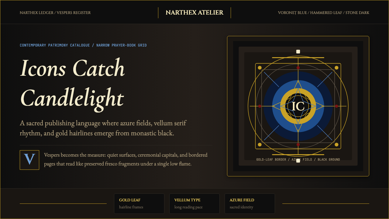
The defining structural choice of this aesthetic is the ground: a deep, near-black that functions not as absence but as a field of potential sacred depth. In Byzantine iconographic practice, the gold ground behind a figure represents the divine uncreated light of eternity — the background is not empty space but the most theologically charged element of the composition. The Romanian Orthodox modern revival translates this into a very deep, near-lightless dark ground that gives all other elements their luminous charge. Nothing on this ground is casually placed; everything that appears against the darkness must justify its presence by radiating visual light.这种美学的核心结构选择在于底面:一种深沉的近黑色,不作为虚空而作为潜在神圣深度的场域。在拜占庭圣像传统中,人物身后的金色底面代表永恒的神圣非受造之光——背景不是空白空间,而是构图中神学含量最高的元素。罗马尼亚东正教现代复兴将其转化为极深、近乎无光的暗色底面,赋予所有其他元素发光的张力。底面上没有任何随意放置的元素;一切在黑暗中显现的东西都必须以辐射视觉之光来证明自身的存在。
Sacred Azure神圣蓝
The specific blue drawn from the Voroneț monastery tradition occupies a narrow chromatic register — deep, slightly muted, carrying the visual weight of mineral pigments rather than synthetic brightness. It is not the vivid blue of a screen at full saturation, nor the pale blue of a corporate interface, but a dense, slightly oxidized azure that reads as ancient even on a contemporary display. In the modern revival, this blue is deployed with restraint — typically reserved for halos, architectural highlights, or the most significant structural divisions in a layout — treating it as a color of theological rather than decorative significance.从沃罗内茨修道院传统中汲取的特定蓝色占据一个狭窄的色彩区间——深沉、略带静穆,承载矿物颜料的视觉重量而非合成的鲜亮感。它不是屏幕满饱和度的鲜艳蓝,也不是企业界面的浅蓝,而是一种浓密、略带氧化感的蓝色,即使在当代显示器上也透出古老的气息。在现代复兴中,这种蓝色被克制地使用——通常只保留给光环、建筑高光或版面中最重要的结构划分——将其作为具有神学而非装饰意义的色彩加以对待。
Gold as Light金色即光
Gold in the Byzantine tradition is not a color of luxury or wealth in the secular sense — it is the material representation of uncreated divine light, a radiance that does not come from a natural light source but from the sacred reality it depicts. In Romanian Orthodox modern revival design, gold is deployed as hairlines, thin rules, accent marks, and halo rings rather than as filled areas or background washes. Its restraint is essential: gold used sparingly against deep black produces the visual effect of light emerging from darkness — the very phenomenon it was chosen to represent. Gold used generously becomes mere gilding.拜占庭传统中的金色并非世俗意义上的奢华或财富之色——它是神圣非受造之光的物质表达,一种不来自自然光源、而来自其所描绘的神圣实在的光芒。在罗马尼亚东正教现代复兴设计中,金色被部署为细线、薄规则线、强调标记和光环圆圈,而非填充面积或背景底色。其克制至关重要:在深黑底面上稀疏使用的金色产生光从黑暗中浮现的视觉效果——正是它被选用来表达的那种现象。大量使用的金色则沦为单纯的镀金装饰。
Liturgical Typography礼仪字体排印
Text in this tradition moves at the pace of a lectionary — the slow, measured rhythm of liturgical reading rather than the scanning speed of a web interface. Typography is set with generous line spacing, a narrow measure that enforces deliberate reading, and strong vertical rhythm. The preferred letterforms are serifs with roots in calligraphic or stone-carved traditions, carrying the visual weight of inscription rather than printing. Hierarchy is established through measured variation in weight and size rather than contrasting families. The reading experience is meant to feel like moving through a space of textual depth, not processing information efficiently.这一传统中的文字以圣经讲道书的节奏行进——礼仪诵读缓慢而有节制的韵律,而非网页界面的浏览速度。排版采用宽松的行间距、强制细心阅读的窄行宽,以及强烈的垂直韵律。偏好的字形是具有书法或石刻传统渊源的衬线体,承载铭文而非印刷品的视觉分量。层级通过字重与尺寸的有节制变化而非对比字体家族来建立。阅读体验旨在让人感受到穿越文字深度的空间感,而非高效处理信息。
Iconostasis Composition圣像壁构图
The iconostasis — the carved and icon-laden screen that separates the nave from the sanctuary in Orthodox churches — provides the compositional logic for this aesthetic. It is not a free arrangement but a rigidly hierarchical one: the most sacred figures occupy the center and upper registers, lesser sacred figures descend outward and downward, and the architectural frame organizes everything according to theological rather than visual priority. Contemporary designs in this tradition inherit this logic: the central visual element carries maximum weight, surrounding elements diminish in visual authority proportionally, and the overall frame — borders, rules, margins — is a structural actor, not a passive container.圣像壁——东正教教堂中隔开中殿与圣所的雕刻圣像屏——为这种美学提供了构图逻辑。它不是自由排列,而是严格层级化的:最神圣的人物占据中心与上层格位,次一级的神圣人物向外向下递减,建筑框架按神学而非视觉优先级组织一切。这一传统中的当代设计继承了这一逻辑:中央视觉元素承载最大分量,周围元素的视觉权威按比例递减,整体框架——边框、规则线、页边距——是结构性的行动者,而非被动的容器。
Chiaroscuro Depth明暗对比深度
Romanian Orthodox sacred art is an art of emergence: figures, inscriptions, and ornamental detail are meant to appear as if they are surfacing from darkness rather than being placed on a neutral ground. This is not the dramatic chiaroscuro of Baroque painting — it is more restrained, more architectural, more about revealed depth than theatrical contrast. In the modern revival, this translates into a compositional approach where the brightest elements — gold accents, azure highlights, pale lettering — appear to float slightly above a ground that recedes into depth. Gradations are not literal gradients but rather the visual logic of candlelight: things seen from a slight distance in low light.罗马尼亚东正教神圣艺术是一种浮现的艺术:人物、铭文与装饰细节被设计为从黑暗中浮现,而非被放置于中性底面上。这不是巴洛克绘画中戏剧性的明暗对比——它更为克制、更具建筑感,更多关乎被揭示的深度而非剧场式的对比。在现代复兴中,这转化为一种构图方式:最明亮的元素——金色强调、蓝色高光、浅色文字——似乎微微浮于向深处退隐的底面之上。明暗变化不是字面意义上的渐变,而是烛光的视觉逻辑:在低光环境中从略远距离所见的事物。
Ornament as Theology装饰即神学
Ornament in the Brâncoveanu tradition is not merely decorative — it is a visual argument about the ordered beauty of creation. The interlaced vine scrolls that run along column shafts and portal frames reference the Vine of Life from the Gospel of John; the acanthus capitals that top every column echo the ancient symbol of immortality; the trefoil arch above every doorway is a Trinitarian form. In the modern revival, ornamental elements derived from this tradition are used sparingly but with full awareness of their symbolic genealogy. A vine-scroll border on a layout is not a flourish — it is a claim about the nature of the work's subject. Designers working in this register do not reach for ornament casually.布伦科韦亚努传统中的装饰不仅仅是装饰性的——它是关于创造之有序美的视觉论述。沿柱身与门廊边框延伸的交织藤蔓卷轴指向约翰福音中的「生命之藤」;每根柱子顶部的莨苕柱头呼应古老的不朽象征;每扇门楣上方的三叶拱是三位一体的形态。在现代复兴中,从这一传统派生的装饰元素被稀疏使用,但完全意识到其象征谱系。版面上的藤蔓卷轴边框不是花饰——它是对作品主题性质的一种宣称。在这一语境中工作的设计师不会随意援引装饰。

See the Romanian Orthodox Modern Revival design system →查看 Romanian Orthodox Modern Revival 完整设计系统 →
Who shaped Romanian Orthodox Modern Revival?谁塑造了 Romanian Orthodox Modern Revival?
Prince of Wallachia from 1688 to 1714, Brâncoveanu was both the political patron and symbolic martyr of the aesthetic tradition bearing his name. He commissioned an extraordinary program of church building, monastery construction, and manuscript illumination that synthesized Byzantine, Renaissance, and Ottoman decorative vocabularies into a distinctively Romanian visual language. His execution by the Ottomans in 1714 — along with his four sons and his advisor, all of whom refused to convert to Islam — was canonized by the Romanian Orthodox Church in 1992, making him simultaneously a historical design patron and a recognized saint. The style he patronized carries this dual weight: it is both a historical aesthetic and a sacred emblem.1688至1714年在位的瓦拉几亚大公布伦科韦亚努,既是以其名字命名的美学传统的政治资助者,也是这一传统的象征性殉道者。他委托实施了大规模的教堂建造、修道院兴建与手稿彩绘项目,将拜占庭、文艺复兴与奥斯曼装饰词汇综合为独具特色的罗马尼亚视觉语言。他与四个儿子及其顾问于1714年被奥斯曼人处死——所有人都拒绝改宗伊斯兰——1992年被罗马尼亚东正教会封圣,使他同时成为历史上的设计资助者和公认的圣人。他所资助的风格承载着这种双重分量:它既是历史美学,也是神圣象征。
A painter, theorist, and public intellectual who became one of the most visible advocates for a rigorous contemporary application of Orthodox iconographic principles in Romanian visual culture. Dumitrescu argued that the icon's visual grammar — its rejection of perspectival illusionism, its use of inverse perspective to draw the viewer into rather than through the image, its insistence on flat gold ground as divine reality — offered a genuine alternative to both Western modernism and the kitschy religious eclecticism of post-communist Romania. His published writings and his work as a painter provided a theoretical armature that subsequent designers and artists could draw on without having to defend the tradition from first principles.索林·杜米特雷斯库是一位画家、理论家与公共知识分子,成为在罗马尼亚视觉文化中严格运用东正教圣像原则的最具代表性的倡导者之一。他主张:圣像的视觉语法——拒绝透视幻觉主义、使用反透视将观者引入而非穿越画面、坚持以金色平面底面表达神圣实在——为西方现代主义与后共产主义罗马尼亚的廉价宗教折衷主义提供了真正的替代方案。他的著作与绘画实践提供了一套理论框架,使后续设计师与艺术家能够援引这一传统,而无需每次都从第一原则开始为其辩护。
A monastic painter and theologian who worked at the intersection of traditional iconographic technique and contemporary visual inquiry. Father Iustin's significance lies in his insistence that traditional Byzantine iconography is not an archaeological pursuit but a living practice with its own internal logic of development — that the tradition evolves not by absorbing contemporary styles but by deepening its own formal principles. His workshop practice and his writings on the theology of beauty have been influential for a generation of Romanian artists navigating the tension between iconographic fidelity and contemporary relevance.尤斯丁·马尔基什神父是一位修道院画家与神学家,工作于传统圣像技艺与当代视觉探索的交汇处。他的意义在于坚持主张:传统拜占庭圣像绘制不是考古事业,而是具有自身内在发展逻辑的活态实践——传统不是通过吸收当代风格而演进,而是通过深化自身的形式原则。他的工坊实践与关于美之神学的著作,影响了在圣像忠实性与当代相关性之间寻找平衡的一代罗马尼亚艺术家。
The Prodromu workshop, based at the Romanian Skete of Prodromu on Mount Athos, represents the most rigorous institutional continuity of traditional Byzantine iconographic training accessible to contemporary Romanian painters. Mount Athos, the monastic peninsula in northern Greece, has maintained Romanian monastic communities since at least the fourteenth century, preserving craft traditions — egg-tempera technique, gilding with gold leaf, the specific color relationships and hierarchical compositional logic of Byzantine painting — in a continuous line of practice. Painters trained at Prodromu returned to Romanian cities with both technical mastery and a theological framework for understanding what they were making and why, providing the revival movement with its most technically credible practitioners.普罗德罗姆工坊设于阿索斯山上的罗马尼亚普罗德罗姆修院,代表着当代罗马尼亚画家可接触到的传统拜占庭圣像绘制训练中机构连续性最为严格的场所。阿索斯山这一希腊北部修道院半岛,自至少十四世纪以来一直维持着罗马尼亚修道社区,在连续不断的实践传承中保存着工艺传统——蛋彩技艺、金箔镀金、拜占庭绘画特有的色彩关系与层级构图逻辑。在普罗德罗姆受训的画家带着技术掌握与神学框架返回罗马尼亚各城市,理解自己在创作什么以及为何创作,为复兴运动提供了最具技术可信度的实践者。
Prince of Moldova from 1457 to 1504 and one of the most prolific patrons of religious architecture in Romanian history, Stephen commissioned over forty churches and monasteries during his reign — including the foundation of Voroneț in 1488, built after his victory over the Ottomans at the Battle of Vaslui. The painted-monastery tradition of Bukovina — which later generations would experience as the defining historical aesthetic of Romanian Orthodox visual culture — is substantially his creation. He was canonized by the Romanian Orthodox Church in 1992, the same year as Brâncoveanu, giving both the historical originator and the later refiner of the tradition the status of saints whose legacy carries spiritual as well as aesthetic authority.1457至1504年在位的摩尔多瓦大公斯蒂芬大帝是罗马尼亚历史上最多产的宗教建筑资助者之一,在位期间委托兴建了四十余座教堂与修道院——包括1488年在瓦斯卢伊战役击败奥斯曼人后兴建的沃罗内茨。布科维纳彩绘修道院传统——后代将其体验为罗马尼亚东正教视觉文化的决定性历史美学——在很大程度上是他的创造。他于1992年被罗马尼亚东正教会封圣,与布伦科韦亚努同年,使这一传统的历史肇始者与后来的精炼者都获得了圣人地位,其遗产兼具精神权威与美学权威。
How do you use Romanian Orthodox Modern Revival today?今天怎么用 Romanian Orthodox Modern Revival?
Romanian Orthodox Modern Revival is among the most contextually specific design aesthetics available — applying it well requires understanding not just its surface appearance but its underlying logic of sacred chiaroscuro and hierarchical composition. The core challenge for contemporary designers is translating a tradition built around illuminated manuscripts, exterior fresco programs, and architectural stone carving into digital surfaces without stripping out the gravitas that makes the tradition meaningful. The aesthetic rewards restraint and patience; it does not compress well into rapid consumer-facing interactions.罗马尼亚东正教现代复兴是现有设计美学中语境特殊性最强的之一——正确应用它不仅需要理解其表面外观,还需要理解其神圣明暗对比与层级构图的底层逻辑。当代设计师面临的核心挑战是,将一个围绕彩绘手稿、外部壁画程序与建筑石雕构建的传统转化到数字界面上,同时不剥夺使这一传统具有意义的庄严感。这种美学奖励克制与耐心;它不适合压缩进快速的面向消费者的交互中。
For presentation slides, this aesthetic is most powerful in contexts where the subject matter has genuine weight — cultural institutions, memorial or historical presentations, significant organizational announcements, premium brand identity reveals. A cover built in this tradition will use a very deep background, a single gold hairline or ornamental motif to establish the frame, and lettering in a serif with calligraphic roots set at a scale that commands the page. The title is not a quick scan point but an inscription. Content slides should resist the temptation to lighten the palette for readability; instead, text set in warm near-white against deep near-black produces the candlelit legibility that is the aesthetic's characteristic register. Data, if present, should be treated as inscription rather than infographic — presented in precise tabular form with gold rules as structural dividers, avoiding chart types that imply casual accessibility.对于演示文稿,这种美学在主题具有真正分量的场合最为有力——文化机构、纪念或历史性演示、重要的组织宣布、高端品牌身份揭示。以这一传统构建的封面将使用极深的背景,以一条金色细线或装饰母题建立框架,以具有书法根源的衬线体在命令页面的尺度上排印文字。标题不是快速扫描点,而是铭文。内容页应抵制为提升可读性而减轻色调的诱惑;以暖近白色在深近黑色底面上排印的文字,产生这种美学特有的烛光可读性。若有数据,应将其视为铭文而非信息图形——以精确的表格形式呈现,以金色规则线作为结构分隔,避免暗示随意可及性的图表类型。
For web interfaces, the style is best suited to long-form reading experiences, premium cultural institutions, liturgical or theological digital publishing, and high-end hospitality brands with genuine heritage claims. The compositional logic favors single-column layouts with generous vertical rhythm, deep backgrounds broken only by the most necessary structural elements, and navigation that is sparse — almost deliberately difficult to find — because the content is meant to reward focused attention rather than browsing. Interactive states should use the gold accent sparingly: a gold underline on hover, a gold border on a focused input, rather than color fills that overwhelm the dark ground.对于网页界面,这种风格最适合长篇阅读体验、高端文化机构、礼仪或神学数字出版,以及具有真实遗产宣称的高端款待品牌。构图逻辑偏向具有宽裕垂直韵律的单列布局,深色背景只被最必要的结构性元素打破,导航稀疏——几乎是刻意难以找到的——因为内容意在奖励专注的注意力而非浏览式阅读。交互状态应稀疏使用金色强调:悬停时的金色下划线、聚焦输入框上的金色边框,而非会压过暗色底面的色彩填充。
For editorial and marketing work, the aesthetic supports long-form storytelling and cultural authority claims better than conversion-focused marketing. An editorial layout in this tradition will carry a single large image — treated as an icon rather than a photograph, cropped to isolate its subject against a near-black ground — with body text set in a measured column below or alongside. Pull quotes, if used, should feel like illuminated inscriptions rather than highlighted excerpts: isolated on the page, surrounded by generous space, and ornamented with a single gold rule above or below. The aesthetic is poorly suited to promotional contexts emphasizing discounts, urgency, or casual approachability; it implies that the content is worth sustained attention, and the design should support that claim rather than undercut it.对于编辑与营销内容,这种美学比以转化为导向的营销更能支持长篇叙事与文化权威宣称。这一传统中的编辑版面将承载一张大图——被当作圣像而非照片对待,裁切以在近黑底面上隔离其主体——正文以有节制的列宽排印于图片下方或旁边。若使用摘引,应让其感觉像彩绘铭文而非突出的摘录:在页面上孤立呈现,被宽裕的空间围绕,以上下各一条金色规则线加以装饰。这种美学不适合强调折扣、紧迫感或随意亲切感的促销语境;它暗示内容值得持续关注,设计应支持而非削弱这一宣称。
The most common mistake in applying this aesthetic is treating the gold and azure as mere color choices decorating an otherwise conventional layout. The style's power comes from the relationship between those colors and the deep ground — from the logic of emergence rather than placement. Gold hairlines that appear to glow against near-black produce a completely different effect from the same color used as a fill against a neutral grey. Similarly, the sacred azure derives its power from its density and restraint; diluting it into a generic corporate blue or expanding it beyond its traditional role as a field of theological significance immediately collapses the visual logic. A layout in this tradition should feel as if its visual elements have been revealed rather than designed.应用这种美学时最常见的错误,是将金色与蓝色视为装饰否则惯常版面的单纯色彩选择。这种风格的力量来自这些颜色与深色底面之间的关系——来自浮现的逻辑而非放置的逻辑。在近黑底面上似乎发光的金色细线,与同一颜色用作中性灰底面上的填充,产生完全不同的效果。同样,神圣蓝从其密度与克制中汲取力量;将其稀释为通用企业蓝,或将其扩展到传统神学意义场域之外,立即使视觉逻辑崩溃。这一传统中的版面应该让人感觉其视觉元素是被揭示的而非被设计的。
A common practical error is overcrowding the composition. Orthodox sacred composition depends on hierarchical emptiness — much of the space around a central figure is held deliberately, not because the painter ran out of content but because the surrounding space is itself a theological statement about divine transcendence. Contemporary designers accustomed to filling every pixel of a layout will find this hard to honor; the temptation to add secondary graphics, supporting imagery, or navigational elements to unused space should be resisted. The deep, near-empty surround is doing essential work.一个常见的实践错误是过度填充构图。东正教神圣构图依赖层级性的虚空——中心人物周围的大量空间是刻意保留的,不是因为画家用尽了内容,而是因为周围的空间本身就是关于神圣超越性的神学陈述。习惯于填满版面每个像素的当代设计师会发现这很难尊重;在未使用空间中添加次级图形、支持图像或导航元素的诱惑应当被抵制。深沉的、近乎空旷的周围是在做至关重要的工作。
See the Romanian Orthodox Modern Revival design system →查看 Romanian Orthodox Modern Revival 完整设计系统 →
Romanian Orthodox Modern Revival — FAQRomanian Orthodox Modern Revival · 常见问题
How does this aesthetic differ from general Byzantine or Eastern Orthodox design?这种美学与一般拜占庭或东方正教设计有何不同?
Byzantine and Eastern Orthodox design encompasses an enormous range of national and regional traditions — Greek, Russian, Serbian, Bulgarian, Georgian, Coptic, and others — each with distinct chromatic registers, ornamental vocabularies, and compositional conventions. Romanian Orthodox Modern Revival is specifically rooted in the Moldavian painted-monastery tradition of exterior fresco programs (most visibly at Voroneț, Sucevița, and Humor), in the Brâncoveanu architectural ornament of Wallachia, and in the post-1989 recovery of these traditions within a contemporary Romanian context. It is darker in ground than most Greek or Russian Byzantine traditions, more specific in its azure reference, and more heavily inflected by the Brâncoveanu ornamental vocabulary than a generically pan-Orthodox approach would be.拜占庭与东方正教设计涵盖极为广泛的民族与地区传统——希腊、俄罗斯、塞尔维亚、保加利亚、格鲁吉亚、科普特等——每种都有独特的色彩区间、装饰词汇与构图惯例。罗马尼亚东正教现代复兴则特别根植于摩尔多瓦彩绘修道院的外部壁画程序传统(最典型的是沃罗内茨、苏切维察和胡莫尔),根植于瓦拉几亚的布伦科韦亚努建筑装饰,以及1989年后这些传统在当代罗马尼亚语境中的复苏。它的底面比大多数希腊或俄罗斯拜占庭传统更深,对蓝色的援引更为特定,受布伦科韦亚努装饰词汇的影响也比泛东正教方式更深。
Can this aesthetic work for secular brands and products?这种美学能用于世俗品牌和产品吗?
Yes, but only where the brand has genuine claims to depth, heritage, cultural seriousness, or premium positioning that the aesthetic's weight can honestly represent. The visual language carries with it associations of sacred seriousness and ancient authority — these are powerful communicative assets, but they are also demanding. A brand that applies this aesthetic without the substance to back it up will appear pretentious rather than distinguished. Where it works well: premium wine, spirits, or food brands with genuine regional heritage; cultural institutions such as museums, concert halls, or publishing houses; luxury hospitality brands with authentic historical properties; memorial or commemorative design projects. Where it does not work: consumer technology, startup brands emphasizing accessibility and friendliness, healthcare products requiring approachability, or any context where the user needs to feel in control rather than in the presence of something larger than themselves.可以,但仅限于品牌对深度、遗产、文化严肃性或高端定位有真实宣称,而这种美学的分量能够诚实代表的场合。这套视觉语言带有神圣严肃性与古老权威的联想——这些是强大的传播资产,但也是苛刻的要求。没有实质内容支撑就应用这种美学的品牌,会显得自命不凡而非卓然特立。它适用的场合:具有真实地域遗产的优质葡萄酒、烈酒或食品品牌;博物馆、音乐厅或出版社等文化机构;具有真实历史建筑的高端款待品牌;纪念或纪念性设计项目。它不适用的场合:消费科技、强调亲切易达性的初创品牌、需要平易近人感的医疗产品,以及任何用户需要感到掌控而非处于某种比自身更宏大之物面前的语境。
How should ornamental elements be sourced and used responsibly?装饰元素应如何负责任地取材与使用?
This is one of the most important questions for designers working in this tradition. The ornamental vocabulary — vine scrolls, trefoil arches, acanthus capitals, specific mandorla and halo forms — carries specific iconographic and theological meaning within its source tradition. Using these elements purely as surface decoration without awareness of their symbolic content is possible but produces a superficial result that practitioners within the tradition will recognize as empty. The responsible approach is to understand what each ornamental form means in its original context and to use it only where that meaning is either relevant or honestly set aside — not obscured by ignorance. Designers who engage seriously with this tradition typically study its iconographic grammar, consult with practitioners, and make deliberate choices about which elements to adopt and why, rather than treating the vocabulary as a clip-art library.这是在这一传统中工作的设计师面临的最重要问题之一。装饰词汇——藤蔓卷轴、三叶拱、莨苕柱头、特定的杏仁形光环与圆形光环——在其源头传统中承载着特定的圣像与神学含义。在不了解其象征内容的情况下纯粹将这些元素作为表面装饰使用是可能的,但会产生传统内部实践者能够辨认出的空洞结果。负责任的做法是理解每种装饰形态在其原始语境中的含义,并仅在该含义相关或经过诚实搁置(而非被无知遮蔽)的情况下使用它。认真对待这一传统的设计师通常会研究其圣像语法,咨询实践者,并对采纳哪些元素及其原因作出审慎选择,而非将这套词汇视为图片素材库。
What is the relationship between this style and Romanian national identity?这种风格与罗马尼亚民族身份认同有何关系?
The relationship is deep but not simple. The painted monasteries of Bukovina, the Brâncoveanu style, and the Orthodox iconographic tradition are all central to Romanian national cultural memory — they survived periods of Ottoman suzerainty, Habsburg administration, and communist suppression, and emerged in the post-1989 period as touchstones of cultural continuity. The Romanian Orthodox Church itself is a major institutional carrier of national identity, which gives this visual tradition a political and cultural freight beyond its purely aesthetic dimensions. Designers working in this tradition outside Romania should be aware of this weight and consider whether their use of the aesthetic is in dialogue with or indifferent to its national and religious context. Within Romania, the visual tradition is contested as well as revered — there are ongoing debates about the relationship between authentic iconographic practice and nationalist appropriation, and thoughtful designers engage with this complexity rather than resolving it prematurely.这种关系深刻但不简单。布科维纳的彩绘修道院、布伦科韦亚努风格与东正教圣像传统,都是罗马尼亚民族文化记忆的核心——它们在奥斯曼宗主权、哈布斯堡行政管治与共产主义压制的各个时期中存活下来,并在1989年后作为文化延续的试金石重新浮现。罗马尼亚东正教会本身就是民族身份认同的重要机构承载者,这赋予了这一视觉传统超越纯粹美学维度的政治与文化重量。在罗马尼亚之外运用这种美学的设计师,应意识到这种分量,并思考自己对这种美学的使用是在与其民族和宗教语境对话,还是对其漠然。在罗马尼亚境内,这一视觉传统既受到尊崇,也存在争议——关于真实圣像实践与民族主义挪用之间关系的争论持续进行,有思考力的设计师会与这种复杂性对话,而非过早地化解它。
How does the dark ground of this style affect accessibility and readability?这种风格的暗色底面如何影响可及性与可读性?
A well-executed dark-ground layout in this tradition achieves high contrast between the very dark background and near-white or gold text, which can satisfy accessibility contrast requirements if the specific tonal values are chosen carefully. The challenge is that the aesthetic's characteristic palette — warm near-white text, gold hairlines, and deep azure accents — requires precise calibration to achieve both the visual atmosphere and the technical contrast thresholds required for legibility. The greater readability risk is not contrast but density: long-form text set in a calligraphic serif at generous leading on a dark ground requires careful optical-size adjustment to remain readable at body text sizes, particularly on lower-resolution displays. The tradition itself was not concerned with rapid information processing; the reading pace it implies is measured and deliberate. Designers who want to apply the aesthetic in genuinely accessible contexts will need to honor the aesthetic's tonal relationships while ensuring that the practical legibility requirements of diverse audiences are met.这一传统中执行良好的暗色底面版面,在极深背景与近白或金色文字之间实现高对比度,如果特定的色调值经过仔细选择,可以满足可及性对比度要求。挑战在于,这种美学的特有色调——暖近白色文字、金色细线与深蓝色强调——需要精确校准,才能同时实现视觉氛围与可读性所需的技术对比度阈值。更大的可读性风险不是对比度而是密度:在暗色底面上以宽松行距排印书法衬线体的长篇文字,需要仔细的光学尺寸调整才能在正文字号保持可读性,尤其是在低分辨率显示器上。这一传统本身并不关注快速信息处理;它所暗示的阅读节奏是有节制而审慎的。希望在真正可及的语境中应用这种美学的设计师,需要在尊重美学色调关系的同时,确保满足多样受众的实际可读性需求。
Related design styles相关设计风格
 Shanghai Bund Art Deco RevivalNight-black Deco luxury. Rose-gold lines, jade accents, and broadsheet type s…夜黑装饰艺术质感。淞金线条、翡翠点缀与报刊排版定调。
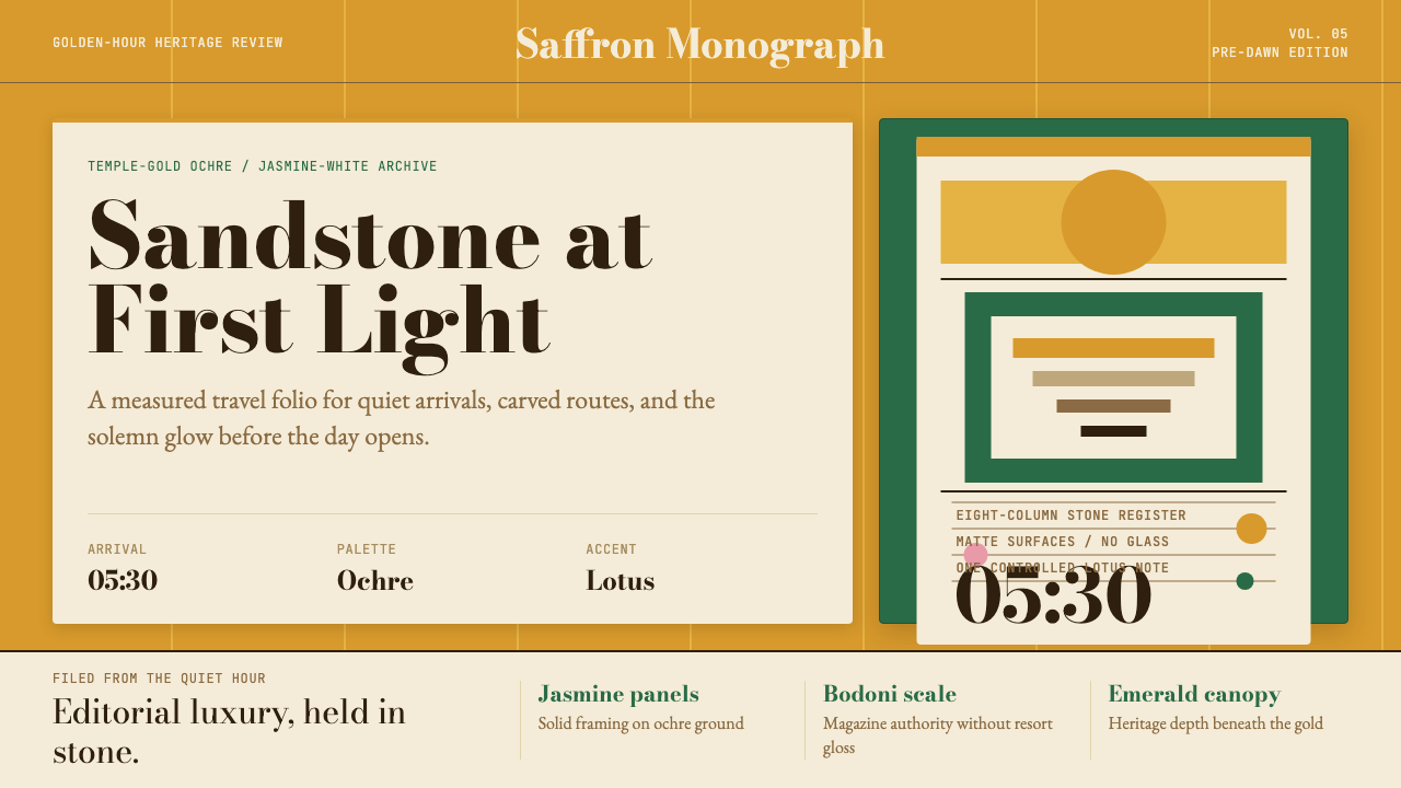 Cambodian Angkor Tourism ModernQuiet authority at dawn. Ochre ground, Bodoni serif, jasmine panels, one lotu…黎明般安静有力:赭金底、Bodoni衬线、茉莉白面板与一笔莲粉。
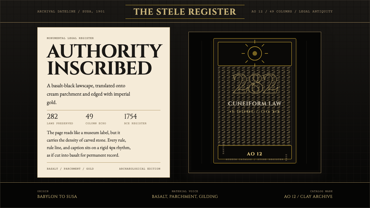 Babylonian Hammurabi SteleAuthority carved in stone. Basalt-black grids, parchment panels, and imperial…权威刻于石上。玄武岩黑底、羊皮纸面板、帝王金点缀。
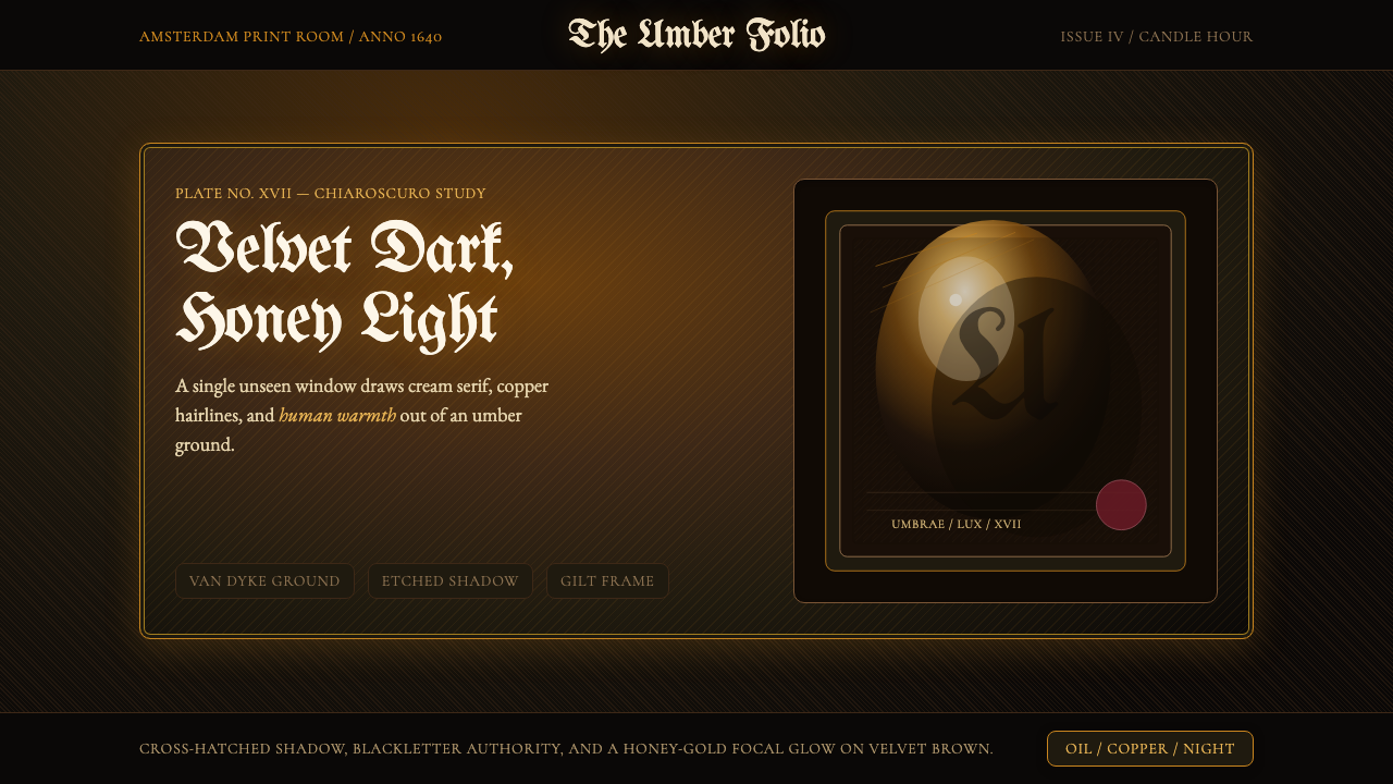 Rembrandt BaroqueDarkness becomes theatre. Honey-gold spotlight and blackletter rise from Van…黑暗成为剧场:蜂蜜金聚光与哥特黑体从范戴克棕浮现。
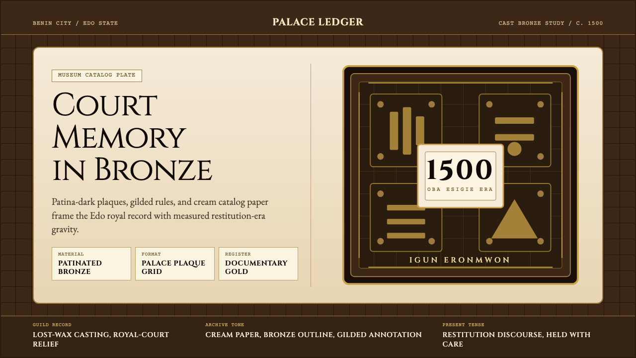 Benin Bronze (Edo, 1500)Royal memory, cast in bronze. Cream plaques and gilded lines carry museum gra…王权记忆铸于青铜。奶油牌板与鎏金线条带出图录庄重。
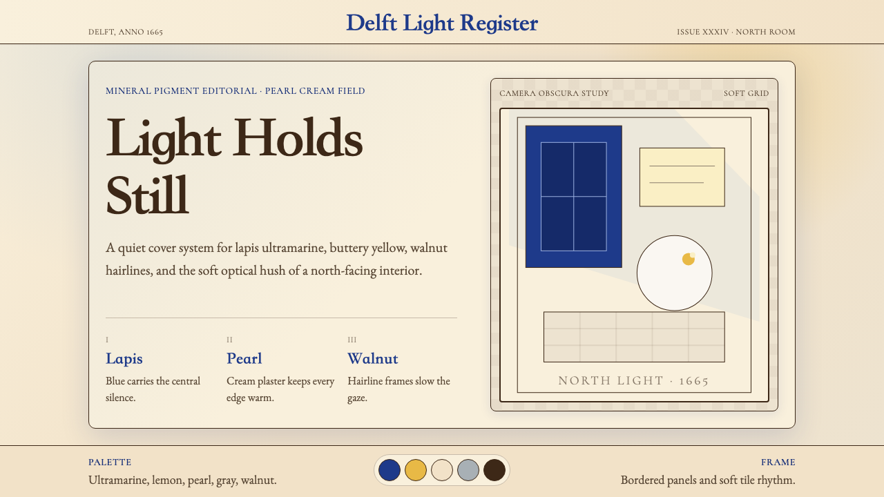 Vermeer Dutch Golden AgeStillness glows. Lapis ultramarine, pearl cream, and walnut frames hold north…静谧发光:青金石蓝、珍珠奶油与胡桃边框承住北窗光。