What is Scandinavian Hygge?
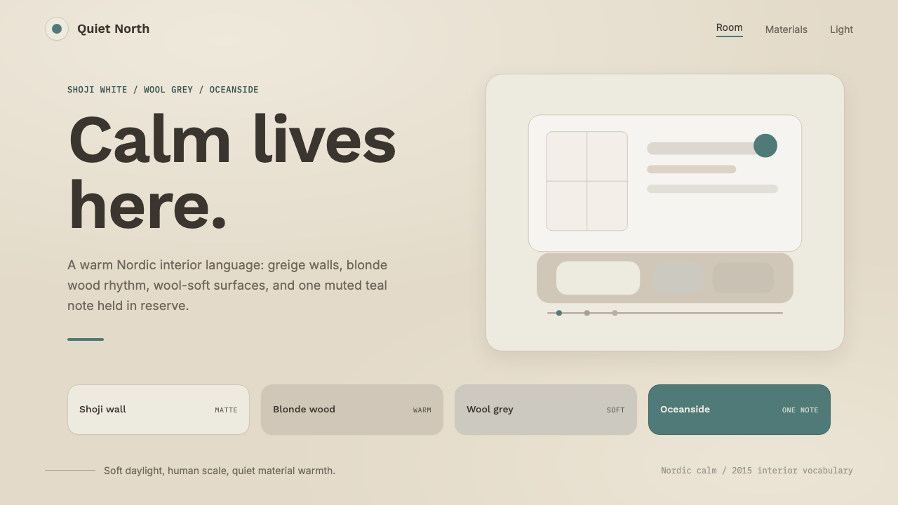
Coziness as a design brief — a warm greige room of pale wood, wool-grey textiles, and northern daylight, with exactly one muted teal note allowed to make a sound.
Scandinavian Hygge in brief
Hygge is a Danish concept usually translated as 'coziness' or 'contentment,' describing the deliberate cultivation of comfort, warmth, and togetherness in everyday domestic life — candlelight, wool blankets, simple food shared with close company, unhurried time at home. This system translates that feeling into an interior palette rather than a historical furniture style, taking its cues from the contemporary Scandinavian hygge trend that gained wide popularity outside Scandinavia through the 2010s.
The base of the room is a warm greige — walls pulled toward beige rather than a stark white — paired with pale blonde-wood flooring, soft wool-grey textiles, and the diffuse quality of northern daylight. Nothing here reads as cream, and nothing reads as clinical white; the entire ground is a quiet, grey-brown warmth borrowed directly from natural wool and untreated wood.
Against that calm base, exactly one saturated color is permitted: a muted, dusty teal, used sparingly as a single accent rather than a supporting palette. The system treats restraint itself as the point — soft matte surfaces, gentle shadows, airy and human-scaled layouts — so that the single teal note reads as a considered decision rather than an oversight.
Where does Scandinavian Hygge come from?
Hygge as a word and a lived practice long predates its global popularity — Danes have used it for generations to describe the specific comfort of gathering indoors during long, dark northern winters, wrapped in wool, lit by candles, sharing food and conversation without hurry. It is less a design style than a value system: prioritizing comfort, presence, and simplicity over status display or visual spectacle.
The word entered mainstream international vocabulary during the 2010s, as a wave of lifestyle books, magazine features, and design coverage introduced hygge to English-speaking audiences as shorthand for the broader appeal of Scandinavian domestic life — often alongside Denmark and other Nordic countries' consistent rankings in global happiness surveys, which fueled curiosity about what, specifically, made everyday Scandinavian life feel so contented.
As hygge crossed from lifestyle concept into interior design trend, it picked up a specific, recognizable palette: warm greige and taupe walls rather than the starker whites associated with earlier Scandinavian minimalism, pale wood tones, soft wool-grey textiles, and a restrained use of a single muted accent color. Major paint and design brands responded directly to this demand — Sherwin-Williams, for instance, released a dedicated Hygge color collection in 2018, formalizing the warm, grey-brown-toned palette that had emerged organically from the trend into a packaged, sellable product line.
This system belongs to that specific 2010s moment rather than to the older, more austere strain of Scandinavian design associated with mid-century modernism. Where earlier Nordic minimalism often prized cool, stark contrast, the hygge interior explicitly warms that formula — trading crisp white for greige, and pairing pale wood with soft, tactile textiles rather than sleek, hard surfaces — in service of a specifically comfort-first, rather than form-first, ideal.
What defines the Scandinavian Hygge look?
Color
A warm greige dominates walls and large surfaces — deliberately pulled toward beige rather than a stark, cool white. Pale blonde wood and soft wool-grey textiles round out the base palette, with a single muted, dusty teal held back as the only saturated accent in the entire room.
Typography
Clean, understated Nordic sans-serif letterforms carry all text, with no flourish or expressive character. Type is meant to be quiet and legible rather than a design statement in its own right, letting the warmth of the surrounding palette do the emotional work instead.
Soft Matte Surfaces
Every surface reads matte and tactile rather than glossy or reflective — wool, untreated or lightly oiled wood, and soft plaster-like textures dominate. Nothing shines or draws attention to itself; the point is a room that invites touch rather than admiration from a distance.
Gentle Shadow
Shadows throughout are soft and diffuse, echoing the quality of northern daylight filtering through a window rather than direct, hard sun. Depth is suggested gently rather than dramatized, keeping the overall mood calm rather than dynamic.
Human-Scaled Layout
Spacing is airy and generous but never grandiose — proportions stay close to what feels comfortable at human scale, echoing a lived-in room rather than a showroom or a monument. Nothing overwhelms; everything sits at a friendly, approachable size.
One Accent Rule
The muted teal accent appears sparingly and deliberately — a single detail, a single highlight — never as a supporting family of related colors. This single-accent discipline is what keeps the palette feeling calm rather than merely neutral or dull.
Who shaped Scandinavian Hygge?
Sherwin-Williams' 2018 Hygge collection formalized the warm greige-and-wool palette that had emerged organically from the hygge interior trend, packaging it as a named, sellable product line and helping cement the specific color relationships — beige-leaning walls, soft grey-brown neutrals, restrained accent color — that define this look.
How do you use Scandinavian Hygge today?
This system reads as calm, welcoming, and unhurried, so it works best wherever a brand or product wants to feel human, trustworthy, and low-pressure rather than aspirational or high-energy. Its strength is restraint — one accent color, soft matte surfaces, generous but human-scaled space — so it rewards resisting the urge to add more color or decoration.
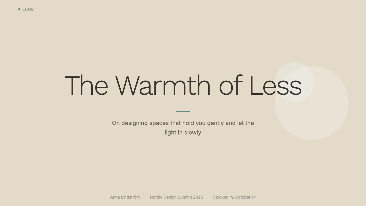
On a slide cover, a warm greige field with pale wood-toned graphic elements and a single teal detail — an underline, a small icon, a highlighted word — makes a quiet, confident opening that avoids feeling corporate or cold. Content slides work best with generous whitespace between blocks, soft rather than hard-edged dividers, and text set in clean sans-serif type without decorative flourish. Data visuals should stay muted overall, using the single teal accent only for the one number or bar that matters most, rather than a full multi-color chart palette.
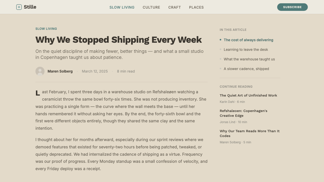
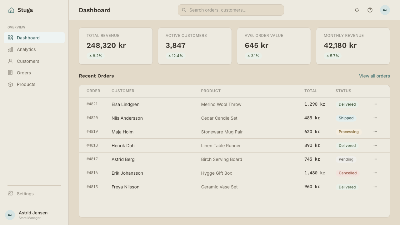
For web interfaces, this palette suits dashboards and pricing pages that want to feel approachable and low-stress rather than clinical or transactional — wellness apps, home and lifestyle products, subscription services aimed at everyday comfort. Keep greige and wool-grey as the dominant surface colors, use soft shadows rather than hard drop-shadows on cards, and reserve the teal accent for primary actions or the single most important piece of information on a screen.
In editorial and marketing work, this system suits stories about home, wellness, slow living, and everyday comfort particularly well. A full-width greige section with a single line of teal-accented text can carry a headline effectively without needing bold color or dramatic imagery to draw attention — the calm itself is the message.
A common mistake is treating hygge as an excuse to add multiple soft pastel colors throughout a layout, rather than holding to a genuinely restricted palette of greige, wool-grey, pale wood, and one muted accent. Doing so drifts the system toward generic 'soft and pretty' decoration rather than the specific, disciplined warmth this style is built on. A second mistake is using pure white instead of greige for large surfaces — a stark white breaks the warm, lived-in feeling that is the entire point of this palette.
Scandinavian Hygge — FAQ
Is hygge a design style, or something broader?
Hygge is originally a Danish concept describing a way of living — cultivating comfort, warmth, and togetherness in everyday domestic life — rather than a formal design movement. This system translates that broader value system into a specific, recognizable interior palette that gained popularity through the 2010s, but it's worth remembering that the underlying idea is about lived experience first and visual style second.
How is this different from earlier, more austere Scandinavian minimalism?
Earlier Scandinavian minimalism often prized stark white, cool contrast, and a more clinical sense of order. This hygge-derived system deliberately warms that formula — replacing stark white with a warm greige, pairing pale wood with soft rather than sleek textiles, and prioritizing tactile comfort over crisp visual precision. Both trace back to Scandinavian design values, but they land in noticeably different emotional registers.
Why only one accent color instead of a broader palette?
Because the entire feeling this system is built around — calm, unhurried contentment — depends on restraint. A single muted teal accent reads as a considered, deliberate detail precisely because it stands alone against a quiet, neutral field. Adding a second or third saturated color would compete for attention and undercut the sense of ease that is the whole point of a hygge-derived room.
What kinds of products or brands does this style suit best?
It suits wellness apps, home and lifestyle products, subscription services, and any brand that wants to feel approachable, human, and low-pressure rather than aspirational or corporate. It is a poor fit for products that need to feel urgent, high-energy, or luxurious, since the entire palette and layout logic is built around calm and comfort rather than excitement or status.
Can this palette include cream or off-white instead of greige?
The defining warmth of this system comes specifically from a grey-brown greige rather than a yellow-leaning cream — the two read quite differently. Cream tends to push a room toward a softer, sweeter feeling, while the wool-and-wood-derived greige used here stays closer to natural, undyed material tones. Substituting cream would shift the mood away from the specific, restrained warmth this style is built on.
Related design styles
 Whole Foods MarketFarmer’s-market polish. Moss green on butcher-paper cream, white cards, growe…
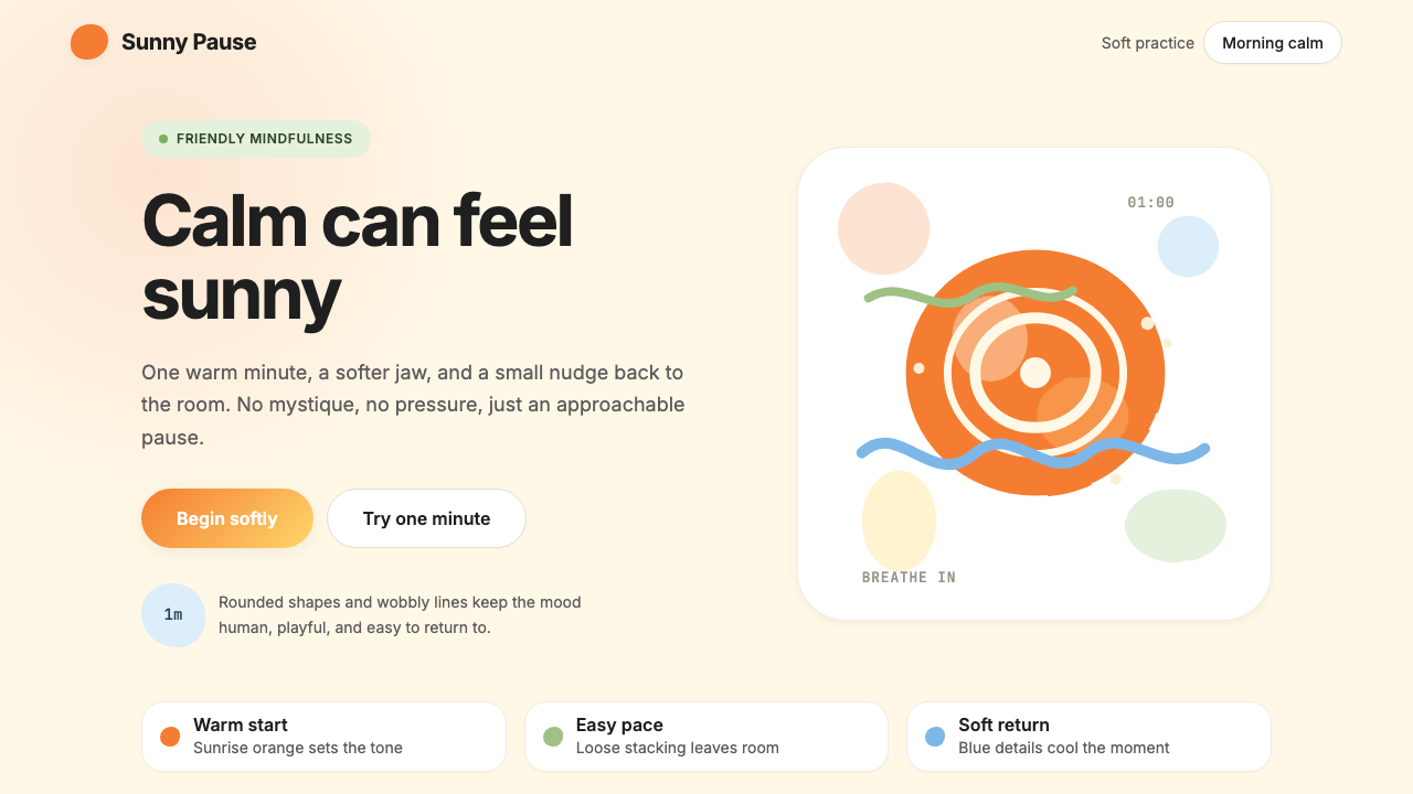 HeadspaceOptimism makes calm approachable. Sunrise orange and wobbly rounded forms bre…
 Jasper Morrison Super NormalRefuses spectacle. Matte greige ground, plain Helvetica, gentle 20px radii —…
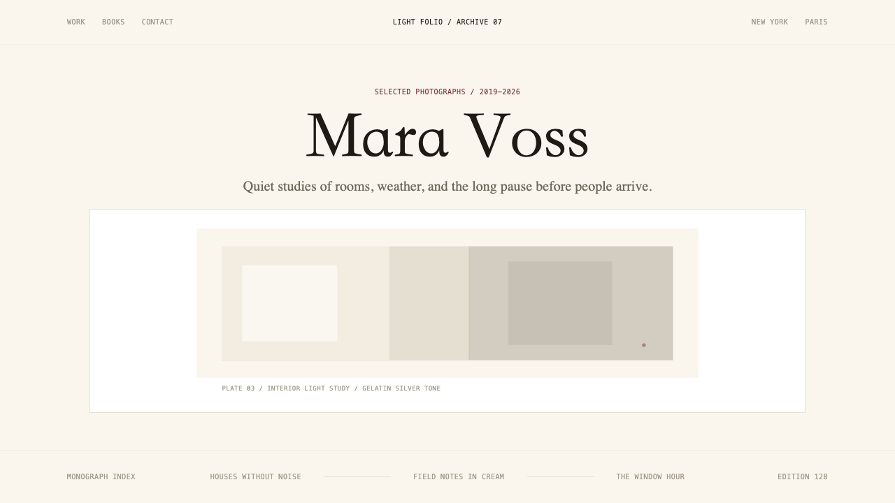 Photographer Light FolioMakes the browser a gallery wall. Warm cream, hairline serif type, and one im…
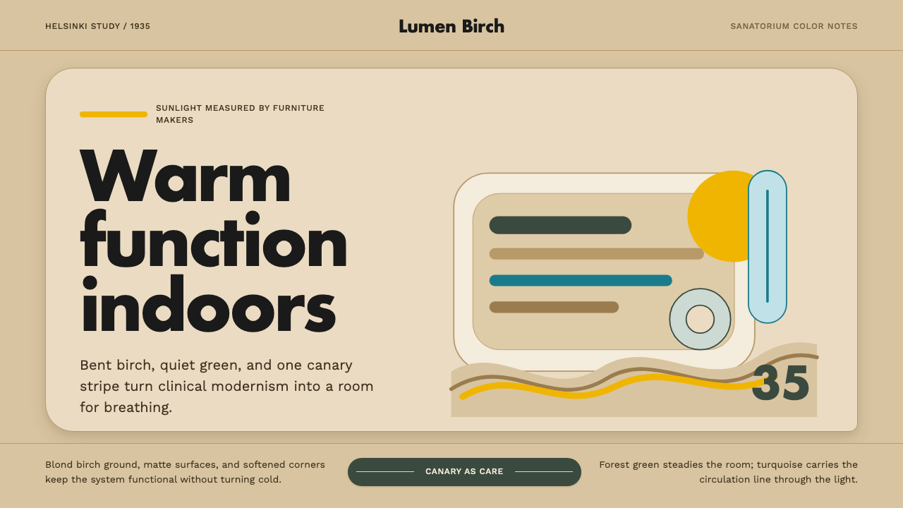 Aalto Finnish ModernModernism made humane. Birch fields, canary yellow, and soft plywood curves b…
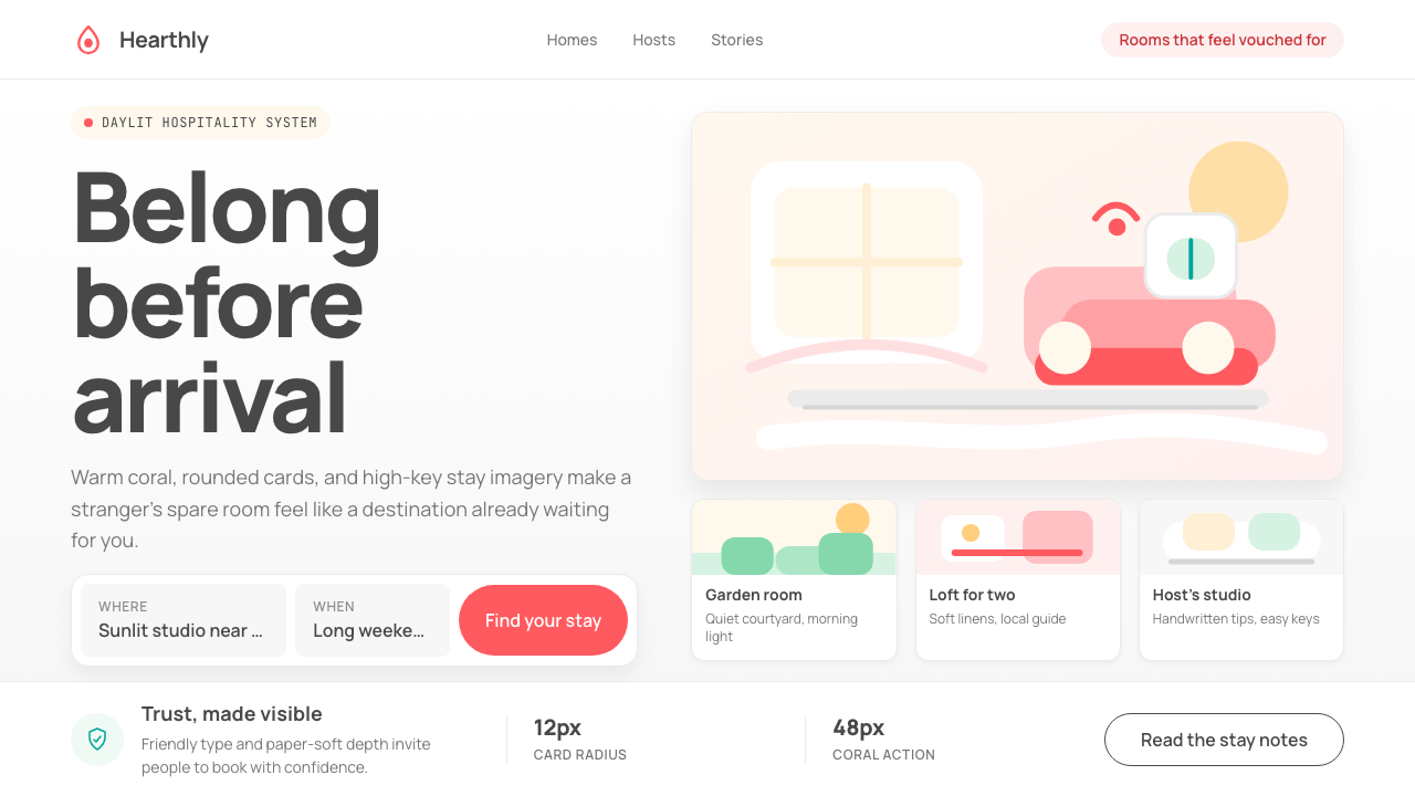 Airbnb 2014Coral red, soft pill cards, Cereal type. The Bélo wraps strangers in warm, da…