About Uruguayan Yerba Mate
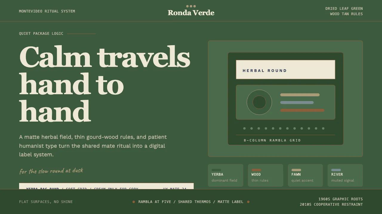
Uruguay consumes more yerba mate per capita than anywhere on earth, and its packaging brands — Canarias, Sara, Del Cebador — have distilled a visual language of herbal calm: deep dried-yerba green, wood-tan accents from the gourd and bombilla, and quiet humanist sans-serifs that never shout. This system channels that rambla-at-dusk restraint into a digital token set rooted in 1960s Montevideo modernism and the cooperative rebrand wave of the 2010s.
- Origin
- Uruguay — Montevideo
- Era
- 1960s Uruguayan modernist graphic-design roots; 2010s–2024 minimal yerba rebrand wave
- Key figures
- Tito Sequeira · Hermanos Estudio · Cooperativa Empaque Canarias · ADGU
- Movements
- Río-de-la-Plata graphic-design school · Latin American minimalist packaging · gaucho material-culture branding
Uruguayan Yerba Mate design spec
Colors
Background
Surface
Primary
Secondary
Accent
Text
Typography
RecoletaHeadings
Work SansBody
JetBrains MonoMono
Unlock for 1 credit
The other 11 sections — buttons, cards, spacing, motion, techniques and more — open once you unlock. Download the DESIGN.md or send it to your AI in one click. Unlock once, yours forever.
Sign up nowHave an account? Sign in
Styles similar to Uruguayan Yerba Mate
Also inspired by brands & products, with a close feel.
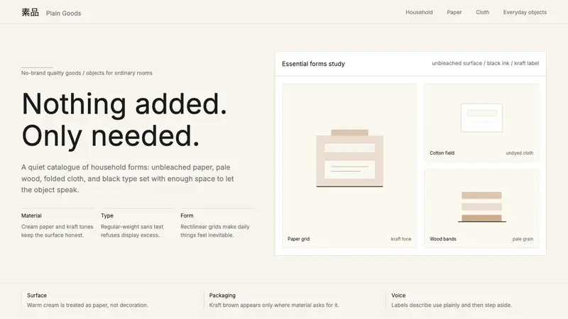 MUJIAnti-brand restraint. Cream paper, kraft brown, and regular Inter leave only essentials.
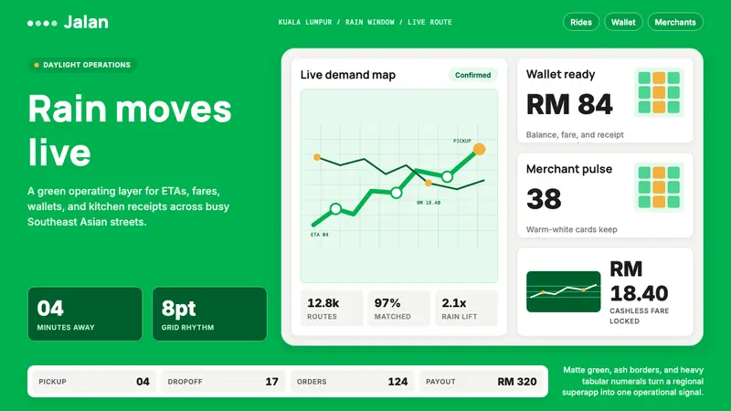 Grab SEA Superapp 2018Operational warmth. Saturated green, Inter numerals, and tight dashboard cards move the brand.
 GitLab 2023DevOps in daylight. Tanuki orange-to-purple gradient, Inter, warm enough for long-form docs.
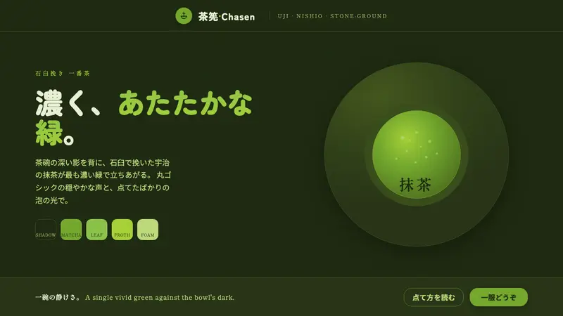 Matcha Latte Powder GreenA single vivid green at full strength. Stone-ground matcha on a dark tea-bowl shadow, rounded type.