What is Sable (Mœbius)?
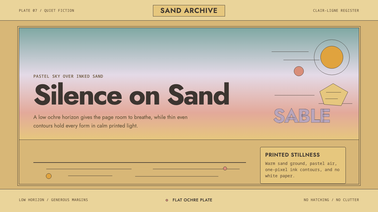
Sable is the desert of a single French cartoonist's imagination — a warm ochre plain under a pastel sky, drawn in a line so calm it barely seems to move.
Sable (Mœbius) in brief
Sable is a design language lifted from the desert science-fiction pages of Jean Giraud, the French cartoonist who signed his most visionary work as Mœbius. It is built around two of his signature albums, Arzach and The Airtight Garage, in which a mute rider on a pterodactyl-like mount glides over a barren ochre world beneath a sky rendered in colors no atlas would use for weather: pale turquoise, dusty rose, muted lilac. The style takes that palette and that quiet as its whole argument.
The visual grammar is almost entirely linear. Every form — dune, rock spire, distant machine — is described by a single, even-weight ink contour with no cross-hatching, no built-up shading, no textural noise. This is the ligne claire tradition of Franco-Belgian comics, but stripped of its usual candy-color cheerfulness and relocated to an empty, meditative landscape. Where most adventure comics fill a panel with incident, Mœbius left enormous tracts of a page nearly empty, trusting a single figure against a vast horizon to carry the emotional weight.
The result reads as calm rather than sparse. Nothing is white in this system — the ground is always warm sand and the air is always some soft, unexpected hue — so the emptiness never feels cold or unfinished. It feels inhabited by weather and light even when nothing is happening. That paradox — maximal atmosphere built from minimal incident — is the core discipline a designer borrows when working in this style.
Where does Sable (Mœbius) come from?
Jean Giraud was already an established cartoonist under his own name before Mœbius existed as a separate identity. He had made his professional name drawing Blueberry, a long-running, meticulously researched Western series scripted by Jean-Michel Charlier — realistic, dusty, historically grounded work that taught Giraud how to draw a desert with total conviction. Mœbius, the pseudonym, was reserved for something else entirely: work that abandoned realism's obligations and let the desert become a stage for pure invention.
That other identity found its home in 1975 with the launch of Métal Hurlant, a French adult science-fiction and fantasy comics magazine co-founded by Giraud alongside fellow cartoonist Philippe Druillet, writer and editor Jean-Pierre Dionnet, and publisher Bernard Farkas. Métal Hurlant existed to give European cartoonists a venue where science fiction did not have to serve a plot-driven, Anglo-American adventure formula. It could be slow, wordless, associative — closer to a dream than a story. Arzach, serialized in the magazine's first issues, was Mœbius's founding statement: a nearly silent narrative in which almost nothing needs to be explained, because the imagery itself is the content.
The Airtight Garage followed soon after, an even more freely improvised strip that Mœbius reportedly drew page by page without a fixed script, letting one image suggest the next. This working method — visual association over plotted narrative — is part of why the style feels so atmospheric rather than illustrative. The pages were not built to service a screenplay; they were built the way a piece of music is built, one phrase answering the last.
Mœbius's influence radiated far beyond the pages of Métal Hurlant. He worked directly with Alejandro Jodorowsky on the legendary unproduced Dune adaptation and later on The Incal, and he contributed concept art to Hollywood productions including Alien, Tron, and The Fifth Element. Two generations of concept artists, animators, and comic creators — in France, in the United States, and notably in Japan, where his linework left a visible mark on artists working in speculative and science-fiction comics — absorbed his particular blend of technical draftsmanship and dreamlike restraint. The desert of Arzach became, in effect, shorthand for an entire register of thoughtful, uncluttered science fiction.
What defines the Sable (Mœbius) look?
Line
The single most defining trait of this system is an even, confident contour line with no variation for pressure, no cross-hatching, and no built-up shading. Every object — a rock, a distant vehicle, a figure — is drawn as if cut from a single unbroken stroke. This is the ligne claire discipline: form is described entirely by outline, and the interior of a shape is left to flat color or nothing at all. A designer working in this system should resist the urge to add gradient fills or drop shadows to give elements weight; weight comes from the confidence of the line itself.
Palette
There is no white ground anywhere in this system — the base is always a warm ochre or sand tone, standing in for sun-baked earth, and the sky is rendered in soft, slightly unreal hues: pale turquoise, dusty rose, muted lilac. These colors never appear saturated or bright; they sit at a hushed, dusty intensity, as though filtered through desert haze. The effect is a world that feels warm underfoot and cool overhead, with the transition between the two handled as a single soft gradient band rather than a hard horizon color-block.
Space
Composition favors an enormous amount of negative space relative to incident. A single small figure against a vast horizon is the default relationship, not the exception. This is deliberate: the emptiness is not absence of content but the content itself, standing in for scale, solitude, and the slow passage of time across a desert. Crowding a layout with competing focal points is the fastest way to break the mood this style depends on.
Horizon and Scale
The horizon line is typically set low, giving the sky far more visual real estate than the ground. This inverted proportion — sky as the dominant field, ground as a narrow foreground band — is what makes the atmosphere feel monumental rather than merely empty. Any element placed near the horizon reads as impossibly distant, reinforcing scale without any need for perspective grids or converging lines.
Silence
Because the source material is a largely wordless comic, the system carries an implicit rule against visual chatter: no busy iconography, no overlapping decorative motifs, no dense information clusters. A page or screen in this style should feel like it could be read in complete silence, its meaning carried by shape and color rather than by explanatory clutter.
Texture
Surfaces are drawn flat and dry, with no glossy highlights, no wet-look reflections, and no simulated grain beyond an occasional light stipple suggesting sand. This dryness is essential to the desert reading — anything glossy or reflective would import a completely different climate into the system.
Solitary Figure
A single rider, walker, or vehicle recurs as the compositional anchor across this world — mute, self-contained, and never accompanied by a crowd. Whether applied to a poster, a cover, or an interface hero image, this style works best when it centers on one subject rather than an ensemble, preserving the sense of a lone traveler crossing an indifferent landscape.
Who shaped Sable (Mœbius)?
Giraud built his early reputation drawing Blueberry, a realistic, historically researched Western series, before adopting the pseudonym Mœbius for freer, more visionary science-fiction work. Arzach and The Airtight Garage, both created for Métal Hurlant in the mid-1970s, established the desert-and-pastel-sky visual language this system is built from. His later collaborations with Alejandro Jodorowsky and his concept-art contributions to films including Alien and The Fifth Element extended his influence well beyond comics into international visual culture.
Druillet co-founded Métal Hurlant alongside Giraud and was himself a major visual stylist of French science-fiction comics, known for dense, baroque, architecturally overwhelming imagery — a striking contrast to Mœbius's restraint. His presence at the magazine's founding underscores that Métal Hurlant was built to house a range of visionary approaches, not a single house style, with Mœbius's quiet desert work standing as one pole of that range.
Dionnet, a writer and editor, co-founded Métal Hurlant and helped shape its editorial identity as a venue where European cartoonists could pursue slow, associative, adult science fiction outside the conventions of mainstream adventure comics. Without that editorial space, Arzach's largely wordless, image-led storytelling would have had no natural home.
The Chilean-French filmmaker and writer collaborated with Mœbius on the ambitious, ultimately unproduced Dune film adaptation in the mid-1970s, and later on the graphic novel series The Incal. Though the Dune project never reached the screen, the visual concepts Mœbius developed for it circulated widely and are often cited as an influence on the science-fiction film design that followed.
How do you use Sable (Mœbius) today?
This style earns its place in a design toolkit precisely because it is built on restraint rather than ornament — which makes it unusually adaptable to modern digital formats that also reward calm, breathing layouts. The discipline is to resist filling space, not to find more things to draw.
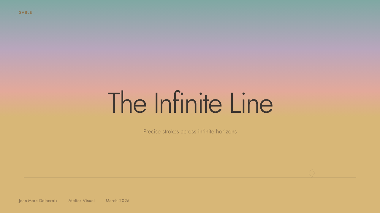
On a presentation cover slide, the style works by giving a single title or image enormous room to sit against a warm ochre-to-pastel gradient field, with a thin outlined graphic element — a shape, a simple icon, a silhouette — placed off-center rather than dead-center. Content slides should keep body copy sparse and let a low horizon-style rule or thin divider line do the organizing work that borders and boxes would do in a busier system; charts translate well as simple outlined shapes with flat, dusty fills rather than gradients or drop shadows.
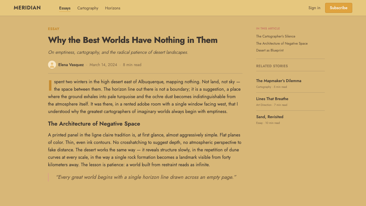
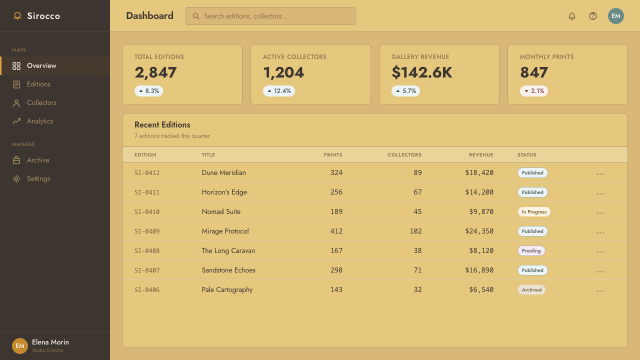
For web interfaces, the palette suits marketing and landing pages more naturally than dense dashboards, since the system's whole logic depends on generous negative space that a data-heavy interface struggles to afford. Where it does work in product UI — a quiet settings screen, an empty-state illustration, an onboarding sequence — the rule is the same: one warm ground tone, one soft sky-toned accent, thin uniform-weight linework for any illustrative element, and a conspicuous absence of drop shadows or glossy surfaces.
In editorial and marketing contexts, this style is well suited to travel, outdoor, and contemplative lifestyle brands that want to signal calm rather than urgency. A full-bleed hero image with a low horizon and a lone silhouetted figure, paired with a short line of type set well away from the image's edge, captures the tone efficiently. Pull quotes work better as plain, generously spaced text than as boxed or highlighted callouts, since boxes reintroduce the visual clutter the style is built to avoid.
A common mistake is treating this as simply a pastel color palette and applying it to a busy, conventional layout — dense navigation bars, drop-shadowed cards, saturated call-to-action buttons. None of that belongs here. The palette only reads correctly when paired with genuine restraint in composition; without the negative space, the colors alone will feel arbitrarily dusty rather than desert-like.
Sable (Mœbius) — FAQ
Is this style just "desert-themed" or is there a stricter discipline underneath?
There is a stricter discipline. Plenty of desert-themed design uses warm colors and sand textures without any of the actual rules this system depends on: an even, unshaded contour line, a low horizon, and — most importantly — a commitment to negative space over incident. A layout can use every ochre and turquoise tone correctly and still fail this style if it is cluttered, symmetrical in a busy way, or built around dense iconography. The palette is the surface; the restraint is the substance.
Can this style support a busy dashboard with lots of data?
Not comfortably. The system's whole emotional effect depends on there being far more empty space than content in any given view, and a data-dense dashboard structurally cannot offer that much room. Applying the palette to a busy dashboard usually produces a layout that looks merely muted rather than genuinely calm — the colors survive, but the atmosphere the style is named for does not. It works far better for landing pages, empty states, onboarding flows, and any screen where the content itself is meant to feel sparse and considered.
How dark or saturated can the sky colors go before it stops reading as this style?
The sky palette is defined by softness rather than by any single hue, so the key constraint is intensity, not color choice. Once turquoise, rose, or lilac become bright or fully saturated, the mood shifts from meditative desert to something closer to a vivid fantasy or synthwave register — a different style with a different emotional intent. The safest test is whether the color could plausibly be mistaken for an actual dusk or dawn sky filtered through haze; if it reads as neon or candy-bright, it has left this system.
Does this style require illustration, or can it work with photography?
The source material is entirely hand-drawn, and the defining trait — a single even ink contour with no shading — is inherently an illustrative technique that photography cannot literally reproduce. That said, photography can approximate the mood if it is heavily simplified: a desert or open landscape photograph with a low horizon, soft color grading toward pastel sky tones, and minimal detail in the frame can carry the same atmosphere even without the literal linework. The safer and more faithful route for any brand-level application is illustration or vector graphics that can genuinely reproduce the contour discipline.
Related design styles
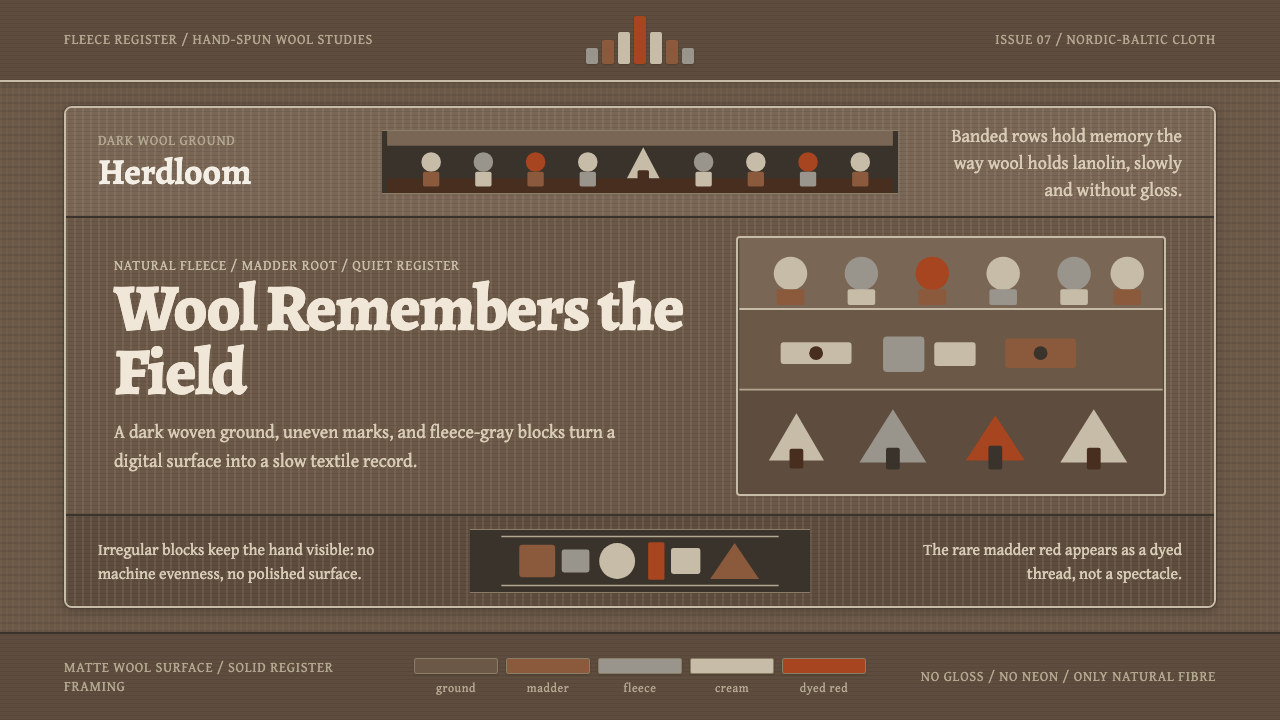 Estonian Folk Tapestry (Anu Raud)Quiet wool carries memory. Banded fleece browns and Alegreya type move like a…
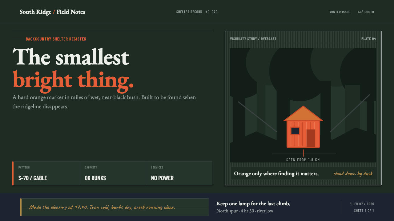 NZ Backcountry HutBuilt to be found. Survival orange cuts through a near-black beech field.
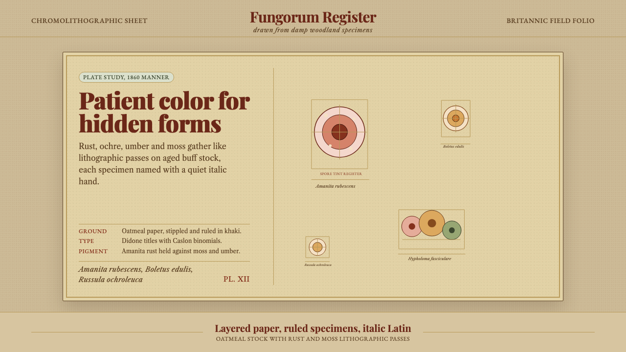 Victorian Mycology PlatePatient field science. Rust and moss specimens sit on stippled buff paper wit…
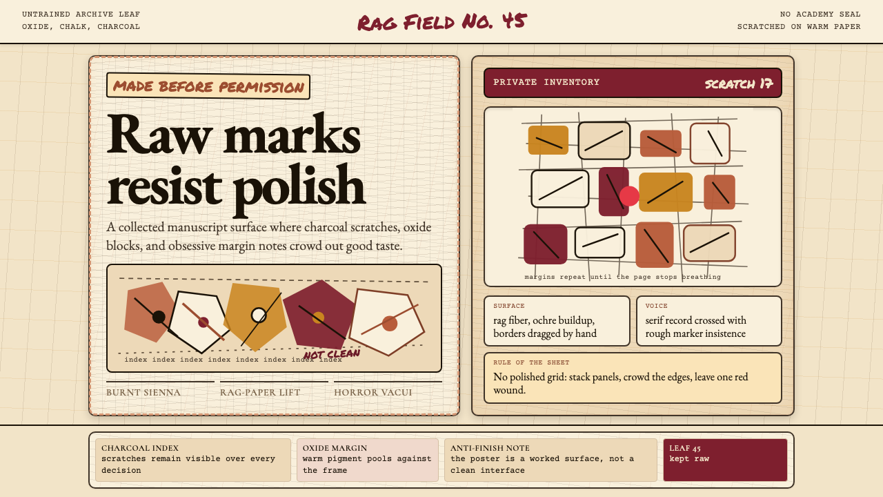 Art Brut (Dubuffet)Polish is refused. Bone-cream paper, earth pigments, scratched borders, dense…
 Chadian Toubou Saharan RouteRadical emptiness holds. Sandstone ochre, indigo serif, and one vertical mark…
 Irish Aran Island Cable KnitMaterial honesty raised in wool. Bone ground, moss ink, and cable columns cas…