Design style guide设计风格指南
What is Bengali Kantha Running Stitch?什么是 Bengali Kantha Running Stitch?
Bengali kantha is South Asia's most autobiographical textile tradition — women stitching family memory, village life, and sacred imagery directly into layered sari cloth with a simple running stitch and no pattern book.孟加拉坎塔是南亚最具自传色彩的纺织传统——妇女无需图样,仅凭记忆,用最朴素的跑针将家族故事、村庄生活与神圣图像缝进一层层叠合的纱丽布料之中。
Bengali Kantha Running Stitch in briefBengali Kantha Running Stitch 速览
Bengali kantha is a form of hand embroidery that originated among the women of Bengal — a region that today spans the Indian state of West Bengal and the nation of Bangladesh. The word kantha means simply 'patched cloth' or 'old cloth,' and the tradition grew from an entirely practical act: layering worn-out saris and wrapping cloth, then stitching them together so they would not fall apart. Over generations this humble repair work became a vehicle for artistic expression of extraordinary depth, with the running stitch evolving from a structural necessity into the primary mark-making tool of an entire visual language.孟加拉坎塔是一种手工刺绣形式,起源于孟加拉地区的女性群体——这一地区如今横跨印度的西孟加拉邦与孟加拉国。“坎塔”这个词,简单来说就是“打补丁的布”或“旧布”,这一传统由一个完全出于实用的行为发展而来:将穿旧的纱丽和包裹布叠放在一起,再将它们缝合以防散落。经过几代人的传承,这种朴素的缝补劳作演变成一种深度艺术表达的载体,跑针从结构必要性升华为整套视觉语言中最核心的造型手段。
What distinguishes kantha from other embroidery traditions is its radical informality. There are no transferred patterns, no specialist tools, no formal instruction in the manner of guild crafts. Each piece is invented by its maker, drawing on a shared visual vocabulary — fish, turtles, lotuses, the tree of life, figures from the Ramayana and Mahabharata, scenes of planting and harvest — but assembled entirely from personal memory and individual judgment. The same fish motif looks different from one maker to the next because it has been drawn in thread from the inside out, not copied from a template. This makes every finished kantha a document of its maker's hand and eye as much as a textile object.坎塔区别于其他刺绣传统之处,在于它彻底的非正式性。没有转描图样,没有专用工具,没有行会式的正规传授。每一件坎塔都由制作者自行创造,取材于一套共享的视觉词汇——鱼、龟、莲花、生命之树、来自《罗摩衍那》与《摩诃婆罗多》的人物、播种与收获的场景——但完全凭个人记忆与自身判断加以组合。同一个鱼形母题在不同制作者手中呈现出不同面貌,因为它是从内心深处用针线“画”出来的,而非从模板上临摹的。这使得每一件成品坎塔都同时是制作者手与眼的记录,而不只是一件纺织品。
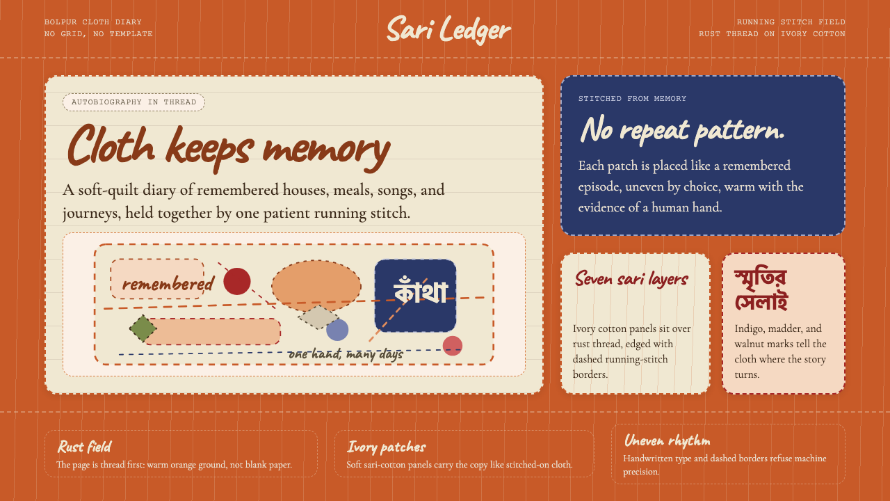
The visual result is a dense, warm, and layered surface unlike anything produced by loom or machine. The ground cloth — typically a soft ivory or natural cotton from recycled sari — shows through in the spaces between stitch lines, giving the work an organic, breathing quality. Motifs accumulate in a field-like arrangement that Western art history might call 'horror vacui' but that Kantha practitioners treat as natural abundance: the textile world, like the natural world, is full. The running stitch itself creates a subtle texture and ripple across the whole surface, so that even the background is never flat.视觉效果是一种浓郁、温暖、层次丰富的布面质地,与任何织机或机器的产物都截然不同。底布——通常是来自回收纱丽的柔软象牙色或本色棉布——在针脚线条的间隙中透出来,赋予作品一种有机的、会呼吸的品质。母题以铺陈式的布局积聚,西方艺术史或许会称之为“恐惧虚空”,而坎塔的制作者视之为自然的丰盛:纺织世界如同自然世界,本就充盈。跑针本身在整个布面上制造出细腻的纹理与波纹,使得背景也从不平坦。
See the Bengali Kantha Running Stitch design system →查看 Bengali Kantha Running Stitch 完整设计系统 →
Where does Bengali Kantha Running Stitch come from?Bengali Kantha Running Stitch 从何而来?
The earliest documented kantha quilts date to the sixteenth century, though the practice almost certainly predates written records. Historical sources from the Mughal period mention layered quilted textiles from Bengal, and references to kantha-like objects appear in Bengali devotional literature from the medieval era. The tradition developed in a specific material context: Bengal was one of the most important cotton and silk weaving regions in the pre-colonial world, and worn cloth had accumulated meaning as well as practical value. Recycling cloth — particularly cloth that had touched the body through daily life and ritual — was an act of conservation that also preserved the cloth's accumulated sanctity.现存最早有文献记录的坎塔棉被可追溯至十六世纪,但这一传统几乎可以确定早于文字记录。莫卧儿时代的史料提到了来自孟加拉的多层缝绗纺织品,而类似坎塔的物件也出现在中世纪孟加拉虔诚文学中。这一传统在特定的物质背景下发展而来:前殖民时代的孟加拉是世界上最重要的棉纺织和丝绸织造中心之一,旧布料积累了意义,也拥有实用价值。循环利用布料——尤其是在日常生活与仪式中贴身使用过的布料——是一种保存行为,同时也保留了布料所积蓄的神圣性。
The geographic heartland of kantha in India is Birbhum, Bolpur, and Murshidabad districts of West Bengal, with important parallel traditions in the Jessore and Rajshahi districts of Bangladesh. These regions share a similar agricultural economy, a syncretic religious culture blending Hindu and Muslim practices, and a dense tradition of folk arts including song, dance, and narrative painting. Kantha emerged as the women's counterpart to these other traditions — an art form practiced in domestic space, during leisure hours, by women who were not classified as professional artists and who left behind no individual signatures on their work. Attribution in historical kanthas is almost always by region and approximate era rather than by named maker.坎塔在印度境内的地理核心地带是西孟加拉邦的比尔布姆、博尔布尔与穆尔希达巴德地区,孟加拉国的杰索尔与拉杰沙希地区也有重要的平行传统。这些地区有着相似的农业经济、融合印度教与伊斯兰实践的混合宗教文化,以及包括歌曲、舞蹈和叙事绘画在内的浓厚民间艺术传统。坎塔作为这些传统的女性对应物而出现——这是一种在家庭空间、在闲暇时光中进行的艺术形式,由那些不被归类为职业艺术家、也未在作品上留下个人署名的女性从事。历史坎塔的归属几乎总是按地区与大致年代,而非具名制作者。
The Santiniketan revival, beginning in the early twentieth century and associated with the circle around Rabindranath Tagore, brought kantha from domestic obscurity into the consciousness of the Bengal cultural renaissance. Tagore himself was interested in folk and craft traditions as living alternatives to both colonial culture and Westernized modernity. His collaborators and students began collecting kanthas, writing about them, and encouraging their production as conscious art rather than anonymous craft. The scholar and art historian Stella Kramrisch produced some of the first rigorous scholarly documentation of kantha in the 1930s, establishing it as a subject for serious study and drawing international attention to the tradition.二十世纪初开始的圣地尼科坦复兴运动,与拉宾德拉纳特·泰戈尔周围的文化圈相关联,将坎塔从家庭的隐秘之处带入了孟加拉文化复兴的公共意识。泰戈尔本人对民间与工艺传统抱有浓厚兴趣,将其视为殖民文化与西化现代性之外的活态替代方案。他的合作者与学生开始收藏坎塔、撰写相关文章,并鼓励将其生产视为有意识的艺术而非匿名手艺。学者与艺术史家斯特拉·克拉姆里什在1930年代完成了关于坎塔的首批严谨学术记录,确立了其作为严肃研究课题的地位,并将这一传统引入了国际视野。
The partition of Bengal in 1947 — and then the liberation of Bangladesh in 1971 — disrupted but ultimately did not destroy the tradition. Kanthas crossed the new borders in refugee bundles, and communities on both sides of the partition line continued to make them. In the 1980s and 1990s, a significant contemporary revival took place in Bangladesh, driven partly by development organizations that recognized kantha as a sustainable livelihood for rural women. Shamlu Dudeja's Crafts Council of West Bengal and parallel organizations in Dhaka worked to bring kantha makers into contact with urban and international markets, a process that generated both economic opportunity and debates about authenticity, commercialization, and the relationship between individual creative expression and market demand.1947年孟加拉的分治——以及随后1971年孟加拉国的独立——打乱但最终未能摧毁这一传统。坎塔跟随难民的包裹越过新边界,分治线两侧的社区继续制作。1980至90年代,孟加拉国迎来了一场重要的当代复兴,这在一定程度上由认识到坎塔可为农村妇女提供可持续生计的发展机构所推动。沙姆卢·杜德贾领导的西孟加拉邦工艺委员会,以及达卡的平行组织,致力于将坎塔制作者引入城市与国际市场,这一过程既创造了经济机遇,也引发了关于真实性、商业化,以及个人创造表达与市场需求之间关系的持续讨论。
What defines the Bengali Kantha Running Stitch look?Bengali Kantha Running Stitch 的视觉特征是什么?
The Running Stitch as Mark跑针作为造型手段
The kantha running stitch is the single technique on which the entire visual language rests. It is not an outline stitch, not a fill stitch, and not a couching technique — it is a continuous in-and-out movement through layered cloth that simultaneously holds the layers together and draws the image. The stitch travels in lines that may be straight, curved, or wave-like depending on what is being depicted. In background areas, horizontal rows of running stitch create a rippled texture across the entire cloth surface. In figural areas, the stitches follow the contours of the motif, describing form from the inside rather than tracing an outline. The visual effect is one of animated energy: the surface shimmers slightly because cloth puckers gently between stitch lines.坎塔跑针是整套视觉语言赖以成立的唯一技法。它既非轮廓针,也非填充针,更非贴线绣——而是一种穿越层叠布料的连续上下运动,同时完成固定布层与描绘图像两项任务。针脚沿着或直或弯或波浪形的线条行进,具体形态取决于所描绘的对象。在背景区域,横向排列的跑针行列在整个布面上制造出波纹般的质感。在图形区域,针脚沿母题轮廓移动,从内部塑造形态而非描摹外廓。视觉效果充满流动的能量:布料在针脚之间轻微起皱,使布面微微闪烁。
Color from Thread来自丝线的色彩
Traditional kantha color comes entirely from thread drawn from the borders of the saris being recycled. Bengali saris characteristically have bright-colored borders — saffron orange, rust red, deep indigo, peacock green — while their body is cream or natural white. When the border threads are unraveled and used for embroidery, the palette is automatically anchored to those warm, saturated accent tones set against a cool neutral ground. Rust orange and terracotta dominate in much historical kantha work, with accents of deep blue-green and occasional yellow or vermilion. Contemporary kantha may use commercially purchased thread in a wider range of colors, but the traditional palette reads as warm, folk, and organically saturated — not pastel, not primary, and not corporate.传统坎塔的色彩完全来自从回收纱丽边缘拆解出的纱线。孟加拉纱丽的边缘具有标志性的鲜亮色彩——藏红花橙、铁锈红、深靛蓝、孔雀绿——而主体布料则是奶油色或本色白。当边缘纱线被拆下用于刺绣时,色板便自然而然地锚定在那些温暖、饱和的强调色调上,与冷调中性底布形成对比。铁锈橙与赭红在历史坎塔作品中占主导,辅以深蓝绿色点缀,偶有明黄或朱砂红出现。当代坎塔可能使用市售丝线,色彩范围更宽,但传统色板读来是温暖的、民间的、有机饱和的——既非粉彩,也非三原色,更非企业调色板。
Folk Figuration民间图像志
Kantha figures are not naturalistic representations but schematic folk symbols with immediate cultural legibility. Fish — the most universal motif — are drawn with a single continuous line suggesting body and tail, sometimes with geometric scale patterns filling the form. Lotuses are depicted in strict frontality, their petals arranged as a formal diagram rather than a botanical observation. Human figures are flat, frontal, and proportioned according to symbolic logic rather than anatomical accuracy: heads may be large to convey importance, limbs simplified to geometric sticks, costumes indicated by a few key marks. Elephants, horses, palanquins, and scenes of royal procession appear in kanthas made for wedding and ceremonial use. Religious scenes — Krishna dancing, the goddess Durga arrayed with weapons, scenes from the life of the Buddha — are rendered in the same flattened, intimate style, making the sacred feel domestic and the domestic feel sacred.坎塔图像并非写实再现,而是具有直接文化可读性的图式化民间符号。鱼——最普遍的母题——用一条连续线条描绘出躯体与尾部,有时以几何鳞纹填充形态。莲花以严格的正面角度呈现,花瓣排列如一张形式图解,而非植物学观察。人物形象扁平、正视、按象征逻辑而非解剖准确度比例:头部可能偏大以传达重要性,四肢简化为几何线条,服饰以少数关键标记指示。象、马、轿子和皇室仪仗场景出现在为婚礼与仪式场合制作的坎塔中。宗教场景——克里希纳起舞、女神杜尔迦持武器的形象、佛陀生平——以同样扁平、亲密的风格呈现,使神圣显得日常,使日常弥漫神圣气息。
Asymmetric Narrative Layout非对称叙事布局
Kantha composition does not observe a single organizing axis or a formal border-and-field hierarchy of the type common in court embroidery traditions. Instead, the surface is populated through accumulation: a central motif — often a lotus medallion or a tree of life — anchors the middle, and surrounding space is filled with secondary figures, narrative scenes, and decorative fills that obey their own internal logic. Borders, when they appear, are typically running stitch lines in alternating colors rather than elaborate woven edges. The overall effect is not chaotic but conversational: different parts of the textile speak to each other across the surface, and the eye travels without a prescribed route. Some kanthas read as pure pattern fields; others as compressed narrative sequences where multiple stories unfold simultaneously in different registers of the cloth.坎塔的构图不遵循单一组织轴线,也不遵循宫廷刺绣传统中常见的正式边框与内核层级关系。相反,布面通过积聚来填充:一个中心母题——通常是莲花圆形图案或生命之树——锚定中央,周围空间则由次级人物、叙事场景和装饰填充所占据,各自遵循内在逻辑。当边框出现时,通常是以交替色彩的跑针线条,而非繁复的编织边缘。整体效果并不混乱,而是对话式的:纺织品的不同部分跨越布面相互呼应,视线游走时没有预设路线。某些坎塔读来是纯粹的图案铺陈;另一些则是压缩的叙事序列,多个故事在布料的不同层次上同时展开。
Layered Ground and Texture叠层底布与织物质感
The substrate of kantha is itself a composite object. Multiple layers of worn sari cloth — sometimes three, sometimes as many as seven — are aligned and secured before embroidery begins. The number of layers affects the weight, warmth, and drape of the finished piece. Because the cloth has been washed many times, it has a softness and suppleness that new cotton lacks. The running stitch not only secures these layers but draws them slightly together, creating a gentle quilted puckering across the entire surface. This puckering is not a flaw to be corrected but a defining quality of the kantha aesthetic: it signals handmade origin and gives the textile a dimensional quality that flatly-woven fabric cannot replicate. In design applications, this quality is evoked through the use of rough, slightly irregular textures and the deliberate avoidance of smooth, machined surfaces.坎塔的底布本身就是一个复合物件。多层穿旧的纱丽布料——有时三层,有时多达七层——在刺绣开始前被对齐固定。层数影响成品的重量、保暖性和垂坠感。由于布料已多次洗涤,具有新棉布所没有的柔软与韧性。跑针不仅固定这些层次,还将它们轻微拉近,在整个布面上制造出温和的绗缝起皱效果。这种起皱并非需要纠正的缺陷,而是坎塔美学的核心品质:它标志着手工来源,赋予纺织品一种机织布料无法复制的立体感。在设计应用中,这种品质通过使用粗糙、略显不规则的质感,以及刻意回避光滑机制表面来唤起。
Hand-Drawn Letterform Quality手绘字形品质
Where text appears in kantha — in dedications, prayers, or as part of narrative scenes — it is stitched freehand without guidelines, producing letterforms that slant, wobble, and vary in spacing in ways that no typeface can fully simulate. This quality has become part of the broader kantha aesthetic vocabulary in contemporary design applications: type that mimics the looseness of handwriting, with variable baseline and stroke weight, signals the same intimacy and personal authorship that characterizes the textile tradition. The visual effect is not sloppy but warmly imprecise — evidence of a human hand making individual decisions at each moment of execution.当文字出现在坎塔中——作为题词、祈祷词或叙事场景的组成部分——它是在没有辅助线的情况下徒手缝绣的,产生倾斜、摇摆、间距参差的字形,这是任何字体都无法完全模拟的效果。这种品质已成为当代设计应用中更广泛的坎塔美学词汇的一部分:模仿手写松散感的字体,带有可变基线与笔画粗细,传递出与纺织传统相同的亲密感和个人作者性。视觉效果并不潦草,而是温暖地不精确——是人手在每个执行时刻做出个别决定的证据。
Sacred and Domestic Intertwined神圣与日常的交织
Kantha objects occupy multiple registers simultaneously: a quilt is a useful object that keeps a child warm, a record of the maker's life and skill, a gift that carries devotional intent, and a depository of sacred imagery. This multiplicity is not a contradiction to be resolved but a feature of the tradition's cultural logic. The same textile may include a representation of a deity and a scene of market life and a decorative fish border, not because the maker was confused about categories but because in the world view from which kantha grows, these categories are not in opposition. Design applications that draw on this tradition work best when they embrace similar multiplicity: warmth and narrative, the decorative and the meaningful, the formal and the handmade, coexisting in the same surface.坎塔物件同时占据多个层次:一条棉被是让孩子保暖的实用物品,是制作者生命与技艺的记录,是承载虔诚意图的礼物,也是神圣图像的储存器。这种多重性并非需要化解的矛盾,而是这一传统文化逻辑的特征。同一件纺织品可能同时包含神明形象、市井生活场景和装饰性鱼形边框,并非因为制作者在概念上感到混乱,而是因为在坎塔生长的世界观中,这些范畴本不对立。从这一传统汲取灵感的设计应用,在拥抱类似多重性时效果最佳:温暖与叙事、装饰性与意义感、正式与手作,在同一表面上共存。
See the Bengali Kantha Running Stitch design system →查看 Bengali Kantha Running Stitch 完整设计系统 →
Who shaped Bengali Kantha Running Stitch?谁塑造了 Bengali Kantha Running Stitch?
A master kantha maker from Birbhum district in West Bengal, Pratima Devi became one of the most celebrated practitioners of the tradition in the twentieth century. Her work was distinguished by exceptional stitch density, an elaborate compositional vision that could encompass dozens of narrative episodes within a single textile, and an ability to maintain visual coherence across a complex and crowded surface. Her pieces entered museum collections in India and abroad and helped establish kantha as a serious subject for curatorial attention rather than simply a category of folk craft.普拉蒂玛·黛维是西孟加拉邦比尔布姆地区的坎塔制作大师,她成为二十世纪这一传统中最受推崇的从业者之一。她的作品以极高的针脚密度、能在一件纺织品中涵盖数十个叙事片段的宏大构图视野,以及在复杂繁密的布面上维持视觉连贯性的能力而著称。她的作品进入了印度及海外的博物馆收藏,帮助将坎塔确立为值得策展关注的严肃课题,而不仅仅是民间工艺的一个品类。
Shamlu Dudeja was the founder of the Crafts Council of West Bengal and one of the most influential figures in bringing kantha to national and international recognition in the late twentieth century. Her organizational work connected rural kantha makers with urban collectors, exhibition venues, and export markets, creating sustainable economic pathways that allowed the tradition to continue. Her approach was careful to balance market adaptation with preservation of the tradition's expressive freedom: she resisted standardization and instead encouraged makers to continue working from personal vision rather than market templates.沙姆卢·杜德贾是西孟加拉邦工艺委员会的创始人,也是二十世纪末推动坎塔获得国家与国际认可的最具影响力的人物之一。她的组织工作将农村坎塔制作者与城市收藏家、展览场所和出口市场联系起来,创造了让这一传统得以延续的可持续经济路径。她的方式谨慎地平衡市场适应与传统表达自由的保护:她抵制标准化,转而鼓励制作者继续从个人视角而非市场模板出发进行创作。
Stella Kramrisch was an Austrian-born art historian who spent decades in India and became one of the foundational scholars of Indian art in the twentieth century. Her essay on kantha, published in the Journal of the Indian Society of Oriental Art in 1939, was the first rigorous scholarly treatment of the tradition in English and remains a key reference document. Kramrisch situated kantha within the larger context of Bengali folk art and ritual practice, demonstrating that it was a systematic visual tradition with its own iconographic rules and symbolic depth rather than a naive or accidental form of decoration.斯特拉·克拉姆里什是一位奥地利裔艺术史家,曾在印度生活数十年,成为二十世纪印度艺术的奠基性学者之一。她于1939年发表在《印度东方艺术学会期刊》上的坎塔研究论文,是英语世界对这一传统的首次严谨学术论述,至今仍是重要的参考文献。克拉姆里什将坎塔置于孟加拉民间艺术与仪式实践的更广泛背景中加以定位,论证它是一种具有自身图像志规则与象征深度的系统性视觉传统,而非朴素的或偶然的装饰形式。
Niaz Zaman is a Bangladeshi scholar and writer whose book The Art of Kantha Embroidery, first published in 1981, provided the most comprehensive documentation of the tradition from the Bangladeshi perspective up to that point. Zaman's work was particularly important for establishing the significance of the Bangladeshi kantha tradition alongside its West Bengali counterpart, demonstrating that the practice had developed distinct regional characteristics in terms of motif vocabulary, compositional organization, and use of color. Her research drew on fieldwork with active kantha makers and provided the scholarly foundation for subsequent revival and documentation efforts in Bangladesh.尼亚兹·扎曼是一位孟加拉国学者与作家,她于1981年首次出版的《坎塔刺绣艺术》一书,从孟加拉国视角对这一传统提供了迄今最为全面的记录。扎曼的工作对于确立孟加拉国坎塔传统与西孟加拉邦对应传统并驾齐驱的重要性尤为关键,论证这一实践在母题词汇、构图组织与色彩使用方面已发展出独特的地区特征。她的研究建立在对活跃坎塔制作者的田野调查之上,为孟加拉国后续的复兴与记录工作提供了学术基础。
Tagore's relationship to kantha was indirect but historically significant. As the animating intelligence of the Santiniketan cultural project — the school and ashram he founded near Bolpur in Birbhum district — Tagore created an institutional environment where Bengali folk arts were treated as aesthetically serious and culturally vital. His explicit interest in rural craft traditions and his critique of colonial cultural hierarchies that devalued non-Western and non-elite art forms made Santiniketan a place where kantha could be appreciated, collected, and eventually studied. The Santiniketan revival of kantha in the early twentieth century was inseparable from the broader cultural politics that Tagore represented.泰戈尔与坎塔的关系是间接的,但在历史上具有重要意义。作为圣地尼科坦文化项目的精神核心——他在比尔布姆地区博尔布尔附近创办的学校与修行院——泰戈尔营造了一种将孟加拉民间艺术视为在美学上严肃、在文化上重要的机构氛围。他对农村工艺传统的明确兴趣,以及他对贬低非西方、非精英艺术形式的殖民文化等级制度的批判,使圣地尼科坦成为坎塔得以被欣赏、收藏并最终被研究的地方。二十世纪初圣地尼科坦对坎塔的复兴,与泰戈尔所代表的更广泛文化政治是不可分割的。
How do you use Bengali Kantha Running Stitch today?今天怎么用 Bengali Kantha Running Stitch?
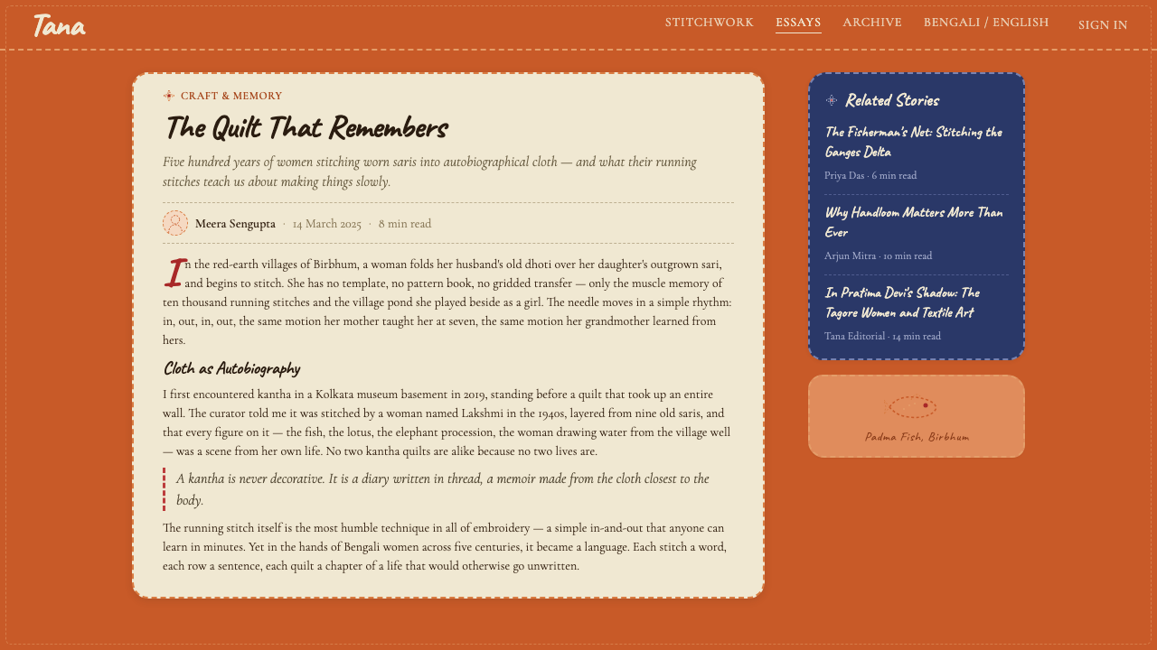
The kantha aesthetic translates into contemporary design contexts most successfully when treated as a philosophy of warmth, accumulation, and personal storytelling rather than as a surface pattern to be applied. The three defining qualities — hand-drawn line quality, warm organic color, and field-like compositional abundance — each require deliberate translation decisions that preserve the spirit without literally copying textile technique.坎塔美学最成功地转化为当代设计语境的方式,是将其视为一种关于温暖、积聚与个人叙事的哲学,而非一种可以直接套用的表面图案。三个核心品质——手绘线条质感、温暖有机的色彩,以及铺陈式的构图丰盛感——每一项都需要经过深思熟虑的转化决策,以在不字面复制纺织技法的前提下保留其精神。
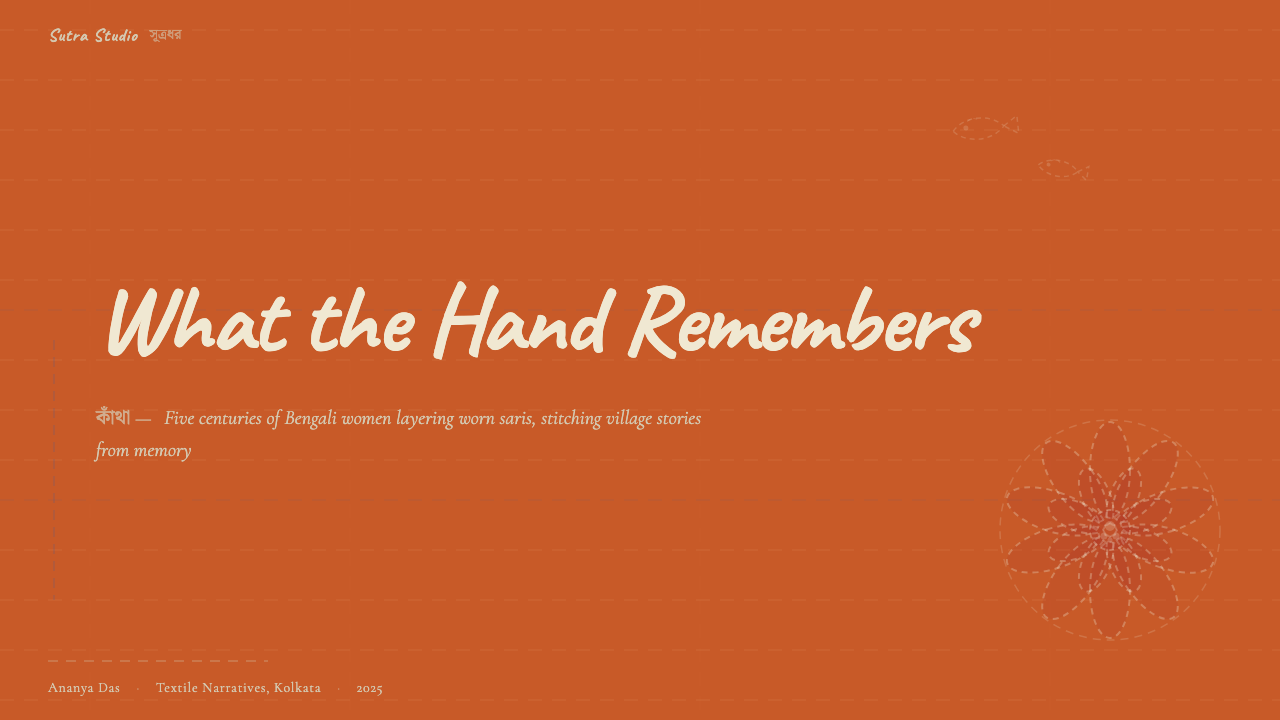
For presentation slides, kantha works best as a storytelling framework. Cover slides benefit from a centered composition with an organic, hand-drawn focal element — a lotus form, a stylized tree, or a folk figure — set against a warm cream or natural ground. The composition should feel slightly asymmetric and human-scaled rather than mechanically centered. Content slides work well with a warm background, generous white space, and typographic choices that lean toward handwritten or semi-casual letterforms rather than crisp geometric sans-serifs. Data slides can use the kantha color vocabulary — rust, terracotta, deep teal — applied to chart elements, with textured or slightly irregular fills that soften the mechanical precision of standard chart software. The overall emotional register should be intimate and narrative rather than authoritative and conclusive.对于演示文稿,坎塔最适合作为叙事框架使用。封面页受益于以有机、手绘焦点元素居中的构图——莲花形态、程式化的树,或民间人物——置于温暖的奶油色或本色底面上。构图应感觉略显不对称、人性化,而非机械地居中。内容页在温暖背景、充裕留白,以及偏向手写或半随意字形(而非清晰几何无衬线体)的字体选择下效果良好。数据页可以使用坎塔色彩词汇——铁锈橙、赭红、深青色——应用于图表元素,使用有质感或略显不规则的填充来软化标准图表软件的机械精度。整体情感基调应是亲密的、叙事性的,而非权威的、结论性的。
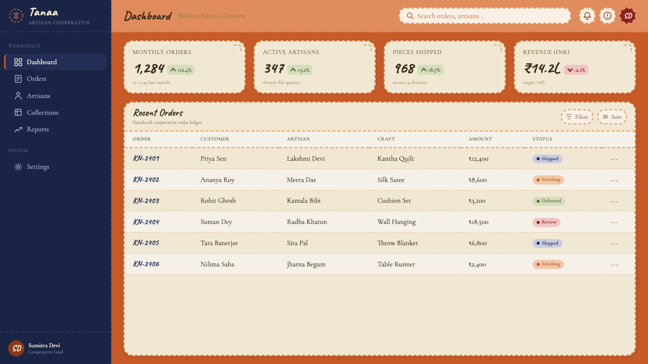
For web interfaces, kantha is most appropriate for contexts where warmth, cultural authenticity, and handmade quality are valued product attributes — artisan marketplaces, craft education platforms, cultural heritage organizations, wellness brands with a traditional rather than clinical orientation. A kantha-influenced dashboard might use warm off-white backgrounds, rust or terracotta as the primary interactive color, hand-drawn or semi-casual typography for headers, and card components with soft, irregular borders that suggest fabric rather than hard-edged screens. Navigation should feel unhurried and conversational. Iconography, if used at all, should be folk-style line drawings rather than geometric or system icons.对于网页界面,坎塔最适合那些将温暖感、文化真实性与手作品质视为有价值产品属性的场景——手工艺品市场、工艺教育平台、文化遗产机构、具有传统而非临床导向的健康品牌。受坎塔影响的仪表板可能使用温暖的米白色背景,以铁锈橙或赭红作为主要交互色,标题使用手写或半随意字体,卡片组件带有柔软、略显不规则的边缘,令人联想到布料而非硬边屏幕。导航应感觉从容不迫、对话式。图标(如果使用的话)应是民间风格的线条插图,而非几何或系统图标。
For editorial and marketing work, the kantha aesthetic supports rich, layered layouts that reward slow reading. A feature article layout might use a full-width textured header in warm tones, body text set in a comfortable measure with generous line height, and pull quotes or marginal notes rendered in a handwritten or irregular typeface. Marketing pages can use the kantha approach to visual abundance — repeating motifs at multiple scales, layering color and texture — but must manage the risk of visual clutter by maintaining clear reading hierarchy and ensuring that the hand-drawn warmth serves the message rather than competing with it. The tradition's dual register — sacred and domestic, formal and folk — makes it particularly effective for brands that want to communicate both quality and approachability.对于编辑和营销内容,坎塔美学支持奖励慢读的丰富、层次感强的版面。一篇特稿版面可能使用温暖色调的全宽纹理标题区域,正文以舒适的行宽与充裕的行高排版,引用语或页边注释以手写或不规则字体呈现。营销页面可以运用坎塔式的视觉丰盛——在多个尺度上重复母题、叠加色彩与质感——但必须通过保持清晰的阅读层级并确保手绘温度服务于信息而非与之竞争,来管控视觉杂乱的风险。这一传统的双重层次——神圣与日常、正式与民间——使其对那些希望同时传达品质与亲和力的品牌尤为有效。
The most common mistake when working with kantha-inspired design is substituting superficial textile texture — noise overlays, rough paper filters, scan effects — for genuine compositional and chromatic thinking. Applying a grain filter to an otherwise standard layout does not produce a kantha-informed design; it produces a standard layout with dirt on it. The tradition's authentic qualities — warmth, accumulation, hand-drawn energy, the sense that every mark is a deliberate act — must be built into the compositional logic from the start. A second frequent error is overextending the palette: kantha's warmth comes from the discipline of a few saturated accent tones against a neutral ground, not from attempting to include all possible warm hues simultaneously.在使用受坎塔启发的设计时,最常见的错误是用表面的纺织质感——噪点叠加、粗糙纸张滤镜、扫描效果——来替代真正的构图与色彩思考。在一个其他方面都标准的版面上叠加颗粒滤镜,并不能产生一个受坎塔启发的设计;它产生的只是一个有灰尘的标准版面。这一传统的真实品质——温暖、积聚、手绘能量、每个标记都是深思熟虑的行为的感觉——必须从一开始就融入构图逻辑。第二个常见错误是过度扩展色板:坎塔的温暖来自于在中性底面上使用几种饱和强调色的自律,而非试图同时纳入所有可能的暖色调。
A common mistake specific to digital kantha applications is treating the aesthetic as exclusively suitable for ethnic or heritage branding contexts. The tradition's core qualities — narrative warmth, layered depth, visible human craft — are applicable across a much wider range of product categories: children's educational software, independent publishing platforms, small-scale food and hospitality brands, personal portfolio sites, and any context where the product proposition depends on human connection rather than technological authority. The limitation is symmetrical: kantha does not work well in contexts requiring clinical precision, corporate authority, or the suggestion of industrial scale.
See the Bengali Kantha Running Stitch design system →查看 Bengali Kantha Running Stitch 完整设计系统 →
Bengali Kantha Running Stitch — FAQBengali Kantha Running Stitch · 常见问题
What is the difference between kantha and quilting?坎塔与绗缝有什么区别?
Both kantha and quilting involve stitching multiple layers of cloth together, but they differ fundamentally in technique, visual effect, and cultural origin. Western quilting typically involves cutting fabric into geometric pieces, reassembling them into planned patterns, and then quilting the top layer to a batting and backing. The visible stitch in quilting is usually a finishing element rather than the primary design tool. In kantha, the running stitch is the sole technique: it simultaneously holds layers together and draws the image. There is no batting, no piecing, and no pattern transfer. The visual surface of kantha is a continuous embroidered field rather than a mosaic of fabric patches. The kinship between the two traditions lies in the spirit of textile recycling and domestic practice rather than in technical method.坎塔和绗缝都涉及将多层布料缝合在一起,但两者在技法、视觉效果和文化起源上存在根本差异。西方绗缝通常将布料剪成几何形状,重新拼装成有规划的图案,然后将表层与填充棉和背衬缝合。绗缝中可见的针脚通常是收尾元素,而非主要设计工具。在坎塔中,跑针是唯一技法:它同时固定布层并描绘图像。没有填充棉,没有拼接,没有图样转印。坎塔的布面是连续的刺绣铺陈,而非布片拼接的马赛克。两种传统的亲缘关系在于循环利用布料的精神和家庭实践,而非技术方法。
Is kantha exclusively a Hindu tradition?坎塔是纯粹的印度教传统吗?
No. Kantha developed in a region — Bengal — where Hindu and Muslim communities have lived in close proximity for centuries, and the textile tradition has always been practiced across religious lines. While some kantha iconography draws on Hindu mythology — depictions of Krishna, the goddess Durga, or scenes from the epics — other kanthas are entirely secular in their imagery, depicting local life, nature, and everyday scenes. In Bangladesh, where the majority population is Muslim, kantha has remained a vibrant living tradition, with makers adapting the iconographic vocabulary to emphasize geometric and floral motifs rather than figurative religious imagery. The tradition is better understood as a Bengali cultural practice than as a specifically religious one.并非如此。坎塔在一个印度教与穆斯林社区数百年来比邻而居的地区——孟加拉——发展而来,这一纺织传统始终跨越宗教界限被广泛实践。虽然一些坎塔图像志取材于印度教神话——克里希纳的形象、女神杜尔迦,或史诗场景——但其他坎塔的图像完全是世俗性的,描绘当地生活、自然与日常场景。在穆斯林占多数人口的孟加拉国,坎塔仍然是一个充满活力的活态传统,制作者调整图像志词汇,强调几何与花卉母题,而非具象的宗教图像。这一传统更应被理解为孟加拉文化实践,而非特定的宗教实践。
How does contemporary commercial kantha relate to the historical tradition?当代商业坎塔与历史传统有何关联?
The relationship is complex and contested. Commercial kantha — produced for export markets, often in workshops with multiple workers and standardized designs — has diverged significantly from the personal, idiosyncratic kantha made by individual women for household use or gift-giving. Commercial pieces often use purchased thread rather than thread from the recycled sari, feature designs that have been market-tested rather than invented by the maker, and are produced under time and cost constraints that limit the density and creativity of the stitching. At the same time, commercial production has provided economic livelihoods for thousands of women who might otherwise have had no income, and some workshop production has found ways to preserve creative latitude for individual makers. The historical and the commercial coexist, and pieces exist across a spectrum from purely handmade-personal to purely market-standardized.这种关系复杂而充满争议。面向出口市场生产的商业坎塔——通常在多人工坊中按标准化设计制作——与个人女性为家用或赠礼而制作的私人性、个性化坎塔已有显著分歧。商业品往往使用购买的丝线而非从回收纱丽中拆解的纱线,图案经过市场测试而非由制作者自创,并在时间和成本约束下生产,这些约束限制了针脚的密度和创造力。与此同时,商业生产为数千名否则可能没有收入的女性提供了经济生计,一些工坊生产也找到了为个别制作者保留创作空间的方式。历史的与商业的并存,作品在从纯粹手工个人化到纯粹市场标准化的整个光谱上分布。
Why is the running stitch so central — why not more complex embroidery techniques?为什么跑针如此核心——为何不使用更复杂的刺绣技法?
The running stitch is central to kantha precisely because of its simplicity and universality. It requires no specialized tools, no advanced training, and no materials beyond a needle and thread. This accessibility meant that kantha could be practiced by women across a wide range of economic circumstances and skill levels, and that the tradition could spread and sustain itself without institutional support or formal apprenticeship. The artistic achievement in kantha is not technical virtuosity in the conventional sense — it is the expressive depth that a master practitioner can achieve with the most elementary of stitches. The constraint is generative: because the same stitch must serve every purpose, the tradition developed extraordinary resourcefulness in varying stitch direction, density, and color to achieve a wide range of visual effects.跑针之所以在坎塔中居于核心地位,恰恰是因为它的简洁性与普遍性。它不需要专用工具,不需要高级训练,除了针与线之外不需要任何材料。这种可及性意味着坎塔可以由各种经济状况和技能水平的女性实践,传统得以在没有机构支持或正式学徒制的情况下传播与延续。坎塔中的艺术成就并非传统意义上的技艺炫技——而是一位精熟的实践者用最基本的针法所能达到的表达深度。约束是生成性的:因为同一种针法必须服务于所有目的,这一传统发展出了非凡的灵活性,通过变化针脚方向、密度和色彩来实现广泛的视觉效果。
Can the kantha aesthetic work for technology products or fintech?坎塔美学能用于科技产品或金融科技吗?
Generally no, and the reasons are structural rather than superficial. The kantha aesthetic communicates warmth, personal narrative, organic imprecision, and handmade intimacy — values that are in direct tension with what most technology and financial products need to project: precision, reliability, systemic control, and institutional trust. A banking interface that signals handmade quality raises questions about the reliability of its backend systems; a data dashboard that uses folk-art illustration raises questions about the accuracy of its numbers. There are exceptions: fintech products targeting artisan economies or small-scale cultural producers might find kantha's vocabulary genuinely aligned with their user community. Educational technology for young children is another area where the warmth of the aesthetic serves the product. But for mainstream technology contexts, the aesthetic is better used as an accent — in illustration, in loading states, in onboarding flows — than as the dominant visual system.通常不适合,原因是结构性的而非表面性的。坎塔美学传达温暖、个人叙事、有机的不精确与手作亲密感——这些价值与大多数科技和金融产品需要投射的价值直接冲突:精确、可靠、系统性控制与机构信任。一个以手作品质为信号的银行界面会引发对其后端系统可靠性的质疑;一个使用民间艺术插图的数据仪表板会引发对其数据准确性的质疑。也有例外:面向手工艺经济或小规模文化生产者的金融科技产品,可能发现坎塔的视觉词汇与其用户社群真正对齐。面向幼儿的教育科技是另一个美学温度服务于产品的领域。但对于主流科技场景,这种美学更适合作为点缀——用于插图、加载状态、引导流程——而非主导视觉系统。
Related design styles相关设计风格
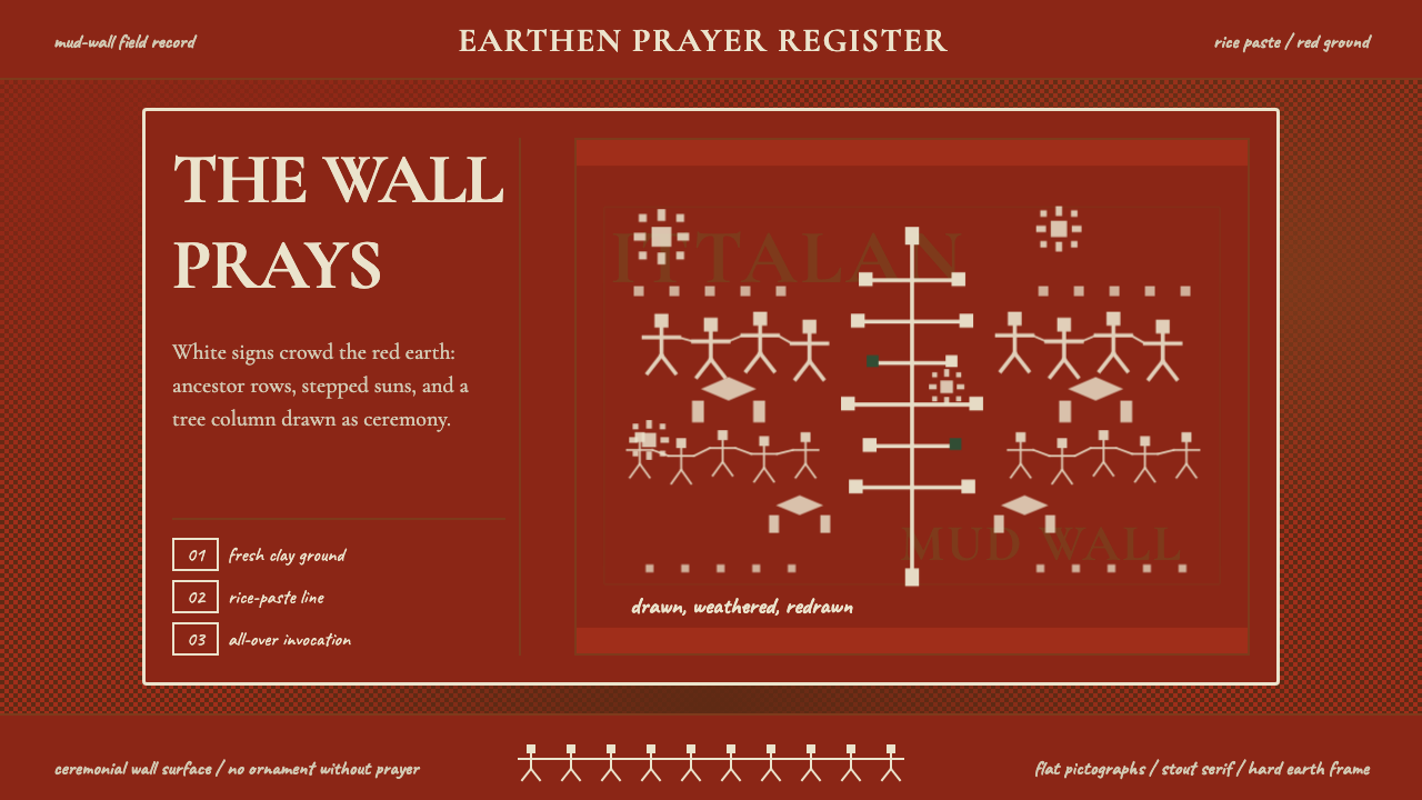 Odisha Saura Tribal MuralSacred density. Rice-white pictographs crowd a red-earth wall in ritual rhyth…神圣密度:米白象形符号挤满红土地墙,形成仪式节奏。
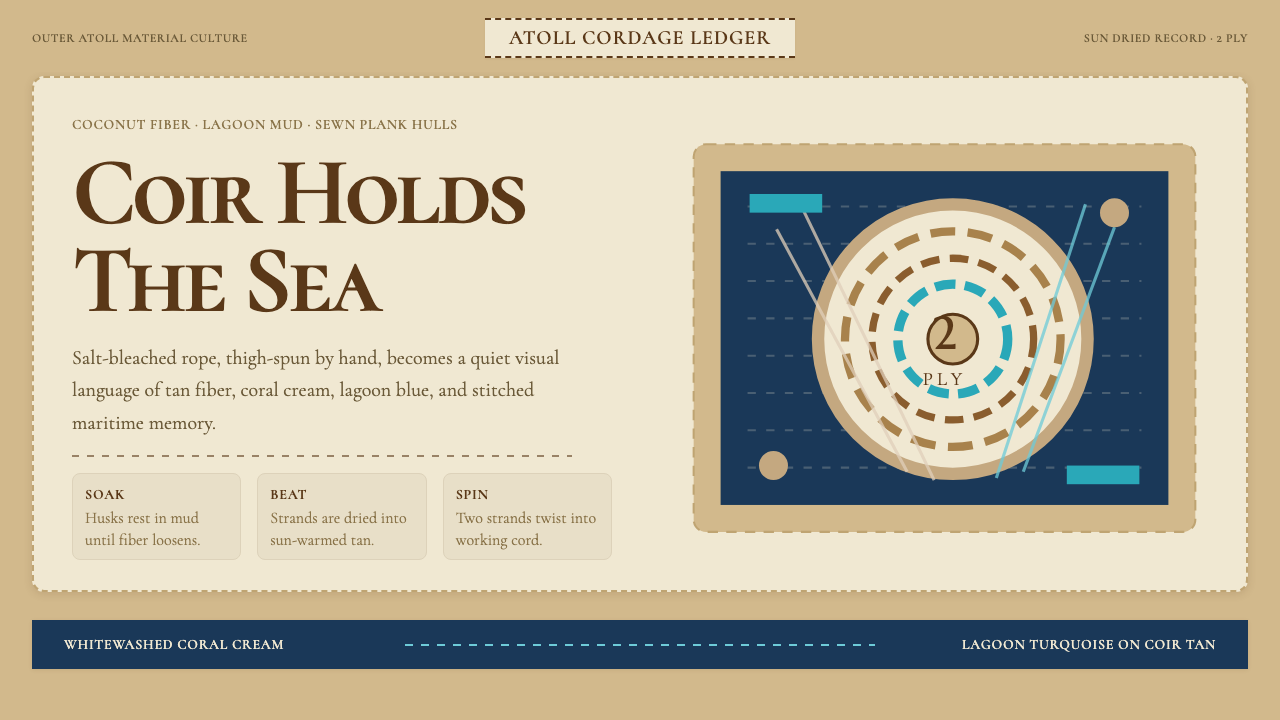 Maldivian Coir (Coconut Rope)Ocean-tested craft. Coir tan, coral cream, Cormorant type, and dashed seam ge…经海考验的手工感:椰棕褐、珊瑚乳白、Cormorant 字体与虚线缝合几何。
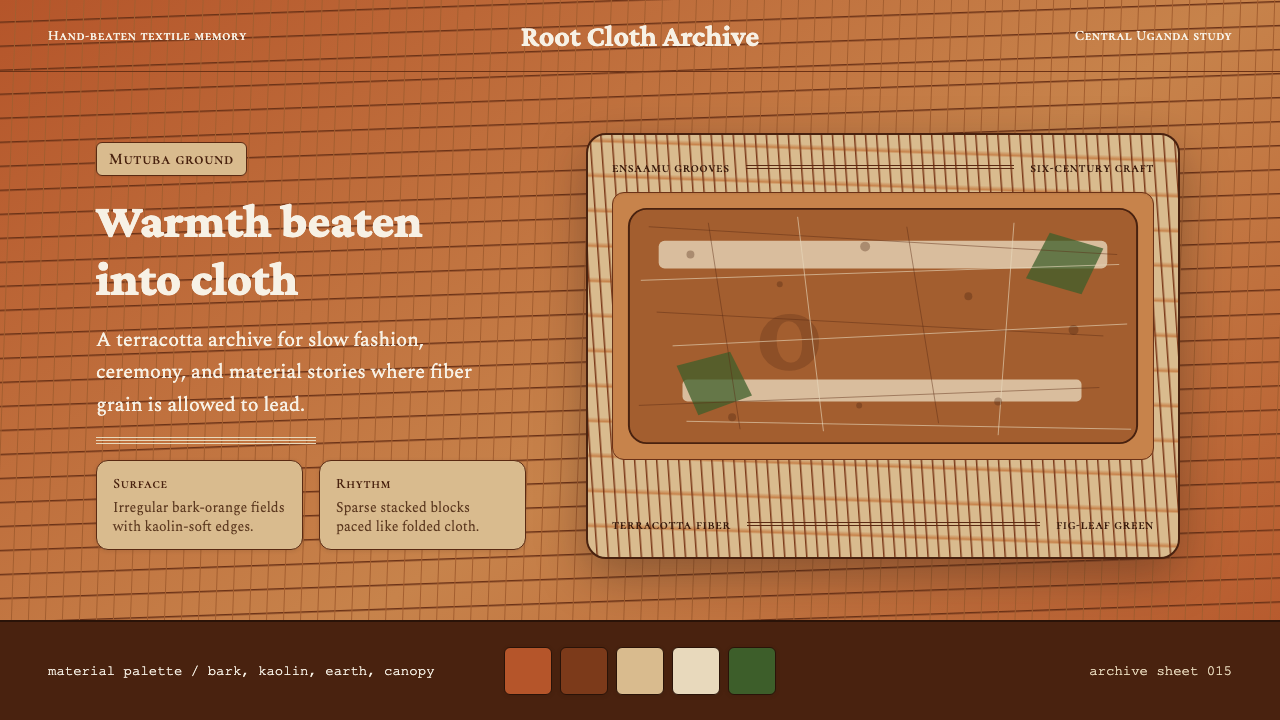 Ugandan Mutuba BarkclothHandmade warmth holds. Terracotta grain, Crimson Pro, and sparse stacked clot…手作温度沉稳铺开。赤陶纤维、Crimson Pro 与疏朗叠布构图。
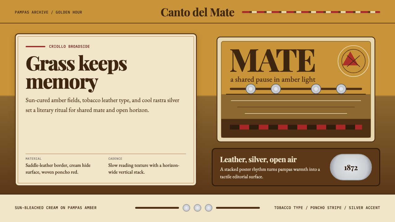 Argentine Gaucho (Pampas Mate Culture)Open grassland, printed warm. Amber fields, Playfair serif, and silver rastra…开阔草原的温热印刷:琥珀底、Playfair衬线与银色腰带几何。
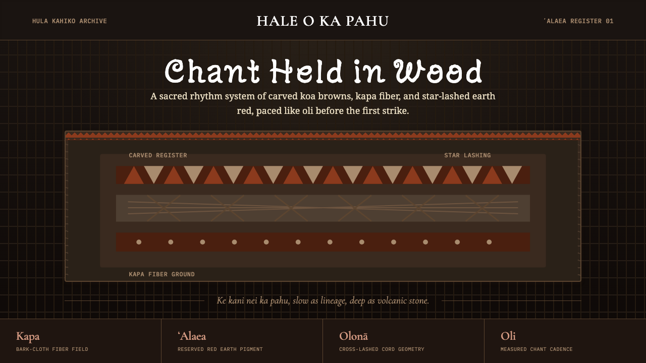 Hawaiian Hula Pahu DrumSacred weight, hand-marked. ʻAlaea red, kapa texture, and stacked carved regi…圣重而手作。ʻAlaea红、卡帕纹理与层叠雕刻带。
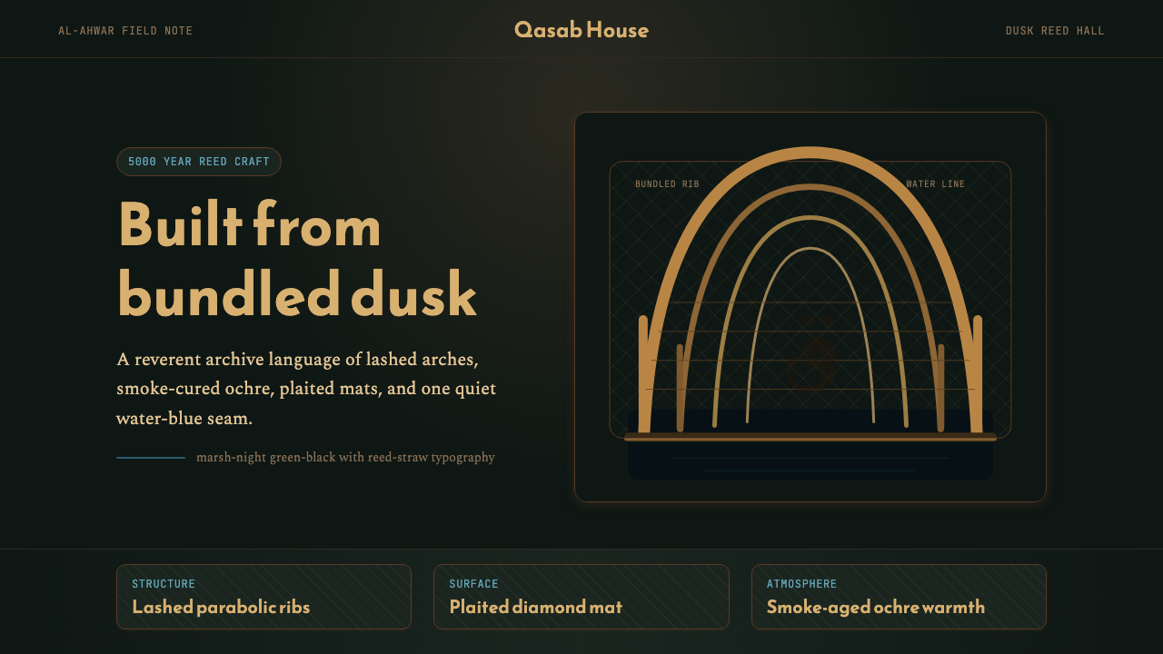 Iraqi Marsh Arab Mudhif ReedReverent reed darkness. Kufi arches, ochre lattice, and one water-blue line h…庄重的芦苇夜色。库菲拱线、赭黄格纹与一笔水蓝托住黄昏。