What is Glossier?什么是 Glossier?
Glossier turned skincare into a conversation between friends — dusty blush, editorial serif, and whitespace so generous it breathes.Glossier 把护肤变成了闺蜜之间的私语——灰粉底色、编辑式衬线字体,留白宽阔得像一次深呼吸。
Glossier in briefGlossier 速览
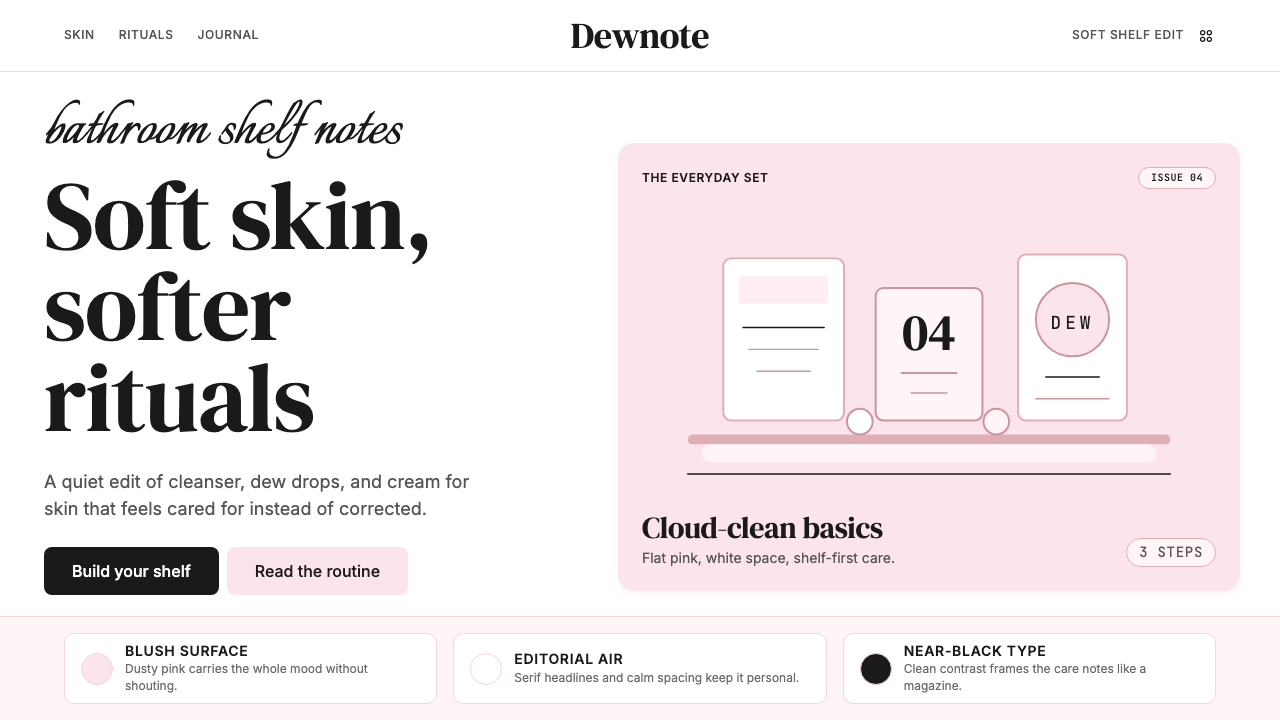
Glossier is a direct-to-consumer beauty brand whose visual identity became one of the most recognized aesthetic signatures of the mid-2010s. At its core, the system is built around a single, carefully calibrated shade of dusty pink — not the saturated bubblegum pink of earlier beauty marketing, but a quieter, more grown-up blush that sits closer to skin than to candy. That tonal restraint is the whole argument: beauty as something you already have, not something sold to you.Glossier 是一家直面消费者的美妆品牌,其视觉识别系统成为2010年代中期最具辨识度的美学标签之一。整套体系的核心是一抹精心调配的灰粉色——不是早期美妆营销常用的饱和泡泡糖粉,而是更内敛、更成熟的腮红调,接近肌肤而非糖果。这种色调上的克制本身就是一种主张:美,是你本来就拥有的,不是被推销给你的。
The design language pairs that signature pink with generous white space, editorial serif headlines, and photography that feels unstaged — bathroom-counter flat lays, close crops of real skin, product shots with no retouching artifice. The overall effect is deliberately casual, as if the brand's art direction happened to catch something beautiful rather than constructing it. Nothing shouts; everything suggests.设计语言以这抹标志性粉色为底,搭配充裕的留白、编辑式衬线大标题,以及看起来毫不刻意的摄影——浴室台面的俯拍铺陈、真实肌肤的近景裁切、不加修饰的产品图。整体感觉刻意随性,仿佛品牌的视觉呈现只是恰好捕捉到了某种美,而非主动构建它。没有叫嚷,只有暗示。
Glossier's visual system sits at the intersection of two traditions: the clean minimalism of Scandinavian editorial design and the approachable, conversational tone of early beauty blogging. The result is a style that feels simultaneously high-end and accessible — polished enough to belong in a fashion magazine, warm enough to belong in a group chat.Glossier 的视觉系统站在两种传统的交汇处:斯堪的纳维亚编辑设计的干净极简,以及早期美妆博客那种亲近、对话式的语气。最终产物是一种既高端又亲民的风格——精致得足以出现在时尚杂志,温暖得足以出现在私信群聊。
Where does Glossier come from?Glossier 从何而来?
Glossier grew directly out of Into The Gloss, a beauty blog launched by Emily Weiss in 2010 while she was working as a fashion assistant at Vogue. The blog's format was conversational and confessional — profiles of interesting women photographed in their bathrooms, at their vanity tables, discussing their actual routines rather than performing idealized ones. The visual language of Into The Gloss — bright natural light, honest close-ups, an absence of studio artifice — became the prototype for what Glossier's brand identity would later formalize.Glossier 直接生长于 Into The Gloss——Emily Weiss 于2010年创办的美妆博客,彼时她正在《Vogue》担任时尚助理。博客的叙事方式是对话式、坦诚式的:将有趣的女性拍摄于浴室、梳妆台前,谈论真实的日常护肤习惯,而非表演理想化的形象。Into The Gloss 的视觉语言——明亮的自然光、诚实的近景构图、对摄影棚刻意感的回避——成为日后 Glossier 品牌视觉体系的原型。
When Weiss founded Glossier in 2014, the challenge was to translate the authenticity of a blog into a commercial brand without losing what made the blog feel different from conventional beauty marketing. The solution was to treat the brand's visual system as an extension of that editorial voice. The dusty pink that became Glossier's signature was chosen not to evoke luxury or aspiration but to evoke the warmth and intimacy of a bathroom conversation — the color of blush already applied, not blush in its packaging.2014年 Weiss 创立 Glossier 时,核心挑战是如何将一个博客的真实感转化为商业品牌,同时不丢失使博客有别于传统美妆营销的那股气质。解决方案是将品牌视觉系统视为那种编辑腔调的延伸。那抹成为 Glossier 标志的灰粉,并非为了唤起奢华或向往感,而是为了唤起浴室闲谈的温度与亲密——是已经涂上肌肤的腮红的颜色,而非包装盒里的颜色。
The brand launched into a specific cultural moment: the Millennial Pink era, roughly 2016 to 2019, when a palette of muted, dusty pinks saturated fashion, interiors, and technology branding. Glossier both contributed to and benefited from that moment, though its pink predates the broader trend. The company's direct-to-consumer model — no department store counters, no traditional beauty-editor gatekeeping — meant that its visual identity had to work entirely online, on social platforms, and in its own sparse retail spaces. That constraint shaped the aesthetic: flat photography works on Instagram; generous whitespace reads well on mobile screens; the editorial serif headline communicates quality in a single glance.品牌恰好踩在一个特定的文化时刻:千禧粉时代,大约从2016年延续至2019年,一套柔和、沉静的粉色调席卷了时尚、室内设计与科技品牌。Glossier 既参与塑造了那个时代,也从中受益,尽管它的粉色早于这股更广泛的趋势。公司的直面消费者模式——没有百货公司专柜,没有传统美妆编辑的把关——意味着品牌视觉识别必须完全在线上、在社交平台以及自己的稀疏零售空间里运作。这种约束塑造了美学:平铺摄影在 Instagram 上好看;充裕留白在手机屏幕上清晰;编辑式衬线大标题一眼就传递出品质感。
Glossier's retail environments, when they opened — the flagship Showroom in New York's SoHo neighborhood in 2016, and subsequent pop-ups in Los Angeles, London, and elsewhere — extended the visual system into three dimensions. Spaces were uniformly pink, with minimalist shelving, full-length mirrors, and the same quality of natural or natural-adjacent light that characterized the photography. Customers were encouraged to touch, test, and photograph products. The stores functioned as content studios as much as retail spaces, generating social media imagery that reinforced the brand's visual identity without requiring the brand to produce it directly.当 Glossier 的线下零售空间陆续开放——2016年在纽约苏荷区开设旗舰展示厅,随后在洛杉矶、伦敦等地开设快闪店——视觉系统延伸进了三维空间。空间统一是粉色调,配以极简置物架、全身镜,以及与摄影中相同质感的自然光或近自然光。顾客被鼓励触摸、试用、拍照。这些店铺与其说是零售空间,不如说是内容创作工作室,源源不断产出强化品牌视觉识别的社交媒体图片——而无需品牌亲自制作。
What defines the Glossier look?Glossier 的视觉特征是什么?
Signature Blush Palette标志性腮红色调
Glossier's palette is built around a single dusty blush that reads as warm without being sweet, feminine without being girlish. It sits far from pure pink — the tone is greyed, muted, almost powdery — which gives it a quality closer to skin than to confection. This primary blush is supported by warm whites, soft off-white creams, and occasional clean blacks for typographic contrast. Saturated or jewel-toned colors appear only as product packaging accents, never as structural elements of the brand system.Glossier 的色板以一抹灰粉为核心,这种粉色温暖而不甜腻,女性化而不幼稚。它远离纯粉——色调被灰化、哑化,近乎粉扑般的质地——因而更接近肌肤而非糖果。这抹主色由温暖的白色、柔和的米白色调支撑,偶尔以干净的黑色做字体对比。饱和色或宝石色仅以产品包装点缀的形式出现,从不作为品牌系统的结构性色彩。
Editorial Serif Headlines编辑式衬线标题
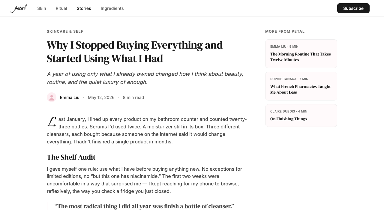
Glossier's typographic hierarchy is headed by tall, elegant serif letterforms that carry the authority of a fashion magazine masthead while remaining approachable in scale and spacing. The serifs are neither classical nor contemporary slab — they lean high-waisted and refined, evoking editorial heritage without academic stiffness. Below the serif headline, body text and interface labels drop to clean, unadorned letterforms that recede without competing. The contrast between the expressive headline and the understated supporting text is the engine of the typographic system.Glossier 的字体层级以高挑优雅的衬线字形开头,它有时尚杂志刊头的权威感,同时在比例与间距上保持亲近。这些衬线字既非古典,也非当代粗衬线——它们修长而精致,唤起编辑传统却没有学院气的僵硬。在衬线标题之下,正文与界面标签切换为干净、无装饰的字形,退隐而不争抢。表达性标题与低调辅助文字之间的对比,是这套字体系统的动力所在。
Flat, Light-Saturated Photography平铺、光线饱满的摄影
Glossier photography is shot in conditions that approximate natural daylight — even, diffuse light that eliminates harsh shadows and renders skin tones warmly. The preferred formats are flat lays (products arranged from above on a pale surface) and close-up skin portraits that show texture honestly. Retouching is minimal by the standards of beauty advertising; the visual goal is something that looks like it could have been taken by the subject themselves. This photography-forward approach means the brand can generate imagery continuously through community and user-generated content without visual inconsistency.Glossier 的摄影在近似自然日光的条件下拍摄——均匀、漫散的光线消除强烈阴影,将肤色渲染得温暖动人。主要形式是俯拍铺陈(产品从正上方排列在浅色台面上)以及诚实呈现肌肤质感的面部特写。以美妆广告的标准衡量,后期修饰极为克制;视觉目标是看起来像被拍摄对象自己拍的那种照片。这种以摄影为核心的方式意味着品牌可以通过社群与用户自制内容持续生产图像,而不出现视觉上的不一致。
Whitespace as a Design Element留白作为设计元素
Whitespace in the Glossier system is not empty — it is the visual equivalent of the pause in a good conversation. Layouts give every element room to exist independently before the eye connects them. Product pages, editorial headers, and packaging all use margins and breathing room that would read as excessive in a more information-dense brand context, but here signal unhurried confidence. The whitespace also makes the blush palette work: surrounded by pale emptiness, even a muted pink carries weight.Glossier 体系中的留白并非空白——它是好的对话中那段停顿的视觉等价物。版面赋予每个元素独立存在的空间,让眼睛在将它们联系起来之前先各自感受。产品页、编辑标题和产品包装,都使用了在信息密度更高的品牌语境中会显得过度的边距与呼吸空间,但在这里,它传递的是从容的自信。留白也让腮红色调生效:被浅淡的空旷包围,即使是一抹哑色粉,也有了分量。
Conversational, First-Person Voice对话式第一人称语气
Glossier's copy tone is inseparable from its visual identity. Text reads as direct address — the brand writes the way a knowledgeable friend talks, not the way a dermatologist prescribes. Product names are lowercase or gently abbreviated. Calls to action avoid imperative commands in favor of invitations. Descriptions foreground how products feel, smell, and sit on skin rather than listing clinical ingredients. This verbal texture reinforces the visual warmth: together they produce an experience that feels one-to-one rather than broadcast.Glossier 的文案语气与视觉识别不可分割。文字读起来像直接说话——品牌以一个博学朋友聊天的方式写作,而非皮肤科医生开处方的方式。产品名称小写或温柔缩写。号召行动避免命令式,倾向于邀请式。描述着重于产品在肌肤上的触感、气味与服帖感,而非罗列临床成分。这种文字质感强化了视觉的温暖:两者合力产生的体验,感觉像一对一的交谈,而非广播式推送。
Minimalist Product Packaging极简产品包装
Glossier products are packaged in forms that mirror the brand's visual restraint — rounded forms, muted surfaces, tactile materials like soft-touch coating and flexible plastic pouches. The famous pink bubble wrap pouch used for product shipping became an iconic brand object not because it was designed to be iconic but because it was designed to be pleasant: soft, reusable, the right size for a bathroom shelf. Packaging avoids busy graphics; product names appear in a single quiet typeface, and the signature blush color unifies the line.Glossier 产品以与品牌视觉克制相呼应的形态包装——圆润造型、低调表面、磨砂涂层与柔性塑料袋等有触感的材料。那个著名的粉色气泡包装袋之所以成为标志性品牌物件,不是因为被刻意设计成经典,而是因为被设计得令人愉悦:柔软、可复用、恰好适合浴室置物架的尺寸。包装回避繁复图形;产品名以单一低调的字体出现,标志性腮红色统一整条产品线。
Community-Sourced Imagery社群共创图像
Uniquely among major beauty brands, Glossier built its image library substantially from community and user-generated content. Customer photographs taken in bathrooms, at mirrors, on phones appear in campaigns alongside professional brand photography, and the two are nearly indistinguishable — because the brand photography was designed to look like the customer photography. This circularity is not accidental: it is the system's most sophisticated feature, a visual style that can reproduce itself indefinitely through the behavior of its users.在主要美妆品牌中独树一帜的是,Glossier 的图像库在很大程度上建立在社群与用户自制内容之上。顾客在浴室、镜前、用手机拍摄的照片出现在品牌推广中,与专业品牌摄影并肩——而两者几乎难以区分——因为品牌摄影本身就被设计得像顾客照片。这种循环并非偶然:它是这套系统最精妙的特质——一种能通过用户行为无限自我再生的视觉风格。
Who shaped Glossier?谁塑造了 Glossier?
Weiss founded Glossier in 2014 after building Into The Gloss into one of the most influential beauty blogs in the English-speaking world. Her editorial instincts — cultivated during her years at Vogue and through the blog's collaborative, interview-driven format — directly shaped the brand's visual and verbal identity. Weiss's central conviction, that beauty should be a conversation rather than an authority, is the thesis around which every design decision in the Glossier system is organized. She stepped down as CEO in 2022 but remains central to the brand's founding mythology.Weiss 于2014年创立 Glossier,此前她已将 Into The Gloss 建成英语世界最具影响力的美妆博客之一。她在《Vogue》工作期间磨砺的编辑直觉,以及博客协作式、访谈驱动的格式,直接塑造了品牌的视觉与文案识别。Weiss 的核心信念——美应当是一场对话而非权威的宣判——是 Glossier 体系中每一个设计决策所围绕的命题。她于2022年卸任 CEO,但仍是品牌创立神话的核心。
Davis joined Glossier as President and COO in 2016 and played a key role in scaling the brand's direct-to-consumer infrastructure during its period of fastest growth. His operational work — expanding the product line, managing the retail experience, overseeing digital channels — created the conditions under which the visual identity could be applied consistently at scale. The discipline of the Glossier system owes as much to operational rigor as to design vision.Davis 于2016年以总裁兼首席运营官身份加入 Glossier,在品牌增长最快的时期主导了直面消费者基础设施的规模化扩张。他的运营工作——扩充产品线、管理零售体验、监督数字渠道——为视觉识别能够在规模化层面保持一致性创造了条件。Glossier 体系的严谨性,既来自设计愿景,也来自运营纪律。
The brand's in-house creative team, working across art direction, copywriting, social strategy, and retail design, translated Emily Weiss's editorial sensibility into a repeatable visual system. Without attribution to a single named designer, the Glossier aesthetic emerged from a collaborative creative process grounded in the brand's community — a fitting origin for a brand whose stated philosophy is that its customers are co-creators. The team's approach to photography direction, typography selection, and spatial design in retail environments set standards that influenced an entire generation of direct-to-consumer brand identities.品牌内部的创意团队跨越视觉指导、文案、社交策略与零售设计多个领域,将 Emily Weiss 的编辑感性转化为可复制的视觉系统。没有单一署名设计师,Glossier 的美学从扎根于品牌社群的协作创意过程中生长出来——这对一个明确主张顾客即共创者的品牌而言,是恰如其分的起源。团队在摄影指导、字体遴选与零售空间设计上确立的标准,影响了整整一代直面消费者品牌的视觉识别。
The community of readers and commenters who built Into The Gloss into a media property before Glossier existed are not designers, but they are the aesthetic's true origin. Their preferences — for honesty over aspiration, for routine over ritual, for real skin over retouched skin — were the brief from which Weiss worked. The visual language of Glossier is, at its root, a formalization of what that community found beautiful and trustworthy. No beauty brand of comparable scale has been as directly shaped by its audience's aesthetic values before launch.在 Glossier 成立之前将 Into The Gloss 建成媒体资产的读者与评论者社群,并非设计师,却是这套美学真正的起源。他们的偏好——重诚实轻向往、重日常轻仪式感、重真实肌肤轻修图肌肤——是 Weiss 工作的设计简报。Glossier 的视觉语言,从根本上说,是对那个社群所认为美丽与可信赖之事物的形式化表达。在同等量级的美妆品牌中,还没有哪个在上市前如此直接地被受众的审美价值观所塑造。
How do you use Glossier today?今天怎么用 Glossier?
Glossier's visual language is one of the most directly applicable historical brand systems for contemporary digital product work, because it was built natively for digital surfaces — mobile photography, social feeds, e-commerce product pages — rather than adapted from print or broadcast. Applying it correctly requires understanding its underlying logic: warmth without excess, restraint without coldness, and a consistent commitment to making every touchpoint feel like it belongs in the same conversation.Glossier 的视觉语言是当代数字产品工作中可直接应用的历史品牌系统之一,因为它原生于数字表面——手机摄影、社交信息流、电商产品页——而非从印刷或广播媒介改编而来。正确应用它,需要理解其底层逻辑:温暖而不过度,克制而不冷漠,以及对每个触点都像属于同一场对话的一贯承诺。
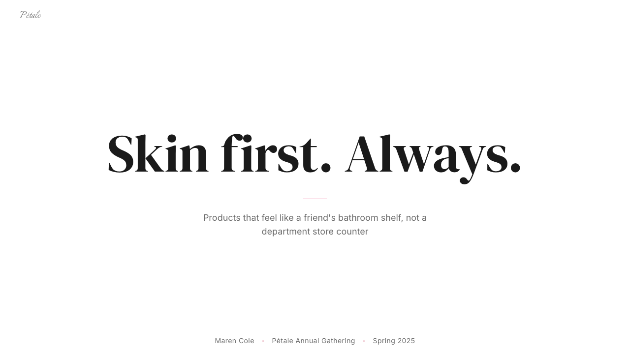
For presentation slides, the Glossier system works best on covers that lead with the blush palette — a dusty pink field, headline in a refined serif at generous scale, and no more than a single supporting line in a lighter weight. The cover should feel like a magazine's opening spread: unhurried, confident, and slightly luxurious in its use of space. Content slides should maintain the whitespace discipline; resist the impulse to fill every margin. Data slides benefit from the palette's restraint: use the signature blush for primary data series, near-white or light backgrounds throughout, and let the typography carry hierarchy rather than color-coding every category.在演示文稿中,Glossier 体系最适合以腮红色调为主导的封面——一片灰粉底色,精致衬线标题以充裕比例呈现,辅助文字仅一行,字重更轻。封面应有杂志首页的感觉:从容、自信,在空间的使用上略带奢侈。内容页应保持留白纪律,抵制填满每个边距的冲动。数据页从这个色板的克制中获益:对主要数据系列使用标志性腮红色,全程保持近白或浅色背景,让字体承担层级职责,而非对每个类别进行色彩编码。
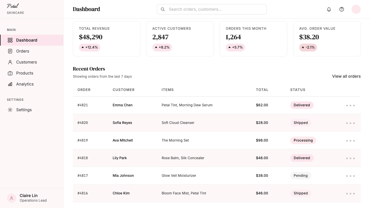
For web UI and dashboards, the system's strength lies in its ability to make functional information feel warm. Navigation bars, card backgrounds, and sidebar panels can adopt the soft blush as a tinting wash over white, while interactive elements — buttons, active states, hover effects — use the more saturated version of the same hue to signal affordance without aggression. Pricing pages work especially well: the combination of generous vertical space, serif product names, and honest product photography in the Glossier manner communicates premium positioning without premium detachment. Avoid dense data tables in this system; if data density is required, default to a cleaner neutral palette and bring the blush in as an accent only.对于网页 UI 和仪表板,这套体系的优势在于使功能性信息感觉温暖。导航栏、卡片背景与侧边栏面板可以在白色上叠加柔和腮红色调作为染色底洗,而交互元素——按钮、激活状态、悬停效果——使用同色相更饱和的版本来传递可操作性,不显攻击性。定价页面尤为适用:充裕的纵向空间、衬线产品名称,以及 Glossier 式的诚实产品摄影相结合,传递出高端定位而不带高端的疏离感。这套体系不适合密集数据表;若需要高数据密度,默认使用更干净的中性色板,仅将腮红色作为点缀引入。
For editorial and marketing work — landing pages, email campaigns, social cards — the Glossier system rewards a photography-first approach. Lead with a well-lit, close-cropped image that occupies the majority of the surface, then layer the serif headline over whitespace rather than directly over the image. Marketing headers should resist the temptation to stack multiple messages; one clear claim, stated in the editorial serif, with supporting detail in lighter type below, is more consistent with the aesthetic's confidence. For email specifically, the system's mobile-native origin means it translates cleanly: single-column layouts, large images, generous padding, and a single typographic call to action.对于编辑与营销内容——落地页、邮件推送、社交卡片——Glossier 体系偏爱以摄影为首的方式。以一张光线充足、紧密裁切的图像占据大部分版面开场,然后将衬线大标题叠加在留白区域而非直接覆盖图像。营销头图应抵制叠加多重信息的诱惑;一个清晰主张,以编辑式衬线字体陈述,辅以下方更浅字重的支撑细节,比信息堆叠更符合这种美学的自信气质。对于电子邮件,该体系移动端原生的出身意味着它转译顺畅:单列布局、大幅图像、充裕内边距,以及单一的字体号召行动。
A common mistake when applying the Glossier aesthetic is misreading its apparent simplicity as low effort. The whitespace is not empty — it is precisely measured. The blush color is not generic pink — it is a specific, desaturated tone that shifts meaning entirely if it tips too warm or too purple. And the photography cannot be substituted with stock imagery without breaking the system: the naturalness of Glossier photography is a craft achievement, not a happy accident. Designers who treat the style as a color palette and a font choice will produce something that looks vaguely pink and vaguely editorial; those who internalize its commitment to warmth, honesty, and conversational confidence will produce work that earns the same trust the original brand built.应用 Glossier 美学时最常见的误读,是将其表面上的简单等同于低成本。那些留白不是空的——是精确测量的。那抹腮红色不是普通粉色——是一种特定的去饱和色调,稍微偏暖或偏紫就会完全改变它传递的意义。摄影也不能用图库素材替代而不破坏整套体系:Glossier 摄影的自然感是一种工艺成就,而非偶然。那些把这种风格理解为一个色板加一款字体的设计师,会生产出某种模糊地粉色、模糊地编辑调的东西;那些真正内化了它对温暖、诚实与对话式自信的承诺的设计师,会创作出赢得与原品牌相同信任的作品。
Glossier — FAQGlossier · 常见问题
Is the Glossier aesthetic the same as Millennial Pink?Glossier 美学和千禧粉是同一回事吗?
They overlap but are not identical. Millennial Pink was a broad cultural trend, roughly 2016 to 2019, that encompassed a wide range of dusty, muted pinks across fashion, interiors, technology branding, and food. Glossier's signature blush predates and outlasts the trend and is more specifically defined: it is a particular dusty tone with warm undertones, used within a disciplined system of whitespace, editorial typography, and honest photography. Many brands adopted Millennial Pink as a palette choice; Glossier built an entire visual system around a pink that happened to coincide with that cultural moment. The distinction matters for application: borrowing a generic muted pink is not the same as applying the Glossier system.两者有重叠,但并不相同。千禧粉是一股大范围文化趋势,大约从2016年延续至2019年,涵盖了时尚、室内设计、科技品牌与食品领域中各种各样的沉静粉色。Glossier 的标志性腮红色早于这股趋势,也延续至趋势之后,定义更为具体:一种带暖色调的特定灰粉,在由留白、编辑式字体与诚实摄影构成的严谨系统中使用。许多品牌把千禧粉作为色板选择;Glossier 则围绕一个恰好与那个文化时刻同频的粉色,构建了整套视觉系统。这种区别对于应用而言至关重要:借用一个通用的哑色粉,并不等同于应用 Glossier 体系。
Can the Glossier visual system work for a brand that is not in beauty or personal care?Glossier 视觉系统能用于非美妆或个人护理品牌吗?
Yes, with deliberate adaptation. The underlying values the Glossier system communicates — approachability, honesty, gentle confidence, quality without intimidation — are transferable to any category where those values are genuine brand attributes. It works well for wellness, food, lifestyle, and certain categories of professional services where the goal is to feel trusted rather than authoritative. Where it struggles is in contexts that require urgency, technical authority, or visual density — financial products, enterprise software, medical devices. The blush palette and generous whitespace signal a pace and a sensibility that can undermine credibility in high-stakes rational contexts.可以,但需要有意识地调适。Glossier 体系传递的底层价值观——亲近感、诚实、温和的自信、无威慑感的品质——可以迁移至任何这些价值观是真实品牌属性的类别。它适用于健康、食品、生活方式,以及某些目标是让人感到被信任而非被权威压服的专业服务领域。它在需要紧迫感、技术权威性或视觉密度的场景中力不从心——金融产品、企业软件、医疗设备。腮红色板与充裕留白传递的节奏与感性,可能在高风险理性语境中损害可信度。
How does Glossier handle dark mode or dark-background layouts?Glossier 体系如何处理暗黑模式或深色背景版面?
The Glossier system is fundamentally a light-background aesthetic; its pale blush and abundant white space depend on the contrast and warmth that a light ground provides. A genuine dark inversion is difficult because the signature dusty pink loses much of its identity when placed on dark backgrounds — it can read as muted or muddy rather than warm and refined. Contemporary applications that need a dark variant typically shift to a near-black with very warm undertones, use the blush sparingly as a typographic accent or thin decorative line, and rely heavily on the editorial serif to carry the brand character. A fully dark Glossier layout is possible but should be treated as a deliberate departure rather than a default option.Glossier 体系从根本上是浅色背景美学;它的浅腮红与大量白色空间依赖于浅色底面提供的对比感与温暖感。真正的暗色反转很难实现,因为标志性的灰粉色放在深色背景上会失去大部分自身特质——看起来会是哑沉或浑浊的,而非温暖精致的。需要深色变体的当代应用,通常转向带有极暖底调的近黑色,将腮红色仅用作字体点缀或细装饰线,并重度依赖编辑式衬线字体来承载品牌气质。完全深色的 Glossier 版面是可能的,但应被视为一种刻意的偏离,而非默认选项。
What is the biggest mistake designers make when trying to apply the Glossier aesthetic?设计师在尝试应用 Glossier 美学时最常犯的错误是什么?
The most common mistake is treating it as a styling choice rather than a values system. Designers add a muted pink and some whitespace, switch to a serif headline, and consider the work done. The result looks adjacent to Glossier without achieving what the system actually does, because the missing ingredient is commitment to the underlying attitude — that everything on screen or on page is part of a conversation, not a broadcast. Concretely, this means: the photography must feel genuinely unstaged, not studio-shot made to look casual; the whitespace must be generous enough to feel slightly risky; the copy must read as if a real person wrote it. Styling without attitude produces imitation. Attitude expressed through consistent styling produces the real thing.最常见的错误是将它视为一种造型选择,而非一套价值观系统。设计师加入一抹哑色粉、一些留白,换上衬线标题,就认为大功告成。结果看起来接近 Glossier,却没有实现这套体系实际上做到的事,因为缺失的成分是对底层态度的承诺——屏幕上或页面上的每一个元素,都是对话的一部分,而非广播。具体而言:摄影必须感觉真正是非摆拍的,而非被做成看起来随性的棚拍;留白必须充裕到感觉略带冒险;文案必须读起来像一个真实的人写的。没有态度的造型,生产出的是仿制品。通过一致造型所表达的态度,生产出的才是真正的东西。
How does the Glossier system relate to other minimalist beauty brand aesthetics?Glossier 体系与其他极简美妆品牌美学有何关联?
Glossier shares surface-level attributes with other minimalist beauty brands — sparse layouts, quality photography, restrained color palettes — but its emotional register is distinct. Brands like Aesop or Le Labo achieve minimalism through an austere, almost archaeological seriousness; their quietness communicates rarity and expertise. Glossier's minimalism is warmer and more social; its quietness communicates ease rather than exclusivity. The practical design difference is in how each handles the human element: Aesop removes human presence almost entirely, letting product and material surface carry meaning; Glossier foregrounds real skin, real faces, and real bathrooms as the primary subject matter. Same structural principle — restraint — very different emotional destination.Glossier 与其他极简美妆品牌共享表面特征——稀疏版面、品质摄影、克制色板——但它的情感频率截然不同。Aesop 或 Le Labo 等品牌通过近乎考古式的严肃感实现极简;它们的安静传递的是稀缺与专业。Glossier 的极简更温暖、更具社交性;它的安静传递的是从容而非排他。实际设计差异体现在对人的元素的处理方式上:Aesop 几乎完全移除了人的存在,让产品与材质表面承载意义;Glossier 将真实肌肤、真实面孔与真实浴室作为主要拍摄对象推向前台。相同的结构原则——克制——截然不同的情感终点。
Related design styles相关设计风格
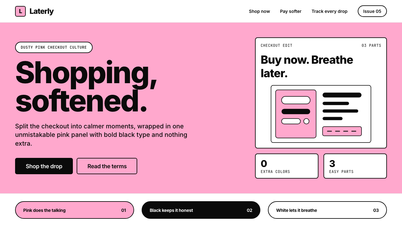 KlarnaFintech turns fashion-editorial. Dusty bubblegum pink, black Inter, and white…金融科技变成时尚编辑:灰泡泡糖粉、黑色 Inter 与留白完成表达。
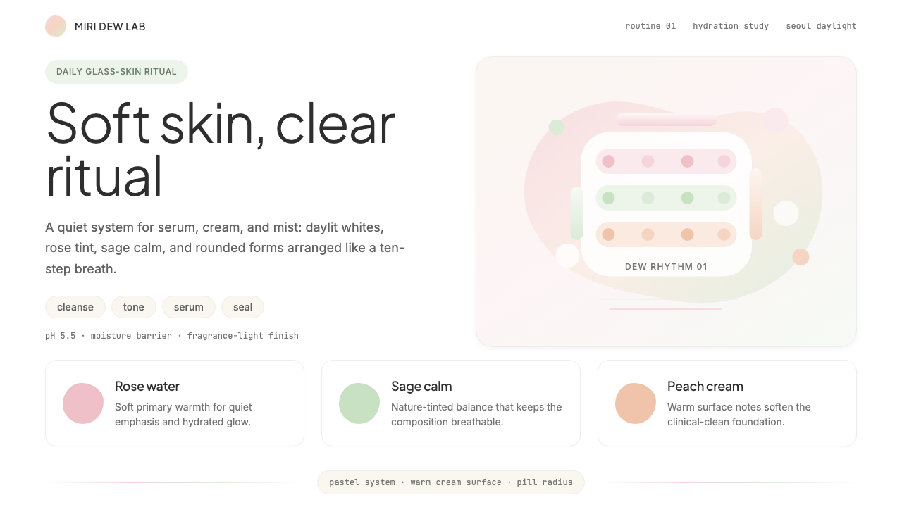 K-Beauty CleanCalm arrives dewy. Rose, sage, and peach pastels float through airy rounded f…水润的平静:玫瑰、鼠尾草与蜜桃粉彩在圆润留白中漂浮。
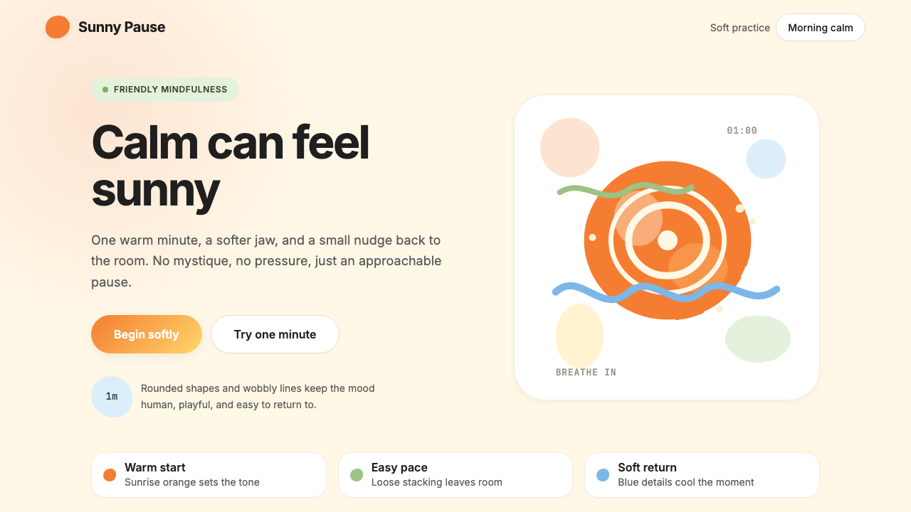 HeadspaceOptimism makes calm approachable. Sunrise orange and wobbly rounded forms bre…乐观让平静亲近:日出橙与摇摆圆形在奶油底上呼吸。
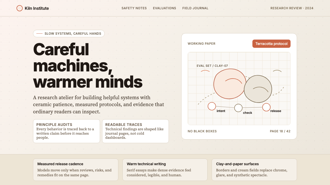 Anthropic ClayAI safety in handmade clay. Sand backgrounds, terracotta accents, serif body…用手工陶土包裹的 AI 安全感:沙色背景、赤陶点缀、衬线正文——缓慢、刻意、有…
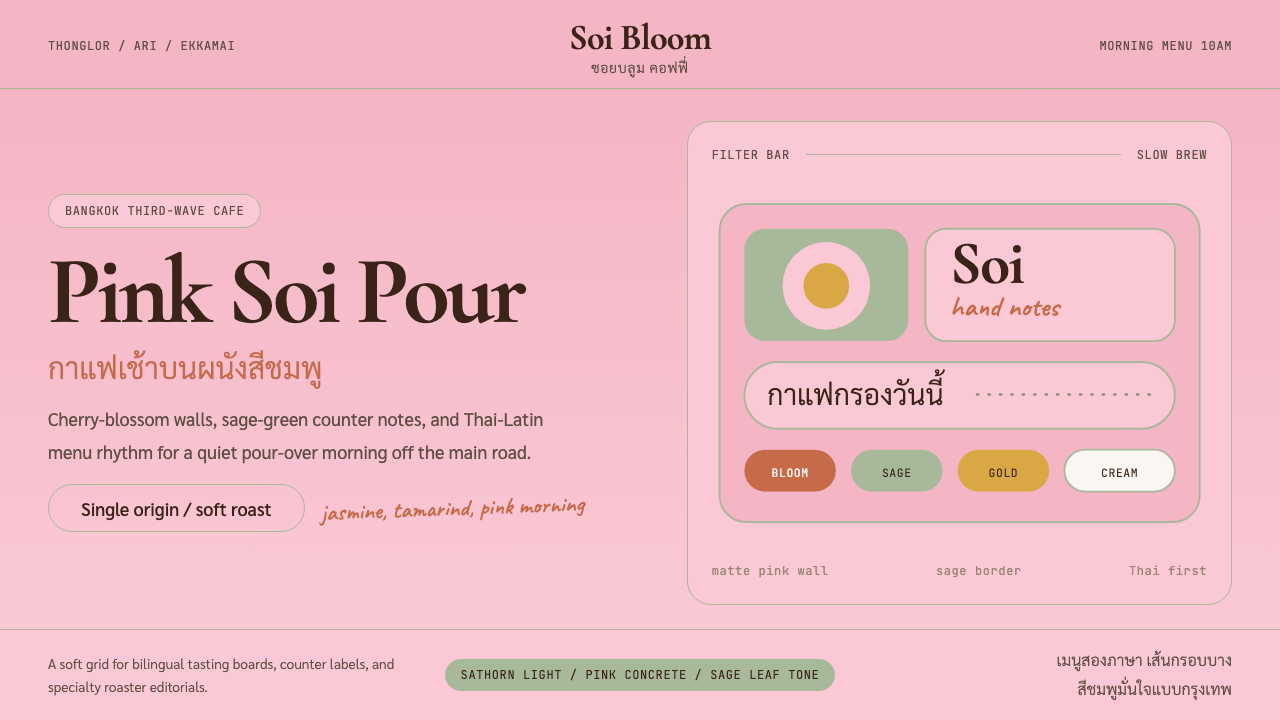 Bangkok Third-Wave CafeBangkok feels soft but sure. Cherry pink, sage borders, and Thai-Latin menu r…曼谷柔和却自信:樱花粉、鼠尾草边框与泰英菜单节奏。
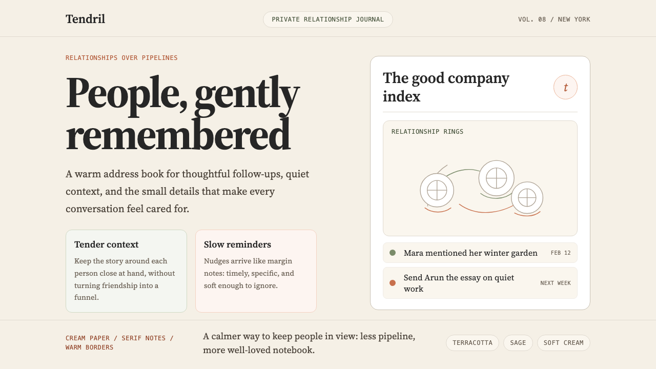 Clay 2024CRM as a sketchbook, not a sales pipeline. Cream backgrounds, terracotta, han…把 CRM 重新想象为安静的私人速写本:奶油底色、陶土点缀、手绘人物线描——拒…