About Glossier
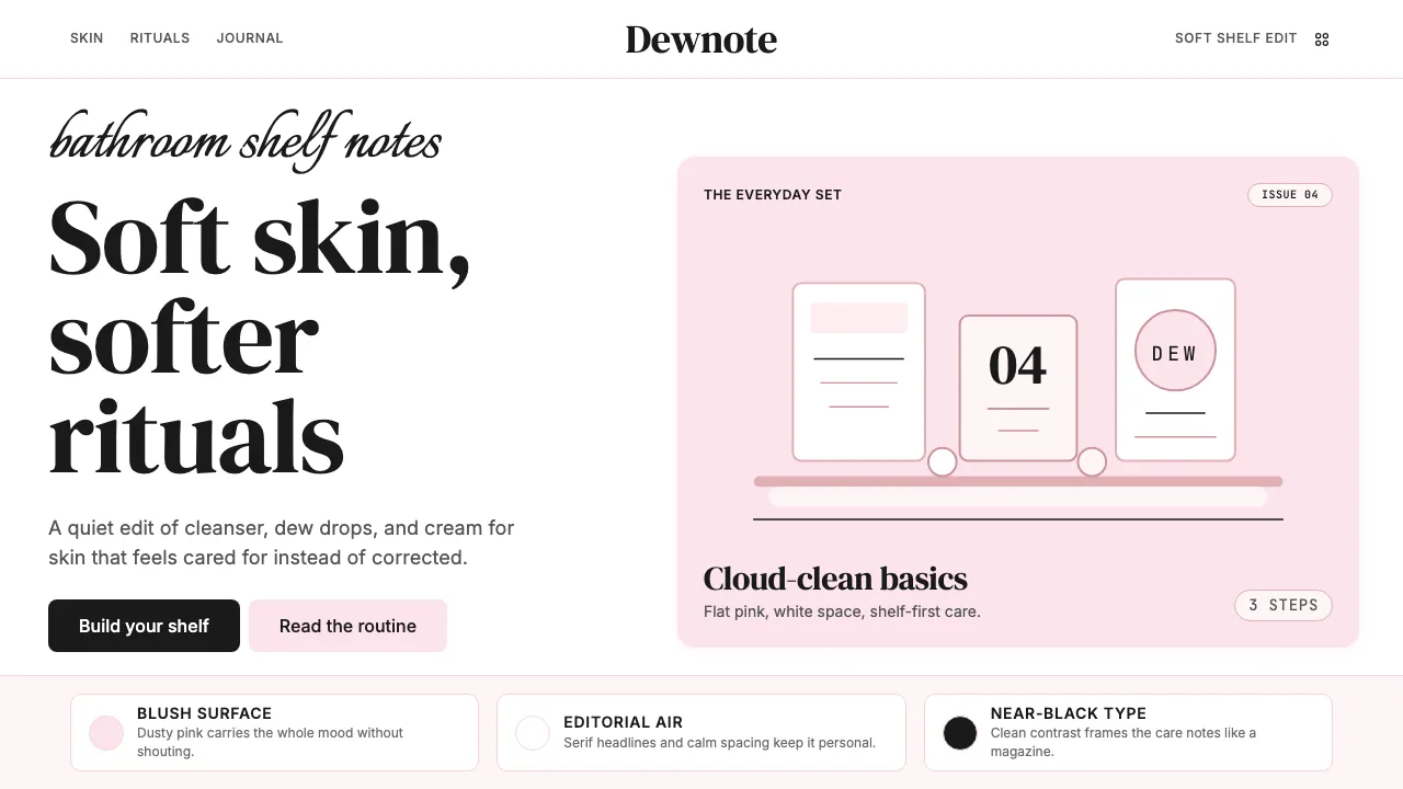
Glossier redefined beauty branding by treating skincare like a conversation between friends, not a clinical prescription. Built from Emily Weiss's blog Into The Gloss, the brand's visual identity centers on a single, unmistakable shade of dusty pink — never bubblegum, always blush.
The design system pairs editorial serif typography with generous whitespace and flat, photography-forward layouts. Every surface feels like a well-lit bathroom shelf: warm, approachable, and quietly confident in its simplicity.
- Origin
- New York City, United States
- Era
- 2014 founded; current visual ~2014–2024
- Key figures
- Emily Weiss · Henry Davis · Glossier Brand Team
- Movements
- Direct-to-consumer beauty · Millennial-pink era · Content-first commerce
Glossier design spec
Colors
Typography
The other 11 sections — buttons, cards, spacing, motion, techniques and more — open once you unlock. Download the DESIGN.md or send it to your AI in one click. Unlock once, yours forever.
Sign up nowStyles similar to Glossier
Also inspired by brands & products, with a close feel.
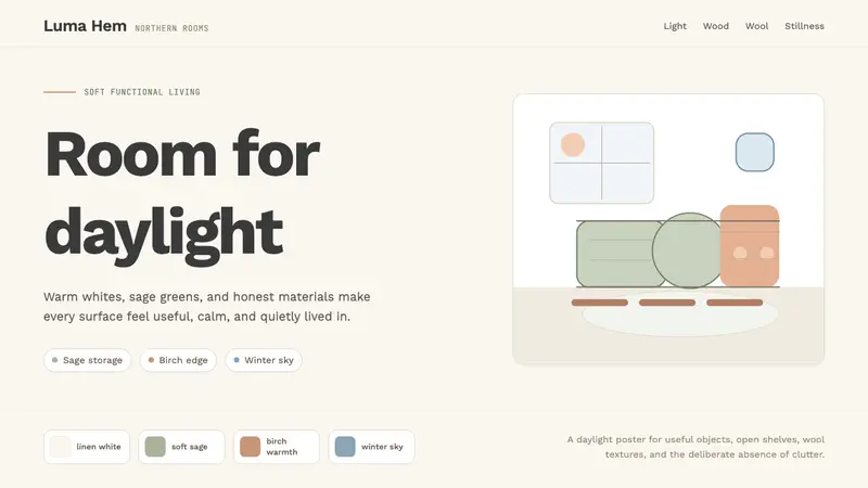 Scandi Hygge (IKEA)Warmth from restraint. Sage, linen white, Work Sans, and wide breathing room.
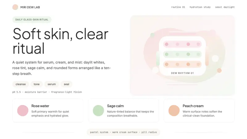 K-Beauty CleanCalm arrives dewy. Rose, sage, and peach pastels float through airy rounded forms.
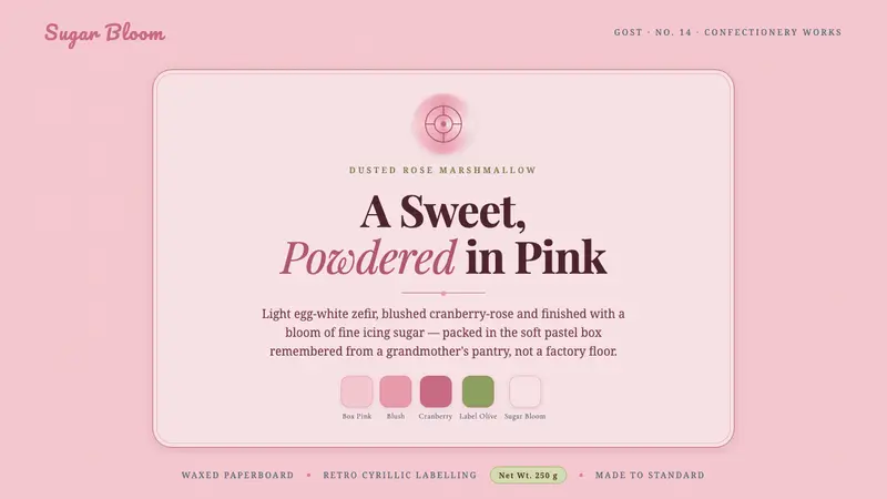 Soviet Zefir ConfectioneryA sweet remembered, not manufactured. Sugar-pink waxed-box ground, berry-rose Playfair serif.
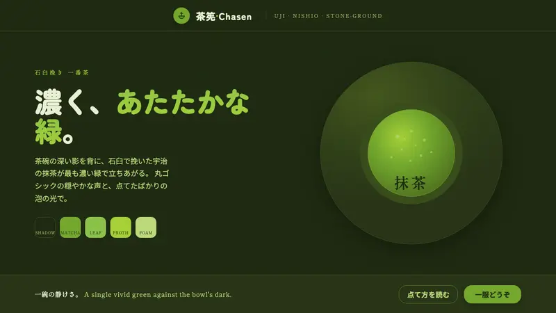 Matcha Latte Powder GreenA single vivid green at full strength. Stone-ground matcha on a dark tea-bowl shadow, rounded type.