What is Klarna?什么是 Klarna?
Klarna proved that a payment company could look like a fashion magazine — by stripping its palette to a single dusty pink, bold black type, and nothing else.Klarna 证明了一家支付公司可以像时尚杂志一样好看——方法是把色板缩减为一种灰泡泡糖粉、黑色粗字,以及其他什么都不加。
Klarna in briefKlarna 速览
Klarna is a Swedish buy-now-pay-later company founded in Stockholm in 2005, and the visual identity it unveiled in its 2018 rebrand is one of the most recognizable systems in contemporary fintech. The design language centers on a single chromatic signature — a dusty, slightly greyed bubblegum pink — paired exclusively with stark black typography and generous white space. No secondary accent colors, no gradients, no decorative shadows interrupt the arrangement.Klarna 是一家于 2005 年在斯德哥尔摩创立的瑞典先买后付公司。2018 年品牌重塑后推出的视觉识别体系,是当代金融科技领域辨识度最高的设计系统之一。整套设计语言以单一色彩特征为核心——一种偏灰、略带雾感的泡泡糖粉——与纯黑色的粗重字体和大面积留白搭配,除此之外别无其他彩色点缀,无渐变,无装饰性阴影。
The system's authority comes from its refusal. Where most financial brands reassure through navy, grey, and gold — palettes inherited from banking's institutional past — Klarna made an almost provocative choice: a color associated with sweetness and lightness, deployed at scale across every touchpoint. The effect shifts the emotional register of consumer credit from obligation to pleasure, from friction to ease.这套系统的力量来自它的拒绝。大多数金融品牌以深蓝、灰色和金色来传递信赖感——那是从银行业的机构历史中继承的色板——而 Klarna 几乎做出了一个挑衅性的选择:将一种与甜蜜感和轻盈感相关联的色彩大规模铺展到每一个触点。这种做法将消费信贷的情感基调,从义务转换为愉悦,从摩擦转换为轻松。
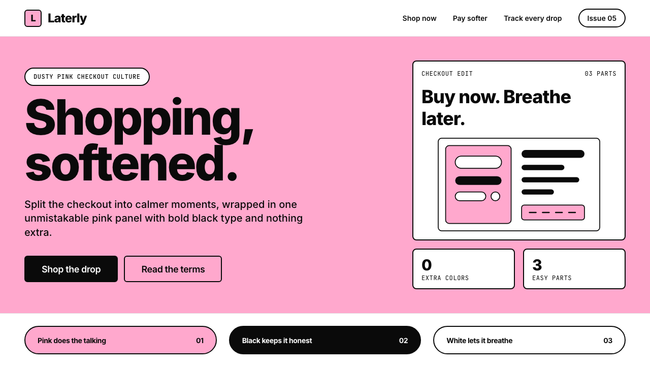
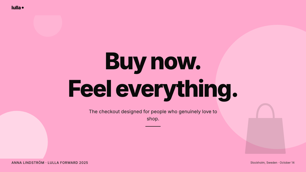
Two visual moves define the aesthetic in practice. First, large blocks of the signature pink are used as background fields rather than as accents, making color do structural work instead of decorative work. Second, typography is set with high contrast in weight and scale — headlines and body text occupy different leagues — so that hierarchy is established through letterforms alone, without relying on color shifts or ornamental dividers. The result is a system that communicates instantly and reads as fashionable without sacrificing clarity.两个视觉动作在实践中定义了这套美学。第一,品牌粉作为背景色块而非点缀色大面积使用,让色彩承担结构性功能而非装饰性功能。第二,排版在字重与字号上形成强烈对比——标题和正文分属不同的量级——使层级完全由字形本身建立,而无需依赖色彩变化或装饰性分割元素。最终呈现出一套能即时传达信息、同时散发时尚气息而不牺牲清晰度的视觉系统。
Where does Klarna come from?Klarna 从何而来?
Klarna was founded in Stockholm in 2005 by Sebastian Siemiatkowski, Niklas Adalberth, and Victor Jacobsson, as a solution to a practical problem: online checkout was complicated and consumers abandoned purchases at the payment step. The original product was simple — let customers buy first and pay later, spreading risk and removing friction. The business grew rapidly across Scandinavia, then into Germany, the United Kingdom, and eventually the United States, becoming one of Europe's most valuable fintech startups.Klarna 由 Sebastian Siemiatkowski、Niklas Adalberth 与 Victor Jacobsson 于 2005 年在斯德哥尔摩创立,初衷是解决一个实际问题:在线结账流程繁琐,消费者常在付款环节放弃购买。最初的产品设计很简单——让客户先买后付,分散风险、消除摩擦。公司在斯堪的纳维亚半岛快速成长,随后进入德国、英国,最终拓展至美国,成为欧洲估值最高的金融科技独角兽之一。
For most of its early years, Klarna's visual presentation was unremarkable — clean and professional, but indistinguishable from the broader fintech landscape. The company looked like what it was: a payment infrastructure company. That changed with a major rebrand undertaken around 2018 in partnership with DesignStudio London, a studio known for bold, character-driven identity work. The brief was to express Klarna not as a financial utility but as a brand with personality — one that stood alongside consumer lifestyle brands rather than behind them.在相当长的早期阶段,Klarna 的视觉呈现并无特别之处——整洁、专业,但与金融科技行业的整体面貌难以区分。公司看起来就是它本来的样子:一家支付基础设施公司。这一切在 2018 年前后发生了根本性的转变。Klarna 与伦敦 DesignStudio 合作完成了一次重大品牌重塑。DesignStudio 以大胆、有性格的品牌识别工作著称。这次重塑的核心命题,是将 Klarna 呈现为一个有个性的品牌——一个与消费者生活方式品牌并肩而立,而非隐身幕后的存在。
DesignStudio's central decision was color. The agency developed the now-signature dusty bubblegum pink as Klarna's sole chromatic identity. The choice was deliberate and research-backed: pink occupied a rare position in the competitive landscape of financial services, where no major player held it. At the same time, the softened, slightly greyed quality of the specific tone prevented it from reading as juvenile or superficial — it landed in a register closer to fashion editorial than to children's branding.DesignStudio 最核心的决策是色彩。设计团队将那种带有雾感的泡泡糖粉确立为 Klarna 唯一的色彩标识。这个选择经过深思熟虑并有调研支撑:在金融服务的竞争格局中,粉色占据了一个罕见的空白——没有任何主要玩家持有这个颜色。与此同时,这一特定色调经过调灰和柔化处理,避免了幼稚或肤浅的联想,最终落在接近时尚杂志而非童装品牌的语境中。
The typographic system that accompanied the color choice was equally considered. A single bold sans-serif voice carries all brand communication, set with decisive contrast in scale. The combination was reinforced by a commitment to restraint: the brand guidelines explicitly exclude secondary color families, gradient treatments, and the decorative shadows common in digital consumer products of the same era. From launch, the system proved unusually durable. Through subsequent product expansions — Klarna entered shopping, deals, and content aggregation — the core visual language remained stable, accumulating recognition without requiring revision. By the mid-2020s, the pink alone had become a trigger for brand recall across markets where the product had never been formally advertised.与色彩并行的字体系统同样经过精心考量。单一的粗重无衬线字体承载所有品牌传播,在字号上形成鲜明的对比层级。克制的理念贯穿整套系统:品牌规范明确排除辅助色系、渐变处理,以及同时代数字消费品中常见的装饰性阴影。品牌体系自发布以来表现出异乎寻常的持久性。随着 Klarna 的产品线扩展至购物、优惠和内容聚合,核心视觉语言保持稳定,不断积累认知度而无需翻新。到 2020 年代中期,仅凭那抹粉色,便足以在从未正式投放过广告的市场触发品牌回忆。
What defines the Klarna look?Klarna 的视觉特征是什么?
Chromatic Singularity单色主导
The Klarna system operates with one chromatic color — the dusty bubblegum pink — supplemented only by black and white. There are no secondary accent colors, no gradient transitions, no tonal variations within the pink family used simultaneously. This extreme reduction means that every chromatic appearance of the pink carries full brand weight, and the system accumulates recognition across applications without diluting its signal.Klarna 的视觉系统只运用一种彩色——那抹带雾感的泡泡糖粉——其余仅由黑色与白色补足。没有辅助强调色,没有渐变过渡,粉色家族内的色调变体也不同时出现。这种极度简化意味着:每一次粉色的出现都承载完整的品牌份量,系统在各类应用场景中积累认知而不稀释信号。
Pink as Architecture粉色即结构
Unlike brands that use color as spot accent, Klarna deploys its pink as a structural field — filling entire screen regions, card backgrounds, and hero sections. Color is not decoration applied over a layout; it is the layout. Large flat pink planes organize space and create the canvas on which black typography performs. This architectural use of color is what makes the system feel bold rather than pretty.与将色彩用作点缀的品牌不同,Klarna 将粉色作为结构性色块来运用——充满整个屏幕区域、卡片背景和主视觉区。色彩不是叠加在版面之上的装饰,它本身就是版面。大面积的平整粉色色块组织空间,构成黑色字体表演的舞台。正是这种建筑式的色彩运用,使整套系统显得大胆而非仅仅好看。
High-Contrast Typography高对比字体排印
A single sans-serif voice carries all communication, but it operates at dramatically different scales and weights to establish hierarchy. Headlines are set at commanding sizes with heavy weight, while body text is proportionally lighter and smaller — the contrast between them is so great that information structure is immediately legible without needing color shifts or ornamental dividers. Uppercase lockup is common for brand marks and short statements, reinforcing the fashion-editorial register.单一的无衬线字体承载所有传播内容,但它在截然不同的字号和字重下运作,以此建立层级。标题以粗重的字重和宏大的字号呈现,正文则按比例更轻、更小——两者之间的对比如此之大,信息结构无需色彩变化或装饰性分割线就能立即被读取。品牌标识和短句常采用全大写排列,强化了时尚编辑风格的语境。
Absence of Decoration无装饰原则
The system excludes gradients, drop shadows, textural overlays, illustrative ornaments, and secondary border treatments. Surfaces are flat and opaque. Edges are clean. There is no visual noise competing with the primary color and typographic hierarchy. This austerity is not poverty of means — it is the enforced clarity that makes every element that does appear carry weight. When Klarna uses an icon or image, it inherits the same restraint: cropped cleanly, usually silhouetted or framed against flat color.系统排除了渐变、投影、纹理叠加、装饰性插图和辅助边框处理。表面平整不透明,边缘干净利落。没有视觉噪音与主色和字体层级竞争。这种简朴不是手段的贫乏——而是一种强制的清晰,使每一个出现的元素都承载重量。当 Klarna 使用图标或图像时,同样继承这种克制:干净裁切,通常是轮廓剪影或平色衬底的呈现方式。
White Space as Signal留白即信号
Where the pink is not, white dominates — and the switching between the two is deliberate and rhythmic. White sections provide visual breathing room and act as counterweight to the saturated pink fields. The ratio of pink to white within any composition is a design decision: it controls perceived energy, from the quiet confidence of a mostly-white page with a pink headline strip to the high-energy impact of a full pink screen. The brand rarely uses grey as a transitional tone, keeping the contrast between its two grounds crisp.粉色不在的地方,白色主导——两者之间的切换是刻意而有节奏的。白色区域提供视觉呼吸空间,与饱满的粉色块形成制衡。在任何构图中,粉色与白色的比例都是一个设计决策:它控制着感知能量,从以白色为主、粉色标题条点题的静谧自信,到全粉屏幕的高张力冲击。品牌极少使用灰色作为过渡调,让两种底色之间的对比始终保持明快。
Fashion-Editorial Posture时尚编辑气质
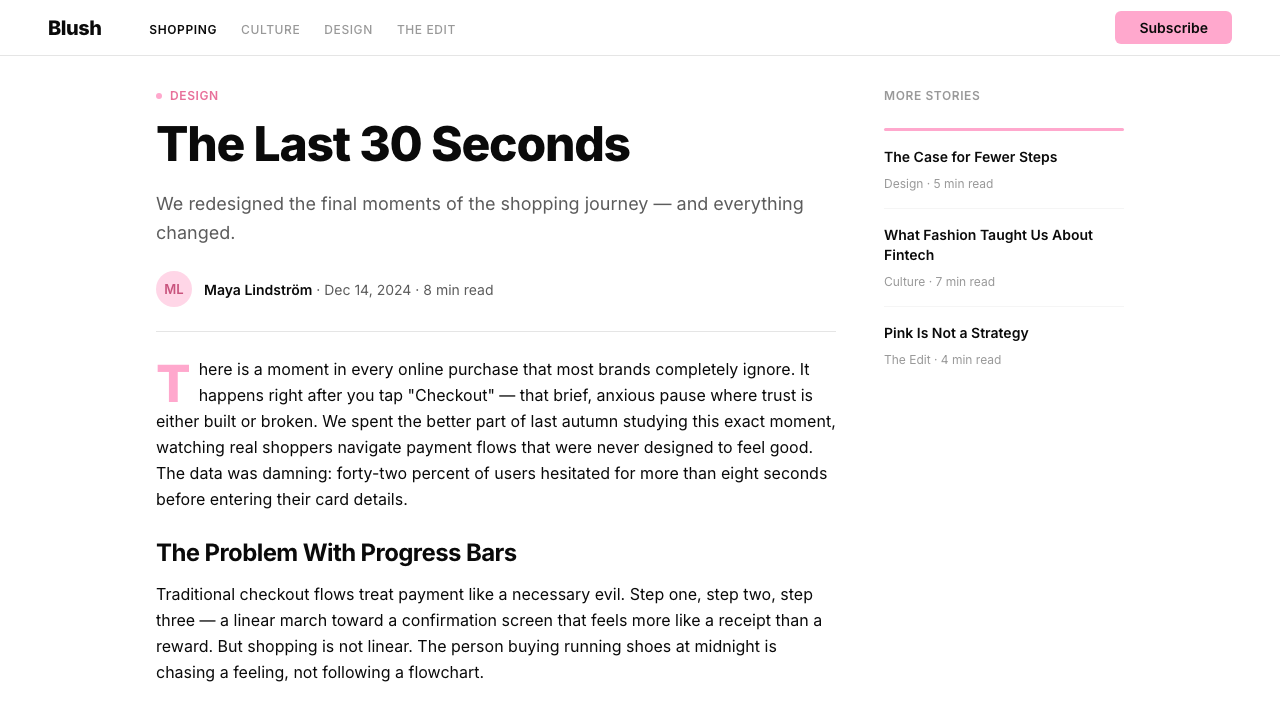
Klarna's visual language borrows conventions from fashion media — generous page margins, typographic boldness treated as aesthetic expression, and imagery selected for mood over information. Product photography and lifestyle imagery, when used, is shot with clean backgrounds and strong lighting, treated as editorial content rather than technical documentation. This posture deliberately positions a financial utility as a lifestyle brand, communicating that shopping with Klarna is itself a desirable experience.Klarna 的视觉语言借鉴了时尚媒体的惯例——充裕的页边距、将字体排印的大胆视为美学表达、以及以情绪而非信息为选图标准。产品摄影和生活方式图像在使用时,以干净背景和强烈光线拍摄,被当作编辑内容而非技术说明处理。这种姿态有意将一个金融工具定位为生活方式品牌,传达出与 Klarna 一起购物本身就是一种令人向往的体验。
Consistency as the Brand Voice一致性即品牌声音
Perhaps the deepest structural choice in the Klarna system is its commitment to consistency across every scale and medium. The same pink, the same typographic logic, the same anti-decoration stance appears on mobile app screens, outdoor advertising, web checkout flows, social media assets, and physical packaging. This uniformity means the system does not need complexity — recognition is built through repetition of a few very precise decisions rather than through visual variety.Klarna 系统中最深层的结构性选择,也许是对跨尺度、跨媒介一致性的坚守。同一抹粉色、同一套字体逻辑、同一种反装饰立场,出现在移动应用界面、户外广告、网页结账流程、社交媒体素材和实体包装上。这种统一性意味着系统不需要复杂性——认知度通过几个极为精确的决策的不断重复而积累,而非依靠视觉多样性。
Who shaped Klarna?谁塑造了 Klarna?
Co-founder and long-serving CEO of Klarna, Siemiatkowski has driven the company's strategic positioning from payment infrastructure toward consumer lifestyle brand. His articulated vision — that Klarna should feel like a trusted shopping companion rather than a lender — directly shaped the brief that led to the 2018 visual rebrand. Under his leadership, the company expanded across more than forty countries while maintaining a single, coherent visual identity, which itself became a case study in how consistent branding compounds into competitive advantage.Klarna 联合创始人兼长期 CEO,Siemiatkowski 推动了公司从支付基础设施向消费者生活方式品牌的战略转型。他明确表达的愿景——Klarna 应该让人感觉像一位值得信赖的购物伙伴,而非一个贷款机构——直接塑造了 2018 年品牌重塑的核心命题。在他的领导下,公司扩展至四十余个国家,同时保持了单一连贯的视觉标识,该标识本身也成为一致性品牌如何转化为竞争优势的经典案例研究。
Co-founder of Klarna, Adalberth helped establish the company's foundational product philosophy — that reducing friction in the payment experience was itself a meaningful consumer benefit. This philosophy, which prioritized user experience over conventional financial-sector presentation norms, created the cultural conditions for the eventual visual repositioning. Adalberth later departed to found the philanthropic organization Norrsken Foundation, but his influence on Klarna's original ethos of making financial services feel effortless persists in the brand's visual simplicity.Klarna 联合创始人,Adalberth 帮助确立了公司的基础产品哲学——降低支付体验中的摩擦本身就是一种有意义的消费者价值。这种优先考虑用户体验而非遵循传统金融行业呈现规范的哲学,为后来的视觉重新定位创造了文化土壤。Adalberth 后来离开创立了慈善机构 Norrsken 基金会,但他对让金融服务感觉轻松自然的原始理念的影响,依然留存在 Klarna 品牌的视觉简洁性之中。
The London-based brand agency that executed the 2018 Klarna rebrand, DesignStudio is known for identity systems built around strong, singular choices rather than comprehensive visual libraries. Their approach with Klarna — selecting a single chromatic color and refusing to dilute it with secondary palettes or decorative systems — reflects their broader design philosophy. The studio had previously worked on high-profile identity projects for companies including Airbnb and Premier League, and their Klarna work has since become one of the most cited examples of successful fintech brand differentiation.执行 2018 年 Klarna 品牌重塑的伦敦品牌机构,DesignStudio 以围绕强烈单一选择而非庞杂视觉资产库构建识别系统而著称。他们在 Klarna 项目上的策略——选定单一彩色并拒绝用辅助色或装饰系统稀释它——折射出他们更广泛的设计哲学。该工作室此前曾为 Airbnb 和英超联赛等高知名度客户操刀品牌识别项目,而他们为 Klarna 完成的工作此后成为金融科技品牌成功差异化的最常引用案例之一。
The buy-now-pay-later sector that Klarna helped pioneer created a distinct set of visual communication challenges: the products needed to feel trustworthy enough to handle financial transactions yet approachable enough to attract consumers who distrust traditional banking. Klarna's visual resolution of this tension — premium simplicity and fashion-aligned color rather than institutional gravity — influenced a wave of subsequent fintech brands that sought to differentiate themselves from legacy banking aesthetics. The movement demonstrated that the visual language of a financial product could be decoupled from the inherited conventions of financial services design.Klarna 参与开创的先买后付行业,带来了一套独特的视觉传播挑战:产品需要在处理金融交易时显得足够值得信赖,同时又足够亲切,能够吸引那些对传统银行持不信任态度的消费者。Klarna 对这一张力的视觉解决方案——高级简洁与时尚对齐的色彩,而非机构式的庄重感——影响了后续一大批寻求与传统银行美学区分开来的金融科技品牌。这场运动证明,金融产品的视觉语言可以从金融服务设计的继承惯例中解放出来。
How do you use Klarna today?今天怎么用 Klarna?
Applying the Klarna style correctly requires internalizing its core logic: the system communicates through what it removes, not what it adds. Before placing any element, ask whether the pink, the black typography, and the white space can carry the communicative burden without supplementary color, texture, or decoration. If the answer is no, the instinct is usually to refine the content rather than to add visual complexity.正确应用 Klarna 风格,需要内化其核心逻辑:这套系统通过移除来传达,而非通过添加。在放置任何元素之前,先问一问:粉色、黑色字体和留白,是否能独自承担传播重量,无需辅助色、纹理或装饰?如果答案是否定的,通常的正确本能是打磨内容,而非增加视觉复杂度。
For presentation slides, the Klarna system works with exceptional force on cover and section-break pages. A cover should commit to a full pink background with a single, large, heavy-weight typographic statement in black — the contrast between the bold letterforms and the pink field is the design. Content slides work on white or near-white grounds, with typographic hierarchy carrying all organizational weight. Pink appears sparingly on content pages — as a highlight strip, a colored data bar, or a strong pull quote background — never as the general field. Data slides benefit from the system's structural clarity: bar charts, progress indicators, and comparison tables become crisp when color is restricted to the primary pink for one data series and black for the rest.在演示文稿中,Klarna 风格在封面页和章节分隔页上展现出极强的视觉冲击力。封面应该以全粉色背景为底,配以单条大号、粗重的黑色字体陈述——粗壮字形与粉色底面之间的对比就是设计本身。内容页在白色或接近白色的底面上展开,完全依靠字体层级承载所有组织性重量。粉色在内容页上极为克制地出现——作为高亮条、彩色数据柱或强力引用背景——绝不作为通用底色。数据页得益于系统的结构清晰性:当色彩仅限于一个数据系列用品牌粉、其余用黑色时,柱状图、进度指示器和对比表格变得格外利落。
For web user interfaces, the Klarna approach is particularly well-suited to e-commerce checkout flows, product pricing pages, and account dashboard states where clarity and confidence are the primary goals. The structural pattern is consistent: white or near-white background for the functional layer, black for all informational text, and pink reserved for primary action elements — the key button, the selected state, the confirmation confirmation indicator. Shadow treatments, if used at all, should be flat and hard-edged rather than soft and diffuse. Card components look best when they use clean borders or elevation through flat-color offset rather than blurred box shadows.对于网页用户界面,Klarna 的方式特别适合电商结账流程、产品定价页面和账户仪表板,因为清晰与自信是这些场景的首要目标。结构模式一以贯之:白色或接近白色的背景承载功能层,黑色用于所有信息性文字,粉色保留给主要操作元素——关键按钮、选中状态、确认指示符。阴影处理若存在,应是平整硬边而非柔和漫射。卡片组件最好使用干净边框或通过平色位移来表现层次,而非模糊的框阴影。
For editorial and marketing applications, the Klarna style supports a poster-like directness. Full-width feature sections alternating between pink grounds with black type and white grounds with black type create rhythm without introducing new colors. Photography, when integrated, should be treated editorially: clean, high-contrast, often cropped to emphasize the subject rather than the setting. Marketing campaign assets — social cards, display advertising, out-of-home formats — benefit from the boldness of a full-bleed pink field with a single strong typographic statement, because the format rewards immediate recognizability over informational complexity.对于编辑和营销应用场景,Klarna 风格支持海报式的直接表达。全宽特性区块在粉底黑字与白底黑字之间交替,制造节奏而不引入新色彩。摄影图像在整合时应被编辑性处理:干净、高对比度,常常裁切至突出主体而非场景。营销素材——社交卡片、展示广告、户外广告格式——能从满版粉底搭配单条有力字体陈述的大胆形式中获益,因为这类格式奖励的是即时可识别性,而非信息复杂度。
The most common mistake when working in this style is treating the pink as one color among many, reaching for a blue or green to signal information categories, error states, or secondary actions. The Klarna system has no room for this expansion — it resolves all communication needs through the interplay of pink, black, and white alone, using scale, weight, and spatial distribution as the variables. A second common error is softening the typography, selecting a lighter weight or a more humanist letterform to avoid the style feeling cold. The hardness and weight of the typographic voice is precisely what makes the pink feel deliberate rather than accidental. Remove the contrast, and the system loses its tension.在这种风格中最常见的错误,是将粉色视为众多颜色之一,继而伸手去拿蓝色或绿色来标注信息类别、错误状态或次级操作。Klarna 系统没有容纳这种扩展的空间——它仅凭粉色、黑色与白色的相互作用解决所有传播需求,以大小、字重和空间分布为变量。第二个常见错误是软化字体,选择较轻的字重或更人文的字形,以避免风格显得冷漠。字体声音的厚重与力度,恰恰是使粉色显得刻意而非偶然的原因。一旦消解了这种对比,整套系统便失去了它的张力。
Klarna — FAQKlarna · 常见问题
Can the Klarna style work in a dark-background variant?Klarna 风格可以做成深色背景的变体吗?
A dark inversion is technically possible but requires significant care. On a black ground, the dusty pink can feel unexpectedly heavy rather than light, losing the breezy quality that makes it distinctive. The system's power on a light ground comes from the brightness ratio between the pink field and the white ground — that relationship collapses on dark. If a dark variant is needed, the most coherent approach is to treat black as the structural field and use the pink exclusively for typographic elements or narrow accent lines, rather than reversing the full composition. The result will read differently from the canonical system, which should be considered a feature rather than a failure.深色反转在技术上是可行的,但需要非常谨慎。在黑色底面上,那抹带雾感的粉色可能会意外地显得沉重而非轻盈,失去它独特的清爽气质。这套系统在浅色底面上的力量,来自粉色块与白色底面之间的亮度比率——这种关系在深色底面上会崩溃。如果确实需要深色变体,最为连贯的做法是将黑色作为结构性底色,将粉色仅用于字体元素或细窄的点缀线条,而非将整套构图完全翻转。结果将与标准系统呈现出不同的观感,这应该被视为一种特性而非失败。
How does the Klarna style handle data visualization and charts?Klarna 风格如何处理数据可视化和图表?
The system's extreme chromatic restriction is both a constraint and a clarifying force in data visualization. Rather than using different colors to distinguish data categories — the default convention in most charting libraries — the Klarna approach relies on contrast between the signature pink and black, with white used as the ground. For a single data series, pink fills naturally. For comparisons requiring distinction, the convention is pink versus black, or solid versus outlined, rather than introducing a second hue. This approach forces compositional clarity: if a chart cannot be read in two tones, the underlying data presentation needs rethinking. Charts designed this way tend to be simpler and more immediately readable than their colorfully coded equivalents.系统的极度色彩限制,在数据可视化中既是约束也是澄清力量。Klarna 的方式不是用不同颜色区分数据类别——这是大多数图表库的默认惯例——而是依赖品牌粉与黑色之间的对比,以白色作为底色。单一数据系列自然以粉色填充。需要区分的对比,采用粉色对黑色、实填充对轮廓的方式,而非引入第二种色相。这种方式强制要求构图的清晰性:如果一张图表无法在两种色调下被读懂,则底层数据的呈现方式需要重新思考。按这种方式设计的图表,往往比多色编码的同类图表更简洁、更能被立即读取。
What kinds of products or brands should avoid the Klarna style?什么类型的产品或品牌应该避免使用 Klarna 风格?
The Klarna style communicates lightness, modernity, and a kind of deliberate sweetness — emotional registers that are a poor fit for contexts requiring authority, gravity, or institutional trust. Healthcare providers, legal services, financial planning tools aimed at older demographics, and government-adjacent services would likely suffer from the style's playful connotations. Similarly, the style's simplicity can feel thin in contexts where richness, tradition, or cultural depth are valued — luxury goods with artisanal heritage, cultural institutions, or editorial contexts covering serious topics. The style is at its best where the product genuinely wants to feel easy, contemporary, and slightly surprising.Klarna 风格传达的是轻盈感、现代性和一种刻意的甜蜜——这些情感基调与需要权威性、庄重感或机构信任的场景格格不入。医疗服务提供商、法律服务、面向年长用户群体的财务规划工具,以及与政府相关的服务,很可能会因这种风格的轻快联想而受损。同样,在珍视丰富感、传统或文化深度的场景中,这种风格的简洁可能会显得单薄——具有工匠传承的奢侈品、文化机构,或涉及严肃议题的编辑内容。这种风格在产品真正希望感觉轻松、当代且略带意外感的场景中表现最好。
Is the Klarna visual system minimalism?Klarna 的视觉系统是极简主义吗?
It shares surface characteristics with minimalism — reduced palette, absence of decoration, generous white space — but the underlying logic is different. Minimalism, in its contemporary use, tends toward quietness and neutrality: the palette often includes warm greys, soft textures, and muted tones that recede rather than assert. The Klarna system is assertive. The pink is not chosen because it disappears; it is chosen because it demands attention. The typographic treatment is bold, not delicate. The system uses restraint, but not in service of neutrality — it uses restraint in service of impact. A better description might be high-reduction boldness: everything removed except the elements that maximize presence.它与极简主义共享表面特征——色板简化、无装饰、充足留白——但内在逻辑是不同的。当代语境下的极简主义倾向于静谧与中性:色板常包含暖灰、柔软纹理和退缩而非主张的哑光调。Klarna 系统是主张性的。选择粉色不是因为它会消隐;选择它恰恰是因为它要求注意。字体处理是粗重的,不是纤细的。系统运用了克制,但不是为了服务于中立性——而是为了服务于冲击力。一个更准确的描述也许是高度精简的大胆:除了最大化存在感的元素之外,一切都被移除。
How should imagery and photography be selected and treated when using this style?使用这种风格时,应该如何选择和处理图像与摄影?
Imagery in the Klarna system works best when it is treated as editorial rather than documentary. Select photographs with clean, uncluttered backgrounds — ideally white, cream, or a neutral — so that the subject reads as a graphic element against the ground rather than as a window into a complex scene. High contrast and strong, directional lighting reinforce the system's structural boldness. Avoid photographs with ambient softness, golden-hour warmth, or lifestyle complexity — they import a tonal range and an emotional warmth that competes with the system's chromatic restriction. When images appear alongside the signature pink, the most coherent treatment is either a contained rectangular crop on a white ground, or a full-bleed photograph where a pink typographic overlay carries the brand voice.Klarna 系统中的图像,以编辑性而非纪录性的处理方式效果最佳。选择背景干净简洁的摄影——理想情况下是白色、奶油色或中性色——使主体作为图形元素在底色上被读取,而非作为通往复杂场景的窗口。高对比度和强烈的方向性光线强化了系统的结构性大胆感。避免具有环境柔和感、黄金时刻温暖光线或生活方式复杂性的照片——它们引入了一个色调范围和情感温度,与系统的色彩限制形成竞争。当图像与品牌粉并置时,最为连贯的处理方式,是在白色底面上的受控矩形裁切,或是满版照片上叠加粉色字体的方式来承载品牌声音。
Related design styles相关设计风格
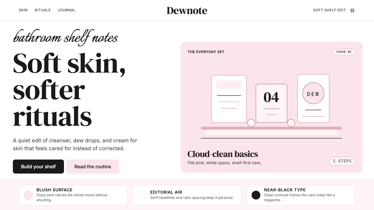 GlossierBeauty as a friend's conversation. Dusty pink (never bubblegum), editorial se…美妆是闺蜜间的私语:唯一标志性的灰粉色(不是泡泡糖粉)、编辑式衬线字体、纯平面…
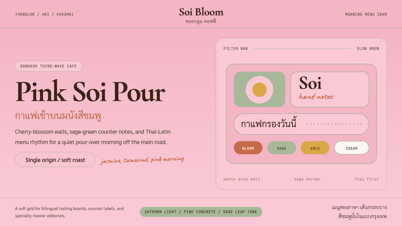 Bangkok Third-Wave CafeBangkok feels soft but sure. Cherry pink, sage borders, and Thai-Latin menu r…曼谷柔和却自信:樱花粉、鼠尾草边框与泰英菜单节奏。
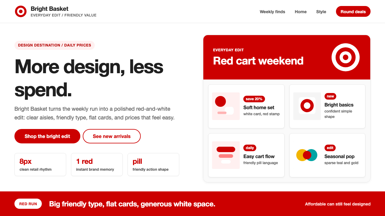 Target — Bullseye RedCheap-chic feels warm. Red bullseyes, pill CTAs, and white space make value l…平价也有设计感:红色靶心、药丸按钮与留白,让日常消费更亲切。
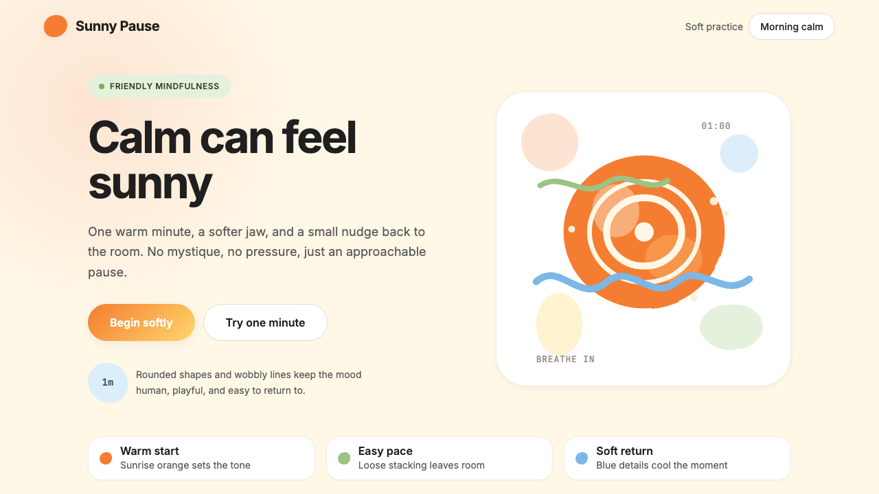 HeadspaceOptimism makes calm approachable. Sunrise orange and wobbly rounded forms bre…乐观让平静亲近:日出橙与摇摆圆形在奶油底上呼吸。
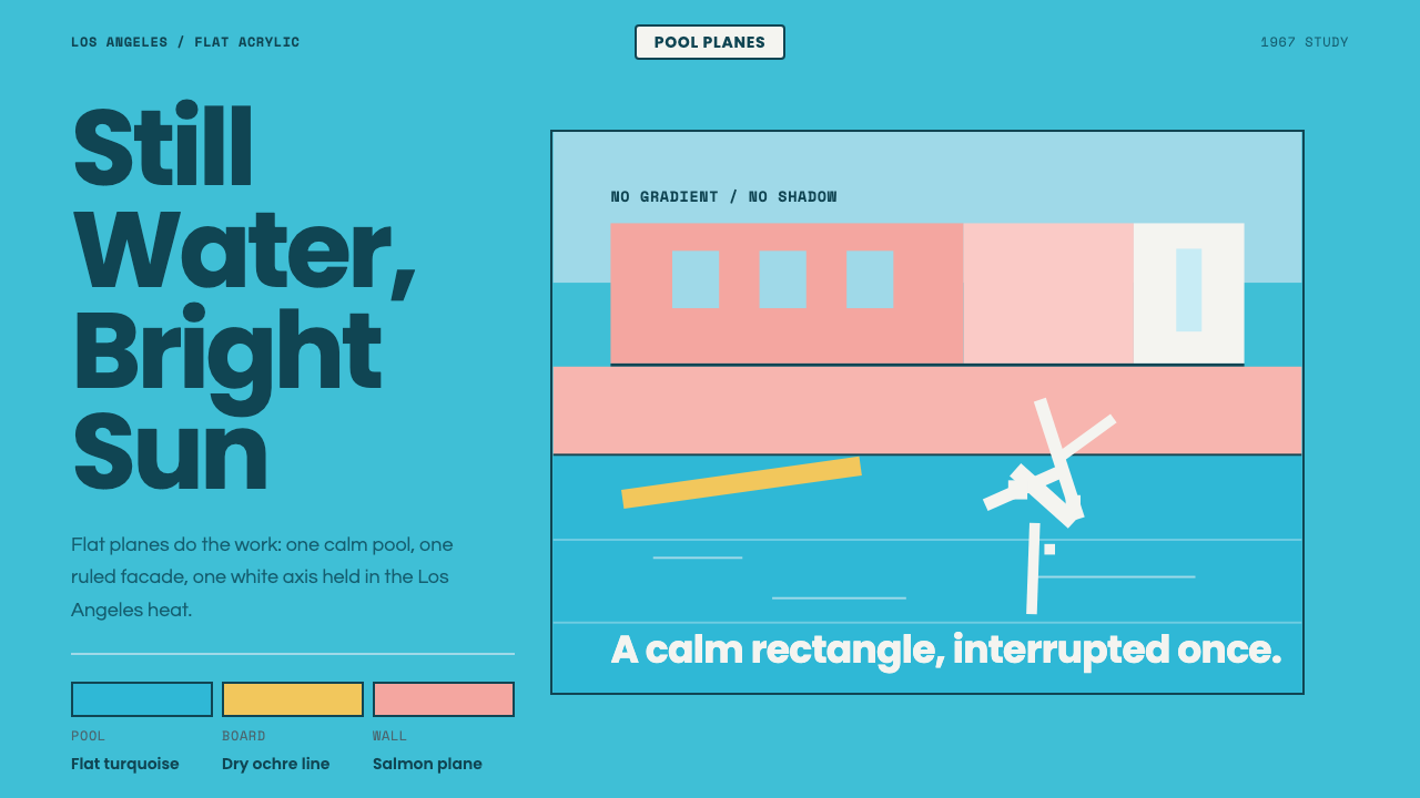 Hockney Pool BlueSerenity turns graphic. Turquoise planes, salmon edges, one white splash.宁静变成图形:绿松石色块、鲑鱼粉边界与一道白色水花。
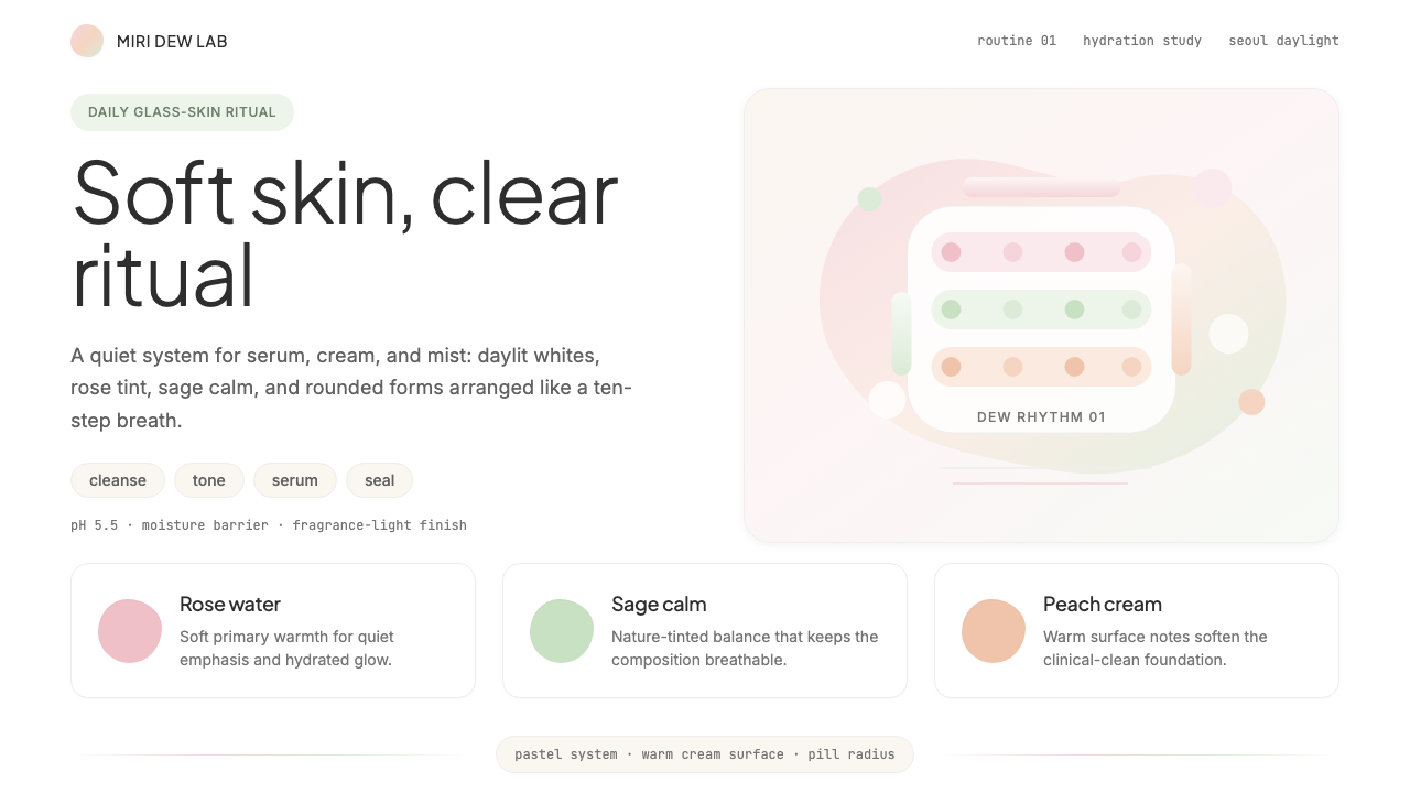 K-Beauty CleanCalm arrives dewy. Rose, sage, and peach pastels float through airy rounded f…水润的平静:玫瑰、鼠尾草与蜜桃粉彩在圆润留白中漂浮。