Design style guide设计风格指南
What is Bangkok Third-Wave Cafe?什么是 Bangkok Third-Wave Cafe?
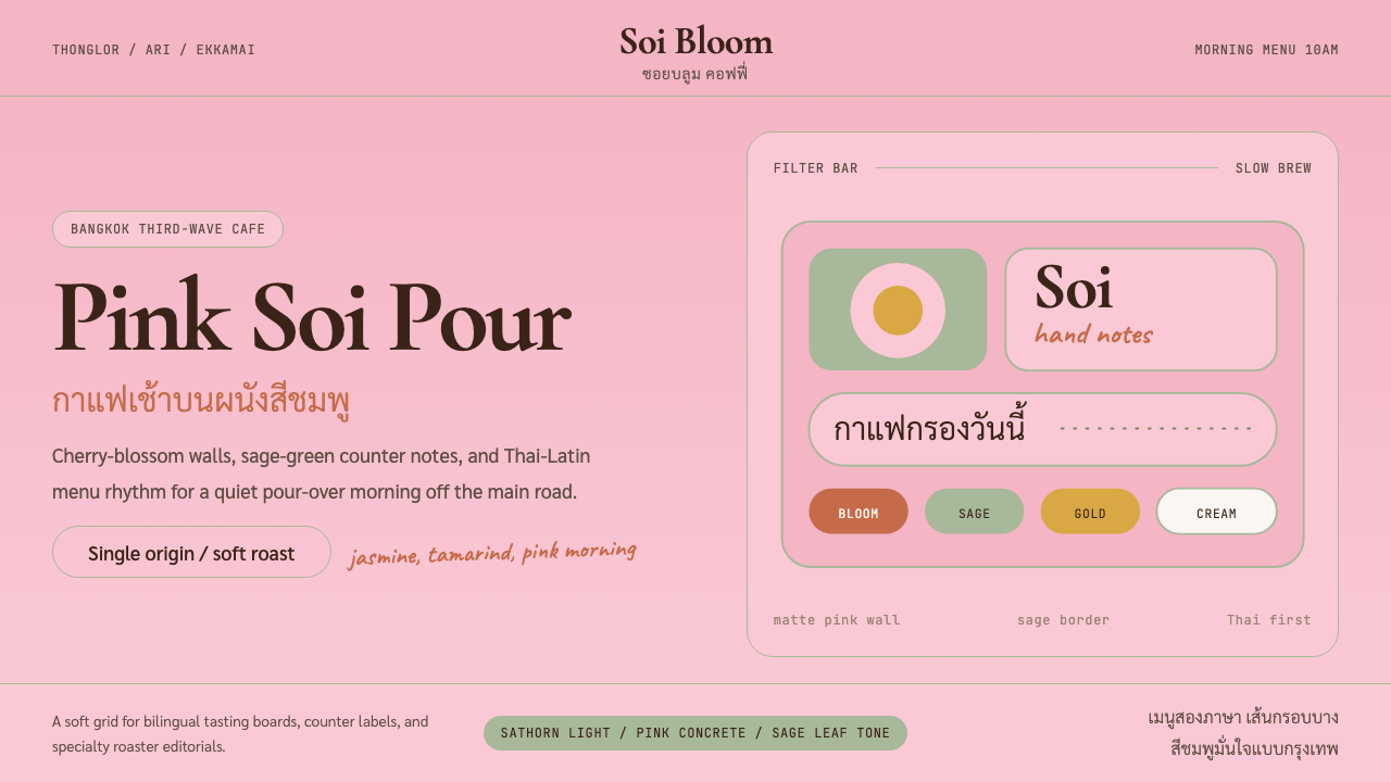
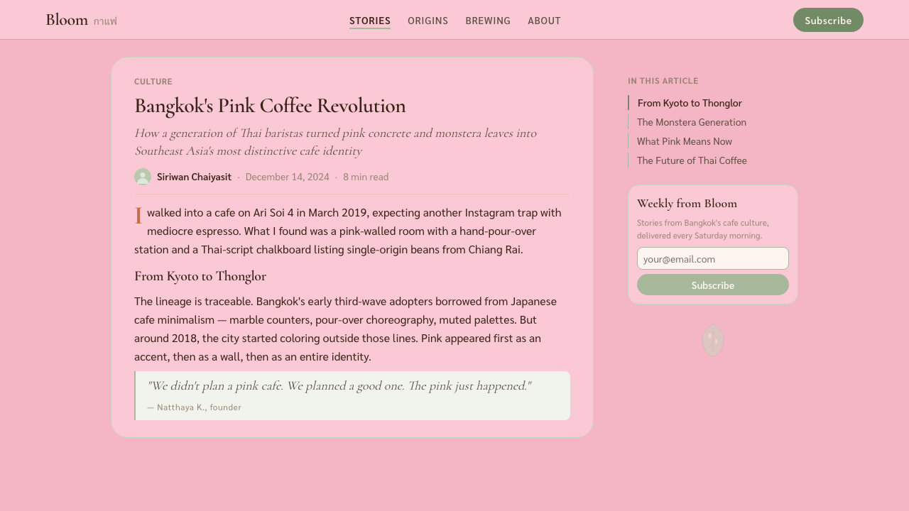
Bangkok Third-Wave Cafe is the aesthetic of a Thonglor side-soi at ten in the morning — cherry-blossom walls, sage monstera, and bilingual menus set with the calm confidence of a city that knows exactly what it is.曼谷第三波咖啡馆美学是通罗小巷上午十点的样子——樱花粉墙、鼠尾草龟背竹,双语菜单以一座对自身了然于心的城市特有的从容自信排列其上。
Bangkok Third-Wave Cafe in briefBangkok Third-Wave Cafe 速览
Bangkok Third-Wave Cafe is a visual language born in the specialty-coffee corridors of Bangkok's inner east side between roughly 2018 and 2024. It fuses Japanese pour-over minimalism — the spare surfaces and restrained palette imported from Kyoto's third-wave roasters — with a distinctly Thai warmth expressed through blossom-pink walls, tropical foliage, and the gentle collision of Thai and Latin scripts on a single menu card.曼谷第三波咖啡馆是一套视觉语言,约在2018至2024年间诞生于曼谷内东区的精品咖啡走廊。它将日式手冲极简主义——从京都第三波烘焙师处引进的简练表面与克制色板——与泰式特有温度融为一体:樱花粉墙、热带植物、泰文与拉丁文在同一张菜单上温柔碰撞。
Where Japanese cafe minimalism tends toward severity and wabi-sabi earthiness, the Bangkok variant softens everything. Surfaces are matte but not raw; pinks are cherry-blossom delicate rather than bubblegum loud; greenery appears as considered accent rather than wild abundance. The overall mood is one of confident ease: not striving to be Tokyo, not nostalgic for old Bangkok, but entirely itself.日本咖啡馆极简主义趋于严峻与侘寂质朴,曼谷变体则将一切柔化。表面哑光但不粗粝;粉色是樱花的细腻而非泡泡糖的喧嚣;绿植以考量过的点缀出现,而非蓬勃的过盛。整体气质是从容自信的轻盈:不执意成为东京,不缅怀旧日曼谷,完全就是它自己。
The style carries a quiet bilingual intelligence at its core. Thai script and Latin letterforms must coexist on signage, menus, and packaging without either apologizing for the other. This constraint — which could produce visual dissonance — instead became a generative tension. Designers learned to exploit the natural roundness and rhythmic density of Thai glyphs as a counterweight to the open ascenders and descenders of Latin type, producing menu layouts that read as unified compositions rather than awkward compromises.这种风格的核心藏着一种静谧的双语智识。泰文与拉丁字母必须在招牌、菜单、包装上共存,两者都无需为对方让步。这一约束——本可制造视觉不和谐——反而成了一种生成性张力。设计师学会利用泰文字形天然的圆润与节律密度,与拉丁字母开放的升部和降部形成平衡,令菜单版面呈现为统一的构图而非牵强的妥协。
See the Bangkok Third-Wave Cafe design system →查看 Bangkok Third-Wave Cafe 完整设计系统 →
Where does Bangkok Third-Wave Cafe come from?Bangkok Third-Wave Cafe 从何而来?
The roots of Bangkok's third-wave cafe aesthetic lie in two overlapping histories: the global spread of specialty-coffee culture after 2010, and Bangkok's own long-running negotiation between modernist aspiration and tropical tradition. Japanese coffee culture arrived in Thailand first as product export — single-origin beans, manual brewing equipment, precision temperature scales — and then as an aesthetic sensibility that Bangkok's roasters translated rather than copied.曼谷第三波咖啡馆美学的根源交织于两段历史:2010年后精品咖啡文化的全球扩散,以及曼谷自身在现代主义抱负与热带传统之间长期进行的协商。日本咖啡文化最初以产品出口的形式抵达泰国——单一产地豆、手动冲煮器具、精密温度秤——继而成为一种美学感性,曼谷的烘焙师们将其翻译而非复制。
Roots Coffee, founded in Bangkok in 2014 by Varatt Vichit-Vadakan, is widely credited as the incubator of the look. Its Thonglor flagship — matte cream walls, sage-toned plants, warm-toned light fittings, and a menu typeset with the kind of careful leading you more commonly see on a gallery wall than a coffee counter — established that Thai specialty coffee could be visually literate without mimicking Nordic or Japanese templates. Brave Roasters, launched by Sahussawan Khanjornkavin and her partners, pushed the palette warmer and pinker, leaning into cherry blossom as a conscious cultural signal rather than a borrowed aesthetic.瓦拉特·维奇特-瓦达坎于2014年在曼谷创立的Roots Coffee被普遍视为这套美学的孵化器。其通罗旗舰店——哑光奶油墙面、鼠尾草色系植物、暖调灯具,以及以画廊展签般细腻行距排版的菜单——确立了泰国精品咖啡可以在视觉上达到文化自觉,而无需模仿北欧或日本模板。萨苏旺·坎乔尔卡尼鲁文及其合伙人创立的Brave Roasters将色板推向更温暖、更粉润的方向,有意识地将樱花作为文化信号而非借来的美学。
Kenneth Shoji's involvement as a design consultant to several Thonglor and Ari cafes helped crystallize the Japanese-Thai synthesis. His approach treated the matte surface not as a blank canvas in the minimalist tradition but as a material with its own warmth — dusty and chalky rather than clinical. The result was spaces that photographed beautifully in the diffuse natural light that Bangkok's late-morning hours provide, which proved essential: the Thonglor cafe aesthetic was shaped partly by its own Instagram documentation, a feedback loop between the space's design and how it looked in a phone camera's square frame.肯尼斯·庄治作为多家通罗与阿里咖啡馆的设计顾问,协助将日泰融合提炼为清晰面貌。他的方法不将哑光表面视为极简主义传统中的空白画布,而是视之为具有自身温度的材料——粉尘感与粉笔感,而非冰冷的临床感。其结果是一批在曼谷上午晚些时段漫射自然光下格外上镜的空间,这一点至关重要:通罗咖啡馆美学在一定程度上由其Instagram记录所塑造——空间设计与手机相机方形取景之间形成了一个反馈回路。
By 2020 the aesthetic had consolidated into recognizable conventions: cherry or dusty-rose wall paint in matte finish, sage or eucalyptus greenery as counterpoint, marble or terrazzo surfaces, rounded pill-shaped UI elements migrating from physical menus to cafe apps and Instagram story templates, and handwritten tasting notes in a casual italic. The Ari and Ekkamai neighborhoods added their own inflections — Ekkamai slightly rawer and more industrial, Ari softer and more residential — but all three corridors shared the same foundational palette and typographic sensibility.到2020年,这套美学已凝固为可辨识的惯例:哑光樱花或尘玫红墙漆、鼠尾草或桉树绿植作为对位色、大理石或水磨石台面、从实体菜单迁移至咖啡馆App与Instagram故事模板的圆润药丸形UI元素,以及以随性斜体书写的手写风味笔记。阿里与伊卡迈街区加入各自的注脚——伊卡迈略粗犷工业,阿里更柔和居家——但三条走廊共享同一基础色板与字体感性。
Phongtorn Karnchanawanichkun's graphic work for several Bangkok-based roasters helped define the typographic identity of the movement: Thai script given full visual parity with Latin type, both rendered at generous leading, neither subordinated to the other. This bilingual confidence — treating the two scripts as complementary rather than hierarchically ordered — became the movement's most distinctive contribution to Southeast Asian cafe design, influencing roasters and cafe brands as far as Chiang Mai, Ho Chi Minh City, and Kuala Lumpur.多位曼谷烘焙师的品牌图形设计帮助界定了这场运动的字体身份:泰文在视觉上与拉丁字体完全平权,两者以宽松行距呈现,互不从属。这种双语自信——将两种字体系统视为互补而非层级排列——成为这场运动对东南亚咖啡馆设计最具辨识度的贡献,影响延伸至清迈、胡志明市与吉隆坡的烘焙师与咖啡馆品牌。
What defines the Bangkok Third-Wave Cafe look?Bangkok Third-Wave Cafe 的视觉特征是什么?
Palette色板
The foundational palette pivots around a dusty cherry-blossom pink — muted rather than saturated, closer to dried petals than fresh ones — paired with sage or eucalyptus green as the primary counterpoint. Cream and warm off-white serve as the dominant background tones, giving the palette its particular softness. Marble veining and terrazzo speckle introduce the only naturalistic complexity, held in check by the evenness of the painted surfaces surrounding them. The overall effect is one of warmth without heat: colours that feel considered and slightly faded, as though the cafe has been in the Bangkok sun just long enough to develop its own patina.基础色板以尘雾樱花粉为轴心——柔和而非饱和,更接近干燥的花瓣而非新鲜的——以鼠尾草绿或桉树绿作为主要对位。奶油色与温润灰白是主导背景色调,赋予色板特有的柔软感。大理石纹脉与水磨石斑点引入唯一的自然主义复杂性,被周围均匀的涂料表面所约束。整体效果是温暖而无炽热:色彩显得经过深思熟虑且略带褪色感,仿佛这家咖啡馆在曼谷阳光下恰好待得足够久,发展出属于自己的包浆。
Surface Texture表面质感
Matte finish is non-negotiable — on walls, on packaging, on ceramic cups. The rejection of gloss is both aesthetic and practical: matte surfaces diffuse the harsh tropical light that pours through Bangkok's east-facing windows, producing the even, flattering glow that became the style's photographic signature. Terrazzo and raw marble introduce texture at counter level, their mineral complexity acting as a visual anchor that prevents the matte softness above from reading as bland. Hand-thrown ceramic cups, with their slight irregularities, extend the soft-tactile register to the object in the guest's hand.哑光饰面是不可妥协的要素——无论是墙面、包装还是陶瓷杯。对光泽的拒绝兼具美学与实用双重考量:哑光表面漫射透过曼谷东向窗户倾泻而入的强烈热带光线,产生均匀而柔和的光晕,成为这种风格的摄影标志。水磨石与原色大理石在吧台高度引入质感,其矿物质复杂性作为视觉锚点,防止上方的哑光柔软感被解读为平淡乏味。手拉坯陶瓷杯以其细微的不规整感,将柔软触感的音域延伸至客人手中的器物。
Typographic Bilingualism双语字体排印
Thai and Latin scripts are treated as equally weighted partners in every typographic application. Menu headings, signage, and packaging give each script equal leading, equal weight in the visual hierarchy, and roughly equivalent spatial territory on the page. Rather than subordinating one to the other — as many international cafe brands do when entering Thai-speaking markets — the Bangkok style makes the two-script composition itself a design statement. The natural round density of Thai glyphs and the open vertical rhythm of Latin letterforms create a balanced visual counterpoint when set with generous leading.泰文与拉丁字母在所有字体排印应用中被视为等权的伙伴。菜单标题、招牌与包装给予两种字体系统同等的行距、视觉层级中同等的字重,以及页面上大致相当的空间领域。不像许多进入泰语市场的国际咖啡品牌会将其中一种从属于另一种——曼谷风格将双字体系统的构图本身作为设计宣言。泰文字形天然的圆润密度与拉丁字母开放的垂直节律,以宽松行距排列时形成平衡的视觉对位。
Botanical Accent植物点缀
Monstera leaves, trailing pothos, and small eucalyptus branches appear as considered accent rather than decorative abundance. The greenery is always sage or muted olive in tone — never the vivid emerald that the same plants would show in stronger light — because the cafe environment softens foliage through controlled backlighting and diffuse positioning. Plants are placed to create compositional rhythm: a large monstera beside a pale wall provides the same kind of structural counterpoint that a bold geometric element might provide in a more austere design system. The biological irregularity of the leaf edge is the style's only permitted organic complexity.龟背竹叶、悬垂绿萝与小枝桉树以考量过的点缀出现,而非装饰性的繁盛。植物的绿色始终是鼠尾草色或柔和橄榄色调——绝非同样植物在强光下呈现的鲜艳翠绿——因为咖啡馆环境通过受控的逆光与漫射位置软化了叶片的色泽。植物被放置以创造构图节奏:一株大龟背竹紧靠浅色墙面,提供与更严峻设计系统中粗重几何元素相似的结构对位感。叶片边缘的生物性不规整,是这种风格唯一被允许的有机复杂性。
Rounded UI Elements圆润UI元素
Pill-shaped buttons, rounded-corner price tags, and softly radiused containers appear consistently across both physical menus and digital touchpoints — the cafe's app, its Instagram story templates, and its QR code landing pages. The rounded corner is not a concession to trend but a coherent extension of the palette's softness: hard right-angled corners would introduce a severity at odds with the overall warmth. The pill shape migrates across scales from the smallest tag to the largest call-to-action button without modification, creating formal consistency across the physical-digital boundary.药丸形按钮、圆角价格标签与柔和半径容器在实体菜单与数字接触点之间保持一致出现——咖啡馆的App、Instagram故事模板与二维码落地页均如此。圆角不是对流行趋势的妥协,而是色板柔软感的连贯延伸:直角会引入与整体温度相悖的严峻感。药丸形在从最小标签到最大行动按钮的各种尺寸上不经修改地迁移,在实体与数字边界之间创造形式一致性。
Handscript Tasting Notes手写风味笔记
A casual italic handscript — typically applied to tasting-note cards, blackboard specials, and packaging stickers — introduces warmth and legibility at the human scale that printed type cannot achieve. The handscript is always light in stroke weight, leaning gently rather than dramatically, and uses a consistent baseline rather than the exaggerated bounce of expressive calligraphy. Its function is to signal care and specificity — that someone thought carefully about this particular batch of coffee — without competing with the quieter, more formal typeset text that frames it.随性斜体手写字——通常用于风味笔记卡、黑板特供与包装贴纸——在印刷字体无法企及的人性尺度上引入温度与亲近感。手写字的笔画始终轻盈,倾斜舒缓而非戏剧性,使用一致的基线而非夸张弹跳的表情书法。其功能是传递用心与具体——有人仔细思考过这批特定的咖啡——同时不与框架它的更安静、更正式的印刷字体竞争。
Light Control光线控制
The Bangkok Third-Wave Cafe aesthetic is inseparable from how it handles light. Natural light is admitted but controlled — sheer linen curtains diffuse direct sun into an even ambient glow; east-facing windows are favored for the gentle quality of morning light over the harsh intensity of afternoon. Artificial lighting uses warm-toned filament bulbs hung at low intervals, supplementing natural light rather than replacing it. The resulting illumination has a specific quality: objects and surfaces photograph without harsh highlights or deep shadows, which is why the style emerged so strongly on social media — it was designed, in effect, to be photographed in its native light.曼谷第三波咖啡馆美学与其处理光线的方式不可分割。自然光被接纳但受到控制——薄亚麻窗帘将直射阳光漫射为均匀的环境光晕;东向窗因上午光质柔和而优于午后的强烈刺目而被偏爱。人工照明使用低悬的暖色灯丝灯泡,补充自然光而非取代它。由此产生的照明具有特定品质:物体与表面在拍摄时不出现强烈高光或深重阴影,这正是这种风格在社交媒体上如此强势涌现的原因——它实际上是为了在其原生光线中被拍摄而设计的。
See the Bangkok Third-Wave Cafe design system →查看 Bangkok Third-Wave Cafe 完整设计系统 →
Who shaped Bangkok Third-Wave Cafe?谁塑造了 Bangkok Third-Wave Cafe?
Varatt Vichit-Vadakan is the co-founder of Roots Coffee, widely regarded as the originating space for the Bangkok Third-Wave Cafe aesthetic. His approach — refusing to choose between Japanese precision and Thai warmth — established the hybrid sensibility that defined the movement. Roots' Thonglor flagship, opened in 2014, became the reference point that subsequent roasters, interior designers, and cafe brands throughout Bangkok and Southeast Asia measured themselves against. Varatt's insistence on treating the cafe as a complete designed environment, from the cup to the wall colour to the menu layout, gave the aesthetic its unusual coherence.瓦拉特·维奇特-瓦达坎是Roots Coffee的联合创始人,被普遍视为曼谷第三波咖啡馆美学的发源空间。他的方式——拒绝在日本精准与泰式温度之间二选一——确立了定义这场运动的混合感性。2014年开业的Roots通罗旗舰店成为曼谷乃至东南亚后续烘焙师、室内设计师与咖啡品牌的参照基准。瓦拉特坚持将咖啡馆视为一个完整的设计环境——从杯子到墙色到菜单版面——赋予了这套美学不寻常的连贯性。
Sahussawan Khanjornkavin co-founded Brave Roasters, which pushed the palette of the Bangkok cafe aesthetic toward its most recognizably warm and pink expression. Where Roots had leaned toward cream and sage, Brave committed more fully to cherry blossom as a statement colour — a decision that proved enormously influential on the broader movement. Her approach to branding treated the roastery's packaging and social media presence as extensions of the physical space, establishing a standard of cross-platform visual consistency that became normative for Bangkok specialty coffee brands in the early 2020s.萨苏旺·坎乔尔卡尼鲁文联合创立了Brave Roasters,将曼谷咖啡馆美学的色板推向最具辨识度的温暖与粉润表达。Roots偏向奶油与鼠尾草,Brave则更全面地将樱花粉作为宣言色——这一决定对整个运动产生了巨大影响。她的品牌方法将烘焙坊的包装与社交媒体呈现视为实体空间的延伸,建立了一种跨平台视觉一致性标准,在2020年代初成为曼谷精品咖啡品牌的规范。
Kenneth Shoji worked as a design consultant across multiple Thonglor and Ari cafe spaces during the consolidation period of the aesthetic. His contribution was primarily spatial: the understanding that matte surfaces should be understood not as minimalism but as active material, with their own warmth and dusty texture. He helped resolve the central tension in the style between the Japanese-influenced drive toward restraint and the Thai preference for hospitality-warmth, finding a position where each reinforced rather than cancelled the other. His work on lighting design — the specific approach to diffusing natural light through linen and complementing it with warm artificial sources — became a formative influence on the movement's photographic signature.肯尼斯·庄治在美学凝固时期担任通罗与阿里多家咖啡馆空间的设计顾问。他的贡献主要是空间性的:确立了哑光表面不应被理解为极简主义,而应被理解为具有自身温度与粉尘质感的能动材料的认知。他帮助化解了这种风格的核心张力——日式影响带来的克制趋向与泰式好客温度的偏好——找到了一个让两者相互强化而非相互抵消的位置。他在灯光设计上的工作——以亚麻漫射自然光并以暖色人工光源加以补充的具体方法——成为这场运动摄影标志的形塑影响。
Phongtorn Karnchanawanichkun's graphic design practice for Bangkok-based specialty roasters established the typographic standard that became one of the movement's most significant contributions: Thai script and Latin type treated as genuine equals, neither decorative, neither dominant, both given the breathing room of generous leading. His menus and packaging demonstrated that the visual challenge of bilingual coexistence, long handled clumsily in Thai commercial design, could produce something genuinely beautiful when approached as a compositional opportunity rather than a constraint. His influence extended beyond typography to the full graphic identity of several roasters, establishing a coherent visual language across packaging, signage, and digital touchpoints.丰通·坎恰那瓦尼初库为曼谷精品烘焙师提供图形设计服务,建立了成为这场运动最重要贡献之一的字体排印标准:泰文与拉丁字体被视为真正的平权伙伴——既非装饰性的,也非主导性的,两者都获得宽松行距的呼吸空间。他的菜单与包装证明,双语共存的视觉挑战——在泰国商业设计中长期处理笨拙——当被作为构图机遇而非约束来面对时,可以产生真正美丽的结果。他的影响力超越字体排印,延伸至数家烘焙师的完整图形身份,在包装、招牌与数字接触点之间建立了连贯的视觉语言。
How do you use Bangkok Third-Wave Cafe today?今天怎么用 Bangkok Third-Wave Cafe?
Bangkok Third-Wave Cafe translates well to contemporary digital design because its principles are rooted in atmosphere rather than ornament. The style's core move — softening a minimal foundation with warmth, botanical texture, and bilingual typographic confidence — is replicable in screen environments without requiring any of its physical materials. The key is understanding that warmth in this system comes from palette restraint and surface finish, not from decorative addition.曼谷第三波咖啡馆美学在当代数字设计中具有良好的可移植性,因为它的原则植根于氛围而非装饰。这种风格的核心动作——以温度、植物质感与双语字体自信软化极简基础——在屏幕环境中是可复制的,无需任何物理材料的实际存在。关键在于理解:这套系统中的温度来自色板克制与表面质感,而非装饰性的叠加。
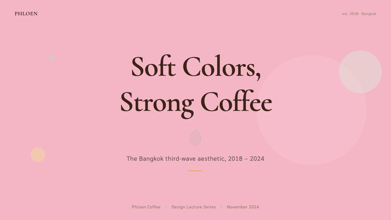
For presentation slides, the style works best as a full environmental commitment rather than a surface treatment. A cover slide should use the dusty-pink or warm-cream ground as its primary field, with foliage imagery cropped to show only leaf silhouette against the plain background — no stock-photo complexity, no busy scene-setting. Title type should be generous in leading, with a secondary line in a harmonious tonal weight rather than a contrasting colour. For content slides, the underlying structure is a clean two-column layout with one column carrying the argument and the other holding visual counterpoint — a botanical crop, a rounded-corner pull quote, or a simple icon. Data slides benefit from the palette's natural softness: rather than high-contrast chart colours, use the sage, rose, and cream as the chart's own colour system, producing visualisations that feel integrated rather than grafted on.对于演示文稿,这种风格最适合作为整体环境承诺而非表面处理。封面页应以尘粉或暖奶油色为主场域,植物图像裁剪为仅在素色背景上展示叶片轮廓——无库存照片的复杂性,无忙碌的场景铺陈。标题字体应行距宽裕,副标题以和谐的色调字重而非对比色出现。内容页的底层结构是干净的双栏布局,一栏承载论点,另一栏持有视觉对位——植物裁图、圆角引文框或简单图标。数据页从色板的自然柔软中获益:与其使用高对比度图表色,不如以鼠尾草、玫瑰与奶油作为图表自身的色彩系统,产生感觉整合而非嫁接的数据可视化。
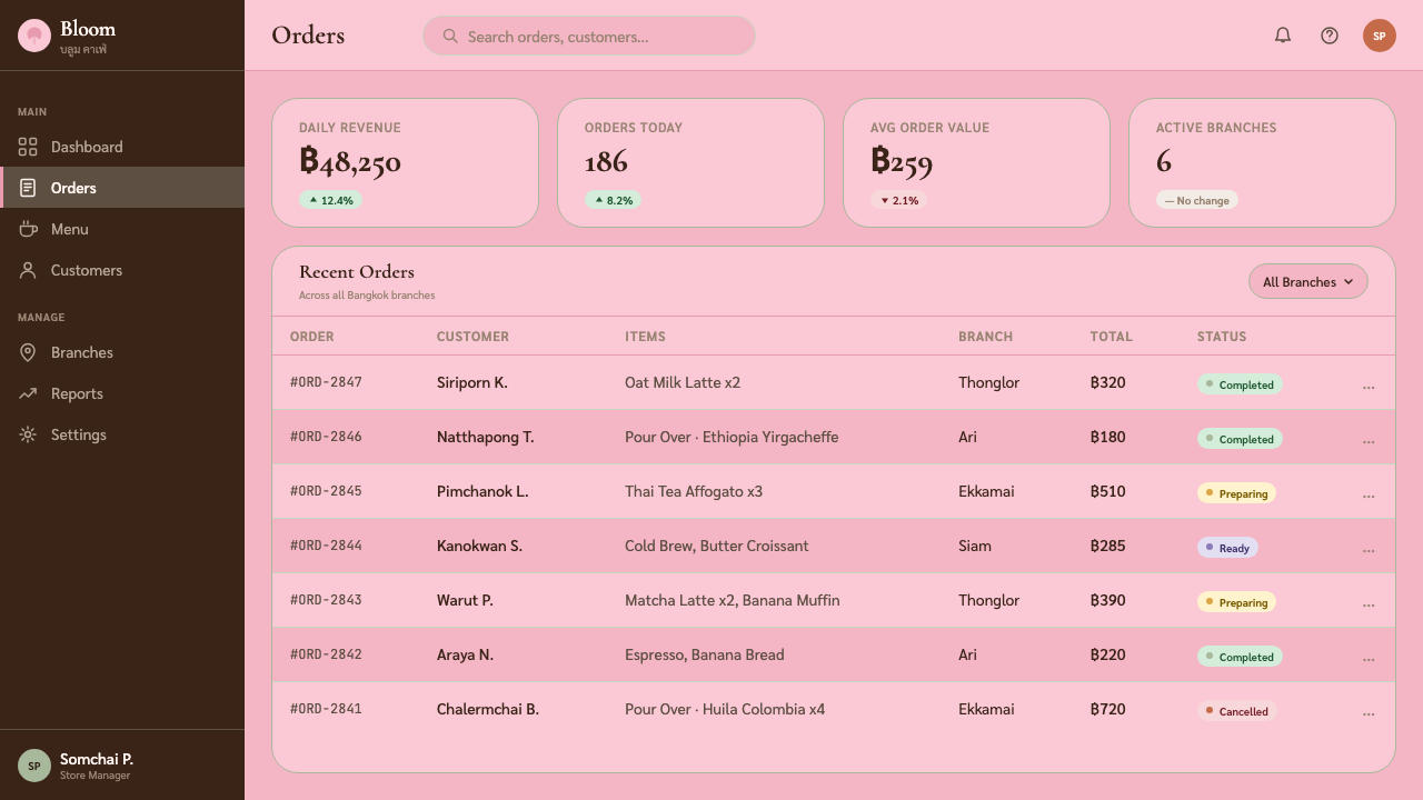
For web and app interfaces, the style suits onboarding flows, landing pages for wellness or lifestyle brands, and any product whose primary value proposition involves taste, curation, or considered quality. The structural approach: a cream or warm-white ground, body type in a deep warm-neutral rather than pure black, pill-shaped buttons as the primary interactive element, and rounded-corner cards with matte-looking backgrounds rather than drop-shadow depth. Navigation should be typographic and understated — wordmarks and text links rather than icon-heavy menus. For dashboards, the style works if the data being presented benefits from a calm, unhurried reading environment — it becomes stressful if the palette's softness fights against the urgency that operational metrics typically demand.对于网页与应用界面,这种风格适合引导流程、健康或生活方式品牌的落地页,以及任何核心价值主张涉及品味、精选或考量品质的产品。结构方法:奶油或温润白色背景,正文字体使用深暖中性色而非纯黑,圆润药丸形按钮作为主要交互元素,哑光感背景的圆角卡片而非投影深度。导航应是字体性的且低调——文字标识与文本链接而非图标繁重的菜单。对于仪表板,若所呈现的数据受益于平静从容的阅读环境,这种风格可以奏效——但若色板的柔软感与运营数据通常需要的紧迫感相抗,就会产生不适。
For editorial and marketing applications, Bangkok Third-Wave Cafe supports premium lifestyle positioning most naturally. A long-form article layout benefits from generous leading, a modestly narrow measure, and section breaks marked by botanical illustration rather than geometric rules. For marketing pages, the approach is full-bleed botanical photography — monstera or eucalyptus on the pale ground — alternating with type-only sections where the warmth of the palette carries the full visual weight. Packaging design is where the style arguably reaches its highest expression: the matte surface, bilingual labelling, hand-noted text on a cream field, and the restrained botanical accent translate directly to physical paper and card.对于编辑与营销应用,曼谷第三波咖啡馆最自然地支持高端生活方式定位。长文版面受益于宽裕的行距、适度窄的行宽,以及以植物插图而非几何线条标记的段落分隔。营销页面的方法是全出血植物摄影——淡色背景上的龟背竹或桉树——与纯文字段落交替,让色板的温度承担全部视觉重量。包装设计可能是这种风格表达最高峰的领域:哑光表面、双语标注、奶油底面上的手注文字,以及克制的植物点缀,直接移植到实体纸与卡板上。
A common mistake when applying this aesthetic is treating it as simply a palette swap — adding pinks and sage greens to an otherwise generic layout — without attending to the surface quality, typographic generosity, and bilingual logic that define the style. Without matte-feeling surfaces, without generous leading, and without the discipline of treating two scripts as equals, the result reads as trend-adjacent rather than specific. Another frequent error is over-botanising: a single well-placed monstera is structural; a screen full of foliage becomes noise. The style is about considered restraint, not abundance.应用这套美学时最常见的错误是将其仅仅视为色板替换——在一个原本通用的版面上加入粉色与鼠尾草绿——而不关注定义这种风格的表面质感、字体慷慨度与双语逻辑。没有哑光感表面,没有宽裕行距,没有将两种字体系统视为平权的自律,结果呈现为接近潮流而非具体风格。另一个常见错误是过度植物化:一株位置经过考量的龟背竹是结构性的;满屏植物则变成噪音。这种风格关乎有原则的克制,而非丰盛。
The style also struggles when forced into high-density information environments. Complex SaaS dashboards, data-heavy analytical tools, and transactional interfaces where speed and precision are the primary user values are not natural homes for this aesthetic. Its warmth and softness, which create the right atmosphere for an unhurried specialty-coffee experience, work against the cognitive clarity that productivity software demands. Knowing this boundary is part of applying the style correctly.
See the Bangkok Third-Wave Cafe design system →查看 Bangkok Third-Wave Cafe 完整设计系统 →
Bangkok Third-Wave Cafe — FAQBangkok Third-Wave Cafe · 常见问题
Is this a Thai style or a Japanese style?这是泰国风格还是日本风格?
It is emphatically a Thai style, though one that has consciously absorbed and transformed Japanese minimalism. The distinction matters: Japanese third-wave cafe minimalism tends toward monochrome restraint, natural wood, and a wabi-sabi acceptance of material imperfection. Bangkok Third-Wave Cafe warms and softens those precedents — adding dusty pink, tropical foliage, and the confident coexistence of two scripts — in ways that reflect Thai hospitality culture and Bangkok's specific tropical light. The Japanese influence is real and acknowledged by the cafes themselves, but the transformation is thoroughgoing enough that the result is distinctly its own thing.这无疑是一种泰国风格,尽管它有意识地吸收并转化了日本极简主义。这一区别很重要:日本第三波咖啡馆极简主义倾向于单色克制、天然木材与对材料不完美的侘寂接纳。曼谷第三波咖啡馆以反映泰式好客文化与曼谷特有热带光线的方式温化并柔化了这些先例——加入尘粉、热带植物,以及两种文字系统的自信共存。日本影响是真实存在的,咖啡馆本身也予以承认,但转化已足够彻底,其结果显然是独特的自身。
How does the style handle dark mode?这种风格如何处理深色模式?
The Bangkok Third-Wave Cafe aesthetic is fundamentally a light-ground system — its warmth and softness depend on pale backgrounds that catch and diffuse light. A dark-mode inversion is possible but requires significant recalibration. On a deep background, the dusty pink reads very differently — it can appear more vivid and less sophisticated — while the sage green loses the muted quality that gives it its elegance. The most successful dark-mode adaptations tend to shift the background toward a very deep warm charcoal rather than pure black, retain the sage as a muted accent, and allow cream-toned type to carry the warmth. The style loses some of its characteristic softness in dark mode but can maintain its bilingual typographic identity and botanical accents.曼谷第三波咖啡馆美学根本上是一个浅色底面系统——其温度与柔软感依赖于捕捉并漫射光线的淡色背景。深色模式反转是可能的,但需要大幅重新校准。在深色背景上,尘粉色读感大相径庭——可能显得更鲜艳、更少精致感——而鼠尾草绿也会失去赋予其优雅的柔和品质。最成功的深色模式改编倾向于将背景移向非常深的暖炭色而非纯黑,保留鼠尾草绿作为柔和点缀,并让奶油色调文字承担温度。这种风格在深色模式中会失去一些特有的柔软感,但可以保持其双语字体身份与植物点缀。
Can this style work without actual botanical imagery?没有实际植物图像,这种风格能运作吗?
Yes — the botanical accent is important but not load-bearing in isolation. The style's warmth comes first from the palette, second from the typographic generosity, and third from the matte surface quality. A well-executed application of Bangkok Third-Wave Cafe using only the colour palette, the rounded UI elements, the bilingual typographic approach, and the generous leading will feel recognizably related to the style even without a single leaf in sight. The absence of botanical imagery does push the style toward a more generic pastel-minimal look, so at least a small botanical element — even a single leaf graphic or a subtle texture — is worth including if it can be justified by the context.可以——植物点缀很重要,但并非孤立地承重。这种风格的温度首先来自色板,其次来自字体排印的慷慨度,再次来自哑光表面质感。一个仅使用色板、圆润UI元素、双语字体方法与宽裕行距的曼谷第三波咖啡馆良好执行版本,即使视野中没有一片叶子,也会让人感到明显与这种风格相关。植物图像的缺席确实会将风格推向更通用的柔和极简外观,因此至少加入一个小植物元素——哪怕是单片叶片图形或微妙质感——若能被语境合理化,是值得的。
How does Bangkok Third-Wave Cafe differ from general Scandinavian or Nordic minimalism?曼谷第三波咖啡馆与一般的斯堪的纳维亚或北欧极简主义有何不同?
Both traditions share a commitment to pale grounds, natural materials, generous whitespace, and restraint in decoration. The differences are in warmth, colour, and cultural specificity. Nordic minimalism tends toward cooler tones — grey-whites, ash tones, blue-adjacent neutrals — reflecting Scandinavian light conditions. Bangkok Third-Wave leans decisively warm: the pinks, creams, and sage greens all tend toward the warm end of their range. Nordic minimalism typically excludes script as a design element; Bangkok Third-Wave makes bilingual script coexistence a positive aesthetic feature. And where Nordic minimalism reaches for timelessness and universality, Bangkok Third-Wave is rooted in a specific city, a specific neighbourhood, and a specific cultural moment — its regionality is a feature, not a liability.两种传统都承诺浅色底面、天然材料、宽裕空白与装饰克制。差异在于温度、色彩与文化特殊性。北欧极简主义倾向于更冷的色调——灰白、桦灰、蓝邻近中性色——反映斯堪的纳维亚的光线条件。曼谷第三波则果断偏暖:粉色、奶油色与鼠尾草绿都倾向于各自色域的暖端。北欧极简主义通常将文字系统排除在设计元素之外;曼谷第三波将双语字体系统共存作为积极的美学特征。而北欧极简主义追求永恒性与普遍性,曼谷第三波则扎根于一个具体城市、具体街区与具体文化时刻——其地域性是特征,而非局限。
Is this a style suited to luxury positioning, or is it more casual?这种风格适合高端定位,还是更偏休闲?
Bangkok Third-Wave Cafe occupies a particular middle ground: it communicates considered quality and thoughtful curation without signalling exclusivity or formality. The matte surfaces, generous leading, and careful material choices read as premium compared to generic cafe design, but the handscript tasting notes, the approachable roundness of the UI elements, and the warmth of the palette prevent it from tipping into cool luxury or high-fashion austerity. It suits brands whose offer is premium but whose relationship with the customer is warm and democratic — specialty coffee being the archetype, but the logic extends to boutique wellness, independent bookshops, and considered lifestyle retail. It would struggle to carry ultra-luxury positioning, where more architectural restraint and a colder, more exclusive palette are typically expected.曼谷第三波咖啡馆占据一个特殊的中间地带:它传递经过考量的品质与审慎的精选,但不信号排他性或正式感。哑光表面、宽裕行距与考量过的材料选择相较通用咖啡馆设计显得高端,但手写风味笔记、UI元素令人亲近的圆润感以及色板的温度,阻止了它倾向冷峻奢华或高级时装的严峻感。它适合产品高端但与客户关系温暖而平民化的品牌——精品咖啡是原型,但逻辑延伸至精品健康、独立书店与考量过的生活方式零售。它难以承载超高端定位,那里通常期待更具建筑感的克制与更冷、更排他的色板。
Related design styles相关设计风格
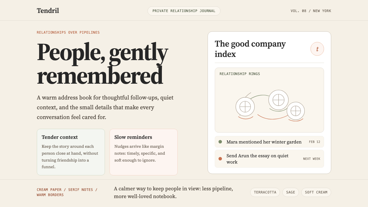 Clay 2024CRM as a sketchbook, not a sales pipeline. Cream backgrounds, terracotta, han…把 CRM 重新想象为安静的私人速写本:奶油底色、陶土点缀、手绘人物线描——拒…
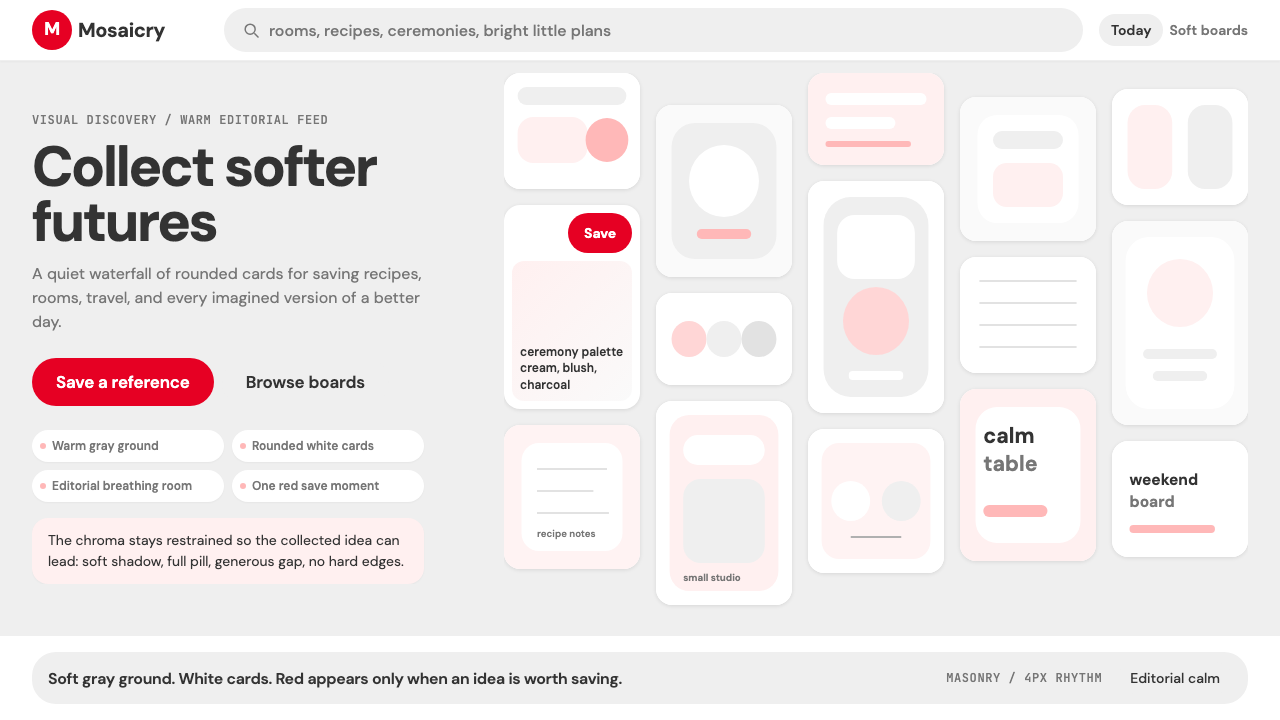 Pinterest 2024Aspirational calm. Warm gray masonry, rounded white pins, one surgical red sa…向往感很安静:暖灰瀑布流、白色圆角卡片、一颗红色保存按钮。
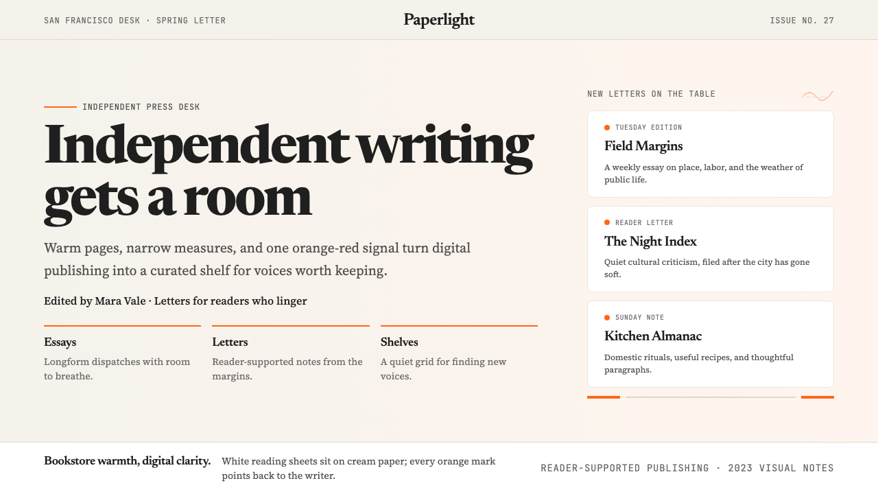 Substack 2023Writing feels shelved, not streamed. Cream paper, Newsreader serif, and one o…写作像上架而非信息流:奶油纸底、Newsreader 衬线与橙红信号。
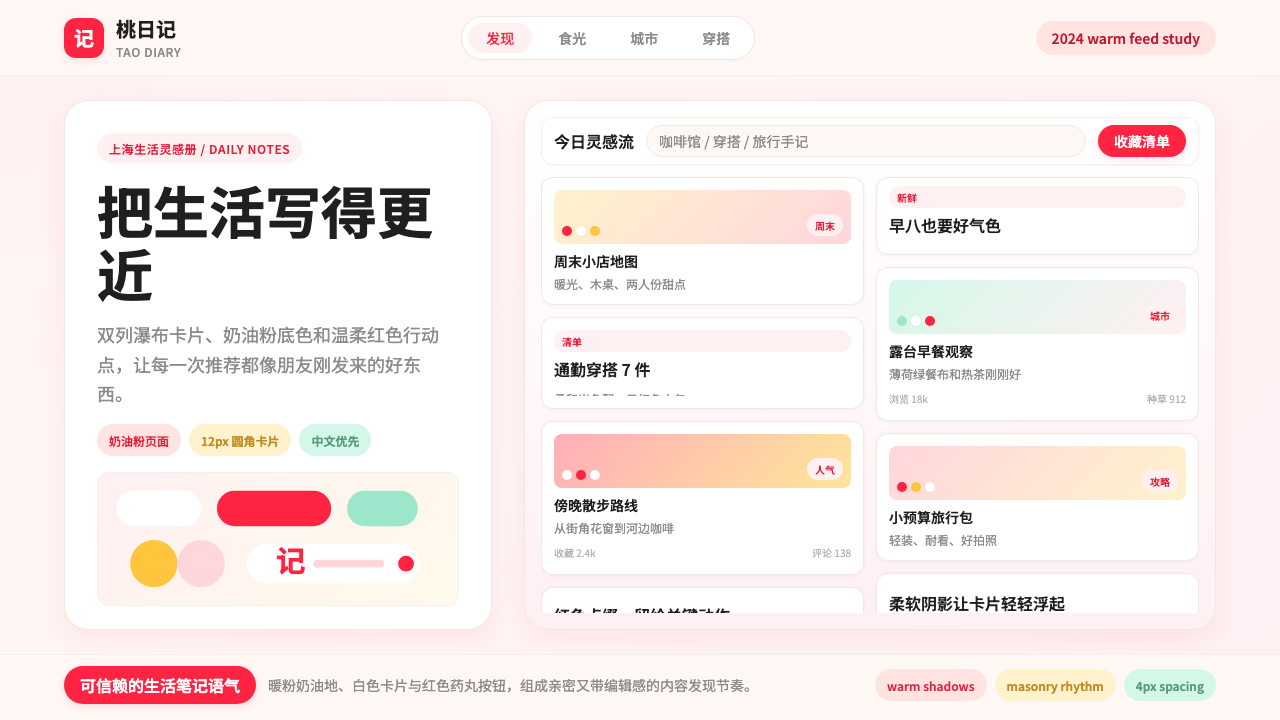 Xiaohongshu (RedNote) 2024Warm notes feel trusted. Cream-pink masonry cards glow with signature red acc…亲密可信的生活笔记:奶油粉瀑布流卡片,以标志红点亮。
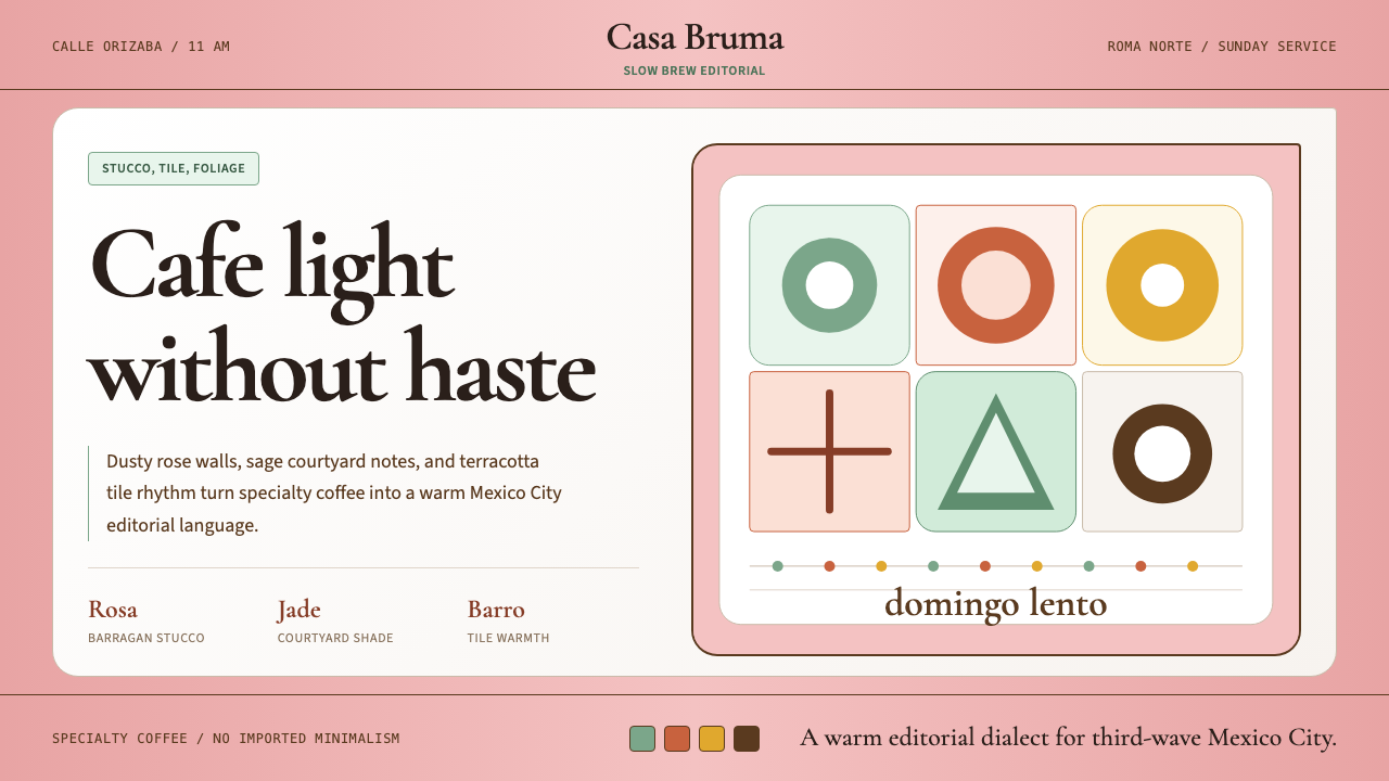 CDMX Roma Norte CafeMexico City coffee, unhurried. Dusty rose, sage jade, and serif rhythm carry…从容的墨城咖啡感:灰玫瑰、鼠尾草绿与衬线节奏传递温度。
 GlossierBeauty as a friend's conversation. Dusty pink (never bubblegum), editorial se…美妆是闺蜜间的私语:唯一标志性的灰粉色(不是泡泡糖粉)、编辑式衬线字体、纯平面…