What is Substack 2023?什么是 Substack 2023?
Substack turned independent writing into a visual identity — warm cream, a single orange-red accent, and editorial serif type that says library, not app.Substack 将独立写作变成了一种视觉身份——温暖的奶油底、唯一的橙红强调色,以及传递着图书馆而非应用程序气质的编辑衬线字体。
Substack 2023 in briefSubstack 2023 速览
Substack 2023 is the visual design language of the Substack publishing platform as it matured through its mid-2020s growth period. It is characterized by a warm cream ground, a restrained charcoal-to-black type scale, and a single signature orange-red used exclusively for calls to action and brand accents. The aesthetic reads as editorial rather than transactional — closer in spirit to an independent bookshop or a literary journal than to a SaaS dashboard.Substack 2023 是 Substack 出版平台在其 2020 年代中期成长阶段趋于成熟的视觉设计语言。其特征是温暖的奶油底色、从近黑到炭灰的克制文字层级,以及唯一一种仅用于行动号召和品牌强调的标志性橙红色。整体美学传递的是编辑气质而非交易感——在精神上更接近一家独立书店或文学期刊,而非 SaaS 仪表板。
The system's central commitment is to reading comfort. Column widths are deliberately narrow, line-heights are generous, and the page is never crowded with competing visual elements. Hierarchy is established through typographic weight and size alone, relying on a classic serif typeface that carries the authority of print tradition while remaining highly legible on screen. The result is a design language that flatters the writing it contains.这套系统的核心承诺是阅读舒适度。内容栏宽刻意保持克制,行高宽裕,页面上从不堆砌相互竞争的视觉元素。层级完全通过字体字重与尺寸来建立,依赖一种经典衬线字体——它承载着印刷传统的权威感,同时在屏幕上保持出色的可读性。最终呈现的是一种衬托文字本身的设计语言。
What makes the system coherent is its radical restraint. The palette uses just three values — cream, near-black, and one warm accent — and nearly every interface element, from newsletter subscription cards to profile pages, is built from the same small vocabulary. This consistency makes the platform feel unified across thousands of different writer voices and subjects, a neutral but dignified stage on which any content can perform.让这套系统保持连贯的,是其彻底的克制。色板仅使用三个维度——奶油、近黑与一抹暖调强调色——几乎所有界面元素,从通讯订阅卡片到个人主页,都由同一套极小词汇构成。这种一致性使平台在数以千计的不同写作者声音与主题中依然保持统一感,构成一个中性而有尊严的舞台,供任何内容在其上演出。
Where does Substack 2023 come from?Substack 2023 从何而来?
Substack was founded in San Francisco in 2017 by Chris Best, Hamish McKenzie, and Jairaj Sethi with a straightforward premise: give writers a direct relationship with their readers and a simple way to charge for their work. The platform launched against the backdrop of declining advertising revenue for digital media, the beginning of what observers were calling the creator economy, and growing frustration among journalists and essayists with the algorithmic feed logic of mainstream social platforms.Substack 由 Chris Best、Hamish McKenzie 和 Jairaj Sethi 于 2017 年在旧金山创立,出发点直接明了:让写作者与读者建立直接关系,并提供一种简单的方式将内容变现。平台的诞生背景是数字媒体广告收入的持续下滑、被观察者称为「创作者经济」的时代起点,以及记者与散文作者对主流社交平台算法信息流逻辑日益加剧的不满。
The early Substack interface was functional rather than distinctive — a clean white canvas that stayed out of the way of the writing. As the platform scaled through 2020 and 2021, attracting high-profile writers departing from major newspapers and magazines, it became clear that the visual environment needed to signal something more deliberate. The platform was positioning itself not as a social network or a content management system, but as a home for serious writing — and the design needed to reflect that ambition.早期的 Substack 界面更注重功能而非辨识度——一块洁净的白色画布,甘愿退到写作背后。随着平台在 2020 至 2021 年间快速扩张,吸引大批知名写作者从主流报纸和杂志转投旗下,一件事变得清晰起来:视觉环境需要传达更为明确的信号。平台将自身定位的不是社交网络或内容管理系统,而是严肃写作的家园——设计必须体现这一抱负。
The visual identity that coalesced around 2022 and carried through 2023 drew on several converging influences. The editorial serif typeface, Newsreader, was custom-designed for screen reading at comfortable measures, directly evoking the texture of quality print journalism. The cream-toned backgrounds departed from the clinical white that dominated most web interfaces, borrowing warmth from the tradition of laid paper and printed books. The orange-red accent, close in hue to a well-aged red ink or a stop-press stamp, became the single vivid gesture in an otherwise deliberately quiet system.在 2022 年前后逐渐成形、并贯穿整个 2023 年的视觉身份,汇聚了几股相互交织的影响。编辑衬线字体 Newsreader 专为舒适的屏幕阅读而定制设计,直接唤起优质印刷新闻的质感与温度。奶油色调的背景摆脱了主宰大多数网页界面的临床白,从纹路纸与印刷书籍的传统中借取温暖。那枚橙红强调色,色调接近一瓶陈年红墨水或一枚急件印章,成为整套刻意安静的系统中唯一一抹鲜活的手势。
The broader cultural context was equally significant. Substack rose during what many described as a post-Twitter media moment — a period when writers and readers were searching for alternatives to engagement-maximizing platforms and their chaotic information environments. The design language communicated stability, seriousness, and longevity in deliberate contrast to the velocity and visual noise of social feeds. By 2023, the look had become recognizable enough to function as a brand signal: that warm cream page with its orange subscribe button was, for a specific audience, a mark of editorial credibility.更宏观的文化背景同样意味深长。Substack 崛起于许多人所描述的后 Twitter 媒体时刻——写作者与读者共同寻求替代以最大化互动为目标的平台及其混乱信息环境的出路。这套设计语言传达着稳定、严肃与持久,刻意与社交信息流的速度和视觉喧嚣形成对比。到 2023 年,这一外观已足够具有辨识度,可以作为品牌信号发挥作用:那个带有橙色订阅按钮的温暖奶油页面,在特定受众眼中,是编辑公信力的标记。
What defines the Substack 2023 look?Substack 2023 的视觉特征是什么?
Cream Ground奶油底色
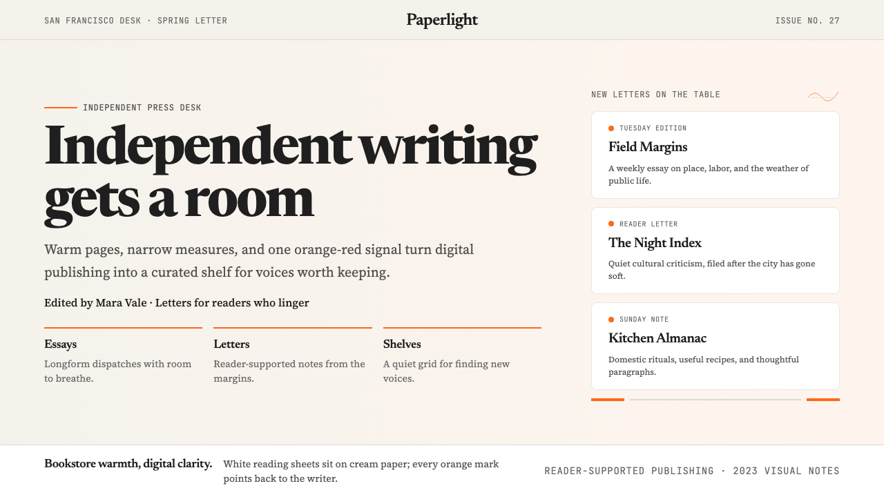
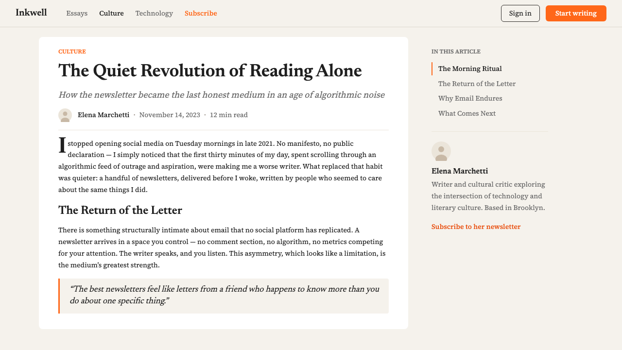
The base of the Substack visual system is not white but a warm off-white tending toward cream. This choice is the single most important departure from standard web conventions and from the clinical white backgrounds of most publishing platforms. The warmth of the cream immediately signals print tradition — the laid paper of literary journals, the ivory pages of a well-made hardcover. It lowers visual fatigue for long reading sessions and gives the orange-red accent its full emotional register: against cream, the accent reads as warm and inviting rather than urgent or alarming.Substack 视觉系统的底色并非白色,而是偏向奶油的温暖米白。这一选择是与标准网页惯例以及大多数出版平台临床白底的最重要偏离。奶油色的温暖立即发出印刷传统的信号——文学期刊的纹路纸、一册精制精装书的象牙书页。它降低了长时间阅读的视觉疲劳,也让橙红强调色得以充分展现其情感共鸣:在奶油底衬托下,强调色读来温暖而令人向往,而非紧迫或警示。
Editorial Serif Typography编辑衬线排印
Substack's type system centers on a serif typeface purpose-built for screen reading at comfortable column widths. The serifs carry cultural connotations of literary authority and careful editing — associations built over centuries of print journalism and book publishing. Headlines sit at a generous scale relative to body text, establishing a clear hierarchy without relying on color or decorative elements. Body text is set with ample line-height and a column width calibrated for reading flow rather than information density. The contrast between large, authoritative headlines and comfortable running text is the primary compositional move of the system.Substack 的排印体系以一款专为舒适栏宽下的屏幕阅读而设计的衬线字体为核心。衬线字体承载着文学权威与精细编辑的文化联想——这些联想经由数百年的印刷新闻与图书出版积累而来。标题相对于正文以宽裕的尺寸呈现,无需依赖色彩或装饰元素便能建立清晰的层级。正文以充裕的行高排布,栏宽专为阅读流畅性而非信息密度所校准。大型权威标题与舒适连续文字之间的对比,是这套系统最主要的构图动作。
Single Accent Color单一强调色
The entire platform operates on a one-accent-color discipline: a warm orange-red that appears almost exclusively on primary calls to action — the Subscribe button, key navigation states, and brand-level moments. It appears nowhere else. This extreme restraint means that every instance of the accent is load-bearing: the eye is reliably directed to the most important interactive element on any page. The hue itself — closer to a deep terracotta or a vintage red ink than to a fire-engine red — avoids the aggression of pure red while retaining full urgency against the cream background.整个平台遵循单一强调色纪律:一种温暖的橙红色几乎只出现在最主要的行动号召上——订阅按钮、关键导航状态以及品牌级别的时刻。它在其他任何地方都不出现。这种极度的克制意味着每一次强调色的出现都是承重的:眼睛被可靠地引导向每个页面上最重要的交互元素。这一色调本身——比起消防车红,更接近深赤陶或一瓶复古红墨水——避免了纯红的攻击性,同时在奶油底上保留了完整的紧迫感。
Narrow Content Column窄内容栏
Substack layouts constrain the reading column to a width derived from classical typography's ideal measure for body text — a range that most typographers agree produces the most comfortable reading rhythm. On wide screens, this means substantial white space flanking the content, which itself becomes a visual statement: the writing is precious enough to deserve this much breathing room. This structural choice also creates a consistent reading experience regardless of screen size, as the measure barely changes between desktop and mobile. Side margins may carry metadata — author name, publication date, read time — but never compete with the main text.Substack 的版面将阅读栏约束在源自古典排印学对正文理想行长标准的宽度范围内——大多数字体排印师一致认为这一范围能产生最舒适的阅读节奏。在宽屏上,这意味着内容两侧留有大量空白,而这本身成为一种视觉陈述:写作足够珍贵,值得拥有这么多呼吸空间。这一结构选择也创造了在不同屏幕尺寸下一致的阅读体验,因为从桌面到移动端,行宽几乎不变。侧边留白可以承载元数据——作者名、发布日期、阅读时长——但绝不与主体文字竞争。
Card-Based Navigation卡片式导航
Outside the reading experience itself, Substack uses a grid of newsletter cards to present publications, authors, and issues. Each card is minimal: a publication logotype or portrait image, a name, a short description, and a subscriber count or category tag. The cards share the cream background and rely on subtle border or shadow cues — never heavy graphic treatment — to establish their boundaries. The grid layout borrows from editorial traditions of magazine tables of contents and bookshop display tables rather than from app store conventions. Browsing feels like leafing through a publication directory, not like scrolling a social feed.在阅读体验之外,Substack 使用一组通讯卡片网格来呈现出版物、作者和期次。每张卡片极为简洁:出版物标志或肖像图像、名称、简短描述,以及订阅者数量或类别标签。卡片共享奶油底色,依靠细微的边框或阴影线索——而非厚重的图形处理——来划定边界。网格版式借鉴的是杂志目录和书店陈列台的编辑传统,而非应用商店惯例。浏览的感觉像是翻阅一本出版物名录,而非滚动社交信息流。
Typographic Restraint in UI界面中的排印克制
Interface elements — buttons, labels, navigation items, form fields — are set in type with minimal decorative support. Buttons are filled with the orange-red accent or left as outlined; they do not use gradients, shadows, or icon decoration. Input fields are simple bordered rectangles. Section headings throughout the platform use the same serif system as editorial content, blurring the line between interface chrome and content, which reinforces the sense that the platform itself is a reading environment first. No interface element competes visually with the text being read.界面元素——按钮、标签、导航项、表单字段——以极少装饰支撑的文字排印为主。按钮以橙红强调色填充或保持轮廓线形式;不使用渐变、阴影或图标装饰。输入字段是简单的有边框矩形。平台中各处的区块标题与编辑内容使用同一衬线系统,模糊了界面外壳与内容之间的界限,这强化了平台本身首先是阅读环境的感知。没有任何界面元素会在视觉上与正在被阅读的文字竞争。
Warmth Without Decoration无装饰的温度
Perhaps the most subtle achievement of the Substack visual system is that it feels warm and human without using any of the conventional signals of warmth — no rounded corners pushed to extremes, no illustration characters, no gradient brand colors, no whimsical iconography. The warmth comes entirely from the cream palette, the serif tradition, and the generous spacing. This is warmth through restraint rather than warmth through addition. The system trusts that readers associate the textures of serious print culture with comfort and welcome, and builds on that association rather than trying to manufacture friendliness through graphic decoration.Substack 视觉系统最微妙的成就,或许是它在不使用任何常规温暖信号的情况下,依然传递出温暖而人性化的感受——没有极度圆润的角落,没有插画人物,没有渐变品牌色,没有异想天开的图标体系。温暖完全来自奶油色板、衬线传统和宽裕的间距。这是通过克制实现的温暖,而非通过叠加实现的温暖。这套系统相信读者会将严肃印刷文化的质感与舒适感和欢迎感相联结,并建立在这种联结之上,而非试图通过图形装饰制造亲切感。
Who shaped Substack 2023?谁塑造了 Substack 2023?
Chris Best is a co-founder of Substack and served as its CEO through the platform's foundational growth years. A former engineer who helped build the messaging infrastructure at Kik, Best brought a product-first perspective to Substack's design decisions. His philosophy — that the platform should be invisible, foregrounding the writer and the writing rather than the container — directly shaped the editorial restraint that defines the Substack visual system. Under his leadership, the platform resisted the feature-accumulation and visual complexity that characterized competing platforms, maintaining the dignified reading-first aesthetic that became Substack's most distinctive quality.Chris Best 是 Substack 的联合创始人,在平台奠基成长阶段担任 CEO。作为曾参与构建 Kik 消息基础设施的前工程师,Best 为 Substack 的设计决策带来了产品优先的视角。他的理念——平台应当隐形,将写作者与写作本身而非承载容器置于前台——直接塑造了定义 Substack 视觉系统的编辑克制。在他的领导下,平台抵制了竞争平台所特有的功能堆积与视觉复杂性,维护了以阅读为先的优雅美学,使之成为 Substack 最具辨识度的品质。
Hamish McKenzie, a journalist and author before co-founding Substack, brought a writer's sensibility to the platform's positioning and identity. His public writing about the independent writer economy — including a book on the subject — helped articulate the cultural ambition behind Substack's visual choices. The platform's aesthetic is inseparable from its editorial mission: McKenzie consistently argued that writers deserve tools that respect their work, and the cream-and-serif design language is the visual expression of that conviction. His communication of Substack's purpose attracted many of the high-profile writers whose presence, in turn, validated the platform's claim to editorial seriousness.Hamish McKenzie 在联合创办 Substack 之前是一位记者和作家,他将写作者的感受力带入了平台的定位与身份构建。他关于独立写作者经济的公开写作——包括一本专著——帮助阐明了 Substack 视觉选择背后的文化抱负。平台的美学与其编辑使命密不可分:McKenzie 始终主张写作者值得拥有尊重其工作的工具,而奶油加衬线的设计语言正是这一信念的视觉表达。他对 Substack 使命的传播吸引了许多知名写作者,而这些写作者的入驻反过来又验证了平台对编辑严肃性的主张。
The internal brand team that shaped Substack's visual identity through 2022 and 2023 made a series of decisions that are easy to underestimate in retrospect: choosing Newsreader as the platform's defining typeface, settling on the specific register of orange-red that became the brand's signature, and establishing the cream ground as the platform's default state. These choices involved navigating between the conventions of SaaS design — which lean toward clean white, sans-serif pragmatism, and vibrant brand colors — and the traditions of editorial design, which Substack's brand team drew from more explicitly than nearly any other technology platform of the era.在 2022 至 2023 年间塑造 Substack 视觉身份的内部品牌团队做出了一系列事后看来容易被低估的决定:选择 Newsreader 作为平台的定义字体,确定成为品牌标志的特定橙红色调,以及将奶油底色确立为平台的默认状态。这些选择涉及在 SaaS 设计惯例——倾向于纯白、无衬线实用主义和鲜艳品牌色——与编辑设计传统之间的导航,后者是 Substack 品牌团队比同期几乎所有其他科技平台都更为明确地汲取营养的来源。
Newsreader is the custom serif typeface that anchors the Substack reading experience. Designed specifically for comfortable on-screen reading at the measures common to newsletter and long-form editorial layouts, it draws on the tradition of newspaper text faces — compact, durable, highly legible at small sizes — while being optimized for retina displays and the reading habits of people consuming long-form writing in bursts. The typeface choice is central to why Substack feels like reading rather than browsing: it carries enough typographic authority to confer editorial seriousness, and enough screen-native refinement to feel contemporary rather than nostalgic.Newsreader 是锚定 Substack 阅读体验的定制衬线字体。它专为在通讯和长篇编辑版面常见行宽下的舒适屏幕阅读而设计,汲取了报纸正文字体的传统——紧凑、耐用、在小字号下高度可读——同时针对视网膜屏幕和人们分段消费长篇写作的阅读习惯进行了优化。这一字体选择是 Substack 读来像是阅读而非浏览的核心原因:它承载着足以赋予编辑严肃性的排印权威,以及足以让它感觉当代而非怀旧的屏幕原生精炼度。
Jairaj Sethi, the third co-founder of Substack, served as CTO and shaped the technical architecture that made the platform's visual simplicity possible. A clean visual system is only maintainable when the underlying infrastructure prevents the accumulation of inconsistent UI states, conflicting component styles, and platform-by-platform fragmentation. Sethi's technical decisions about how the platform renders content — prioritizing consistent, author-controlled presentation over algorithmic reformatting — supported the visual coherence that the brand system depended on. His engineering philosophy aligned with the design philosophy: constrain the variables, maximize quality within those constraints.Jairaj Sethi 是 Substack 的第三位联合创始人,担任 CTO,塑造了使平台视觉简洁得以可能的技术架构。一套干净的视觉系统只有在底层基础设施能够防止不一致界面状态、相互冲突的组件样式以及跨平台碎片化积累时,才能得到维护。Sethi 关于平台如何渲染内容的技术决策——优先考虑一致的、作者可控的呈现方式,而非算法重新格式化——支撑了品牌系统所依赖的视觉连贯性。他的工程哲学与设计哲学相互呼应:约束变量,在这些约束内最大化品质。
How do you use Substack 2023 today?今天怎么用 Substack 2023?
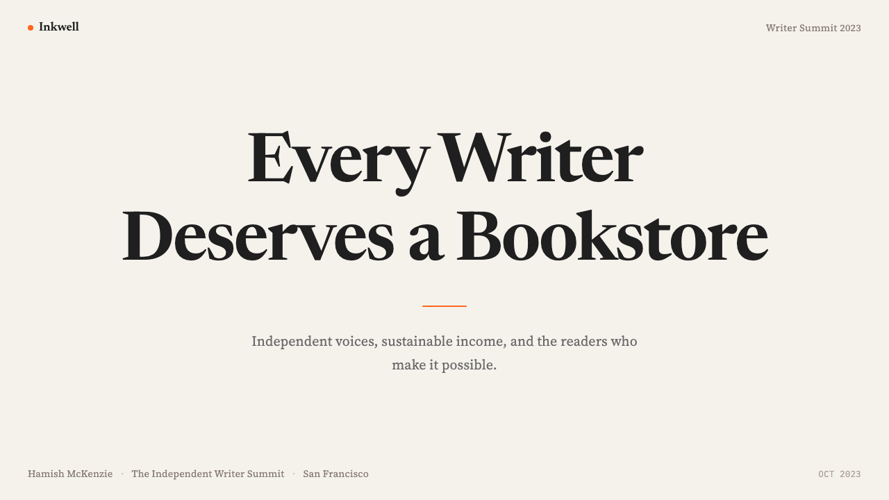
The Substack 2023 aesthetic is highly transferable to presentation design when the goal is editorial authority rather than visual spectacle. A slide deck built in this language communicates seriousness and care — appropriate for thought leadership presentations, research summaries, investor materials from content businesses, and any context where the ideas themselves are the product. Cover slides work best with the same structure that Substack uses for its publication hero: publication name or deck title in large serif type on a cream field, with the orange-red accent appearing only on a single sub-element such as a category label, volume number, or speaker name. The restraint of the single accent makes the cover feel considered rather than decorated.当目标是编辑权威而非视觉奇观时,Substack 2023 美学对演示文稿设计具有极强的可移植性。以这种语言构建的幻灯片传达出严肃与用心——适合思想领导力演讲、研究摘要、内容类企业的投资者材料,以及任何以理念本身为产品的场景。封面页最好采用 Substack 为其出版物主图所使用的同一结构:出版物名称或幻灯片标题以大号衬线字体置于奶油底面上,橙红强调色仅出现在唯一一个次级元素上,如类别标签、期号或演讲者姓名。单一强调色的克制使封面感觉是经过深思熟虑的,而非被装饰的。
For content slides, the discipline is the same as Substack's reading pages: one clear typographic hierarchy, generous white space, and no decorative elements that do not carry information. Data slides should treat charts and graphs as typographic objects — labeled in the same serif type, with bars or line accents in the orange-red color — rather than as colorful visual interruptions. The cream background unifies data visualization with prose content, maintaining the sense that the data is an argument being made rather than a display being shown.对于内容页,纪律与 Substack 阅读页面相同:一套清晰的排印层级,宽裕的空白,以及没有不承载信息的装饰性元素。数据页应将图表视为排印对象——以同一衬线字体标注,以橙红色为柱条或折线强调色——而非视为多彩的视觉中断。奶油底色将数据可视化与散文内容统一起来,维持着数据是正在被论证的论点而非正在被展示的陈列的感知。
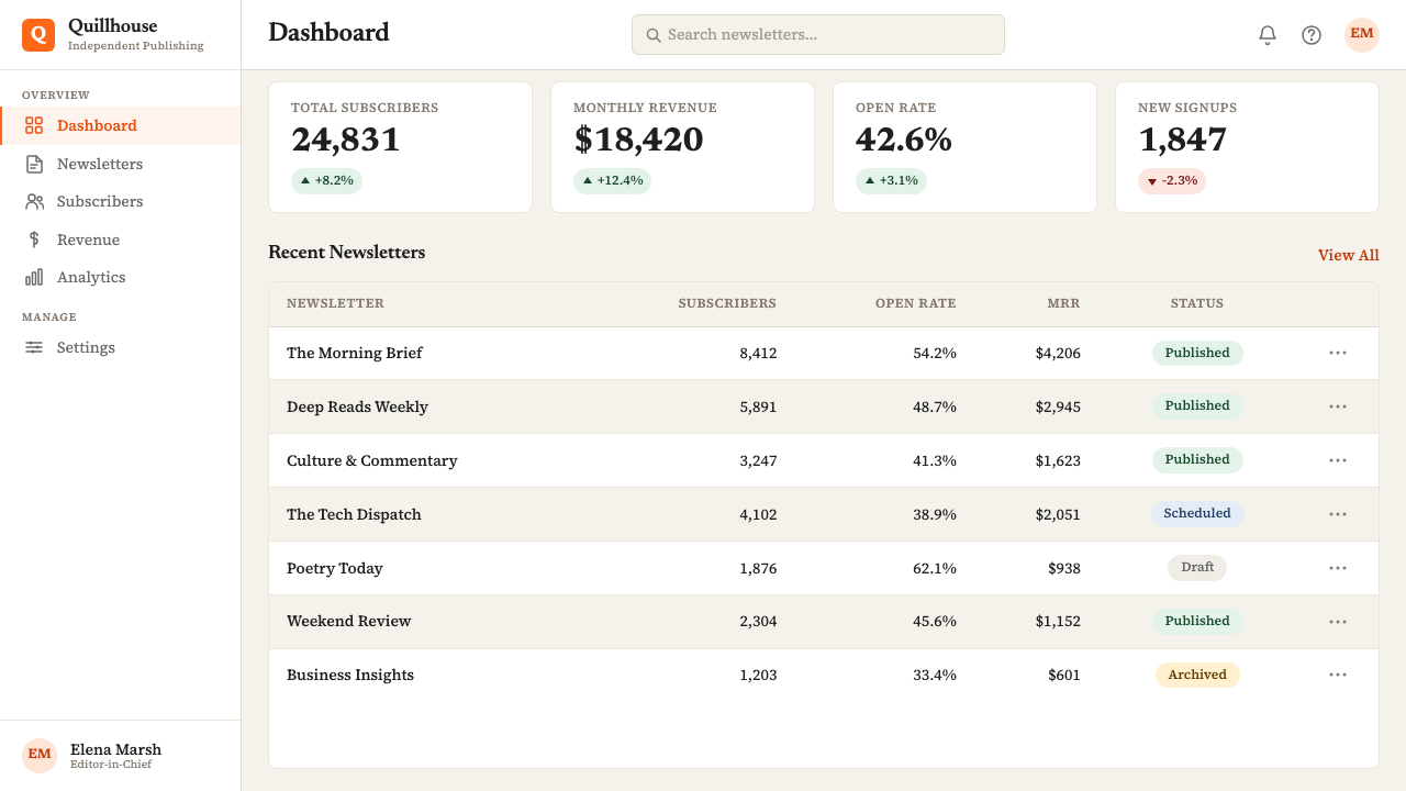
In web UI design, the Substack visual language is well suited to applications that need to feel trustworthy and content-forward: editorial platforms, newsletter tools, knowledge bases, writing environments, and any product where users spend significant time reading rather than navigating. The key structural principles are the narrow reading column for primary content, the cream or very warm near-white background, and the orange-red accent reserved strictly for the one primary action per screen. Dashboard layouts can use this system by treating metric cards the same way Substack treats newsletter cards — minimal, bordered, content-labeled — while keeping the typographic hierarchy simple and serif-forward.在网页界面设计中,Substack 视觉语言非常适合需要传达可信赖感和内容优先感的应用:编辑平台、通讯工具、知识库、写作环境,以及任何用户花费大量时间阅读而非导航的产品。关键结构原则是:为主要内容使用窄阅读栏,奶油色或非常温暖的近白色背景,以及橙红强调色严格保留给每个页面唯一的主要操作。仪表板版面可以通过将指标卡片视为 Substack 对待通讯卡片的方式来采用这套系统——简洁、有边框、内容标注——同时保持排印层级简单且以衬线为主导。
For editorial and marketing applications, the Substack aesthetic supports a poster-like confidence that is unusual for a reading-first design language. Full-width hero sections with large serif headlines over cream fields can carry substantial visual impact without any graphic decoration. Marketing pages built in this system should alternate between cream-background sections and very dark near-black sections — the same move Substack uses for its own promotional pages — with the orange-red appearing at each section's primary call to action. Pull quotes, testimonials, and feature descriptions benefit from the same narrow-column discipline as editorial content: wide margins signal that the information is considered and edited, not poured in.对于编辑和营销应用,Substack 美学支持一种不寻常的海报式自信,这对于一种以阅读为先的设计语言而言颇为罕见。在奶油底面上配以大号衬线标题的全宽主图区域,无需任何图形装饰便能产生强大的视觉冲击力。以这套系统构建的营销页面应在奶油背景区块与极深的近黑背景区块之间交替——这与 Substack 用于自身推广页面的手法相同——橙红色在每个区块的主要行动号召处出现。引语、证言和功能描述从与编辑内容相同的窄栏纪律中受益:宽阔的边距传达着信息是经过深思与编辑的,而非灌入的。
A common mistake when applying this aesthetic is reaching for decorative supplements to compensate for its quietness — adding subtle background textures, layering multiple type styles, introducing a second accent color, or using oversized illustrative elements to create visual interest. Each of these moves undermines the system. The Substack visual language is deliberately minimal; its warmth comes from the palette and typeface, not from graphic activity. Treating the cream ground as a canvas to be filled rather than a space to be honored produces results that look like a failed Substack imitation rather than a coherent application of the system. The correct response to the aesthetic's quietness is to trust it, not to override it.应用这种美学时最常见的错误,是为了补偿其安静而寻求装饰性补充——添加细微的背景纹理、叠加多种文字风格、引入第二种强调色,或使用超大尺寸插图元素来制造视觉兴趣。这些举动中的每一个都会破坏这套系统。Substack 视觉语言刻意极简;其温暖来自色板与字体,而非图形活动。将奶油底色视为需要填满的画布而非需要珍视的空间,会产生看起来像 Substack 失败仿制品的结果,而非这套系统的连贯应用。对待这种美学安静的正确回应是信任它,而非凌驾于其上。
Substack 2023 — FAQSubstack 2023 · 常见问题
Is Substack 2023 the same as general editorial web design?Substack 2023 和通用编辑网页设计是同一回事吗?
They share common ancestors but are distinct. General editorial web design draws on a broad tradition that includes magazine layouts, newspaper web editions, and long-form journalism sites. It can accommodate very wide color ranges, bold photography, and highly variable typographic systems. Substack 2023 is a specific, more constrained version of that tradition: it commits to a single warm ground color, a single accent, and a serif reading experience calibrated for newsletter-length content delivered to paying subscribers. The key distinction is intentionality: Substack's system is designed to communicate that writing is the product, and every element of the visual system reinforces that claim with unusual consistency.两者有共同的源头,但截然不同。通用编辑网页设计汲取自一个宽泛的传统,包括杂志版式、报纸网页版和长篇新闻网站。它可以容纳非常宽广的色彩范围、大胆的摄影和高度可变的排印系统。Substack 2023 是这一传统中更为具体和受约束的版本:它承诺于单一的温暖底色、单一的强调色,以及针对向付费订阅者发送的通讯长度内容而校准的衬线阅读体验。关键区别在于意图性:Substack 的系统被设计为传达写作就是产品,视觉系统的每个元素都以不寻常的一致性强化这一主张。
Can this aesthetic work for non-writing products?这种美学能用于非写作类产品吗?
Yes, but with important caveats. The Substack visual language communicates literary seriousness and reading comfort as its primary signal. Applied to a non-writing product, those signals still land — they communicate thoughtfulness, editorial care, and a certain kind of cultural positioning — but they can also create an expectation mismatch if the product itself is transactional, fast-paced, or primarily visual. It works well for products adjacent to writing and knowledge: research tools, document editors, note-taking applications, publishing infrastructure, and education platforms. It works less well for e-commerce, action-oriented apps, entertainment products, and any context where users need to feel excited rather than settled.可以,但有重要前提。Substack 视觉语言传达的主要信号是文学严肃性和阅读舒适度。应用于非写作类产品时,这些信号依然有效——它们传达出深思熟虑、编辑用心和某种文化定位——但如果产品本身是交易性的、节奏快速的或以视觉为主的,也可能产生期望落差。它在写作与知识的邻近产品中表现良好:研究工具、文档编辑器、笔记应用、出版基础设施和教育平台。在电商、行动导向应用、娱乐产品以及任何需要用户感到兴奋而非安定的场景中,它的表现则相对逊色。
How does the Substack aesthetic differ from Medium's design?Substack 美学与 Medium 的设计有何不同?
Both platforms prioritize reading comfort, but they arrive at very different visual results. Medium has historically used a pure white ground, a bolder sans-serif headline typeface, and a more social-platform-influenced layout with claps, highlights, and recommendation logic built visually into the reading page. Substack's approach is warmer, less social, and more closely aligned with independent publishing traditions: the cream ground, the serif type throughout, and the near-total absence of social interaction mechanisms from the reading surface signal a different relationship between reader and writer — one mediated by subscription and editorial commitment rather than public engagement metrics. Medium looks like a publishing startup; Substack looks like a literary journal that has learned to exist on the internet.两个平台都以阅读舒适度为优先,但抵达了截然不同的视觉结果。Medium 历来使用纯白底色、更为大胆的无衬线标题字体,以及更受社交平台影响的版式——掌声、高亮和推荐逻辑在视觉上被嵌入阅读页面。Substack 的方式更为温暖,更少社交属性,更密切地与独立出版传统对齐:奶油底色、贯穿始终的衬线字体,以及阅读界面上几乎完全缺席的社交互动机制,传达出读者与写作者之间不同的关系——一种由订阅和编辑承诺而非公众参与指标所中介的关系。Medium 看起来像一家出版创业公司;Substack 看起来像一本已经学会在互联网上存在的文学期刊。
Why does Substack use a serif typeface when most tech platforms use sans-serif?为何 Substack 使用衬线字体,而大多数科技平台使用无衬线字体?
The choice is deliberate and communicative. Sans-serif type on technology platforms carries a set of associations: modernity, efficiency, neutrality, and a kind of ambient rationalism inherited from the Swiss International Style. These associations serve a software product well. Substack is not positioning itself as a software product — it is positioning itself as a publishing platform, and the serif typeface activates a different set of associations: literary tradition, editorial care, the physical texture of books and journals, and the implicit suggestion that what you are about to read has been written and edited with deliberate attention. The typeface does cultural positioning work that no amount of marketing copy could achieve as efficiently.这一选择是刻意的,也是有传达意图的。科技平台上的无衬线字体携带着一套联想:现代性、效率、中立,以及一种从瑞士国际主义风格传承而来的环境理性主义。这些联想很好地服务于软件产品。Substack 并未将自身定位为软件产品——它将自身定位为出版平台,而衬线字体激活了一套不同的联想:文学传统、编辑用心、书籍与期刊的实体质感,以及你即将阅读的内容是经过刻意用心写作与编辑的隐性暗示。这一字体选择完成的文化定位工作,是再多的营销文案也无法如此高效地实现的。
What is the biggest risk when adopting this aesthetic?采用这种美学时最大的风险是什么?
The biggest risk is passive execution — applying the surface elements of the system without understanding the discipline that makes it work. The Substack aesthetic is held together by restraint: one accent color, one type tradition, one warm ground. The moment a second accent color enters, or a sans-serif display typeface is introduced for contrast, or the background shifts to pure white for cleanliness, the system loses its coherence and begins to look like a generic editorial style rather than a considered visual identity. A related risk is under-investing in the typographic scale: the system's warmth depends significantly on generous type sizing, ample line-height, and the confidence to let a headline be genuinely large. Timid typographic choices collapse the editorial authority that the rest of the system is working to establish.最大的风险是被动执行——应用系统的表面元素而不理解使其发挥作用的纪律。Substack 美学由克制维系:一种强调色、一种排印传统、一种温暖底色。一旦引入第二种强调色,或为对比感引入无衬线展示字体,或为整洁感将背景切换为纯白,系统就会失去连贯性,开始看起来像通用编辑风格而非经过深思熟虑的视觉身份。另一个相关风险是在排印尺度上投入不足:系统的温暖感在很大程度上依赖于宽裕的字体大小、充分的行高,以及让标题真正够大的信心。怯懦的排印选择会瓦解系统其余部分正在努力建立的编辑权威。
Related design styles相关设计风格
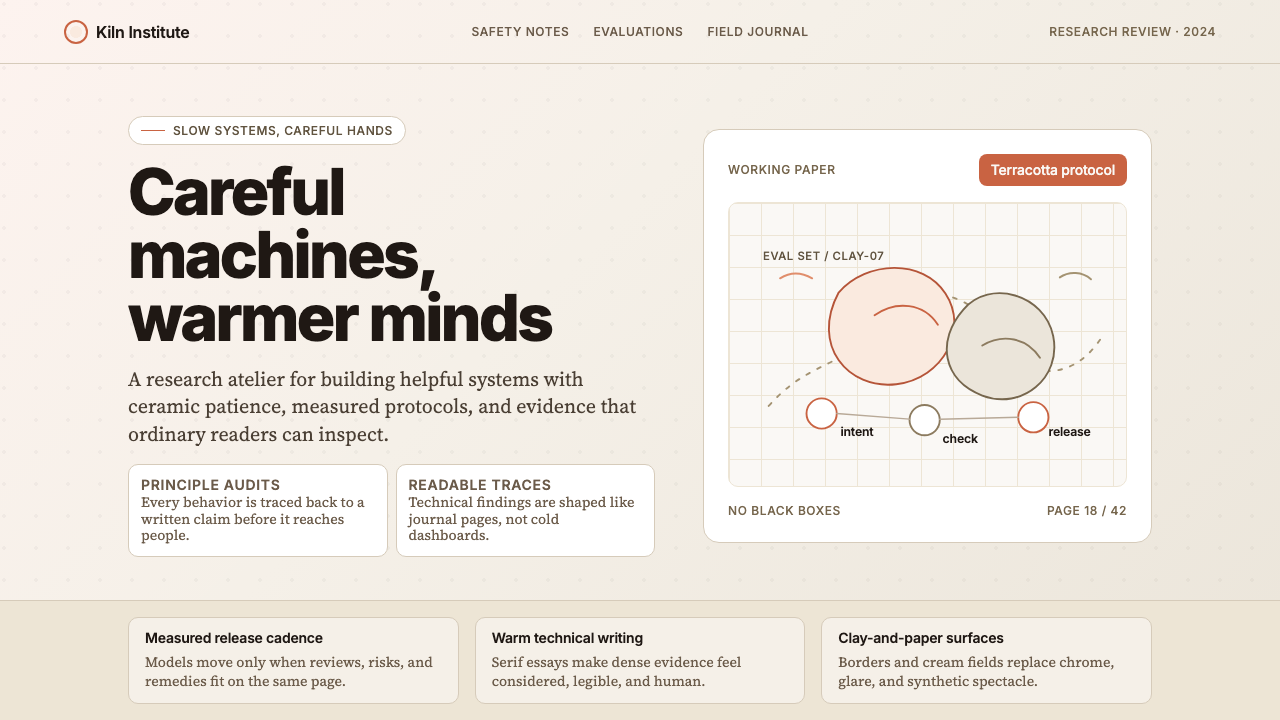 Anthropic ClayAI safety in handmade clay. Sand backgrounds, terracotta accents, serif body…用手工陶土包裹的 AI 安全感:沙色背景、赤陶点缀、衬线正文——缓慢、刻意、有…
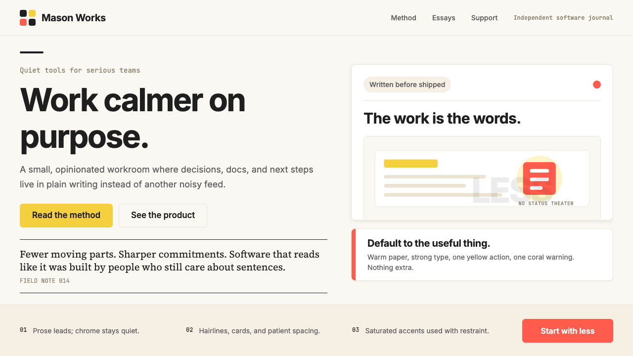 Basecamp / 37signalsQuiet craft, strong opinions. Cream paper, tight sans type, yellow and coral…安静却有主张。米色纸底、紧排无衬线、黄与珊瑚克制点题。
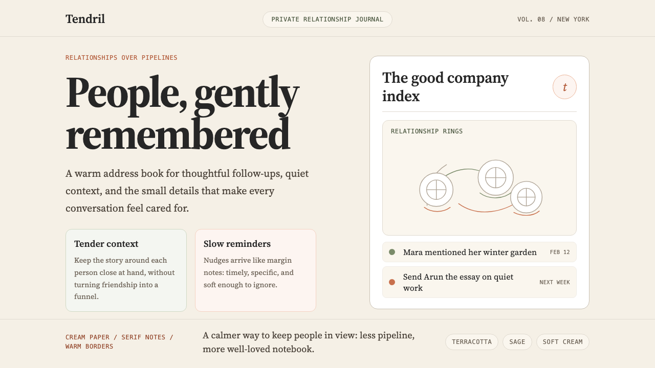 Clay 2024CRM as a sketchbook, not a sales pipeline. Cream backgrounds, terracotta, han…把 CRM 重新想象为安静的私人速写本:奶油底色、陶土点缀、手绘人物线描——拒…
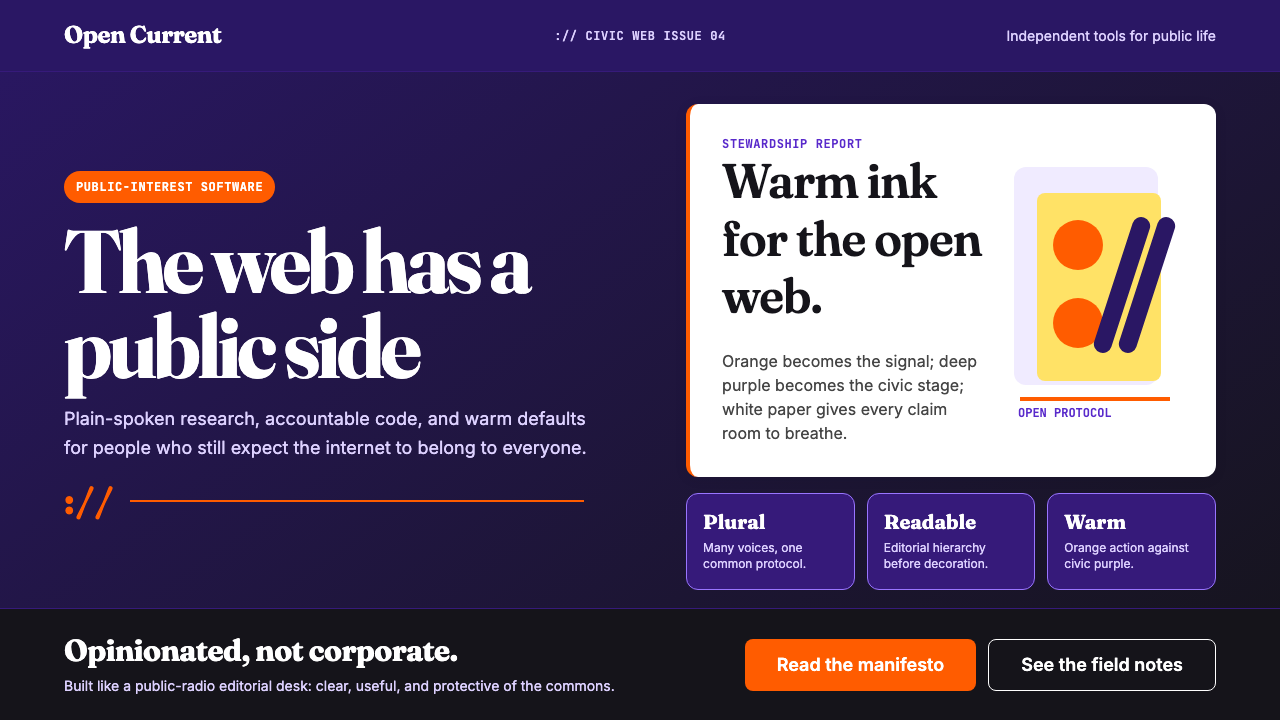 Mozilla Firefox 2024 RefreshPublic-interest warmth. Flame orange cuts through deep purple with Fraunces h…公共利益的温度。火焰橙穿透深紫,Fraunces 标题定调。
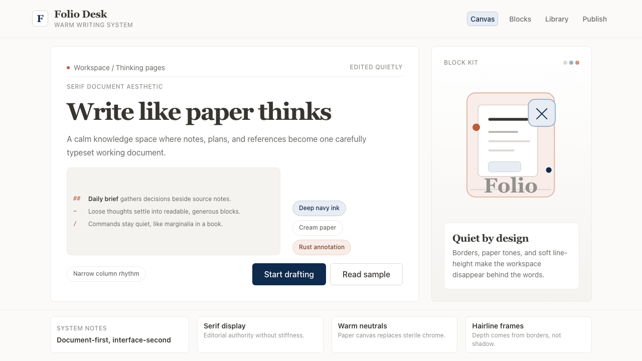 Notion ModernWriting feels papery. Source Serif on warm cream, navy ink, and hairline bord…书写像纸页:暖米白、衬线标题、深蓝墨色与细边框。
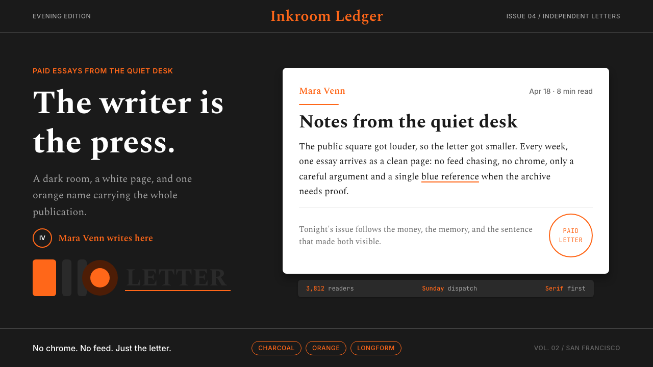 Substack Orange NewsletterLit page, dark room. Orange serif bylines ignite white cards on charcoal.暗室里的亮页。橙色衬线署名点燃炭黑上的白卡。