Design style guide设计风格指南
What is Mozilla Firefox 2024 Refresh?什么是 Mozilla Firefox 2024 Refresh?
Mozilla's 2024 brand refresh turns Firefox-flame orange and deep purple into a civic-editorial statement: warm enough to trust, bold enough to mean something.Mozilla 2024 品牌焕新将火焰橙与深紫转化为一份公民编辑宣言——温暖到令人信任,大胆到不可忽视。
Mozilla Firefox 2024 Refresh in briefMozilla Firefox 2024 Refresh 速览
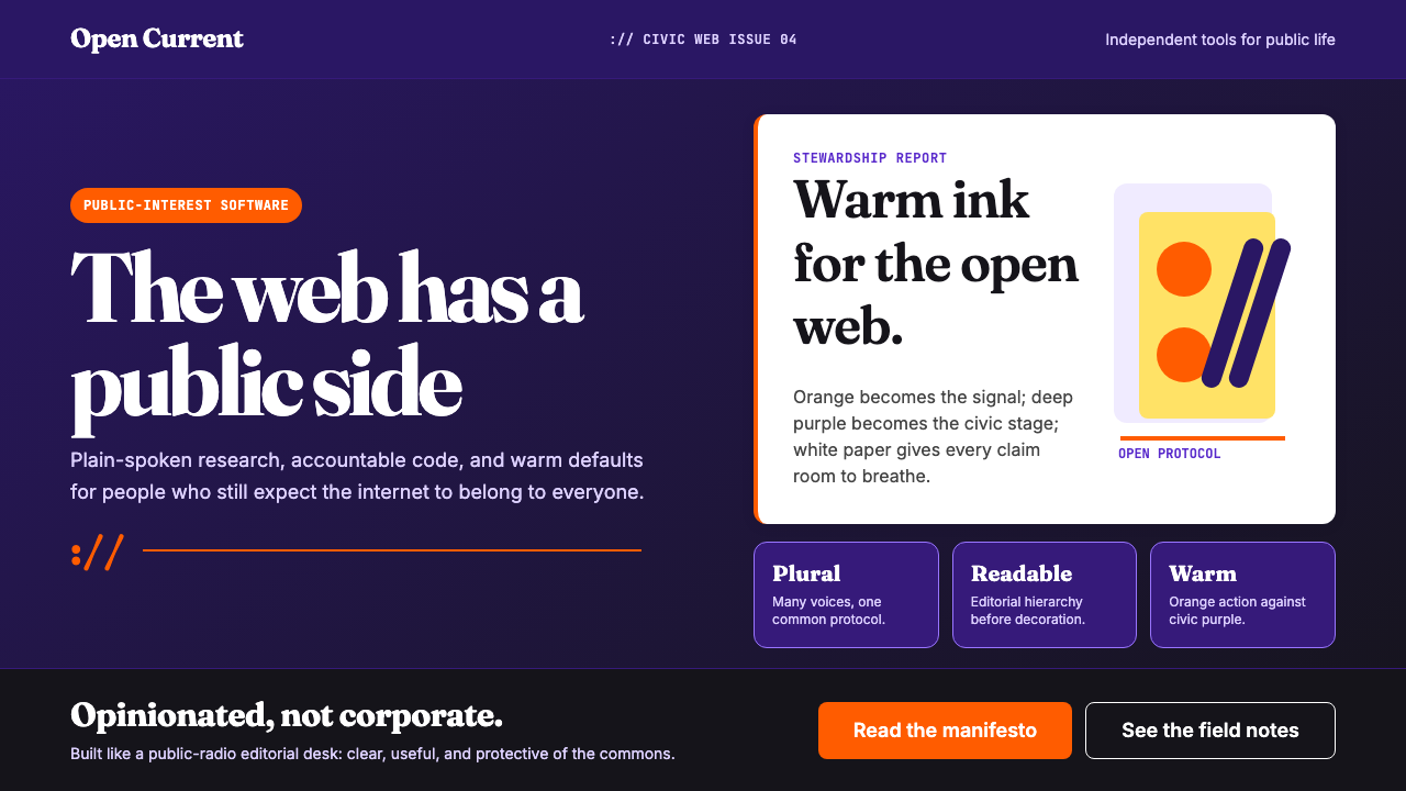
Mozilla Firefox 2024 Refresh is the visual identity system Mozilla adopted in its most significant rebrand in over a decade. Led by CMO Lindsey O'Brien, the redesign abandoned the sleek-but-anonymous aesthetic common to tech startups in favor of something warmer and more opinionated: a palette anchored in deep purple backgrounds and Firefox-flame orange calls to action, with cream-white cards providing breathing room. The result reads less like a software company and more like a public broadcaster with a genuine editorial point of view.Mozilla Firefox 2024 焕新是 Mozilla 十余年来规模最大的品牌重塑所采用的视觉识别体系。由首席营销官 Lindsey O'Brien 主导,这次重设计彻底放弃了科技创业公司惯用的精致却面目模糊的视觉语言,转而选择了一种更温暖、更有态度的风格:以深紫色背景为底,Firefox 火焰橙担当核心行动色,奶白卡片提供视觉喘息空间。整体气质更像一家有真实编辑立场的公共广播机构,而非一家软件公司。
The system is built around a few disciplined choices. Fraunces, a high-contrast display serif originally designed for editorial contexts, carries the headlines — an unusual move in a product space dominated by geometric sans-serifs, and a deliberate signal that Mozilla has things worth reading, not just features worth clicking. The iconic colon-slash-slash motif from internet URLs appears as ornamental punctuation throughout the system, threading browser heritage into every composition without leaning on literal logo placement.这套体系建立在几个克制而坚定的选择之上。Fraunces——一款原本为编辑语境设计的高对比度展示衬线字体——承担了所有标题排印,在一个几何无衬线字体称霸的产品领域里,这是一个不寻常的选择,也是一个刻意的信号:Mozilla 有值得阅读的内容,而不仅仅是值得点击的功能。互联网 URL 中标志性的冒号斜杠斜杠符号作为装饰性标点贯穿整套体系,在不依赖字面 Logo 摆放的前提下,将浏览器的历史基因编织进每一个版面。
What distinguishes this system from other nonprofit rebrands is its refusal to split the difference. The palette is genuinely warm — the orange is vivid and unapologetic, the purple is rich rather than corporate navy — and the typography is generous in size and weight. The visual message is civic confidence rather than institutional hedging: here is an organization that believes in something and wants you to know it.这套体系区别于其他非营利品牌焕新的关键,在于它拒绝折中妥协。色板是真正温暖的——橙色鲜明而毫不道歉,紫色丰盈而非呆板的企业深蓝——字体的尺寸与字重都是慷慨的。视觉传递的是公民自信而非机构式的模棱两可:这是一个真正相信某些事情、并且希望你知道这一点的组织。
See the Mozilla Firefox 2024 Refresh design system →查看 Mozilla Firefox 2024 Refresh 完整设计系统 →
Where does Mozilla Firefox 2024 Refresh come from?Mozilla Firefox 2024 Refresh 从何而来?
Mozilla's story begins in 1998, when Netscape Communications released the source code of its Navigator browser under a public license — an act of defiance against Microsoft's mounting dominance of the web through Internet Explorer. The Mozilla project emerged from that release as a community-driven effort to build an open, standards-compliant browser. By 2003, the Mozilla Foundation was formally established as a nonprofit to steward this work, and in 2004 Firefox launched to widespread public enthusiasm, reaching one hundred million downloads in less than a year. For a brief window, it genuinely reversed Internet Explorer's stranglehold on the browser market.Mozilla 的故事始于 1998 年。当时 Netscape Communications 将其 Navigator 浏览器的源代码以公开许可证形式释放——这是一次对微软借助 Internet Explorer 统治互联网的正面反抗。Mozilla 项目从这次发布中成长为一项社区驱动的事业,致力于构建一个开放、符合标准的浏览器。2003 年,Mozilla 基金会正式作为非营利组织成立以托管这项工作;2004 年,Firefox 以广泛的公众热情正式发布,不到一年内完成一亿次下载。在短暂的窗口期内,它真正逆转了 Internet Explorer 对浏览器市场的垄断。
The organization's visual identity through these years was serviceable but unremarkable — the fox-wrapped-around-a-globe mark was distinctive, but the surrounding design language was largely indistinguishable from the broader tech industry aesthetic of the time. Mozilla went through a more formal identity exercise around 2017, introducing a system that used the colon-slash-slash URL motif as a structural device, but the overall palette remained cool and digital-neutral. The brand communicated competence without conviction.这些年间,Mozilla 的视觉识别体系实用但不突出——狐狸缠绕地球的标志有一定辨识度,但周围的设计语言与当时整个科技行业的审美大体无从区分。Mozilla 在 2017 年前后进行了一次更正式的品牌梳理,引入了以冒号斜杠斜杠 URL 符号为结构性元素的视觉体系,但整体色板仍然偏冷、数字中性。品牌传达了能力,却没有传达信念。
The 2024 refresh reflects a genuinely changed competitive and cultural moment. By the mid-2020s, Mozilla was operating in a browser market almost entirely dominated by Chromium-based products, with Firefox maintaining a loyal but modest share. Simultaneously, the organization had expanded its advocacy work into AI ethics, data privacy policy, and open-internet governance — concerns that resonated far beyond the technical audience. The rebrand was an acknowledgment that Firefox's audience is not developers managing configurations but ordinary people who care about how the internet is governed.2024 年的焕新映射出一个真实变化的竞争与文化时刻。到 2020 年代中期,Mozilla 所处的浏览器市场几乎完全被基于 Chromium 的产品所主导,Firefox 维持着忠诚但规模有限的份额。与此同时,Mozilla 将其倡导工作扩展至 AI 伦理、数据隐私政策与开放互联网治理——这些议题的共鸣范围远超技术受众。这次重塑是一种承认:Firefox 的受众不是管理配置的开发者,而是关心互联网如何被治理的普通人。
CMO Lindsey O'Brien framed the project explicitly around public-interest positioning: Mozilla is not a vendor competing on features but a civic institution competing on values. The choice of a display serif for headlines, the warmth of the orange-and-purple palette, the generosity of the whitespace — each was a deliberate distancing from the cool rationalism of the browser market and an embrace of the editorial tradition of journalism and public broadcasting. The colon-slash-slash motif, retained from the 2017 system, now reads less as a technical reference and more as a symbol of the open internet itself.首席营销官 Lindsey O'Brien 明确以公共利益定位来框架这个项目:Mozilla 不是一个在功能上竞争的供应商,而是一个在价值观上竞争的公民机构。为标题选择展示衬线字体、橙色与紫色色板的温暖、留白的慷慨——每一个选择都是与浏览器市场冷冽理性主义的刻意疏离,以及对新闻业与公共广播编辑传统的主动拥抱。从 2017 年体系沿袭下来的冒号斜杠斜杠符号,如今读起来不再是技术引用,更像是开放互联网本身的象征。
What defines the Mozilla Firefox 2024 Refresh look?Mozilla Firefox 2024 Refresh 的视觉特征是什么?
Palette色板
The color system is built around three anchors: a rich, saturated purple that functions as the dominant background in dark contexts, a vivid flame orange that serves exclusively as an action and emphasis color, and a warm cream-white that provides contrast without the clinical harshness of pure white. The purple is closer to aubergine than corporate navy — it has warmth baked into its undertones. The orange reads as heat and urgency rather than warning or hazard. Together they produce a palette that is simultaneously bold and approachable, neither cold-tech nor overly casual.色彩体系围绕三个锚点构建:丰盈、饱和的紫色在深色语境中充当主导背景,鲜明的火焰橙专用于行动与强调,温暖的奶白色则提供对比,同时避免纯白的临床冷感。这里的紫色更接近茄紫而非企业深蓝——其底色本身携带着温度。橙色传递热度与紧迫感,而非警示或危险。两者共同构成一套既大胆又亲切的色板,既非冷冽的科技调性,也不流于随意轻松。
Typography字体排印
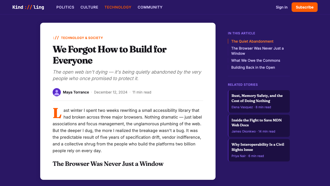
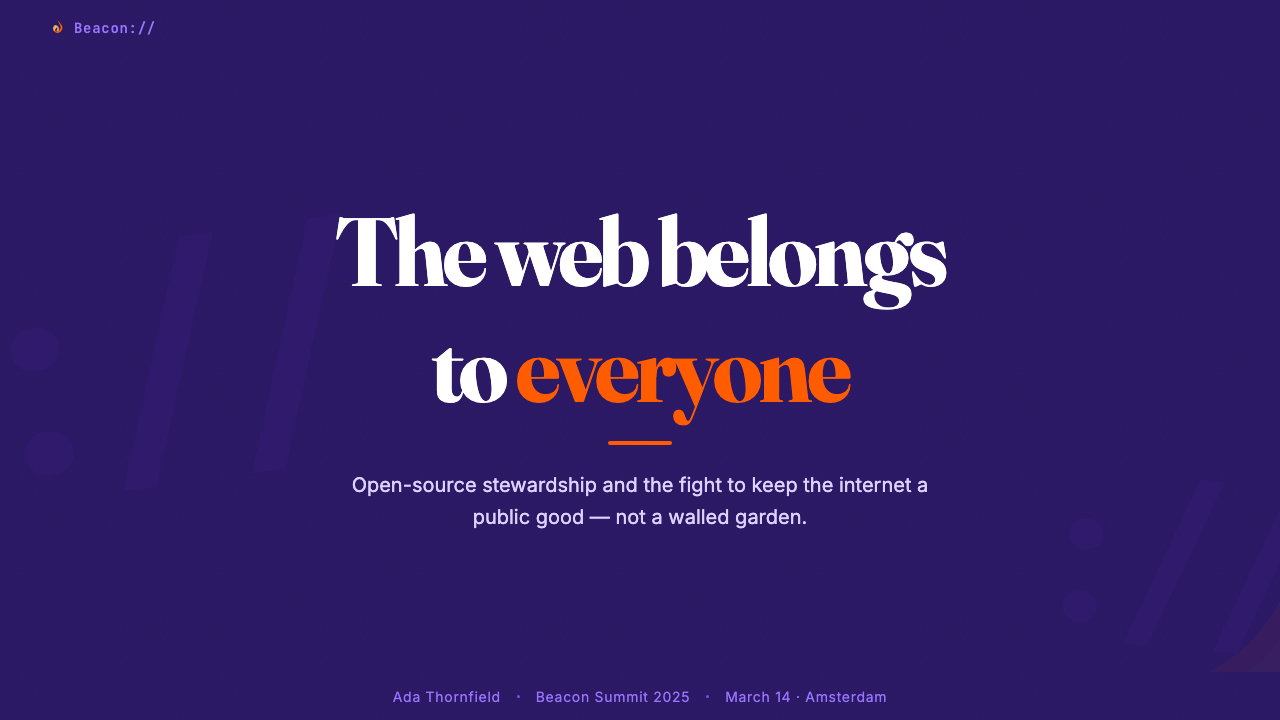
Fraunces, a variable display serif with high contrast between thick and thin strokes, anchors the headline voice. It was designed for editorial work — long-form reading, magazine covers, institutional publishing — and its presence in a browser brand signals that Mozilla is treating design as editorial rather than transactional. Headlines are set large and with deliberate weight, letting the letterforms carry emotional register without needing color support. Supporting text uses geometric sans-serifs that provide clean contrast without competing for attention.Fraunces 是一款粗细笔画高度对比的可变展示衬线字体,承载着标题排印的核心声调。它为编辑工作而生——长文阅读、杂志封面、机构出版——它出现在浏览器品牌中,传达了 Mozilla 将设计视为编辑性而非交易性的立场。标题字号大、字重重,让字形本身携带情感分量,无需色彩辅助。辅助文字采用几何无衬线字体,提供清晰对比而不争夺注意力。
URL MotifURL 符号母题
The colon-slash-slash sequence — borrowed from the structural syntax of every web address — appears throughout the system as ornamental punctuation, section dividers, and compositional anchors. It functions as a brand-owned graphic element that grounds the visual identity in browser heritage without being literal about it. In large display use, the three characters have enough geometric presence to work as pure form; in smaller contexts, they read as knowing cultural shorthand for the web itself.冒号斜杠斜杠序列——借自每个网址的结构性语法——作为装饰标点、段落分隔与版面锚点贯穿整套体系。它作为品牌专属的图形元素,在不字面强调 Logo 的前提下,将视觉识别深植于浏览器传承之中。在大型展示用途中,这三个字符具有足够的几何存在感,可以作为纯粹的形态运作;在较小的语境中,它们则作为互联网本身广为人知的文化速记而被识读。
Editorial Confidence编辑自信
The system uses generous whitespace and large type not as minimalist restraint but as editorial authority — the visual grammar of an institution that knows it has something worth saying. Section introductions breathe; captions are given actual typographic hierarchy; headlines are sized to stop the eye rather than guide it politely. This editorial register is unusual in the browser space, where interface density and feature-demonstration tend to dominate marketing materials.这套体系运用慷慨的留白与大号字体,不是作为极简主义克制,而是作为编辑权威——一个知道自己有话值得说的机构的视觉语法。段落导语得以自由呼吸;图注获得真实的排印层级;标题的尺寸是为了让眼睛停下,而非礼貌地引导它前行。这种编辑风格在浏览器领域极为罕见——界面密度与功能展示通常主导着营销物料。
Warmth as Stance温暖作为立场
Unlike most tech brands, which pursue neutrality or authority as their primary emotional register, the Firefox 2024 system leans into warmth as a deliberate ideological signal. The cream tones, the orange's association with fire and heat, the editorial serif — these are not concessions to approachability but assertions about what Mozilla values: human presence over algorithmic polish, civic mission over corporate efficiency. The warmth is political in the sense that every design decision has a position.与大多数科技品牌将中立或权威作为首要情感基调不同,Firefox 2024 体系将温暖作为刻意的意识形态信号。奶油色调、橙色与火焰和热度的关联、编辑衬线字体——这些不是对亲切感的妥协,而是对 Mozilla 所珍视之物的宣示:人的存在胜于算法的打磨,公民使命胜于企业效率。这里的温暖是政治性的,因为每一个设计决策都包含一个立场。
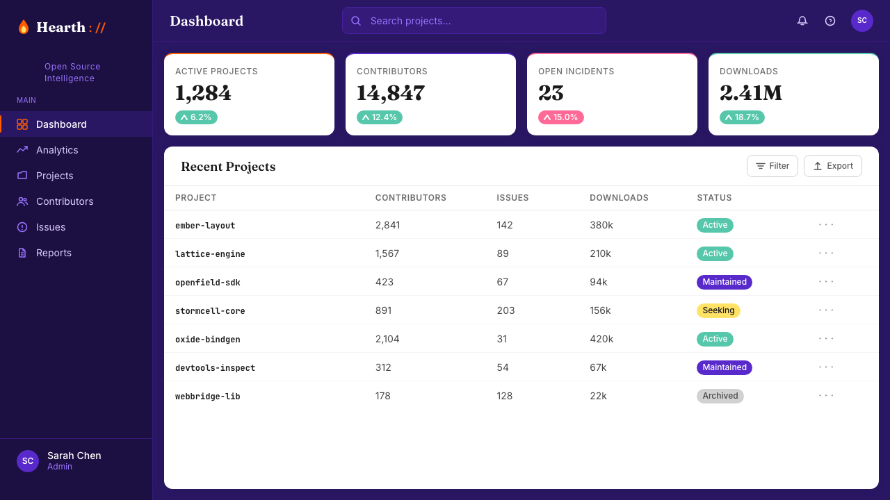
Dark-First Composition深色优先构图
The deep purple background is treated as the canonical context — most hero and feature sections lead with it. This is unusual for a public-facing product brand, where light backgrounds are the default, and it reinforces the sense of editorial drama. Against the dark ground, cream cards and orange accents pop with intensity; the hierarchy of information is immediately legible without needing subtle shadow or border work. Light surfaces appear as respite or contrast, not as the default state.深紫色背景被视为标准语境——大多数 Hero 区块与特性区块以此为起点。对于一个面向公众的产品品牌来说,这是不寻常的——浅色背景通常是默认选择——而这强化了编辑戏剧感。在深色底面上,奶白卡片与橙色强调以饱满的力度跳出;信息层级无需精巧的投影或边框即可立即被读取。浅色表面作为喘息或对比出现,而非默认状态。
Nonprofit Sincerity非营利诚意
The visual system deliberately avoids the aspirational lifestyle imagery and slick gradient surfaces associated with commercial browser and platform marketing. There are no abstract data-stream visuals, no photorealistic device mockups dissolving into light, no glossy brand photography of idealized users. The design stays close to language — words, headlines, the URL motif — because Mozilla's actual product is an argument about how the internet should work, not a physical object to be desired.这套视觉体系刻意回避了商业浏览器与平台营销惯用的励志生活方式图像和精致渐变表面。没有抽象的数据流视觉、没有溶解于光线中的超写实设备模型、没有理想化用户的光鲜品牌摄影。设计紧贴语言——文字、标题、URL 符号——因为 Mozilla 真正的产品是一个关于互联网应当如何运作的论点,而非一件有待被渴望的实体对象。
See the Mozilla Firefox 2024 Refresh design system →查看 Mozilla Firefox 2024 Refresh 完整设计系统 →
Who shaped Mozilla Firefox 2024 Refresh?谁塑造了 Mozilla Firefox 2024 Refresh?
Baker co-founded the Mozilla project and served as its longtime chair and CEO, making her one of the most consequential figures in the history of the open web. Her leadership framed Mozilla not as a software company but as a mission-driven institution — a framing that the 2024 visual rebrand finally makes legible at first glance. Her persistent advocacy for browser diversity and internet openness shaped the cultural position that the new brand identity now communicates.贝克共同创立了 Mozilla 项目,并长期担任其主席与首席执行官,是开放互联网历史上影响最深远的人物之一。她的领导将 Mozilla 定位为使命驱动的机构而非软件公司——2024 年的视觉焕新终于让这一定位在第一眼就清晰可读。她对浏览器多元化与互联网开放性的持续倡导,塑造了新品牌识别体系如今所传达的文化立场。
As CMO, O'Brien led the 2024 brand refresh and articulated the public-interest positioning that drives its visual language. Her framing — Mozilla as a civic institution competing on values rather than features — was the conceptual foundation that justified the choice of editorial typography, warm palette, and generous whitespace over the default tech-brand playbook. The rebrand represents one of the clearer examples in recent years of a CMO's strategic brief becoming legible as specific visual decisions.作为首席营销官,O'Brien 主导了 2024 年品牌焕新,并阐明了驱动其视觉语言的公共利益定位。她的框架——Mozilla 是一个在价值观而非功能上竞争的公民机构——是正当化编辑字体、温暖色板与慷慨留白选择(而非默认科技品牌手册)的概念基础。这次焕新是近年来 CMO 战略简报最清晰地转化为具体视觉决策的案例之一。
Surman served as Mozilla Foundation's executive director for over a decade and was a central voice in expanding Mozilla's identity from a browser maker to an internet health and AI ethics advocate. His framing of the organization's work as 'internet health' — a term he helped popularize through Mozilla's annual Internet Health Report — contributed significantly to the ideological foundation that the 2024 brand now expresses visually: the internet as a civic resource to be tended, not merely a marketplace to be monetized.苏曼担任 Mozilla 基金会执行董事逾十年,是将 Mozilla 身份从浏览器制造商扩展为互联网健康与 AI 伦理倡导者的核心声音。他将组织工作定义为「互联网健康」——这一术语他通过 Mozilla 年度《互联网健康报告》帮助推广——为 2024 年品牌如今以视觉表达的意识形态基础做出了重要贡献:互联网是一项需要被呵护的公民资源,而非仅仅是一个待货币化的市场。
Chambers took on the CEO role at Mozilla during the period in which the 2024 rebrand was finalized and launched. Her tenure coincided with the organization's sharpened focus on AI accountability and its repositioning as a public-interest counterweight to the concentrated power of large technology platforms. The brand identity launched under her leadership is the clearest visual articulation of that positioning Mozilla has yet produced.钱伯斯在 2024 年品牌焕新最终确定并发布期间担任 Mozilla 首席执行官。她的任期恰与 Mozilla 在 AI 问责领域的锐化聚焦,以及将其重新定位为大型科技平台集中权力的公共利益制衡力量同步发生。在她领导下发布的品牌识别体系,是 Mozilla 迄今对这一定位最清晰的视觉阐述。
How do you use Mozilla Firefox 2024 Refresh today?今天怎么用 Mozilla Firefox 2024 Refresh?
The Firefox 2024 system translates well into presentation contexts because its hierarchy is legible at a glance. For cover slides, the deep-purple-background treatment with a large Fraunces-style display serif headline and flame-orange accents produces immediate authority — the composition communicates that the presenter has something to say, not just information to convey. The cream-on-dark treatment is especially effective for conference presentations and keynotes, where light-on-dark reads better from a distance than dark-on-light. For content slides, the key discipline is restraint: one accent color per slide, generous margins, and body text sized generously rather than compressed to fit more points. Data slides should treat charts as editorial objects — clear axis labels, orange used only for the single most important data series, cream background for chart areas within a purple slide field.Firefox 2024 体系在演示文稿语境中移植性良好,因为其层级在第一眼就清晰可读。对于封面幻灯片,深紫色背景搭配大号 Fraunces 式展示衬线标题与火焰橙强调色,产生即时的权威感——这一构图传达的是演讲者有话要说,而非仅仅有信息要传递。深底浅字的处理方式在会议展示与主题演讲中尤为有效,因为浅色文字在深色底面上的远距离可读性优于深色文字在浅色底面上。对于内容幻灯片,关键原则是克制:每张幻灯片只用一种强调色,保留慷慨的页边距,正文字号宁可放大也不要压缩以容纳更多要点。数据幻灯片应将图表视为编辑性对象——清晰的坐标轴标签,橙色仅用于最重要的单一数据系列,在紫色底面内的图表区域使用奶白背景。
For web UI, the system's dark-first orientation makes it well-suited to dashboards, monitoring tools, and any interface where information density is high and the user needs to orient quickly. The deep purple background with cream card components produces a visual hierarchy that works without heavy shadow or border reliance — the contrast between background and card is sufficient. Navigation should be minimal and typographic; the URL motif can be adapted as a subtle structural divider. For pricing pages, the orange color reserved for the primary call-to-action tier communicates urgency and value without requiring any additional visual treatment.对于网页界面,这套体系的深色优先取向使其非常适合仪表板、监控工具,以及任何信息密度高、用户需要快速定向的界面。深紫色背景搭配奶白卡片组件,在不依赖大量投影或边框的前提下产生清晰的视觉层级——背景与卡片之间的对比度已经足够。导航应当精简而字体性;URL 符号可以改造为微妙的结构性分割元素。对于定价页面,保留给主要行动层级的橙色传达了紧迫感与价值感,无需任何额外的视觉处理。
Editorial and marketing applications benefit most from the system's confidence in language. Long-form landing pages should lead with large Fraunces-style headlines — single ideas stated plainly and at scale — before descending into supporting detail. Pull quotes and callouts work well in orange or cream against the dark field, treated as typographic objects rather than boxed or bordered elements. The URL motif functions as a section break that carries semantic weight: it signals 'we are going somewhere' rather than merely dividing content. For social and short-form content, the flame-orange-on-purple combination is immediately distinctive and crops well at small sizes; the colon-slash-slash can function as a micro-brand signature in contexts where the full wordmark does not fit.编辑与营销应用从这套体系对语言的信心中获益最多。长文落地页应以大号 Fraunces 式标题领航——单一想法以大尺度清晰陈述——再逐渐展开支撑细节。引用语与标注框在深色底面上以橙色或奶白色处理效果良好,作为排印性对象而非加框或加边框的元素。URL 符号作为段落分隔符具有语义重量:它传达「我们正在前往某处」而非仅仅划分内容。对于社交媒体与短内容,火焰橙叠深紫的组合辨识度极高,在小尺寸裁切下表现良好;冒号斜杠斜杠可以在完整文字标识无法适配的语境中作为微型品牌签名使用。
The system adapts to cause-marketing and advocacy contexts with particular naturalness, because its emotional register — civic warmth, editorial confidence, principled clarity — aligns with the communication needs of organizations arguing for a position rather than selling a product. Reports, annual reviews, and policy documents benefit from the Fraunces headline treatment and the careful whitespace discipline; the palette signals seriousness without institutional coldness.这套体系在公益营销与倡导语境中的适配最为自然,因为其情感基调——公民温暖、编辑自信、有原则的清晰——与那些在表达立场而非销售产品的组织的传播需求高度契合。报告、年度回顾与政策文件从 Fraunces 标题处理与细心的留白规律中获益;色板在传递严肃性的同时不带机构冷感。
A common mistake when applying this system is using the orange too liberally. In the Firefox 2024 identity, orange is reserved: it appears on calls to action, key data points, and moments of editorial emphasis. When it appears everywhere, it loses its function as a signal and the system collapses into visual noise. Similarly, the serif-and-sans pairing requires deliberate hierarchy — mixing Fraunces-weight headlines with an unrelated decorative serif in supporting roles undermines the editorial coherence the system depends on. Stay within the typographic register: display serif for headlines, geometric sans for everything else.应用这套体系时最常见的错误是过于随意地使用橙色。在 Firefox 2024 识别体系中,橙色是被保留的:它出现在行动号召、关键数据点与编辑强调的时刻。当它到处出现时,便失去了作为信号的功能,整套体系就此坍塌为视觉噪音。同样,衬线与无衬线的搭配需要刻意的层级区分——将 Fraunces 字重标题与无关的装饰衬线字体混用于辅助角色,会破坏这套体系所依赖的编辑连贯性。保持在字体排印的音域之内:展示衬线用于标题,几何无衬线用于其余一切。
See the Mozilla Firefox 2024 Refresh design system →查看 Mozilla Firefox 2024 Refresh 完整设计系统 →
Mozilla Firefox 2024 Refresh — FAQMozilla Firefox 2024 Refresh · 常见问题
Is this style specific to Mozilla, or can it be adapted for other organizations?这种风格是 Mozilla 专属的,还是可以为其他组织借鉴?
The aesthetic principles — display serif headlines, warm editorial palette, generous whitespace, dark-first composition — are not proprietary to Mozilla. They represent a coherent design language with a specific emotional register: civic warmth, editorial confidence, principled stance. Any organization that communicates from a values-based rather than features-based position can draw on the same vocabulary — advocacy organizations, public broadcasters, mission-driven foundations, educational institutions. The key is ensuring that the warmth is earned by the organization's actual content and mission rather than applied as surface styling.这套审美原则——展示衬线标题、温暖编辑色板、慷慨留白、深色优先构图——并非 Mozilla 的专属。它们代表着一套具有特定情感基调的连贯设计语言:公民温暖、编辑自信、有原则的立场。任何从价值观而非功能出发进行传播的组织都可以借鉴同样的词汇——倡导组织、公共广播机构、使命驱动的基金会、教育机构。关键在于确保这种温暖是由组织真实的内容与使命所赚取的,而非作为表面风格硬套上去的。
How does this style differ from other editorial or media brand identities?这种风格与其他编辑或媒体品牌识别有何不同?
Most editorial brands work with restrained, neutral palettes — black ink on cream or white, with a single accent color used sparingly. The Firefox 2024 system is more assertive: the deep purple is rich and saturated rather than neutral, and the orange is vivid rather than a subtle warmth. The combination reads as editorial in structure but activist in temperature. It sits somewhere between a magazine identity and a protest poster — which is appropriate for an organization whose editorial mission is advocacy rather than objectivity.大多数编辑品牌使用克制、中性的色板——奶油或白底上的黑色墨迹,再加一种克制使用的单一强调色。Firefox 2024 体系则更具主张:深紫色是浓郁饱和而非中性的,橙色是鲜明的而非微妙的温暖。这一组合在结构上读来像编辑风格,在温度上却像活动人士风格。它坐落于杂志识别与抗议海报之间的某处——这对于一个编辑使命是倡导而非客观报道的组织来说,是合适的。
Can this palette work in a light-background version without losing its character?这套色板能以浅色背景版本呈现而不失其特性吗?
Yes, but with care. A light-background inversion — cream or off-white ground, deep purple for headlines and structural elements, orange for calls to action — preserves the palette's emotional register while reversing its compositional drama. What changes is the sense of weight: dark-background compositions feel dense and urgent; light-background equivalents feel lighter and more approachable. For long-form reading contexts, the light version typically performs better; for hero moments and feature marketing, the dark version is more effective. The key constraint is that the purple must remain rich enough on the light ground to maintain contrast and character — a desaturated lavender reads as entirely different and loses the civic warmth entirely.可以,但需要谨慎。浅色背景反转——奶油色或近白底面,深紫色用于标题与结构性元素,橙色用于行动号召——在保留色板情感基调的同时逆转了其构图张力。变化的是重量感:深色背景构图感觉厚重而紧迫;浅色背景等价物感觉更轻盈、更亲切。对于长文阅读语境,浅色版本通常表现更好;对于 Hero 时刻与功能营销,深色版本更有效。关键限制在于:紫色在浅色底面上必须保持足够的饱和度以维持对比度与特性——一种不饱和的薰衣草紫读来是完全不同的风格,并完全失去公民温暖感。
Why does the system use a serif for headlines when most browser brands use sans-serif?为什么这套体系为标题使用衬线字体,而大多数浏览器品牌使用无衬线字体?
Because the choice communicates something specific about what Mozilla is. Sans-serif type in tech contexts reads as precision, efficiency, and modernity — the values of a product company optimizing for performance. Fraunces, a display serif with editorial associations, reads as authority, depth, and considered opinion — the values of a publisher or institution with a point of view. The typeface choice is not a stylistic preference but a positional statement. Mozilla is not trying to look like a software product; it is trying to look like the kind of organization whose arguments about the internet deserve to be taken seriously.因为这个选择传达了关于 Mozilla 是什么的特定信息。无衬线字体在科技语境中读来是精确、效率与现代性——一家优化性能的产品公司的价值观。而 Fraunces 作为带有编辑联想的展示衬线字体,读来是权威、深度与经过考量的观点——一家有立场的出版机构或机构的价值观。字体选择不是风格偏好,而是定位声明。Mozilla 不是在试图看起来像一个软件产品;它是在试图看起来像一个关于互联网的论点值得被认真对待的那类组织。
How should the colon-slash-slash motif be used without becoming gimmicky?如何使用冒号斜杠斜杠母题,而不至于流于噱头?
The motif works when it carries structural function — as a section break, a heading prefix, an ornamental pause before a quote or a key statement. It becomes gimmicky when it is used decoratively without purpose, or when it appears so frequently that it stops registering as meaningful. The discipline is to treat it like punctuation: used where it aids comprehension or emphasis, absent where it does not. In practice, one or two appearances per page or screen is usually the right register. The motif also works best at scale — large enough that its geometric character is legible — rather than as a small repeated texture.当这个母题承载结构性功能时,它是有效的——作为段落分隔、标题前缀、引言或关键陈述前的装饰性停顿。当它被无目的地装饰性使用,或出现频率高到不再被感知为有意义时,它就变成了噱头。这里的原则是把它当标点来用:在有助于理解或强调的地方使用,在没有此作用的地方缺席。实践中,每页或每屏出现一到两次通常是合适的频率。这个母题在大尺寸下效果最佳——足够大以让其几何特性清晰可读——而不是作为重复的小型纹理使用。
Related design styles相关设计风格
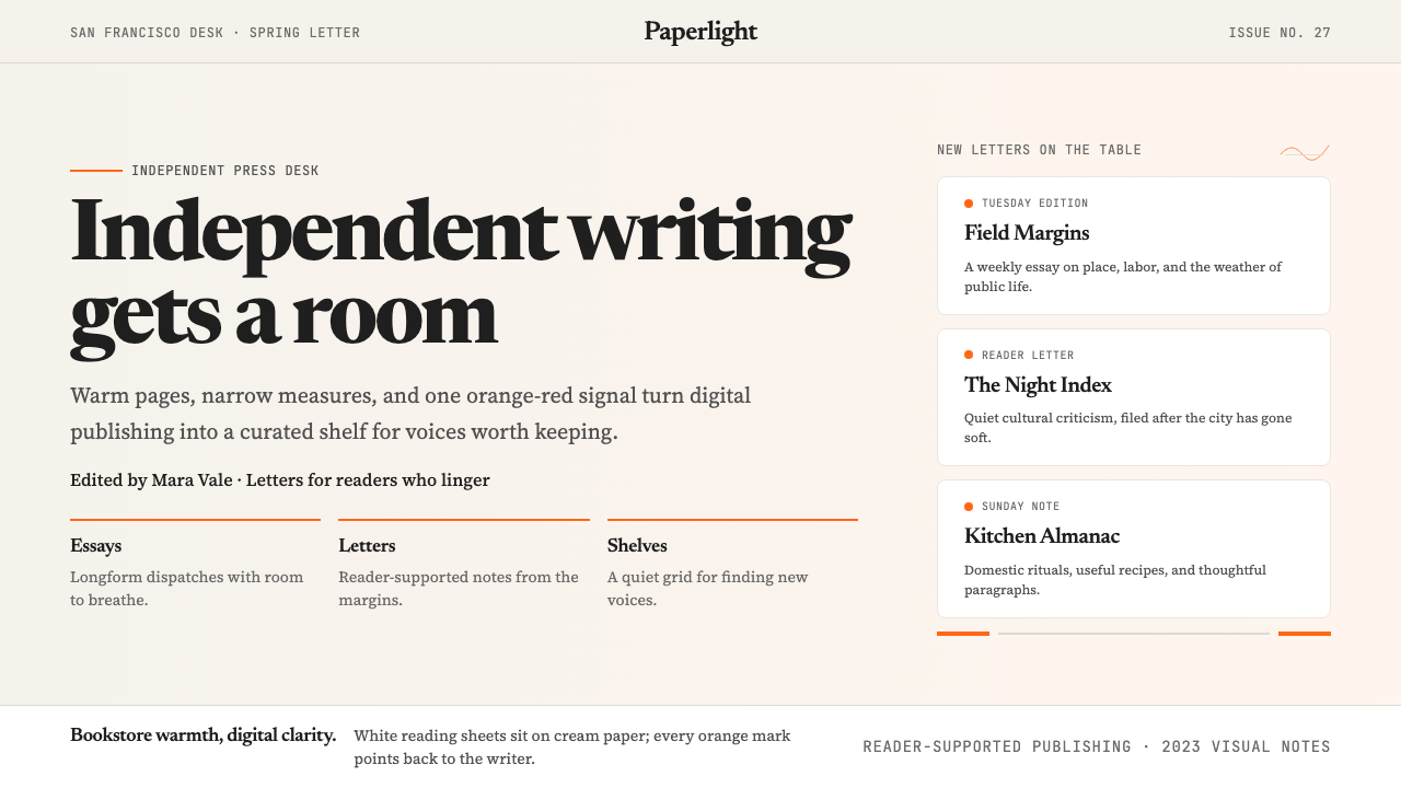 Substack 2023Writing feels shelved, not streamed. Cream paper, Newsreader serif, and one o…写作像上架而非信息流:奶油纸底、Newsreader 衬线与橙红信号。
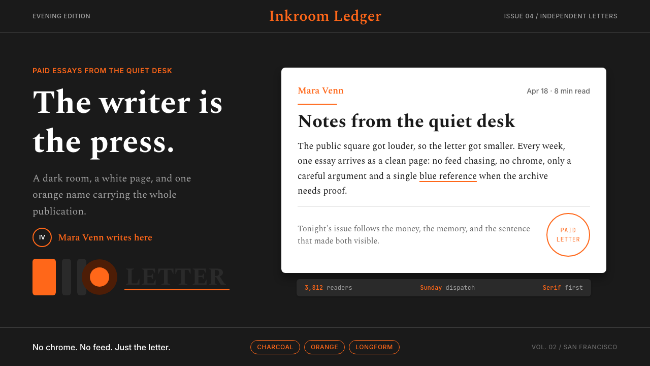 Substack Orange NewsletterLit page, dark room. Orange serif bylines ignite white cards on charcoal.暗室里的亮页。橙色衬线署名点燃炭黑上的白卡。
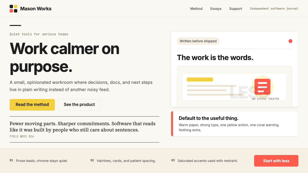 Basecamp / 37signalsQuiet craft, strong opinions. Cream paper, tight sans type, yellow and coral…安静却有主张。米色纸底、紧排无衬线、黄与珊瑚克制点题。
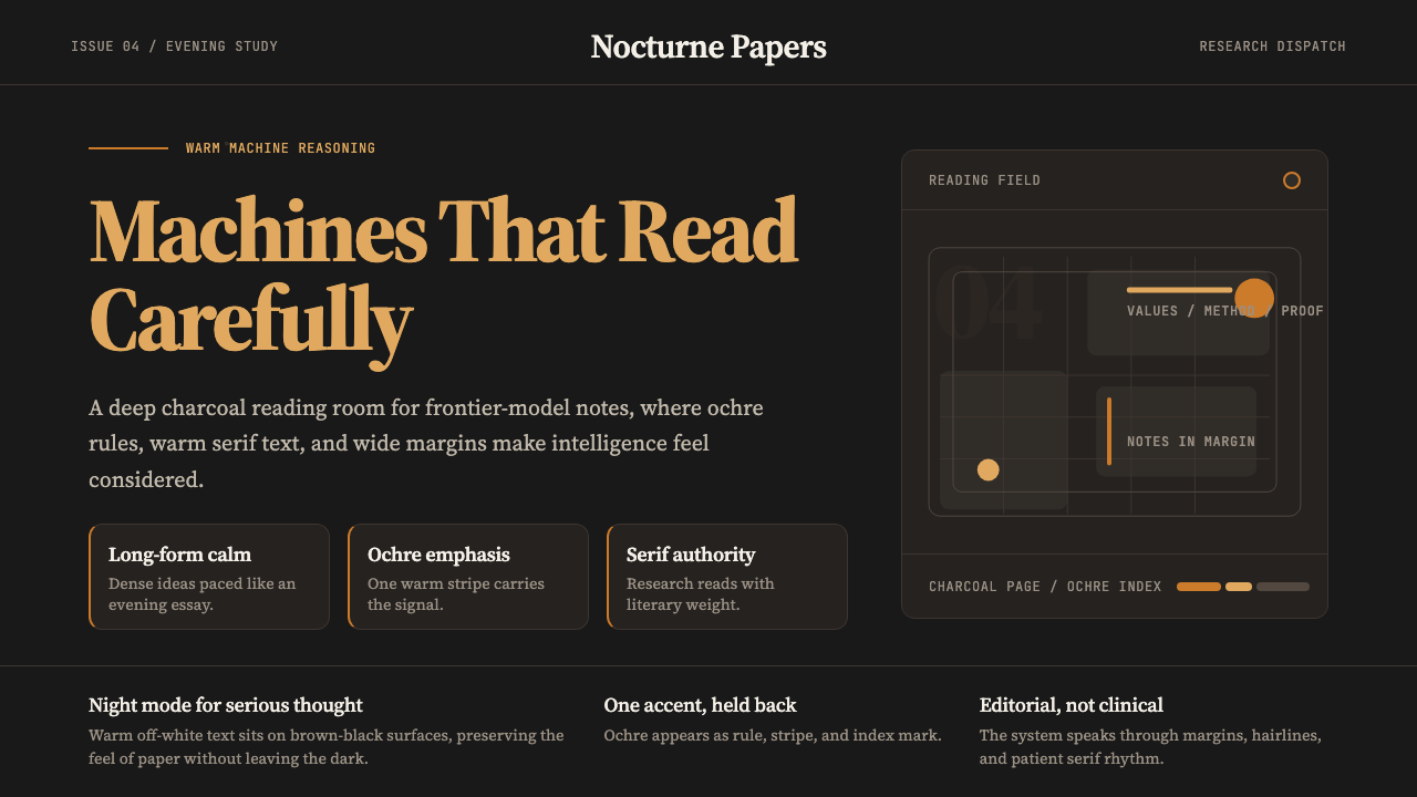 Claude / Anthropic Warm 2024Warm intelligence at night. Ochre rules and Source Serif glow on deep charcoa…夜读式温暖智能:深炭底、赭橙线与 Source Serif 发光。
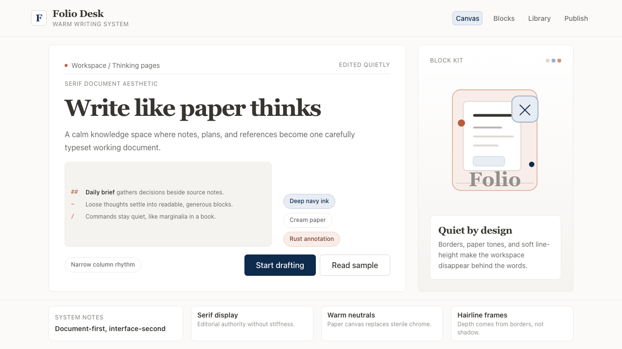 Notion ModernWriting feels papery. Source Serif on warm cream, navy ink, and hairline bord…书写像纸页:暖米白、衬线标题、深蓝墨色与细边框。
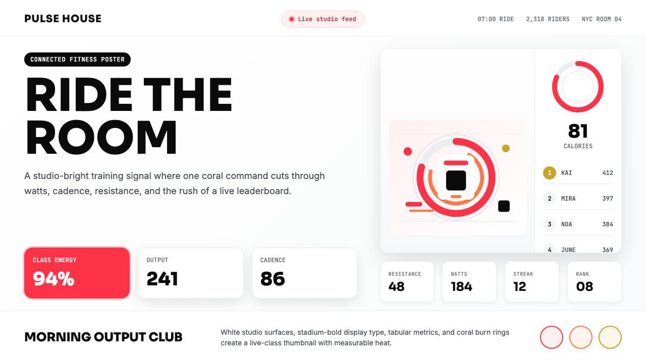 Peloton Fitness Coral (2020)Studio-bright urgency. Coral rings, Sora caps, and leaderboard grids drive th…明亮而紧迫:珊瑚红圆环、Sora 大写与排行榜网格点燃热量。