Design style guide设计风格指南
What is Peloton Fitness Coral (2020)?什么是 Peloton Fitness Coral (2020)?
Peloton turned the anxiety of a live leaderboard into a visual language — coral urgency, studio-bright white, and data rings that made every home ride feel like a Chelsea broadcast.Peloton 将实时排行榜的紧迫感转化为一套视觉语言——珊瑚红的热力、摄影棚般明亮的白色,以及让每一次居家骑行都像切尔西直播的数据环形图。
Peloton Fitness Coral (2020) in briefPeloton Fitness Coral (2020) 速览
Peloton Fitness Coral is the visual design system that defined connected-fitness branding at the peak of the at-home workout boom. Built around a single highly saturated warm accent — the coral that came to function almost as a proprietary signal color — laid against a studio-light-bright white field, the system communicates urgency, achievement, and community in a format optimized equally for a tablet screen mounted on a stationary bike and a mobile phone carried to the couch.Peloton Fitness Coral 是在居家健身热潮顶峰定义互联健身品牌视觉语言的设计系统。它以一种高度饱和的暖色调强调色——这抹珊瑚红几乎成为品牌的专属信号——铺陈于摄影棚般明亮的白色底面上,在固定单车的平板屏幕与手机屏幕之间传递紧迫感、成就感与社群归属。
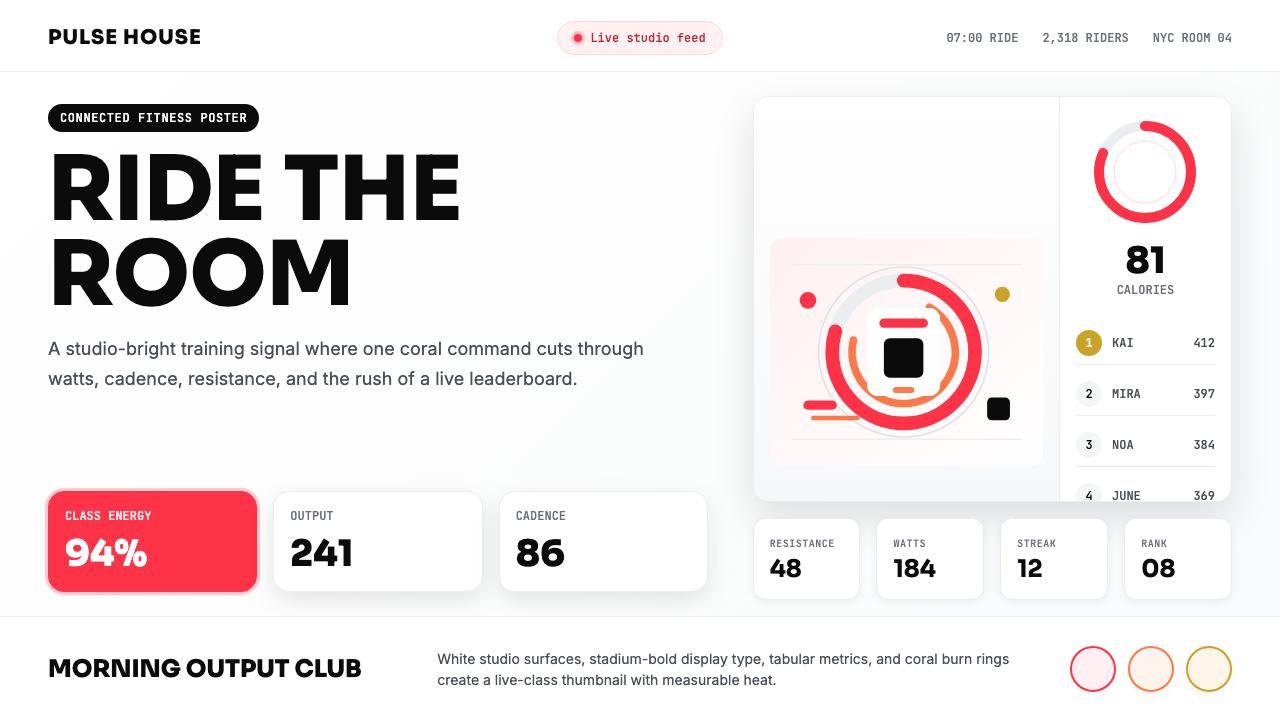
The aesthetic is not subtle. It is engineered to replicate the physiological conditions of a live fitness class: the heat of the room, the pulsing energy of a crowd, the instructor's voice cutting through noise. Every visual decision — the near-neon warmth of the coral, the caps-locked stadium-bold display type, the ring-shaped data visualizations modeled on calorie-burn meters — is calibrated to raise the viewer's heart rate a fraction before the workout even begins.这套美学不追求含蓄。它被设计成能够复制真实健身课程的生理体验:房间的热度、人群涌动的能量、教练穿透噪音的声音。每一个视觉决定——珊瑚红近乎荧光的暖意、全大写的体育场式粗体展示字、参照卡路里燃烧计设计的环形数据可视化——都被精心校准,让观者在运动开始之前心率已微微加快。
What makes the system coherent is its discipline. Despite the emotional intensity of the color and imagery, the underlying layout logic is methodical: a clean grid, clear typographic hierarchy, and consistent spatial relationships between data elements and photographic content. The instructor portrait sits at the emotional center, but the leaderboard and metric displays are the structural spine. The coral operates as a single controlled accent rather than a diffuse wash, which is why the brand feels energetic without becoming chaotic.使这套系统保持连贯的是它的纪律性。尽管色彩与摄影散发着强烈的情感张力,底层版面逻辑却条理清晰:干净的网格、明确的字体层级、数据元素与照片内容之间稳定的空间关系。教练肖像占据情感核心,但排行榜与运动数据显示才是结构支柱。珊瑚红作为单一受控强调色运作,而非弥散的色彩氛围——这正是品牌充满活力却不显混乱的原因。
See the Peloton Fitness Coral (2020) design system →查看 Peloton Fitness Coral (2020) 完整设计系统 →
Where does Peloton Fitness Coral (2020) come from?Peloton Fitness Coral (2020) 从何而来?
Peloton was founded in New York City in 2012 by John Foley, who wanted to bring the energy of Manhattan boutique fitness studios — SoulCycle, Barry's Bootcamp, Flywheel — into the home for people who could not schedule around a class time or afford the per-session cost. The company started as a hardware startup: the bike came first, the brand identity was secondary. Early visual materials leaned on generic fitness-industry imagery — muscular bodies, high-contrast black and white, the usual catalogue of aspirational sweat.Peloton 由约翰·福利于2012年在纽约市创立。他希望将曼哈顿精品健身工作室——SoulCycle、Barry's Bootcamp、Flywheel——的能量带入家庭,服务那些无法配合课程时间表或负担不起单次费用的人。公司起步是一家硬件创业公司:单车先行,品牌视觉是后来的事。早期视觉材料倚重通用的健身行业图像语言——肌肉线条、高对比度黑白摄影、惯常的励志汗水图集。
The coral identity solidified around 2018 as Peloton shifted from a niche hardware startup into a media company with a library of on-demand classes and live broadcasts from its Chelsea production studio. The decision to anchor the entire brand on a single warm saturated accent color was both practical and strategic. Practically, it made the Peloton interface instantly distinguishable on a screen in a room full of other screens. Strategically, it aligned the brand with a tradition of media companies using signature colors to claim territory — the specific coral was warmer and more optimistic than standard fitness-industry reds, closer in spirit to entertainment brands than to pharmaceutical or athletic equipment brands.珊瑚红身份在2018年前后逐渐固化,彼时 Peloton 从一家小众硬件公司转型为拥有点播课程库和切尔西制播工作室直播的媒体公司。以单一暖色调饱和强调色锚定整个品牌的决定,兼具务实与战略双重考量。务实层面,它让 Peloton 界面在一个充斥屏幕的房间里立刻可辨;战略层面,它令品牌与媒体公司用签名色彩占领心智的传统一脉相承。这抹特定的珊瑚红比标准健身行业的红更温暖、更乐观,在精神气质上更接近娱乐品牌,而非药品或运动器械品牌。
The visual peak came in 2020 and 2021, when the COVID-19 pandemic closed gyms worldwide and Peloton became one of the most discussed consumer products in American culture. Subscriber numbers grew from roughly half a million to nearly six million in two years. The design system had to scale across a dramatically expanded surface area: bike screens, mobile apps, web interfaces, promotional campaigns, broadcast graphics for the live class studio, apparel, and packaging. The coral held its identity anchor through all of it, becoming one of the more recognized brand color choices of the pandemic era.视觉高峰出现在2020至2021年——新冠疫情关闭了全球各地的健身房,Peloton 成为美国文化中被讨论最多的消费品之一。两年间,订阅用户从约五十万增长至近六百万。设计系统需要在急剧扩展的应用面上保持一致:单车屏幕、移动应用、网页界面、推广活动、直播课程工作室的广播图形、服装与包装。珊瑚红在所有这些场景中守住了品牌的身份锚点,成为疫情时代最具辨识度的品牌色彩选择之一。
The key figures who shaped the brand's visual presence included John Foley, whose founding vision of replicating the boutique fitness experience determined the emotional register; Hisao Kushi, whose product and technology leadership drove the integration of real-time data visualization into the core experience; and instructors Cody Rigsby and Robin Arzón, whose personas — warm and comedic for Rigsby, driven and athlete-focused for Arzón — set the human tone that the visual system had to support. The instructors were not just talent; they were design constraints. The portrait photography, the leaderboard legibility requirements, the way the interface had to simultaneously show a live human face and a dense data readout — all of these flowed from the centrality of the instructor relationship.塑造品牌视觉存在的关键人物包括:约翰·福利,其复制精品健身体验的创始愿景决定了品牌的情感基调;久志比佐(Hisao Kushi),其产品与技术领导力推动了实时数据可视化与核心体验的整合;教练科迪·里格斯比(Cody Rigsby)与罗宾·阿尔松(Robin Arzón),前者温暖幽默,后者进取而运动员气质十足,两人的个人形象设定了视觉系统所需支撑的人文基调。教练不只是内容表演者,更是设计约束条件——肖像摄影、排行榜的可读性要求、界面必须同时呈现真实人脸与密集数据读数的方式——所有这些都源于教练关系在产品中的核心地位。
What defines the Peloton Fitness Coral (2020) look?Peloton Fitness Coral (2020) 的视觉特征是什么?
The Coral Signal珊瑚红信号
The defining visual element of the system is a warm, highly saturated coral — not the aggressive red of danger signage, not the pale pink of softness, but a midpoint that reads simultaneously as energetic and welcoming. It functions as a proprietary color in the same way that a major technology company might own a particular shade of blue: trained viewers recognize it as Peloton before reading any text. It appears sparingly but consistently — on primary call-to-action buttons, on the active ring in calorie-burn visualizations, on instructor-name treatments, and on metric highlights in the leaderboard. Its restraint is precisely what gives it power.这套系统最具定义性的视觉元素是一种温暖、高度饱和的珊瑚红——既非危险标识的攻击性正红,也非柔软感的淡粉红,而是一个同时传递活力与热情的中间点。它的运作方式犹如某家大型科技公司「占有」某一特定蓝调:训练有素的观者在阅读任何文字之前就能辨认出这是 Peloton 的颜色。它出现得有节制但一以贯之——主行动按钮、卡路里燃烧可视化中的激活环、教练姓名处理,以及排行榜中的数据高亮。正是这种克制赋予了它力量。
Studio-Light White and Photographic Ground摄影棚白与照片底场
The background register of the system is a near-pure white that reads like studio lighting rather than a paper page. This creates an aspirational cleanliness — the interface feels hygienically bright, like a well-run gym with good HVAC. Against this white ground, instructor portrait photography operates at full saturation and sharp contrast. The photographs are shot and processed to maximize the emotional presence of the subject: strong key lighting, compressed depth of field, subjects looking directly into the lens or caught mid-effort with genuine exertion visible. The photography is not lifestyle — it is almost theatrical.这套系统的背景基调是近乎纯白的色调,读来像摄影棚灯光而非纸张页面。这制造了一种令人向往的洁净感——界面明亮而卫生,如同通风良好的优质健身房。在这片白底上,教练肖像摄影以充分的饱和度与锐利对比运作。照片的拍摄与后期处理旨在最大化主体的情感存在感:强烈的主光、压缩的景深,主体或直视镜头,或在全力输出时被捕捉到真实的用力状态。这些摄影不是生活方式图,而是近乎剧场式的呈现。
Ring Data Visualization环形数据可视化
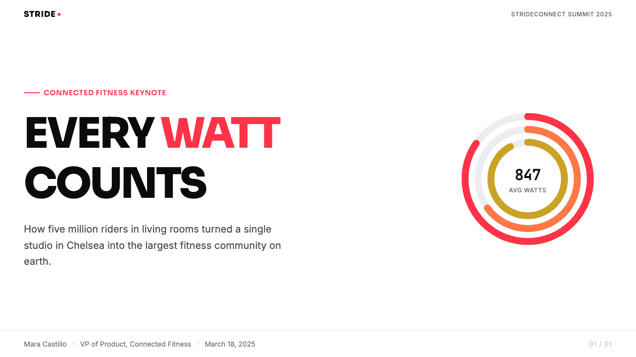
The recurring structural motif of the Peloton visual system is the incomplete circle — the progress ring or completion arc that indicates calorie burn, output, or effort as a proportion of a goal. This form carries both functional and symbolic weight. Functionally, it communicates a quantitative metric at a glance without requiring the user to parse a number in context. Symbolically, the incomplete ring creates perpetual tension — the circle is not closed, and the implicit invitation is always to complete it. The coral arc against a neutral ring track became one of the most imitated data visualization conventions in the wellness and health technology sector.Peloton 视觉系统反复出现的结构性母题是未完成的圆——指示卡路里消耗、输出功率或努力程度占目标百分比的进度环或完成弧。这一形态兼具功能与象征双重分量。功能上,它让用户无需在语境中解析数字就能一瞥掌握量化指标。象征上,未完成的环制造了持续的张力——圆还没有合拢,隐含的邀请始终是:去完成它。珊瑚色弧线在中性环形轨道上的呈现,成为健康与医疗科技领域被模仿最多的数据可视化惯例之一。
Stadium-Bold Display Typography体育场式粗体展示排版
Display type in the Peloton system is set in heavy, caps-locked letterforms at large scale — the kind of typographic weight associated with arena scoreboards and sports broadcast chyrons rather than editorial design. This choice connects the interface to the cultural vocabulary of competitive athletics rather than wellness or consumer technology. For metric-dense content — the leaderboard with its scrolling ranks and real-time wattage and cadence readouts — a more compact, tabular sans-serif takes over, optimized for rapid scanning of changing numbers. The contrast between the muscular display type and the information-dense data type creates a visual rhythm that maps onto the rhythm of a workout: big effort, then data check, then big effort again.Peloton 系统的展示字体以粗重、全大写的字形大尺寸呈现——这种字体分量更接近竞技场记分板和体育直播字幕条,而非编辑设计。这一选择将界面与竞技运动的文化词汇联结,而非与健康或消费科技挂钩。对于数据密集的内容——实时滚动排名、瓦数与踏频读数的排行榜——则换用更紧凑、更适合表格的无衬线字体,为快速扫读变化中的数字而优化。粗犷的展示字体与信息密集的数据字体之间的对比,制造出与运动节奏相映射的视觉韵律:大力输出,查看数据,再次输出。
Mirror-Bright Surface and Card Shadows镜面亮度与卡片投影
Cards and UI containers in the Peloton visual system carry a signature shadow treatment that reads like a gym-floor reflection — soft and directional, suggesting a polished surface beneath each component rather than a light source above it. This shadow style reinforces the studio-space metaphor: the interface is not a piece of paper but a lit room with a reflective floor. The effect is used consistently across class cards, instructor cards, and promotional modules, creating a depth system that sits between the stark flatness of earlier material design conventions and the more theatrical shadow work of entertainment and streaming platforms.Peloton 视觉系统中的卡片和界面容器带有标志性的阴影处理,读来像健身房地板的反光——柔和而有方向感,暗示每个组件下方是抛光表面,而非上方有光源。这种阴影风格强化了摄影棚空间的隐喻:界面不是一张纸,而是有反光地板的明亮房间。这一效果在课程卡片、教练卡片与推广模块中一以贯之,构建出一套深度系统,介于早期 Material Design 惯例的纯粹平面感与娱乐和流媒体平台更具剧场感的阴影处理之间。
Leaderboard Grid Logic排行榜网格逻辑
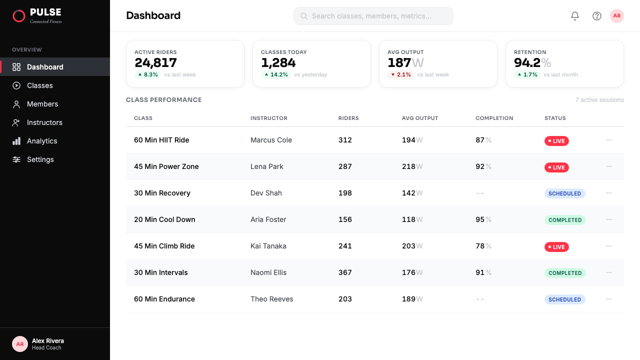
The leaderboard — the central social and competitive mechanism of the Peloton platform — imposes a strict tabular grid that runs at a faster pace than the rest of the interface. Ranks, output numbers, names, and effort indicators must coexist in a narrow horizontal band that updates in real time. The design solution is ruthlessly hierarchical: rank as the primary identifier, name in a secondary weight, metrics in the most compact form that remains legible. Color in the leaderboard is reserved entirely for the user's own row — highlighted in coral against the monochrome list — reinforcing both the competitive structure and the personal stake. This grid logic bleeds into marketing materials, where structured data displays become aesthetic elements in their own right.排行榜——Peloton 平台的核心社交与竞争机制——强制执行一套比界面其他部分刷新速度更快的严格表格网格。排名、输出数字、姓名与努力指标必须在实时更新的窄水平带内共存。设计方案无情地遵循层级逻辑:排名是主标识,姓名以次级字重呈现,数据以仍可辨读的最紧凑形式显示。排行榜中的色彩完全保留给用户自己的行——以珊瑚色在单色名单中高亮——同时强化了竞争结构与个人投入感。这套网格逻辑渗透进营销材料,结构化数据展示本身成为了美学元素。
Community and Social Warmth社群与社交温度
Unlike fitness brands that foreground the solitary athlete, Peloton's visual system consistently encodes communal presence. Multiple riders shown simultaneously in a class still, the accumulating high-five count, the instructor addressing the camera as though speaking to a packed room — these choices embed a social warmth into what is technically a solo workout product. The coral color itself participates in this: its warmth and approachability are distinct from competitive reds or clinical blues. The system positions the user not as a lone striving individual but as a member of a large, energized, mutually encouraging community — and the visual language is doing that work continuously.与突出孤独运动员形象的健身品牌不同,Peloton 的视觉系统持续编码着群体存在。课程截图中同时显示的多位骑手、不断累积的击掌数量、教练对着镜头讲话仿佛面对一整屋子的人——这些选择将社交温度嵌入了一款技术上属于独自使用的健身产品。珊瑚色本身也参与其中:它的温度与亲切感有别于竞争性的红和临床感的蓝。这套视觉系统将用户定位为大型活力社群中的成员,而非孤独奋斗的个体——而视觉语言始终在持续完成这项工作。
See the Peloton Fitness Coral (2020) design system →查看 Peloton Fitness Coral (2020) 完整设计系统 →
Who shaped Peloton Fitness Coral (2020)?谁塑造了 Peloton Fitness Coral (2020)?
Foley co-founded Peloton and served as its chief executive through the critical growth years that established the brand's visual and cultural identity. His founding vision — that boutique fitness energy could be bottled and delivered to a home rider through technology and content — determined the emotional register that the entire design system was built to communicate. The insistence on a studio broadcast quality for what was, technically, a workout recording session set the photographic and production standards that made the coral system feel like television rather than software.福利共同创立了 Peloton,并在品牌视觉与文化身份确立的关键增长期担任首席执行官。他的创始愿景——精品健身的能量可以通过技术与内容装瓶,传递给居家骑手——决定了整套设计系统所需传递的情感基调。坚持以摄影棚直播品质呈现技术上属于健身录制课程的内容,确立了让珊瑚红体系感觉像电视而非软件的摄影与制作标准。
Arzón joined Peloton as an instructor and became one of its most recognized faces, eventually rising to vice president of fitness programming. Her persona — driven, athletic, intellectually serious — shaped the aspirational register of the brand's human imagery. The photography conventions around Arzón, particularly the direct address to camera and the visible effort in mid-workout shots, became templates that informed how the entire instructor roster was presented. Her presence also pushed the brand toward an inclusive definition of athletic identity that broadened its photographic and copy vocabulary significantly.阿尔松以教练身份加入 Peloton,成为最具辨识度的品牌面孔之一,最终晋升为健身内容副总裁。她进取、运动员气质、严肃的知识分子形象,塑造了品牌人物形象的向往感基调。围绕阿尔松建立的摄影惯例——尤其是直视镜头的对话感与运动中途可见的真实用力——成为呈现整个教练阵容的范本。她的存在也将品牌推向对运动身份更具包容性的定义,显著拓宽了品牌的视觉摄影与文案词汇。
Rigsby became one of the platform's most followed instructors through a persona that combined genuine athletic coaching with humor and warmth that cut against the severity of traditional fitness culture. His presence in the visual system — often bright-eyed, mid-comment, in clear mid-exchange with the camera — contributed a human levity that balanced the more intense instructor imagery and made the overall brand feel approachable rather than intimidating. The design system had to accommodate both Arzón's competitive drive and Rigsby's communal warmth, which is part of why the coral choice — energetic but not aggressive — worked across both.里格斯比以将真实的运动执教与幽默感、温度感融合的形象成为平台关注度最高的教练之一,这种风格与传统健身文化的严肃性形成对比。他在视觉系统中的呈现——通常是眼神明亮、话语正酣、清晰地与镜头交流的状态——为整体品牌注入了一种人文的轻盈感,平衡了其他更具张力的教练形象,使品牌整体感觉亲切而非威慑。设计系统必须同时容纳阿尔松的竞争驱动力与里格斯比的社群温度,这也是珊瑚红选择——充满活力但不具攻击性——能够同时适用于两者的部分原因。
Kushi's leadership over the technology and product organization shaped the data layer that sits beneath the visual surface of the Peloton experience. The integration of real-time metrics — cadence, output, heart rate, rank — into an interface that remained emotionally engaging rather than clinically overwhelming required both engineering precision and design judgment. The ring visualization and the leaderboard logic that became hallmarks of the brand's aesthetic identity both emerged from the product decisions made under Kushi's leadership, making the data display not a compromise but a central visual feature.久志比佐对技术与产品组织的领导,塑造了 Peloton 体验视觉表面之下的数据层。将实时指标——踏频、功率、心率、排名——整合进一套情感上仍然引人入胜而非临床上令人不堪重负的界面,需要工程精度与设计判断力的兼备。成为品牌美学标志的环形可视化与排行榜逻辑,都源于久志比佐领导下的产品决策,使数据显示不是一种妥协,而是核心视觉特征。
How do you use Peloton Fitness Coral (2020) today?今天怎么用 Peloton Fitness Coral (2020)?
Applying the Peloton Fitness Coral aesthetic requires understanding that the system is built around a three-part hierarchy: the human element at the emotional center, data at the structural spine, and the coral accent as the signal that links them. Any application that inverts this hierarchy — leading with color and treating the human or data layer as secondary — will produce an energetic but incoherent result. The coral must earn its appearance by marking something that matters: an achievement, a call to action, a live moment, a personal record.应用 Peloton Fitness Coral 美学,需要理解这套系统建立在三层次层级之上:人物元素占据情感核心,数据构成结构支柱,珊瑚色强调充当联结两者的信号。任何颠覆这一层级的应用——以色彩领衔、将人物或数据层置于次要地位——都将产出充满能量但缺乏连贯性的结果。珊瑚色必须通过标记真正重要的东西来赢得出现的资格:一项成就、一个行动号召、一个实时时刻、一个个人纪录。
For presentation slides, the system adapts well to cover slides that need to communicate momentum and group energy. A strong instructor-style portrait occupying the majority of the slide area, a coral accent on a key metric or achievement stat, and a dark lower band with white type for the presenter's name and context produces an opening that reads as broadcast-quality and high-effort. Content slides should resist the temptation to use the coral liberally — reserve it for one key data point or one call-to-action per slide, and let the rest work in black, white, and neutral gray. Data slides benefit from ring or arc visualizations where a coral segment indicates current performance against a neutral baseline ring.在演示文稿方面,这套系统非常适合需要传递动能与群体能量的封面幻灯片。一张以教练风格肖像占据幻灯片大部分面积的照片,一个用珊瑚色标注的关键数据或成就数字,底部深色条带以白色字体显示演讲者姓名与背景——这样的开场读来具有播出品质与高投入感。内容幻灯片应抵制大量使用珊瑚色的诱惑——每张幻灯片只保留一个关键数据点或一个行动号召用珊瑚色标记,其余内容在黑、白、中性灰中运作。数据幻灯片适合运用环形或弧形可视化,以珊瑚色扇段指示当前表现相对于中性基准环的水平。
For web and product interfaces, the aesthetic is particularly well suited to any product that combines a social leaderboard or competitive ranking with personal progress tracking. Health apps, challenge platforms, e-learning tools with completion metrics, and team productivity dashboards all share the structural logic that Peloton refined. The implementation principle is identical: white or very light field, coral reserved for the user's own position and primary actions, tabular data in a compact neutral typeface, portrait photography for the human element where appropriate. The shadow treatment on cards should be directional and medium-weight — not flat, not heavily three-dimensional.在网页与产品界面方面,这套美学尤其适合任何将社交排行榜或竞争排名与个人进度追踪结合的产品。健康应用、挑战平台、带完成度指标的在线学习工具、团队生产力仪表板,都共享 Peloton 精炼的结构逻辑。实施原则完全一致:白色或极浅色底场,珊瑚色保留给用户自身位置与主要操作,表格数据使用紧凑中性的无衬线字体,在合适的位置以人像摄影引入人文元素。卡片阴影处理应有方向感且重量适中——不完全平面,也不过度立体。
For marketing and editorial applications, the system supports the kind of bold, campaign-style layouts associated with sports media and entertainment. Full-bleed photography of people in active, visible effort states anchored by a large coral typographic element — a score, a percentage, a challenge metric — works as a promotional module with high visual authority. The Peloton visual vocabulary translates naturally into event promotion, product launch campaigns, and brand awareness advertising where the goal is to make the viewer feel the energy of the product before reading a word.在营销与编辑应用方面,这套系统支持体育媒体与娱乐行业惯用的大胆、战役式版面。以全出血的主动用力状态人物摄影为基底,叠加大号珊瑚色字体元素——分数、百分比、挑战指标——构成具有高度视觉权威的推广模块。Peloton 视觉词汇自然地转化为活动推广、产品发布战役和品牌认知广告,在这些场景中,目标是让观者在阅读任何文字之前就感受到产品的能量。
A common mistake when referencing this aesthetic is turning the coral from a signal into a field. When coral covers a background or fills a large area, it stops functioning as an alert and starts feeling like a brand color applied indiscriminately — the visual equivalent of shouting every word rather than emphasizing the important ones. The original system uses coral as a line, an arc, a button border, a name highlight: it is always a small, hot mark in a cool white field. A second common error is using instructor-style portrait photography without the production values that make it work — a bright, high-key photograph with visible effort and direct engagement communicates authority; a casual or low-contrast image undermines the entire energy system the style depends on.参考这套美学时最常见的错误,是将珊瑚色从信号变为底场。当珊瑚色覆盖背景或填满大面积区域,它便不再作为警示信号运作,开始变得像是被随意应用的品牌色——视觉上等同于每个词都高声强调,而非突出重要的那些。原始系统将珊瑚色用作线条、弧形、按钮边框、姓名高亮:它始终是冷白底场中一个小而热的标记。第二个常见错误是在缺乏相应制作品质的情况下使用教练风格的人像摄影——明亮、高调、可见用力状态且直接对话的照片传递权威感;随意或低对比度的图像则会瓦解这套风格所依赖的整个能量系统。
See the Peloton Fitness Coral (2020) design system →查看 Peloton Fitness Coral (2020) 完整设计系统 →
Peloton Fitness Coral (2020) — FAQPeloton Fitness Coral (2020) · 常见问题
How does Peloton Fitness Coral differ from standard sports-brand red?Peloton Fitness Coral 与标准运动品牌红有何不同?
Standard sports-brand reds tend toward cool, aggressive tonalities — they signal danger, competition, and physical dominance. The Peloton coral is warmer and more optimistic in character, sitting closer to the boundary between energizing and welcoming. This was a deliberate positioning decision: Peloton needed to recruit people who found traditional gym culture intimidating, so the accent color had to be exciting without being threatening. The coral also works differently from a pure red in data visualizations — on the ring and leaderboard, a warm arc reads as achievement and progress rather than warning, which aligns with the motivational context.标准运动品牌红往往偏向冷调、富有攻击性的色相——传递危险、竞争与身体主导感。Peloton 的珊瑚红在性格上更温暖、更乐观,更接近激励与欢迎之间的边界。这是一个经过审慎考量的定位决策:Peloton 需要吸引那些觉得传统健身房文化令人生畏的用户,因此强调色必须令人兴奋但不令人紧张。珊瑚红在数据可视化中的运作方式也不同于纯红——在环形图与排行榜上,一道暖色弧线被读作成就与进步,而非警告,这与动力驱动的情境高度契合。
Can this visual system work for products outside the fitness category?这套视觉系统能用于健身类别以外的产品吗?
Yes, but the transfer works best for products that share the same emotional and functional structure: a social or competitive ranking layer, real-time personal performance data, and a human expert or coach as a central relationship. E-learning platforms, productivity tools with team leaderboards, financial performance dashboards, and any subscription product where retention depends on habit formation and community engagement are natural fits. The system struggles in categories where the primary emotional register is calm, unambitious, or private — personal journaling apps, meditation tools, or conservative financial services would all fight against the broadcast energy the visual language encodes.可以,但迁移效果最好的是分享相同情感与功能结构的产品:社交或竞争排名层、实时个人表现数据,以及作为核心关系的人类专家或教练。在线教育平台、带团队排行榜的生产力工具、财务表现仪表板,以及任何留存依赖习惯养成与社群参与的订阅产品,都是自然的适配场景。这套系统在主要情感基调为平静、不求上进或私密的品类中则力不从心——个人日记应用、冥想工具或保守型金融服务,都将与这套视觉语言所编码的播出能量产生冲突。
What is the right way to handle the data layer without it feeling clinical or cold?如何处理数据层才能使其不显得临床化或冰冷?
The Peloton solution to this tension was structural: data lives alongside the human element, never above it in the visual hierarchy. The instructor face is always the largest and most emotionally present element on the class screen; the metrics and leaderboard sit in a secondary zone. Within the data zone itself, the coral ring and the user's highlighted rank line introduce warmth and personalization — the data is not an abstract measurement, it is your measurement, your position, your progress. When applying this approach, keep the data typography compact and neutral, introduce color only for the user's own data, and ensure a human or aspirational photographic element is always present in the same layout.Peloton 对这一张力的解决方案是结构性的:数据与人文元素并置,从不在视觉层级中凌驾于其上。教练面孔始终是课程界面上最大、情感存在感最强的元素;数据指标与排行榜处于次级区域。在数据区域内部,珊瑚色环与用户高亮的排名行引入了温度与个人化——数据不是抽象的测量值,而是你的测量值,你的位置,你的进步。应用这一方法时,保持数据字体紧凑且中性,仅对用户自身的数据引入色彩,并确保同一版面中始终存在人文或向往感的摄影元素。
How does the system handle dark-mode or dark-background variants?这套系统如何处理深色模式或深色背景变体?
The canonical Peloton visual system is a light-ground system — the studio-bright white is core to its identity. A dark variant exists in the actual product for certain viewing contexts, particularly during active workouts where a bright screen can be distracting. In those dark contexts, the coral shifts from being a warm-accent-on-white to a luminous signal against near-black — the ring arc glows rather than pops, and the overall mood moves from broadcast to cinematic. The key constraint in dark variants is that the coral must become more restrained in use, not more liberal: against a dark field, it carries even more visual weight and will dominate if overused. The leaderboard in dark mode works best with a dark gray table background and the user's row highlighted in a muted coral rather than full saturation.Peloton 标准视觉系统是浅色底场系统——摄影棚般明亮的白色是其身份的核心。在实际产品中,特定的观看情境(尤其是主动运动中亮屏可能分散注意力的场景)存在深色变体。在这些深色情境中,珊瑚色从白底暖调强调色转变为近黑底上的发光信号——环形弧线以发光感而非跳脱感出现,整体氛围从播出感转向电影感。深色变体的关键约束在于:珊瑚色的使用必须更克制,而非更自由。在深色底场上,它承载着更大的视觉重量,过度使用将主导整个画面。深色模式下的排行榜以深灰色表格背景为佳,用户自身行以低饱和度珊瑚色高亮,而非使用完全饱和的色彩。
How did the pandemic affect the visual language, and does it feel dated now?疫情如何影响了这套视觉语言?它现在看起来过时了吗?
The pandemic amplified the Peloton visual system by dramatically expanding the number of people who experienced it daily — and by associating it, for many users, with one of the most physically and emotionally challenging periods of their lives. This created both brand equity and a specific cultural timestamp. The coral identity is strongly associated with the 2020 to 2021 moment: the home studio setup, the workout as coping mechanism, the leaderboard as social lifeline. For some applications, this timestamp is an asset — it evokes a period of discipline, community, and shared effort that has positive emotional resonance. For others, particularly products that need to feel current and forward-looking, the heaviest elements of the system — the stadium bold caps, the aggressive ring visualization, the broadcast-quality production standard — may need to be lightened or reinterpreted rather than reproduced wholesale.疫情通过急剧扩大每天体验这套视觉系统的人数——以及将它与许多用户生理和情感上最具挑战性的时期相关联——放大了 Peloton 的视觉语言。这既创造了品牌资产,也留下了特定的文化时间戳。珊瑚红身份与2020至2021年的时刻强烈绑定:居家工作室的布置、作为应对机制的运动、作为社交生命线的排行榜。对某些应用场景而言,这个时间戳是一种资产——它唤起那个纪律性、社群感与共同努力的时期,具有正向的情感共鸣。对其他场景而言,尤其是需要感觉当下与前瞻的产品,系统中最厚重的元素——全大写体育场粗体、强势的环形可视化、播出品质的制作标准——可能需要被减轻或重新诠释,而非原样复制。
Related design styles相关设计风格
 Adobe Creative CloudUnified, not uniform. Red anchor, white space, and saturated app tiles organi…统一而不单一:红色锚点、留白与高饱和应用方块组织整套工具。
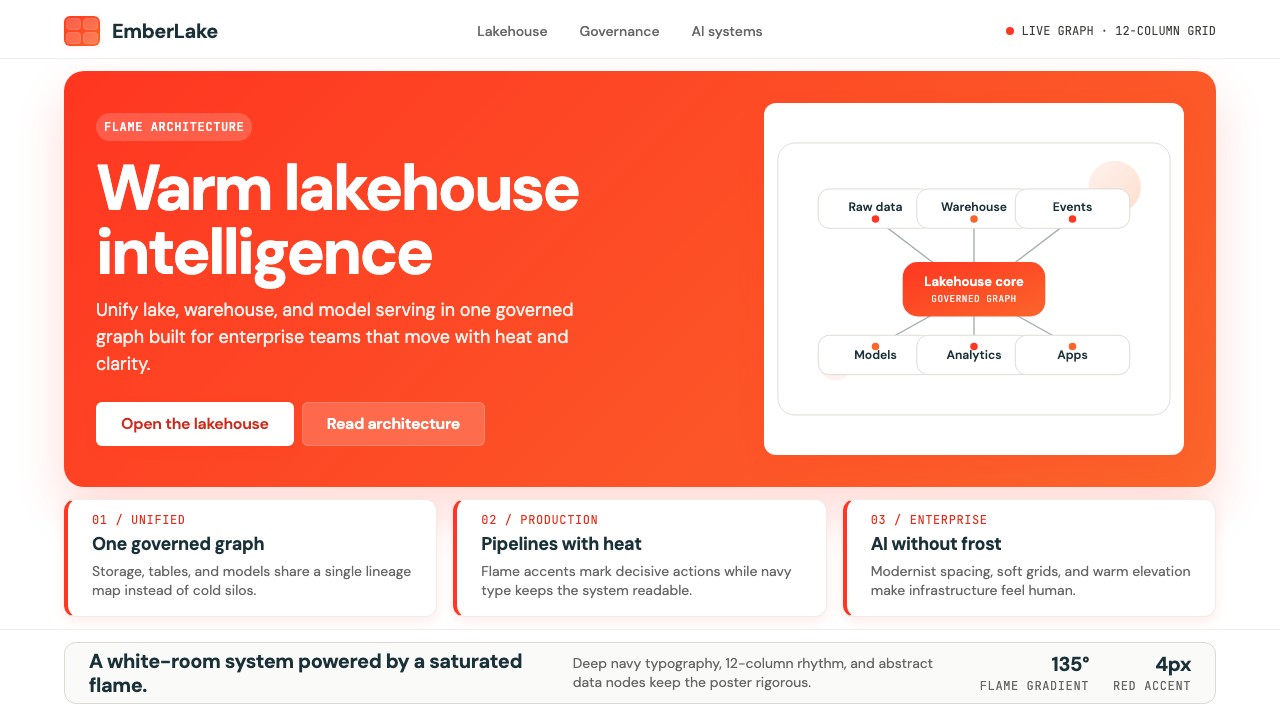 Databricks LakehouseWarm enterprise confidence. Flame red-orange gradients meet DM Sans and clean…温暖的企业信心:红橙火焰渐变配 DM Sans 与洁净数据图。
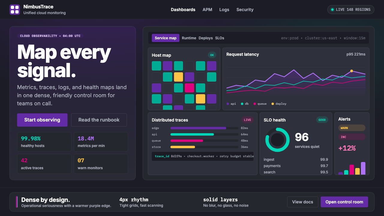 DatadogSerious telemetry, friendly pulse. Purple dark grids pack charts, badges, and…严肃监控也亲近:紫色暗网格塞满图表、徽章与追踪。
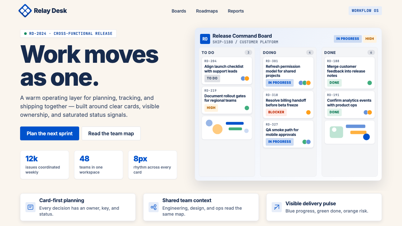 Atlassian Jira BlueWarm enterprise teamwork. Saturated blue cards on cream make status feel huma…温暖的企业协作:奶油底上的饱和蓝卡片,让状态更有人味。
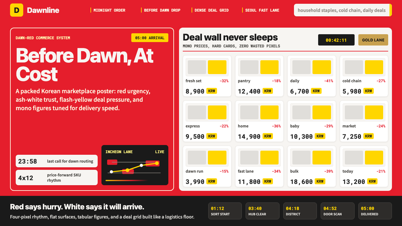 Coupang Rocket DeliveryUrgency made trustworthy. Rocket red, flash yellow, mono prices and packed gr…可信的紧迫感。火箭红、闪黄价格与密集网格推进速度。
 JD.com (京东)Urgency earns trust. Deep red prices pack a white 12-column grid with gold fe…急迫也可信:深红价格挤满白色12栏网格,金色大促点燃节奏。