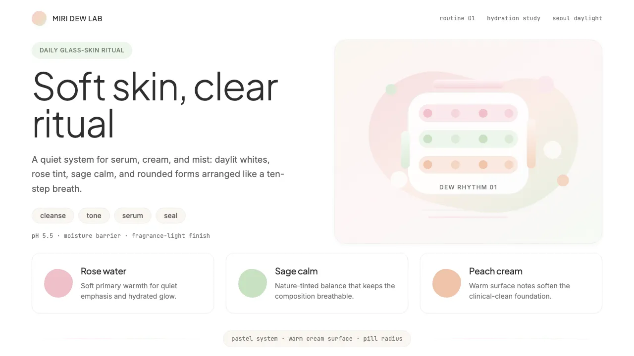
About K-Beauty Clean
K-Beauty Clean distills the visual language of South Korea's skincare revolution into a design system: soft pastels, generous white space, and ultra-clean sans-serif typography that feels like a freshly moisturized face. Every element radiates the dewy, glassy clarity that made Korean beauty a global phenomenon.
The system channels skincare-as-self-care philosophy — friendly, approachable, and never aggressive. Organic soft shapes, pill buttons, and airy layouts create interfaces that feel as calming as a 10-step routine.
- Origin
- Seoul, South Korea
- Era
- 2010–present; peak global influence 2014–2020
- Key figures
- Emily Weiss · Innisfree Design Team · Laneige Brand Team · Cosrx
- Movements
- Hallyu wave · Clean beauty · K-pop-driven global aesthetics
K-Beauty Clean design spec
Colors
Typography
The other 11 sections — buttons, cards, spacing, motion, techniques and more — open once you unlock. Download the DESIGN.md or send it to your AI in one click. Unlock once, yours forever.
Sign up nowStyles similar to K-Beauty Clean
Also inspired by brands & products, with a close feel.
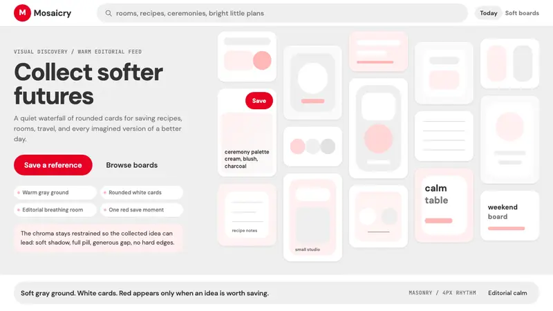 Pinterest 2024Aspirational calm. Warm gray masonry, rounded white pins, one surgical red save pill.
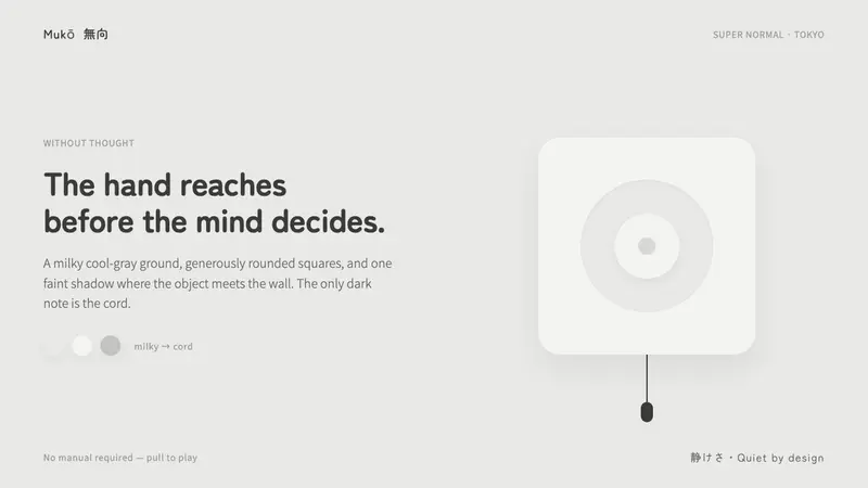 Fukasawa Without ThoughtHand reaches before mind decides. Milky cool-gray plastic, rounded squares, one faint wall shadow.
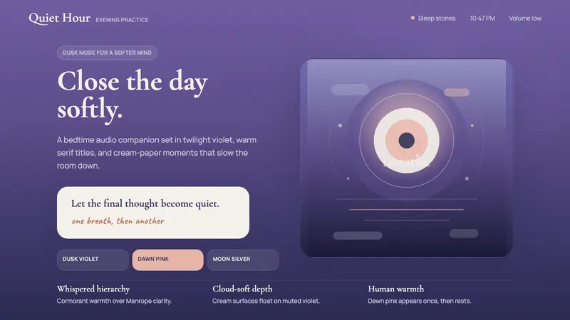 Calm App Purple MeditationWhispers at bedtime. Dusk-purple gradients, cream serif type, and dawn-pink warmth.
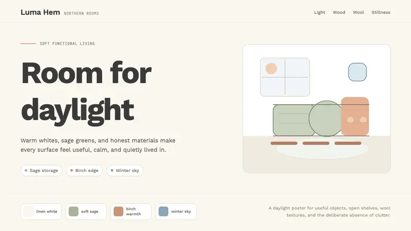 Scandi Hygge (IKEA)Warmth from restraint. Sage, linen white, Work Sans, and wide breathing room.