What is Coquette Aesthetic Pink Bow (2023)?什么是 Coquette Aesthetic Pink Bow (2023)?
Dusty pink, cream silk, and strawberry-red bows turned self-aware femininity into a full design language — and TikTok made it go global overnight.尘粉色、奶油丝绸与草莓红蝴蝶结将自觉的女性气质转化为一套完整的设计语言,而TikTok让它一夜之间走向全球。
Coquette Aesthetic Pink Bow (2023) in briefCoquette Aesthetic Pink Bow (2023) 速览
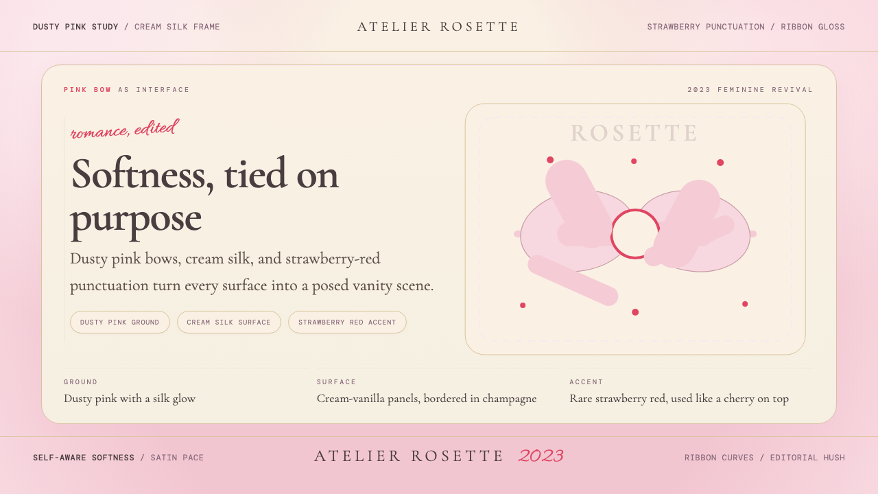
The coquette aesthetic is a visual system built from a small, precisely tuned palette — dusty blush pink, warm cream-vanilla, and punctuation accents of strawberry red — arranged on surfaces that evoke the texture of silk or satin laid over antique vanity furniture. Every element curves. Corners soften into ribbons. Hard edges give way to tied bows and gathered fabric. The overall impression is deliberate softness: nothing accidental, nothing casual, nothing without intention.Coquette美学是一套视觉系统,由一组精确调配的色彩构成——尘雾玫瑰粉、温暖的奶油香草色,以及草莓红的点缀强调——铺陈于令人联想到古董梳妆台上丝绸或缎面质感的表面之上。每个元素都带着弧度。边角软化为丝带,硬边让位于系好的蝴蝶结与聚拢的织物褶皱。整体印象是刻意的柔软:没有任何偶然,没有任何随意,没有任何无意为之。
What distinguishes coquette from generic pastel romance is its ironic self-awareness. This is femininity rendered as a considered interface rather than an inherited default. The aesthetic knows it is performing softness; that performative quality is the point. Objects and compositions feel like they are wearing an outfit, not simply existing. A slide deck in this style does not merely use pink — it argues for pink, presents pink as a position.将coquette与普通粉色浪漫风格区别开来的,是它反讽式的自觉。这是一种被作为经过深思熟虑的界面呈现的女性气质,而非一种被继承的默认状态。这套美学知道自己在表演柔软,而那种表演性恰恰是它的意义所在。物件与构图感觉像是在穿一套服装,而非仅仅存在着。以这种风格制作的幻灯片不只是使用粉色——它在为粉色立论,将粉色呈现为一种立场。
Visually, the system is defined by the bow as its central motif — a ribbon tied at center, symmetrical yet organic, simultaneously decorative and structural. Where Bauhaus used the circle, square, and triangle as its visual alphabet, coquette uses the bow and the ribbon curve as its primary formal vocabulary. Layered tulle-like transparencies, frilled or ruffled edge treatments, and delicate serif or script letterforms complete the register.在视觉上,这套体系以蝴蝶结作为核心母题——一条从中心系起、左右对称而又带有有机感的丝带,同时兼具装饰性与结构性。包豪斯以圆形、正方形与三角形作为视觉字母表,coquette则以蝴蝶结与丝带曲线作为最基本的形式词汇。层叠如薄纱般的透明质感、褶边与荷叶边处理,以及纤细的衬线或手写体字形,共同完成了这套视觉语域。
See the Coquette Aesthetic Pink Bow (2023) design system查看 Coquette Aesthetic Pink Bow (2023) 完整设计系统
Where does Coquette Aesthetic Pink Bow (2023) come from?Coquette Aesthetic Pink Bow (2023) 从何而来?
The coquette aesthetic did not emerge from a design school or a single manifesto. It crystallized on TikTok between 2021 and 2022 from a convergence of fashion, music, and nostalgia, peaking as a cultural dominant in 2023 and continuing into 2024 and beyond. The word 'coquette' — from French, describing a woman who flirts with artful self-presentation — became a hashtag category and then a worldview, adopted predominantly by Gen Z creators in the United States, the United Kingdom, and Brazil, while drawing its cultural references from French and Italian visual traditions.Coquette美学并非诞生于某所设计学院,也没有单一的宣言作为起点。它在2021至2022年间于TikTok上结晶而成,由时尚、音乐与怀旧情绪的汇聚催化,于2023年达到文化主导地位的顶峰,并延续进入2024年乃至更后。「Coquette」一词——源自法语,描述以妩媚的自我呈现进行调情的女性——成为一个话题标签,进而演变为一种世界观,主要被美国、英国与巴西的Z世代创作者所采用,同时以法国与意大利的视觉传统作为文化参照。
The deepest historical root is Sofia Coppola's 2006 film Marie Antoinette, whose production design transformed the Palace of Versailles into a pastel fever dream of macarons, ribbon-tied hatboxes, and silk gowns in blush, cream, and lavender. Coppola's deliberate use of anachronism — pairing eighteenth-century court dress with a New Wave soundtrack — established the template for the coquette sensibility: historical femininity refracted through contemporary irony. That film's visual language was not widely codified as an aesthetic movement until TikTok provided the infrastructure for micro-taste communities to name and amplify it.其最深层的历史根源是索菲亚·科波拉2006年执导的电影《绝代艳后》。影片的美术设计将凡尔赛宫转化为一场以马卡龙色系构筑的梦境:丝带系扎的帽盒、玫瑰粉与奶油色的丝绒长裙,薰衣草紫点缀其间。科波拉对错时代感的刻意运用——将十八世纪宫廷服饰与新浪潮配乐并置——为coquette美学确立了基本范式:经由当代反讽折射的历史女性气质。然而,这部电影的视觉语言直到TikTok为微型趣味社群提供了命名与放大的基础设施之后,才被广泛整理为一场美学运动。
Fashion was the second accelerant. New York designer Sandy Liang had been building a bow-centric design vocabulary since the late 2010s, with her collections featuring cascading bow embellishments on fleece, tailoring, and knitwear that felt simultaneously childlike and sophisticated. When Liang's work reached broader cultural visibility around 2022 and 2023, it gave the TikTok coquette aesthetic a high-fashion anchor. Simultaneously, Phoebe Philo's austere-romantic approach to womenswear — restraint with unexpected softness — provided a secondary reference point for creators who wanted to position the aesthetic as intelligent rather than merely cute.时尚是第二股加速力量。纽约设计师Sandy Liang自2010年代末便持续构建以蝴蝶结为核心的设计词汇,其系列作品将层叠的蝴蝶结装饰运用于摇粒绒、西装与针织品之上,呈现出一种同时带有童趣与成熟感的气质。当Liang的作品在2022至2023年间获得更广泛的文化关注时,它为TikTok上的coquette美学提供了一个高级时装锚点。与此同时,菲比·费洛对女装克制而出人意料地带有柔软感的处理方式,为那些希望将这套美学定位为智识性而非单纯可爱的创作者提供了第二个参照点。
Lana Del Rey's musical world supplied the emotional grammar. Her albums from Ultraviolence (2014) through Did You Know That There's a Tunnel Under Ocean Blvd (2023) built an extended meditation on romantic melancholia, Americana nostalgia, and a kind of doomed femininity that is fully conscious of its own performance. Del Rey's aesthetic — floral headbands, vintage silk slips, the visual language of old Hollywood — translated readily into coquette imagery, and her fanbase formed a significant portion of the movement's early community. By 2023, the convergence of Coppola's film legacy, Sandy Liang's runway vocabulary, Phoebe Philo's intellectual framing, and Del Rey's emotional landscape had produced a coherent aesthetic system with global reach and genuine expressive depth.拉娜·德雷的音乐世界则提供了情感语法。她从《暴力紫》(2014年)到《你知道大洋大道下面有一条隧道吗》(2023年)的系列专辑,构建了一场延伸的冥想——关于浪漫的忧郁、美国往昔的怀念,以及一种完全清楚自己正在表演的宿命式女性气质。德雷的视觉世界——花朵头冠、复古丝质睡裙、好莱坞黄金时代的视觉语言——与coquette意象天然契合,她的粉丝群体构成了这场运动早期社群的重要部分。至2023年,科波拉的电影遗产、Sandy Liang的秀场词汇、菲比·费洛的智识框架,以及德雷的情感景观相互融合,共同生产出一套具有全球传播力与真实表达深度的连贯美学体系。
What defines the Coquette Aesthetic Pink Bow (2023) look?Coquette Aesthetic Pink Bow (2023) 的视觉特征是什么?
Color Palette色彩体系
The palette is built from three anchors in careful relation to each other: dusty blush pink as the dominant ground, warm cream-vanilla as the secondary surface tone, and strawberry red as the accent punctuation. None of these colors is saturated at full intensity — each carries a muted, slightly faded quality, as if the hues have been softened by years of sunlight filtering through lace curtains. The overall temperature is warm and slightly powdery. Deep black and cool neutrals are used sparingly, if at all; when contrast is needed, it comes from the strawberry red rather than from darkness.色板由三个彼此精心关联的锚点构成:尘雾玫瑰粉作为主导底色,温暖的奶油香草色作为次级表面调,草莓红作为点缀性强调。这三种颜色都不以完整饱和度呈现——每一种都带有一种柔和、略显褪色的质感,仿佛色相已被多年来透过蕾丝窗帘滤入的阳光轻轻软化。整体色温偏暖而略带粉质感。深黑色与冷调中性色极少使用;当需要对比时,来源是草莓红,而非深暗。
The Bow Motif蝴蝶结母题
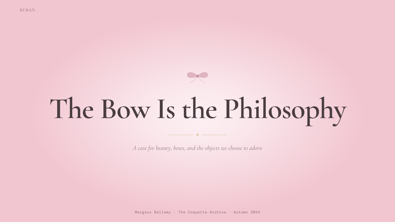
The bow is the defining formal signature of the coquette aesthetic — the equivalent of the geometric circle in Bauhaus or the floral arabesque in Art Nouveau. It appears at multiple scales: as a structural centerpiece on a hero image, as a small recurring decorative detail at section breaks, as a pattern element tiled across a background. The bow's shape implies tying and being tied, revealing and concealing simultaneously — qualities that map onto the aesthetic's broader sensibility of deliberate self-presentation. A bow is never merely ornamental within this system; it is the system's argument rendered as a form.蝴蝶结是coquette美学最具决定性的形式签名——相当于包豪斯中的几何圆形,或新艺术运动中的花卉阿拉伯纹样。它以多种尺度出现:作为主视觉图像的结构中心,作为段落分隔处反复出现的小型装饰细节,作为平铺于背景上的图案元素。蝴蝶结的形态暗示着系缚与被系缚、揭示与遮掩同时进行——这些特质与这套美学更宏观的刻意自我呈现的感性相呼应。在这套体系中,蝴蝶结从不仅仅是装饰;它是这套体系的主张以形态呈现的结果。
Soft Texture and Surface柔软质感与表面
Where Bauhaus insists on flat, material-honest surfaces, coquette actively simulates texture — the sheen of silk, the translucency of tulle, the slight crumple of satin ribbon. Backgrounds may carry a subtle fabric-like grain or a very gentle gradient that suggests the drape of cloth rather than a digital ramp. Layering is essential: elements sit on top of each other in a way that implies physical depth without abandoning the decorative register. The goal is not photorealistic simulation but an idealized memory of how certain fabrics feel to the eye.包豪斯坚持平面而诚实于材料的表面,coquette则主动模拟质感——丝绸的光泽、薄纱的透明度、缎带的轻微褶皱。背景可能带有细微的织物状颗粒感,或一种极轻柔的渐变,暗示布料的垂坠而非数字色带。层叠是必要的:元素相互叠压,以一种暗示物理深度却不脱离装饰语域的方式排布。目标不是照片级的真实模拟,而是某些织物如何感触于眼睛的理想化记忆。
Typography字体排印
Type in the coquette aesthetic gravitates toward high-contrast display serifs and flowing script faces — letterforms that feel hand-crafted or historically resonant rather than mechanically produced. Body text, when present, is typically set in a refined old-style serif that feels like it belongs on the pages of a nineteenth-century French novel. Tracking is generous; line spacing is airy. Type is never heavy or muscular; even at large display sizes, it retains a delicate, ribbon-like quality. All-capitals usage is rare — the lowercase feels more suited to the register of intimate, personal address.Coquette美学中的字体倾向于高对比度的展示型衬线字体与流动的手写体——那些感觉是手工制作的或带有历史共鸣的字形,而非机械生产的产物。正文(若存在)通常以精炼的旧式衬线字体排印,令人联想到十九世纪法国小说的书页。字间距宽松,行距通透。字体从不厚重或有力;即使在大型展示尺寸下,也保持一种纤细如丝带般的质感。全大写字母的使用极为罕见——小写字母更契合那种亲密、私语般直接呼告的语域。
Ornament as Structure装饰即结构
The coquette aesthetic inverts one of Bauhaus's most fundamental principles. Here, ornament is not waste — it is the primary communicative device. Decorative borders, scalloped edges, repeated ribbon motifs, and delicate line-work flourishes are not applied after the composition is resolved; they are the composition. This does not mean that anything goes: the ornamental vocabulary is tightly controlled, and the difference between an authentic coquette composition and an undisciplined one is whether the decorative elements are selected from the same controlled family and arranged with internal consistency.Coquette美学颠覆了包豪斯最根本的原则之一。在这里,装饰不是浪费——它是首要的传达装置。装饰边框、扇贝形边缘、反复出现的丝带母题与纤细的线描花饰,并非在构图完成后叠加上去的,它们本身就是构图。这并不意味着可以随意为之:装饰性词汇受到严格控制,一个真正的coquette构图与一个缺乏自律的构图之间的区别,在于装饰元素是否从同一受控家族中精选,并以内在一致性加以排布。
Romantic Melancholy浪漫忧郁
The emotional register of coquette is not cheerful or exuberant — it is wistful, slightly dreamy, and tinged with the kind of melancholy that looks beautiful rather than painful. Images may reference wilting flowers, diary pages, antique mirrors, handwritten letters. Color combinations feel like faded photographs rather than fresh pigments. This melancholic undercurrent differentiates coquette from simpler kawaii or bubblegum pink aesthetics: it implies interiority, narrative, and time — the sense that the person behind this visual world has a rich and slightly sad inner life.Coquette的情感语域并不欢快或热情洋溢——而是带有一种惆怅、略显梦幻、并以那种美丽而非痛苦的忧郁为底色。图像可能涉及凋萎的花朵、日记页面、古董镜子、手写信件。色彩组合感觉像褪色的照片而非新鲜颜料。这种忧郁的潜流将coquette与更简单的可爱风或泡泡糖粉色美学区别开来:它暗示着内心世界、叙事性与时间感——一种让人觉得这套视觉世界背后的人拥有丰富而略带哀愁的内在生命的感觉。
Ironic Self-Awareness反讽式自觉
Perhaps the most sophisticated quality of the coquette aesthetic is that it is never naive about itself. The softness is theatrical; the bows are chosen, not given. This self-awareness shows up visually through slight exaggeration — bows that are a size too large, compositions that are a degree too precious, color that is a note too sweet. The excess is calibrated. When designing in this style, the most successful work sits in the narrow register where the visual language is legible as a deliberate choice rather than an accidental one.Coquette美学最精妙的品质,或许是它从不对自身天真。那种柔软是戏剧性的;蝴蝶结是被选择的,而非天然给定的。这种自觉性在视觉上通过轻微的夸张显现——蝴蝶结比正常尺寸稍大一号,构图比恰当程度稍微矫揉造作一些,色彩比合适音调稍甜那么一丝。那种过度感是经过校准的。在这种风格下设计时,最成功的作品所处的窄小语域,是视觉语言能被解读为刻意选择而非偶然结果的那个区间。
See the Coquette Aesthetic Pink Bow (2023) design system查看 Coquette Aesthetic Pink Bow (2023) 完整设计系统
Who shaped Coquette Aesthetic Pink Bow (2023)?谁塑造了 Coquette Aesthetic Pink Bow (2023)?
Coppola's 2006 film Marie Antoinette is the primary visual source for the coquette aesthetic. Her art direction — pastel macaron palettes, silk-draped chambers, ribbon-tied accessories — translated the excess of the French court into a deliberately modern, anachronistic fantasy. The film treated historical femininity not as museum artifact but as a living, desirable mode of self-expression. Its visual language provided the aesthetic with a cinematic authority that TikTok creators could reference and remix, giving the movement depth beyond pure trend.科波拉2006年执导的《绝代艳后》是coquette美学最主要的视觉源头。她的美术指导——马卡龙色系的色板、丝绸覆盖的宫殿内室、丝带系扎的配饰——将法国宫廷的奢靡转化为一场刻意现代化、跨越时代的幻想。这部电影将历史性的女性气质视为活生生的、令人渴望的自我表达方式,而非博物馆文物。其视觉语言为这套美学赋予了一种电影式的权威性,让TikTok创作者可以加以引用与再创作,为这场运动提供了超越单纯流行趋势的深度。
Liang is the designer most directly responsible for translating coquette sensibility into wearable high fashion. Her New York-based label built an extended vocabulary around the bow — appearing on fleece pullovers, suiting, ballet flats, and eveningwear — that combined childhood nostalgia with adult sophistication. When her collections gained broader cultural visibility after 2021, they provided concrete design evidence that the coquette aesthetic could be deployed with seriousness and craft. Her bow-centric visual language is the most direct precursor to the motif's appearance in graphic design and digital interfaces.Liang是最直接将coquette感性转化为可穿着的高级时装的设计师。她在纽约创立的品牌围绕蝴蝶结构建了一套延伸的视觉词汇——出现在摇粒绒上衣、西装、芭蕾平底鞋与晚装上——将童年怀旧与成人的老练结合在一起。当她的系列在2021年后获得更广泛的文化关注时,为coquette美学提供了具体的设计依据,证明这套感性可以以严肃性与工艺加以运用。她以蝴蝶结为核心的视觉语言,是这一母题出现在平面设计与数字界面中最直接的前身。
Del Rey's musical and visual world provided the emotional grammar that distinguishes coquette from simpler pink aesthetics. Her body of work from the early 2010s through the mid-2020s developed an extended meditation on romantic melancholy, performance of femininity, and the aesthetics of nostalgia — florals, vintage slip dresses, old Hollywood imagery — that became the emotional backbone of the coquette sensibility. Her fanbase was among the earliest communities to formalize and name the aesthetic, and her visual references remain foundational touchstones for practitioners of the style.德雷的音乐与视觉世界提供了将coquette与更简单的粉色美学区别开来的情感语法。她从2010年代初到2020年代中期的全部作品,发展出一场关于浪漫忧郁、女性气质表演与怀旧美学的延伸冥想——花卉、复古睡裙、好莱坞黄金时代的意象——成为coquette感性的情感骨架。她的粉丝群体是最早将这套美学系统化并加以命名的社群之一,她的视觉参照至今仍是这种风格实践者的基础坐标。
Philo's influence on coquette is more indirect but genuinely present. Her work at Céline (2008–2018) and later under her own name established a template for femininity that was simultaneously restrained and emotionally rich — never girlish, but never cold. Her vocabulary of unexpected softness within otherwise severe tailoring gave the coquette aesthetic a counterweight against pure sweetness, suggesting that the sensibility could carry intellectual seriousness. Designers and creators who wanted to position coquette as more than trend frequently cited her work as evidence that extreme femininity and sharp thinking were not opposites.费洛对coquette的影响更为间接,但真实存在。她在赛琳(2008—2018年)及后来以自己名字经营的品牌所做的工作,为女性气质确立了一套模板——同时具有克制感与情感丰富性,从不幼稚,也从不冰冷。她在原本严苛的剪裁中置入出人意料的柔软感的词汇,为coquette美学提供了一个对抗纯甜的平衡砝码,暗示这套感性可以承载智识上的严肃性。那些希望将coquette定位为超越流行趋势之物的设计师与创作者,常常援引她的作品作为极致女性气质与敏锐思维并不对立的佐证。
The historical queen functions in the coquette aesthetic not as a political figure but as a visual archetype — the ultimate embodiment of femininity as spectacle, excess, and deliberate self-fashioning. The Versailles court's visual language: blush brocades, towering powdered wigs, ribbon-trimmed gowns, porcelain skin — was already a highly constructed aesthetic performance in its own time. Coppola's film reactivated this material, and TikTok creators further distilled it into the coquette visual vocabulary. Marie Antoinette stands as the movement's primary historical icon: not emulated but sampled.这位历史上的王后在coquette美学中的功能,不是作为政治人物,而是作为一个视觉原型——作为奇观、过度与刻意自我塑造的女性气质的终极体现。凡尔赛宫廷的视觉语言——玫瑰色锦缎、高耸的假发、丝带装饰的礼服、瓷器般的肌肤——在其自身所处的时代就已经是一场高度建构的美学表演。科波拉的电影重新激活了这些材料,TikTok创作者进一步将其提炼为coquette的视觉词汇。玛丽·安托瓦内特是这场运动最主要的历史偶像:不是被模仿,而是被采样。
How do you use Coquette Aesthetic Pink Bow (2023) today?今天怎么用 Coquette Aesthetic Pink Bow (2023)?
Applying coquette correctly to designed artifacts requires understanding that the style's emotional register is its primary value proposition — warmth, intimacy, deliberate femininity — and that every compositional decision should serve that register. Unlike Bauhaus, where the principles are structural and transferable across cold contexts, coquette works only where softness is appropriate and desired. The most common misapplication is using the color palette without the motif system, or using the motif system without the emotional tone — producing something that looks vaguely pink but communicates nothing coherent.将coquette正确应用于设计作品,需要理解这套风格的情感语域是其首要的价值主张——温暖、亲密、刻意的女性气质——并且每一个构图决定都应服务于这一语域。与包豪斯不同,包豪斯的原则是结构性的,可跨越冷调语境移植,coquette只在柔软感恰当且被渴望的场合中奏效。最常见的误用是仅使用色板而不运用母题系统,或使用母题系统而缺少情感基调——最终产出某种隐约带有粉色感却毫无连贯表达的东西。
For presentation slides, the coquette aesthetic is well-suited to brand story decks, investor presentations for consumer and lifestyle brands, editorial pitch documents, and any context where the presenter wants to signal taste, care, and personal investment. A cover slide works best with a single large bow motif centered or offset on a cream ground, the presentation title set in a display serif, and a strawberry-red detail as punctuation. Content slides should use generous white space — cream or blush ground with light text at an airy line height — with section titles in script or high-contrast serif and body text in a refined smaller face. Data slides can carry the aesthetic through color assignment: pink for the primary metric, cream for supporting data, strawberry red for a highlight value or call-out annotation.在演示文稿中,coquette美学最适合品牌故事幻灯片、消费品与生活方式品牌的投资人演示、编辑提案文件,以及任何演示者希望传递品味、用心与个人投入感的场合。封面幻灯片以单个大型蝴蝶结母题居中或偏置于奶油底上效果最佳,演示标题以展示型衬线字体排印,草莓红细节作为标点性强调。内容幻灯片应使用充裕的留白——奶油或玫瑰粉底面配以通透行距的浅色文字——段落标题使用手写体或高对比度衬线字体,正文以精炼的小号字体排印。数据幻灯片可通过色彩分配延续这套美学:粉色用于主要指标,奶油色用于辅助数据,草莓红用于高亮数值或注释标注。
For web interfaces, the coquette aesthetic is most natural in contexts aligned with its cultural origins: beauty and skincare brands, fashion e-commerce, wedding planning tools, lifestyle editorial platforms, personal portfolio sites, and any subscription or membership product targeting an audience that values self-expression and aesthetic intentionality. Dashboard and pricing page design can work in this style when the product itself is aspirational: use cream as the page ground, blush card surfaces with very soft shadow or subtle border, strawberry red for primary call-to-action buttons and alert states, and a display serif for hero headings. Navigation should be spacious and typographic — script or refined serif wordmarks, generous padding, no aggressive icon systems.在网页界面中,coquette美学在与其文化起源相契合的场景中最为自然:美妆与护肤品牌、时尚电商、婚礼策划工具、生活方式编辑平台、个人作品集网站,以及任何面向重视自我表达与美学意图的受众的订阅或会员产品。当产品本身具有向往性时,仪表板与定价页面设计也可在这种风格下运作:以奶油色作为页面底色,玫瑰粉卡片表面配以极轻柔的阴影或细边框,草莓红用于首要行动召唤按钮与警示状态,展示型衬线字体用于英雄标题。导航应当宽裕而字体性——手写体或精炼衬线字体的文字标识,宽松的内边距,不使用激进的图标系统。
For editorial and marketing work, coquette supports strong visual storytelling with high emotional immediacy. Feature editorial layouts work well with full-bleed blush or cream image backgrounds, display serif headline typography layered over the image, and bow or ribbon graphic elements used as pull-quote ornaments or section dividers. Marketing campaign assets — social cards, email headers, landing page heroes — benefit from the style's poster-like quality: one strong central image (a bow, a ribbon-tied product, a soft-focus floral), title text in large display serif, and a minimal copy block in a smaller refined face. The key is restraint in the number of decorative elements: three or four carefully chosen ornamental details create a richer effect than a surface covered in competing motifs.在编辑与营销内容中,coquette支持具有高度情感即时性的强视觉叙事。专题编辑版面以全出血的玫瑰粉或奶油色图像背景、层叠在图像上的展示型衬线标题字体,以及作为引言装饰或段落分隔的蝴蝶结与丝带图形元素效果最佳。营销活动素材——社交卡片、邮件头图、落地页主视觉——受益于这种风格的海报式品质:一个有力的中心图像(一只蝴蝶结、一个丝带系扎的产品、一幅柔焦花卉),以大型展示衬线字体排印的标题,以及以精炼小号字体排印的简短文案块。关键在于对装饰性元素数量的克制:三到四个精心选择的装饰细节所创造的效果,比一个铺满相互竞争母题的表面要丰富得多。
A common mistake when applying the coquette aesthetic is confusing softness with lack of structure. The most effective coquette compositions are precisely organized beneath their decorative surface — type is aligned to a grid, hierarchy is clear, reading order is unambiguous. Another frequent error is over-saturating the pink: dusty and muted is correct; hot pink or bubble-gum pink breaks the tonal register immediately. Similarly, mixing typefaces from incompatible periods — pairing a Victorian swash font with a modern geometric sans, for instance — undermines the historical coherence that gives the aesthetic its authority. Choose typefaces that feel like they belong to the same imaginary wardrobe, and ensure every decorative element could have appeared on the same antique vanity table.应用coquette美学时,一个常见错误是将柔软感与缺乏结构混为一谈。最有效的coquette构图在其装饰性表面之下是精确组织的——字体对齐网格,层级清晰,阅读顺序明确。另一个频繁出现的错误是过度饱和粉色:尘雾感与柔和感才是正确的;荧光粉或泡泡糖粉会立即打破整体的色调语域。同样,将来自不兼容时代的字体混用——例如将维多利亚式花饰字体与现代几何无衬线字体配对——会破坏赋予这套美学以权威性的历史连贯感。选择那些感觉像属于同一件想象中的衣橱的字体,并确保每一个装饰性元素都可以出现在同一张古董梳妆台上。
See the Coquette Aesthetic Pink Bow (2023) design system查看 Coquette Aesthetic Pink Bow (2023) 完整设计系统
Coquette Aesthetic Pink Bow (2023) — FAQCoquette Aesthetic Pink Bow (2023) · 常见问题
Is the coquette aesthetic the same as kawaii or Y2K pink?Coquette美学与可爱风或Y2K粉色是同一回事吗?
They share color adjacency but are emotionally and historically distinct. Kawaii originates in Japanese youth culture and is characterized by rounded, cheerful, maximally approachable forms with a palette that skews toward bright, saturated pinks and pastels. Y2K pink draws on the futurism of early-2000s consumer electronics — metallics, iridescence, a slightly ironic techno-optimism. Coquette is older in its references — eighteenth-century French court, early-twentieth-century boudoir, 1950s romantic femininity — and carries a specific emotional tone of wistful melancholy that kawaii and Y2K do not. The colors are also categorically different: coquette's palette is intentionally dusty and muted, while kawaii and Y2K pink are typically at higher saturation.它们在色彩上邻近,但在情感与历史上截然不同。可爱风起源于日本青年文化,以圆润、欢快、最大限度亲切的形态为特征,色板偏向明亮、高饱和的粉色与马卡龙色。Y2K粉色则汲取了2000年代初消费电子产品的未来主义——金属感、彩虹光泽、略带反讽的科技乐观主义。Coquette的参照更为久远——十八世纪法国宫廷、二十世纪初的闺房、1950年代的浪漫女性气质——并承载着一种可爱风与Y2K所没有的惆怅忧郁的特定情感基调。色彩上也有本质差异:coquette的色板刻意呈现出尘雾感与柔和感,而可爱风与Y2K粉色通常处于更高的饱和度。
Can the coquette aesthetic work for non-fashion or non-beauty brands?Coquette美学能用于非时尚或非美妆品牌吗?
Yes, with careful mapping of values. The aesthetic works whenever a brand's desired emotional register overlaps with what coquette communicates: intimacy, care, deliberate self-expression, warmth, and a slightly romantic view of the world. A literary publisher producing poetry collections, a boutique hotel with a nostalgic interior design approach, a wellness brand positioning itself around self-care rituals, or an artisanal food producer with a French-inflected brand story can all use coquette elements with genuine coherence. The style struggles for brands that need to convey authority, technical precision, scale, or institutional trustworthiness — a financial services platform or a B2B SaaS product is unlikely to benefit from bow motifs and dusty pink grounds.可以,但需要仔细映射价值观的契合度。每当一个品牌期望传递的情感语域与coquette所传达的内容重叠时,这套美学就能奏效:亲密感、关怀、刻意的自我表达、温暖,以及对世界略带浪漫的眼光。一家出版诗集的文学出版社、一家以怀旧室内设计为特色的精品酒店、一个将自己定位于自我关怀仪式的健康品牌,或一个带有法式品牌叙事的手工食品生产商,都可以以真实的连贯性运用coquette元素。对于需要传递权威性、技术精确性、规模感或机构可信度的品牌,这种风格则力不从心——金融服务平台或B2B软件产品不太可能从蝴蝶结母题与尘粉底色中获益。
How do you prevent coquette from reading as childish or unprofessional?如何防止coquette被解读为幼稚或不专业?
The key is the ironic self-awareness that is intrinsic to the aesthetic. Coquette at its most sophisticated is never naive — it is always performing softness rather than simply being soft. In practical terms: maintain precise typographic hierarchy so reading order is unambiguous; keep the ornamental vocabulary tightly edited to three or four recurring elements rather than saturating every surface; ensure that blush and cream tones are genuinely muted rather than bright or candy-sweet; and treat layout structure with the same rigor you would bring to any other style. The professional register is preserved not by reducing the aesthetic's intensity but by making visible the intentionality behind every choice.关键在于这套美学本身所固有的反讽式自觉。最精妙的coquette从不天真——它始终是在表演柔软,而非简单地呈现柔软。在实践层面:保持精确的字体层级,使阅读顺序毫无歧义;将装饰性词汇严格编辑为三到四个反复出现的元素,而非让每一个表面都过于饱和;确保玫瑰粉与奶油色调是真正柔和的,而非明亮或糖果般甜腻;并以同等的严谨性对待版面结构。专业语域的维持,不是通过降低美学强度,而是通过让每一个选择背后的意图性显而易见来实现的。
What is the difference between coquette and dark academia or old money aesthetic?Coquette与暗黑学院风或旧贵族美学有什么区别?
All three aesthetics share an interest in historical reference, literary or cultural depth, and a rejection of corporate-contemporary blandness. But they occupy very different emotional and chromatic registers. Dark academia is cool, shadowed, and intellectually austere — its palette of charcoal, deep brown, and muted olive references autumnal libraries and candlelit study. Old money aesthetic values restraint and inconspicuous quality — navy, ivory, and heritage tweed — and its emotional register is measured confidence rather than romantic longing. Coquette is the warmest and most emotionally expressive of the three, the only one where decoration is embraced rather than avoided, and the only one where melancholy is aestheticized rather than suppressed. They can be in conversation with each other — a brand might use coquette's warmth with old money's restraint — but mixing them carelessly produces incoherence.三种美学都对历史参照、文学或文化深度抱有兴趣,并共同拒绝企业当代风的平庸无味。但它们处于截然不同的情感与色彩语域中。暗黑学院风冷峻、阴翳而在智识上趋于简朴——其以木炭灰、深棕与柔和橄榄绿构成的色板,参照秋日图书馆与烛光书房。旧贵族美学重视克制与低调的品质——深海军蓝、象牙白与传承感花呢——其情感语域是沉稳的自信而非浪漫的渴望。Coquette是三者中最温暖、情感表达最丰富的,是唯一拥抱而非回避装饰的,也是唯一将忧郁美学化而非压制的。它们可以彼此对话——一个品牌可能将coquette的温暖与旧贵族美学的克制结合——但随意混用会产生不连贯感。
Is the coquette aesthetic tied to a specific gender audience?Coquette美学是否与特定性别受众绑定?
The aesthetic emerged from and is primarily practiced within feminine-identified communities, and its historical references — eighteenth-century court femininity, Sandy Liang womenswear, Lana Del Rey's self-presentation — are explicitly gendered. However, as a design system applied to products and communications rather than to personal identity, its utility is determined by emotional register rather than by the gender of the end user. A brand targeting any audience that values warmth, intimacy, and aesthetic care can use elements of the coquette vocabulary without those choices being gendered in the final user's experience. The more relevant question for designers is whether the style's emotional values align with the product's promise — and that alignment is context-dependent, not gender-determined.这套美学在女性认同社群中发源并主要在其中实践,其历史参照——十八世纪宫廷女性气质、Sandy Liang女装、拉娜·德雷的自我呈现——具有明确的性别属性。然而,作为应用于产品与传播的设计系统,而非个人身份的表达,其效用由情感语域决定,而非由最终用户的性别决定。任何面向重视温暖、亲密感与美学关怀的受众的品牌,都可以在不使这些选择在最终用户体验中被性别化的情况下,运用coquette词汇中的元素。对设计师而言,更相关的问题是:这种风格的情感价值观是否与产品的承诺相契合——而这种契合是情境依赖的,而非由性别决定的。
Related design styles相关设计风格
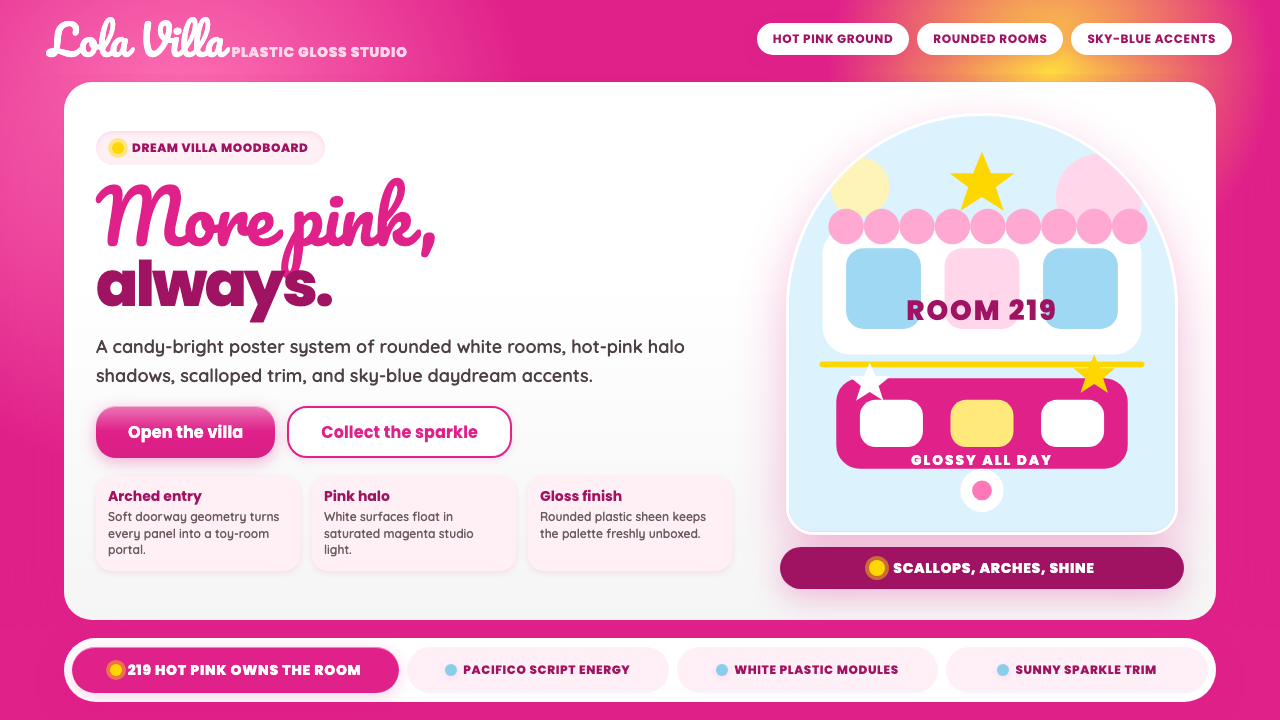 Barbie DreamhousePink is the whole world. Hot magenta ground, Pacifico script, scallops and gl…粉色就是全世界:洋红底、Pacifico手写、扇贝边与亮面拱门。
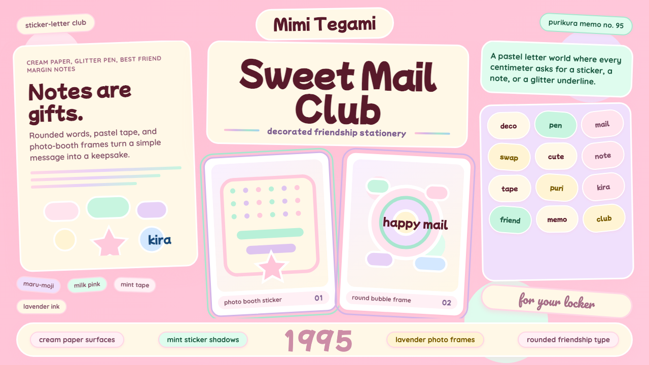 Kawaii Japanese Letter PurikuraCuteness fills every inch. Pink cream paper, mint stickers, lavender frames.可爱填满每寸:粉色奶油纸、薄荷贴纸、薰衣草相框。
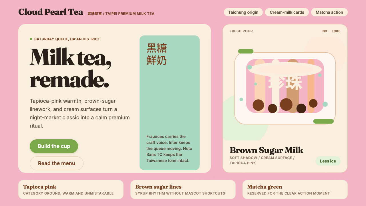 Taiwan Bubble Tea PremiumWarm craft, not kawaii. Tapioca pink, Fraunces serif, cream cards, matcha act…溫暖精品,不走可愛風:珍珠粉、Fraunces 襯線、奶白卡與抹茶綠。
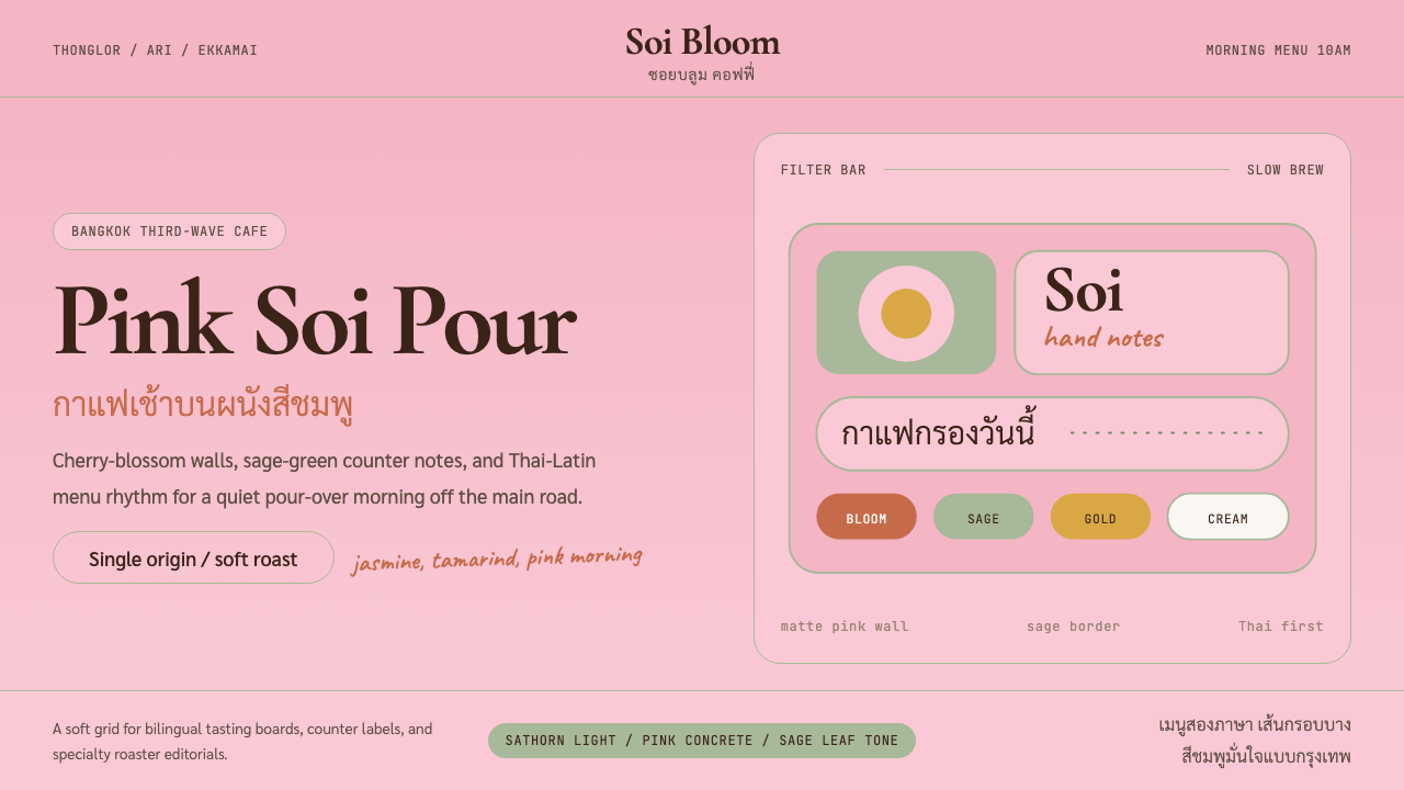 Bangkok Third-Wave CafeBangkok feels soft but sure. Cherry pink, sage borders, and Thai-Latin menu r…曼谷柔和却自信:樱花粉、鼠尾草边框与泰英菜单节奏。
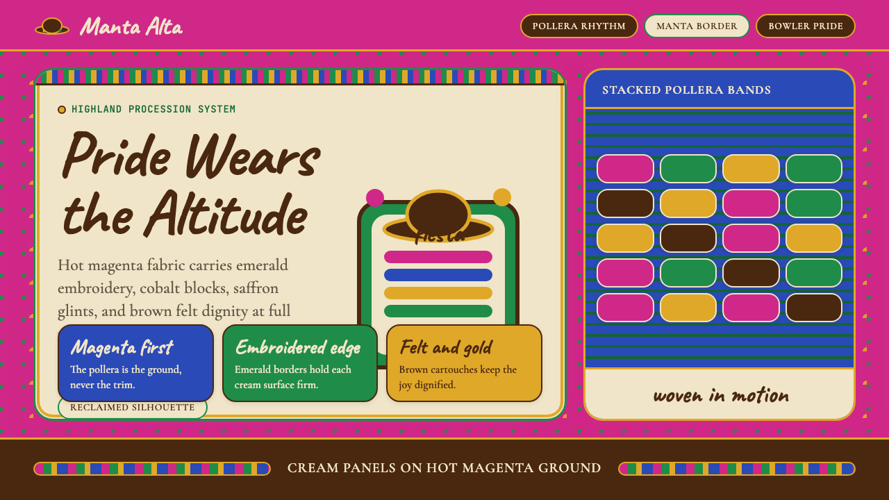 Bolivian Cholita (Bowler-Hat Fiesta)Loud pride, fully reclaimed. Magenta pollera bands, emerald borders, bowler c…骄傲高声回归:洋红波莱拉条带、翡翠边框与礼帽牌匾。
 CottagecoreRural romance, hand-drawn. Sage and dusty rose, gingham textures, serif paire…工业化前的乡村浪漫:鼠尾草绿与灰粉、亚麻方格纹质感、衬线搭配手写体——慢生活的…