Design style guide设计风格指南
What is Taiwan Bubble Tea Premium?什么是 Taiwan Bubble Tea Premium?
Taiwan's premium bubble tea aesthetic transformed a beloved night-market drink into a global craft-beverage visual identity — warm, approachable, and unmistakably rooted in the island's own sensibility.台灣精品珍珠奶茶的美學,將一杯街頭飲料提煉成全球精品茶飲的視覺語言——溫暖親切,辨識度極高,根植於這座島嶼獨特的氣質之中。
Taiwan Bubble Tea Premium in briefTaiwan Bubble Tea Premium 速览
Taiwan Bubble Tea Premium is a contemporary visual identity system that emerged from the 2017–2019 brown-sugar boba wave — the period when Taiwanese brands like The Alley and Tiger Sugar transformed tapioca-pearl tea from a regional comfort drink into a globally recognized craft-beverage category. The visual language that crystallized during this moment is warm, handcrafted in feeling, and built around a palette drawn directly from the drink itself: the rosy warmth of tapioca pink, the clean vitality of matcha green, and the rich depth of brown-sugar-syrup illustration.台灣精品珍珠奶茶是一套當代視覺識別系統,源自2017至2019年的黑糖波霸浪潮。在那個時代,鹿角巷、老虎堂等台灣品牌將珍珠奶茶從地域性的日常飲品,重塑為全球認可的精品茶飲類別。這一時期凝結的視覺語言溫暖而富有手工質感,以飲品本身的色彩為設計根基:珍珠粉的溫柔玫色、抹茶綠的清爽生氣,以及黑糖糖漿插畫的醇厚深沉。
The aesthetic deliberately positions itself against two possible pitfalls. It refuses the saccharine kawaii aesthetic that dominates some Taiwanese consumer branding — no cartoonish mascots, no pastel overload, no playful infantilization of the product. Equally, it resists cold European minimalism, opting instead for a warmth that reads as genuine craft and honest hospitality. The result is a system that feels contemporary and premium without losing the human, approachable quality that makes bubble tea culturally beloved.這套美學刻意迴避兩種陷阱。它拒絕台灣消費品牌中某些作品常見的甜膩可愛風——沒有卡通吉祥物,沒有粉嫩色系的泛濫,沒有對產品的嬰兒化詮釋。同樣,它也抗拒冷峻的歐洲極簡主義,選擇一種讀來如同真實工藝與誠摯待客之道的溫暖感。結果是一套既當代又精品的視覺系統,卻絲毫不失珍珠奶茶文化本身那種親近、可愛的人情味。
At its core, the style is a portrait of a Saturday afternoon queue in Taipei's Da'an district — the anticipation before a glass of tiger-striped milk tea, the pale cream of a paper cup, the dewy condensation that forms in summer heat. These sensory details are translated into design decisions: soft pink-tinted shadows suggest the warmth of an afternoon queue; cream-milk card surfaces evoke the color of the drink itself; hand-drawn brown-sugar-syrup illustration carries the craft and labor that premium positioning requires.從根本上說,這種風格是台北大安區週六下午排隊場景的視覺化——等待那杯虎紋鮮奶的期待感、紙杯的奶白色澤、夏日高溫下凝結的水珠。這些感官細節被轉化為設計決策:粉色調的柔和陰影暗示午後隊伍的溫度;奶白卡片喚起飲品本身的色彩;手繪黑糖糖漿插畫承載著精品定位所需要的工藝感與勞動痕跡。
See the Taiwan Bubble Tea Premium design system →查看 Taiwan Bubble Tea Premium 完整设计系统 →
Where does Taiwan Bubble Tea Premium come from?Taiwan Bubble Tea Premium 从何而来?
The origins of bubble tea trace back to 1986 in Taichung, Taiwan, where Liu Han-Chieh of Chun Shui Tang tea house is credited with adapting iced tea service — inspired by Japanese cold-brew coffee culture — into a Taiwanese street format. His product developer Tu Tsong-he is widely credited with the innovation of adding tapioca pearls to sweetened milk tea, creating the drink that would become a cultural touchstone. From Taichung, bubble tea spread through Taipei and across Taiwan through the 1990s, carried by independent tea-shop networks and night-market culture.珍珠奶茶的源頭可追溯到1986年的台灣台中。春水堂的劉漢介借鑒日本冷泡咖啡文化,將冰飲茶導入台灣街頭形式;其產品開發者杜聰明則廣泛被視為珍珠(粉圓)加入甜奶茶這一創意的實踐者,催生了後來成為文化符號的飲品。1990年代,珍珠奶茶從台中蔓延至台北,經由獨立茶飲店網絡與夜市文化流傳全台。
By the early 2000s, bubble tea was an established export. Chains had expanded across East and Southeast Asia, into Australian Chinatowns, European university districts, and North American suburban strip malls. But this first wave of globalization was largely unbranded visually — functional, cheerful, and typified by bright signage and plastic cups with hand-lettered menus. The drink was popular, but it lacked a coherent design language that could support premium positioning.2000年代初,珍珠奶茶已成為成熟的出口產品。連鎖品牌擴張至東亞、東南亞,進入澳洲華人社區、歐洲大學城區,以及北美郊區商業街。然而,這第一波全球化在視覺上幾乎沒有品牌意識——功能性、愉悅感,以明亮招牌和手寫菜單為典型。飲品流行,卻缺乏一套能夠支撐精品定位的連貫設計語言。
The transformation began in the 2010s and accelerated sharply between 2017 and 2019, when a new generation of Taiwanese brands entered the market with a deliberate premium-rebrand strategy. Tiger Sugar, founded by Jay Chiu, popularized the brown-sugar boba genre, and the brand's visual identity — tiger-stripe syrup photography, understated typography, clean packaging — set a new benchmark. The Alley formalized the craft-beverage visual idiom with serif typography, botanical illustration, and artisanal positioning. These brands were not just selling drinks; they were building a visual argument that Taiwanese bubble tea belonged alongside specialty coffee and third-wave tea culture as objects of design attention and craft pride.轉型始於2010年代,並在2017至2019年間急速加速。新一代台灣品牌帶著明確的精品重塑策略入市。周子豪創立的老虎堂推廣了黑糖波霸類型,其視覺識別——虎紋糖漿攝影、克制的排版、簡潔包裝——樹立了新的行業標竿。鹿角巷則以襯線字體、植物插畫和工匠定位,確立了精品茶飲的視覺慣例。這些品牌不只是在賣飲料,更是在建立一個視覺論點:台灣珍珠奶茶理應與精品咖啡、第三波茶飲文化並列,成為值得設計關注與工藝驕傲的對象。
The premium-rebrand wave coincided with the global rise of social media as a visual platform. Long queues outside The Alley locations in Tokyo, London, and New York generated enormous organic visual content. The photogenic qualities of the new visual systems — the condensation droplets on cups, the brown-sugar stripes, the cream-milk palette — were not incidental. The design was built to be photographed and shared, and the visual vocabulary that succeeded in that environment became the template that defined the aesthetic category. By 2020, Taiwan Bubble Tea Premium was a legible, coherent style — a design language with historical depth, cultural specificity, and a clear emotional signature.精品重塑浪潮與社交媒體作為視覺平台的全球崛起恰好同步。東京、倫敦、紐約的鹿角巷門口大排長龍,催生了巨量的自發視覺內容。這些視覺系統的上鏡質感——杯身的凝結水珠、黑糖條紋、奶白色系——並非偶然。設計本為被拍攝和傳播而生,而在這一環境中脫穎而出的視覺語彙,成為定義整個美學類別的模板。到2020年,台灣精品珍珠奶茶已是一套清晰連貫的風格——一種具有歷史深度、文化特殊性與鮮明情感特徵的設計語言。
What defines the Taiwan Bubble Tea Premium look?Taiwan Bubble Tea Premium 的视觉特征是什么?
Color Palette色彩體系
The palette is built from the drink itself rather than from abstract color theory. Tapioca pink — a soft, rosy warmth closer to blush than to candy — serves as the primary brand ground, giving the system its distinctive warmth without tipping into sweetness. Matcha green functions as the action color: slightly cool, slightly saturated, cut against the pink and cream as a confident accent. Brown-sugar amber and deep syrup tones appear in illustration and photography, grounding the palette in the physical reality of the product. Cream and off-white serve as card and page surfaces, avoiding pure white's clinical detachment. The overall effect is warm without being saccharine — a palette that evokes afternoon light, not a candy shop.色板以飲品本身為源泉,而非抽象色彩理論的產物。珍珠粉——一種柔和的玫色暖調,偏向腮紅而非糖果——作為主要品牌底色,賦予整套系統獨特的溫暖感,同時不流於甜膩。抹茶綠作為行動色:略帶清涼,略有飽和度,在粉色與奶白之間形成自信的點綴。黑糖琥珀與深色糖漿色調出現在插畫與攝影中,將色板錨定於產品的真實物質感。奶白與米色作為卡片和頁面底面,避免純白的臨床冷漠感。整體效果溫暖而不甜膩——這是一個喚起午後陽光而非糖果店的色板。
Typography Character字體排印個性
The typographic voice of the style centers on display serif letterforms that carry historical weight without formality. The serifs in question are drawn with generous curves and a slightly organic quality — closer to the warmth of hand-lettering than the precision of classical book typography. Headlines benefit from setting in cream or off-white against dark backgrounds, or in rich dark tones against cream surfaces. Body text should be set with comfortable line spacing and a measure that allows the eye to rest, reinforcing the approachable, hospitality-inflected character of the brand. The relationship between display headline and body text is one of clear hierarchy but not rigid contrast — both voices belong to the same warm family.這種風格的排版聲音以帶有歷史分量而不失親切感的展示性襯線字形為核心。相關的襯線字形曲線豐盈,帶有輕微的有機質感——更接近手寫字體的溫度,而非古典書籍排版的精確。標題適合在深色背景上以奶白色或米色呈現,或在奶白底面上以深色濃郁色調書寫。正文應保持舒適的行距與適中的行寬,讓眼睛得到休息,強化品牌親切、待客之道的氣質。展示標題與正文之間是清晰的層級關係,但非嚴苛的對比——兩種聲音同屬一個溫暖的大家庭。
Surface and Texture表面與質感
Card and container surfaces in this system are cream-milk rather than pure white, giving them a warmth that reads as material and honest rather than sterile and digital. The texture register is subtle: the suggestion of paper grain, the slight unevenness of a hand-stamped ink impression, the soft grain of fine cloth. These are not simulations in the skeuomorphic sense — they do not try to fool the eye into believing it is touching a physical surface — but rather tonal suggestions that remind the viewer of handcraft and care. Condensation-droplet photography, when used, adds a specifically Taiwanese summer sensory note: the cool glass on a hot day, the visible evidence that something real and cold is inside.這套系統中的卡片與容器底面是奶白色而非純白,賦予它們一種讀來真實而誠懇、而非無菌和數字化的溫度。質感層次是微妙的:紙張紋理的暗示、手蓋印章略帶不規則的墨色、細布的輕柔顆粒感。這些並非擬物化意義上的模擬——它們不試圖欺騙眼睛相信自己正在觸摸一個實體表面——而是一種色調上的暗示,提醒觀者手工藝與用心的存在。凝結水珠的攝影(如使用)加入了一個特屬台灣夏日的感官注腳:熱天的冰涼玻璃,杯身可見的水珠,是裡面真實且冰冷的有形證明。
Illustration and Ornamentation插畫與裝飾性元素
Brown-sugar-syrup line illustration is the system's primary decorative vocabulary — flowing, calligraphic strokes that evoke both the viscous pour of syrup and the brushwork tradition in East Asian ink art. These marks are used sparingly: as a background flourish on a packaging label, as a dividing element on a section header, as an ornamental detail in a photography composition. They carry cultural specificity without requiring explanation, functioning as a visual anchor that distinguishes this aesthetic from generic premium-craft design. Secondary illustration may include botanical references — tea leaves, tapioca plants, water imagery — always in the same spare, flowing register.黑糖糖漿線條插畫是這套系統的主要裝飾語彙——流動的、書法式的筆觸,既喚起糖漿傾倒時的黏稠質感,也呼應東亞水墨藝術的用筆傳統。這些元素用法克制:作為包裝標籤的背景點綴、章節標題的分隔元素、攝影構圖中的裝飾細節。它們承載文化特殊性而無需說明,作為視覺錨點,將這種美學與泛泛的精品工藝設計區分開來。次要插畫可能包含植物元素——茶葉、木薯植株、水意象——始終保持同樣疏落、流動的筆調。
Shadow and Depth陰影與空間感
Unlike the hard-offset shadows of austere modernism, the shadow language in this system is soft and tinted — pinkish-warm shadows that read as afternoon light falling on cream surfaces rather than geometric structural devices. The softness is deliberate: it reinforces the warmth and hospitality of the brand. Shadows are present but not assertive; they lift elements gently from the surface rather than stamping them against it. Depth is created through layering of cream surfaces, subtle tonal shifts, and the contrast between photograph and flat element — a composition feels three-dimensional without relying on dramatic shadow for structural organization.與嚴峻現代主義的硬邊偏移投影不同,這套系統的陰影語言是柔和且帶有色調的——帶粉的暖色陰影,讀來如同午後陽光落在奶白表面,而非幾何結構性裝置。這種柔軟是刻意的:它強化了品牌的溫暖感與待客之道。陰影存在但不強勢,它輕柔地將元素從底面托起,而非將它們壓印其上。空間深度通過奶白表面的層疊、微妙的色調變化,以及照片與平面元素之間的對比來創造——一組構圖呈現三維感,卻不依賴戲劇性投影作為結構組織手段。
Photography and Visual Atmosphere攝影與視覺氛圍
Photography in this system serves a specific atmospheric function: it makes the intangible — warmth, freshness, the pleasure of anticipation — visible and credible. Subject matter centers on the drink itself (condensation on a cup, the pour of brown-sugar syrup, the steam above a hot tea) and on social moments (hands around cups, queues, the warm interior of a tea shop). Color grading is warm-shifted: shadows tend toward amber rather than cool gray, highlights toward cream rather than pure white. The photographic register is not lifestyle fantasy but honest testimony — the kind of image that feels taken in the moment rather than staged for effect.這套系統中的攝影服務於一種特定的氛圍功能:讓無形的事物——溫暖、新鮮感、期待的喜悅——變得可見且可信。拍攝主題集中於飲品本身(杯身的凝結水珠、黑糖糖漿傾倒的瞬間、熱茶升騰的蒸氣)以及社交時刻(雙手環杯、排隊等候、茶飲店的溫暖內景)。色彩調性偏暖:暗部傾向琥珀而非冷灰,高光傾向奶白而非純白。攝影的基調不是生活方式的幻想,而是誠實的見證——那種讓人感覺是當下抓拍而非刻意擺拍的影像。
Layout and Spatial Generosity版面與空間慷慨感
Layouts in this system are characterized by generous white — or rather cream — space around every element. Nothing crowds. The spatial generosity communicates quality: premium goods are never crammed into their packaging, and premium visual systems give every element room to breathe. Hierarchy is achieved through typographic scale and tonal contrast rather than through dense information stacking. A cover image, a headline, a single supporting line: these are enough. The system trusts the power of a well-chosen element presented with breathing room over the cumulative force of many elements packed tightly together.這套系統的版面以每個元素周圍充裕的留白(或更準確地說,奶白空間)為特徵。沒有什麼是擁擠的。空間的慷慨傳達品質:精品從不被塞進包裝,精品視覺系統讓每個元素都有呼吸的餘地。層級通過字體大小與色調對比來實現,而非通過密集的信息堆疊。一張封面圖片、一行標題、一句支持語:這已足夠。這套系統信任一個被妥善選擇並以呼吸空間呈現的元素所擁有的力量,勝過許多元素緊密堆砌在一起的累積效果。
See the Taiwan Bubble Tea Premium design system →查看 Taiwan Bubble Tea Premium 完整设计系统 →
Who shaped Taiwan Bubble Tea Premium?谁塑造了 Taiwan Bubble Tea Premium?
Liu Han-Chieh, founder of Chun Shui Tang tea house in Taichung, is credited with adapting iced tea service to the Taiwanese street format in 1986, drawing inspiration from Japanese cold-brew coffee culture he had encountered during travels in Japan. His innovation established the tea-house format that made bubble tea commercially viable as a sit-down street experience. Chun Shui Tang remains in operation today and occupies a foundational position in the cultural narrative of bubble tea's origin — its Taichung locations function both as businesses and as cultural landmarks visited by enthusiasts tracing the drink's history.台中春水堂創辦人劉漢介因在1986年借鑒在日本旅行時接觸到的日式冷泡咖啡文化,將冰飲茶服務引入台灣街頭形式,而廣泛獲得珍珠奶茶誕生的歷史歸功。他的創新確立了讓珍珠奶茶作為街頭坐飲體驗商業化的茶飲店格局。春水堂至今仍在運營,在珍珠奶茶起源的文化敘事中佔據奠基性地位——其台中門店既是商業場所,也是尋訪飲品歷史的愛好者前往的文化地標。
Tu Tsong-he, product developer at Chun Shui Tang, is widely credited with the specific innovation of adding sweetened tapioca pearls — then commonly served as a cold dessert — to milk tea, creating the defining textural experience of bubble tea. The accidental or experimental origin of the combination is part of the drink's founding mythology. Tu's contribution demonstrates a pattern central to Taiwanese food culture: the creative recombination of elements from different culinary traditions (Chinese milk tea, Taiwanese tapioca desserts) into something new with its own identity.春水堂產品開發人員杜聰明廣泛被視為在奶茶中加入甜味粉圓(當時常作冷甜品食用)這一具體創意的實踐者,創造了珍珠奶茶標誌性的口感體驗。這一組合的偶然或實驗性起源是飲品創始神話的一部分。杜聰明的貢獻展示了台灣飲食文化的一個核心模式:將不同飲食傳統的元素(中式奶茶、台式粉圓甜品)創造性地重新組合,形成具有自身身份的全新事物。
Jay Chiu founded Tiger Sugar in Taichung in 2017, launching the brown-sugar boba genre with a visual identity that became the single most influential aesthetic reference in the premium bubble tea rebrand movement. Tiger Sugar's signature — the photogenic brown-sugar syrup drizzled in tiger stripes down the inside of a cup, photographed against a light background — is a design decision as much as a culinary one. The brand demonstrated that a bubble tea visual identity could generate global social-media momentum through the photogenic quality of its product presentation alone. Tiger Sugar's subsequent expansion into dozens of international markets carried the visual vocabulary of the brown-sugar boba aesthetic with it.周子豪於2017年在台中創立老虎堂,以一套成為精品珍珠奶茶重塑運動中最具影響力美學參照的視覺識別,開啟了黑糖波霸類型。老虎堂的標誌性符號——沿杯壁淋下的黑糖虎紋,在淡色背景下拍攝——與其說是烹飪決策,不如說是設計決策。該品牌證明,珍珠奶茶視覺識別能夠僅憑其產品呈現的上鏡品質,在全球社交媒體上引發巨大的自發傳播動能。老虎堂此後向數十個國際市場擴張,將黑糖波霸美學的視覺語彙帶到世界各地。
The Alley, founded in Taiwan in 2013 and expanding internationally from 2017 onward, established the botanical, artisanal visual idiom that became the second major pillar of the premium bubble tea aesthetic alongside Tiger Sugar's more dramatic, photography-driven approach. The Alley's identity — antler-logo branding, serif typography with deliberate historical patina, botanical illustration, and craft-coffee-inflected store interiors — drew explicitly from third-wave coffee culture's premium positioning playbook and applied it to tea. The brand demonstrated that premium bubble tea could be framed as a connoisseur beverage with its own cultural depth, not simply a fun and trendy drink.鹿角巷於2013年在台灣創立,並從2017年起向國際擴張,建立了植物學風格、工匠氣質的視覺慣例,成為精品珍珠奶茶美學(與老虎堂更具戲劇性、攝影主導的路線並列)的第二大支柱。鹿角巷的品牌識別——鹿角標誌、帶有歷史包漿感的襯線字體、植物插畫、精品咖啡風格的店鋪內裝——明確借鑒了第三波咖啡文化的精品定位策略,並將其應用於茶飲。該品牌證明,精品珍珠奶茶可以被框架為具有自身文化深度的鑑賞家飲品,而不僅僅是一種時髦有趣的消費品。
The brown-sugar boba wave of 2017–2019 was less the work of any single figure than a collective competitive market phenomenon. Dozens of Taiwanese brands simultaneously raised their visual game, recognizing that the globalized social-media environment had made brand aesthetics inseparable from product quality in the consumer's perception. The cumulative effect of this competitive aesthetic upgrading — each brand trying to out-premium the next — produced the Taiwan Bubble Tea Premium visual language as a coherent category. It is one of the few instances in contemporary design history where a regional food culture generated a completely new, globally recognizable premium visual aesthetic in under five years.2017至2019年的黑糖波霸浪潮,與其說是某一個人的功勞,不如說是一場集體性的競爭市場現象。數十個台灣品牌同步提升視覺水準,因為他們意識到,在全球化的社交媒體環境中,品牌美學已在消費者認知中與產品品質密不可分。這場競爭性美學升級的累積效應——每個品牌都試圖超越對手的精品感——將台灣精品珍珠奶茶的視覺語言塑造成一個連貫的類別。這是當代設計史上罕見的案例之一:一種地域性飲食文化在不到五年的時間內,催生了一套全新的、全球可辨識的精品視覺美學。
How do you use Taiwan Bubble Tea Premium today?今天怎么用 Taiwan Bubble Tea Premium?
Taiwan Bubble Tea Premium is a style built around warmth, hospitality, and craft. Applying it well means understanding that its visual appeal comes from a specific emotional register — the pleasure of a carefully made drink, the warmth of an afternoon ritual, the pride of a regional food culture claiming its place in a global premium market — and ensuring that every design decision reinforces rather than contradicts that register.台灣精品珍珠奶茶是一套圍繞溫暖、待客之道與手工感建立的風格。正確應用它,意味著理解其視覺吸引力來自一種特定的情感基調——精心製作的飲品帶來的喜悅、午後儀式的溫度、一種地域飲食文化在全球精品市場確立自身位置的自豪感——並確保每一個設計決策都強化而非矛盾這種基調。
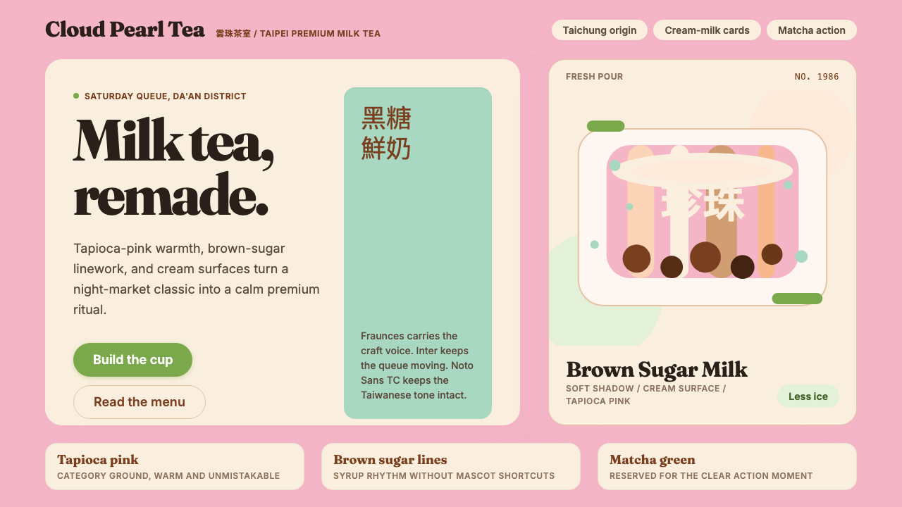
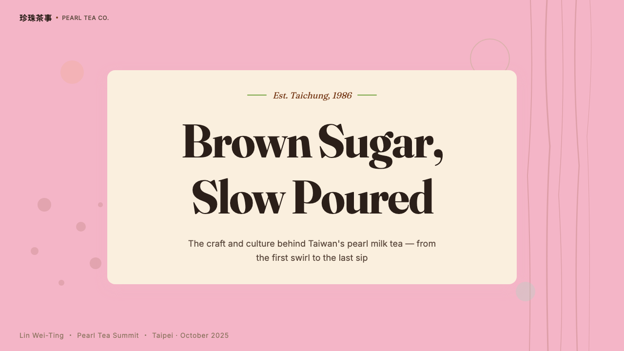
For presentation slides, the style works particularly well for brand storytelling, product introduction, and pitch decks for food, beverage, or lifestyle brands. A cover slide benefits from a single strong photograph — a well-composed cup shot with visible condensation, or a close-up of brown-sugar syrup — set against a cream or pale pink background with a display serif headline in deep brown or matcha. Content slides should lean into generous spacing, soft warm tones for section markers, and hierarchy built through scale contrast rather than color variety. Data slides are best kept minimal: clean warm-toned bar charts on cream backgrounds, with matcha green as the primary accent for the highlighted data series.在演示文稿中,這種風格尤其適合品牌故事講述、產品介紹,以及食品、飲料或生活方式品牌的融資路演。封面幻燈片適合搭配一張強而有力的照片——構圖良好的帶水珠杯身特寫,或黑糖糖漿傾倒的瞬間——置於奶白或淡粉背景上,配以深棕或抹茶色的展示性襯線標題。內容幻燈片應多留空間,以柔和暖色調作段落標記,以大小對比而非色彩多樣性建立層級。數據幻燈片最好保持極簡:奶白背景上的乾淨暖色柱狀圖,以抹茶綠作為重點數據系列的主要強調色。
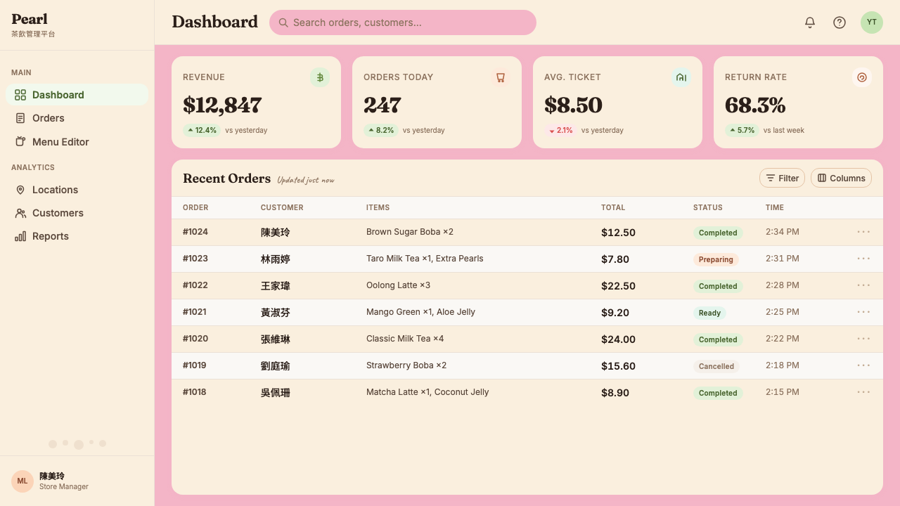
For web interfaces, this aesthetic is well-suited to e-commerce product pages, restaurant or cafe landing pages, brand-story microsites, and any interface where the emotional goal is warmth and credibility rather than urgency or efficiency. The approach: use cream as the default page background rather than pure white, introduce tapioca pink as a warm accent for calls-to-action and hover states, and reserve matcha green for confirmations and positive signals. Photography should be integrated generously — not as decoration but as the primary storytelling medium. Avoid dense information architecture: this aesthetic struggles when it is asked to carry heavy data or complex navigation.對於網頁界面,這種美學特別適合電商產品頁、餐廳或咖啡館的落地頁、品牌故事微站,以及任何情感目標是溫暖與可信度而非緊迫感或效率的界面。設計方法:以奶白色而非純白作為默認頁面背景,引入珍珠粉作為行動號召和懸停狀態的暖色強調,將抹茶綠保留給確認和正向信號。攝影應大方地融入——不作裝飾,而作主要敘事媒介。避免密集的信息架構:當被要求承載大量數據或複雜導航時,這種美學會顯得吃力。
For editorial and marketing work, the style performs strongly in food and beverage editorial, lifestyle journalism, brand campaigns, and social content. An editorial layout using this aesthetic would pair a large-format hero photograph with a serif headline set in generous point size and loose tracking, using the cream page background to let the image breathe. Marketing assets — banners, social cards, packaging mockups — benefit from the boldness of a single tapioca pink or matcha green field with a short typographic statement and perhaps a single illustrative mark in brown-sugar ink style.對於編輯與營銷工作,這種風格在食品飲料編輯、生活方式新聞、品牌推廣和社交內容中表現突出。使用這種美學的編輯版面,會在大幅英雄攝影圖與寬鬆字號、舒適字距的襯線標題之間形成搭配,以奶白頁面背景讓圖像得到呼吸。營銷素材——橫幅廣告、社交卡片、包裝效果圖——受益於珍珠粉或抹茶綠單一色域的大膽感,配以簡短的排版陳述,也許再加上一個黑糖墨色風格的插畫細節。
A common mistake when applying this aesthetic is importing its surface qualities — the pink, the serif, the cream — without the underlying warmth of intention. The palette can be applied to a layout that is still cold and clinical in its spatial logic, producing a result that feels like a costume rather than a character. The style works when generous spacing, soft shadows, and a sense of hospitality in the layout's architecture reinforce the palette and typography — when every element communicates care, not just visual style.應用這種美學時最常見的錯誤,是引入其表面品質——粉色、襯線、奶白——卻沒有帶入其背後的溫暖意圖。這套色板可以被應用在一個空間邏輯依然冷漠而臨床的版面上,產生一種像是穿著戲服而非活生生性格的結果。這種風格真正有效,是在充裕的留白、柔和的陰影,以及版面架構中的待客之道精神共同強化了色板與字體之時——當每個元素都在傳達用心,而不僅僅是視覺風格。
See the Taiwan Bubble Tea Premium design system →查看 Taiwan Bubble Tea Premium 完整设计系统 →
Taiwan Bubble Tea Premium — FAQTaiwan Bubble Tea Premium · 常见问题
Is Taiwan Bubble Tea Premium the same as a generic Asian or kawaii aesthetic?台灣精品珍珠奶茶美學等同於一般的亞洲或可愛(kawaii)風格嗎?
No, and the distinction matters. The kawaii aesthetic — associated with Japanese pop culture, bright pastels, cartoonish mascots, and playful infantilization of products — is a completely different design tradition. Taiwan Bubble Tea Premium is deliberately positioned against kawaii: it is warm rather than cute, craft-forward rather than playful, and serious about its cultural roots in Taiwanese food history without being nostalgic or kitschy. Similarly, it is not a generic pan-Asian aesthetic — it is specifically Taiwanese, referencing the visual culture of Taiwanese tea-shop signage, Taipei street life, and the specific color vocabulary of the drinks themselves. Applying generic Asian pastels or cuteness signals to this system would be a category error.不,而且這一區別相當重要。可愛(kawaii)美學——與日本流行文化、明亮粉嫩色彩、卡通吉祥物和對產品的嬉遊嬰兒化相關聯——是一套完全不同的設計傳統。台灣精品珍珠奶茶美學刻意與可愛風格拉開距離:它是溫暖的而非可愛的,是工藝導向的而非玩耍性的,對其在台灣飲食歷史中的文化根源是認真嚴肅的,卻不懷舊,也不低俗。同樣,它也不是一種泛泛的泛亞洲美學——它具體是台灣的,參照台灣茶飲店招牌的視覺文化、台北街頭生活,以及飲品本身特定的色彩語彙。將泛泛的亞洲粉嫩色系或可愛感套用到這個系統上,是一種類別錯誤。
Can this aesthetic work for brands outside the food and beverage industry?這種美學能應用在食品飲料行業之外的品牌嗎?
Yes, but with care. The aesthetic's core emotional qualities — warmth, approachability, craft-quality signaling, and a sense of artisanal honesty — are transferable to other categories where those values align with the brand's identity. Wellness and beauty brands, independent retail and lifestyle brands, boutique hospitality, and specialty food products all share enough of the emotional territory to apply this aesthetic credibly. Where the style struggles is in contexts that require authority, urgency, technical precision, or institutional gravitas — financial services, healthcare, legal, enterprise software. In those contexts, the warmth and softness of the palette and typography work against the communication goals rather than supporting them.可以,但需要謹慎。這種美學的核心情感品質——溫暖、親切、工藝品質信號,以及工匠誠實感——可以遷移到其他與品牌身份中這些價值觀相符的類別。健康與美容品牌、獨立零售與生活方式品牌、精品酒店業,以及特色食品產品,都與這種美學的情感領域有足夠的重疊,能夠可信地應用這套風格。這種風格力不從心的地方,是那些需要權威感、緊迫感、技術精確性或機構莊嚴感的語境——金融服務、醫療、法律、企業軟件。在這些語境中,色板與字體的溫暖感和柔軟感會對傳播目標形成阻礙,而非支撐。
How does this style relate to other premium craft-beverage aesthetics, like specialty coffee?這種風格與其他精品工藝飲品美學(例如精品咖啡)有何關係?
There is a clear family resemblance, because Taiwan Bubble Tea Premium consciously borrowed from third-wave specialty coffee's premium-positioning visual playbook during the 2017–2019 rebrand wave. Both traditions share commitments to serif typography with historical weight, botanical or origin-story illustration, photographic emphasis on the craft process, and packaging that communicates artisanal care. The key differences lie in color and warmth: specialty coffee aesthetics tend toward cooler, more austere palettes — kraft paper, deep forest green, matte black, aged cream — while Taiwan Bubble Tea Premium embraces a warmer, softer palette that reflects the drinks' more playful and social cultural context. Where specialty coffee aesthetics signal connoisseurship and restraint, bubble tea aesthetics signal warmth and occasion.兩者之間有明顯的家族相似性,因為台灣精品珍珠奶茶在2017至2019年的品牌重塑浪潮中,有意借鑒了第三波精品咖啡的精品定位視覺策略。兩種傳統都重視帶有歷史分量的襯線字體、植物學或原產地故事插畫、強調工藝過程的攝影,以及傳達工匠用心的包裝。關鍵差異在於色彩與溫度:精品咖啡美學傾向於更涼、更簡約的色板——牛皮紙色、深林綠、啞光黑、舊奶白——而台灣精品珍珠奶茶採用更溫暖、更柔和的色板,反映了這些飲品更具玩樂性和社交性的文化語境。精品咖啡美學傳達的是鑑賞家氣質與克制,珍珠奶茶美學傳達的是溫暖感與儀式感。
What is the risk of this aesthetic becoming dated quickly, given its roots in a specific commercial trend?鑒於這種美學根植於某一特定商業潮流,它是否有快速過時的風險?
The risk exists but is mitigated by the depth of the style's cultural roots. Visual aesthetics that emerge from genuine cultural phenomena — rather than purely from trend cycles — tend to have longer shelf lives because they carry real historical and social content. The tapioca pink and matcha green of this system are not arbitrary trend colors; they refer to actual objects that have meaning in Taiwanese food culture. That grounding gives the aesthetic more stability than a trend-driven palette would have. The more time-sensitive aspects of the style are its specific execution choices — the condensation-droplet photography style, the exact character of the brown-sugar illustration — which may feel more dated than the underlying palette and typographic warmth. Applying the core values of the aesthetic rather than its most surface-specific execution gives the style better longevity.這一風險確實存在,但因這種風格的文化根源深度而得到緩解。從真實文化現象(而非純粹潮流週期)中涌現的視覺美學,往往擁有更長的生命週期,因為它們承載真實的歷史與社會內容。這套系統的珍珠粉與抹茶綠並非任意的流行色;它們指涉的是在台灣飲食文化中具有意義的真實事物。這種錨定賦予了這套美學比純粹潮流驅動的色板更強的穩定性。這種風格中對時間較為敏感的部分,是它的具體執行選擇——凝結水珠的攝影風格、黑糖插畫的確切筆觸特質——這些可能比底層色板與字體溫度更容易顯得過時。圍繞這種美學的核心價值而非最具表面特異性的執行方式來應用,能讓這種風格擁有更好的持久性。
How should this aesthetic handle dark-mode or dark-background layouts?這種美學應如何處理深色模式或深色背景版面?
Dark inversions of this aesthetic are possible but require a considered approach. The style's warmth depends substantially on its light, cream-milk surface — a straight inversion to dark gray or black risks losing the warmth that makes the system coherent. A more successful approach for a dark version is to shift toward deep amber or very deep brown-sugar tone as the dark background rather than neutral black, preserving the warmth of the color family while creating the contrast needed for a dark layout. On this warm dark ground, tapioca pink and matcha green both remain legible and warm rather than becoming artificially bright. Cream text on dark amber reads as warm and craft-inflected rather than clinical. The key is treating the dark mode as a shift within the color family's warmth rather than an inversion into a cold, neutral palette.這種美學的深色反轉版本是可行的,但需要審慎的處理方式。這種風格的溫暖感在很大程度上依賴其明亮的奶白表面——直接反轉為深灰或黑色,有喪失使系統連貫的溫暖感的風險。深色版本更為成功的方法,是以深琥珀色或極深的黑糖色調作為深色背景,而非中性的純黑,在保留色彩家族溫度的同時,創造深色版面所需的對比。在這個溫暖的深色底面上,珍珠粉與抹茶綠都保持可讀性與溫暖感,而非變得人工刺眼。奶白色文字在深琥珀底面上讀來溫暖且帶有工藝質感,而非臨床冷漠。關鍵在於將深色模式理解為在色彩家族的溫度範圍內的一次移位,而非向冷性中性色板的反轉。
Related design styles相关设计风格
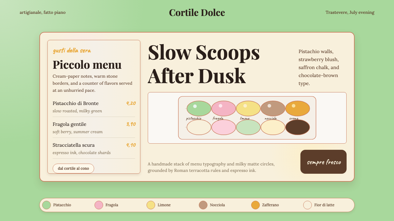 Italian Gelato ShopWarmth is hand-scooped. Pistachio green, cream panels, high-contrast serif, c…手工温暖被舀起。开心果绿、奶油纸卡、高反差衬线和粉笔字。
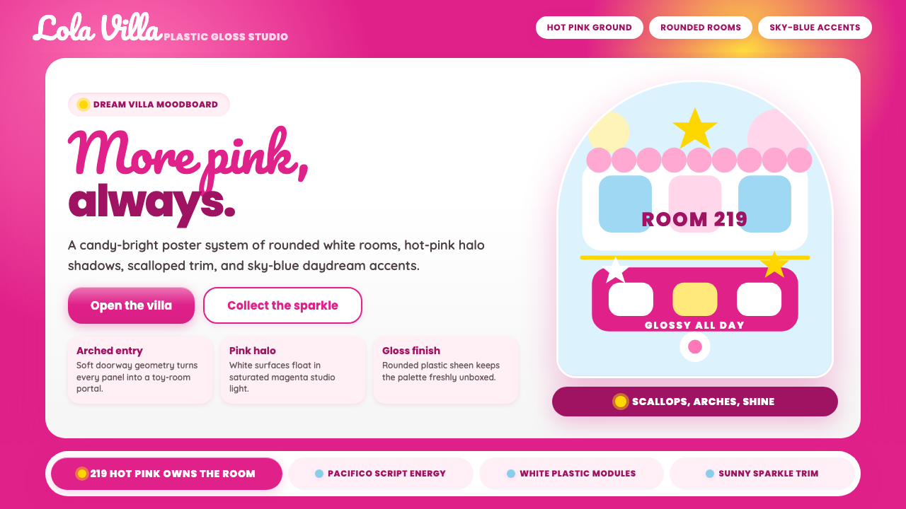 Barbie DreamhousePink is the whole world. Hot magenta ground, Pacifico script, scallops and gl…粉色就是全世界:洋红底、Pacifico手写、扇贝边与亮面拱门。
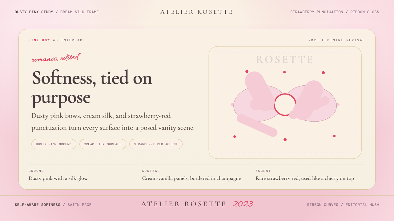 Coquette Aesthetic Pink Bow (2023)Softness is deliberate. Dusty pink, cream silk, and strawberry red frame ever…柔软是刻意的。尘粉、奶油丝绸与草莓红框住每个蝴蝶结。
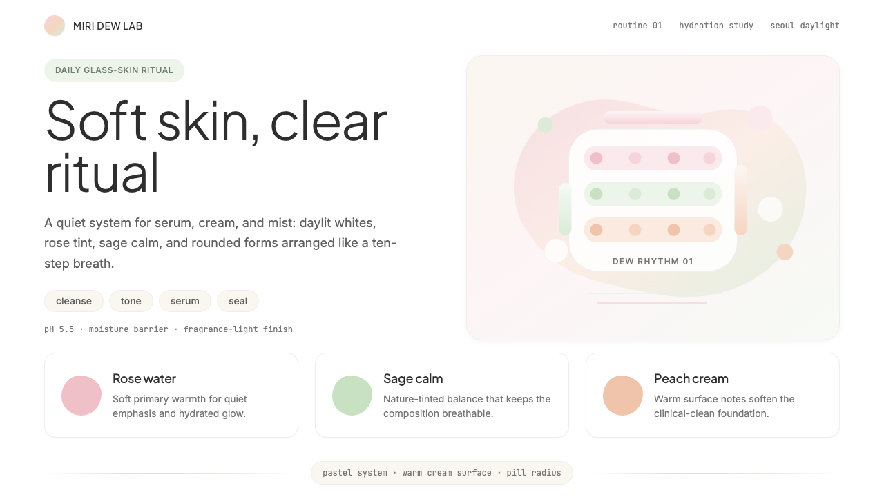 K-Beauty CleanCalm arrives dewy. Rose, sage, and peach pastels float through airy rounded f…水润的平静:玫瑰、鼠尾草与蜜桃粉彩在圆润留白中漂浮。
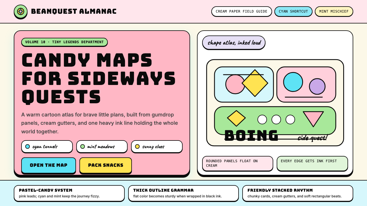 Adventure TimeCartoon warmth, inked loud. Cream gutters, candy pink, cyan and mint lock int…卡通温暖被粗线放大:奶油留白、糖粉、青色与薄荷全靠黑描边定型。
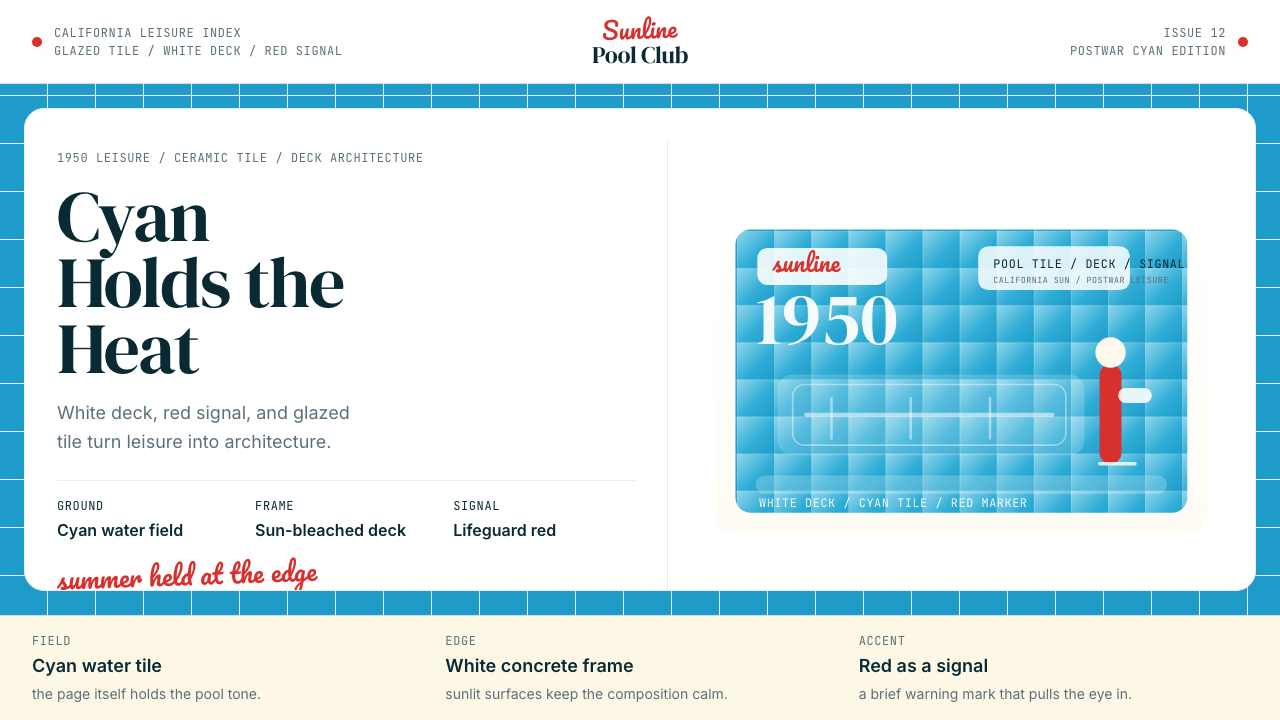 Swimming Pool Vintage Cyan Tile (1950)Leisure turned architectural. Cyan tile, white deck, and red accents set the…把悠闲做成建筑感。青瓷砖、白池边与红色点睛。