What is Italian Gelato Shop?什么是 Italian Gelato Shop?
Italy's gelateria counter is a design system in disguise — pastel tubs glowing under warm light, chalk script, and the quiet authority of centuries of craft.意大利冰淇淋店的陈列台是一套伪装成食品展柜的设计语言——粉彩色调在柜台灯光下轻盈发光,粉笔字飘逸,数百年工艺积淀出一种不事声张的自信。
Italian Gelato Shop in briefItalian Gelato Shop 速览
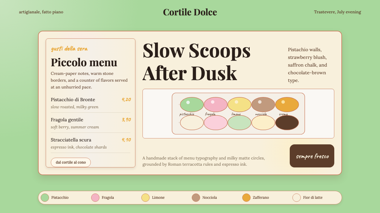
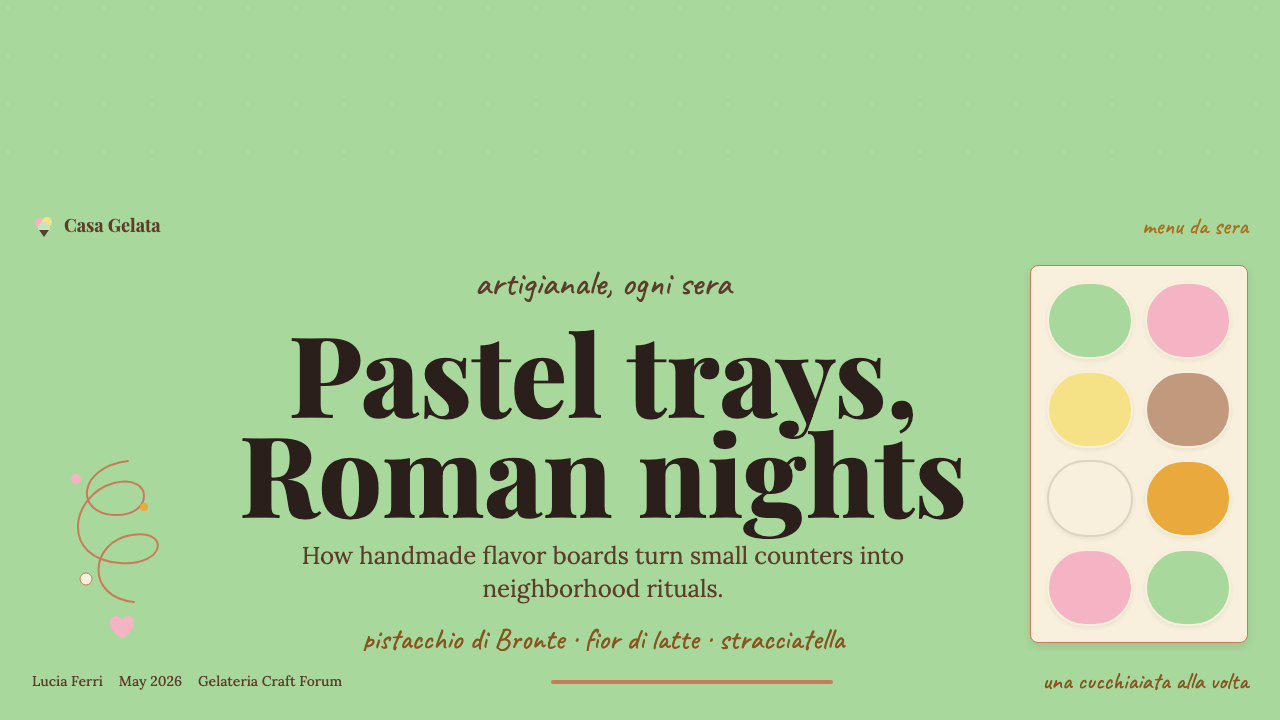
The Italian Gelato Shop aesthetic is a visual language drawn from the artisanal gelateria — the neighbourhood ice-cream parlour that has anchored Italian street life since the early modern period. Its palette is built from the colours inside the metal trays: pistachio green, strawberry pink, lemon yellow, hazelnut brown, and the off-white of fresh fior di latte, all held together by a warm terracotta or chocolate ground. Nothing is garish; every hue has been softened by dairy and light until it reaches exactly the temperature of an afternoon in summer.意大利冰淇淋店美学是一套源自精品冰淇淋店的视觉语言——那种扎根意大利街头生活、自近代早期便存在于每个街区的手工冰淇淋小店。它的色板取自金属展示盘中的实物:开心果绿、草莓粉、柠檬黄、榛子棕,以及新鲜奶油冰淇淋的米白,一切都被温暖的赤陶红或巧克力棕作为底色统一收拢。没有任何色彩是刺目的——每一个色调都已被乳脂与灯光柔化,直到达到夏日午后的那种温度。
The system's typographic character comes from the chalkboard. Hand-lettered Italian names — Pistacchio, Fragola, Limone, Stracciatella — appear in a loose, confident script that treats the board surface as a kind of controlled imperfection. When print or digital media adopt this character, they turn to warm serif display faces and hand-drawn lettering that preserve a sense of the maker's hand without becoming decorative pastiche. Body text, where it appears, is set small and quietly, deferring to the flavour names and visual colour blocks.这套系统的字体性格来自黑板。手写意大利语风味名——Pistacchio(开心果)、Fragola(草莓)、Limone(柠檬)、Stracciatella(碎巧克力)——以松弛而自信的书写体呈现,将黑板表面视为一种有控制的不完美。当印刷或数字媒介采用这一气质时,转向温润的衬线展示字体与手绘字母,保留制作者之手的感受,同时避免堕入纯装饰的陷阱。正文在出现时总是细小而安静,把版面中心礼让给风味名称与视觉色块。
Texture is the quality that separates this aesthetic from other pastel traditions. The surfaces are not smooth digital gradients but carry the grain of marble countertops, the slight roughness of recycled paper wrapping, the tactile irregularity of hand-trowelled plaster walls. Applied to slides, web interfaces, or print, this means favouring textured backgrounds, slightly irregular hand-lettered elements, and a deliberate avoidance of the sterile smoothness associated with factory production.质感是将这一美学与其他粉彩传统区分开来的关键品质。其表面不是光滑的数字渐变,而带有大理石台面的纹理、再生纸包装纸的轻微粗糙、手抹灰泥墙面的触感不规则。应用于幻灯片、网页界面或印刷品时,这意味着偏好有质感的背景、略显不规则的手写元素,以及对工业化生产所关联的那种无菌光滑感的刻意回避。
See the Italian Gelato Shop design system查看 Italian Gelato Shop 完整设计系统
Where does Italian Gelato Shop come from?Italian Gelato Shop 从何而来?
Gelato's origins in Italy trace back to the sixteenth century, when Florentine court culture gave rise to spectacular dessert performances. Bernardo Buontalenti — architect, engineer, and theatrical designer to the Medici — is credited with refining the iced confections served at Florentine banquets around the 1560s and 1570s. His preparations combined eggs, sugar, milk, and fruit in ratios that produced a denser, creamier freeze than the simple sorbetti already known across the Mediterranean. The aesthetic of those early preparations was already theatrical: displayed in elaborate silver vessels, flavoured with rare spices, and presented as part of a total sensory spectacle.冰淇淋在意大利的起源可追溯至十六世纪,彼时佛罗伦萨的宫廷文化催生了壮观的甜品表演。美第奇家族的建筑师、工程师兼戏剧设计师贝尔纳多·布翁塔伦蒂,被认为在约1560至1570年代改良了佛罗伦萨宴会所供冰冻甜品的配方。他将鸡蛋、糖、牛奶与水果以特定比例组合,制成质地比地中海地区已知的简单冰沙更为浓郁、细腻的冰冻甜品。这些早期甜品的美学已然充满戏剧性:盛放在精致银器中展示,以珍稀香料调味,作为一整套感官盛宴的组成部分被呈上。
The tradition spread across Europe through Sicilian emigrant Procopio Cutò, who opened the Café de Procope in Paris in 1686 — the oldest continuously operating café in France and arguably in the world. Procopio's establishment introduced iced desserts to a sophisticated Parisian clientele and established the template for the gelateria as a place of refined leisure: marble surfaces, a carefully arranged display of colours, and a ritual of selection that was itself part of the pleasure. By the eighteenth century, Italian gelato makers — gelatieri — were working across European courts, and their visual vocabulary of pastel-coloured confections in elegant vessels had begun its long career as a signifier of cultivated pleasure.这一传统经由西西里移民普罗科皮奥·库托向欧洲传播——他于1686年在巴黎开设了普罗科普咖啡馆,这是法国乃至可能是世界上持续经营最久的咖啡馆。普罗科皮奥的店铺将冰冻甜品引介给精致的巴黎顾客,并确立了冰淇淋店作为优雅休闲场所的模板:大理石台面、精心陈列的缤纷色彩,以及挑选口味这一仪式本身也是乐趣的组成部分。到十八世纪,意大利冰淇淋师傅遍布欧洲各地的宫廷,他们以雅致器皿盛放粉彩色调甜品的视觉词汇,开始了其作为高雅享乐标志的漫长生涯。
The modern gelateria as a neighbourhood institution emerged in the nineteenth and early twentieth centuries, as Italian families opened small shops in cities from Rome and Bologna to Turin and Naples. Bologna's La Romana, founded in 1947, represents one of the earliest examples of what would later be called the boutique gelateria: a small, family-run shop committed to traditional recipes, quality ingredients, and a distinctive local identity. The visual language of these shops — marble counters, brass fittings, hand-lettered boards, trays of vibrantly coloured tubs — became the design template the rest of the world would copy.作为街区机构的现代冰淇淋店,在十九世纪至二十世纪初随意大利家族在罗马、博洛尼亚、都灵、那不勒斯等城市开设小店而成形。博洛尼亚的La Romana创立于1947年,代表了后来被称为精品冰淇淋店的最早范例之一:一家坚守传统配方、优质原料与独特本地身份认同的小型家族经营店铺。这些店铺的视觉语言——大理石柜台、黄铜配件、手写黑板、一排排色彩鲜亮的展示盘——成为其余世界竞相模仿的设计模板。
The contemporary revival of the artisanal gelateria aesthetic dates from the early 2000s, when Federico Grom and Guido Martinetti opened the first Grom location in Turin in 2003, with an explicit commitment to single-origin ingredients and a brand identity that drew on the warm, handmade quality of mid-century Italian shop design. Grom's success — eventually expanding to dozens of locations across Europe, Japan, and the United States — demonstrated that the aesthetic vocabulary of the traditional gelateria could function as a powerful contemporary brand language. The revival coincided with the broader slow-food and artigianale food movements, which positioned artisan production methods and their associated visual codes as a meaningful counterpoint to industrial food culture.当代精品冰淇淋店美学的复兴始于2000年代初。2003年,费德里科·格罗姆与圭多·马尔蒂内蒂在都灵开设了第一家Grom店铺,明确承诺使用单一产地原料,品牌形象汲取了二十世纪中期意大利店铺设计的温润手工质感。Grom的成功——最终扩张至欧洲、日本及美国数十家门店——证明了传统冰淇淋店的美学词汇可以作为强大的当代品牌语言发挥作用。这一复兴与更广泛的慢食运动及意大利手工食品运动同步发生,这些运动将手工生产方式及其关联的视觉符码定位为工业化食品文化的有意义的对立面。
What defines the Italian Gelato Shop look?Italian Gelato Shop 的视觉特征是什么?
Pastel Palette with Warm Ground暖底粉彩色板
The defining colour move is pastel hues — pistachio green, strawberry pink, lemon cream, lavender — set against a warm ground rather than a cool white. The ground reads as terracotta, aged parchment, warm sand, or milky chocolate depending on context, and it is this warmth in the base layer that prevents the pastels from feeling cold or clinical. The pastels themselves are never fully saturated; they carry the optical memory of dairy, of something blended with cream until its intensity softened.这套系统最具决定性的色彩处理是:将粉彩色调——开心果绿、草莓粉、柠檬奶油、薰衣草紫——置于暖色底面而非冷白底面之上。底色读来如赤陶、陈年羊皮纸、暖沙或奶油巧克力,正是这种底层的温度防止了粉彩色调显得冰冷或临床。粉彩本身从不达到完全饱和——它们携带着乳制品的视觉记忆,仿佛某种被搅入奶油直至强度柔化的东西。
Hand-Lettered Script Typography手写书法字体
The typographic character of the gelateria aesthetic is inseparable from the chalkboard script. Flavour names appear in a loose, flowing hand that is clearly skilled — not rough or amateur — but that preserves the slight irregularity of a person who writes the same board every morning, slightly differently each time. In designed applications, this spirit is captured through warm, humanist typefaces with calligraphic origins for headlines, contrasted against tight, classical roman type for supporting information. The two typographic registers create a dialogue between the handmade and the traditional institutional.冰淇淋店美学的字体性格与黑板书写体密不可分。风味名称以松弛流动的笔迹呈现——技巧明显熟练,绝非粗糙或业余——却保留了每天早晨书写同一块黑板、每次略有不同的那种细微不规则。在设计应用中,这种精神通过具有书法起源的温润人文主义字体(用于标题)来捕捉,与紧凑的古典罗马衬线字体(用于说明信息)形成对比。两种排印格调之间的对话,呈现出手工制作与传统机构感之间的张力。
Marble and Counter Texture大理石与台面质感
The material world of the gelateria is dominated by cool marble countertops, brass trim, and the particular quality of Italian tile — surfaces that have been touched, cleaned, and used for decades and that show it. This material vocabulary translates into design as textured backgrounds that carry visible grain, paper stocks with tooth, and a general preference for surfaces that reveal their physical nature rather than aspiring to seamless digital perfection. Even when rendered digitally, the aesthetic favours slight noise and warmth over pristine flatness.冰淇淋店的物质世界由清凉的大理石台面、黄铜装饰和意大利瓷砖的特殊质感主导——这些表面已被触摸、清洁和使用了数十年,并将这一历史显示出来。这种材料词汇在设计中转化为带有可见纹理的背景、有齿感的纸张,以及对显示物理本性的表面的普遍偏好,而非追求无缝的数字完美。即使以数字方式呈现,这种美学也偏好轻微的噪点与温度感,而非无瑕的平整。
Generous Warmth Over Minimalism慷慨的温度感而非极简主义
Unlike cold-palette minimal aesthetics, the gelato shop visual system is deliberately full. A counter display with a dozen flavours visible simultaneously is not cluttered; it is abundant. This abundance is a design value: it communicates choice, generosity, and the confidence of a producer who has many excellent things to offer. In designed layouts, this translates to rich use of colour blocks, full flavour-name labelling, and a composition that allows multiple colours to coexist without any single one dominating aggressively.与冷色调极简美学不同,冰淇淋店视觉系统是刻意丰盛的。一个同时展示十几种口味的柜台陈列并不杂乱——它是充裕的。这种充裕本身是一种设计价值:它传达着选择、慷慨,以及一个拥有众多优质产品的生产者的自信。在版面设计中,这转化为色块的丰富运用、完整的风味名称标注,以及允许多种颜色共存而无任何单一颜色强势主导的构图方式。
Artisanal Imperfection as Signal手工不完美作为品质信号
The slight drip down the side of a tub, the uneven hand-press of a logo stamp on wax paper, the diagonal chalk line that is almost but not perfectly straight — these are not errors in the gelateria aesthetic; they are its proof of authenticity. A too-perfect, too-regularized version of this style reads as imitation, as a factory product packaging itself in artisanal clothes. Deliberate imperfection — applied with skill so that it reads as confidence rather than sloppiness — is the central authenticity signal.展示盘边缘的轻微滴落、蜡纸上徽标印章略显不均的手压痕迹、几乎但并不完全笔直的粉笔斜线——这些在冰淇淋店美学中并非错误,而是其真实性的证明。这种风格若过于完美、过于规整,读来便是模仿,是工业产品给自己穿上手工衣裳。刻意的不完美——以熟练的技巧呈现,读来是自信而非粗糙——是核心的真实性信号。
Warm Serif and Script Contrast暖衬线与书写体的对比
The typographic system layers at least two contrasting registers: a flowing, calligraphic script for names and highlights, and a structured, upright serif for institutional or informational content. This contrast maps directly onto the gelateria experience, where the chalkboard (handmade, personal, changeable) coexists with the more permanent signage and packaging of the brand (official, traditional, authoritative). Neither register is neutral; both carry emotional weight that the combination amplifies.这套排印系统至少叠加两种形成对比的格调:用于名称与重点的流动书法体,以及用于机构信息内容的规整直立衬线体。这种对比直接映射到冰淇淋店的体验——黑板(手工的、个人的、可变的)与品牌更为永久的标牌和包装(官方的、传统的、权威的)并存。两种格调都不是中性的,都承载着情感重量,而二者的组合进一步放大了这种重量。
Layered Colour Blocks and Tray Logic层叠色块与展示盘逻辑
The visual organisation of the gelateria display — flavours arranged in rows, each in its own tray with its own colour — offers a layout logic applicable far beyond ice cream. Colour blocks are self-contained units, clearly bounded, each occupying its own territory without bleeding into its neighbour. This tray logic produces layouts that feel organised without feeling rigid: the boundaries are clear but the overall effect is warm and browsable, not clinical and taxonomic.冰淇淋店陈列的视觉组织——口味按行排列,每种各占一个展示盘、各有其颜色——提供了一种远超冰淇淋场景的版面逻辑。色块是自足的单元,边界清晰,各占一方领地而不向邻近区域渗透。这种展示盘逻辑产生出感觉有序却不感觉僵硬的版面:边界清楚,整体效果温暖可浏览,而非冰冷的分类目录。
See the Italian Gelato Shop design system查看 Italian Gelato Shop 完整设计系统
Who shaped Italian Gelato Shop?谁塑造了 Italian Gelato Shop?
Medici court designer and polymath, Buontalenti is credited with creating the refined iced dessert preparations served at Florentine banquets in the 1560s and 1570s, laying the technical and visual foundations of Italian gelato. His involvement meant that gelato began its life as a luxury spectacle — displayed in elaborate vessels, styled for a sophisticated audience — and this origin as a designed, presented experience has shaped the aesthetic of the gelateria ever since.美第奇宫廷设计师与博学家,布翁塔伦蒂被认为是1560至1570年代佛罗伦萨宴会所用精制冰冻甜品的缔造者,奠定了意大利冰淇淋的技术与视觉基础。他的介入意味着冰淇淋从一开始便以奢华奇观的形式诞生——展示于精致器皿中,为高雅观众而设计——这一作为被设计、被呈现的体验的起源,此后一直塑造着冰淇淋店的美学。
Sicilian-born Procopio opened the Café de Procope in Paris in 1686, bringing Italian iced desserts to France and establishing a template for the café-gelateria as a site of refined public leisure. His establishment's visual language — marble surfaces, elegant display, a social atmosphere that was simultaneously democratic and aspirational — became the archetype that European and eventually global café culture would imitate for the next three centuries.西西里出生的普罗科皮奥于1686年在巴黎开设了普罗科普咖啡馆,将意大利冰冻甜品带入法国,并确立了咖啡-冰淇淋店作为优雅公共休闲场所的模板。他的店铺视觉语言——大理石表面、优雅陈列、既民主又充满向往感的社交氛围——成为欧洲乃至全球咖啡馆文化此后三个世纪竞相模仿的原型。
Grom co-founded the gelato company that bears his name in Turin in 2003, with a brand concept explicitly rooted in single-origin ingredients and the warm, handmade visual identity of mid-century Italian shop design. Grom's international expansion demonstrated that the artisanal gelateria aesthetic could function as a powerful premium brand language in global markets, and his company's visual and editorial choices — warm palettes, hand-lettered elements, emphasis on provenance — became widely imitated by food brands across categories.格罗姆于2003年在都灵与合伙人共同创立了以其姓氏命名的冰淇淋品牌,品牌概念明确根植于单一产地原料与二十世纪中期意大利店铺设计的温润手工视觉身份。Grom的国际扩张证明了精品冰淇淋店美学可以在全球市场中作为强大的高端品牌语言发挥作用,他们的视觉与内容选择——暖色调、手写元素、对产地的强调——被各品类食品品牌广泛模仿。
Neapolitan artisan Stefano Ferrara is the foremost contemporary designer of gelato display cases — the refrigerated counters that define the spatial and visual experience of the gelateria. Ferrara's cases, produced in his Naples workshop, are characterized by curved glass, polished metal trim, and a proportional elegance that frames the coloured trays like paintings in a gallery. His work demonstrates that the aesthetic of the gelateria is inseparable from its purpose-built equipment, and that great craft objects can define an entire spatial and visual language.那不勒斯工匠斯蒂法诺·法拉利是当代首屈一指的冰淇淋展示柜设计师——正是这些冷藏柜台定义了冰淇淋店的空间与视觉体验。法拉利在那不勒斯工坊生产的展示柜以弯曲玻璃、抛光金属装饰和比例上的优雅为特征,将彩色展示盘框成如同画廊中的画作。他的工作证明,冰淇淋店的美学与其专用设备密不可分,而伟大的手工艺品可以定义一整套空间与视觉语言。
La Romana represents the tradition of the family gelateria carried across generations — a Bologna institution that has maintained its recipes, its visual identity, and its neighbourhood character since 1947. Its longevity illustrates the durability of the gelateria aesthetic: a combination of consistent colour palette, handmade quality signals, and a spatial atmosphere that reads as both timeless and specific to place. La Romana's brand continuity from the postwar period to the present is itself a lesson in how visual systems based on warmth and craft can outlast trends.La Romana代表了跨代传承的家族冰淇淋店传统——这家博洛尼亚机构自1947年以来一直维护着其配方、视觉身份与街区气质。它的长寿说明了冰淇淋店美学的持久性:一致的色板、手工品质信号,以及读来既超越时间又特属某一场所的空间氛围的组合。La Romana从战后至今的品牌连贯性,本身就是一堂关于以温度感与工艺为基础的视觉系统如何比潮流更长久的课程。
How do you use Italian Gelato Shop today?今天怎么用 Italian Gelato Shop?
The Italian Gelato Shop aesthetic is one of the warmer and more human historical palettes available to contemporary designers, and it transfers well to contexts where warmth, craft, and sensory richness are meaningful brand signals. Applying it correctly requires understanding that this is not a cold-pastel minimal system — it is an abundant, textured, deliberately imperfect one. The palette invites colour, the typography invites handmade variation, and the layout logic invites a browsable richness rather than austere hierarchy.意大利冰淇淋店美学是当代设计师可用的历史调色板中温度感与人情味最强的之一,它在温暖、工艺与感官丰富性是有意义品牌信号的场景中具有良好的迁移性。正确应用它需要理解:这不是一套冷调粉彩极简系统,而是一套丰盛的、有质感的、刻意不完美的系统。这套调色板邀请色彩,这套字体邀请手工变化,这套版面逻辑邀请可浏览的丰富感,而非严肃的层级秩序。
For presentation slides, the style works particularly well on covers that need to feel inviting rather than authoritative. A cover page built on a warm terracotta or aged-parchment ground, with a large script headline in a warm pastel and a secondary serif line for the subtitle, immediately establishes a tone of quality and care. Content slides benefit from the tray logic: treat each major content block as a self-contained colour unit — a soft pistachio card for one theme, a cream card for another — separated by warm-toned gutters rather than hard lines. Data slides can lean into the coloured-tub palette: bar charts in gelato pastels on a warm ground read as distinctive and memorable without sacrificing clarity.对于幻灯片演示,这种风格在需要传达邀请感而非权威感的封面上尤为出色。一张建立在温暖赤陶色或陈年羊皮纸色底面上的封面,以粉彩大号书法体作为主标题,以次级衬线体作为副标题,立刻确立了一种品质与用心的基调。内容页从展示盘逻辑中受益:将每个主要内容块视为自足的色彩单元——一张柔和的开心果绿卡片用于某一主题,一张奶油色卡片用于另一主题——以暖色调间距而非硬线条分隔。数据页可以倚重彩色展示盘的调色板:在暖色底面上以冰淇淋粉彩绘制的条形图,读来独特而令人难忘,同时不牺牲清晰度。
For web interfaces, the aesthetic suits editorial landing pages, food and hospitality brands, and any product experience where the user should feel welcomed rather than processed. The approach is to build the colour system from the pastel palette — reserving the warmer, deeper anchor colours for navigation and structural elements, and using the lighter pastels as background cards or section colour-coding. Typographic hierarchy should run from a display script or warm serif at headline scale down to a clean, legible roman for body text. Interactive states — hover, selected, active — work well with soft shadow lifts and gentle colour temperature shifts rather than the hard-edge treatments appropriate to more structural styles.对于网页界面,这种美学适合内容型落地页、餐饮与款待品牌,以及任何用户应感到被欢迎而非被处理的产品体验。方法是从粉彩调色板构建色彩系统——将更温暖、更深沉的锚定色保留给导航与结构性元素,以较浅的粉彩作为背景卡片或板块色彩编码。字体层级应从展示用书法体或暖衬线体(标题尺度)延伸至干净易读的罗马体(正文)。交互状态——悬停、选中、激活——用柔和的阴影提升与温和的色温变换效果更好,而不是适合更具结构性风格的硬边处理。
For editorial and marketing content, the style is well-suited to food publications, travel writing, artisanal product marketing, and lifestyle brands that want to position quality and heritage without appearing stiff. A marketing layout in this system typically pairs a full-bleed warm-ground photograph or textured illustration with a large, confident headline in script, then transitions into a structured information layer using upright serif and clear visual hierarchy. Pull quotes can be set in script against a pastel colour block; product or pricing information should be typeset in a more restrained serif to signal reliability alongside warmth.对于编辑与营销内容,这种风格适合食品出版物、旅行写作、手工产品营销,以及想在不显得刻板的前提下传达品质与传承的生活方式品牌。这套系统中的营销版面通常将全出血暖色底面照片或有质感的插图与书法体大号自信标题配对,然后转入使用直立衬线体和清晰视觉层级的结构化信息层。引用文字可以用书法体置于粉彩色块上;产品或定价信息应排印为更为克制的衬线体,在传达温度的同时发出可靠性信号。
A common mistake when applying this style is allowing the pastel palette to drift into the cold register — using blue-white grounds instead of warm cream, or choosing pastels with a grey base rather than a warm one. Cold pastels produce a clinical or Nordic-minimal effect entirely at odds with the gelateria character. A related error is over-regularising the handmade elements: a hand-lettered headline that is too perfectly spaced or too mechanically consistent loses exactly the confidence and warmth it was supposed to convey. The goal is controlled imperfection, not chaos, but also not factory uniformity.应用这种风格时最常见的错误是让粉彩调色板滑入冷调领域——使用蓝白色底面而非暖奶油色,或选择以灰色为基调而非暖色基调的粉彩色。冷调粉彩产生的临床感或北欧极简效果与冰淇淋店气质完全相悖。另一个相关错误是对手工元素进行过度规整化:一个间距过于完美或过于机械一致的手写标题,恰恰失去了它本应传达的自信与温度。目标是有控制的不完美,而非混乱,但也绝非工厂式的整齐划一。
See the Italian Gelato Shop design system查看 Italian Gelato Shop 完整设计系统
Italian Gelato Shop — FAQItalian Gelato Shop · 常见问题
How is this different from other pastel design styles like Scandinavian minimalism or Y2K?这与其他粉彩设计风格(如斯堪的纳维亚极简主义或Y2K)有何不同?
The key differentiator is warmth and texture. Scandinavian minimalism uses pastels on cool, near-white grounds with abundant negative space and a deliberate removal of texture; the effect is serene and clean. Y2K pastels are typically cold-based — bubblegum pinks, sky blues, electric lavenders — deployed with a sleek, synthetic surface quality and often with a digital-chrome sensibility. The Italian Gelato Shop palette is warm-based — creamy, dairy-tinged, honey-influenced — and always accompanied by a preference for organic texture and material authenticity. If Scandinavian minimalism is a calm morning, the gelato aesthetic is a warm evening.关键区别在于温度感与质感。斯堪的纳维亚极简主义在冷调近白色底面上使用粉彩,留有充裕负空间,刻意去除质感,效果宁静而洁净。Y2K粉彩通常以冷色为基调——泡泡糖粉、天空蓝、电光薰衣草——配以光滑合成的表面质感,往往带有数字镀铬感。意大利冰淇淋店调色板以暖色为基调——奶油感、乳制品色调、蜂蜜色影响——并始终伴随着对有机质感与材料真实性的偏好。如果斯堪的纳维亚极简主义是平静的清晨,冰淇淋店美学便是温暖的傍晚。
Can this style work for non-food brands without looking like a food company?这种风格能用于非食品品牌而不显得像食品公司吗?
Yes, with careful calibration. The gelato aesthetic reads as food-specific only when the full set of its signals is present simultaneously — the chalkboard script, the tub-like colour blocks, the counter-top texture, the Italian-inflected naming. Remove two or three of these signals and what remains is a warm-palette, artisanal-quality visual system that reads as premium craft without being gelateria-specific. Wellness brands, children's educational products, artisanal retail, boutique hospitality, and premium stationery have all successfully borrowed from this palette family. The key is anchoring the warmth in brand-appropriate texture and typography rather than in food-specific visual codes.可以,但需要谨慎校准。冰淇淋店美学之所以被读为食品专属,是因为其全套信号同时出现——黑板书写体、展示盘状色块、台面质感、意大利语风格命名。去掉其中两三个信号,剩下的便是一套暖色调、手工品质的视觉系统,读来是高端工艺感而非冰淇淋店专属。健康品牌、儿童教育产品、手工零售、精品款待业和高端文具都曾成功借用这一调色板家族。关键是将温度感锚定于品牌适切的质感与字体,而非食品专属的视觉符码。
Does the style work in dark mode?这种风格适用于深色模式吗?
The classic gelateria aesthetic is a light-mode system — its warmth comes specifically from the relationship between soft pastels and a warm off-white or parchment ground. A dark inversion is possible, but the result is a significantly different aesthetic: placing the pastel colours on a very dark espresso-brown or near-black ground produces something closer to a vintage trattoria atmosphere than a bright gelateria counter. This dark variant works well for evening-atmosphere applications, cocktail or spirits branding that wants to borrow the Italian food heritage, or premium packaging. However, the core warmth and abundance of the original are harder to preserve; the pastels become accents rather than the dominant register, and the system risks losing its characteristically generous, browsable quality.经典冰淇淋店美学是一套浅色模式系统——其温度感正是来自柔和粉彩与暖白色或羊皮纸色底面之间的关系。深色反转版本是可能的,但结果是一种显著不同的美学:将粉彩色置于极深的浓缩咖啡棕或近黑色底面上,产生的效果更接近复古意大利小馆的氛围,而非明亮的冰淇淋店柜台。这种深色变体适合夜晚氛围的应用场景、想借用意大利食品传承的鸡尾酒或烈酒品牌,或高端包装设计。然而,原版的核心温度感与丰盛感更难以保留——粉彩色变为点缀而非主导格调,整套系统有失去其特有的慷慨、可浏览品质的风险。
How much handmade texture is too much?手工质感多少算过头?
The calibration question. The correct amount of handmade texture is the amount that reads as confidence and skill rather than either sterility or chaos. A single hand-lettered headline in an otherwise typeset layout carries the entire warmth of the system; a layout where every element — headline, body text, labels, borders, dividers — is hand-lettered becomes unreadable and precious. The gelateria itself offers the calibration guide: the chalkboard is handmade, but the counter, the signage, and the tubs are not. Structural elements should be clean and consistent; expressive elements — headlines, pull quotes, flavour-name equivalents — can carry the handmade character.这是一个校准问题。正确数量的手工质感,是读来传达自信与技巧的量——既非无菌感,也非混乱。在一个其余部分均为排印文字的版面中,单个手写标题即可承载整套系统的温度;若版面中每一个元素——标题、正文、标签、边框、分隔线——都是手写的,版面便会变得不可读而显得做作。冰淇淋店本身提供了校准指南:黑板是手工的,但台面、标牌和展示盘不是。结构性元素应当干净一致;表达性元素——标题、引用文字、风味名称等价物——可以承载手工感。
Which contexts is this style poorly suited for?这种风格不适合哪些场景?
The Italian Gelato Shop aesthetic struggles in contexts that require communicating rigour, authority, or technical precision above all else. Financial services, legal platforms, medical interfaces, and enterprise software dashboards call for visual languages that signal systematic rationality — the warmth and deliberate imperfection of the gelateria system work against these values. The style also underperforms in contexts where the brand needs to feel cutting-edge or technologically forward: the artisanal sensibility has a heritage quality that positions it as craft and tradition rather than innovation. Finally, in highly data-dense interfaces where maximum information density and legibility are paramount, the textural and typographic richness of this palette can compete with content rather than serving it.意大利冰淇淋店美学在最需要传达严谨、权威或技术精确性的场景中表现欠佳。金融服务、法律平台、医疗界面和企业软件仪表板需要能够发出系统性理性信号的视觉语言——冰淇淋店系统的温度感与刻意不完美与这些价值观背道而驰。在品牌需要显得前沿或技术先进的场景中,这种风格同样表现不佳:手工感具有一种传承品质,将其定位为工艺与传统而非创新。最后,在信息密度极高、可读性与最大信息密度至关重要的界面中,这一调色板的质感与字体丰富性可能与内容形成竞争,而非服务于内容。
Related design styles相关设计风格
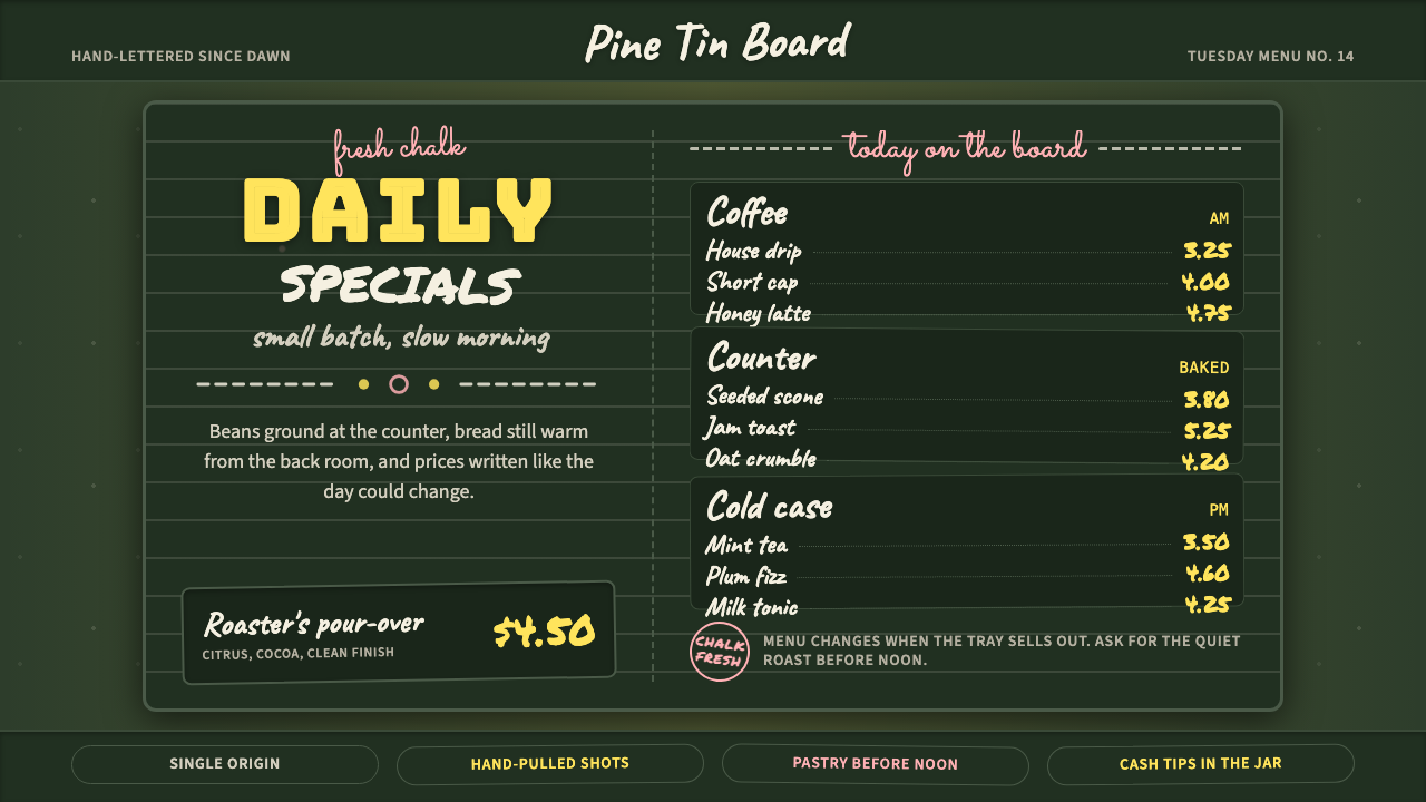 Chalkboard Cafe Menu (2010)Warm craft, handwritten. Chalk-white stacks on green slate with yellow prices…温暖手作感:深绿板面上粉白堆叠,黄价与粉色花饰点亮。
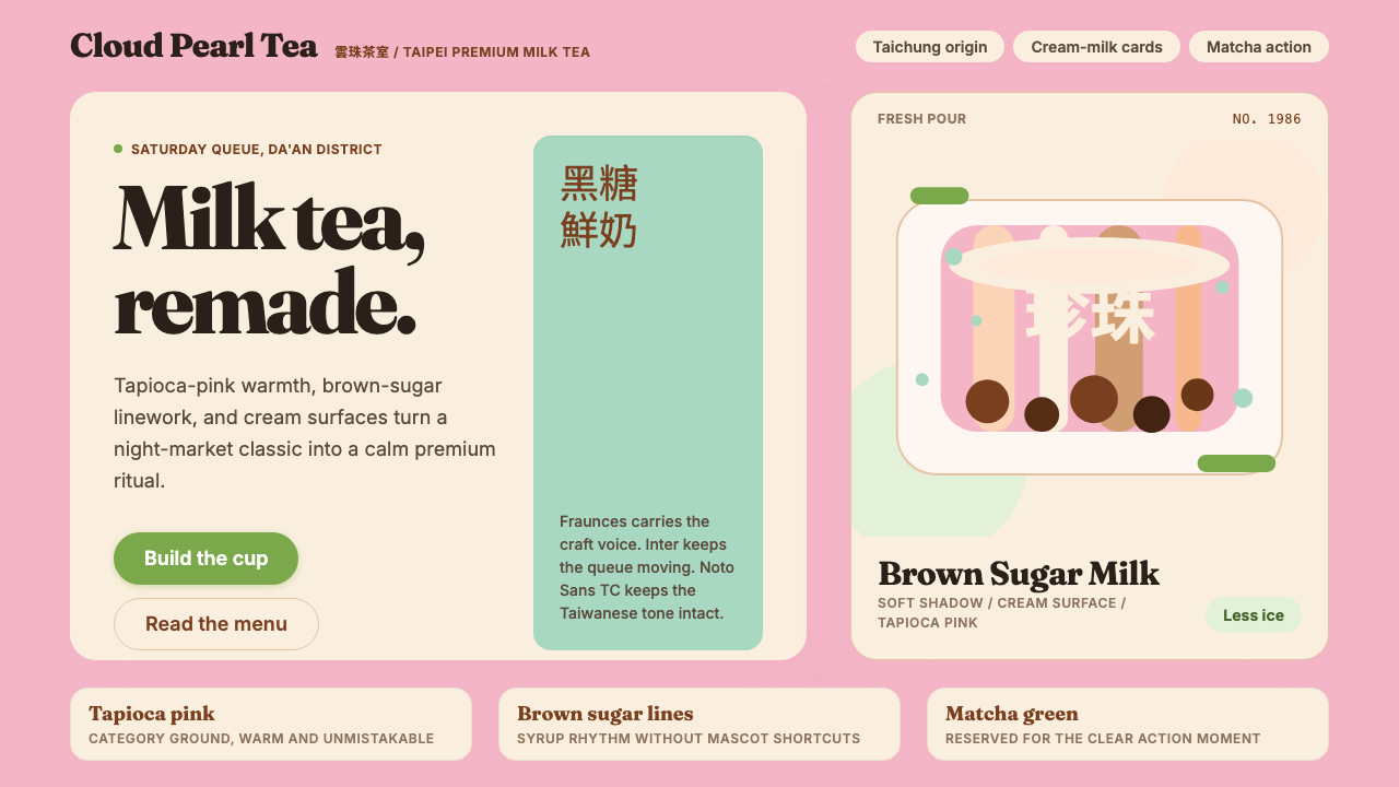 Taiwan Bubble Tea PremiumWarm craft, not kawaii. Tapioca pink, Fraunces serif, cream cards, matcha act…溫暖精品,不走可愛風:珍珠粉、Fraunces 襯線、奶白卡與抹茶綠。
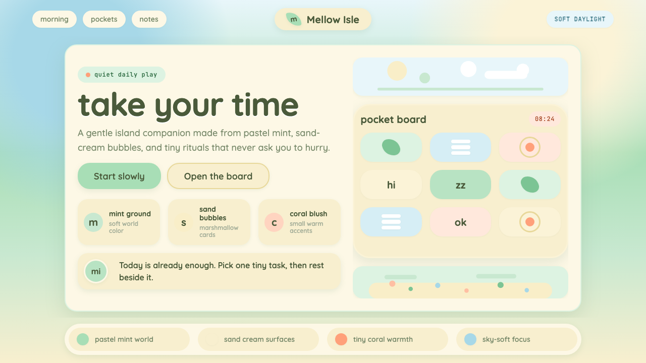 Animal Crossing — New HorizonsNo pressure, only daylight. Mint fields and sand bubbles soften every edge.没有压力,只有日光。薄荷地与沙奶油气泡软化所有边角。
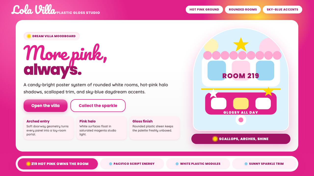 Barbie DreamhousePink is the whole world. Hot magenta ground, Pacifico script, scallops and gl…粉色就是全世界:洋红底、Pacifico手写、扇贝边与亮面拱门。
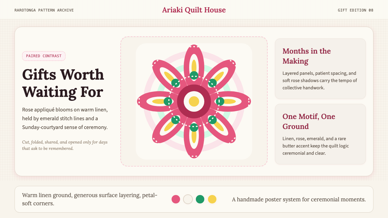 Cook Islands TivaivaiPatient generosity. Rose appliqué geometry blooms on linen with emerald stitc…耐心而慷慨:玫瑰粉贴布几何在亚麻底上绽放,翡翠线勾边。
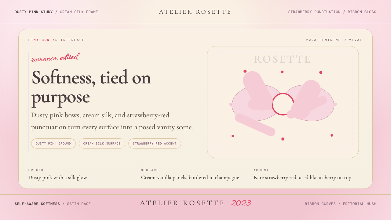 Coquette Aesthetic Pink Bow (2023)Softness is deliberate. Dusty pink, cream silk, and strawberry red frame ever…柔软是刻意的。尘粉、奶油丝绸与草莓红框住每个蝴蝶结。