What is Barbie Dreamhouse?什么是 Barbie Dreamhouse?
Barbie Dreamhouse turns pink into a complete worldview — glossy arches, scalloped edges, and script lettering declare that more is always more.芭比梦幻屋把粉色变成一整套世界观——亮面拱门、扇贝花边与手写体宣告:多,永远是更好的选择。
Barbie Dreamhouse in briefBarbie Dreamhouse 速览
Barbie Dreamhouse is a design system rooted in aspirational femininity, built around an all-encompassing hot pink ground, rounded forms, glossy surfaces, and a playful combination of script and rounded sans-serif lettering. Every element in the system — from doorway silhouettes to shadow treatment to typographic pairing — reinforces a single emotional register: confident, joyful, and unapologetically maximalist.芭比梦幻屋是一套根植于向往性女性气质的设计体系,以无处不在的炽热粉色底面、圆润的形态、光泽的表面,以及手写体与圆润无衬线字体的俏皮组合为核心。体系中的每一个元素——从门洞轮廓到投影处理到字体配对——都在强化同一种情感基调:自信、欢愉,且毫无歉意地走向极致。
Unlike design movements grounded in restraint, Barbie Dreamhouse embraces saturation and repetition as virtues. The signature color is not used as an accent or a highlight but as the atmosphere itself. Walls, floors, furnishings, vehicles, and backgrounds share the same warm, luminous pink field, creating a unified visual world where the environment and the objects within it feel inseparable. This total-immersion strategy is the system's defining characteristic and its primary emotional tool.与以克制为根基的设计运动不同,芭比梦幻屋将饱和与重复视为美德。那个标志性的色彩并非用作点缀或强调,而是作为氛围本身存在。墙壁、地板、家具、车辆与背景共享同一片温暖、发光的粉色场域,构建出一个统一的视觉世界,让环境与其中的物件浑然一体、难以分割。这种全沉浸式策略是整套体系最鲜明的特征,也是它最主要的情感工具。
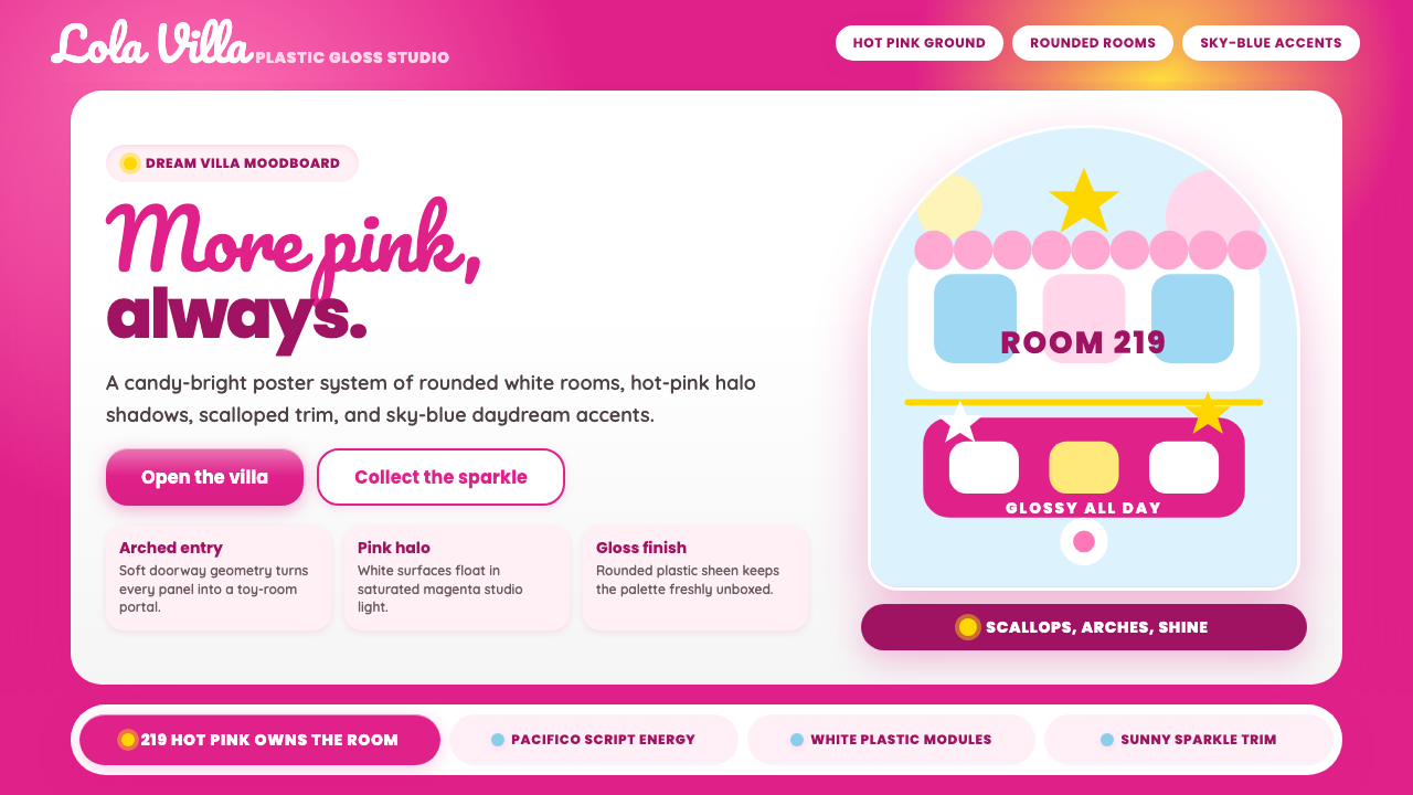
The system's vocabulary is deliberately soft: arched doorways instead of rectangular frames, scalloped hems instead of straight edges, bubble letterforms instead of angular type, gentle gloss instead of matte flatness. Depth is suggested through soft, diffuse highlights and warm-toned shadows that read as glamorous rather than structural. The overall effect is one of theatrical warmth — a stage set for fantasy that invites participation rather than observation.体系的视觉词汇刻意保持柔和:拱形门洞取代矩形框架,扇贝花边取代直线边缘,气泡字形取代棱角字体,轻盈的光泽取代哑光的平整。深度通过柔和、漫射的高光与暖调阴影来暗示,这些阴影读起来更像魅力装饰而非结构元素。整体效果如同一处充满戏剧性温度的舞台——一个为幻想而搭建的场景,邀请人们参与其中,而非仅仅旁观。
See the Barbie Dreamhouse design system查看 Barbie Dreamhouse 完整设计系统
Where does Barbie Dreamhouse come from?Barbie Dreamhouse 从何而来?
The Barbie doll was created by Ruth Handler and launched by Mattel at the American International Toy Fair in March 1959. Handler was inspired by watching her daughter Barbara imagine adult scenarios for paper dolls, and she conceived of a three-dimensional adult fashion doll that could embody aspiration and possibility rather than domesticity. The doll's full name — Barbara Millicent Roberts — was rarely used; she was simply Barbie, and from the beginning her visual identity was anchored in a particular shade of warm, saturated pink that Mattel would eventually formalize in partnership with Pantone.芭比娃娃由露丝·汉德勒创造,于1959年3月在美国国际玩具展上由美泰公司正式推出。汉德勒受到女儿芭芭拉为纸娃娃想象成人场景的启发,构想了一款三维成人时装娃娃,以具象化向往与可能性,而非束缚于家务场景。这个娃娃的全名——芭芭拉·米利森特·罗伯茨——几乎从未被使用;她只是芭比,而从一开始,她的视觉身份便锚定于一种特定的温暖、饱和的粉色——美泰最终与潘通合作将其正式化为品牌色。
The first Barbie Dreamhouse arrived in 1962, just three years after the doll's debut, and established the architectural vocabulary that would define the franchise for decades. The dollhouse format gave Mattel's designers a literal stage on which to develop a complete interior world: arched openings, pastel furnishings, and an abundance of pink as both structure and decoration. Over the following decades the Dreamhouse was reimagined repeatedly — gaining swimming pools, elevator shafts, spiral staircases, and increasingly elaborate facades — but the core visual grammar remained stable: everything curved, everything pink, everything glamorous.第一款芭比梦幻屋于1962年面世,距娃娃首次登场仅三年,并确立了此后数十年定义整个品牌的建筑视觉语言。娃娃屋的形式为美泰的设计师提供了一个真实的舞台,让他们得以发展出一个完整的室内世界:拱形开口、粉彩家具,以及大量粉色既作结构又作装饰的运用。在此后数十年间,梦幻屋被反复重新诠释——增添了游泳池、电梯井、螺旋楼梯,以及越来越繁复的外立面——但核心视觉语法始终稳定:一切皆弧线,一切皆粉色,一切皆魅力。
The Barbiecore cultural moment of 2022 and 2023 marked the style's most significant expansion beyond the toy aisle. Sparked initially by fashion circles rediscovering and celebrating hyper-feminine aesthetics, Barbiecore was then crystallized into a fully realized design language by director Greta Gerwig's 2023 live-action film. Production designer Sarah Greenwood and set decorator Katie Spencer constructed a physical Barbieland in which the architecture, props, and landscape were all rendered in the system's signature vocabulary — arched facades, scalloped trim, and an overwhelming chromatic saturation — establishing a definitive visual reference that has since influenced fashion, interiors, digital design, and marketing worldwide.2022至2023年的「Barbiecore」文化时刻,标志着这种风格超越玩具货架、迈向更广阔影响力的最重要一次扩张。起初由时尚圈重新发现并赞颂超级女性化美学而点燃,Barbiecore随后因导演格蕾塔·葛韦格2023年的真人电影而被凝结成一套完整实现的设计语言。制作设计师莎拉·格林伍德与布景装饰师凯蒂·斯宾塞在片场搭建了一个真实存在的「芭比乐园」,其中建筑、道具与景观全部以这套体系的标志性词汇呈现——拱形外立面、扇贝装饰与压倒性的色彩饱和度——树立了一个权威的视觉参照,此后广泛影响了全球的时尚、室内、数字设计与营销领域。
The cultural resonance of Barbie Dreamhouse draws on several decades of contested meaning around pink as a gendered color. Pink's association with femininity in Western consumer culture is largely a twentieth-century construction — in earlier centuries, pink was considered a warm, energetic color more appropriate for boys, while blue was seen as delicate and suitable for girls. The reversal hardened during the mid-twentieth century, coinciding almost exactly with Barbie's launch. The Dreamhouse aesthetic participates in and ultimately reclaims this history, deploying pink not as a passive or diminutive signal but as a loud, assertive, world-filling declaration. Feminist reclamation of the style — the recognition that embracing pink maximalism can be a form of defiance rather than conformity — is central to why Barbiecore resonated so strongly with adult audiences.芭比梦幻屋的文化共鸣,植根于数十年来粉色作为性别化色彩所承载的复杂意涵。粉色与女性气质的关联在西方消费文化中,很大程度上是二十世纪的建构——在更早的世纪里,粉色曾被视为温暖、充满活力、更适合男孩的颜色,而蓝色则被认为纤柔、适合女孩。这一颠倒在二十世纪中叶前后固化成型,时间上几乎与芭比的诞生完全重合。梦幻屋美学参与并最终重新认领了这段历史,将粉色不作为被动或缩减性的信号,而是作为嘹亮、自信、填满整个世界的宣言来部署。对这种风格的女性主义重新认领——认识到拥抱粉色极致主义可以是一种反叛而非顺从——正是Barbiecore在成年观众中强烈共鸣的核心所在。
What defines the Barbie Dreamhouse look?Barbie Dreamhouse 的视觉特征是什么?
Color Field色彩场域
The dominant tone is a warm, intense hot pink — not a pastel blush, not a dusty rose, but a fully saturated, almost luminous magenta-pink that reads as both cheerful and authoritative. This color functions as the ground for nearly everything else: it appears in backgrounds, shadows, architectural elements, and surface textures simultaneously, creating a monochromatic envelope rather than a color accent. Secondary tones — soft lilac, warm cream, bright white, occasional coral — appear as relief against the primary field without ever challenging its dominance.主导色调是一种温暖、强烈的炽热粉色——不是浅粉,不是雾玫瑰,而是完全饱和、几近发光的洋红粉,读来既欢愉又带着一种权威感。这种颜色作为几乎一切元素的底色而存在:同时出现在背景、阴影、建筑元素与表面质感中,形成一种单色包裹,而非色彩点缀。次要色调——柔和薰衣草、暖奶油、亮白、偶尔出现的珊瑚色——作为对主色场的喘息而出现,却从不挑战其统治地位。
Form and Silhouette形态与轮廓
Every structural element favors curvature over angularity. Doorways are arched, windows are rounded, furniture legs curve outward, and rooflines describe gentle arcs. Scalloped edges — the repeating half-circle pattern derived from decorative trim — appear consistently on awnings, skirt hems, table edges, and architectural borders. The absence of hard right angles is not incidental: it is the system's primary way of signaling comfort, approachability, and femininity as traditionally coded softness.所有结构性元素都偏好弧线而非棱角。门洞是拱形的,窗户是圆润的,家具腿向外弯曲,屋顶线条描绘出柔和的弧度。扇贝花边——由装饰裙边衍生出的重复半圆图案——持续出现在遮阳篷、裙摆边缘、桌子边沿和建筑边框上。硬直角的缺失并非偶然:这正是整套体系传递舒适感、亲近感,以及传统编码意义上的柔软女性气质的主要手段。
Surface and Gloss表面与光泽
Surfaces are rendered with a high-gloss finish that recalls lacquered plastic, patent leather, and polished resin. Highlights are soft and diffuse rather than sharp and specular, suggesting a warm, ambient glow rather than a point-source reflection. This glossiness is crucial to the system's emotional meaning: it reads as aspirational luxury, the visual equivalent of something beautiful and untouchable. Matte or textured surfaces rarely appear; when they do, they function as contrast elements rather than as the dominant surface quality.表面以高光泽处理呈现,令人联想到亮漆塑料、漆皮皮革与抛光树脂。高光是柔和、漫射的而非尖锐、镜面式的,暗示出一种温暖的环境光晕,而非点光源的反射。这种光泽感对体系的情感意义至关重要:它传达出向往性的奢华感——那是美丽而不可触碰之物的视觉等价物。哑光或有纹理的表面极少出现;一旦出现,也只作为对比元素而非主导表面质感。
Typography字体排印
The typographic system pairs a flowing, informal script face — recalling the cursive signature of the Barbie logo itself — with a rounded, friendly sans-serif for display and body use. Script letterforms carry the system's sense of personal warmth and signature authority; they appear in titles, taglines, and moments of emotional emphasis. The rounded sans-serif provides legibility and structure without introducing the geometric austerity of classical grotesque faces. Together, the pairing produces a register that feels both polished and handmade, aspirational and intimate.字体系统将一种流畅、非正式的手写体——令人联想到芭比 logo 本身的草书签名——与圆润、友好的无衬线体配对,用于展示与正文。手写字形承载着体系所特有的个人温度与签名权威感,出现在标题、标语及情感强调的时刻。圆润无衬线体提供可读性与结构感,同时不引入古典grotesque字体的几何严肃性。两者搭配,产生出一种既精致又手工、既向往又亲密的双重基调。
Shadow and Dimension投影与立体感
Depth is achieved through warm-toned, soft shadows that suggest gentle three-dimensionality without breaking the system's fantasy logic. Shadows are typically pink-adjacent — slightly deeper or more saturated versions of the background tone rather than neutral grays or cool blacks — which maintains the monochromatic envelope even in darker areas. This approach differs fundamentally from either the flat, shadow-free surfaces of contemporary digital minimalism or the hard, offset shadows of graphic design traditions: the shadows here are atmospheric, meant to feel like stage lighting rather than simulated physics.立体感通过暖调、柔和的投影来实现,暗示出温柔的三维感而不破坏体系的幻想逻辑。阴影通常是与粉色相邻的——背景色调的稍深或稍浓版本,而非中性灰或冷黑——即便在较暗区域也维持着单色包裹感。这种处理方式从根本上有别于当代数字极简主义的无阴影平面,也有别于平面设计传统中硬边偏移的投影:这里的阴影是大气性的,更像舞台灯光而非模拟的物理规律。
Ornament and Decoration装饰与纹样
Unlike design systems that treat ornament as waste, Barbie Dreamhouse treats decoration as structural. Scallops, bows, floral motifs, star accents, and repeating geometric borders are not applied to an otherwise complete design but are woven into the system's fundamental grammar. The guiding principle is not 'does this element earn its place' but rather 'does this element add to the sense of joyful abundance.' More is understood as more, and the restraint exercised is one of color temperature and tonal range rather than decorative quantity.与那些将装饰视为浪费的设计体系不同,芭比梦幻屋将装饰视为结构本身。扇贝、蝴蝶结、花卉母题、星形点缀与重复几何边框,并非叠加在一个本已完整的设计之上,而是被织入体系最基本的语法之中。指导原则不是「这个元素是否值得占据一席之地」,而是「这个元素是否增添了欢乐丰盛感」。多,被理解为更好;所施加的克制,是色温与色调范围的克制,而非装饰数量的克制。
Spatial Logic空间逻辑
The Barbie Dreamhouse spatial vocabulary is theatrical rather than architectural. Spaces are organized around display and visibility — rooms are often open-fronted, furniture is arranged facing outward, and sightlines are carefully managed to maximize the sense of abundance within the frame. In two-dimensional applications, this translates to centered, symmetrical compositions where objects are displayed rather than arranged, and generous scaling ensures that key elements — the logo, the product, the headline — feel larger than life. The stage-set logic prioritizes emotional impact over spatial efficiency.芭比梦幻屋的空间词汇是戏剧性的而非建筑性的。空间围绕展示与可见性来组织——房间通常是开放正面的,家具朝向外侧排列,视线被精心管理以在画框内最大化丰盛感。在二维应用中,这转化为以展示而非编排为导向的居中对称构图,慷慨的尺度确保关键元素——logo、产品、标题——感觉大过现实。舞台布景式的逻辑将情感冲击力置于空间效率之上。
See the Barbie Dreamhouse design system查看 Barbie Dreamhouse 完整设计系统
Who shaped Barbie Dreamhouse?谁塑造了 Barbie Dreamhouse?
Ruth Handler co-founded Mattel with her husband Elliot in 1945 and created the Barbie doll in 1959, naming it after her daughter Barbara. Handler's core insight — that girls wanted to imagine themselves as adults rather than play at being mothers — produced a doll whose entire design ecosystem was organized around aspiration, fashion, and self-projection. She also created Ken in 1961, named after her son. Handler's original vision established the foundational values of the Barbie design system: femininity as empowerment, play as a rehearsal for limitless possibility, and pink as the visual language of a world entirely the doll's own.露丝·汉德勒于1945年与丈夫埃利奥特共同创立美泰公司,并于1959年创造了芭比娃娃,以女儿芭芭拉的名字命名。汉德勒的核心洞察——女孩们想要想象自己成为成人,而非扮演母亲——催生了一款设计生态系统全部围绕向往、时尚与自我投射而组织的娃娃。她也于1961年以儿子的名字创造了肯尼。汉德勒最初的愿景确立了芭比设计体系的基础价值观:女性气质即赋权,玩耍即对无限可能的预演,粉色即一个完全属于这个娃娃的世界的视觉语言。
Jill Barad joined Mattel in 1981 and rose to become its CEO in 1997, the first woman to lead a major toy company. During her tenure she was the primary architect of Barbie's global expansion, overseeing the doll's transformation into a fully realized lifestyle brand with hundreds of career iterations, globally diverse versions, and a cohesive visual identity that extended the Dreamhouse aesthetic into packaging, marketing, and retail environments. Her aggressive brand-building strategy established Barbie as a cultural institution rather than simply a toy, and the visual consistency she enforced across categories laid the groundwork for the style's later recognition as a coherent design system.吉尔·巴拉德于1981年加入美泰,并于1997年升任CEO,成为第一位执掌主要玩具公司的女性。在其任期内,她是芭比全球扩张的主要设计师,主导了芭比从玩具向完整生活方式品牌的转型——拥有数百种职业版本、全球多元形象,以及将梦幻屋美学延伸至包装、营销与零售环境的统一视觉识别。她激进的品牌建设策略将芭比确立为文化机构而非仅仅一款玩具,她在各品类中强制执行的视觉一致性,为这种风格日后被认定为一套连贯设计系统奠定了基础。
As director of the 2023 live-action Barbie film, Greta Gerwig transformed a toy franchise's visual vocabulary into a fully articulated cinematic design language. Working with production designer Sarah Greenwood, Gerwig oversaw the construction of physical sets — arched facades, scalloped trim, overscaled furniture, and saturated pink throughout — that gave the Barbie Dreamhouse aesthetic its most rigorous and widely seen realization to date. The film's visual approach was deliberately maximalist and self-aware, treating the style's excesses as expressive tools rather than limitations. The resulting images circulated globally and defined the visual benchmarks for Barbiecore as a design movement.作为2023年真人版《芭比》电影的导演,格蕾塔·葛韦格将一个玩具品牌的视觉词汇转化为一套充分阐明的电影设计语言。与制作设计师莎拉·格林伍德合作,葛韦格主导了实体布景的搭建——拱形外立面、扇贝装饰、超大比例家具,以及无处不在的饱和粉色——赋予芭比梦幻屋美学迄今最严格且最广泛呈现的实现形式。影片的视觉方式是刻意的极致主义与自我意识的:将这种风格的过度感作为表达工具而非局限来对待。由此产生的影像在全球范围内流通,并为Barbiecore作为一种设计运动确立了视觉基准。
Production designer Sarah Greenwood, working alongside set decorator Katie Spencer, was responsible for the physical realization of Barbieland in the 2023 film. Greenwood's approach involved meticulous research into the history of Mattel's Dreamhouse designs across decades, synthesizing their recurring visual motifs — the scalloped edges, the arched openings, the glossy finishes, the overscaled props — into a coherent built environment that could support both comedy and emotional weight. Her sets demonstrated that the Barbie Dreamhouse vocabulary is not merely decorative whimsy but a spatially coherent system with its own internal logic, capable of sustaining the full complexity of a designed world.制作设计师莎拉·格林伍德与布景装饰师凯蒂·斯宾塞携手合作,负责2023年电影中「芭比乐园」的实体呈现。格林伍德的方法涉及对美泰数十年来梦幻屋设计历史的细致研究,将其反复出现的视觉母题——扇贝花边、拱形开口、光泽饰面、超大比例道具——综合为一个连贯的建成环境,既能承载喜剧效果,又能承托情感分量。她搭建的布景证明:芭比梦幻屋的视觉词汇并非单纯的装饰奇想,而是一套具有内在逻辑的空间连贯体系,足以支撑一个被设计出的世界的全部复杂性。
How do you use Barbie Dreamhouse today?今天怎么用 Barbie Dreamhouse?
Barbie Dreamhouse is among the most emotionally immediate styles available for presentation and marketing work, precisely because its associations are so deeply embedded in popular culture. Applying it correctly requires understanding its emotional logic — the system is built around abundance, confidence, and theatrical warmth — rather than simply applying pink to an existing layout. The question to ask before deploying the style is whether the product or message genuinely benefits from that emotional register, and whether the audience will read the reference as intentional celebration rather than unironic kitsch.芭比梦幻屋是演示与营销工作中情感即时性最强的可用风格之一,恰恰是因为它的联想在流行文化中嵌入得如此之深。正确应用它,需要理解其情感逻辑——这套体系围绕丰盛、自信与戏剧性温度而构建——而不仅仅是在现有版面上涂上粉色。在部署这种风格之前,需要问的问题是:产品或信息是否真正受益于这种情感基调,以及受众是否会将这个引用解读为有意的庆颂,而非未经反思的媚俗。
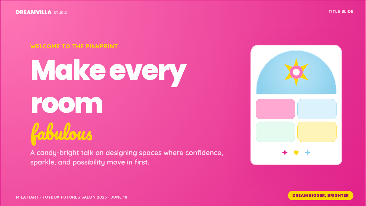
For presentation slides, the style works most powerfully on cover slides and section dividers, where its theatrical boldness can operate at full scale. A Barbie Dreamhouse cover slide centers the title in a rounded, script-accented typeface against a saturated pink ground, with scalloped or arched framing elements that echo the dollhouse architecture. Content slides require more restraint: a warm cream or very light pink ground with the primary hot pink reserved for headings, callout boxes, and visual accents keeps the system readable across a full deck. Data slides benefit from the style's cheerful palette — bar charts in tonal variations of the primary pink, with white labels — which makes quantitative information feel approachable rather than clinical.在演示文稿中,这种风格在封面幻灯片与章节分隔页上发挥最大力量——在那里,它的戏剧性大胆感可以全规模运作。一张芭比梦幻屋风格的封面,将标题以圆润、手写点缀的字体居中置于饱和粉色底面上,配以呼应娃娃屋建筑的扇贝或拱形框架元素。内容页需要更多克制:以温暖奶油色或极浅粉色为底面,将炽热粉色保留给标题、引用框与视觉强调,可使整套文稿在全程保持可读性。数据页受益于这种风格欢愉的调色板——柱状图使用主粉色的色调变化,配以白色标签——使定量信息感觉亲近而非临床。
For web interfaces, Barbie Dreamhouse is well-suited to landing pages, marketing homepages, consumer-facing product pages, and event microsites where emotional impact and brand distinctiveness are the primary goals. The approach: use the saturated pink as a full-bleed background for hero sections, pair it with white or cream for text-heavy areas, and deploy the script typeface for headlines while reserving the rounded sans-serif for body copy and navigation. Buttons should feel rounded and tactile — slightly elevated, soft-shadowed, with color fills that suggest the lacquered plastic of the original toy. Dashboard or data-heavy interfaces are rarely suited to the style; its maximalism competes with information density rather than supporting it.在网页界面中,芭比梦幻屋最适合落地页、营销主页、面向消费者的产品页与活动专题页——在这些场景中,情感冲击力与品牌辨识度是首要目标。方法:在英雄区块使用饱和粉色作满版背景,在文字密集区域配以白色或奶油色,以手写字体处理大标题,以圆润无衬线体处理正文与导航。按钮应当感觉圆润而有触感——稍微凸起、带有柔和阴影、色填暗示原始玩具的亮漆塑料质感。仪表板或数据密集型界面极少适合这种风格;其极致主义与信息密度相互竞争,而非相互支持。
For editorial and marketing work, the style excels in contexts where the brand message is explicitly playful, celebratory, or reclaiming a traditionally feminine aesthetic. Campaign posters and social graphics benefit from the system's full visual force: centered composition, overscaled lettering, layered decorative elements, and that defining hot pink at maximum saturation. Print materials — packaging, invitations, promotional items — translate the system's gloss through paper stock and finish choices: coated stocks with soft-touch or gloss laminate, foil accents in warm metallic tones, and die-cut edges that echo the scalloped and arched silhouettes of the Dreamhouse itself.在编辑与营销工作中,这种风格在品牌信息明确为俏皮、庆颂,或重新认领传统女性美学的场景中表现卓越。活动海报与社交图形从体系的全部视觉力量中受益:居中构图、超大比例字体、分层装饰元素,以及处于最大饱和度的炽热粉色。印刷物料——包装、请柬、推广品——通过纸张与表面处理选择来转译体系的光泽感:带软触感或光泽覆膜的涂布纸张、暖金属色调的烫金点缀,以及呼应梦幻屋扇贝与拱形轮廓的异形模切边缘。
A common mistake when applying Barbie Dreamhouse is confusing saturation with maximalism. Adding more decorative elements without coordinating them to the system's specific curvature-and-gloss logic produces visual noise rather than joyful abundance. The style's maximalism is disciplined: every element curves, every surface gleams, and the color envelope stays tight within the warm-pink-to-white range. Introducing cool tones, hard-edged geometric shapes, or high-contrast dark backgrounds immediately breaks the fantasy register. Similarly, pairing the style with serious or austere messaging creates a tonal mismatch that reads as either ironic or confused — the system works with confidence only when the communication it carries is as unambiguous in its warmth as the design itself.应用芭比梦幻屋时,一个常见错误是将饱和度与极致主义混为一谈。在没有与体系特定的弧度-光泽逻辑相协调的情况下叠加更多装饰元素,产生的是视觉噪音而非欢愉的丰盛感。这种风格的极致主义是有纪律的:每个元素都弯曲,每个表面都发光,色彩包络在暖粉色到白色的范围内保持紧凑。引入冷色调、硬边几何形,或高对比度深色背景,会立即打破幻想基调。同样,将这种风格与严肃或朴素的信息配对,会造成基调错位——读来要么是反讽,要么是混乱。这套体系只有在它所承载的传播内容在温度上与设计本身同样毫不含糊时,才能自信地运作。
See the Barbie Dreamhouse design system查看 Barbie Dreamhouse 完整设计系统
Barbie Dreamhouse — FAQBarbie Dreamhouse · 常见问题
Is Barbie Dreamhouse the same as Barbiecore?芭比梦幻屋和Barbiecore是同一回事吗?
Barbiecore is the broader cultural and fashion trend that peaked in 2022 and 2023, characterized by the enthusiastic adoption of pink maximalism across clothing, interiors, and popular culture. Barbie Dreamhouse is more specific: it refers to the particular design vocabulary developed across decades of Mattel's Dreamhouse products and crystallized in the 2023 film — arched architecture, scalloped edges, glossy surfaces, script-and-rounded-sans typography, and the signature hot pink as an all-encompassing field. Barbiecore is the cultural moment; Barbie Dreamhouse is the specific visual system that most fully expressed it.Barbiecore是2022至2023年达到高峰的更广泛文化与时尚潮流,以在服装、室内与流行文化中热情采用粉色极致主义为特征。芭比梦幻屋则更为具体:它指的是在美泰梦幻屋产品数十年演变中发展出来、并在2023年电影中凝结成形的特定设计词汇——拱形建筑、扇贝花边、光泽表面、手写体与圆润无衬线的字体配对,以及炽热粉色作为全覆盖场域的标志性运用。Barbiecore是文化时刻;芭比梦幻屋是最充分表达它的具体视觉体系。
Can the style work without the signature pink?去掉标志性粉色,这种风格还能成立吗?
The style can be partially translated to other warm, saturated color families — a coral-and-cream version, or a lilac-dominant variant — and retain much of its emotional character, because the structural vocabulary of arches, scallops, gloss, and rounded type carries substantial meaning on its own. However, removing the specific hot pink while keeping everything else produces a result that reads as Dreamhouse-adjacent rather than Barbie Dreamhouse proper. The color is not merely an attribute of the system — it is its primary identity signal, the first thing audiences recognize, and the element most directly tied to its cultural meaning. Translations that preserve the warmth and saturation direction while shifting hue can work in specific contexts, but they should be understood as variations on the theme rather than full expressions of the system.这种风格可以部分移植到其他暖调、饱和的色彩家族——珊瑚色与奶油的版本,或以薰衣草为主导的变体——并保留大部分情感特质,因为拱形、扇贝、光泽与圆润字体的结构词汇本身就承载着相当丰富的意涵。然而,在保留其他一切的前提下移除那特定的炽热粉色,产生的结果读来是「梦幻屋周边」而非真正的芭比梦幻屋。颜色不仅仅是体系的一个属性——它是体系的首要身份信号,是受众最先识别的元素,也是与其文化意涵最直接关联的部分。保留温度与饱和方向同时平移色相的演绎在特定场景下可以奏效,但应被理解为主题变奏,而非体系的完整表达。
How is Barbie Dreamhouse different from other feminine or pastel design styles?芭比梦幻屋与其他女性化或粉彩设计风格有何不同?
Pastel design styles — think of the soft, desaturated pinks of contemporary wellness or beauty branding — typically use reduced saturation and quiet tonal ranges to convey gentleness, calm, and approachability. Barbie Dreamhouse does the opposite: it uses maximum saturation, high contrast between hot pink and white, layered decoration, and theatrical scale to convey confidence, exuberance, and aspiration. Where pastel aesthetics whisper, Barbie Dreamhouse shouts. The system is also more architecturally specific than generic feminine palettes — its scalloped edges, arched forms, and glossy surfaces are not interchangeable with other pink-adjacent styles but constitute a coherent spatial and material vocabulary with a particular cultural lineage.粉彩设计风格——想想当代健康或美妆品牌那些柔和、去饱和的粉色——通常用降低的饱和度与安静的色调范围来传达温柔、平静与亲近感。芭比梦幻屋则恰恰相反:以最大饱和度、炽热粉色与白色之间的高对比、分层装饰以及戏剧性的体量来传达自信、热情与向往。粉彩美学在低语,芭比梦幻屋在呐喊。这套体系在建筑意义上也比泛化的女性化调色板更为具体——它的扇贝花边、拱形形态与光泽表面,并非与其他粉色相邻风格可互换的元素,而是构成了一套具有特定文化传承的连贯空间与物质词汇。
Does the style suit serious or professional contexts?这种风格适合严肃或专业的场景吗?
Rarely in a direct application, but productively when the professional context is itself questioning or subverting expectations around seriousness. The Barbie Dreamhouse aesthetic has been used effectively in feminist discourse, in marketing for products that deliberately challenge conventions of what professionalism looks like, and in entertainment and events contexts where boldness and memorability are valued over authority. Applying it to genuinely serious contexts — financial services, healthcare, legal, enterprise software — typically produces tonal mismatch because the system's values are celebratory rather than authoritative. However, borrowing individual elements — the rounded typeface, a restrained use of warm pink as an accent — from the system without adopting its full maximalism can introduce warmth into professional contexts without the tonal collision.在直接应用中很少适合;但当专业场景本身在质疑或颠覆关于严肃性的预期时,则可能产生富有成效的结果。芭比梦幻屋美学已在女性主义话语中、在刻意挑战专业性外观惯例的产品营销中,以及在大胆与令人难忘优先于权威感的娱乐与活动场景中得到有效运用。将其应用于真正严肃的场景——金融服务、医疗、法律、企业软件——通常会产生基调错位,因为这套体系的价值观是庆颂式的而非权威式的。然而,从体系中借用单个元素——圆润字体、暖粉色作为点缀的克制运用——而不采用其完整的极致主义,可以在不造成基调冲突的前提下,为专业场景注入温度。
What is the most common error when designers first apply this style?设计师初次应用这种风格时最常见的错误是什么?
The most common error is treating Barbie Dreamhouse as a color palette rather than a spatial and material system. Designers who apply only the pink — without adopting the rounded forms, the scalloped detailing, the glossy surface logic, and the script-plus-rounded-sans typographic pairing — produce work that looks pink without feeling like the Dreamhouse. The color alone does not carry the meaning; it is the complete combination of chromatic saturation, curvature, surface quality, and typographic warmth that produces the system's distinctive emotional effect. A second common error is undercommitting: the style does not work at half intensity. Muted pinks, minimal decoration, and restrained composition all pull against the system's fundamental logic. Barbie Dreamhouse requires full confidence in its own excess.最常见的错误是将芭比梦幻屋当作一套调色板而非一套空间与物质体系来对待。只应用粉色——而不采用圆润形态、扇贝细节、光泽表面逻辑以及手写体加圆润无衬线的字体配对——的设计师,产出的作品看起来是粉色的,却不像梦幻屋。颜色单独不承载全部意涵;正是色彩饱和度、弧度、表面质感与字体温度的完整组合,产生了这套体系独特的情感效果。第二个常见错误是力度不足:这种风格在半力度下是不奏效的。柔和的粉色、极少的装饰、克制的构图,都与体系的基本逻辑相悖。芭比梦幻屋需要对自身过度感的充分自信。
Related design styles相关设计风格
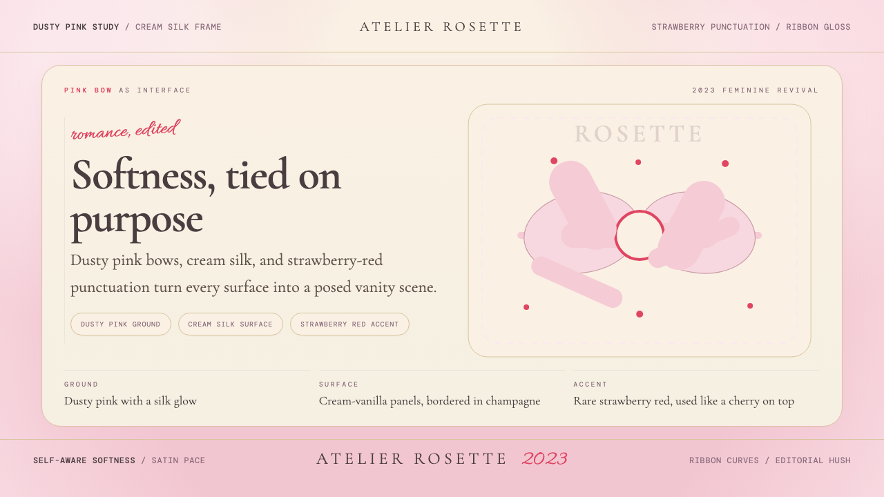 Coquette Aesthetic Pink Bow (2023)Softness is deliberate. Dusty pink, cream silk, and strawberry red frame ever…柔软是刻意的。尘粉、奶油丝绸与草莓红框住每个蝴蝶结。
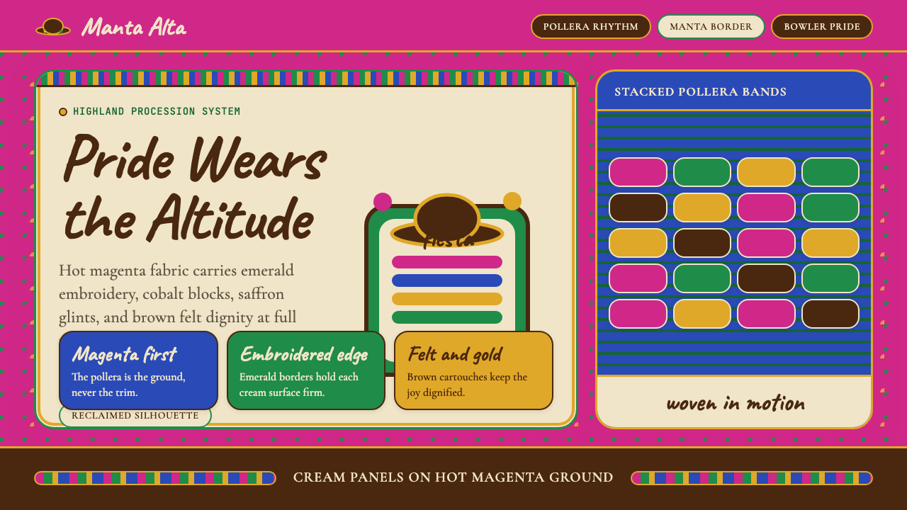 Bolivian Cholita (Bowler-Hat Fiesta)Loud pride, fully reclaimed. Magenta pollera bands, emerald borders, bowler c…骄傲高声回归:洋红波莱拉条带、翡翠边框与礼帽牌匾。
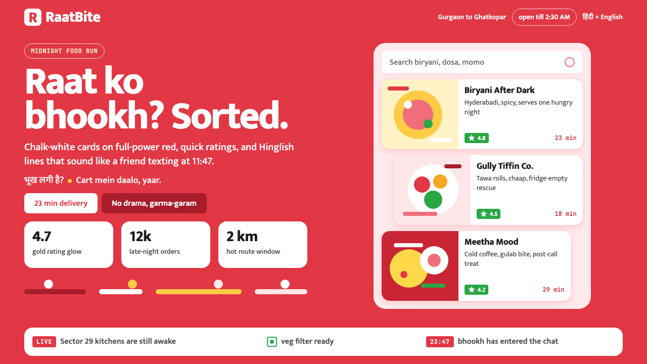 Zomato India DeliveryOwns the midnight scroll. Saturated red, Mukta Hinglish, white cards and gold…午夜外卖很会说话:饱和红、Mukta双语字和白卡金星撑起深夜滚动。
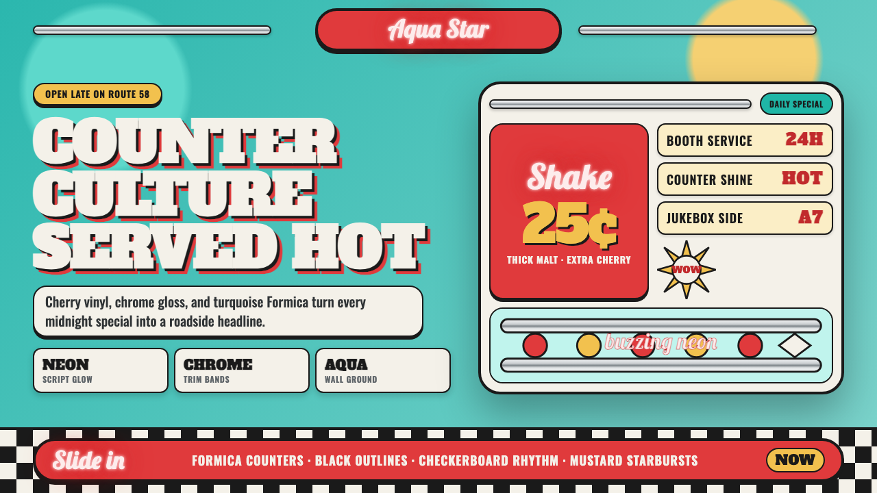 1950s Diner AquaRoadside optimism shouts. Aqua walls, cherry vinyl, chrome bands, and neon sc…公路乐观主义在叫卖:湖水蓝墙、樱桃红皮革、镀铬条与霓虹手写体发光。
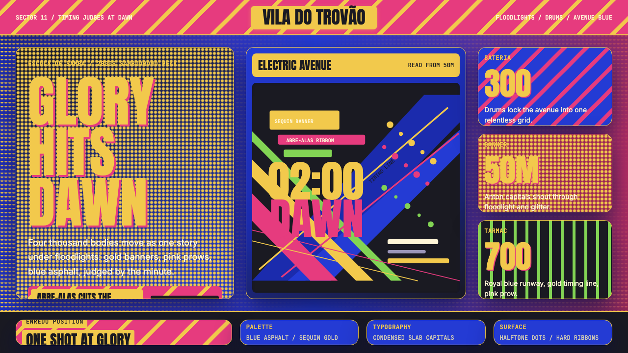 Brazilian Samba School (2000s Carnaval)Parade at floodlight volume. Royal blue asphalt, sequin gold type, pink ribbo…泛光灯音量的游行。宝蓝路面、亮片金字、玫红斜带。
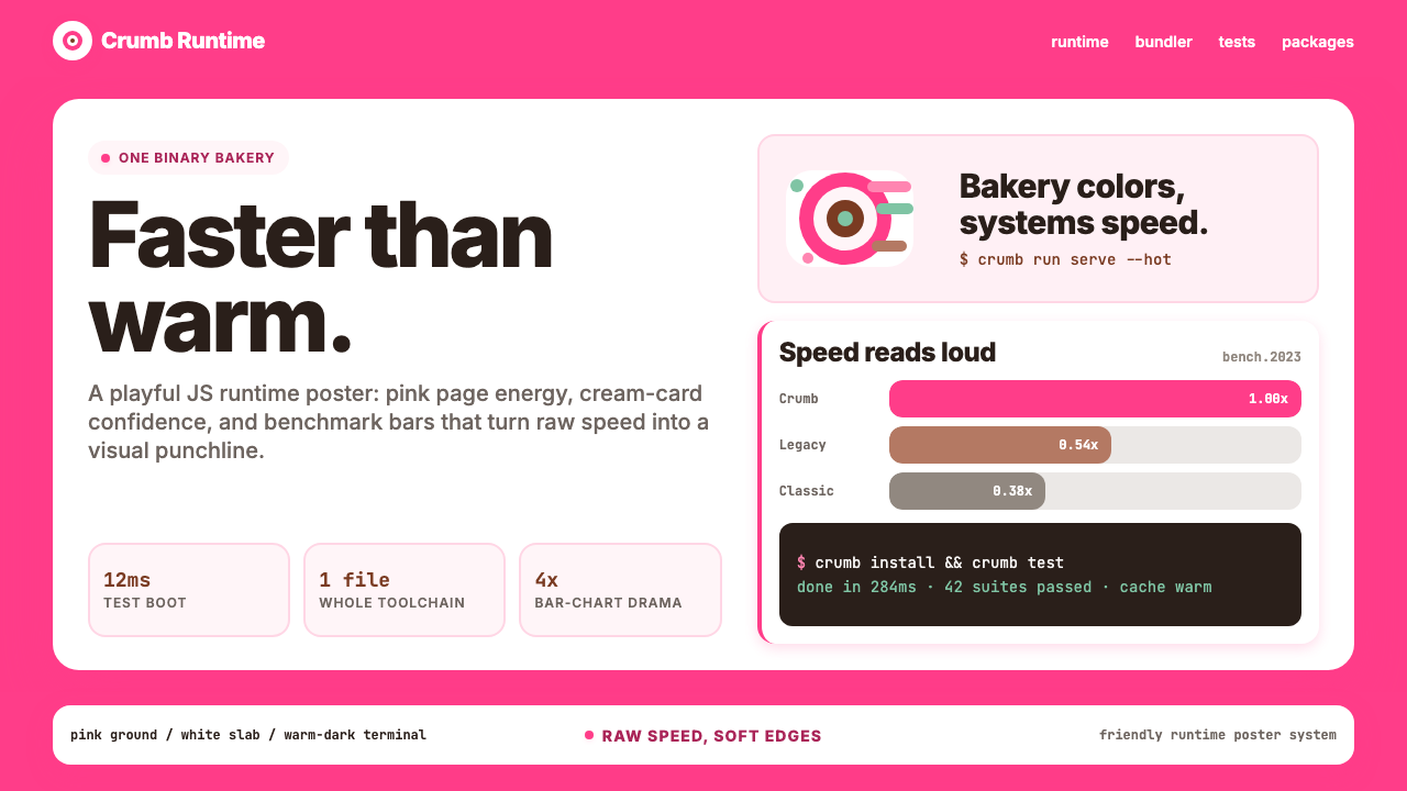 Bun JS Runtime Pink 2023Dev speed gets bakery-bright. Hot pink grounds white slabs, mono bars, and wa…开发速度像烘焙店一样明亮:热粉底、白卡片、等宽基准条与暖黑终端。