What is 1950s Diner Aqua?
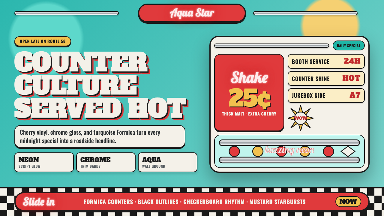
The 1950s American diner turned Formica, chrome, and vinyl into a mood — loud, optimistic, and built to be seen from a moving car.
1950s Diner Aqua in brief
1950s Diner Aqua is the visual language of the post-war American roadside restaurant: saturated turquoise walls, chrome banding that catches every passing headlight, cherry-red vinyl booths, black-and-white checkerboard floors, and neon script glowing above the door. It is one of the few historical design systems built not for a page or a screen but for a building meant to be recognized at forty miles an hour.
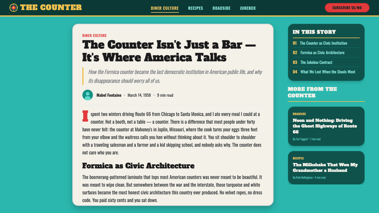
Where many mid-century styles retreat into pastel restraint, this one leans into saturation and shine. The aqua is not a pale accent color — it is the ground, the wall itself, the color the whole room is dipped in. Chrome is not trim, it is a material treated as decoration in its own right, prized precisely because it throws back light rather than absorbing it.
The system reads as commercial vernacular rather than fine-art design — nobody was writing manifestos about it — but that populist confidence is exactly its appeal. It promises abundance, speed, and good cheer without apology, and it does so through a small, disciplined set of recurring materials and gestures rather than any single trademark motif.
Where does 1950s Diner Aqua come from?
The classic American diner descends from an even older idea: the horse-drawn lunch wagon that fed factory workers on night shifts in New England mill towns during the 1870s and 1880s. By the early twentieth century, manufacturers such as the Worcester Lunch Car Company in Massachusetts were building stationary, prefabricated lunch cars — long, narrow structures modeled on railroad dining cars — and shipping them whole to towns across the Northeast. The diner's signature long-counter-and-stool layout is a direct inheritance from this railcar ancestry.
The style this system captures belongs to the second great wave of diner building, which crested after World War II. Wartime rationing had ended, car ownership was exploding, new highways were being paved across the country, and returning soldiers wanted fast, cheap, all-hours food near the road. Manufacturers like Valentine Manufacturing and Paramount Diners answered with modular, factory-built units finished in the material vocabulary of the moment: porcelain enamel panels, structural glass block, gleaming stainless steel trim, and Formica laminate counters in bright, easy-to-clean colors.
This building boom overlapped with Googie, the exuberant commercial architecture that grew up alongside Los Angeles coffee shops, motels, and gas stations in the same years. Googie borrowed forms from the Space Age and jet age — boomerang shapes, upswept rooflines, starburst signage — to sell drivers on speed and modernity from the road. Diner design absorbed this same appetite for spectacle: a building's whole job was to be a billboard for itself, visible and legible from a windshield rather than a sidewalk.
Neon signage completed the picture. Cheap, durable, and glowing in eye-catching color even in daylight, neon had become the default signage technology for roadside commerce by the 1950s, and diners used it lavishly — for the name over the door, for arrows pointing to parking, for a script word like 'OPEN' burning through the night. The result was a building type meant to be encountered after dark as much as by day, and the style has never fully let go of that after-dark glow.
What defines the 1950s Diner Aqua look?
Color
Saturated turquoise or aqua serves as the dominant ground — walls, panels, and upholstery all draw from this single deep, cool blue-green rather than treating it as a mere accent. Against it sits cherry red, used for booths and stools, and the neutral gleam of chrome, which functions almost like a third color even though it has none. Black and white appear together only in the checkerboard floor, kept separate from the wall palette so the floor reads as a distinct plane underfoot.
Chrome and Reflective Surfaces
Chrome banding trims counters, stool bases, and furniture edges, and its purpose is optical rather than merely protective: it catches and bounces ambient light and neon glow, giving every surface a highlight that shifts as a viewer moves. This is the single most identifying material cue of the style — a design that relies on brightness and reflection is instantly legible as diner, in a way that color alone cannot achieve.
Typography
Two very different lettering registers coexist. Neon script — loose, cursive, hand-drawn in feeling — carries the name of the place and any word meant to glow after dark, evoking sign-painter tradition rather than any disciplined type system. Alongside it, thick slab-serif or bold rounded display letters announce specials and prices on menus and boards, chosen for maximum legibility at a glance rather than elegance. The two registers are never blended into one typeface; the contrast between loose neon script and blunt slab display is itself part of the style's character.
Pattern
The black-and-white checkerboard floor is close to a signature: a large-scale, high-contrast grid of alternating squares that grounds the room and gives the eye a stable, almost dizzying rhythm underfoot, in deliberate contrast to the curved, upholstered forms above it. Beyond the floor, pattern stays sparse — a boomerang or amoeba silhouette might appear on a countertop or laminate surface, echoing the same atomic-age motifs found in Googie signage, but stripes, florals, or dense ornament are absent. The floor carries nearly all of the system's patterning workload.
Form and Silhouette
Furniture and fixtures favor rounded, bulbous, streamlined forms over hard corners — stool seats are circular discs on a single chrome stem, booth backs curve rather than angle, counters end in soft rounded noses instead of squared edges. This same appetite for smooth, aerodynamic-looking curves shows up in the boomerang shape used for countertops and signage silhouettes, a motif borrowed wholesale from the era's fascination with speed, flight, and the atomic age.
Light and Glow
Neon is treated as an architectural material rather than a mere sign, wrapping doorframes, window edges, and roof lines with continuous glowing tubes as often as it spells out words. This produces a light quality unlike ordinary interior lighting: colored, linear, and slightly buzzing, casting a saturated glow onto the aqua walls and chrome trim it sits beside. The style is built to look its best exactly at dusk, when neon glow and interior light both read clearly against a darkening sky.
Material Honesty of the Roadside
Every surface in the system is chosen for durability and easy cleaning as much as looks: porcelain enamel, laminate, vinyl, and chrome-plated steel were all industrial materials suited to a restaurant that ran around the clock and needed to be wiped down between rushes. The style's shine is therefore not purely decorative vanity — it is what a hard-wearing, hygienic, mass-manufactured material looks like when it is new and well kept, and the aesthetic still communicates that same sense of a clean, well-run counter even decades later.
Who shaped 1950s Diner Aqua?
Based in Worcester, Massachusetts, this manufacturer was among the most prolific builders of prefabricated diner cars from the 1900s through the 1950s, shipping finished units by rail and truck to towns across New England and beyond. Its production methods — building a complete, furnished dining car in a factory and delivering it whole — established the template that later manufacturers refined into the fully modular, brightly finished postwar diner.
Valentine specialized in small, inexpensive, prefabricated diners built in Wichita, Kansas, and shipped nationwide, aimed at entrepreneurs who could not afford a full-size custom-built car. Its compact units still carried the full material vocabulary of the style — porcelain enamel panels, chrome trim, small counters — proving the aesthetic scaled down as readily as it scaled up, and helping spread diner culture into small towns far from the original Northeastern diner belt.
Another major postwar manufacturer, Paramount built diners known for their generous use of glass block, extended glazed facades, and bold exterior signage, pushing the roadside-visibility logic of the style to an extreme. Paramount's units are often cited by preservationists as some of the most architecturally striking survivors of the classic diner boom, their glass-and-chrome facades still legible as a distinct building type decades after most were built.
How do you use 1950s Diner Aqua today?
Applying 1950s Diner Aqua well means treating it as an environment built for constant visibility rather than a quiet interior, so the transfer works best wherever a design can afford to be loud, warm, and a little theatrical.
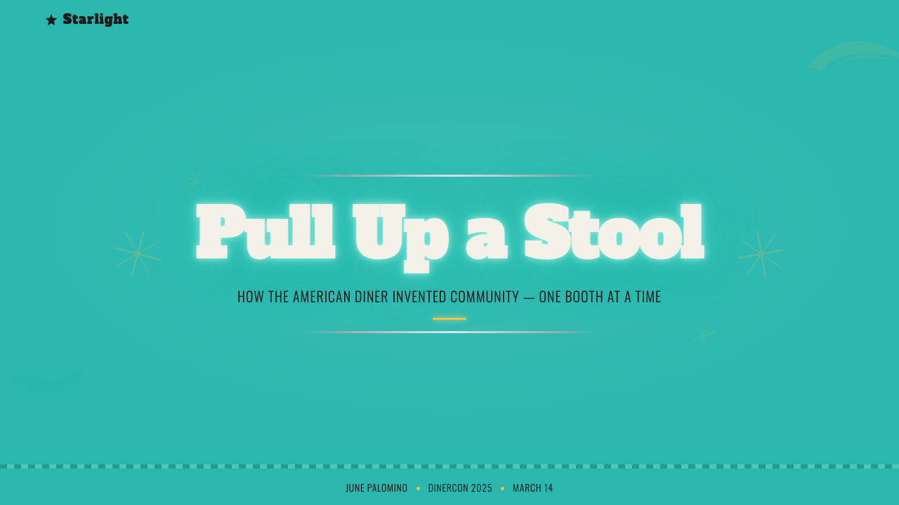
For presentation slides, a cover slide can use the deep aqua as a full-bleed ground with a chrome-effect rule or divider anchoring the title, evoking a counter edge rather than a plain line. Content and data slides should keep the aqua and cherry-red palette but let it structure hierarchy: aqua as background or section dividers, cherry red reserved for the one number, callout, or key takeaway that should catch the eye first, the way a red booth catches the eye against a blue wall. A checkerboard motif works well as a footer band or a subtle section marker, never as full-slide texture that would compete with data.
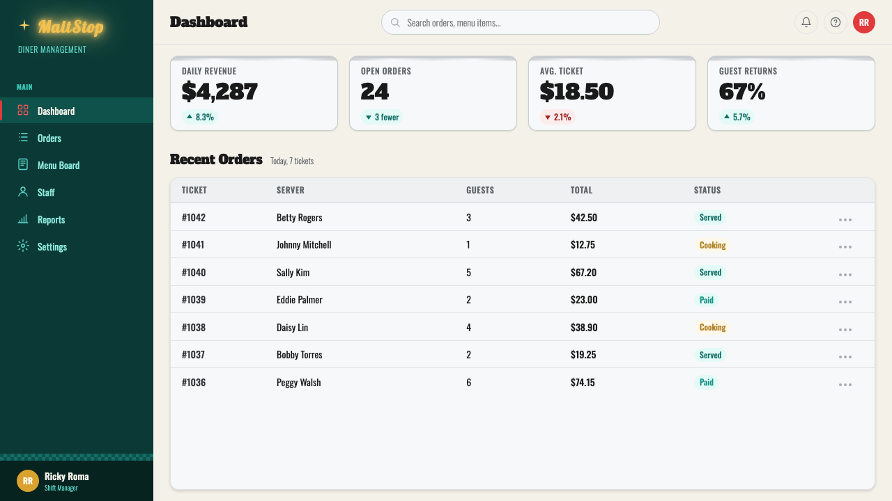
For web interfaces such as dashboards and pricing pages, the style translates into a light or aqua-tinted background with cherry-red used sparingly for primary actions and highlighted tiers, and chrome-like gradients or borders reserved for card edges and buttons rather than applied everywhere. A pricing page in particular can lean into the diner-menu-board heritage: bold, high-legibility numerals for prices, a slab display face for plan names, and a single accent color guiding the eye to the recommended plan the way a menu board highlights the day's special.
For editorial and marketing work, the style is well suited to nostalgic, food, travel, or Americana-adjacent brands. A full-bleed aqua hero with cherry-red type and a neon-script wordmark can carry a landing page's top section convincingly, while body copy should drop into a plainer, highly legible slab or rounded display face so long-form reading does not fight the decorative script. Photography or illustration in this system benefits from warm, high-contrast lighting reminiscent of dusk, rather than flat, even daylight.
The most common mistake is treating the style as pastel nostalgia — soft mint, baby pink, and muted tones borrowed from unrelated 1950s kitchen or fashion references. That reading loses the style's actual nerve: the aqua should stay deep and saturated, the red should stay a true cherry rather than a blush, and chrome should read as bright and reflective rather than flat gray. A second common mistake is scattering the checkerboard pattern everywhere; it belongs on the floor plane or its direct equivalent, not layered across every panel and card.
1950s Diner Aqua — FAQ
Is this the same as generic 'retro' or '50s style' design?
It overlaps but is more specific. 'Retro' is often used loosely to describe anything evoking the mid-twentieth century, including pastel kitchen prints, atomic-age wallpaper, or 1950s fashion illustration. This system names one concrete building type — the postwar American roadside diner — and its actual material palette: saturated aqua, cherry red, chrome, checkerboard flooring, and neon script. It is closer to a specific commercial vernacular than a broad decade-mood.
How does this style relate to Googie architecture?
They are close siblings from the same postwar, car-centric moment rather than the same thing. Googie is primarily an architectural movement — boomerang rooflines, upswept canopies, starburst structures — most associated with Los Angeles coffee shops, motels, and gas stations. This diner system shares Googie's roadside logic and some of its motifs, such as the boomerang silhouette, but is defined more by interior material choices — vinyl, chrome, checkerboard flooring, neon script — than by structural or roofline geometry.
Can this style work in a dark UI, or does it require a light background?
The historic reference is not a light-ground style in the way many mid-century systems are — the aqua wall itself is a mid-to-deep saturated tone, and neon was always designed to glow against evening darkness. This means the style already carries dark-mode instincts: a near-black or deep-navy background with neon-bright cherry red and glowing accent lines can feel more authentic to the after-dark diner than a pale, sunlit version. What should not change is the source of contrast — light needs to look like it is glowing against darkness, not simply be a bright color on a black field.
What kinds of products or brands does this style fit poorly?
It struggles wherever restraint, quiet authority, or minimal sensory input is the goal — enterprise software, financial or legal services, medical platforms, or any context where users expect a calm, low-stimulation interface. The style's saturated color and reflective shine are attention-seeking by design, which reads as playful in a food, hospitality, or entertainment context but can feel jarring or unserious in a context where trust is built through sobriety rather than warmth.
Does the checkerboard pattern have to be black and white, and does it have to be on the floor?
Black and white is the canonical combination and does most of the work of reading as 'diner floor' at a glance; substituting other color pairs weakens that recognition considerably. As for placement, the floor is the traditional plane because it lets the pattern function as ground without competing with wall color, signage, or upholstery above it — but the same logic transfers to any clearly bounded 'floor-equivalent' area in a digital layout, such as a footer band, a table's background, or a bottom navigation bar, as long as it stays confined to one plane rather than spreading across every surface.
Related design styles
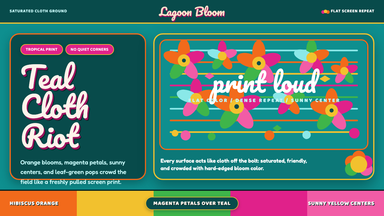 Fiji Bula Floral ShirtLoud cloth, zero quiet corners. Teal ground carries orange blooms and magenta…
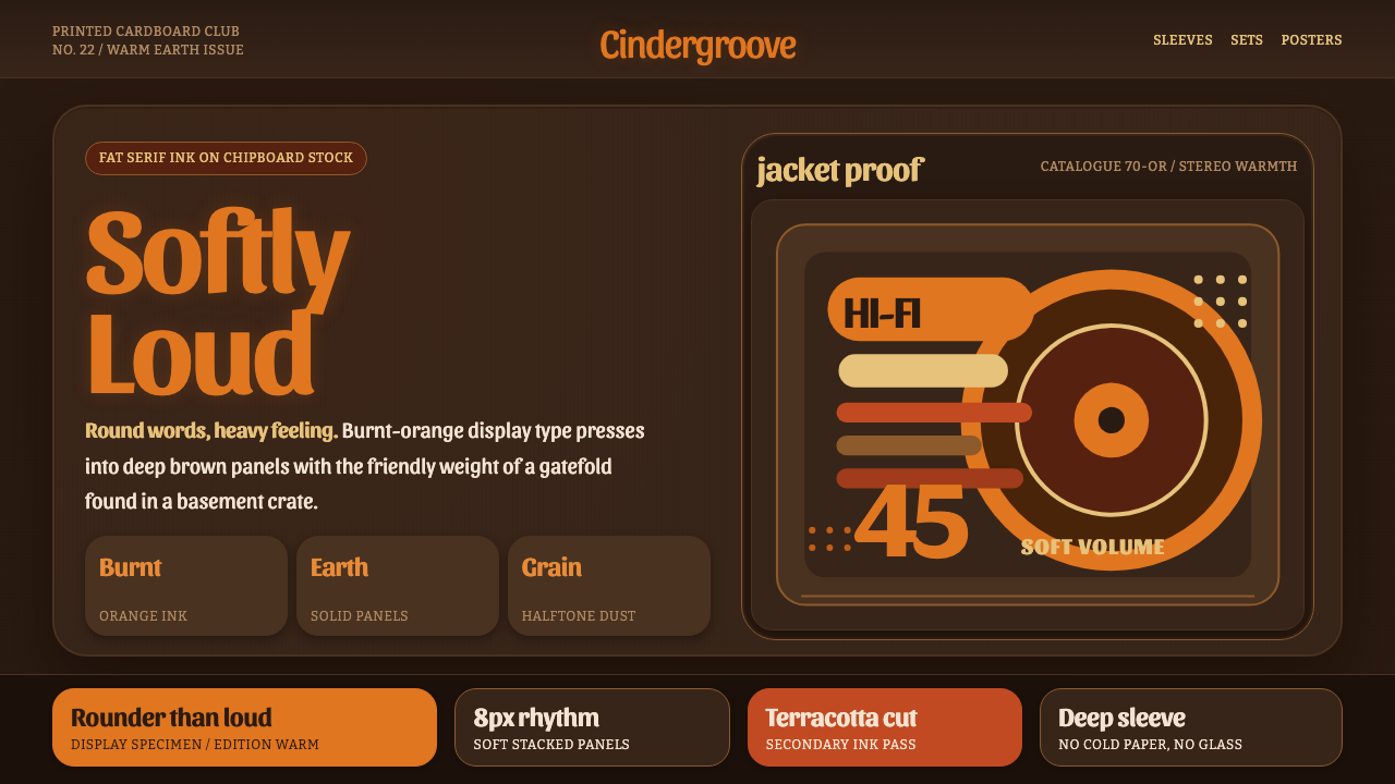 Cooper Black DisplayShouts softly. Burnt-orange Cooper type sinks into deep chipboard brown with…
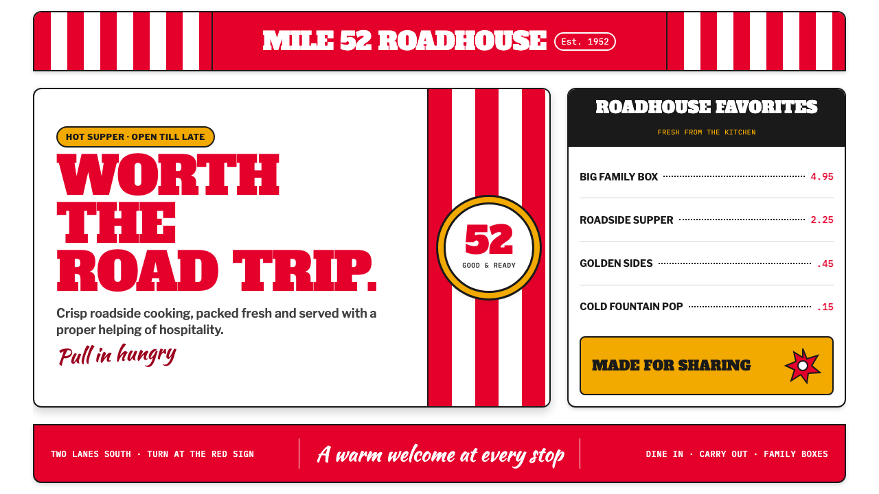 KFC Colonel (1952)Roadside appetite, turned up loud. Enamel red stripes and slab-serif shouts f…
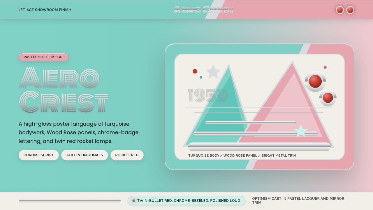 Cadillac TailfinShowroom optimism. Pastel aqua, Wood Rose panels, chrome Monoton, and rocket…
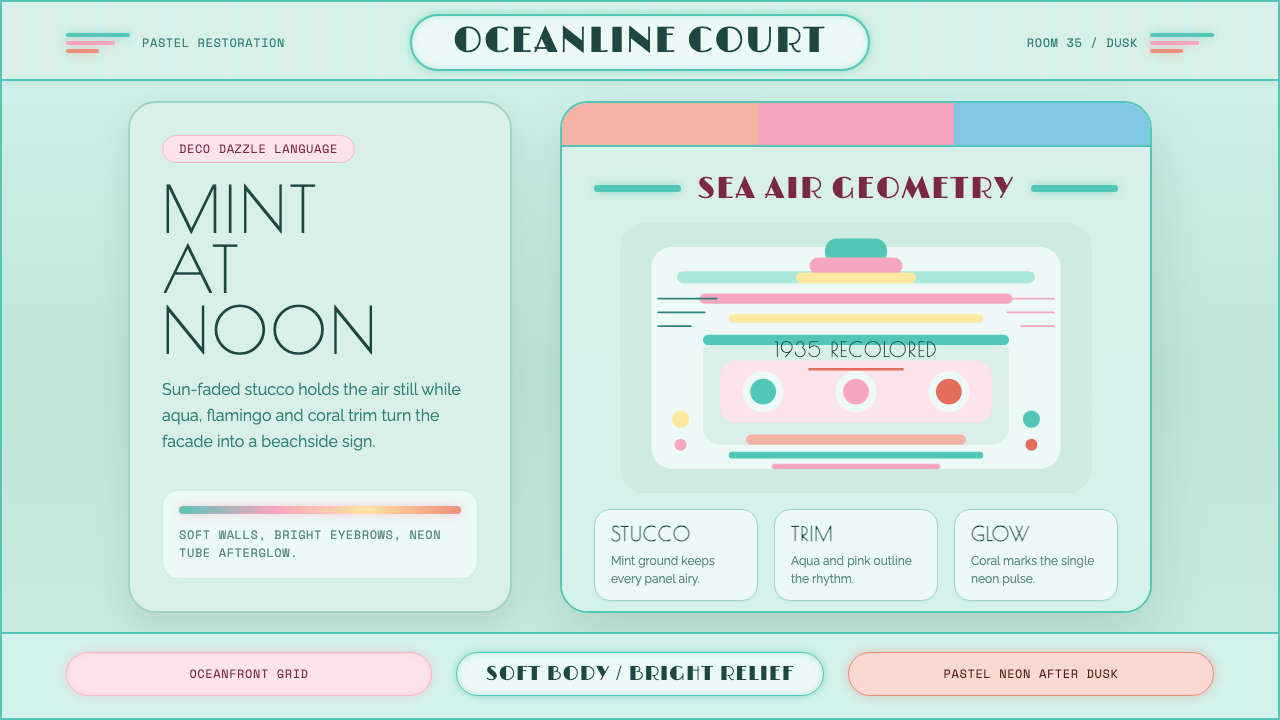 Miami Art Deco PastelSunlit Deco, not noir. Mint stucco, aqua bands and flamingo trim make it brea…
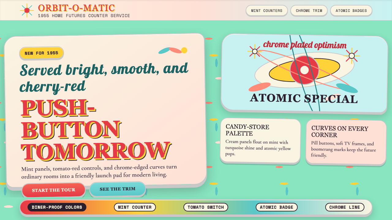 Populuxe Atomic AgeThe future grins. Mint Formica, tomato-red pills, Cooper Black, and atomic st…